
What Is Prototyping for Founders: AI, Web3, Fintech Guide

Yusuf
Founder and lead designer at 925studios

Most advice about prototyping gets the order wrong. It tells founders to make something polished, get everyone excited, then hand it to engineering.
That's backwards.
A prototype isn't valuable because it looks finished. It's valuable because it helps you learn what should never get built. If you're building an AI SaaS workflow, a Web3 onboarding flow, or a fintech dashboard, the primary job of prototyping is to surface risk early, while changes are still cheap and nobody has written production code.
That's the practical answer to what is prototyping. It's not a design deliverable. It's a decision-making tool. Done right, it helps a team test assumptions about usability, trust, clarity, and user behavior before those assumptions harden into roadmap commitments.
Table of Contents
The Difference Between a Prototype and Prototyping
Founders often say they need “a prototype” when what they need is a fast way to answer a hard product question.
That distinction matters. A prototype is the artifact. Prototyping is the process. If you confuse the two, you start optimizing for the wrong thing. You polish screens, add interactions, and debate colors before you've learned whether users even understand the core idea.
Ben Nadel puts it sharply: “prototypes are worthless; but prototyping is essential” in his piece on why prototyping matters more than the artifact. That framing is useful because it forces a founder to stop asking, “How do I make this look real?” and start asking, “What do I need to learn before I fund this?”
A prototype is a snapshot
A prototype can be a paper sketch, a wireframe, or a realistic interactive demo. It captures one possible answer to a problem.
That's useful, but limited. The file itself doesn't create value. The learning around it does.
If a founder builds a sleek AI dashboard prototype but never tests whether users understand the model output, the prototype is decoration. If a fintech team designs a perfect transfer flow but skips testing whether people trust the language around fees or approvals, the prototype is theater.
Prototyping is a risk reduction habit
Prototyping works when teams use it as a loop. They define an assumption, make the lightest thing that can test it, put it in front of real users, and revise or kill the idea.
Practical rule: If your prototype can't answer a specific question, you're probably making artwork, not reducing risk.
Product failure usually isn't about effort. It's about direction. The same Ben Nadel source notes that 60% of startups fail due to poor product-market fit, which is exactly the kind of failure process-driven prototyping is meant to catch early.
What founders should ask instead
A stronger set of questions looks like this:
Core assumption: Do users understand what this product does in the first minute?
Critical flow: Can they complete the main action without help?
Trust signal: Does the interface feel safe enough for money, identity, or automation?
Decision point: Should we refine this concept, simplify it, or drop it?
That's what prototyping is for. Not to impress investors with a fake finished product, but to prevent your team from spending months building the wrong thing.
Why Prototyping Is Your Startup's Best Insurance Policy
Startups buy all kinds of insurance. Legal review. Security tools. Compliance checks. But many still skip the one habit that protects product spend before it turns into engineering cost.
Prototyping is that habit.

A prototype lets you pressure-test flows before code makes them expensive. That's especially important in AI SaaS, fintech, and Web3, where a “small” UX mistake often affects activation, trust, support load, and conversion all at once.
It protects time and engineering focus
High-fidelity prototyping isn't just a nicer mockup. According to Figma's overview of what prototyping is in product design, high-fidelity prototyping can reduce product development cycles by up to 50% and cut post-launch fix costs by 30–40% because teams uncover usability flaws before engineering commits to them.
That's the business case in one line. The earlier you discover confusion, friction, or broken expectations, the cheaper the fix.
A founder usually feels this in three places:
Risk area | Without prototyping | With prototyping |
|---|---|---|
Engineering scope | Developers build unclear flows, then rebuild them | Teams align before tickets are written |
Go-to-market timing | Launch slips because core UX issues surface late | Product questions get resolved earlier |
User trust | Customers hit friction in onboarding or payments | Teams test whether the flow feels clear and credible |
A prototype is cheaper than a rebuild, and a rebuild is cheaper than a failed launch. Founders should pick the first option.
It sharpens fundraising conversations too
Investors don't just fund features. They fund clarity. A founder who can show how a user moves through a product, where the friction is, and what has been tested usually tells a stronger story than one pitching abstractions.
If you're still shaping that story, this roadmap to startup funding is useful because it frames how founders connect product readiness to capital. Prototypes help in that process because they make your assumptions visible.
They also force discipline. You stop saying “users will probably get it” and start watching whether they do.
It improves product decisions beyond design
A strong prototype becomes a working conversation tool for founders, PMs, designers, and engineers. It gets everyone reacting to the same thing, instead of interpreting a spec in different ways.
That's one reason UX research and prototyping are tightly connected. If you want a practical example of where teams go wrong, this piece on why AI products fail without UX research shows how quickly a product can drift when assumptions go untested.
The short version is simple. Prototyping doesn't eliminate product risk. It gives you a much cheaper place to find it.
The Prototyping Spectrum From Napkin Sketch to Interactive Demo
Founders waste time when they treat every prototype like a mini product launch. Fidelity is a choice, not a status symbol. The right prototype is the cheapest version that answers the next risky question.
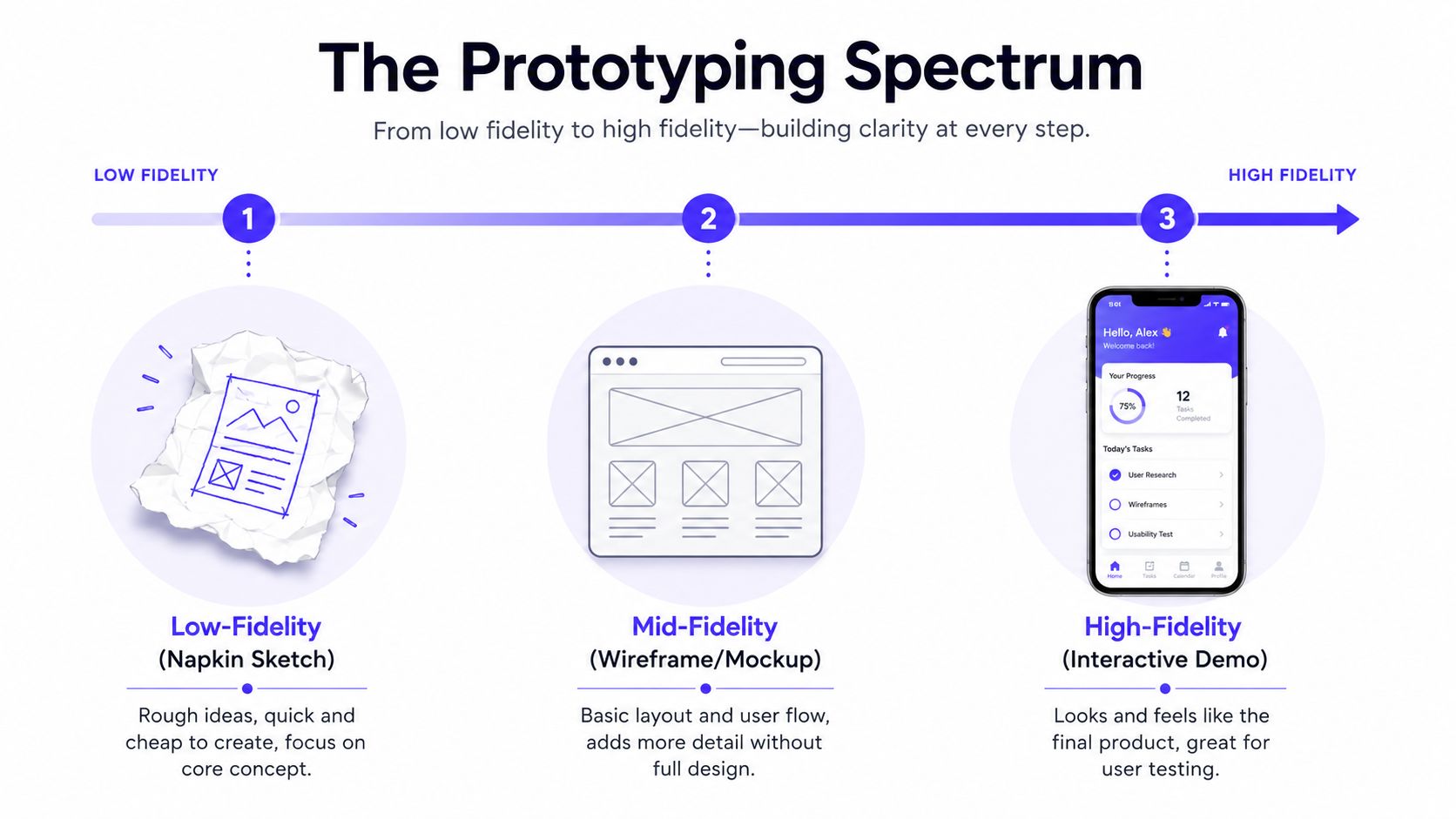
A sketch on paper can kill a weak onboarding flow in 20 minutes. A clickable demo can expose trust issues before engineering spends a sprint building the wrong thing. Both count as prototypes because both help the team learn what should exist, what should change, and what should be cut.
Low fidelity when the idea is still fragile
Low-fidelity prototypes are rough by design. Whiteboard sketches, sticky-note flows, paper screens, and simple Figma boxes work well when the product direction is still unstable.
Use them to answer early questions such as:
Does this user flow make sense
Are we solving a problem the user actually cares about
Which steps are necessary, and which are product team fiction
Where does the user pause, ask questions, or drop interest
For an AI SaaS founder, that often means sketching the first-run experience for a copiloted workflow and watching whether a user understands setup, output, and next action. For a Web3 founder, a hand-drawn wallet connection and signature sequence is often enough to show that the flow feels risky or confusing long before visual design matters.
Cheap prototypes are good at one thing founders avoid. They make it easier to throw away bad ideas.
Mid fidelity when structure starts to matter
Mid-fidelity prototypes add hierarchy, navigation, and clearer screen structure without spending time on polished visuals. This is usually the level where teams stop debating features in the abstract and start seeing where the product is bloated, unclear, or missing a step.
Fidelity level | Best for | Bad use case |
|---|---|---|
Low | Early concepts and rough flows | Final stakeholder sign-off |
Mid | Navigation, task sequence, screen structure | Testing emotional response to brand and trust |
High | Realistic interactions and usability testing | Exploring raw concepts that have not earned polish |
A grayscale click-through for a dashboard, onboarding path, or application flow is usually enough to test information architecture. Users either know where to go next or they do not. If they keep opening the wrong menu, skipping a key field, or missing the primary action, the team has learned something worth fixing before code.
If you are deciding how much realism to add at this stage, this guide to high-fidelity wireframes shows where extra detail improves decisions and where it just creates noise.
High fidelity when behavior changes with the details
High-fidelity prototypes are useful when copy, visual hierarchy, motion, form behavior, or state changes can alter what the user does. At that point, realism is not about impressing stakeholders. It is about testing behavior with fewer blind spots.
A useful rule is simple. If wording, spacing, trust cues, or interaction feedback could change conversion or confidence, move up the fidelity scale.
That happens often in products with financial, technical, or opaque workflows. In fintech, users react differently when a repayment screen, approval state, or transaction review feels clear versus risky. In AI products, trust can rise or collapse based on whether confidence labels, explanations, and recommended actions feel understandable. In Web3, signature prompts and confirmation screens need enough realism to show whether users know what they are approving.
Teams building these kinds of flows can use an AI development platform for full-stack to move from concept to testable product experiments faster. The tool matters less than the sequencing. High fidelity should come after the team has already cut obvious mistakes with cheaper prototypes.
The spectrum is not a ladder where every idea climbs to the top. Good product teams move back and forth across it. They sketch to explore, click through to test structure, and simulate reality only when the details are likely to change the decision to adopt, trust, or buy.
Prototyping Examples for AI, Web3, and Fintech
The best way to understand prototyping is to watch what it uncovers in a real product flow.
AI SaaS example, making model output understandable
An AI product often fails at the moment it should prove value. The user uploads data, clicks run, and lands on a screen full of charts, summaries, and generated recommendations. The team knows what it means. The customer doesn't.
A useful prototype here isn't just a dashboard mockup. It's an interactive test of explanation. Can the user tell what happened, what the model is confident about, and what they should do next?
A team might prototype:
A results dashboard with confidence labels and expandable reasoning
An empty state that explains what data is needed before the tool becomes useful
A handoff flow that lets a user approve, reject, or edit AI output
If you're building with modern tooling, an AI development platform for full-stack can help teams move from concept to working experiments faster. But the key decision still comes before code. Does the user understand and trust the interaction?
Web3 example, reducing wallet friction
Web3 teams usually know their protocol. Their users usually don't.
The problem often shows up in onboarding. “Connect wallet” sounds simple to the team that built it. To a new user, it can feel risky, technical, and irreversible. A prototype helps you watch where trust collapses.
Good Web3 prototypes focus on moments like:
Wallet selection
Permission explanation
Signature request
Transaction confirmation
Recovery from failed or rejected actions
A clickable flow can reveal whether users think they're logging in, approving a charge, or granting permanent access. Those are very different mental models. If the copy and sequencing don't make that clear, adoption suffers.
For more practical patterns, these Web3 onboarding examples for non-crypto users show why clarity beats insider language every time.
Most Web3 UX problems aren't chain problems. They're explanation problems.
Fintech example, designing for trust under pressure
Fintech products carry a different burden. Users don't just need a clean interface. They need to feel safe making a financial decision.
A strong prototype for fintech usually tests language, order, and confidence. Consider a cash management app, lending product, or payments dashboard. The team may need to know whether users can scan balances, understand statuses, and complete a transfer without second-guessing what happens next.
That prototype might include a realistic flow for:
entering transfer details
reviewing fees or timing
confirming identity
seeing the post-action state
Here, founders often learn that “simple” and “reassuring” are not the same thing. A sparse screen can feel elegant, but if it hides critical context, users won't trust it. Prototyping exposes that gap before compliance, engineering, and support all inherit the fallout.
A Simple Prototyping Workflow You Can Run Next Week
Founders waste weeks on prototypes that answer nothing.
A useful prototype cycle does one job well. It reduces uncertainty fast enough that the team can keep building, change direction, or kill the idea before engineering inherits the cost. That makes prototyping a weekly decision system, not a design deliverable.

Start with one decision that matters
Set the test up around a decision, not a vague goal like "improve onboarding" or "design the app." Good prototype questions are specific enough to change the roadmap.
Examples:
Can a new user finish onboarding without sales or support?
Do users understand what permission they are granting when they connect a wallet?
Can an ops lead tell the difference between available funds, pending funds, and failed transfers at a glance?
If the answer will not change what gets built next, the question is too soft.
Cut the scope to one flow
Pull out the smallest flow that can answer that question. Skip everything else.
A team testing transfer-review trust in fintech may only need four screens. Amount entry, fee review, identity check, and confirmation. A team testing an AI workflow may only need to know whether users want to start with a prompt, a file upload, or a template. They do not need a full dashboard, billing logic, team settings, and a polished marketing site wrapped around it.
That constraint matters. Small prototypes are easier to test, easier to revise, and easier to throw away when the idea is weak.
After the first two steps, it helps to see the cadence in motion.
Match the fidelity to the risk
Use the cheapest format that can produce honest reactions.
If you're testing | Build this |
|---|---|
Basic flow logic | paper sketches or rough frames |
Navigation and sequence | clickable wireframes |
Trust, clarity, and realistic interaction | high-fidelity interactive prototype |
Founders often get the trade-off wrong. Low fidelity is faster, but it can hide trust problems. High fidelity feels convincing, but it takes longer and can make the team defend a bad concept because it already looks expensive. Choose the level of realism based on what users need to react to naturally.
Put it in front of target users quickly
Test with people who have the problem. For a B2B fintech tool, that might mean controllers, finance managers, or operators who approve transfers every week. For an AI product, it means people already doing the job your product is supposed to speed up.
Give them a task. Stay quiet. Watch for hesitation, wrong assumptions, skipped information, and places where they ask for reassurance. Those moments are the signal.
Then force a decision the same day:
Iterate if the value is clear but the flow is confusing
Simplify if too many steps or messages are competing for attention
Scrap it if users do not care enough to push through the task
The point is not collecting notes. The point is reducing waste.
A strong weekly rhythm is simple. Pick one question. Build one flow. Test with the right users. Make one hard decision. Then repeat with the next risk on the roadmap.
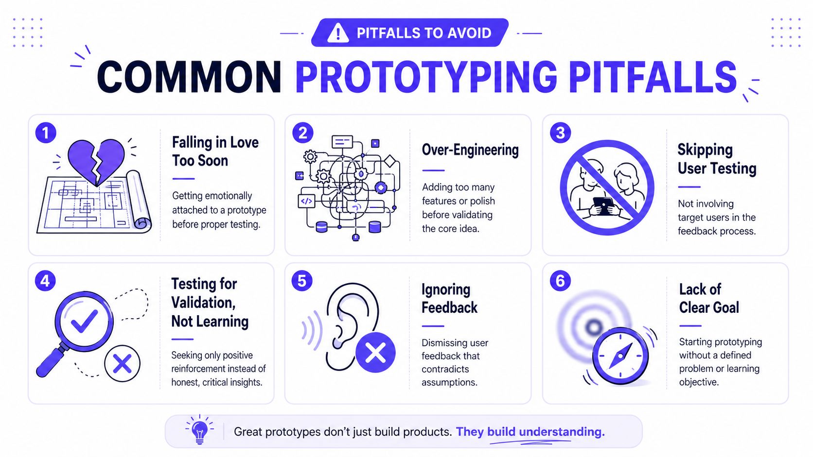
Common Prototyping Pitfalls That Waste Time and Money
Most prototyping mistakes don't come from bad tools. They come from bad intent.
Founders usually sabotage the process in predictable ways. They chase polish too early, test with the wrong people, or use the prototype to confirm what they already believe instead of learning something new.
Myth, a polished prototype proves the idea
Reality, a polished prototype often hides the actual question.
Founders fall in love with the thing because it looks close to launch. That emotional attachment makes it harder to kill weak ideas. If the interface looks expensive, people start defending it.
Use polish only when realism is necessary for the test. Otherwise, keep it rough enough that the team stays honest.
Myth, feedback from friends is good enough
Reality, friendly feedback is usually soft feedback.
People who like you tend to protect you. They'll say the product looks great, then never use it. That doesn't help. You need target users who have the problem your product claims to solve.
A fintech founder should test with people who directly manage transfers, approvals, reporting, or reconciliation. An AI founder should test with users who already work with the kind of output being generated.
Myth, prototyping is for validation
Reality, prototyping is for discovery.
If the only goal is proving you're right, you'll ignore the best signal in the room. Strong teams prototype to find weak assumptions, not to decorate strong opinions.
A practical way to keep that mindset is to write down what would make you kill the idea before testing starts.
Myth, once it tests well, you're done
Reality, changing markets and shifting user expectations keep moving the target.
That's where Non-Finito Prototyping becomes useful. Delve describes this approach in its piece on Non-Finito Prototyping and continuous discovery. The idea is simple. Leave prototypes intentionally unfinished so teams keep inviting feedback and discovering needs as the product evolves.
That's especially relevant for AI, Web3, and fintech teams operating in volatile environments. If your market, onboarding friction, compliance surface, or user expectations keep changing, a “final” prototype can lock you into stale assumptions.
Leave room for the product to argue back. Finished-looking artifacts often shut down the exact feedback a startup still needs.
The practical fix
Use this checklist before every prototype cycle:
Clear question: What exact assumption are we testing?
Right fidelity: Are we using the lightest format that can answer it?
Right audience: Are we testing with actual target users?
Honest threshold: What result would make us change direction?
Next move: If feedback is negative, will we iterate, simplify, or kill it?
That discipline saves more money than any design tool ever will.
Turn Your Idea Into a Shipped Product
The useful answer to what is prototyping isn't “a mockup” or “a clickable design.” It's a working method for making better product decisions before they get expensive.
That matters for founders because product teams don't lose time only by building slowly. They lose time by building confidently in the wrong direction. Prototyping fixes that by giving the team a cheaper place to learn. You test the flow, the explanation, the trust signal, the onboarding logic, the dashboard hierarchy, or the transaction review state before engineering has to carry the weight.
The strongest teams don't treat prototyping like a presentation file. They treat it like a filter. Bad ideas get cut early. Good ideas get sharper before launch. The product that finally ships is clearer because the team already worked through the confusion.
If you're moving from concept to build, it also helps to study practical starter patterns, especially for SaaS products. These LaunchFast SaaS kit applications are useful reference points for how teams structure real product foundations without starting from a blank page.
Founders in AI SaaS, Web3, and fintech usually don't need more abstract advice. They need a way to turn complex product logic into something users can understand, trust, and use. That's what strong prototyping does. It closes the gap between an idea that sounds good in a meeting and a product that holds up in the market.
If you need a partner to turn rough product ideas into clear flows, polished interfaces, and shipped frontend, 925 studios gives startup teams one creative partner that replaces three hires, product designer, brand designer, and frontend developer.


Let’s keep in touch.
Discover more about high-performance web design. Follow us on Twitter and Instagram.

