
Design for Branding: A Startup Founder's Guide for 2026

Yusuf
Founder and lead designer at 925studios

Most advice about branding still starts in the wrong place. It starts with the logo, the color palette, the moodboard, then hopes the product will somehow catch up later.
That approach breaks down fast in AI SaaS, Web3, and Fintech. Users don't decide whether your brand feels credible by looking at a brand guide in Figma. They decide when they open your app, connect data, move money, read an onboarding step, hit an error state, or compare your landing page promise with what the product does.
That's why design for branding isn't a layer you add after product work. It's the system that makes your website, UI, motion, copy, and frontend feel like they came from one company with one point of view. When those pieces drift apart, users feel it immediately. The brand looks polished in marketing and confused in the product, or vice versa. Trust drops before anyone says it out loud.
Table of Contents
What Design for Branding Actually Means for a Startup
Founders often hear "branding" and think marketing team, launch assets, maybe a homepage refresh. That's too narrow. In a startup, your brand is the combined experience of every place a customer touches the company.
For a technical product, that means the product itself does most of the branding work. Your dashboard layout, your onboarding flow, your empty states, your loading behavior, your chart styling, your error messages, your typography choices, they all tell users what kind of company you are. Careful and clear, or messy and improvised.
The product is the brand in practice
If your landing page promises effortless automation but the app feels dense and unpredictable, users don't remember the promise. They remember the friction. If your homepage looks premium but your UI uses mismatched patterns, weak hierarchy, and generic components, the product cancels out the marketing.
At this point, design for branding becomes concrete. A founder doesn't need to ask, "Do we have a strong brand?" first. Ask better questions:
Does the website feel like the product they're about to use
Do product screens repeat the same visual logic
Do copy and interface tone match across onboarding, help, and sales
Does the frontend implementation preserve the decisions made in design
A lot of teams split these into separate streams. Brand agency for visuals. Product freelancer for UI. Developer for implementation. That structure usually creates small inconsistencies that stack up into a weak identity.
Practical rule: If a user can tell that your homepage, app, and email lifecycle were designed by different minds with different standards, your brand system isn't working.
Separate tasks create a fragmented brand
This is why founders benefit from studying how perception forms across touchpoints, not just in campaigns. The perception of brands is shaped by repeated signals, not isolated assets.
A useful way to audit this is to lay out your paid ads, landing page, onboarding, and first-use screens side by side. Teams using a performance ad creative platform often see this clearly because ad creative forces them to compare message, visual tone, and promise across variants. The exercise exposes whether your acquisition layer and product experience belong to the same company.
Design for branding is the discipline of making those layers coherent. Not prettier. Coherent.
Why Brand Consistency Matters for Technical Products
Users forgive less when the product is complex. If you're asking someone to trust an AI workflow, move funds, connect internal systems, or interact with blockchain infrastructure, they'll read design quality as an operational signal.
That's not vanity. It's risk assessment.

Consistency tells users your system is under control
Think about products like Stripe or Mercury. What users notice first isn't "beautiful branding" in an abstract sense. They notice restraint. Clear spacing. Predictable flows. Calm typography. Interface decisions that reduce doubt instead of adding noise.
AI SaaS, Web3, and Fintech products need that same discipline because the user is already doing extra mental work. They may be evaluating model outputs, permissions, transaction states, compliance constraints, or unfamiliar workflows. If your design language changes between the website, the app, and support materials, users start asking a dangerous question: if the experience feels inconsistent, what else is inconsistent?
That is why brand consistency becomes a trust mechanism.
Technical buyers spot exaggeration fast
Branding for technical products has to be grounded in cause and effect. Authenticity and benefit-focused communication directly reduce customer churn, and brands that communicate realistic use cases help prevent the "too good to be true" reaction that savvy buyers reject, as noted in this piece on branding technical products.
In practice, that changes how design works:
Touchpoint | What weakens trust | What strengthens trust |
|---|---|---|
Landing page | Big claims with vague visuals | Clear product framing and UI that matches the promise |
Onboarding | Generic setup flow copied from another SaaS tool | Steps that reflect your actual workflow and terminology |
Dashboard | Random card styles, inconsistent states | Repeatable patterns that teach users how the product behaves |
Sales materials | Different tone from the product itself | One voice across demo, deck, help docs, and app UI |
Technical users don't need flashy design. They need evidence that the team behind the product thinks clearly.
The higher the stakes, the less room you have
In Fintech, inconsistency can feel unsafe. In AI, it can feel untrustworthy. In Web3, it can feel amateur. None of those reactions help conversion, activation, or retention.
What works is a design system that makes complexity feel managed. What doesn't work is treating the website as brand, the app as product, and implementation as an engineering cleanup task. Users experience all of it as one thing.
The Core Principles of an Unforgettable Brand Design
Founders often treat brand design like decoration. That mistake gets expensive fast. An unforgettable brand comes from a small set of choices applied across the product, website, sales materials, and lifecycle messaging until users recognize the company without needing the logo as a cue.
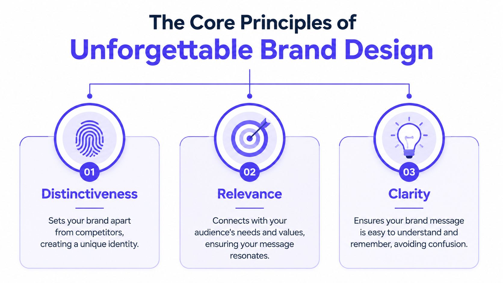
Distinctiveness beats category cosplay
Startups usually lose memorability in the same place. They copy the visual defaults of their category to look credible, then erase any reason to remember them.
In SaaS, that often means the same blue palette, the same soft gradients, the same friendly geometric icon, and the same polished but interchangeable landing page. It feels safe in the review meeting. It performs like a commodity in the market.
Useful brand design creates appropriate distinctiveness. The product still needs to feel legible to the category, but it also needs signals users can attach to your company and no one else. That can come from shape language, spacing, motion, typography, illustration style, or interface density. The point is not novelty. The point is recognition.
For a cybersecurity startup, tighter type, sharper geometry, and disciplined motion can signal control and seriousness. For a developer tool, denser layouts and stronger information hierarchy can communicate capability faster than a playful marketing treatment ever will.
A few levers matter more than teams expect:
Shape language: soft curves suggest approachability, while sharper forms suggest precision
Interface density: spacious layouts feel editorial, denser layouts can signal depth and control
Motion behavior: restrained transitions feel deliberate, while energetic motion can make serious products feel less credible
Illustration and icon systems: one visual family builds memory, mixed assets make the brand feel assembled instead of designed
Coherence makes the brand believable
Distinctive choices only work if they repeat. A startup does not build brand memory through a homepage redesign alone. It builds memory when the website, onboarding flow, dashboard, sales deck, and help center all feel like they came from the same company with the same standards.
Many technical products break down in situations such as these. Marketing introduces a polished identity. Product keeps an older UI. Growth ships paid ads with a third visual style. Users experience that mismatch as organizational sloppiness, even if they never say it that way.
A simple test exposes the gap:
Open your homepage and product side by side
Hide the logo
Check whether hierarchy, color behavior, typography, and tone still feel connected
If the answer is unclear, the brand exists as a set of assets, not a system.
Teams usually fix this by documenting tokens and components, then stopping there. In practice, consistency holds when brand rules live inside the way design and engineering ship work. A good reference point is how embedded design systems support consistency inside real product workflows, not just in a static brand file no one opens after kickoff.
A short walkthrough on brand thinking in practice can help sharpen this lens:
Flexibility keeps the system useful
Rigid guidelines break the moment a startup adds a new feature, launches a second product line, localizes a sales page, or ships a mobile view the original brand deck never considered.
Strong brand systems allow variation without drift. The dashboard can be denser than the homepage. A sales one-pager can be more direct than onboarding. A feature announcement can carry more energy than a billing screen. The underlying logic should still hold. Type scales, spacing rules, color roles, interaction patterns, voice, and visual hierarchy should behave predictably.
That is what founders are paying for when they invest in design for branding. Not prettier mockups. A repeatable identity system that makes every shipped surface feel related, trustworthy, and easier to remember.
From Principles to Pixels in Practical Application
Brand principles only matter when they survive contact with shipped work, a point at which many startups lose the thread. The strategy deck says one thing, the marketing site says another, and the product team ships whatever fits the sprint.
The fix is to translate brand intent into visible rules inside the product, the website, and the component layer.
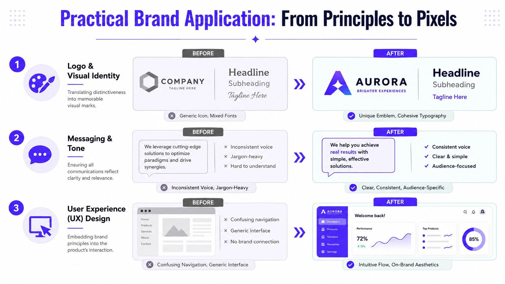
Your Product UI
Take a hypothetical AI finance product with a brand idea of "effortless power." That shouldn't stay in a positioning doc. It should show up in the interface.
In the dashboard, "effortless power" might mean dense capability with calm presentation. Fewer decorative elements. Strong hierarchy. Tables that are easy to scan. Filters that don't hide core actions. Empty states that teach, not just decorate.
It also affects micro-decisions:
Buttons: one primary action style, not four competing button treatments
Charts: a consistent visual grammar so users don't decode each screen from scratch
Forms: fewer interruptions, clearer labels, no clever wording where clarity matters
Errors: direct language that explains what happened and what to do next
A Visual Brand Language, or VBL, is the strategic integration of shape, color, and texture through the product itself. The form and geometry become identifiers users connect to the brand promise, as described in this article on Visual Brand Language in product design.
Your Marketing Website
The website shouldn't look like a separate costume. It should feel like the cleanest, most understandable version of the product experience.
A lot of startup sites fail here. The hero section says "AI-native intelligence for next-gen financial orchestration" while the product is basically a workflow tool with analytics. The visuals are cinematic, the product is utilitarian, and the gap creates doubt.
A stronger website does three things well:
Website layer | Strong application |
|---|---|
Narrative | Explains the product in the same language the UI uses |
Visual rhythm | Mirrors the product's pace, density, and confidence |
Proof | Uses real screens, realistic flows, and grounded claims |
If you want a good example of how interface-level decisions shape perception in conversational product surfaces, the write-up on the new DocsBot chat widget is worth studying. It shows how brand expression can live inside a functional embedded experience, not just in a marketing shell.
Your Design System
Your design system is where brand consistency stops being aspirational and becomes repeatable.
That means tokens, components, spacing rules, type scales, interaction states, and frontend implementation all need to reflect the brand logic. If your system is generic, the shipped product will be generic, no matter how strong the original concept was.
For teams that don't want to split this across separate hires, 925 Studios is one option because it covers product design, brand design, and frontend development in one partner. The practical value of that model is continuity. Fewer handoff losses. Fewer visual compromises between strategy and shipped UI.
When the component library and the brand language are built together, consistency stops depending on memory.
How to Weave Branding into Your Product Workflow
Brand drift rarely starts with a rebrand. It starts in sprint planning.

A founder approves a sharp homepage, the product team ships features under deadline, marketing launches campaigns in parallel, and six weeks later the company has three different versions of itself in the market. The website sounds polished. The app feels generic. Lifecycle emails read like they came from another business. Users may not describe that as a branding problem, but they feel it as uncertainty.
The fix is operational. Brand has to enter the workflow at the same point as scope, usability, and engineering constraints.
Start features with a brand decision, not just a user story
Before a team sketches a flow, define the trait the product needs to express in that moment. Precision. Speed. Calm. Control. Whatever the company claims publicly should show up in the interaction model, not just in the homepage copy.
That changes real product decisions. A fintech startup that wants to signal control should not bury risk information behind tooltips and soft language. An AI copilot that claims speed should not force users through slow, high-friction confirmation steps on every action. The pattern library might support both approaches. The brand should tell you which one fits.
Often, startup teams go off course. They borrow familiar SaaS patterns because they are fast to ship, then wonder why the product feels interchangeable. Category conventions matter, but copying them blindly erases distinction.
Turn brand into product rules the team can ship
Founders do not need another brand deck. They need rules that survive handoff.
That usually means writing brand decisions into the same artifacts the team already uses:
Component guidance: how tables, forms, empty states, and alerts should communicate the company's character
Content rules: preferred tone for labels, onboarding prompts, warnings, and success messages
Frontend constraints: which visual choices are fixed in code so every release does not drift
Design review criteria: what counts as on-brand during product critique, not just what looks clean
For teams trying to align marketing pages, app UI, and engineering output, this article on embedded design systems is a useful reference. It shows how to keep brand logic inside the system instead of relying on memory.
Build brand checks into the sprint itself
A practical workflow is simple, and it works because it attaches branding to existing product rituals.
Discovery defines the message and the trait each feature needs to reinforce
Design translates that into interface patterns, states, and copy
Engineering ships those patterns without one-off visual improvisation
QA and review check both usability and brand fit before release
I have seen this matter most in AI startups, where the pressure to ship is high and the product changes weekly. Teams often invest in launch assets first, then let the in-product experience evolve on speed alone. That creates a polished promise on the outside and a disconnected experience inside. If your growth team is also using automation and AI to scale campaigns, the same identity needs to carry through those touchpoints as well. The guide to marketing AI by Armox is useful context for that side of the stack.
Branding works when it becomes part of how the company ships. Every screen, state, email, and landing page should feel like it came from the same mind.
How to Measure the Real Impact of Your Brand Design
Most founders have heard some version of "good design matters," but that isn't enough. If you're funding work, you need to connect design for branding to business outcomes.
The cleanest place to start is with a simple distinction. Design success should be measured by the value created for users, not the number of features shipped. Products are outputs, while outcomes are changes in human behavior that drive business results, as explained in this article on outcome-focused design.
Stop measuring taste, start measuring behavior
"I like it" is not a useful metric. Neither is "the team feels better about the homepage." Stronger brand design should change how people understand, trust, and use the product.
For a startup, that usually means watching signals like:
Onboarding completion: does the product look and read clearly enough for users to get through setup
Time to value: do users reach a meaningful first result without extra confusion
Support friction: are fewer conversations driven by navigation issues, unclear labels, or weak hierarchy
Sales clarity: are prospects asking fewer basic questions because the website and demo explain the product better
Retention quality: do activated users keep using the product because the experience feels reliable and understandable
Match each design change to one expected outcome
Here, teams get more rigorous. Don't redesign five things and hope something improves. Map one change to one outcome hypothesis.
A simple framework works well:
Design change | Expected user behavior |
|---|---|
Clearer onboarding hierarchy | More users finish setup without assistance |
Unified visual patterns in dashboard | Users navigate faster and hesitate less |
Website messaging aligned with product UI | Better-qualified demos and fewer mismatched expectations |
Consistent tone in product states | More confidence during critical actions |
Brand design earns its keep when users understand the product faster and trust it sooner.
If you need a practical way to connect these UX signals to startup metrics, this guide on how to measure UX design ROI for a startup is a useful next read.
Your Brand Is What You Ship Not What You Say
Founders don't need another reminder to care about branding. They need a clearer definition of what branding is.
It isn't the logo file sitting in a shared drive. It isn't the deck from the strategy workshop. It isn't the polished homepage if the app still feels patched together. Your brand is the lived impression users get from the thing you release and the way every touchpoint supports it.
That matters even more in AI, Web3, and Fintech because users are judging competence while they judge design. They want to know if your team is credible, focused, and careful. The fastest way to answer that isn't a slogan. It's a product that feels coherent from first click to daily use.
If you're shaping go-to-market around AI, the guide to marketing AI by Armox is a useful complement to this thinking because it helps connect product positioning with how the market encounters your brand.
The practical takeaway is simple. Stop treating branding, product design, and frontend execution as separate jobs with separate standards. When they move together, the company becomes easier to recognize, easier to trust, and easier to buy from.
925 Studios works with AI SaaS, Web3, and Fintech teams that need one creative partner across brand, product design, and frontend implementation. If you want your website, UI, and shipped product to feel like one clear company instead of three disconnected efforts, see 925 studios.


Let’s keep in touch.
Discover more about high-performance web design. Follow us on Twitter and Instagram.

