
Embedded Design Systems: A Founder's Guide for 2026

Yusuf
Founder and lead designer at 925studios

Your product probably already has three versions of the same decision.
The dashboard has one primary button style. The marketing site has another. The onboarding flow in the app uses a third version that somebody rebuilt because the original component didn't support an icon, or loading state, or dark mode, or the exact spacing they needed that week.
That's how organizations often end up talking about a design system too late. Not when they're planning infrastructure, but when inconsistency starts leaking into the product. Support sees users question whether a new screen is “part of the same app.” Engineering slows down because every feature needs fresh UI work. Marketing publishes pages that look related to the product, but not fully connected to it.
Founders usually feel this as drag, not as a design problem. Releases take longer. QA catches visual defects late. New hires copy what they see, so the mess spreads.
An embedded design system fixes that, but not by giving you a prettier Figma file. It works when design decisions are treated the way hardware teams treat critical system choices, with constraints, ownership, and a clear path from standards to shipped product.
Table of Contents
The Hidden Cost of Inconsistent Design
A startup can look polished at ten screens and chaotic at fifty.
One product squad ships a billing page with tighter spacing and different form labels. Marketing launches a campaign page in off-brand colors because they needed to move fast. Mobile picks a date picker that behaves differently from web. None of these choices feel fatal on their own. Together, they teach users that your product is assembled in pieces.

The damage shows up in places founders care about. Sales demos feel less sharp. Engineers spend time matching old patterns by eye. Designers stop trusting the library because it's incomplete. QA ends up reviewing the same visual issues over and over. If you're seeing this already, it's the same pattern behind the hidden cost of cheap design for startups, just inside the product instead of only on the surface.
Small inconsistencies create big operational waste
What looks like a button mismatch is usually a systems problem.
Symptom | What's really happening |
|---|---|
Different button styles | No shared component ownership |
Off-brand landing pages | Brand rules aren't connected to build workflows |
Rebuilt forms in each feature | Engineers don't trust reuse |
UI bugs late in QA | Standards are checked too late |
A lot of teams try to solve this with a style guide. That helps, but only up to a point. A PDF, Notion page, or Figma board can describe the rules. It can't enforce them in code, and it can't resolve product trade-offs when a real feature doesn't fit the pattern.
Practical rule: If a team can bypass the system without friction, they will.
Why trust erodes faster in SaaS, Web3, and Fintech
In these categories, users aren't just buying features. They're judging credibility.
A fintech user notices when numbers align poorly or tables behave inconsistently. A Web3 user sees immediately when wallet flows feel bolted on. An AI SaaS buyer expects the product UI, website, and onboarding experience to feel like one company made them. When they don't, people question the maturity of the business.
That's why embedded design systems matter. They don't just tidy up visual choices. They reduce decision drift across product, brand, and frontend work, so the company stops shipping mixed signals.
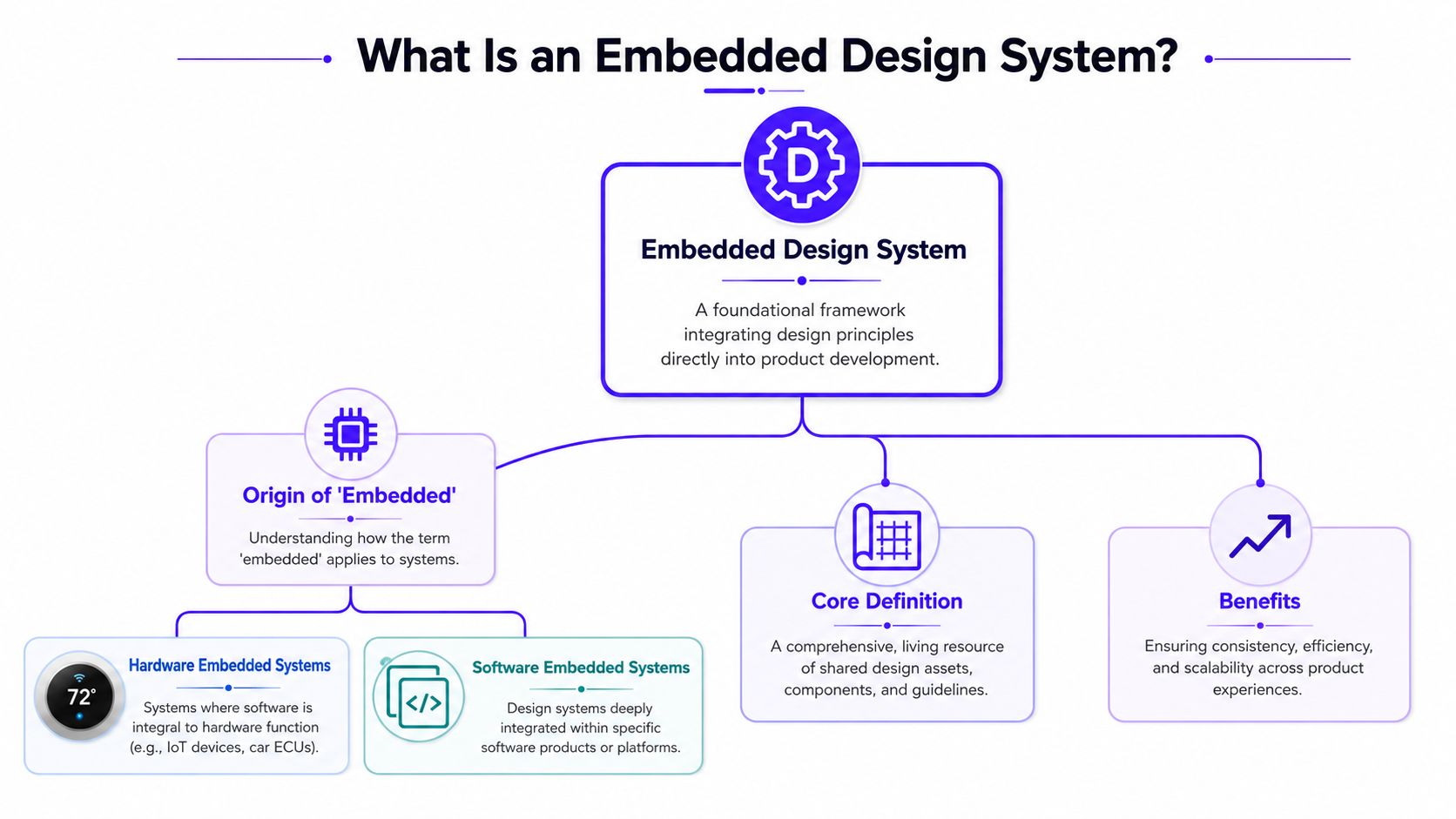
What Is an Embedded Design System
An embedded design system is a design system built with the discipline of an embedded hardware program, not the looseness of a shared asset folder.
In hardware, teams don't get to improvise forever. Embedded system design works under hard budgets for latency, power, memory, and cost. Teams have to choose architecture and components early because changes after prototype build get expensive, and time-critical products often rely on an RTOS to guarantee deterministic behavior, as described in this embedded systems design reference.
That's the useful metaphor.
Why the word embedded matters
The word has two jobs here.
First, it describes a system of constraints. In software product teams, that means colors, typography, spacing, states, accessibility rules, interaction patterns, and component behavior aren't treated as loose suggestions. They're treated like architecture decisions. Teams can evolve them, but they don't reinvent them feature by feature.
Second, it describes where expertise lives. The people who know the system can't sit on the side and hand over kits. They need to be close to roadmap decisions, design reviews, and shipped frontend work. Otherwise the system becomes shelfware.
A component library without embedded ownership usually turns into a museum. Nice to look at, rarely used.
How that maps to software teams
A standard design system often stops at assets and documentation. An embedded one includes three layers.
Shared standards: Tokens, components, patterns, copy rules, and accessibility expectations.
Operational integration: The system connects to design files, code repositories, documentation, review processes, and release workflows.
Human enforcement: Designers and frontend builders are involved where product decisions happen, not after the screen is already decided.
For founders, the simplest way to think about it is this. A component library is a parts bin. An embedded design system is the parts bin, the assembly rules, the quality checks, and the people accountable for keeping all of it useful.
A significant issue arises when software teams build components before defining the underlying rules. This typically leads to failure, as every “reusable” part then has exceptions. For a solid example of how teams approach reusable building blocks in practice, AppLighter's guide to AppLighter UI components is a useful reference.
The strongest embedded design systems also cover brand and product together. That means the website headline style, the dashboard empty state, the billing table, and the notification logic all come from one coherent language. Users don't separate those experiences, so your team shouldn't either.
Why This Discipline Drives Growth in Tech
Founders in SaaS, Web3, and Fintech often treat design systems as cleanup work. That's a mistake. In these businesses, the interface is part of the core product, and consistency affects adoption, trust, and execution speed.
The hardware world is a good reminder of what disciplined systems create. The global embedded systems market was valued at $112.3 billion in 2024 and is projected to reach $169.1 billion by 2030, with a 7.1% CAGR, according to Grand View Research on the embedded system market. The point isn't that software UI should imitate hardware exactly. The point is that discipline around constraints has enormous business value.
Trust is the product in regulated and technical markets
In consumer social apps, teams can get away with a little roughness. In fintech and infrastructure products, roughness reads as risk.
If a user sees one style of balance card on desktop and a different version in email or mobile, they don't think, “design debt.” They think, “Is this reliable?” The same is true in AI SaaS. If the product promises intelligence but the experience feels patched together, buyers question whether the backend is equally messy.
A strong system improves growth in practical ways:
Product teams ship with less rework: Engineers reuse approved patterns instead of rebuilding controls for every release.
Marketing stays on-brand: Landing pages and product surfaces stop feeling like separate companies.
Onboarding gets clearer: Repeated UI patterns teach users how the product works.
Sales demos look sharper: Consistency makes a company feel larger and more mature than its headcount.
The upfront cost is real
This approach isn't cheap at the start.
Someone has to audit what exists. Someone has to clean up naming, states, and edge cases. Frontend has to wire reusable components properly instead of copying local variants into each feature. Product leaders need to accept slower movement for a short stretch while the foundation gets built.
That trade is usually worth making because the alternative is hidden and recurring. Teams pay for inconsistency every sprint. They pay in extra review cycles, duplicated code, visual bugs, and slower onboarding for new hires.
If your team rebuilds the same interface pattern three times, you don't have speed. You have repeated cost.
The companies that benefit most are the ones with real surface area. Multi-product SaaS. Fintech with dashboards, flows, and transactional states. Web3 products spanning app, docs, and wallet interactions. When the brand has to feel trustworthy across all of it, embedded design systems stop being a design preference and start looking like operating infrastructure.
Architecture and Integration Patterns
Most design systems fail because teams start with the visible part. They build a button set in Figma, maybe a Storybook, and call it progress. That's backwards.
A system holds up when the foundation is defined first, the reusable layer sits on top of it, and the shipping process keeps everything in sync.
Start with tokens, not components
Design tokens are the lowest useful layer. They hold the decisions that should stay consistent everywhere, like color roles, type sizes, spacing units, border radius, shadows, and motion rules.
Think of tokens as brand DNA. Components inherit from them.
If your primary button hardcodes a blue hex value, and your card component uses a slightly different blue from another file, you've already lost the system. But if both point to the same token, one change updates the product consistently.
Here's the plain-English architecture:
Layer | What it contains | Why it matters |
|---|---|---|
Tokens | Color, spacing, type, radius, motion | Keeps brand rules centralized |
Components | Buttons, inputs, modals, tables | Gives teams reusable building blocks |
Patterns | Forms, onboarding flows, dashboards | Shows how components work together |
Distribution | Docs, packages, CI workflows | Makes adoption practical |
How distribution prevents drift
The best component library still fails if teams can't use it easily.
Developers need versioned packages. Designers need the latest components in their design files. Product teams need documentation that explains not just what a component looks like, but when to use it and when not to. For teams shaping that workflow, a developer's guide to docs as code is helpful because it treats documentation like a maintained product asset, not a neglected side file.
At this stage, embedded design systems become more than a design artifact. Distribution matters as much as design quality.
A practical stack usually includes:
Design source of truth: Figma libraries with clear naming and usage notes.
Code source of truth: Shared frontend packages in the main development workflow.
Documentation: Examples, props, states, do and don't guidance, and accessibility notes.
Release discipline: A clear path for updating tokens or components without surprising product teams.
The mistake I see most is teams trying to build the full universe first. They create dozens of components before proving integration with one real product area. A better route is narrower. Start with the patterns users hit most often, then build outward. If you need a practical baseline for that approach, this guide on how to build a design system from scratch in 2026 is a useful companion.
Good architecture reduces the number of decisions a product squad has to make on release week.
That's the payoff. Designers stop redrawing standard UI. Engineers stop solving solved problems. The system handles the common cases, and the team focuses its energy on product logic.
Team and Governance Models That Work
A design system doesn't get abandoned because the colors were wrong. It gets abandoned because no team structure supports it.
Ownership is the core issue. If nobody owns the standards, every squad edits locally. If one central team owns everything, product squads wait in line. Both models create resentment.
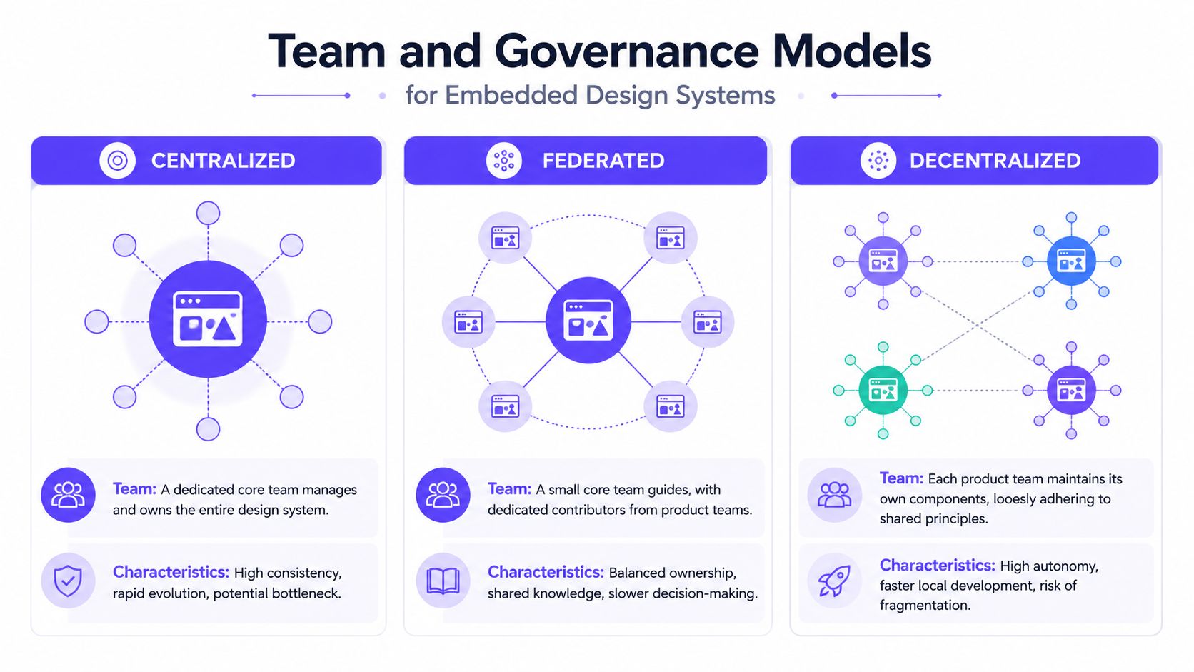
Three models, three failure modes
Here's how the common models behave in practice.
Model | What works | What breaks |
|---|---|---|
Centralized | Strong consistency | Core team becomes a bottleneck |
Federated | Shared ownership across squads | Decisions get slower |
Decentralized | Fast local autonomy | Product fragments quickly |
A purely centralized model looks clean on paper. One team maintains tokens, components, and docs. Product squads submit requests. The problem is predictable. Requests pile up, teams ship local workarounds, and the system loses relevance.
A decentralized model feels agile at first. Each squad moves fast and adapts to its own needs. Then small differences become structural differences. The billing flow uses one modal pattern, onboarding uses another, and nobody agrees on what “standard” means anymore.
Why the hybrid model holds up
The model that usually lasts is hybrid. A small core team owns the system. Product squads have a designer or frontend lead who is embedded enough in the system to use it well, contribute back, and flag gaps early.
That structure matters even more when products add technical complexity. In hardware, a reported 300% surge in edge AI adoption has created new integration pressure, and about 65% of embedded engineers report uncertainty about validating that logic, according to Embedded.com on edge AI momentum for IoT devices. The lesson for software teams is simple. New complexity doesn't reduce the need for deep ownership. It increases it.
For AI products, this shows up fast. A squad adds an AI assistant, confidence indicators, or new permission states. If the design system team is distant, the feature ships with one-off interaction rules. If expertise is embedded in the squad, the new pattern gets shaped in context and folded back into the system properly.
A workable governance setup usually includes:
Core maintainers: They own standards, release rules, naming, and long-term coherence.
Embedded contributors: They sit close to product work and bring real requirements back to the core.
Review rituals: Lightweight design and frontend review before local exceptions become permanent.
Approval clarity: Teams know what needs review and what they can ship freely.
The human side matters outside the product team too. When stakeholders need to review design changes, clarity beats endless comment threads. Tools built around streamlining client design approval can help teams keep feedback and signoff from becoming another source of chaos.
The system should be strict on standards and flexible on contribution. That balance keeps it alive.
A Phased Roadmap to Adoption
Teams often don't need a grand redesign. They need a phased rollout that improves the product while reducing risk.
That matters because new systems often fail from overreach. In hardware, RISC-V adoption has reached over 40% of new IoT designs, yet 70% of teams lack proper IDE support, which creates friction when teams adopt a new architecture without the right support path, according to RISC-V adoption reporting. Software teams make the same mistake when they announce a design system before they've built the workflow around it.
Start small. Prove value. Expand in stages.
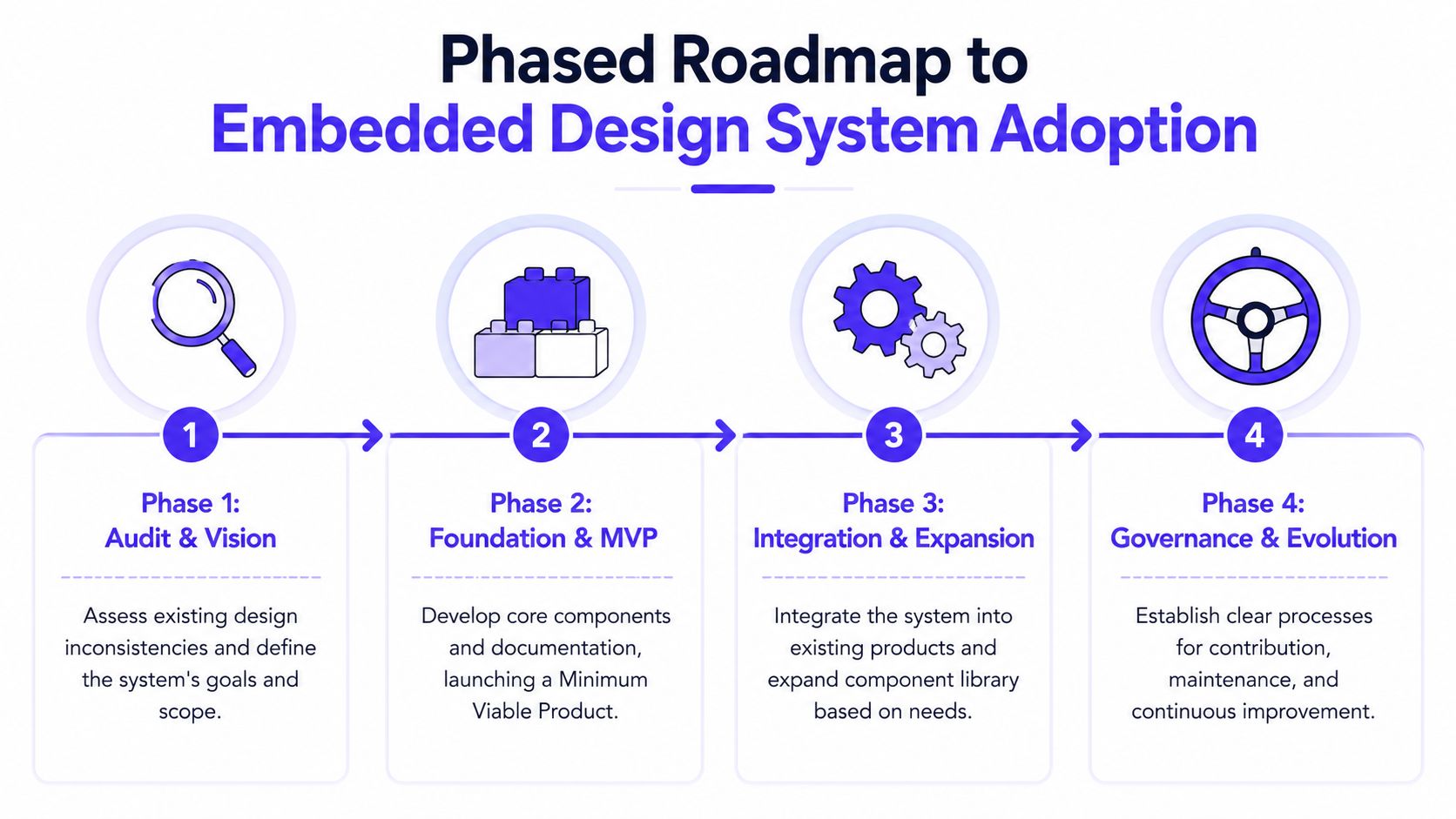
Phase 1 audit and align
Begin with a UI inventory.
Pull screens from the product, website, onboarding, account flows, settings, and email if it matters to the user journey. Group repeated patterns together. You're looking for drift, overlap, and obvious reuse opportunities.
Focus on questions like these:
Where do patterns repeat most often?
Which parts feel most off-brand or least trustworthy?
What do engineers rebuild again and again?
Which flows matter most to revenue, retention, or activation?
This phase is also where founder and leadership buy-in happens. If leadership sees this as a side design project, it will stall.
A quick walkthrough can help frame the process before internal rollout:
Phase 2 build the foundation
Don't start with every component. Start with the rules underneath them and a narrow MVP.
That usually means tokens first, then a small set of high-frequency components such as buttons, inputs, form fields, cards, modals, and table elements. Tie those to documentation from day one. If the usage guidance lives only in somebody's head, the system won't survive turnover.
Phase 3 embed and expand
Pick one squad and one meaningful product area.
A billing flow, onboarding path, analytics dashboard, or settings area is usually enough. The point is to test real integration, not to show a polished library in isolation. A designer and frontend lead should work close to that squad so they can catch missing states, odd edge cases, and naming problems before the system spreads.
Contribution rules need to become visible. Teams should know how to request a new variant, how to propose a pattern change, and how to document a legitimate exception.
Phase 4 scale and govern
Once one area works, expand carefully.
Roll the system into more squads. Set a release rhythm. Decide who approves foundational changes. Keep docs current. For these efforts, many teams benefit from a dedicated home for standards and process, especially if they're formalizing design system documentation practices across product and marketing.
A few rules keep this phase healthy:
Version changes clearly: Nobody likes surprise UI updates.
Document exceptions: If a team breaks pattern for a good reason, record it.
Review before drift spreads: Small inconsistencies are easier to stop early.
Retire old components: Leaving duplicates in circulation guarantees confusion.
An embedded design system is never finished, but it should become calmer over time. Fewer one-off decisions. Fewer local hacks. More confidence that the brand users see in your website, dashboard, and product flows comes from one coherent system.
If your team is feeling that drag already, 925 Studios can help you build the system behind the screens, not just the screens themselves. We work with AI SaaS, Web3, and Fintech teams as one embedded creative partner across product design, brand, and frontend, so you can ship a design system people use instead of another internal library that gets ignored.

Let’s keep in touch.
Discover more about high-performance web design. Follow us on Twitter and Instagram.

