Design System Documentation That Gets Used

Yusuf
Founder and lead designer at 925studios

Your team probably already has design system documentation. It just doesn't live in one place.
A few rules sit in Figma. A developer remembers the button states from a sprint three months ago. Someone in marketing has the latest logo in a Slack thread. A PM keeps answering the same question about form behavior. Then a new feature ships, and the UI feels slightly off because each person worked from a different version of the truth.
This is the core problem. Poor documentation doesn't only create mess. It slows releases, creates avoidable review cycles, and makes a startup look less polished than it really is. Good design system documentation fixes that by turning scattered knowledge into something people can use while they're shipping.
Table of Contents
Why Your Startup Needs Documentation That Works
A startup feels documentation pain early, even if nobody calls it that. A developer builds a pricing card based on an old pattern. A designer redraws a modal that already exists. A founder reviews a launch page and asks why the product UI and marketing site feel like two different companies.
Those problems usually aren't caused by lack of talent. They happen because the team has no shared source for decisions, rules, and implementation details. If you need a broader refresher on what is documentation, it helps to think of it as captured operational knowledge, not a folder of notes.
Documentation is operating infrastructure
For startups, design system documentation isn't bureaucracy. It's infrastructure. It answers the small questions before they become meetings.
When your team knows which button variant to use, how a form field behaves in error state, what copy tone fits the brand, and where the approved code snippet lives, work moves with less friction. That means fewer review loops and fewer “quick calls” to settle things that should already be settled.
This is also why a design system matters in the first place. If you're still framing the system itself, this breakdown of why startups need a design system connects the dots between consistency and shipping a stronger product.
Practical rule: If the same question gets answered twice in Slack, it belongs in the documentation.
Usage matters more than existence
A lot of teams treat documentation as complete once the pages are published. That's the wrong finish line.
Leading guidance now treats documentation as a product with its own metrics. Supernova recommends measuring documentation usage through analytics like site traffic, most-visited pages, time on page, and interaction tracking, and connects that work to ROI through reduced design debt and time saved in design and development in its guide to design system metrics that matter.
That shift changes how you build it. A useful doc site isn't a museum. It's a working tool. Teams should be able to open it in the middle of a sprint, find the rule they need, and keep moving without waiting for a design review or a frontend lead to step in.
The startups that benefit most from documentation aren't the ones with the prettiest libraries. They're the ones that use documentation to remove recurring uncertainty.
The Foundation What to Document First
Most startups make the same early mistake. They try to document the entire system at once, then stall because the project gets too big.
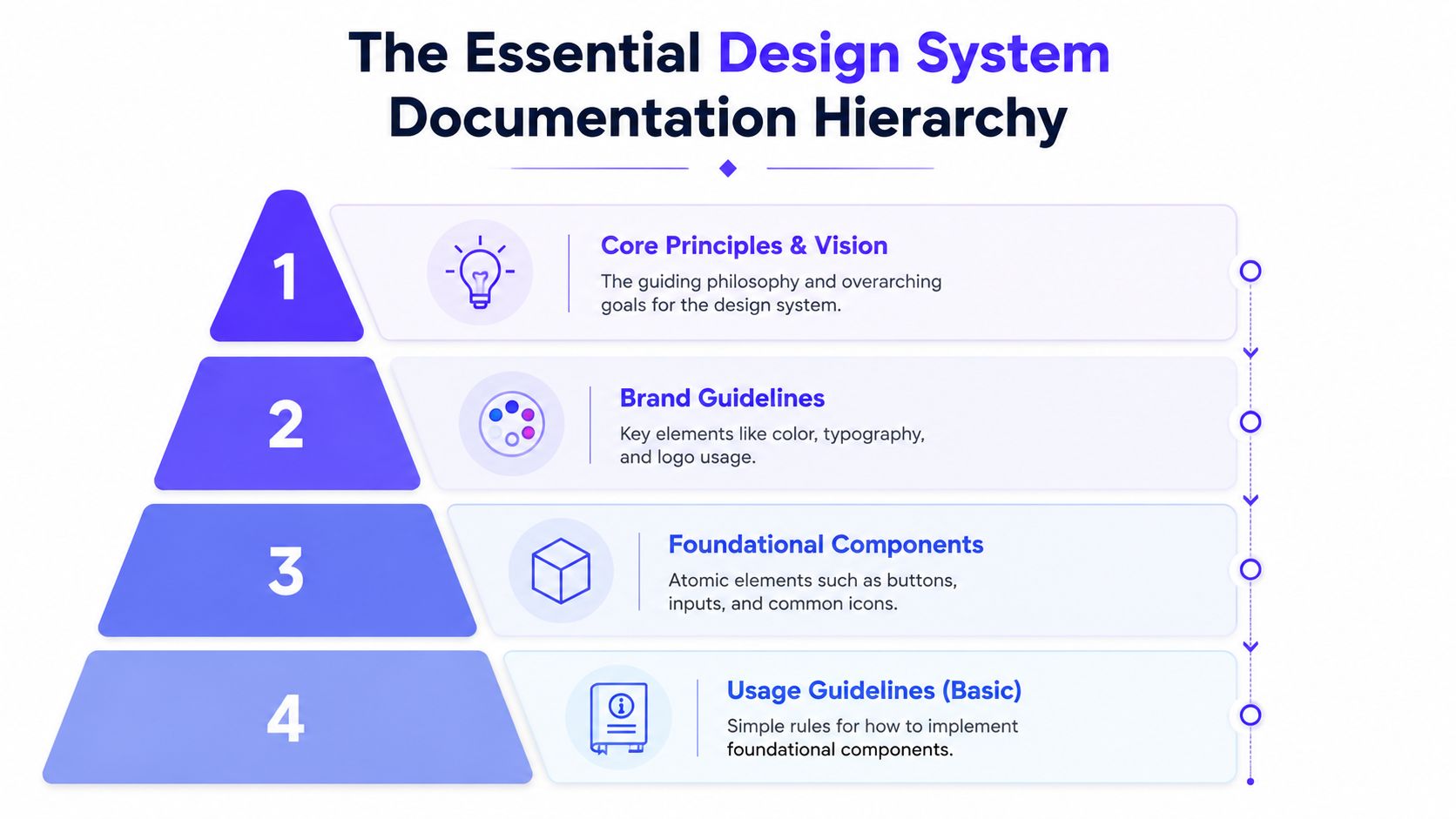
A better approach is to document the few things your team touches constantly. That creates immediate value, gives people a reason to trust the system, and keeps the work grounded in real usage instead of theory.
Start with the parts people reuse every week
The first pass should cover the assets and patterns that create the most confusion when they're inconsistent.
Start with these three areas:
Brand foundations: Logo usage, core colors, typography, spacing basics, and any rules that keep the product and marketing site feeling related.
Core UI components: Buttons, inputs, selects, cards, modals, tabs, badges, alerts, and navigation elements your team uses over and over.
Guiding principles: Short rules on voice, accessibility, and interaction behavior so people understand not just what exists, but how to choose the right pattern.
If you're building from zero, this guide on how to build a design system from scratch is useful because it keeps the system grounded in practical startup constraints rather than enterprise process.
What a useful first version includes
“Documented” shouldn't mean “there's a screenshot and a name.”
According to Figma's guidance on documentation that drives adoption, a complete component entry includes usage instructions, code snippets, accessibility requirements, and contribution processes. That turns documentation into part of the development workflow instead of a passive style reference.
In plain terms, a strong component page should answer questions like these:
When should this component be used Explain the job it does. A primary button triggers the main action. A secondary button supports it. A destructive action needs different treatment than a neutral action.
What states exist Show default, hover, focus, disabled, loading, error, selected, or any state the component uses in production.
What not to do Teams need guardrails. If a card shouldn't contain more than one primary action, say that. If a badge isn't meant to carry critical status by itself, say that too.
How it connects to code A developer shouldn't reverse engineer usage from a screenshot. Include copy-ready implementation guidance and name the props or variants clearly.
Good documentation reduces interpretation. Great documentation removes it.
A practical first release often looks smaller than people expect. That's fine. Ten well-documented components beat a long catalog of half-finished pages that nobody trusts.
Choosing Your Documentation Tool
The tool matters because it shapes who contributes, how often updates happen, and whether the docs stay close to the shipped product or drift into a parallel universe.
A lot of teams pick a platform based on what looks polished in a demo. That's usually the wrong filter. The better question is simpler. Who will maintain this every month, and where do they already work?
Match the tool to the team you have now
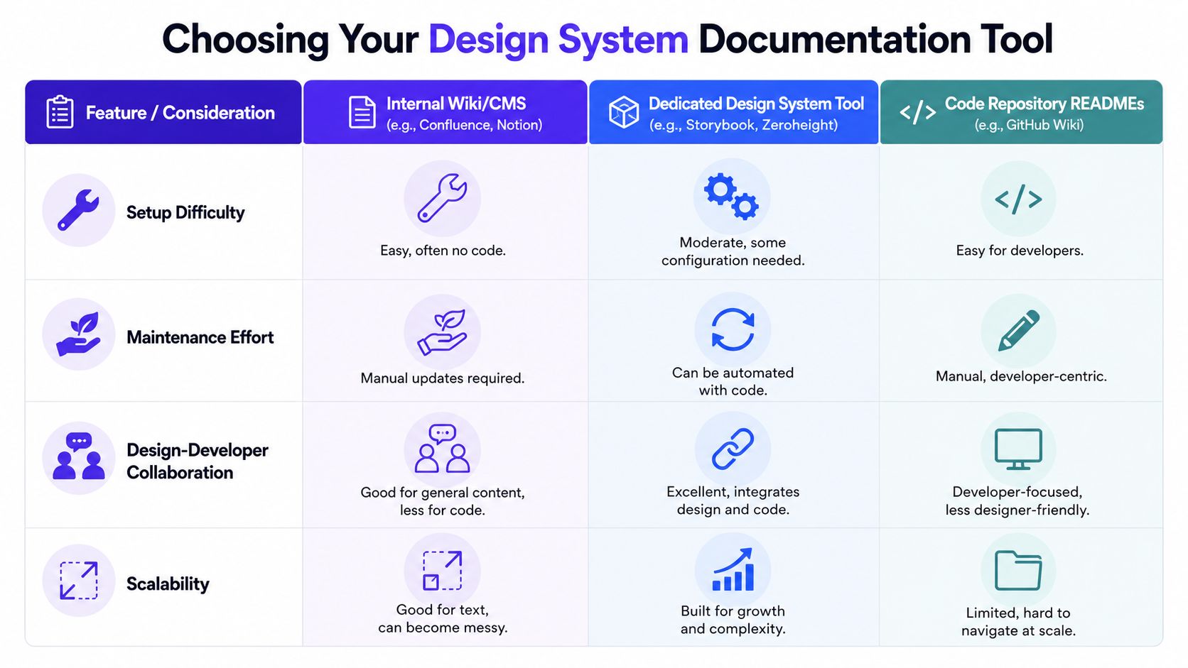
Three categories usually cover most startup setups.
Internal wiki or CMS tools like Notion or Confluence are easy to start with. They work well for principles, brand rules, process notes, and lightweight component guidance. Their weakness is drift. Because updates are manual, the docs can fall behind the product fast.
Dedicated design system tools like Storybook and Zeroheight are stronger when your team needs documentation to stay close to design files or live components. They're built for reusable systems, not general knowledge management.
Code repository READMEs and developer docs work when engineers are the main maintainers and the system is tightly tied to a component library. They tend to be weaker for non-technical stakeholders who need guidance without reading implementation details.
Here's a quick comparison.
Tool | Best For | Effort to Start | Key Feature |
|---|---|---|---|
Notion or Confluence | Early-stage teams documenting principles and process | Low | Fast publishing for non-technical contributors |
Storybook or Zeroheight | Teams documenting reusable components and shared patterns | Moderate | Better connection to live UI or design assets |
GitHub Wiki or README-based docs | Engineer-led systems tied closely to code | Low to moderate | Keeps documentation near implementation |
A lot of founders also compare docs platforms before they compare design system tools. If you're weighing general product doc options, this Docusaurus vs GitBook comparison is a useful lens for understanding trade-offs around structure, customization, and maintenance.
A simple comparison for startup teams
Teams often ask whether Storybook, Zeroheight, or a custom site is the “right” answer. Usually, the answer depends on the center of gravity in your workflow.
Choose Storybook when your system is code-first. It's strongest when frontend developers maintain the source of truth and you want live component examples to reflect production behavior.
Choose Zeroheight when your team is still heavily design-led and wants easier publishing around Figma-based system content.
Choose a custom docs site built with something like Gatsby or Docsify when you need full control over structure and presentation, and you already have frontend capacity to maintain it.
Choose a simple wiki first when your real problem is missing rules, not missing technology.
925 Studios sometimes helps teams connect product design decisions, brand rules, and frontend implementation into one documentation setup, which is often the hard part regardless of tool. The platform matters, but the maintenance model matters more.
For a more grounded example of how teams structure information inside flexible tools, this look at a Notion design breakdown is helpful because it shows how documentation choices affect clarity, not just aesthetics.
A short walkthrough can help if your team needs to see one of these systems in action.
What usually works in practice
Early-stage teams often do well with a hybrid setup. Principles, governance, and brand rules live in an easy-to-edit docs space. Code-backed components live in Storybook or a similar environment. The main docs site then links these pieces together clearly.
That arrangement isn't elegant on paper, but it's often more durable than forcing everyone into one tool that only one function enjoys using.
If updating the docs feels harder than answering the question in Slack, people will skip the docs.
Structuring Your Documentation for Actual Use
Even solid documentation fails when the structure is wrong. Teams don't stop using docs because they hate standards. They stop using them because they can't find the answer in time.
That's why information architecture matters as much as content quality. A giant index of components isn't enough, especially once founders, marketers, PMs, designers, and engineers all need different answers from the same system.

Organize by audience, not by internal pride
A common failure is building one giant documentation site for everyone. Guidance from Zeroheight and Nielsen Norman Group recommends audience-based structure so designers, developers, and non-technical stakeholders can find relevant information quickly, as covered in Zeroheight's advice on great design system documentation.
That usually means separate entry points like these:
For designers: Component variants, Figma usage, spacing rules, visual examples, and interaction intent.
For developers: Props, code examples, installation notes, edge cases, accessibility requirements, and implementation constraints.
For product and marketing teams: Brand voice, messaging rules, naming patterns, layout principles, and guidance on when to use which pattern.
This isn't duplication if the system stays shared underneath. It's just a better front door.
Use one repeatable page pattern
Every component page should feel familiar. If one page starts with anatomy, another starts with code, and a third starts with philosophy, people waste time relearning the format.
A reliable template keeps the docs scannable:
Section on the page | What it should answer |
|---|---|
Live example or visual preview | What does this component look like in the real product |
Usage guidance | When should I use it, and when shouldn't I |
Variants and states | What options exist |
Code or implementation notes | How do I build it correctly |
Accessibility notes | What must not break for users |
Related patterns | What should I use if this isn't the right fit |
A button page, for example, should quickly settle debates your team has every week. Which button is primary on a settings page. Whether loading replaces the label or appears beside it. Whether icon-only buttons need visible labels somewhere else in context. Those are practical questions. Documentation should answer them directly.
Write for the moment when someone is under deadline and slightly annoyed. That's the real user of your docs.
The best test is simple. Hand the docs to someone outside the core system team and ask them to complete a common task without help. If they get lost, the structure needs work.
Governance and Maintenance A Living System
Most design system documentation fades away. Nobody announces it. The pages just stop matching production, people lose trust, and the team goes back to Slack answers and ad hoc decisions.
That failure usually starts after launch. Initial setup gets attention. Ongoing maintenance gets treated like optional cleanup. It isn't optional.
Every component needs a lifecycle
Many guides explain how to create the first version of a system, but they stop short of the harder operational questions. UXPin and Magic Patterns push the conversation further by arguing for versioning, deprecation workflows, and decision history so the documentation stays trustworthy and aligned with production reality, which UXPin covers in its design system documentation guide.
That matters because components age. A modal pattern gets replaced. A form field gains a validation rule. A token name changes. If the docs don't show what changed, why it changed, and what to use now, trust collapses.
A good maintenance model includes these basics:
Versioning: Mark whether a change is minor guidance, a meaningful update, or a breaking change that affects implementation.
Deprecation: Keep old patterns visible long enough for teams to migrate, but clearly label them and point to the replacement.
Decision history: Add a short note on why a change happened. That prevents the same debate from restarting every quarter.
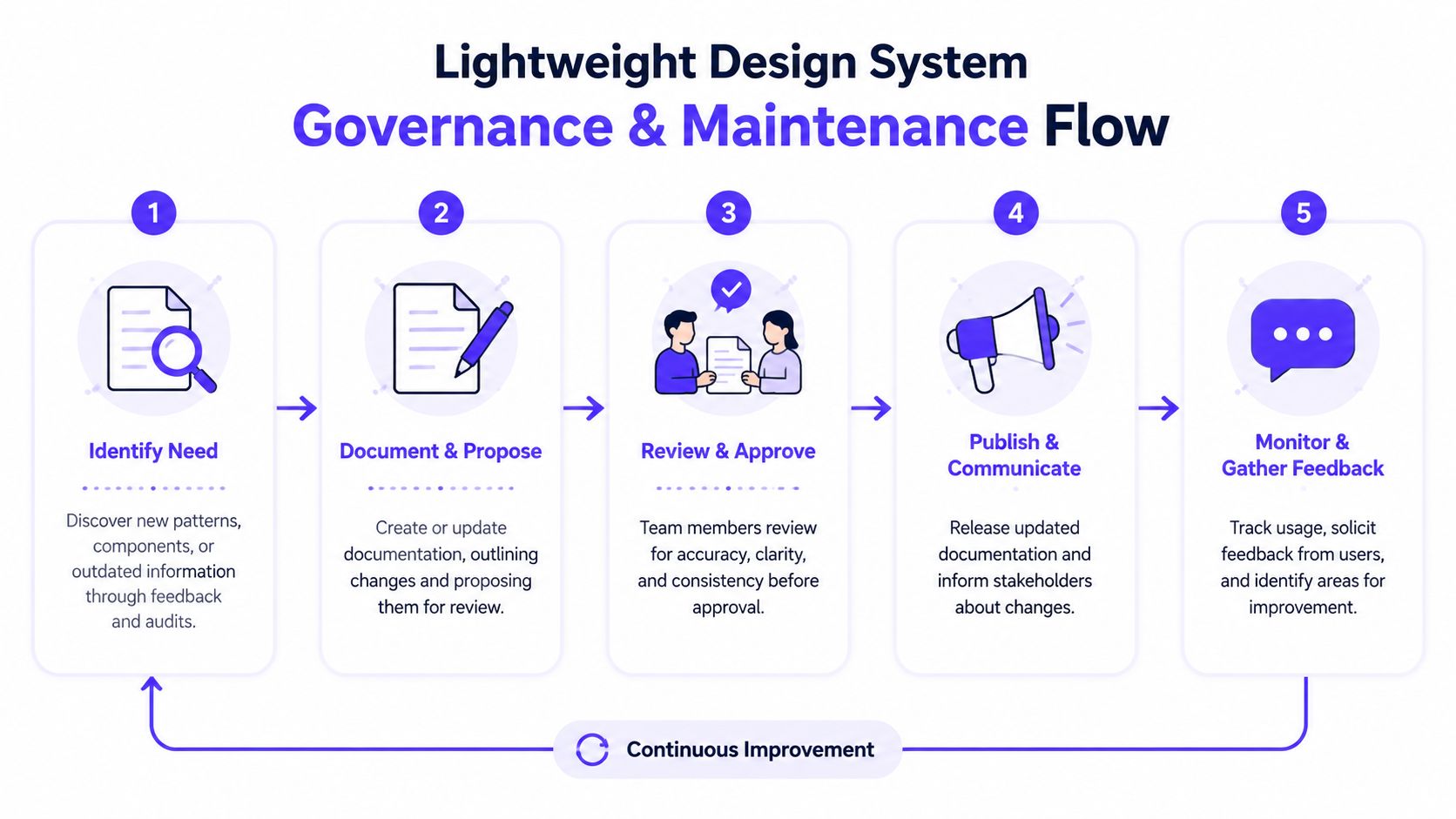
A lightweight governance model
Governance sounds heavy, but it doesn't need to be.
For most startups, a workable model looks like this:
One owner, shared input One person or small pair owns final quality. Designers and developers can still propose changes.
A simple contribution path Anyone proposing a new component or change should answer a few standard questions. What problem does this solve. Is there already a similar pattern. What teams will use it. What needs to change in design and code.
A review step before publish Someone checks clarity, consistency, and alignment with shipped behavior before the docs go live.
A release note habit Post updates where the team already pays attention. Slack, sprint notes, or changelog emails all work if they're consistent.
For teams building this muscle, a practical guide to documentation maintenance can help frame recurring upkeep as an operating habit rather than a rescue project.
The key is keeping the process tight enough that updates happen while the work is fresh. If documentation becomes a separate initiative, it falls behind. If it's a required step in the release path for new components and major changes, it stays alive.
The documentation isn't current unless it reflects what a user can actually use today.
Driving Adoption and Measuring Success
Even strong documentation won't spread by itself. Teams need a reason to use it, a habit for finding it, and visible signals that it's the default place to get answers.
The first lever is onboarding. New designers and engineers should get a short walkthrough of the system, where it lives, how pages are structured, and what to check before they ask for help. That sounds basic, but it changes behavior early.
Adoption needs active distribution
Documentation adoption improves when leads reinforce it in daily work.
A few tactics work well:
Answer questions with links: When a question comes up in Slack, answer it, then link the relevant doc page.
Publish updates visibly: A dedicated channel for design system changes helps people see the system as active, not abandoned.
Add it to workflows: Include doc review in design handoff, component release, and onboarding checklists.
Keep pages close to the work: Link docs from Figma files, pull requests, and tickets so people hit them in context.
This approach matters because over-documentation creates its own failure mode. Nielsen Norman Group guidance summarized by Supernova stresses that success is not about how much you document, but whether people can find what they need quickly, and that this should be refined through feedback and testing in Supernova's piece on why design system documentation matters and how to do it.
Measure whether people get answers faster
Start with basic analytics if your docs platform supports them. Look at which pages people visit, which ones they ignore, and where usage clusters. That gives you a map of what the team needs.
Then pair that with qualitative checks:
Ask new hires which pages helped and where they got stuck.
Ask engineers which component docs still leave room for interpretation.
Ask PMs and marketers whether brand and messaging guidance is easy to find without design support.
Review repeated questions from Slack, planning, and QA. Those are documentation gaps in plain sight.
A healthy documentation system reduces confusion in ways your team can feel. Fewer duplicate components. Cleaner handoff. Fewer last-minute debates over basic UI decisions. Less time spent hunting for approved assets or asking whether a pattern is “still current.”
If the documentation helps the team ship with fewer interruptions, it's doing its job.
If your team needs design system documentation that stays aligned across product design, brand, and frontend build, 925 studios helps startups set up the system, the structure, and the maintenance model so the docs stay useful after launch, not just on launch day.


Let’s keep in touch.
Discover more about high-performance web design. Follow us on Twitter and Instagram.

