
The Hidden Cost of Cheap Design for Startups (2026)

925studios
Creative agency for AI & Web3

Reviewed by Yusuf, Lead Designer at 925Studios
Startups that cheap out on design do not save money. They defer the cost, compound it with interest, and pay it back at the worst possible moment: when a fundraise falls apart, when churn spikes in month three, or when engineering spends six weeks rebuilding components that should have been designed right the first time. The price of cheap design is never the invoice you did not pay. It is everything that breaks downstream because of it.
TL;DR:
Cheap design costs appear upfront but the real bill arrives 12-18 months later
88% of users will not return after a single bad UX experience
McKinsey data shows top-quartile design companies grow revenue 32 percentage points faster
Engineering rework, redesign overruns, and fundraising friction are the three biggest hidden costs
The fix is not spending more. It is spending on the right scope at the right stage
Quick Answer: Cheap design for startups carries hidden costs that multiply over time: engineering rework when components need rebuilding at scale, user churn from friction-heavy onboarding, failed fundraising conversations where investors judge execution discipline by the product interface, and full redesigns that cost 3-6x the original savings. A $5,000 design shortcut routinely compounds into a $40,000-$80,000 problem within 18 months.
What is actually happening when a startup goes cheap on design?
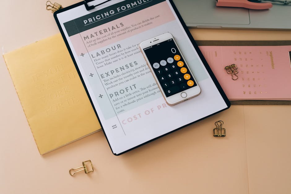
The conventional story is that early-stage startups should move fast, ship something functional, and worry about design later when there is revenue and customers to justify the investment. This logic sounds reasonable. It fails in practice because "design later" rarely means design better. It almost always means design more expensively, under more pressure, with more constraints created by the cheap decisions that preceded it.
When startups underfund design, three things happen in sequence. First, the product ships with friction points that the team has normalized because they built it. Second, new users who have not normalized anything encounter those friction points and leave, often within the first session. Third, the team interprets churn as a product-market fit problem rather than a design problem, doubles down on building features, and compounds the original issue with more complexity layered on a broken foundation.
925Studios has seen this pattern across SaaS products at seed and Series A. The founders who come to us 18 months post-launch with a churn problem almost always have a design problem that has been misdiagnosed as something else for a year.
Seeing this pattern in your own product? Book a free 30-minute audit call.
Why is the "ship first, design later" logic wrong?
The assumption behind cheap design is that design is a surface layer you apply to a working product. This gets the relationship backwards. Design shapes the decisions that become the product. When design is underinvested at the start, those foundational decisions (information architecture, user flows, component structure, interaction patterns) get made by default rather than intention. Changing them later is not a design refresh. It is a rebuild.
The TinyPilot case documented this precisely. Founder Michael Lynch budgeted $7,000 for a website redesign and a 4-week timeline. The final cost was $46,000 and the engagement ran 8 months. He described it as "an interminable drain on my time and finances." That was a website redesign, not a full product overhaul. For SaaS products with complex workflows, the overruns are proportionally larger because the interdependencies run deeper. The cheap decision at the start does not stay isolated. It propagates.
The data supports the opposite of the "design later" logic. According to McKinsey research tracking 300 companies over 5 years, companies in the top design quartile achieved 32 percentage points higher revenue growth than their industry peers. That is not a marginal edge. That is a structural advantage created by consistently treating design as a core function, not an afterthought.
What does the data actually show about design investment and outcomes?

Forrester Research found that every $1 invested in UX returns up to $100, a 9,900% return on investment when applied to real conversion and retention problems. That number is frequently cited but rarely taken seriously by early-stage founders because it sounds too large. The mechanism is straightforward though. A 5% improvement in activation rate on a $50 monthly product with 1,000 active users is $2,500 in additional monthly recurring revenue. Compounded over 12 months, a single design intervention that costs $15,000 can return $30,000 in year one and $60,000 in year two if the cohort retains.
Maze research from 2025 found that 88% of users are less likely to return to a product after a single bad UX interaction, and 32% stop doing business with a company entirely after one negative experience. For a SaaS product where activation is already the hardest moment in the user journey, those numbers represent real churn. A product with a confusing onboarding flow is not just creating friction. It is actively destroying the cohort retention curve that determines whether the business is viable.
Fixing a UX problem after development costs up to 100 times more than addressing it during the design phase (IBM research, frequently replicated). This is not a rule about aesthetics. It is a rule about the cost of changing decisions that have been built into a system. A navigation architecture that made sense in a Figma mockup but breaks at 50 screens in production is not fixed with a CSS tweak. It requires rethinking the information architecture, rebuilding the component structure, and re-educating users who have already formed habits around the broken pattern.
Not sure how much your current design debt is costing you? Get a free product audit from 925Studios.
What should startups do instead of going cheap on design?
The alternative to cheap design is not expensive design. It is scoped design: identifying the specific flows that drive your most important metric and investing appropriately in those, rather than spreading a thin budget across everything.
For pre-revenue startups, the highest-ROI design investment is almost always the onboarding flow. This is the moment where users first encounter the product, form their mental model, and decide whether to continue or leave. A focused $8,000 to $15,000 sprint with a senior designer on the first-run experience, the activation flow, and the first value moment will return more than a $5,000 full-site refresh that touches everything lightly.
For post-revenue startups with a retention problem, the highest-ROI design investment is usually a UX audit followed by targeted fixes on the drop-off points identified. Not a full redesign. A systematic diagnosis that reveals where users are leaving and why, followed by specific interventions on those exact screens. This approach costs $10,000 to $20,000, takes 4-6 weeks, and produces measurable results within 60 days. Compared to a 6-month redesign that costs $80,000 and moves multiple things at once (making it impossible to know which change drove the improvement), the audit-first approach is both cheaper and more accountable.
The framework for choosing the right design partner matters here too. Cheap design often comes from choosing an agency or freelancer on price rather than vertical experience. A designer who has worked across 20 consumer apps has not internalized the patterns that drive SaaS activation. A studio that understands SaaS onboarding, enterprise dashboards, and fintech trust flows brings applied knowledge that a cheaper generalist does not. The gap shows up in the quality of decisions made during the engagement, not just in the final screens.
When we take on a new client at 925Studios, the first question is always: what metric are we trying to move, and what is the current baseline? That framing keeps every design decision accountable to a business outcome rather than a subjective preference about visual style. It is how you build something that justifies the investment.
Yusuf breaks down the specific patterns that separate high-ROI design investments from expensive mistakes on the 925Studios YouTube channel, including real examples from SaaS and fintech products.
Want to see work where design moved real metrics? Browse 925Studios case studies.
Frequently Asked Questions

How much should an early-stage startup spend on design?
There is no universal number, but a useful heuristic is to allocate design budget proportional to the user moment you most need to optimize. Pre-revenue startups should plan $8,000 to $20,000 for a focused onboarding and activation sprint. Post-revenue startups with a churn or conversion problem should budget $15,000 to $30,000 for an audit and targeted redesign of the specific flows driving drop-off. Full product redesigns become relevant at Series A and above, with budgets of $50,000 to $150,000 for a 12-24 week engagement.
What are the most common signs that cheap design is hurting a startup?
The four most reliable signals: activation rates below 30% for a self-serve SaaS product, support tickets clustered around the same 2-3 confusing flows, investors asking why the product looks unfinished during fundraising demos, and engineering teams spending more than 20% of sprint capacity rebuilding or patching UI components. Any one of these is a signal. All four together indicate a design debt problem that will compound further without deliberate intervention.
Can you fix bad design without a full redesign?
Yes, and for most startups this is the right starting point. A UX audit identifies the specific screens and flows causing the most user friction, ranked by impact on your key metric. Targeted fixes on the top 3-5 issues typically deliver 70-80% of the value a full redesign would produce, at 20-30% of the cost. Full redesigns make sense when the information architecture is broken at a structural level or when the visual system has become inconsistent to the point that targeted fixes are not sustainable.
What is design debt and how does it form?
Design debt is the accumulated cost of design decisions made quickly, cheaply, or inconsistently that become harder and more expensive to correct over time. It forms when components are built without a shared visual system, when onboarding flows are patched rather than rethought, and when product decisions are made by engineers rather than designers because there is no design resource available at the decision point. Like technical debt, design debt does not stay stable. It compounds as new features are layered on the inconsistent foundation.
How does poor design affect fundraising for startups?
Investors form impressions quickly. A product that looks rough in a demo signals execution discipline problems, not just aesthetic preferences. This is especially true for B2B SaaS, where the product interface is a proxy for the team's ability to make good decisions under constraints. Founders regularly report losing conversations with investors who cited "product quality" as a concern. In most of these cases, the underlying product worked correctly. The interface communicated uncertainty about whether the team could build something users would trust.
Is hiring a junior freelancer for design a bad idea early on?
Not inherently, but the risk is misaligned judgment rather than misaligned execution. A junior designer can produce polished screens from a clear brief. What they cannot do reliably is identify the right brief, spot the information architecture problem underneath the surface request, or push back on a founder's instinct when user research points in a different direction. For the activation flow and core onboarding, those judgment calls determine outcomes. For marketing pages, brand assets, and low-stakes screens, a skilled junior freelancer is often the right call for the budget.
What is the real ROI of good UX design?
Forrester Research found that $1 invested in UX returns up to $100, a 9,900% return. McKinsey's five-year study of 300 companies found that top-quartile design firms grew revenue 32 percentage points faster than industry averages. These numbers are aggregate across large companies, so for a single product the range varies widely. A realistic expectation for a focused SaaS onboarding redesign is a 15-35% improvement in activation rate and a corresponding improvement in 30-day retention, with full payback on the design investment within 3-6 months of launch.
How do you measure whether a design investment actually worked?
Define the metric and baseline before the engagement starts: activation rate, 30-day retention, checkout conversion, or support ticket volume on a specific flow. Measure the same metric 30 and 60 days after the redesign goes live. Compare the cohort that experienced the new design against the cohort that experienced the old design. This controlled comparison is straightforward in tools like Amplitude, Mixpanel, or even basic Google Analytics with goal tracking. Any agency that cannot tell you how to measure the outcome of their work should not be trusted to design the outcome.
If your product's design is costing you users you should be keeping, talk to 925Studios.
If you're building a product and want a second opinion on your UX, talk to 925Studios. 925Studios works with SaaS, fintech, healthtech, web3, and AI startups.
See the 925Studios work or book a free 30-minute call.
Follow 925Studios on Instagram and YouTube for design breakdowns and case studies.


Let’s keep in touch.
Discover more about high-performance web design. Follow us on Twitter and Instagram.

