Mastering the Web Page Design Process for Startup Success

Yusuf
Founder and lead designer at 925studios

Most advice about the web page design process starts too late. It starts with layouts, colors, hero sections, and homepage inspiration. That's exactly how founders end up burning months on a site that looks polished and still doesn't convert.
A homepage mockup is not a strategy. It's a screenshot of assumptions.
If you're building for AI SaaS, Web3, or Fintech, the cost of getting those assumptions wrong is higher than many realize. Your site isn't just there to look credible. It has to explain a complex product, guide the right user, reduce trust friction, and move someone toward a demo, signup, wallet connection, or onboarding flow. Design has become the main driver of first impressions online, with 94% of users' initial judgments tied to website design, and those impressions form in about 0.05 seconds, according to this web design statistics roundup.
That is why a serious web page design process acts more like business planning than creative output. If you're still deciding how to approach building a website from scratch, start by defining what the site must do before you decide how it should look.
Table of Contents
Your Web Page Design Process is a Business Plan
Founders often ask for a new homepage when the core problem sits upstream. The offer isn't sharp enough. The audience is too broad. The navigation asks users to think too hard. The product story assumes buyers already understand the category.
A page redesign can't fix weak decisions above it.
The right web page design process forces those decisions into the open early. It asks what the page must accomplish, who it's for, what that user needs to understand first, and what action matters most. That's why I treat page design as conversion planning with a visual layer on top, not the other way around.
Practical rule: If the team can't state the page goal in one sentence, it isn't ready for visual design.
This matters even more for startup teams selling technical products. An AI workflow tool, a crypto product with wallet-based access, or a Fintech platform with compliance concerns all ask users to trust unfamiliar systems. If the page structure, copy hierarchy, and CTA path don't reduce that uncertainty, a nicer UI won't save it.
A business-minded process usually changes the conversation in three ways:
It replaces taste debates with decision criteria tied to signups, demos, activation, or qualified leads.
It cuts fake progress by stopping teams from polishing sections that shouldn't exist.
It exposes risk early, especially when the page is trying to serve too many audiences at once.
Good founders usually don't need more design options. They need a process that keeps the company from shipping the wrong message in a prettier wrapper.
Before You Design Nailing Strategy and Discovery
Discovery is the part most rushed teams try to compress. It's also the part that saves the project.
When teams skip strategy, they usually don't save time. They defer hard decisions until later, when each change is more expensive. A button label becomes a messaging debate. A hero section becomes a positioning debate. A nav revision becomes a product segmentation debate. That's how a website project drifts for months.
A structured workflow prevents that drift. According to UXPin's breakdown of the web design process, a goal-driven workflow increases design-to-launch velocity by 30–50%, and projects with a distinct discovery phase are 1.8x more likely to meet primary KPIs like signups or qualified demos.

What discovery needs to answer
Discovery isn't a mood board session. It's where the team gets specific about the business problem.
That usually means answering questions like these:
What action matters most: demo request, waitlist signup, free trial, wallet connect, contact form, or something else.
Who the page serves first: buyer, end user, technical evaluator, operations lead, or procurement stakeholder.
What objections show up immediately: security, integration complexity, onboarding effort, compliance risk, AI reliability, pricing fit.
What the product story is: problem, mechanism, proof, and next step.
For founders, this is often the first useful gut check on whether the site is trying to do too much. If your homepage needs to sell to an engineer, a CFO, a compliance lead, and a solo user in one pass, the issue isn't visual. The issue is page strategy.
The work product that actually matters
A good discovery phase usually produces a short set of decisions the whole team can use:
A primary conversion goal
A shortlist of audience segments
A clear value proposition
A content hierarchy for the most important pages
A list of proof points and trust signals
A definition of what the page should not try to do
If your team needs a more formal lens on that early decision-making, 925 Studios has a useful perspective on product strategy that aligns closely with this phase.
Discovery should feel slightly uncomfortable. If nobody had to make a trade-off, you probably stayed too vague.
The biggest mistake here is writing goals that sound nice but can't guide design. "Look more premium" is not a goal. "Help qualified buyers understand why this product is safer to adopt than the incumbent workflow" is a real design constraint. It changes copy, layout, trust blocks, and CTA sequencing.
Blueprint the Experience with IA and Wireframes
You wouldn't pour concrete before approving the floor plan. Websites deserve the same discipline.
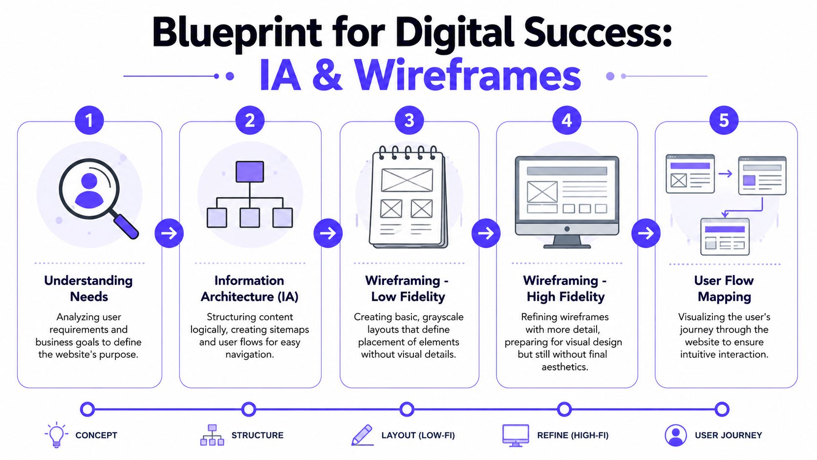
Information architecture, or IA, is the structure underneath the page. It decides what content exists, how it's grouped, what comes first, and how users move from one decision to the next. Wireframes are the low-detail layouts that test that structure before anyone gets attached to gradients or illustrations.
Why structure comes before style
This part is less glamorous, which is exactly why it gets skipped.
That skip is expensive. A review of 70 studies on website design and engagement found that clear navigation and intuitive organization were the most frequently cited design elements linked to stronger user engagement, appearing in over 62% and 42% of the studies, respectively.
For a founder, the takeaway is simple. Users engage when they can tell where they are, what the page is for, and what to do next.
A strong IA phase usually settles:
Page purpose: is this page for education, conversion, comparison, onboarding, or support?
Content order: what has to appear first so the rest makes sense?
Navigation logic: what belongs in primary nav, what belongs deeper, and what should be removed entirely?
User paths: where should a first-time visitor go versus an informed buyer?
What good wireframes actually settle
Wireframes are where teams stop arguing in abstractions.
Instead of saying "the hero feels weak," you're looking at whether the first screen answers the right question. Instead of saying "we need more on the page," you're deciding whether another section helps the user move forward or just adds noise.
If you're unfamiliar with the progression from rough structure to detailed screen planning, this guide to high-fidelity wireframes helps show where wireframing fits in the larger product flow.
A useful wireframe review usually focuses on five things:
Message hierarchy
What does the user understand in the first few seconds?Section logic
Does each block earn its place, or is it repeating what another block already said?CTA flow
Is the next action obvious at the point where the user is ready to act?Trust placement
Are proof points placed near moments of hesitation?Edge cases
What happens when content gets longer, product names are technical, or a user needs more explanation before converting?
Later in the process, a short walkthrough video can help teams align on flow before visual design starts.
Startup Web Design Process Roadmap
Founders often want to know what the whole effort should look like in practice. A basic roadmap keeps the project grounded.
Phase | Key Deliverable | Typical Timeline | Who Leads |
|---|---|---|---|
Discovery | Goals, audience, conversion priorities | Early project phase | Founder, product, strategy lead |
Content audit | Existing pages, gaps, proof points, source materials | Early project phase | Marketing, product marketing |
Information architecture | Sitemap, page priorities, nav model | Early to middle phase | UX or product designer |
Wireframes | Low-detail page structures and flows | Middle phase | Product designer |
Visual design | Final UI direction and branded page comps | Middle to late phase | Brand or product designer |
Development | Responsive build and component implementation | Late phase | Frontend developer |
Testing and QA | Content checks, browser/device review, interaction validation | Pre-launch | Design and development |
Launch and optimization | Live release, analytics review, iteration backlog | Post-launch | Marketing, product, design |
The best wireframes feel boring in the right way. They remove style as a distraction so the team can judge the actual experience.
Bringing the Blueprint to Life with Visual Design
Visual design is where people tend to overvalue style and undervalue control.
What matters here isn't whether the page looks trendy. What matters is whether the visual system directs attention, builds trust, and supports the message without making the user work. The strongest pages feel clear before they feel impressive.
Attention is a design decision
Users do not look at every part of a page evenly. A 2024 study on visual attention in web pages found that users focus more strongly on headings, key images, and primary interactive elements like buttons. That supports a simple rule. Put the most important message and the main action where attention naturally concentrates.
This is why good visual design is selective. It doesn't try to make every block loud.
A practical visual review usually checks for these failures:
Too many focal points: headline, animation, chart, badges, and CTA all competing at once.
Weak visual hierarchy: body text and headings carrying similar weight.
False emphasis: decorative elements overpowering proof, product UI, or action buttons.
Unclear interface cues: links, fields, and buttons not looking interactive.
Brand choices need a job
Color, type, spacing, and imagery aren't decoration layers. They each carry workload.
In AI SaaS, visual design often needs to balance innovation with clarity. In Fintech, it usually needs to signal trust and operational seriousness without feeling cold. In Web3, it has to avoid looking speculative or confusing if the product expects mainstream adoption.
That means every visual choice should answer a practical question:
Typography should improve scanning and make complex claims easier to parse.
Color should create emphasis and support brand recognition, not turn every section into a new mood.
Spacing should separate decisions so users don't process the page as one dense wall.
Imagery and UI captures should explain the product, not just fill space.
If your team is exporting product shots, diagrams, or logos for the site, this guide on when to use JPG or PNG is useful because asset format choices affect sharpness, transparency, and page weight.
One practical note for startup teams. This is the stage where disconnected hiring starts to show. A product designer may handle UX well but miss brand coherence. A brand designer may make the page look strong but not think through responsive states. A frontend developer may build accurately but inherit weak comps. That's one reason some teams work with 925 Studios, which covers product design, brand design, and frontend development in one workflow.
A polished page that draws attention to the wrong thing is still a bad page.
Designing for AI and Web3 User Expectations
Generic website advice breaks down fast when the product itself behaves differently from traditional software.
An AI product can produce uncertain output. A Web3 product can ask for wallet-based identity or transaction approval. A Fintech dashboard can serve a first-time user and an operations lead with completely different needs. Those aren't minor UX details. They change the web page design process at the architecture level.
According to Contentsquare's web design best practices guide, most process guides don't address how to incorporate probabilistic AI outputs or wallet-authenticated journeys into core information architecture. That's the blind spot.
AI products need explanation built into the page
Founders building AI products often make the same mistake. They explain capabilities and skip usage boundaries.
If the product uses generated answers, recommendations, or automations, the site should prepare users for how that system behaves. That doesn't mean dumping technical detail into the hero. It means building the right cues into the page structure:
Set expectations early so users understand whether the system suggests, predicts, summarizes, or decides.
Explain confidence and review points when output quality depends on context or user input.
Show the human role if the product works best with review, editing, or approval.
Use product UI examples that reveal workflow, not just polished interface fragments.
If you're thinking through these patterns in more depth, this article on AI product UX design patterns is a helpful companion. For visual direction, Superdesign's AI UI strategies offers useful ideas on making AI interfaces feel more distinct and less template-driven.
Web3 and Fintech need trust before action
Wallet connection, account linking, permissions, and sensitive financial flows create hesitation fast. Users want to know what they're authorizing, why it matters, and what happens next.
That means the page should do more than market the product. It should lower trust friction with structure.
For Web3 and Fintech pages, the process usually works better when teams:
Place trust signals near high-friction actions, not buried in a footer.
Use progressive disclosure for advanced features so novice users aren't overwhelmed.
Separate user modes clearly when the same product serves beginners, analysts, and admins.
Write action labels plainly so users understand the consequence of clicking.
A lot of bad startup pages fail because they compress all of this into one generic layout. The result is usually either a vague overview that says nothing or a crowded page that says everything badly.
From Handoff to Launch and Beyond
A page isn't done when design files are approved. That's when a different class of mistakes can start.
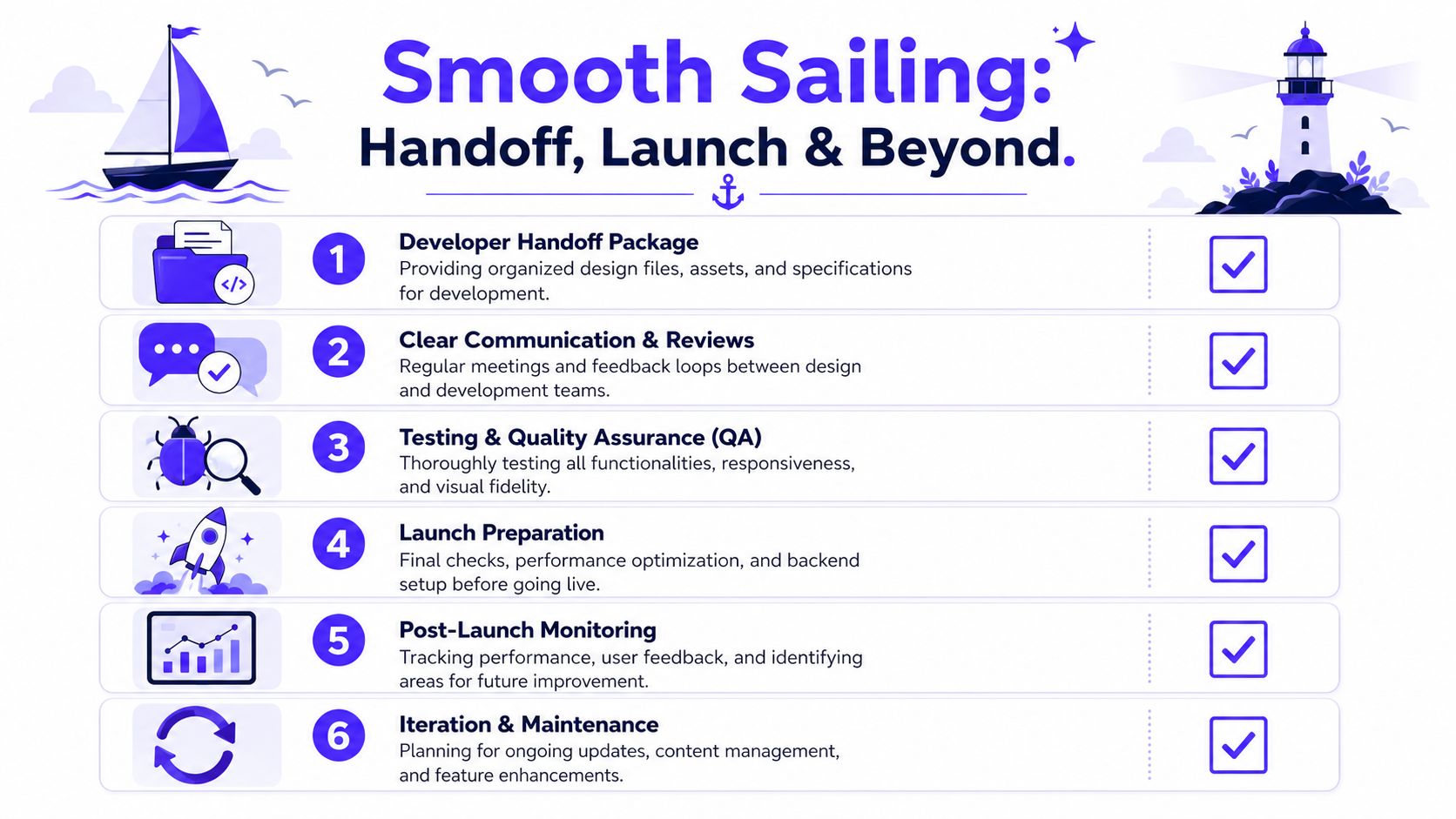
I've seen strong design work lose value in handoff because spacing rules weren't documented, responsive behavior wasn't defined, and component states weren't specified. Developers then have to guess. Sometimes they guess well. Often they don't, especially when the build is moving fast and the product team is changing copy in parallel.
What developers need from design
A clean handoff package should remove ambiguity.
That usually includes:
Component definitions: buttons, form fields, cards, nav states, modals, tables.
Responsive behavior: what stacks, what hides, what shrinks, what stays fixed.
Spacing and type rules: so rhythm survives implementation.
Asset guidance: optimized exports, formats, and naming that make build work cleaner.
Interaction notes: hover states, validation states, empty states, loading states.
For modern product teams, a mobile-first mindset matters here. The Interaction Design Foundation's overview of web design recommends designing mobile-first, using fluid grids, and supporting at least three breakpoints. In practice, that leads to simpler hierarchies and fewer weak elements surviving onto smaller screens.
Performance is part of design
Performance decisions don't belong at the end of the project. They belong inside the design process because layout, media, and component choices all affect load time.
The business impact is direct. A DesignRush roundup of web design statistics notes that a one-second delay in page load time can reduce conversions by about 7%. It also notes that for an e-commerce site earning $100,000 per day, that delay can cost roughly $2.5 million in annual revenue.
Even if you're not running ecommerce, the lesson holds. Slow pages cost trust, demos, signups, and product exploration.
A solid launch review should check:
Image weight and export quality
Embedded media that slows first load
Mobile tap targets and form usability
Whether key actions stay obvious on smaller screens
Whether page sections still make sense when content wraps
This is also where founders should stop treating responsive design as a technical cleanup item. Device behavior changes the experience itself. If a CTA disappears below clutter on mobile, that's not a frontend bug. That's a design failure.
Launch is the start of iteration
The healthiest teams don't treat launch as the finish line. They treat it as the first live test of a structured point of view.
Post-launch work usually includes three tracks:
QA in the wild
Check real devices, real content, real user paths, and edge cases your staging setup missed.Behavior review
Look at where users hesitate, what they ignore, and where the flow breaks down.Planned iteration
Tighten messaging, adjust section order, refine forms, simplify nav, or add proof where trust drops.
Launching without a post-launch review plan is just handing production risk to your users.
A founder-friendly web page design process should leave you with a site your team can operate. That means marketing can update content without breaking the layout, product can request improvements without redoing the whole system, and engineering isn't cleaning up avoidable design debt.
If you're building an AI SaaS, Web3, or Fintech product and need a partner who can handle strategy, product design, brand, and frontend execution in one workflow, 925 studios is built for that kind of work. The goal isn't more mockups. It's shipping a site and product experience that explains the product clearly, earns trust fast, and supports growth after launch.


Let’s keep in touch.
Discover more about high-performance web design. Follow us on Twitter and Instagram.

