
AI Product UX Design: Patterns, Trust and Interface Guide (2026)

925studios
Creative agency for AI & Web3
AI Product UX Design: Patterns, Trust and Interface Guide (2026)
Reviewed by Yusuf, Lead Designer at 925Studios
Designing for AI is not hard because the technology is new. It is hard because AI outputs are variable. A traditional button always does the same thing. An AI assistant answers the same question differently every time. The entire framework of UX design, which is built around predictable system states, has to be rebuilt for interfaces where the output is generated, not retrieved. In 2026, the products that are getting this right have developed a consistent set of patterns. This guide covers them.
TL;DR:
AI product UX design requires new mental models: outputs are variable, uncertainty must be designed for, and user trust is earned interaction by interaction.
The five core patterns: progressive capability disclosure, uncertainty states, human override affordances, consistent output structure, and explainability signals.
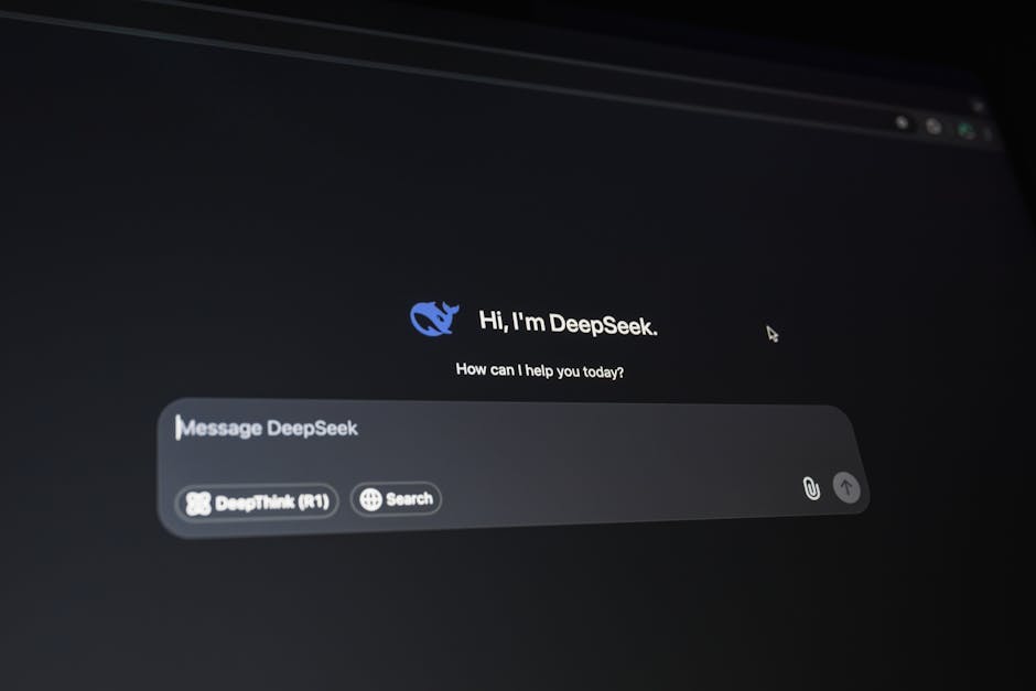
Products like ChatGPT, Claude, Perplexity, Notion AI, and GitHub Copilot define the current baseline. Study them.
The biggest AI UX mistakes: no loading state, no error recovery, no way for users to signal that the output was wrong.
Trust is the primary conversion metric in AI products. Users who do not trust the AI within three interactions will not return.
Quick Answer: AI product UX design in 2026 centers on five patterns: progressive disclosure of capabilities, transparent uncertainty states, human override at every step, consistent output formatting, and trust-building through explainability. Products like ChatGPT, Claude, Perplexity, and Notion AI define the current standard. The core challenge is designing for variable outputs. Unlike traditional UI where responses are predetermined, AI interfaces must handle responses that differ in length, tone, and accuracy on every interaction. Designing for this variability is the primary skill gap between teams that ship trusted AI products and those that do not.
What is AI product UX design and why is it different from traditional UX?
AI product UX design is the practice of designing interfaces, interactions, and conversation flows for products powered by machine learning models, particularly large language models. It differs from traditional UX in one fundamental way: the system's outputs are generated, not programmed. Every other discipline in UX design assumes that the system will behave consistently. AI design assumes it will not.
This changes the design vocabulary. Designers who work on AI products spend as much time designing for uncertainty, error recovery, and trust calibration as they do on visual layout and information architecture. A response that is 60% accurate but presented with full confidence is more damaging to user trust than a response that says "I am not certain about this." Designing the uncertainty state is not an edge case. It is core product work.
The market has grown fast. As of 2024, 78% of enterprise SaaS products have added at least one AI feature, up from 21% in 2022 (Salesforce State of Technology, 2024). Most of those features were shipped without dedicated AI UX design. The result is a generation of AI features that erode trust rather than build it, not because the models are bad, but because the interaction design fails to account for what makes AI outputs feel reliable.
At 925Studios, AI product design has become one of our most common client requests in 2025-2026. The pattern we see most often: strong engineering, weak interaction design at the AI layer, and users who disengage after the first bad output.
Building an AI feature and want to get the UX right before you ship? We run AI UX audits for SaaS teams.
Why does AI product UX design matter for SaaS retention?
Trust is the primary retention driver in AI products. Users who encounter an AI response that feels wrong, even once, disengage from the feature at a rate significantly higher than users who encounter a conventional UI bug. Research from Nielsen Norman Group found that a single perceived "hallucination" or confidently wrong AI output reduces feature engagement by 40% in the following two weeks, even when subsequent outputs are accurate (Nielsen Norman Group, 2024).
This asymmetry, where one bad output costs more in trust than ten good outputs earn, is the central challenge of AI UX design. It explains why transparency and uncertainty signaling are not optional features. They are retention tools. A product that says "I found 3 relevant results, but I am not certain about the second one" performs better in long-term retention than a product that presents all three with equal confidence and gets the second one wrong.
The products that have solved this, ChatGPT's citations, Perplexity's source display, GitHub Copilot's accept-or-reject interaction, all share the same underlying design decision: they give users the tools to verify, override, or dismiss AI outputs without friction. This is not humility for its own sake. It is a retention mechanism grounded in how human trust works.
What are the core patterns in AI product UX design?
Progressive disclosure of AI capabilities
New users do not know what an AI product can do. Showing every capability upfront produces the same paralysis as a blank canvas. The best AI products reveal capabilities progressively: start with the most common use case, surface advanced features in context, and show examples of what good prompts or inputs look like. Notion AI surfaces its rewrite and summarize capabilities contextually when you select text, rather than putting them in a menu you have to find. This pattern applies the same progressive disclosure logic that works for complex SaaS tools to AI capability discovery.
Transparent uncertainty states
Every AI product ships with responses that are sometimes wrong. The question is not how to eliminate wrong responses, which is currently impossible. The question is how to design the interface so that users can identify and handle uncertainty appropriately. Perplexity displays source citations inline with every claim, making it possible for users to verify the information independently. Claude uses hedging language by design when making probabilistic claims. GitHub Copilot presents suggestions as suggestions, not completions, with a clear accept-or-reject affordance. Each approach handles uncertainty differently but shares the core principle: do not present uncertain information with the same confidence as certain information.
Human override at every step
The most trusted AI products make it easy to disagree with the AI and easy to undo what the AI has done. This means every AI-generated output needs a visible, low-friction rejection or correction path. Notion AI's "Try again" and "Discard" options appear immediately after every output. GitHub Copilot's suggestions persist in a ghost text state until explicitly accepted. Intercom's Fin AI agent escalates to a human agent with one click. These affordances are not features that sophisticated users need. They are trust signals that every user reads, consciously or not. Their presence communicates that the product does not expect the AI to be right 100% of the time.
Consistent output structure
Variable length and format in AI outputs create cognitive load. A response that is sometimes three sentences and sometimes three paragraphs for the same type of question forces users to re-orient every time. The best AI products constrain output format through prompt design and UI constraints: max character limits, structured response templates, and formatted outputs that always appear in the same visual container. Perplexity always structures responses with a direct answer, then sources, then follow-up questions. This consistency makes the experience feel designed rather than generated, which directly impacts trust.
Explainability signals
Users trust AI more when they understand why it made a recommendation. This does not require complex technical explanations. A simple "Based on your last 3 conversations" or "From the page you are currently editing" is enough. Grammarly shows the rule it applied to every suggestion. Notion AI references the document context it used for summaries. GitHub Copilot indicates when it is drawing from the file currently open versus training data. Each of these is a minimal explainability signal, but their effect on perceived reliability is substantial.
What common mistakes do AI products make in UX design?
No loading state for long outputs. AI generation takes 1-5 seconds. Products that display a blank space during this time lose users who assume the feature is broken. A streaming output display, where the response appears word by word as it generates, is now the standard because it eliminates the blank wait entirely. ChatGPT popularized this pattern and it has become the expected default.
No error recovery path. AI features fail in ways traditional features do not: responses time out, context windows are exceeded, models return unexpected formats. Products that display a generic error message with no recovery path lose users permanently. The best AI products differentiate between "I could not find an answer" (which should offer a reformulation option) and "The service is temporarily unavailable" (which should offer retry).
Confident presentation of uncertain information. This is the most common and most damaging AI UX mistake. Presenting a hallucinated fact with the same visual weight as a verified fact destroys trust. The design fix is not complex: visual differentiation, hedging language in the prompt, or inline source display. All three work. None of them require changing the underlying model.
No feedback mechanism. AI products improve with feedback. Products that give users no way to flag a bad response are wasting a trust-building opportunity and leaving valuable training signal on the table. A thumbs-down icon with one follow-up question ("What was wrong with this response?") handles both. ChatGPT, Claude, and Gemini all use this pattern for exactly this reason.
Not sure if your AI product's interaction design is making or losing trust? Book a free AI UX audit with 925Studios.
What should you implement first in AI product UX design?

If you are adding an AI feature to an existing SaaS product, prioritize in this order:
Streaming output display. Replace any blank loading state with a streaming text display. This one change eliminates the most common AI UX failure mode and takes less than a day to implement in most systems.
Uncertainty signaling. Audit your system prompt for places where the model makes claims it cannot verify. Add hedging language for uncertain claims. Add source references where the model draws from factual data. Add a "Not sure about this? Check our documentation" link in responses that involve product-specific information.
Override affordances. Add a visible "Try again" and "Discard" option to every AI-generated output. These do not need to be prominent. They need to exist and be findable. Their presence alone increases user confidence that the product does not expect perfect outputs.
Feedback capture. Add a minimal thumbs-up/thumbs-down to every AI response. Route negative feedback to a product review queue. This generates the data you need to improve both the model prompts and the interaction design in subsequent releases.
At 925Studios, these four changes have produced measurable retention improvements in every AI product we have launched in 2025-2026. None of them require model changes. They are all interaction design decisions.
Want to see how these patterns apply to your specific AI feature? Talk to our AI product design team.
Frequently Asked Questions
What is AI product UX design?
AI product UX design is the practice of designing interfaces and interactions for products powered by machine learning models. It covers conversation design, uncertainty state design, trust calibration, output formatting, error recovery, and feedback mechanisms. It requires extending traditional UX frameworks to handle variable outputs and non-deterministic system behavior, which are the defining challenges that separate AI UX from conventional product design.
What are the most important AI UX design patterns in 2026?
The five most important patterns are: progressive disclosure of AI capabilities, transparent uncertainty states, human override affordances at every step, consistent output structure, and explainability signals. These patterns appear across the best-performing AI products of 2025-2026, including ChatGPT, Claude, Perplexity, Notion AI, and GitHub Copilot. They address the core challenge of AI UX: building user trust in a system whose outputs are variable and probabilistic.
How do you design for AI uncertainty without undermining user confidence?
The key is calibrated transparency: signal uncertainty proportional to its actual level, not uniformly. High-confidence outputs can be presented without hedging. Lower-confidence outputs benefit from source citations, hedging language, or a simple "based on available information" qualifier. Products like Perplexity and Claude have shown that clear uncertainty signaling does not reduce user confidence. It increases it, because users trust systems that are honest about their limitations over systems that project false confidence.
What does a good AI onboarding flow look like?
A good AI onboarding flow does three things: shows the user one high-value use case immediately (not a list of everything the AI can do), provides a pre-filled example prompt or action so users can see output quality before writing their own inputs, and includes a single follow-up interaction that demonstrates a correction or refinement (showing that the AI is responsive to feedback). Notion AI, Copilot, and Intercom Fin all use variations of this pattern.
How is AI product UX different from chatbot UX design?
Chatbot UX design from 2015-2020 was primarily about scripted conversation trees with limited branching. AI product UX design in 2026 addresses genuinely generative outputs where the response space is unlimited. The key differences: chatbot design is about mapping decision trees; AI design is about constraining and calibrating open-ended generation. AI UX also requires handling hallucination, managing context window limits, and designing for outputs that can be longer, shorter, or differently structured than anticipated.
What metrics should you track for AI feature UX quality?
Track four metrics: feature engagement rate (percentage of active users who use the AI feature in a given week), response acceptance rate (percentage of AI outputs that users keep versus discard or modify), negative feedback rate (thumbs-down or equivalent), and feature-attributed retention (do users with high AI feature engagement churn at lower rates?). These four metrics together tell you whether the AI experience is building trust and contributing to retention, which are the right business outcomes to optimize for.
How do you design for AI output length variability?
Use UI constraints and prompt constraints together. At the prompt level, specify maximum response length for each use case. At the UI level, use expandable containers that show the first 3-4 lines by default with a "See more" expand option. This prevents long responses from overwhelming short ones in the same interface. Perplexity and Claude both use variants of this pattern to keep their interfaces readable regardless of response length.
What is the role of typography and visual design in AI interfaces?
Typography matters more in AI interfaces than in conventional ones because text is the primary output medium. Key decisions: monospace versus proportional fonts for different output types (code versus prose), line height and paragraph spacing for readability at variable lengths, visual hierarchy between AI output and user input in conversation interfaces, and color coding for different confidence levels or output types. Products that treat AI output formatting as an afterthought consistently score lower on trust and readability metrics than those that design the text presentation as carefully as the visual chrome.
If you are shipping an AI product or feature and want to make sure the UX layer supports the trust your model needs to earn, talk to 925Studios.
If you're building a product and want a second opinion on your UX, talk to 925Studios. We work with SaaS, fintech, healthtech, web3, and AI startups.
See our work or book a free 30-minute call.
Follow us on Instagram and YouTube for design breakdowns and case studies.


Let’s keep in touch.
Discover more about high-performance web design. Follow us on Twitter and Instagram.
