High Fidelity Wireframes: Founder's Playbook

Yusuf
Founder and lead designer at 925studios

You're probably in one of two situations right now. Either your team is about to hand a half-defined product idea to engineering, or you already did, and now the build is drifting away from what you thought you approved.
That's where founders get burned. Not because the team is bad, but because everyone filled in the blanks differently. The PM imagined one flow. The designer meant another. The engineer shipped the version that made technical sense. Then you see the product in staging and realize the “approved design” was never specific enough to begin with.
High fidelity wireframes fix that, but only when you use them at the right moment. Used well, they reduce ambiguity, tighten handoff, and help your team ship something that feels intentional. Used too early, they waste money and slow learning.
Table of Contents
What Are High-Fidelity Wireframes and Why Should You Care
A high fidelity wireframe is the version of the design where guessing should stop.
It's not a napkin sketch. It's not a gray-box prototype with placeholder text. It's the design artifact that shows what the product should look like and how it should basically behave before development starts. That means real copy, real layout decisions, clear spacing, visual hierarchy, brand choices, and enough interaction detail that your team can judge the product as if it were close to real.
The founder problem it solves
A messy handoff usually sounds harmless at first.
Someone says, “Engineering can figure out the rest.” That works for simple flows. It fails fast in AI SaaS dashboards, wallet interactions, onboarding sequences, settings architecture, and any product where trust and clarity matter. If the design leaves room for interpretation, your team will interpret it differently.
According to Moqups' guidance on high-fidelity wireframes, high fidelity wireframes are typically created in the final stages of the design process, after low and mid-fidelity work has validated user flow and functionality. They're meant to be a nearly one-to-one approximation of the final product, which gives stakeholders a realistic asset to approve before code begins.
That's the point. Approval should happen when the design is specific enough to deserve approval.
Practical rule: If a developer still needs to ask what the page should feel like, what content belongs where, or how a component should behave, you're not done.
What makes them different from earlier design work
Low fidelity work is for exploration. You use it when the team still needs to answer basic questions like:
What's the right flow: Is onboarding one screen or four?
What belongs on this page: Should the dashboard lead with actions, metrics, or alerts?
What's the core path: What does a user need to do first to get value?
High fidelity wireframes come later. They answer a different set of questions:
Does this feel trustworthy
Can a user read and understand the screen
Is the spacing clean and intentional
Will engineering build the same thing stakeholders approved
Why founders should care
If you're raising, selling, onboarding, or handling money, design precision matters. A founder shouldn't think about high fidelity wireframes as “design polish.” You should think about them as risk control.
They help you catch the expensive problems before build. They force alignment around content, hierarchy, and states. They expose weak assumptions while change is still cheaper than rewrite.
The right question isn't “Should we make this prettier?” It's “Are we specific enough to build the right product?”
The High-Fidelity Decision When to Invest and When to Wait
Most founders don't need more design. They need better timing.
The mistake is treating high fidelity wireframes like a standard step for every feature. They're not. They're expensive clarity. If the product direction is still moving, polished screens won't save you. They'll just make uncertainty look more finished than it is.

The hard trade-off
Miro puts a useful number on the time difference. A low-fidelity screen can take 15-30 minutes, while a high-fidelity screen can take 4-8 hours according to Miro's comparison of low and high fidelity wireframes.
That alone should change how you use them.
If your team can sketch many low-fi options in the same window it takes to finish one or two polished screens, then high fidelity should be reserved for decisions that benefit from realism. If you use it before the core flow is stable, you're paying for detail on top of uncertainty.
When high fidelity is worth the spend
Here's when I'd tell a founder to invest.
Situation | My recommendation | Why |
|---|---|---|
You're testing a core conversion flow | Use high fidelity | Real content and realistic screens expose friction earlier |
You need stakeholder or investor buy-in | Use high fidelity | People react better to something that feels close to shipped |
Engineering is about to start building | Use high fidelity | It reduces interpretation risk |
Your product handles trust-sensitive actions | Use high fidelity | In fintech, AI, and Web3, vague design creates user doubt |
A payment review screen. A wallet connection flow. An AI results page with confidence cues. A settings page that controls sensitive permissions. These are not the places to “figure it out in code.”
A polished prototype has value when it helps someone make a better decision, not when it simply looks more complete.
When to stay lean
There are also clear moments to wait.
You're still debating the flow: Don't polish a path the team may delete next week.
The feature is minor: Internal admin tools and edge utilities usually don't need hi-fi upfront.
You haven't validated the user need: A beautiful interface won't rescue a weak product bet.
The content isn't real yet: If the team still relies on filler text, key design decisions are still hidden.
Founders often overspend on screens that are easy to imagine and underspend on screens that are easy to misunderstand. That's backwards. Spend where ambiguity is dangerous.
A simple founder filter
Before approving high fidelity work, ask three questions:
Will realism change the decision?
Is this flow important enough that rework would hurt?
Are we stable enough that detail won't be wasted?
If the answer is no to any of those, stay in low or mid fidelity longer.
High fidelity wireframes are not the premium version of design maturity. They're a tool for the moment when clarity starts paying for itself.
A Practical Workflow for Producing Great Wireframes
The teams that get value from high fidelity wireframes don't jump straight into polished screens. They build toward them in a controlled sequence.
That sequence matters because high fidelity isn't where product thinking starts. It's where earlier decisions become specific enough to test, approve, and build.

Start with the smallest real problem
Don't begin with “design the app.” Begin with a narrow user journey.
For a fintech product, that might be card freeze and unfreeze. For an AI product, it could be prompt to result review. For a Web3 app, it might be connect wallet to confirm transaction. Pick the flow where confusion would be costly.
Then define the basics:
User goal: What is the user trying to finish?
Business goal: What needs to happen for the company?
Failure points: Where do users hesitate, abandon, or make mistakes?
Key states: What changes when data loads, fails, succeeds, or requires confirmation?
If your team hasn't done that work yet, run a short workshop before touching polish. A structured sprint can help, and this guide on how to run a design sprint is a practical starting point.
Build fidelity in layers
A repeatable workflow looks like this:
Sketch the flow fast
Use low fidelity layouts to test sequence and hierarchy. Keep it disposable.Move to structured wireframes
Define component placement, page sections, and basic interactions.Replace placeholders with real content
It's common for teams to cheat here. Don't. Real copy exposes cramped layouts, weak labels, and missing states.Apply visual system decisions
Add typography, spacing, color, icon treatment, and component logic.Prototype only the screens that need validation
Don't build the whole product in high fidelity if only one path matters.Annotate edge cases before handoff
If a screen includes hidden logic, conditional states, or unusual interactions, document it.
That “only design what needs validation” discipline matters. If you want a fast way to generate a rough starting point before refining flows with the team, tools like RapidNative AI app wireframe generator can help teams get early structure on the page without confusing that first draft for final product thinking.
Here's a useful walkthrough of the flow in action:
What to include in the actual hi-fi file
A good high fidelity wireframe file should remove avoidable questions.
Include:
Final or near-final copy
Approved components
Spacing and alignment that reflect intended build quality
States for inputs, buttons, errors, loading, empty screens, and success moments
Notes for interactions that won't be obvious from the static screen
If your designer is still using fake data at this stage, the team is still hiding problems from itself.
Keep revisions under control
Founders lose weeks when hi-fi review turns into open-ended taste debates.
Use a tighter review standard:
Is the flow clear?
Is the hierarchy obvious?
Does the screen reflect the brand correctly?
Can engineering build this without guessing?
Did we define the hard states, not just the happy path?
That's how you keep high fidelity wireframes practical. Not as art boards. As build-ready product decisions.
Nailing the Details in AI, Web3, and Fintech Interfaces
Generic UI advice falls apart in complex products.
An AI tool has to explain what the system is doing. A Web3 product has to make risky actions feel legible. A fintech interface has to earn trust in every screen. In all three, surface polish isn't enough. The details have to carry meaning.
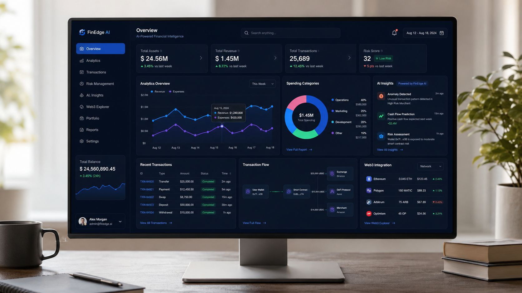
According to Stride's breakdown of high-fidelity wireframes, high fidelity wireframes add real graphics, spacing, branding colors, and real data instead of placeholder text. That's especially important in SaaS and fintech, where precision shapes how credible the product feels.
AI interfaces need visible thinking
Founders building AI products often underdesign system states.
They mock the input and the final answer, then ignore the moments in between. That's a mistake. Users need to understand whether the system is searching, reasoning, waiting on data, or failing gracefully. A high fidelity wireframe for AI should show those transitions clearly.
For example:
Prompt state: What guidance appears before the user types?
Processing state: Does the product show progress, reasoning steps, or a waiting message?
Result state: Are confidence cues, citations, or source references visible?
Revision state: Can the user refine the output without starting over?
If you're designing AI workflows, these are the patterns that matter most in practice. This article on AI product UX design patterns is useful if your team needs concrete interaction ideas for these states.
Users don't trust AI because the screen looks modern. They trust it because the interface explains what's happening, what the model knows, and what they should do next.
Web3 products need safer decision screens
Wallet connection is easy to underestimate.
It's rarely just “connect wallet.” There's wallet selection, permission context, network status, signature prompts, rejection handling, and post-transaction feedback. High fidelity wireframes are valuable here because tiny wording and layout choices change whether a user feels safe proceeding.
A strong Web3 confirmation flow should show:
What action is being approved
Which wallet is connected
Which network is active
What happens after approval or rejection
A clear path back when the transaction fails
Don't leave those as notes in a ticket. Put them in the design.
Fintech products need real data, not fake comfort
Fintech is where weak wireframes get exposed fastest.
A balance screen with made-up content won't tell you if the hierarchy works. A transaction feed with filler rows won't reveal whether users can scan it under pressure. A card management flow without realistic labels won't show whether the controls feel safe.
If your team is designing card controls, spending limits, freezes, or permission settings, studying patterns like this financial card management UI can help you benchmark how to structure actions without clutter.
Use real examples in the wireframe:
Actual transaction labels
Credible amounts and categories
Pending, failed, and reversed states
Warnings that explain consequences in plain language
The design should answer the user's first anxious question before they need support.
What these industries have in common
AI, Web3, and fintech all punish ambiguity.
Here's the shared rule set:
Domain | What users need | What the wireframe must show |
|---|---|---|
AI | Understanding and control | System status, confidence cues, editable outputs |
Web3 | Safety and confirmation | Wallet state, network context, transaction consequences |
Fintech | Trust and clarity | Real data hierarchy, clear actions, transparent states |
If the wireframe can't explain the product's hardest moment, it's not ready. In these categories, details aren't decoration. They're the product.
Beyond the Visuals Data, Accessibility, and Interaction
A polished screen can still be misleading.
The most common failure I see is a design that looks final but behaves vaguely. That usually happens when teams polish visuals faster than they define content and interaction. The result is a fake sense of readiness.
Keep fidelity levels aligned
According to Visily's guidance on low and high fidelity prototypes, a recurring pitfall is mixing fidelity levels inconsistently across interactivity, visuals, and content. When one of those feels finished and the others don't, stakeholders and testers get the wrong read.
A screen with branded visuals but placeholder data isn't high fidelity. Neither is a realistic dashboard that has no defined empty states, hover states, or logic notes. If you want useful feedback, all three layers need to tell the same truth.
Data has to be believable
In AI and fintech products especially, charts and tables carry trust.
That means your wireframes should use realistic labels, believable categories, and clear emphasis. Don't drop in random graphs because the page needs “more product feel.” Every data block should answer a question the user has.
Use this filter:
Does the chart support a real decision
Can a user understand it without a tooltip
Does the empty or no-data state make sense
Would the team know what data belongs here at launch
Accessibility should exist before development
Too many teams treat accessibility like QA cleanup. It should show up in wireframes.
Review contrast. Define focus states. Make error messages visible and specific. Check whether users can tell which actions are primary, destructive, disabled, or complete. If that distinction isn't obvious in design, it won't get easier in code.
A screen isn't high fidelity if only the happy path is usable.
Interaction notes matter more than animation flair
Microinteractions can improve a product. They can also distract a team from the harder work.
Specify the interactions that affect comprehension. Loading behavior, inline validation, dropdown states, success feedback, retry actions, and permission prompts matter more than decorative motion. If a small animation helps explain response or status, include it. If it's there just to make the prototype feel expensive, cut it.
Good high fidelity wireframes don't just look close to the final product. They communicate how the product responds under real use.
The Ultimate Pre-Handoff Checklist for Shipping with Confidence
The handoff is where a strong design either becomes a strong build or falls apart.
This is the moment to get ruthless. If a developer has to reverse-engineer intent from scattered screens, you will lose quality. If product has to answer basic behavior questions after build starts, you will lose time. A handoff package should remove as many open loops as possible.
What must be locked before build starts
IxDF makes an important point in its guidance on high-fidelity prototypes. Teams shouldn't overbuild every screen, but they should add annotations for non-obvious interactions so developers understand both the visible UI and the underlying behavior, as outlined in the IxDF article on high-fidelity prototypes.
That's the standard. Your handoff is not done when the screen looks good. It's done when someone else can build it correctly.
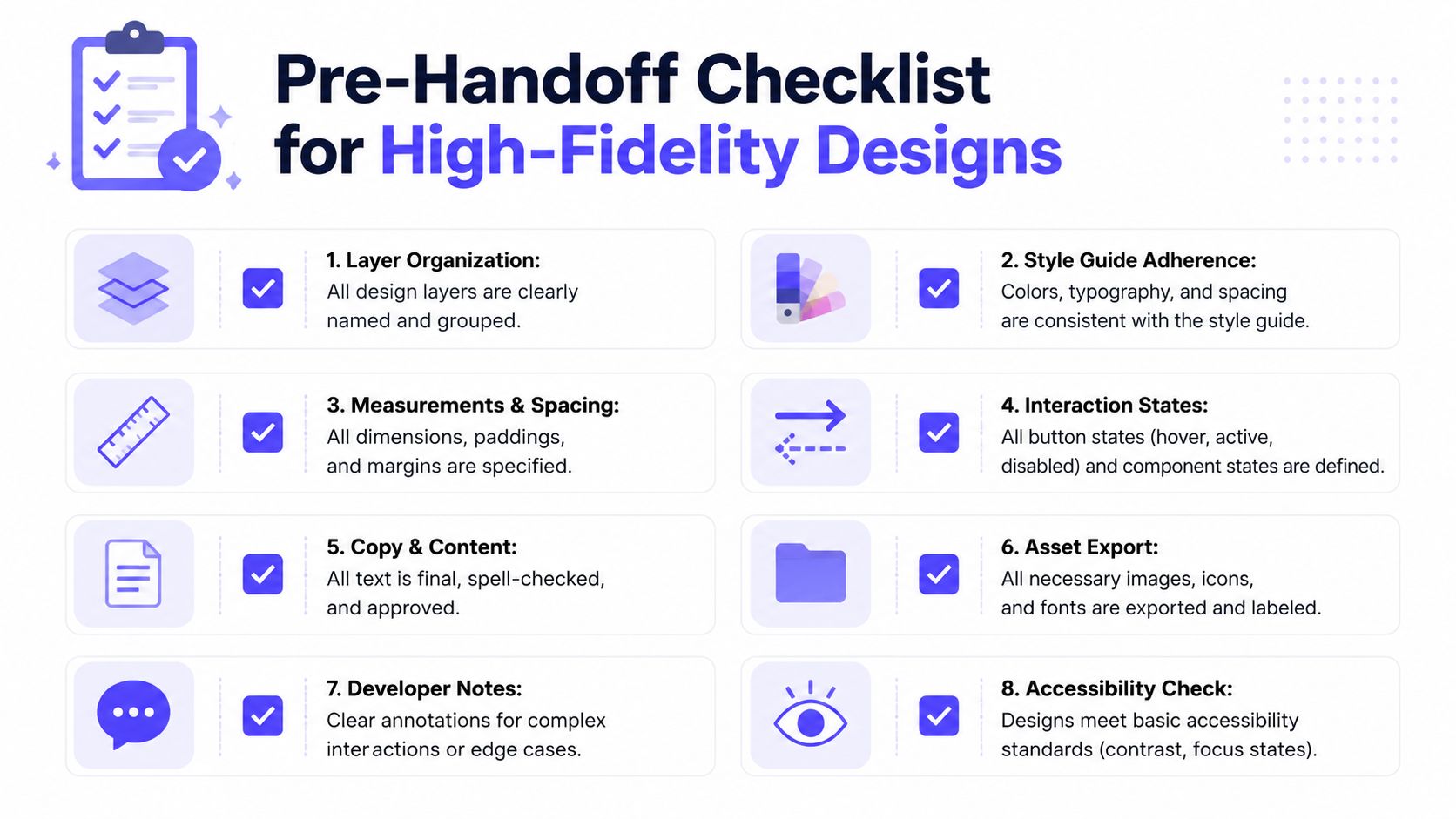
Use this checklist.
File structure is clean: Pages, flows, and components are named in a way engineering can scan quickly.
Core user path is obvious: The main journey is easy to follow without someone narrating it live.
Copy is approved: Buttons, helper text, error states, and warnings use final or near-final language.
States are complete: Hover, active, disabled, loading, success, error, and empty states are all included where relevant.
Spacing is intentional: Padding, margins, and alignment aren't implied. They're visible and consistent.
Assets are ready: Icons, illustrations, logos, and image treatments are easy to locate and export.
Logic is annotated: Conditional states, permissions, edge cases, and unusual interactions are explained.
Accessibility basics are defined: Focus states, contrast decisions, and readable hierarchy are present in the design.
For SaaS teams shipping under pressure, pairing this with a broader SaaS launch design checklist is a smart way to catch the gaps that usually show up late.
What founders should personally review
You don't need to inspect every pixel. You do need to inspect the risk.
Review these five things yourself:
The first-use experience
Can a new user understand what to do next?The most sensitive action
Does the product feel safe when money, permissions, or data are involved?The failure path
What happens when something breaks, stalls, or gets rejected?The brand signal
Does the product feel credible enough for the category you're in?The engineering ambiguity level
Could a strong engineer still build this three different ways?
If the answer to that last question is yes, the design is still under-specified.
Good handoff files don't create more meetings. They remove the need for them.
The finish line that matters
A high fidelity wireframe should do three jobs before code starts. It should validate the user experience, align the team on what's being built, and narrow the room for interpretation.
If it only does one, it's incomplete.
If your team needs a creative partner that can handle product design, brand design, and frontend execution in one place, 925 studios works with AI SaaS, Web3, and fintech companies to turn rough product ideas into polished, shippable interfaces.
Produced via the Outrank app


Let’s keep in touch.
Discover more about high-performance web design. Follow us on Twitter and Instagram.

