
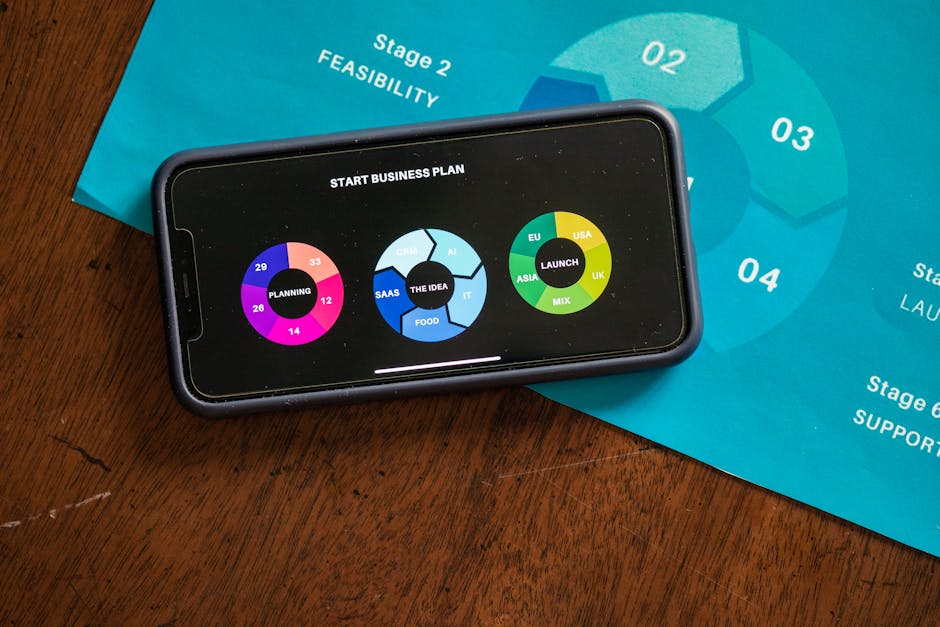
SaaS Launch Design Checklist: 35 Things to Check Before You Ship in 2026

925studios
Creative agency for AI & Web3
SaaS Launch Design Checklist: 35 Things to Check Before You Ship in 2026
Reviewed by Yusuf, Lead Designer at 925Studios
Most SaaS products launch with at least one critical design failure that kills activation before a user ever reaches the core value moment. The signup form asks for too much information. The empty state after first login is blank with no guidance. The onboarding tooltip fires at the wrong time. None of these are engineering failures. They are design failures that a structured pre-launch review would have caught. 88% of users will not return to a product after a single poor experience (industry data, 2026). This checklist is the review that prevents that experience from shipping.
TL;DR:
The highest-risk design failures at launch are in the signup flow, first-session onboarding, and empty states.
A design checklist is not about visual polish. It is about removing friction from the path to first value.
Test with real users before launch, not just internal stakeholders. Five usability sessions reveal most critical failures.
Set up activation and retention tracking before launch, not after. You cannot iterate on data you are not collecting.
This checklist is grouped into six categories: signup, onboarding, core product, visual system, pre-launch testing, and post-launch tracking.
Quick Answer: A SaaS launch design checklist should cover six areas: signup flow friction (minimal fields, clear value proposition), onboarding sequence (defined activation event, three to five steps to first value), empty states (every state has guidance), visual design system (consistent spacing, typography, accessibility), pre-launch usability testing (five sessions minimum), and post-launch tracking setup (activation funnel, session recordings, Day 7 retention tracking). Run this review at least two weeks before your public launch.
Why does a pre-launch design checklist matter for SaaS products?
SaaS activation benchmarks in 2026 are unforgiving. The average Day 1 retention for a new SaaS product sits at 25-30%, and Day 7 retention drops to 10-15% (industry benchmarks, 2026). Most of that drop happens because the user's first session did not deliver a clear value moment. They signed up, looked at an empty dashboard, could not figure out what to do next, and closed the tab.
The design decisions that cause these failures are not complex. They are predictable. An empty state with no guidance, an onboarding flow that asks for team size before showing the product, an error message that says only something went wrong with no recovery path. These are the same failures across dozens of SaaS launches because founders and their teams are too close to the product to see them. The checklist below is the outside-in view that internal review misses.
At 925Studios, pre-launch design reviews are one of the most consistent value-delivery moments we have with SaaS founders. The issues are almost always in onboarding and empty states, two areas that receive the least design attention during the build phase and have the most impact on first-session activation.
The complete SaaS launch design checklist
Category 1: Signup and first impression
The signup flow is where you set expectations for everything that follows. Friction here creates skepticism before the user has seen a single product screen.
Signup fields are the minimum required to deliver first value. Email and password only, or email and OAuth, is the right starting point. Every additional field (company name, phone number, team size) reduces signup completion rate. Ask for this information after the user has experienced value, not before.
Value proposition is visible on the signup page. A user arriving at your signup page from an ad or a search result may not have read your full marketing site. One sentence of specific value should appear on or adjacent to the form: what the product does and what outcome it delivers.
OAuth options are present. Google OAuth at minimum. Reducing password creation friction increases signup completion rates meaningfully, particularly for B2B SaaS where users expect single sign-on convenience.
Email verification is not a signup blocker. If you require email verification, send the verification email but allow the user to continue into the product immediately. Blocking access until verification is complete adds unnecessary friction and email delivery delay to the activation sequence.
Password requirements are visible before submission. Displaying password requirements before the user submits (and fails) prevents a frustrating loop. Show the requirements as the user types.
Error states are specific. Instead of email address is invalid, provide the specific error: that email address is already registered. Log in instead. Specific errors help users recover. Generic errors cause abandonment.
Struggling with a signup flow that looks clean but leaks users before they ever see your product? See 25 real SaaS onboarding examples that get users to activation in under three minutes.
Category 2: Onboarding sequence
Onboarding is the design problem with the highest return on investment before launch. Research from 2026 shows that apps activating users within three minutes see nearly double the retention of slower products.
Activation event is defined. Before writing a single screen of onboarding, define what user action constitutes activation. For Linear, it is creating a first issue. For Notion, it is creating a first page. For Loom, it is recording a first video. Every onboarding screen should be oriented toward delivering this one action.
Onboarding checklist has three to five items maximum. Research consistently shows that checklists with more than five items reduce completion rates. If your onboarding requires more steps, break them into a primary activation sequence and a secondary onboarding sequence that loads after the activation event.
Progress is visible. A completion indicator (3 of 5 steps complete) keeps users oriented and motivated. Products that show no progress signal have users who do not know how close they are to finishing and abandon mid-sequence.
Routing question is used for complex products. If your product serves meaningfully different use cases (solo vs. team, technical vs. non-technical), one routing question at signup that reshapes the onboarding experience outperforms a single generic sequence for everyone.
Skip options exist. Some users do not want to be walked through an onboarding sequence. Let them skip. Force-walking experienced users through onboarding they do not need creates frustration. Track skip rates, but do not remove the option.
The first task requires no input from the user to begin. Pre-populate the first onboarding task with sample data, a suggested starting point, or a template. A blank canvas as the first thing a new user sees after onboarding is a conversion failure. Notion uses pre-built page templates. Linear auto-creates a sample project. Get the user creating immediately, not staring at an empty screen.
Category 3: Core product experience
The core product experience is where most design checklists stop paying attention. The screens that follow onboarding receive less design energy than the signup and onboarding flows, but users spend more time in them.
Every empty state has a clear action. The dashboard for a new user with no data, the team page for a solo user, the project list before a project is created: every empty state must have a primary action that moves the user forward. Text that says no items yet does not help. A button that says create your first project does.
Navigation hierarchy matches user mental models. Run five usability sessions with target users before launch. Ask them to find three specific things using the navigation. Where they click first, not where you designed them to click, is the correct information architecture signal.
Loading states exist for every async operation. Every network request that takes more than 300 milliseconds needs a visible loading state. Spinning icons, skeleton screens, progress bars. Users who see a blank screen on a button click assume the product is broken.
Error messages have recovery paths. Every error message should include: what happened, why it happened (briefly), and what the user can do next. Something went wrong is an error message. Failed to save changes. Check your internet connection and try again is a recovery path.
Destructive actions have confirmation dialogs. Delete, remove, archive, and cancel actions should require confirmation with a plain-language description of what will be deleted. Irreversible actions need extra friction. Reversible actions do not.
Mobile responsiveness is tested on real devices. Even B2B SaaS products receive significant mobile traffic from users checking the product on their phones. Test your product on a real iPhone and Android device, not just in browser responsive mode. Browser responsive mode misses touch target size failures, scroll behavior bugs, and keyboard layout issues.
Category 4: Visual design system
Visual consistency is a trust signal. Products where the button styles change between pages, the spacing is inconsistent between sections, or the typography hierarchy is unclear read as unfinished. Investors, early adopters, and paying customers all notice.
A design system or component library is in place. Even a minimal one: a defined type scale, a consistent color palette with semantic tokens (primary, secondary, danger, success, warning), and a button component with all states (default, hover, active, disabled, loading).
Color contrast meets WCAG 2.1 AA standards. Text on background combinations should meet a minimum 4.5:1 contrast ratio. Use a contrast checker on every text style in your design system before launch. This is both an accessibility requirement and a visual clarity signal.
Typography hierarchy is clear at three levels. Heading, body, and caption text should be visually distinct without requiring color to carry the distinction. Relative sizes and weights should create a hierarchy that is readable at a glance.
Icon usage is consistent. A single icon library throughout. No mixing Heroicons, Material Icons, and custom SVGs on the same product. Inconsistent icon styles are a signal of a product built in phases without design system oversight.
Focus states are visible on all interactive elements. Keyboard accessibility requires visible focus states. Every button, input, and link should have a clear focus indicator. This is both an accessibility requirement and a usability requirement for power users who navigate by keyboard.
Spacing uses a consistent scale. A 4px or 8px base unit with a defined scale (4, 8, 12, 16, 24, 32, 48, 64) applied consistently across all layouts. Products with inconsistent spacing look unfinished even when the visual style is strong.
Category 5: Pre-launch testing
Internal review is not a substitute for user testing. A team that has built a product is constitutionally unable to see it the way a new user sees it. They know where everything is. They know what the buttons do. They have mentally modeled the navigation structure. New users have none of this context.
Five usability sessions completed before launch. Five is not a magic number, but five unmoderated or moderated sessions with target users will surface the critical failures in your onboarding sequence and navigation structure reliably. Five sessions are the minimum. More is better. Fewer is not sufficient.
Cross-browser testing is complete. Chrome, Safari, Firefox, and Edge at minimum. Safari on iOS is where most B2B SaaS products have undetected visual bugs. Test your product in Safari on an iPhone before every major release.
The full signup-to-activation sequence is tested end to end in production. Not staging. Not a local build. The production environment with real email delivery, real OAuth flows, and real data. Production bugs in signup flows have killed more SaaS launches than any other single issue category.
Performance is tested on a real mobile connection. Your product may be fast on a fiber connection in your office. Test it on a real mobile device on a 4G connection. Large unoptimized images, JavaScript bundles that block rendering, and fonts that load late are invisible on fast connections and catastrophic on mobile.
Category 6: Post-launch tracking setup
The design work does not end at launch. Products that improve their activation rate after launch do so because they have the data to see where users drop off. Set up the tracking before launch, not after you notice the activation rate is low.
Activation funnel is instrumented. Every step in your onboarding sequence has an analytics event. Signup completed, onboarding step 1 started, step 1 completed, activation event completed. Track funnel drop-off at each step. The step with the highest drop-off rate is your first design iteration target.
Session recording tool is in place. Hotjar, FullStory, or equivalent. Session recordings of new users' first sessions reveal interaction failures that quantitative data does not. A user clicking a non-interactive element repeatedly is invisible in event analytics and visible in session recordings.
Day 7 retention is being tracked. Set up a cohort analysis from day one. The percentage of week-one users who return in week two is the earliest signal of whether your activation and core product experience is working. Track it weekly from launch.
NPS or CSAT trigger is set up for activated users. Send a one-question NPS or satisfaction prompt to users who have completed the activation event and used the product for three to seven days. Their response is the earliest qualitative signal of whether your product is delivering value.
Not sure your design is ready to push to the push button? Run through our full SaaS UX audit checklist before you brief a redesign or a launch review.
What are the most common mistakes in SaaS launch design?

Designing the marketing site but not the empty states
The marketing site gets more design attention than the product screens that new users actually see on their first session. The empty dashboard, the onboarding confirmation screen, the first project or workspace state: these screens receive less design energy than any homepage section, and they have more impact on whether the user returns in week two than any marketing copy.
Over-designing the onboarding checklist
A six-step onboarding sequence with a welcome video, a feature tour, a setup wizard, and three tooltips is not thorough onboarding. It is a wall of guidance that delays the user from doing the thing they signed up to do. The best onboarding in 2026 is invisible. It gets users to their first created item, first sent message, or first completed task before it asks for anything else.
Treating the checklist as a sign-off document rather than a testing tool
A design checklist run against internal judgment is a checklist of what the team believes about the product. A design checklist run against five usability sessions is a checklist of what users actually experience. Run the checklist against user behavior, not internal confidence.
What are the next steps after completing the launch design checklist?
Complete the checklist at least two weeks before your planned public launch date. Any checklist item that surfaces a failure needs time to fix, retest, and verify in production. One week is not enough time to discover a critical onboarding failure, redesign the flow, implement the change, and test it with real users before launch.
After launch, run the checklist again at thirty days with your activation and retention data in hand. The items that failed in the data should drive your first post-launch design sprint. Activation rate below 20% and Day 7 retention below 15% both signal an onboarding problem worth fixing before scaling acquisition.
Tired of managing three vendors for design, motion, and brand? 925Studios is one creative partner across every visible surface of your product.
Frequently Asked Questions

How many usability sessions should I run before launching a SaaS product?
A minimum of five sessions with target users will surface the critical failures in your onboarding sequence and navigation structure. Five is a practical minimum, not an optimal number. If time and budget allow, ten sessions across two rounds (one on wireframes, one on the final product) significantly reduces the risk of shipping a critical onboarding failure. Each session should ask users to complete your core activation task from scratch with no guidance from you.
What is the most important screen to design before a SaaS launch?
The empty state of the core product view (the dashboard, the main workspace, the primary list view) is the most under-designed and highest-impact screen in most SaaS products. It is the first thing a new user sees after completing onboarding, it is the screen that answers whether the product is ready to use or still requires setup, and it is where most first-session abandonment happens. If this screen does not have a clear primary action and a compelling reason to take it, your launch activation rate will reflect that.
Should I launch with a full design system or can I ship rough components?
Launch with consistent components, not necessarily a fully documented design system. Consistent button styles, a defined type scale, and a predictable spacing grid are the minimum requirement for a product that reads as professional. A fully documented design system is valuable for teams of three or more designers. Before that scale, what matters is visual consistency in the product, not documentation completeness.
How do I track whether my SaaS onboarding design is working?
Instrument every step in your onboarding sequence with analytics events before launch. Track: signup completed, each onboarding step started and completed, and activation event completed (your defined first-value action). Calculate step-level drop-off rates weekly. The step with the highest drop-off rate is your first design iteration target. Combine funnel data with session recordings (Hotjar, FullStory) to understand why users are dropping off, not just where.
What should a SaaS onboarding checklist contain at maximum?
Three to five items for the primary onboarding checklist. Research consistently shows that checklists with more than five items reduce completion rates by creating overwhelm before the user has experienced any product value. If your product genuinely requires more setup steps, use a primary activation checklist of three to five items followed by a secondary onboarding sequence that loads after the primary activation event is completed.
When should I run a design review before launch?
Run a design checklist review at three points: when the product is in final staging (two weeks before launch), when the product is in production with test data (one week before launch), and when the product is in production after your first ten real user signups (immediately post-launch). The staging review catches design failures. The production review catches implementation failures. The post-launch review with real user data catches the failures that neither internal review method finds.
Does mobile responsiveness matter for B2B SaaS before launch?
Yes, even for B2B SaaS products where the primary use case is desktop. A significant percentage of B2B SaaS traffic comes from mobile: users checking a notification, reviewing a report between meetings, or evaluating the product for the first time on their phone. A product that breaks on mobile signals to this audience that the team is not attentive to detail. Test on a real iPhone and Android device, not just in browser responsive mode, before every launch.
What activation rate should I target at SaaS launch?
For a B2B SaaS product, an activation rate above 30% (users who complete your defined first-value action within the first session) is a reasonable baseline target at launch. Rates below 20% indicate a structural problem in the onboarding sequence that should be the first post-launch design priority. Rates above 40% indicate an onboarding experience that is working and can support acquisition scaling. Benchmark your activation event definition carefully: a too-easy activation event (user views the dashboard) will show high rates but not predict retention.
If you're building a product and want a team that covers product design, motion, and founder video under one roof, talk to 925Studios. We work with SaaS, fintech, healthtech, web3, and AI founders.
See our work or book a free 30-minute call.
Follow us on Instagram and YouTube for design breakdowns and case studies.


Let’s keep in touch.
Discover more about high-performance web design. Follow us on Twitter and Instagram.
