
Perception of Brands: A Founder's Guide for Tech Startups

Outrank AI
Your competitor's product is worse, but they still win the call. Their homepage is cleaner. Their onboarding feels finished. Their docs sound like they've done this before. Buyers leave with one simple conclusion, this company feels safer.
That's the perception of brands in practice. Not a mood board. Not a slogan. A fast judgment based on what people see, click, read, and experience.
For AI SaaS, Web3, and Fintech founders, this matters more than most branding advice admits. In high-trust categories, people aren't only evaluating features. They're asking whether your product looks credible enough to adopt, whether your interface feels stable enough to rely on, and whether your company sounds clear enough to trust with money, data, or workflow. If reputation risk is part of your market, it also helps to understand how to safeguard brand reputation once people start talking about you in public channels.
Table of Contents
What Is Brand Perception Really
Brand perception is the judgment people make about your company before they know much about it. It's the gut read they get from your homepage, your product UI, your pricing page, your onboarding flow, your support replies, and the tone of your docs.
Founders often treat this like a marketing layer that sits on top of the product. That's the wrong model. Perception is usually an output of the product and the surrounding experience. If the interface is clumsy, the copy is vague, and the site feels patched together, people don't say, “the branding needs work.” They think the company itself is immature.
It's what customers decide you are
A technical founder usually sees the roadmap, architecture, and feature depth. A buyer sees the login screen, the empty states, the security page, and whether the product explains itself without friction.
Those are not shallow signals. They are the evidence people use when they don't yet have trust.
Strong brand perception doesn't mean people admire your visuals. It means they believe your company will do what it says.
Why superior products still lose
This is why better technology can lose to a more coherent competitor. If one company ships real capability but wraps it in confusing UX, generic visuals, and inconsistent messaging, while another ships a simpler offer with far better clarity, the second company often feels more reliable.
That feeling changes behavior. People book the demo. They forward the link internally. They give the product a chance.
The practical test is simple:
If your homepage promises simplicity, your onboarding should be short and obvious.
If your brand claims security, your interface should feel controlled, calm, and precise.
If your product targets enterprises, your website can't read like a beta launch tweet thread.
The perception of brands isn't created in a workshop alone. It's created in shipped touchpoints.
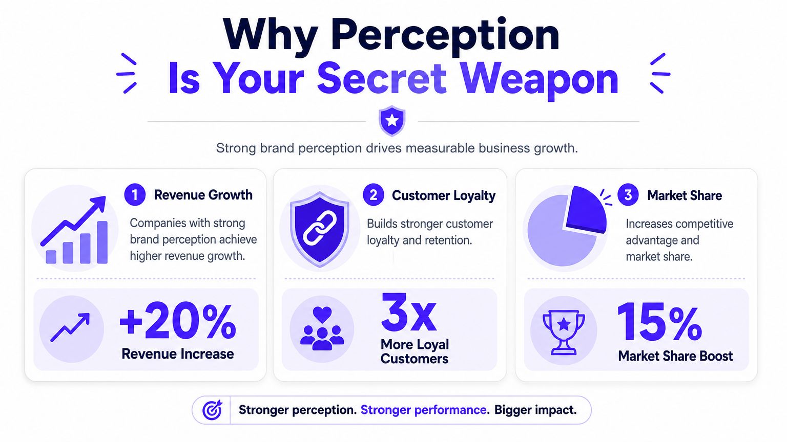
Why Perception Is Your Secret Weapon
Most founders think perception is a soft layer added after product-market fit. In reality, it often determines whether people ever get far enough to evaluate the product at all.
Research summarized by Oberlo reports that people form an opinion about a website in about 50 milliseconds, 88% of consumers say authenticity matters when deciding what brands they like and support, 94% say a brand's treatment of customers influences purchasing decisions, and 46% say they would pay more for brands they trust, according to Oberlo's branding statistics roundup.
First impressions aren't cosmetic
For a startup, that first impression usually happens before a salesperson speaks to anyone. It happens on the homepage, in a shared deck, on a mobile screen, or inside a trial account. If those surfaces feel vague or unfinished, people attach that same uncertainty to the business.
This is why brand perception affects revenue even when nobody calls it branding in the meeting. A founder says pipeline quality is off. A product lead says activation is weak. A marketer says traffic isn't converting. Often, the issue is simpler. The product and brand don't look trustworthy enough yet.
Trust changes buying behavior
In AI, Web3, and Fintech, buyers don't only ask whether your tool works. They ask whether your company is credible enough to integrate into their stack, move money, store sensitive data, or automate decisions.
That shifts design from decoration to proof.
Here's what that proof usually looks like:
A clear homepage message, people understand what you do without decoding jargon.
A stable interface, layouts are consistent, edge cases are handled, and the product doesn't feel fragile.
A coherent visual system, nothing looks borrowed from five different startups.
A serious customer experience, support, docs, and transactional emails sound like one company.
Practical rule: if a buyer has to work hard to understand you, they usually won't trust you.
The commercial advantage is leverage
Perception compounds because it influences more than one moment. It affects click-through, demo acceptance, internal buy-in, conversion, and willingness to stay.
A founder might invest months building capability, then lose the commercial upside because the company still looks early. That's why perception is a secret weapon. It changes how the same product is interpreted.
The strongest teams don't separate brand from product quality. They use design, interface polish, and message clarity to reduce doubt before doubt kills the deal.
How Brand Perception Is Actually Formed
Brand perception forms from repeated signals, not one campaign. People build an opinion of your company by combining what they see in the product, what they read on the site, what they hear from others, and whether those pieces agree with each other.
Qualtrics describes brand perception as being shaped by use, experience, functionality, reputation, and word-of-mouth, and recommends combining survey questions on emotion and free association with social tracking and dashboarding in its guide to brand perception measurement. That maps closely to what shows up in startup work. Buyers don't separate these into neat departments. They experience them as one company.
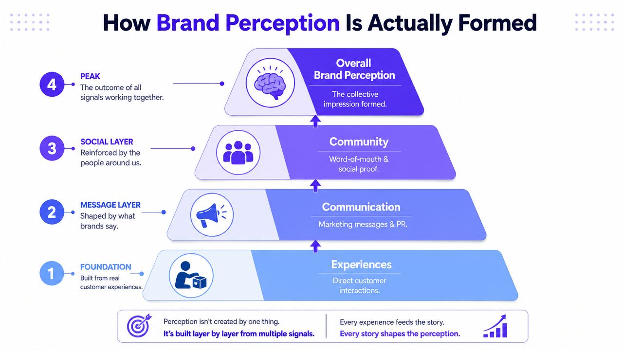
Product experience carries the most weight
If the product is hard to use, the brand starts to feel careless. If onboarding is smooth, permissions make sense, and the UI explains the workflow clearly, the brand feels considered.
Many startups often get the sequence wrong. They redesign the logo while the dashboard still overwhelms users. They polish the homepage while the setup flow breaks trust. People notice the gap immediately.
For technical products, details matter more than founders think:
Onboarding flow, does the first session reduce anxiety or create it?
Empty states, do they help people move forward or expose that the product hasn't been fully thought through?
Data presentation, do charts, tables, and labels make complex output understandable?
Error handling, does the product feel reliable when something goes wrong?
Visual identity tells people how seriously to take you
Visual identity is not just a logo. It's typography, spacing, color, motion, iconography, and the overall discipline of how your company presents itself. A clean identity can make a complex product feel more approachable. A messy one can make a good product feel risky.
This matters most when customers can't yet inspect the underlying quality. Before they test your infrastructure, they judge your clarity. Before they trust your model outputs, they judge your interface.
A good identity system does two jobs at once. It creates recognition, and it supports confidence.
Website and messaging frame the story
Your website is often the first proof layer for the perception of brands. Buyers check whether the company can explain itself. If the copy is full of category clichés, abstract claims, or technical language with no customer meaning, people assume the product may be just as confusing.
The fix is usually blunt, not clever:
Signal | What hurts perception | What helps |
|---|---|---|
Homepage headline | Broad claims with no concrete value | Clear statement of who it's for and what it does |
Pricing page | Hidden logic, fuzzy tiers | Straightforward structure and obvious fit |
Security or trust page | Thin, generic reassurance | Specific, well-organized information |
Docs | Inconsistent voice and poor navigation | Clear taxonomy and practical examples |
Buyers don't need more adjectives. They need fewer reasons to hesitate.
Community and reputation complete the picture
No brand controls every signal. Reviews, social conversation, founder behavior, and customer word-of-mouth all shape the final picture. Consequently, weak product reality catches up fast.
Helms Workshop warns that attempts to change perception without fixing underlying business issues usually fail and can worsen credibility, and notes that trust, credibility, and emotional connection drive positive perception more than visuals alone in its discussion of the power of brand perception.
That's the core trade-off. Better design can sharpen a good business. It can't hide a broken one for long.
How to Measure What People Really Think
Most startups measure perception with one proxy and call it a day. Usually that proxy is NPS, maybe branded search, maybe a few social comments in Slack. That isn't enough.
SurveyMonkey recommends tracking awareness and associations on a quarterly tracker, advocacy through always-on NPS, and share-of-conversation through monthly review or always-on alerts in its guide on how to track your brand perception. The point isn't complexity for its own sake. Different signals reveal different failures.

Use a multi-signal view
If awareness is weak, you may have a reach problem. If awareness is fine but associations are off, your message and your shipped experience are probably out of sync. If NPS drops while social sentiment turns negative around support, the issue may have nothing to do with your visual brand at all.
A practical startup setup usually includes four inputs:
Quarterly perception survey, ask prospects and customers what words they associate with your brand, what category they place you in, and what they trust or doubt.
Always-on product feedback, NPS can be useful if you read the open text and don't treat the score as the whole truth.
Review and support analysis, support tickets, G2 reviews, app store comments, and sales objections often reveal the same pattern before dashboards do.
Social listening, track direct mentions, competitor comparisons, and repeated phrases tied to your product.
Read the language, not just the score
Founders often look for a single number because it feels manageable. But perception usually shows up in repeated wording. People say “confusing,” “secure,” “slow,” “clean,” “for enterprises,” “not for us,” “powerful but hard to use.” That language is the core material.
If you want to get more useful signal from public chatter, it helps to understand modern sentiment analysis AI approaches, especially the difference between simple positive or negative labels and deeper theme detection across reviews, comments, and support text.
Build one dashboard that product, brand, and marketing all trust
A useful perception dashboard doesn't need to be huge. It needs to connect brand signals to shipped experience.
Track things like:
Input | Cadence | What it helps you see |
|---|---|---|
Awareness and associations | Quarterly | Whether the market understands you |
NPS and open text | Always on | Whether existing users would advocate for you |
Social and brand mentions | Monthly or real time | Whether external conversation is shifting |
Reviews and support themes | Ongoing | Which friction points are hurting trust |
For teams trying to connect perception to business outcomes, this should sit next to product and conversion metrics, not in a separate marketing folder. A useful reference on tying experience improvements to commercial results is this guide to measuring UX design ROI for startups.
A Simple Framework to Shape Your Brand
Shaping perception works best when you treat it like a product problem. Audit the current signals, decide what you want people to believe, change the touchpoints that create that belief, then measure whether the market got the message.
Linearity reports that consistent brand presentation across platforms can increase revenue by as much as 23%, and 81% of consumers need to trust a brand before buying, according to its branding statistics summary. That's why consistency matters. It reduces cognitive friction.
Here's the operating model that works.
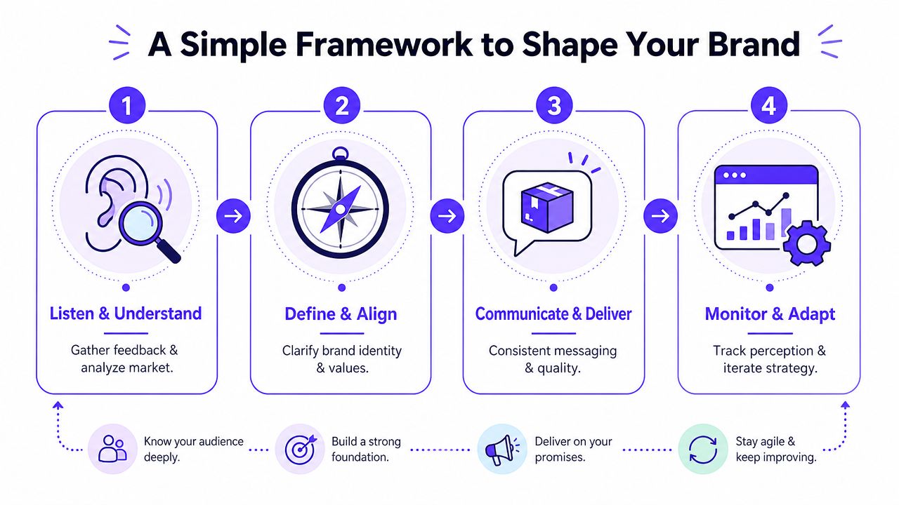
Step 1, audit every signal people can actually see
Start with what's live, not what's in Figma or the strategy deck.
Review the full path a prospect or user touches:
Homepage and landing pages, what does the company claim?
Product onboarding, does the first experience confirm that claim?
Core UI patterns, is the system disciplined or inconsistent?
Sales materials and docs, do they sound like the same company?
Support and lifecycle emails, are they clear, useful, and aligned?
This audit usually reveals contradiction. A startup says “simple,” but the product requires too many setup decisions. It says “secure,” but the site uses playful language at the wrong moment. It says “built for teams,” but permissions and collaboration are weak.
Step 2, choose one perception to own
Don't try to be trusted, premium, simple, enterprise-ready, and community-led all at once. Pick the core perception that matters most for your current market.
For example:
A seed-stage AI tool might need to feel clear and useful, not magical.
A Web3 product might need to feel legible and safe, not hyped.
A Fintech platform might need to feel controlled and dependable, not flashy.
Decision test: if a stranger used your product for ten minutes, what's the single conclusion you want them to leave with?
Step 3, make design and product changes that prove it
Teams frequently either do real work or drift into branding theater.
If you want to be seen as trustworthy, remove ambiguity from pricing, simplify navigation, tighten form states, improve docs, and rewrite transactional emails. If you want to be seen as premium, increase visual discipline, reduce UI noise, and make every interaction feel intentional.
In practice, this often means updating both brand and product at the same time. Some teams handle that with an in-house mix of design and frontend. Others use a partner such as 925 Studios for brand, product design, and frontend execution when they need one team covering identity, UI, and shipped implementation.
A short walkthrough on brand thinking can help here:
Step 4, check for movement and repeat
Don't judge the work by internal approval. Judge it by whether the language people use about you starts to shift.
Look for movement in:
Association words, are customers using the intended language more often?
Conversion friction, are fewer prospects getting stuck on trust questions?
Support themes, are the same credibility complaints fading?
Sales feedback, are buyers responding to the new framing without extra explanation?
The framework is simple on purpose. Perception improves when every visible part of the company points in the same direction.
Brand Perception in Action for Tech Startups
The easiest way to understand the perception of brands is to look at how specific product choices create specific conclusions.
Take a product like Linear. It's often discussed because the interface feels exact. Tight spacing, fast performance, restrained visuals, and strong interaction details create a sense of craftsmanship. Even before someone uses every feature, the product signals that the team cares about precision.
Mercury creates a different impression. The product and website feel calm, clean, and easy to follow. In a financial context, that kind of restraint matters. Simplicity becomes a trust signal.
The same product can read differently to different buyers
Differing perceptions often trip up founders. A feature that an early adopter reads as ambitious can look unstable to an enterprise buyer. A bold visual identity that feels modern to a crypto-native user can feel unserious to a CFO.
Research on brands as socially perceived agents explains why. People interpret brands in context, much like they interpret people, which makes perception dependent on audience and setting, as discussed in this research article on social perception and brands.
That has direct design implications.
Audience | What they may value | Design implication |
|---|---|---|
Early adopters | Novelty, speed, experimentation | Show what's new without making the product feel chaotic |
Enterprise buyers | Reliability, clarity, governance | Make permissions, workflows, and documentation feel mature |
Mainstream users | Ease, safety, predictability | Reduce jargon and explain outcomes in plain language |
What this means for AI SaaS, Web3, and Fintech
In AI SaaS, a flashy interface can create excitement but also trigger doubt if the output isn't interpretable. In Web3, highly stylized branding can attract insiders while pushing away users who already see the category as risky. In Fintech, over-designed marketing can backfire if the account experience doesn't feel stable.
The right brand expression is the one your buyer reads as credible, not the one your team finds most exciting.
Good founders design for the audience they need to win now, then widen the system later.
Your First Steps to Building a Better Brand
If you want to improve brand perception, don't start with a rebrand deck. Start with the surfaces customers already touch.
Three moves worth making this week
Review your homepage for clarity: ask one simple question, can a qualified buyer tell what you do, who it's for, and why it matters within a few seconds?
Walk through onboarding like a new user: note every moment where the product creates uncertainty, especially around setup, permissions, or missing context.
Write down three words you want associated with your company: then compare those words against your current UI, site, docs, and support tone.
The gaps will show up fast.
Build proof, not just polish
If your desired perception is “secure,” your trust signals need to be visible in product and content. If it's “simple,” remove friction before you refresh the visual identity. If it's “expert,” publish useful material that teaches, not just promotes. For some teams, educational media can help reinforce credibility over time, especially in technical categories. This breakdown of podcast content for technology firms is a good example of how content format shapes perception when buyers are still evaluating your category knowledge.
A design system also helps because consistency is easier when rules exist. If your brand and product keep drifting apart, this guide on what a design system is and why startups need one is a useful next step.
The main point is simple. Buyers judge the company you've shipped, not the company you intend to become.
If your brand, product UI, and frontend don't tell the same story yet, 925 studios is one option to close that gap. We work with AI SaaS, Web3, and Fintech teams that need one creative partner across brand design, product design, and frontend, so the perception customers get matches the quality you're building.

Let’s keep in touch.
Discover more about high-performance web design. Follow us on Twitter and Instagram.
