
Modern User Interface Design for 2026's Founders

Yusuf
Founder and lead designer at 925studios

A lot of modern UI advice is backwards. It starts with how things look, when founders should start with what users need to trust, understand, and do next.
That matters even more now because the category itself has become a real business function, not a finishing touch. The global UI design market is projected to grow from USD 3.21 billion in 2026 to USD 11.31 billion by 2035, at a 15.01% CAGR, a clear sign that companies now treat user-centric design as operational infrastructure, especially in AI SaaS and Fintech. A polished interface doesn't just make a product look current. It tells users your product is credible, your team is careful, and the experience won't waste their time.
For founders, that's the fundamental frame for modern user interface design. It's not a style exercise. It's how complex products become usable, how risky products become trustworthy, and how new products earn enough confidence to get a second session.
Table of Contents
Why Modern UI Is More Than Just a Pretty Face
Founders usually feel the cost of weak UI before they can name it. Demo calls get awkward. Users hesitate before clicking. A product with strong underlying tech still feels unfinished.
That happens because UI is the visible layer of product judgment. Users can't inspect your architecture, your model quality, or your internal workflows in the first few minutes. They judge what they can see. If the dashboard feels messy, if actions are hard to predict, or if key moments feel unpolished, they assume the rest of the product is handled with the same level of care.
The interface is your proof of competence
In AI SaaS, Web3, and Fintech, the interface has to translate complexity into confidence. A founder might know a workflow is secure or a model is accurate enough for a given task. The user doesn't know that yet. The interface has to make that legible.
A good UI does three business jobs at once:
It shortens the learning curve, so users reach value faster.
It reduces hesitation, which improves conversion at sign-up, onboarding, and upgrade moments.
It signals reliability, which matters most when people are trusting you with money, data, or automation.
Practical rule: If a screen makes users stop and decode the product, the UI is working against revenue.
This is why modern user interface design has moved out of the “nice to have” bucket. Founders are no longer buying decoration. They're buying clarity, trust, and a smoother path to product adoption.
Good UI connects product and brand
The strongest products don't separate interface design from brand perception. Users experience both at once. The tone of your copy, the sharpness of your layout, the quality of your forms, and the consistency of your components all add up to one judgment, this company knows what it's doing.
That's also why small teams increasingly look for one creative partner that can cover product design, brand design, and frontend development together. When those disciplines are split across too many people, the seams show. The marketing site promises one thing, the app delivers another, and trust drops in the gap.
Modern UI is the bridge between your technical product and the decision a user makes in seconds, stay, try, buy, or leave.
The Unchanging Principles of Good Interface Design
Trends come and go. The fundamentals don't.
The easiest way to judge an interface is to ignore the visual style for a minute and ask a simpler question. Can a new user understand what this product wants them to do, and can they do it without friction? If the answer is no, no gradient, glass effect, or animation will save it.
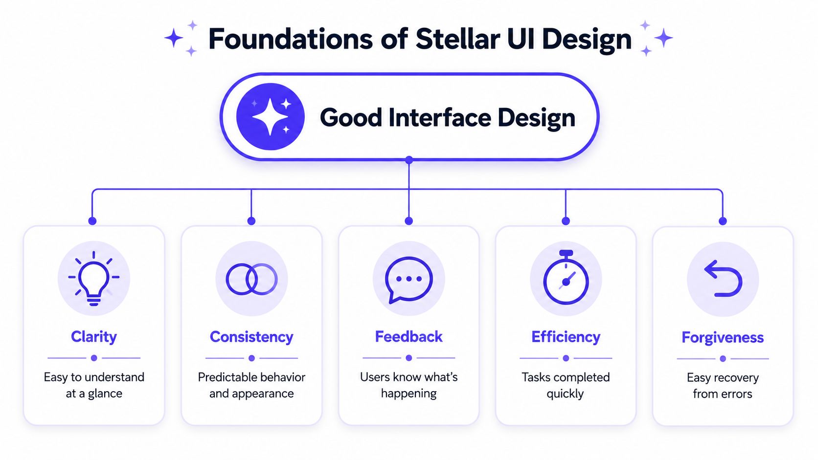
Clarity beats cleverness
A good interface is like a well-run storefront. You shouldn't have to ask where the checkout is, whether a door is locked, or what a sign means. The same rule applies in software.
If an icon needs explanation, it's too clever. If a settings page mixes billing, permissions, and notifications without a clear structure, users won't feel your product is powerful. They'll feel lost.
That's why simplicity performs. Minimalist UI designs that remove non-essential elements increase task completion speed by 34% and reduce user confusion errors by 52% in AI SaaS applications. The takeaway isn't “make everything bare.” It's “remove anything that doesn't help the user make a decision.”
Consistency lowers effort
Consistency sounds boring until you ship without it.
When buttons change color meaning from one screen to another, when tables behave differently across modules, or when a primary action moves around the page, users have to relearn your product every few clicks. That's expensive. It burns attention on navigation instead of task completion.
A founder can spot this quickly by checking a few basics:
UI element | Good pattern | Bad pattern |
|---|---|---|
Primary button | Same color and placement across product | Different style on each screen |
Form validation | Same message style and timing | Random error behavior |
Navigation labels | Plain language, stable wording | Different names for the same thing |
A modern interface should feel familiar after one screen, not after a training session.
Feedback keeps people moving
Every user action needs an answer. Click a button, upload a file, connect a wallet, trigger an AI task, save a setting. The product should respond clearly every time.
That response doesn't need to be flashy. It needs to be unmistakable. A loading state, a confirmation message, an error explanation, a visible status change. These details keep users oriented.
Feedback should answer three questions
Did the product register my action
What's happening now
What should I do next
The best interfaces also include forgiveness. Users will mistype, click the wrong thing, and change their minds. Undo flows, editable states, and clear recovery paths make the product feel safe. Safe products get used more confidently.
That's the core of modern user interface design. Not novelty. Predictability with enough personality to feel current.
Key Trends Shaping Interfaces Today
Most trend roundups turn design into fashion commentary. That's not useful for a founder deciding what to ship.
A trend only matters if it solves a product problem. Some visual styles help users understand hierarchy. Some interaction patterns reduce friction. Others just create noise and make a startup look like it borrowed someone else's taste without understanding the job.

Visual trends are tools, not strategy
Take glassmorphism. Used well, it can separate layers in a dense dashboard and help users understand what sits on top of what. Used badly, it turns a product into frosted decoration with weak contrast and fuzzy priorities.
The same goes for neumorphism. It can give controls a tactile feel, but it often weakens clarity if buttons don't read as buttons. In high-stakes products, that trade-off usually isn't worth it.
A better way to evaluate trends is this:
Use depth when it improves hierarchy, especially in dashboards and overlays.
Use motion when it confirms state change, not when it delays the task.
Use bold visual treatment to direct attention, not to fill empty space.
If you're validating an idea before writing custom frontend code, it can help to build your first app without code so you can test the interaction model before investing in a full design and engineering pass.
Interaction patterns matter more than decoration
The more important shift is how users move through products. Gestures and micro-interactions are no longer niche mobile details. They're part of mainstream interface behavior. Gesture-based interactions are used in 68% of new consumer apps, with users completing tasks 42% faster when allowed swipe-speed flexibility. In fintech, micro-interactions like pinching and dragging have increased user retention by 35% over static button layouts.
That data matters because it points to a broader truth. Users don't want to fight precision thresholds. They want interfaces that feel responsive to natural movement.
Here's where teams get it wrong. They copy the visual style of modern apps, but keep rigid, clunky interaction logic underneath. The result looks current in screenshots and feels dated in use.
A useful way to study this is to watch motion in context, not as a Dribbble clip but as product behavior in sequence.
What to borrow and what to skip
Borrow patterns that help users act faster. Skip anything that adds visual debt without improving comprehension.
Good use of micro-interactions makes filters feel alive, confirms drag-and-drop, and shows that a saved state was saved.
Bad use of micro-interactions turns every click into a tiny performance.
Good use of modern styling separates content types and supports hierarchy.
Bad use of modern styling hides affordances and weakens readability.
Modern user interface design isn't about looking ahead of the curve. It's about choosing the patterns that reduce friction for your specific product.
Designing for Trust in SaaS Web3 and Fintech
In consumer apps, a confusing screen is annoying. In Fintech, Web3, and serious SaaS, it can stop a transaction, trigger support, or kill the sale.
That's why trust is the main design job in high-stakes products. Users are often dealing with money, permissions, automation, risk, or irreversible actions. They need the interface to feel stable before they'll believe the underlying system is safe.
Trust starts with readable screens
When a dashboard tries to show everything at once, people don't read it as powerful. They read it as dangerous.
A useful benchmark comes from screen density research. To prevent cognitive overload, the overall density of a screen should not exceed 40%, while local density within grouped elements must not surpass 62%. Breaching these thresholds in data-heavy SaaS or fintech dashboards leads to a measurable decline in user retention and an increase in error rates.
That number matters because clutter doesn't only hurt usability. It changes user psychology. When people can't quickly tell what matters, they assume they might make a mistake. In a billing flow, trading screen, or admin panel, that hesitation is deadly.
What trust-oriented screens usually include
Clear hierarchy, so the main action stands out from supporting detail.
Visible status, so users know what's pending, completed, failed, or requires review.
Plain-language labels, especially around money movement, permissions, and risk.
Room to breathe, so critical data can be scanned instead of decoded.
If a user has to squint at a payment confirmation, the interface is asking for more trust than it has earned.
High-stakes products need explicit reassurance
Designing for trust also means showing your work. Don't hide important logic behind polished visuals. If an AI system flagged a transaction, say why in plain language. If a wallet action is pending, show what's happening. If consent matters for analytics or personalization, spell it out clearly and make the choice understandable.
For teams handling customer data, a practical primer on understanding consent for data teams helps align product behavior with what users agreed to. In regulated categories, that kind of clarity is part of the product experience, not just a legal checkbox.
The strongest Fintech interfaces also reduce blame in error states. “Something went wrong” is weak. “Your bank account couldn't be verified yet, try again or choose another method” is useful. Users stay calmer when the product gives them a path forward.
For a deeper look at how compliance and user confidence meet in product UX, this Fintech UX design and compliance trust guide is worth reading.
Trust doesn't come from polished shadows or premium type alone. It comes from an interface that helps people understand risk, recover from mistakes, and move forward with confidence.
A Practical Guide to Design Systems
A design system is the difference between a product that scales cleanly and a product that slowly turns into a patchwork.
The easiest analogy is a Lego kit. You don't rebuild the same brick every time you want to make something new. You use a shared set of tested parts, combine them in predictable ways, and keep the whole thing structurally sound as it grows.

Think Lego kit, not art file
Founders often assume a design system is a library of nice-looking buttons. That's only the surface layer.
A real system defines how the product behaves. It covers the basics, color, type, spacing, forms, cards, tables, modals, states, but it also defines usage rules. Which button is primary. How errors appear. What a loading state looks like. How permissions are shown. How a marketing page and app dashboard still feel like the same company.
A small team can punch above its weight. Instead of hiring and coordinating separate specialists for every piece, some teams use one partner that handles product design, brand design, and frontend implementation together. 925 Studios is one example of that model for AI SaaS, Web3, and Fintech teams.
What a startup design system should include
Not every startup needs a giant enterprise library. Most need a compact system with strong rules.
Core parts that matter early
Foundations
Color roles, typography scale, spacing rules, grid behavior, and icon style.Reusable components
Buttons, inputs, dropdowns, tables, navigation, banners, and modal patterns.State logic
Hover, active, disabled, loading, success, warning, and error states.Content rules
Button labels, form help text, empty states, and error copy patterns.
A design system pays off when a new screen feels native to the product before anyone debates what a button should look like.
A good system also helps engineering. Frontend developers can build faster when design decisions are already made and documented. Product teams avoid endless one-off fixes. Marketing and product stop drifting apart visually.
If you want to see how embedded systems support scaling teams, this breakdown of embedded design systems shows the operational side well.
Modern user interface design gets expensive when every screen is a fresh argument. A design system turns those arguments into decisions you've already settled.
The Workflow for Shipping Polished Interfaces
Most rough products don't fail because the team lacked effort. They fail because the handoff chain broke.
A founder explains the product one way. A designer interprets it another way. A developer implements a third version under deadline pressure. By launch, the product still works, but the original clarity is gone. The interface feels almost right, which is often worse than obviously unfinished.
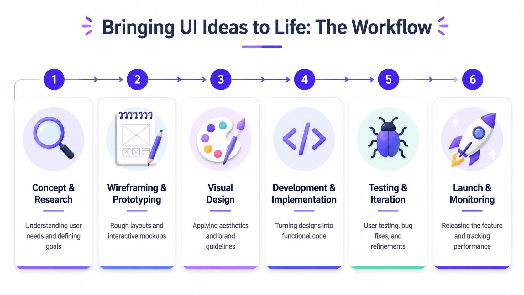
From rough idea to released feature
A polished feature usually starts with a narrow question, not a giant redesign. Maybe onboarding drops users at wallet connection. Maybe a reporting view is too hard to scan. Maybe the homepage says the right words but doesn't convert.
The workflow that works looks more like this:
Define the business goal
Are you trying to improve onboarding, upgrade conversion, trust, activation, or clarity?Reduce the user task
Strip the flow to the smallest useful path. What does the user need to decide right now?Map structure before visuals
Wireframes come first because layout solves logic before styling solves polish.Apply brand and UI rules At this point, the product starts feeling specific to your company, not generic SaaS software.
Build the frontend carefully
Spacing, motion, hover states, empty states, and responsive behavior matter more than founders expect.Review in the production environment Check the feature in production conditions, with actual data, odd edge cases, and slower devices.
Where founders usually lose quality
The biggest quality drop usually happens after design approval. Teams sign off on a polished mockup, then ship an approximation. A button feels slightly off. Form spacing collapses. States are missing. Error messages come from default browser behavior. Trust erodes one small crack at a time.
That's why an integrated process matters. Design and code shouldn't be separate interpretations of the same idea. They should be one continuous workflow.
A useful reference for the end-to-end sequence is this guide to the web page design process. It mirrors how strong product teams keep strategy, UI, and implementation aligned.
If your product has a content-heavy marketing layer on WordPress, it also helps to optimize WordPress site performance so the frontend quality doesn't get undercut by slow page delivery. Good interface work loses impact when the page feels sluggish before the first interaction.
Ship the smallest polished thing. Users forgive limited scope faster than they forgive sloppy execution.
The workflow behind modern user interface design isn't mysterious. It's disciplined. The teams that keep strategy, interface, brand, and frontend close together usually ship products that feel sharper because fewer ideas get lost between steps.
Future Proofing Your UI Beyond the Screen
The biggest shift in interface design isn't visual. It's that the interface is starting to disappear.
AI products increasingly complete tasks on the user's behalf. That breaks the old mental model where good UI meant arranging buttons, forms, and screens more elegantly. When an agent drafts, sorts, routes, decides, or executes in the background, the main design problem changes. The question becomes, how does the user know what the system is doing, why it did it, and whether they should trust it?
When the interface disappears
This isn't theoretical. Emerging data shows AI agents now execute 65% of user tasks without rendering a traditional interface. However, 78% of technical leaders in Fintech report user confusion when AI executes tasks without visual confirmation.
That gap explains why so much “modern UI” advice already feels dated. A lot of it still obsesses over flatter buttons and visual style. Meanwhile, founders are shipping products where the most important interaction isn't click, tap, or swipe. It's intent.
Design the policy surface
When AI takes action, the user still needs a surface for trust. Not always a screen full of controls, but a clear operating model.
That means designing things like:
Permission boundaries, what the agent can do on its own and what needs approval.
Confidence signals, whether the system is certain, uncertain, or waiting for review.
Action history, so users can inspect what happened and reverse it when needed.
Escalation paths, so a human can step in when the task is ambiguous or high risk.
In other words, founders need to design the policy surface. The rules, confirmations, logs, and guardrails that make invisible behavior legible.
Modern user interface design is moving toward this: Less screen decoration. More intent management. More trust architecture. More operational clarity around systems that act before users click.
The teams that understand this early will build products that feel safer and easier to adopt, even when the interface is barely visible.
If your team needs one creative partner that covers product design, brand design, and frontend development for AI SaaS, Web3, or Fintech, 925 studios helps turn complex products into polished, conversion-focused interfaces that are ready to ship.


Let’s keep in touch.
Discover more about high-performance web design. Follow us on Twitter and Instagram.

