
What Is Visual Hierarchy? a Founder's Guide to Better UI

Yusuf
Founder and lead designer at 925studios

Visual hierarchy is the art of arranging interface elements to show users what's most important and guide them to a specific action. It's not about aesthetics, it's a functional tool that uses size, color, and spacing to influence user behavior, and layouts with clear hierarchical flow can increase click-through rates by an average of 27%.
You've probably seen the problem already. Your team ships a powerful product, users land on the screen, and instead of moving forward they hesitate. The product isn't weak. The interface is asking them to process too many things at once.
Founders usually describe this as “busy,” “messy,” or “not intuitive.” What they're reacting to is a hierarchy problem. The screen doesn't tell users where to look first, what matters most, or what action comes next. When that happens, good features get buried under bad presentation.
Table of Contents
What Is Visual Hierarchy and Why It Matters for Your Product
If a user opens your product and asks, “Where do I start?”, your hierarchy has already failed.
What is visual hierarchy? It's the system that tells users what to notice first, what to read next, and what to do after that. In product terms, it's the difference between a dashboard that feels obvious and one that feels like homework. It isn't decoration. It's the mechanism that turns a screen into a guided path.
For founders, that matters because software only creates value when users take the right action. A fintech homepage needs to push people toward account setup. A SaaS onboarding flow needs to surface the one next step that gets a team to activation. A Web3 wallet interface needs to make balances, approvals, and risk signals clear at a glance. If every element on the screen fights for equal attention, users stall.
A good screen answers three questions fast
Strong hierarchy makes a screen useful because it answers these questions immediately:
What matters most right now, such as the balance, alert, primary CTA, or next onboarding step.
What supports that decision, like context, subtext, proof, or status details.
What can wait, including tertiary links, secondary actions, and nice-to-have settings.
That's why visual hierarchy belongs in product strategy, not just design review. When teams treat it seriously, the interface starts doing actual work. It reduces explanation, lowers friction, and helps users act with less effort.
Practical rule: If a founder has to explain where to click on a screen, the screen isn't finished.
This is also why process matters. Teams that structure decisions around user goals, content priority, and layout usually ship clearer products than teams that jump straight into polished mockups. If you want a cleaner way to think about that, this guide to the web page design process is useful because it ties design decisions back to outcomes instead of surface polish.
Founders should treat hierarchy as a growth lever
When people call a product “easy to use,” they're often describing a design that ranked information well. The best interfaces don't show everything with equal force. They make deliberate choices. They push the important thing forward, keep supporting detail available, and remove visual competition around the action that drives the business.
That's what visual hierarchy does. It tells users, subtly and instantly, what to care about.
The Unseen Principles That Guide a User's Eye
Designers don't guide attention by guessing. They use a small set of reliable visual signals, and those signals work because the brain already looks for order.
Your brain wants structure
Visual hierarchy is rooted in Gestalt psychology, the idea that people naturally organize separate elements into a coherent whole. In plain English, users don't inspect every pixel one by one. They scan, group, compare, and rank. That's why size, contrast, spacing, and placement influence attention so quickly. The principle is explained well in this overview of Gestalt-based visual hierarchy.
That's the answer behind why some screens feel obvious. The layout is doing the sorting before the user even starts reading.
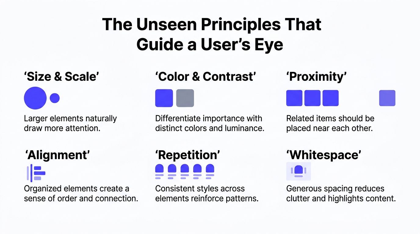
The six tools that actually shape attention
Here's the toolkit. If you understand these six levers, you understand most of what's happening on a strong product screen.
Size and scale
Bigger elements feel more important. A large balance number, bold headline, or oversized primary button gets noticed before supporting text. Users read significance from scale before they read words.Color and contrast
Contrast creates emphasis. If everything is muted except one saturated button, that button becomes the decision point. Good products use this selectively. If five things are bright, nothing is.Proximity
Elements placed near each other feel related. Put a label, number, and trend indicator in one tight group, and users read them as one unit. Scatter them, and users have to work to reconstruct meaning.Alignment
Clean alignment makes a screen feel intentional. More important, it creates scanning paths. Misaligned cards, labels, and buttons slow people down because the eye has to keep reorienting.Repetition
Repeated styles teach the interface. If primary buttons always look the same, users learn what action to trust. If card layouts repeat consistently, users can scan faster.Whitespace
Empty space is not wasted space. It separates groups, lowers clutter, and gives the important thing enough room to stand out.
A larger button looks more important because the brain reads visual weight before it reads instructions.
There's also a simple pattern many teams ignore. Hierarchy works best when a screen has a clear order, not ten competing priorities. That means one focal point, one layer of supporting detail, and one quieter layer beneath that. Not every screen needs to be dramatic. It needs to be legible.
A common founder mistake is trying to “make everything visible.” That usually creates the opposite effect. The user sees all of it, understands none of it, and delays action.
Here's the better approach:
Principle | What it should do on a product screen | Common mistake |
|---|---|---|
Scale | Set the starting point for attention | Making every heading large |
Contrast | Pull focus to the intended action | Using accent color everywhere |
Proximity | Show what belongs together | Spacing related content too far apart |
Alignment | Create an easy scan path | Letting cards and text float inconsistently |
Repetition | Build predictable interaction patterns | Styling similar actions differently |
Whitespace | Reduce noise and isolate importance | Filling every gap with more content |
If you want users to move with confidence, these principles aren't optional. They're the control system.
Visual Hierarchy in Modern SaaS and Fintech Products
The fastest way to understand hierarchy is to look at products that already get it right.
Mercury gets the priority right
Mercury is a useful fintech example because the product has to balance trust, clarity, and action. People open a banking product with a simple question in mind. What's my money doing? If the interface hides the answer behind decorative cards, side quests, or noisy navigation, trust drops fast.
This kind of layout works because users usually look to the largest element first. In digital UX, layouts optimized for clear hierarchical flow increase click-through rates by an average of 27%, and eye-tracking heatmaps show that 70% of users first attend to the largest visual element on a page, according to Sessions' visual hierarchy notes.
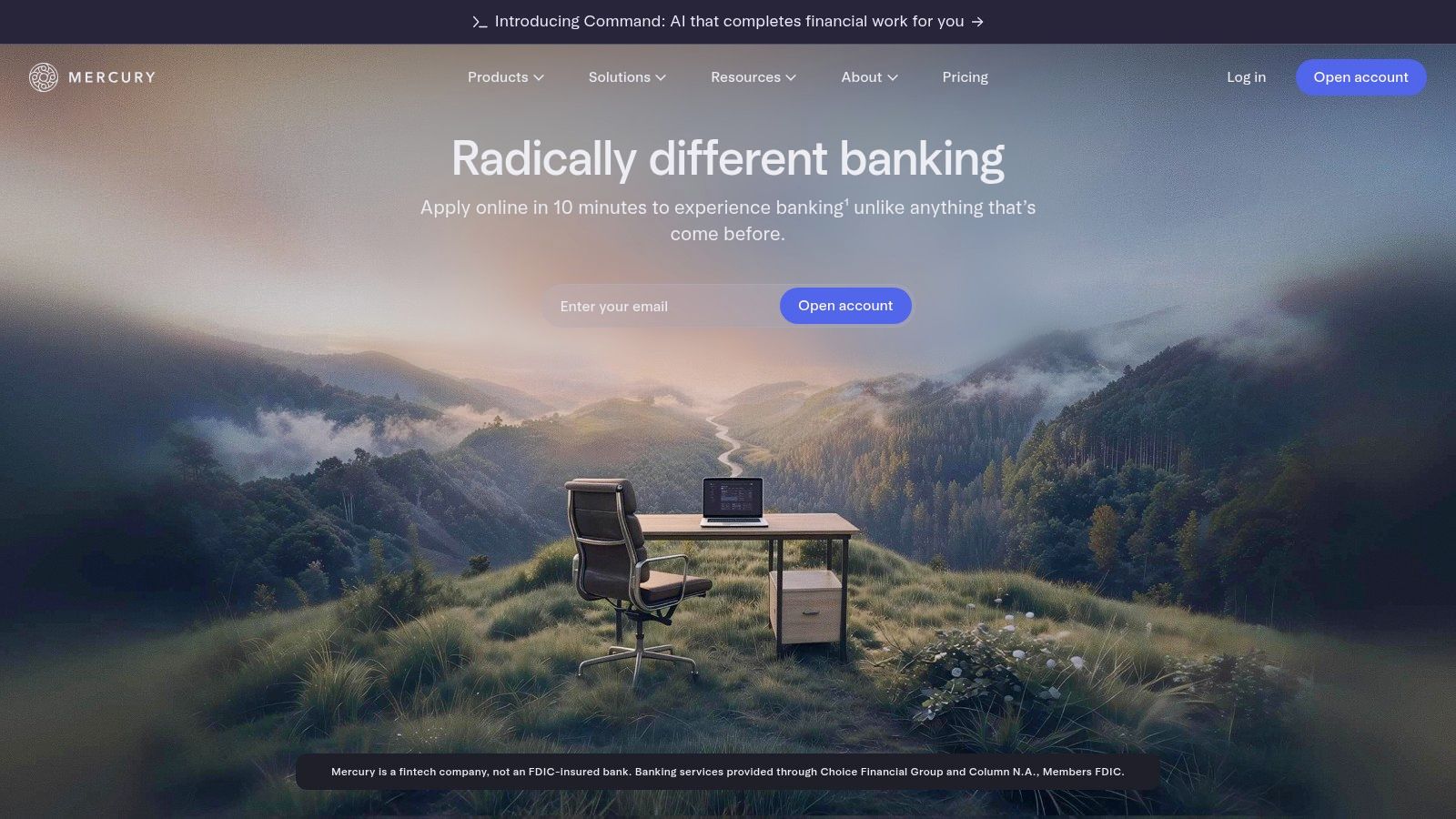
On a product like Mercury, the hierarchy should put the cash balance or highest-value account data at the top of the visual stack. Supporting actions like transfer, account details, or card management can sit beneath it. That order matters. The interface first confirms stability, then offers movement.
A lot of fintech teams get this backwards. They push promotional widgets, feature announcements, and tertiary navigation into high-visibility areas. That wastes premium attention on low-priority content.
Linear proves restraint is part of hierarchy
Linear solves a different problem. It's dense software used by people who move fast, and the interface earns trust by staying controlled. The product doesn't shout. It uses disciplined spacing, predictable alignment, and selective contrast so the important change stands out when it needs to.
That's what many AI SaaS products miss. They borrow dashboard patterns, add dense panels, and call it “power user UX.” But power users still need ranking. They just need it delivered with more precision.
A useful benchmark for teams building financial products is this set of fintech app design examples that build trust. The strongest products don't just look polished. They make the primary task obvious.
This breakdown helps show how hierarchy changes the feel of a product in motion:
What founders should take from Mercury and Linear is simple:
Lead with the core signal, whether that's cash position, task status, or system health.
Use visual emphasis sparingly, so alerts and actions keep their meaning.
Let layout carry meaning, instead of forcing users to read every label.
Protect trust with clarity, especially in fintech and operational software.
Good hierarchy doesn't just help users move. It tells them your product is under control.
Why Your Product's Context Changes the Rules
Most visual hierarchy advice is too generic to be useful. It acts like one set of rules applies equally to a marketing site, a mobile banking app, and a data-heavy desktop dashboard. That's wrong.
Desktop dashboards need organization first
In a dense AI SaaS or fintech dashboard, the main challenge usually isn't grabbing attention. It's organizing complexity. Users need to compare rows, parse metrics, spot anomalies, and move between layers of information without losing context. In that environment, alignment, proximity, and disciplined grouping do more work than oversized headlines.
A desktop analytics screen can't behave like a landing page. If every card tries to be the hero, the result is noise. The better move is to establish a stable structure, then reserve stronger emphasis for the few things that need interruption, like risk flags, outages, or unusual account activity.
On complex screens, hierarchy is less about shouting and more about sorting.

The medium itself starts dictating the rules. A 2024 study by Cardona at Figma notes that “the medium determines which principles are going to be the most useful in actual practice,” and highlights a 40% drop in user engagement when hierarchical principles are misaligned with device constraints.
Mobile products need forceful focus
Mobile flips the priority. Space is scarce. Attention is narrower. Users are often completing one task quickly, not surveying a system. In that setting, scale becomes much more important. One balance, one CTA, one high-priority status message. That's the screen.
A focused fintech app on mobile should make the next move painfully obvious. Send money. Approve transfer. Verify identity. Continue setup. If users have to decode the interface, they'll either pause or abandon the flow.
That means founders should stop asking, “What are the visual hierarchy rules?” and start asking, “What does this screen need to do in this context?”
Here's a useful perspective:
Product context | Principle that should dominate | What that looks like |
|---|---|---|
Data-dense desktop dashboard | Proximity and alignment | Related metrics grouped tightly, clean table structure, stable scan paths |
Mobile fintech flow | Scale and contrast | One prominent balance or CTA, reduced competing elements |
SaaS onboarding screen | Sequence and spacing | Step order is obvious, supporting details stay secondary |
Marketing page | Hero emphasis and reading path | Headline, proof, CTA, then supporting content |
Founders building across desktop and mobile need adaptive hierarchy, not copied layouts. Reusing the same ranking system everywhere creates friction. The product may be consistent, but it won't be clear.
A Practical Checklist for Applying Visual Hierarchy
The easiest way to audit a screen is to stop asking whether it looks good and ask whether it has a clear order.
Visual hierarchy works best with exactly three distinct levels of visual weight, a primary focal point, a secondary detail, and a tertiary finisher, as explained in this guide to three levels of visual weight. That's simple enough for any founder or PM to use in review.
Audit every screen with three levels
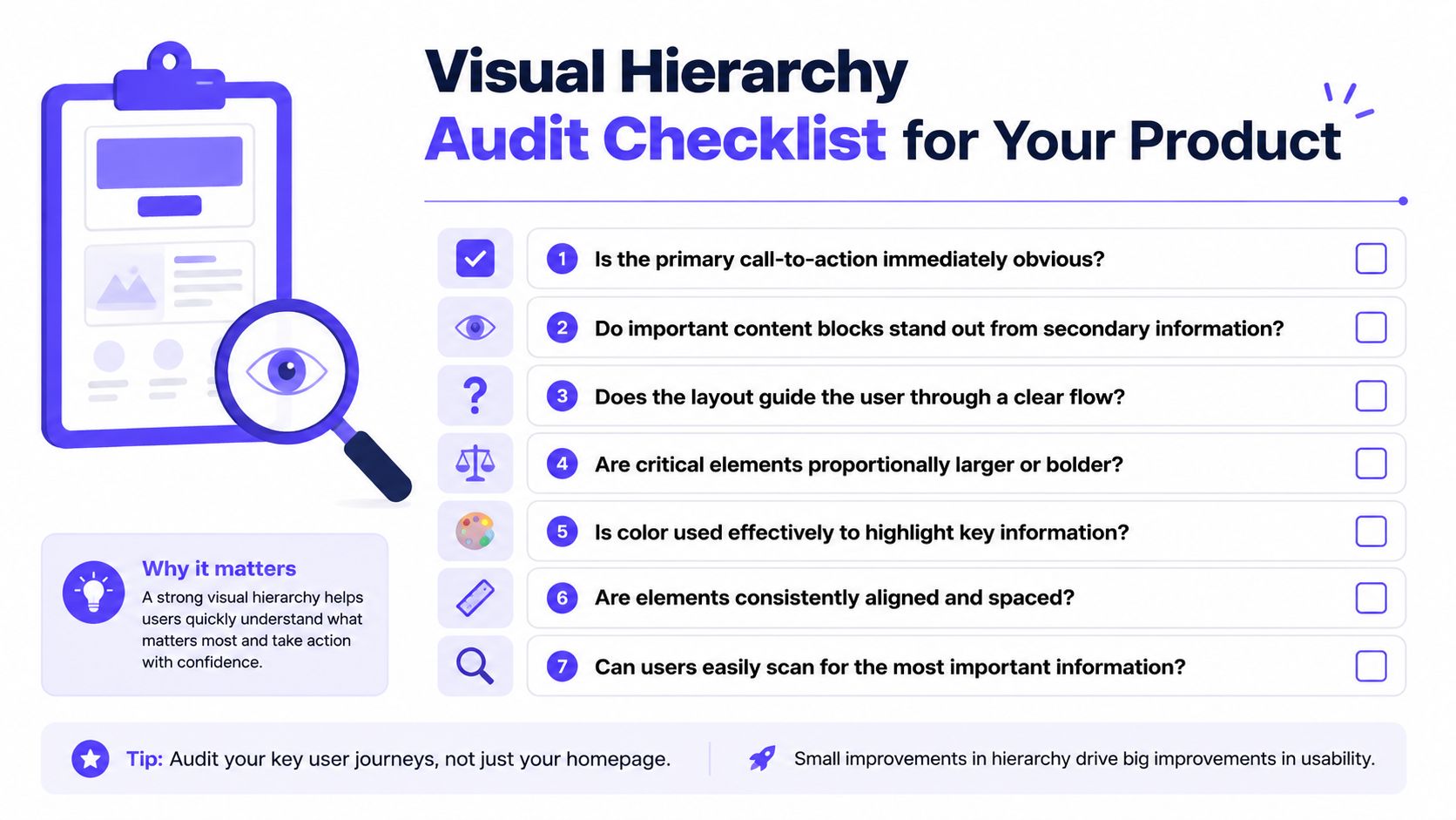
Start with the first thing the user should notice. If you can't name it in one sentence, the screen probably has too many goals.
Then move down the stack:
Primary focal point
What should the eye hit first? This could be a balance, a CTA, a headline, or a risk alert. It should be unmistakable.Secondary detail
What information helps the user evaluate the first thing? Think supporting copy, account context, feature explanation, or status data.Tertiary finisher
What belongs on the screen but shouldn't compete? Settings links, help text, filters, and lower-priority actions usually sit here.
Founder test: Blur the screen or squint at it. If three levels don't appear instantly, the hierarchy is weak.
What founders should flag immediately
Use this checklist in design review, sprint review, or even on a live product walkthrough.
Single starting point
Is there one obvious place for the eye to start, or are multiple elements competing for the same attention?Clear primary action
Can a user tell what to do next without reading the full screen?Grouped related information
Are labels, values, and controls visually grouped so they read as one unit?Visible interaction patterns
Do buttons, links, and inputs look consistent enough that users know what's clickable?Controlled emphasis
Are accent colors, bold text, and large type reserved for important elements?Scan-friendly layout
Can someone understand the screen by scanning, not studying?Quiet tertiary layer
Are lower-priority details present without stealing focus?
If you want to prototype these ideas quickly before committing engineering time, tools like Uizard for AI design can help teams test rough layout direction early. The point isn't to automate taste. It's to pressure-test flow before you ship.
For teams scaling across many screens, this becomes a systems issue, not a one-off design fix. A strong embedded design system makes hierarchy repeatable so every new screen doesn't become a fresh debate.
How to Measure the Business Impact of Good Hierarchy
If the only feedback after a redesign is “looks cleaner,” you haven't measured the right thing.
Measure attention before you measure opinion
Hierarchy changes where users look, how fast they understand the screen, and whether they hesitate before acting. That makes it measurable. One of the clearest ways to test it is to adjust scale around the primary element and watch how behavior changes.
Strategically increasing element size by 20–30% relative to surrounding text creates a stronger focal point, directs 70% of initial eye-tracking attention to headlines, and can reduce decision latency by up to 40% in interface navigation tasks, according to Toptal's visual hierarchy infographic summary.
That gives you a straightforward testing model. Change one visual variable tied to hierarchy, then measure whether users find and act on the intended element faster.
Better hierarchy should reduce hesitation. If users still hunt around the screen, the design change didn't solve the real problem.
If you need a practical way to validate where attention is going, this guide on how to unlock user insights with heat maps is a solid starting point. Heat maps won't tell you everything, but they'll show whether your intended focal point is getting seen.
Tie design changes to business actions
The best metrics depend on the screen:
For onboarding flows, track whether users complete the next step faster and with fewer drop-offs.
For dashboards, track time to find a key metric or complete a routine task.
For fintech actions, track whether users notice and use the intended transfer, approval, or verification path.
For marketing pages, track clicks on the primary CTA, not just page engagement.
You don't need a giant research program to do this well. Start with a before-and-after comparison. Record task completion. Watch a few sessions. Look at click concentration. Ask where users hesitated. Then compare the behavior to the visual decisions you changed.
That's how hierarchy becomes a business discussion. Not “Does this look premium?” but “Did users reach the intended action faster, with less confusion?”
Conclusion From Abstract Concept to Shipped Product
Visual hierarchy isn't a design flourish. It's how a product tells users what matters, what belongs together, and what to do next.
That matters even more in AI SaaS, Web3, and fintech, where products often carry more complexity than the average app. Users are judging balances, permissions, workflows, models, automations, and risk. They don't need more visual stimulation. They need order.
The strongest teams treat hierarchy as part of product strategy. They define the primary action, rank supporting information, adapt the system to the medium, and measure whether users move with confidence. That's how an interface stops being a collection of components and starts acting like a product.
If you remember one thing, remember this. Users don't experience your roadmap. They experience the screen in front of them. If that screen doesn't establish priority instantly, the rest of the product has to work harder than it should.
If your product is powerful but the interface still feels harder to use than it should, 925 Studios helps fix that. We're one creative partner that replaces three hires, a product designer, a brand designer, and a frontend developer, so founders can ship clearer product UX, stronger brand, and polished frontend without building a full in-house team.


Let’s keep in touch.
Discover more about high-performance web design. Follow us on Twitter and Instagram.

