
What Is Creative Strategy: AI, Web3 & Fintech Guide

Yusuf
Founder and lead designer at 925studios

You're probably dealing with some version of this right now. Product says the homepage needs to explain the platform better. Marketing wants sharper messaging for launch. Design is polishing screens. Engineering is asking what needs to ship this sprint. Everyone is busy, but the work still feels loosely connected.
That's usually not a design problem. It's a strategy problem.
For startups, creative strategy is what keeps brand, product, and growth from pulling in different directions. It tells you what story you're telling, who it's for, what the user needs to understand, and how that should show up in the product, the website, the onboarding flow, and the campaign that brings people in. If you're building an AI SaaS product, a Web3 platform, or a fintech tool, that alignment matters because complexity punishes vague thinking fast.
Table of Contents
What Creative Strategy Is and What It Is Not
Creative strategy is the reason behind the work before the work exists. It's the blueprint that connects a business goal to the words, visuals, screens, flows, and campaigns a team creates. If you want the simple answer to what is creative strategy, it's this: a practical plan for how your company will communicate in a way that helps the business move.
According to this definition of the creative strategy role, creative strategy is the systematic framework that transforms consumer insights and market data into high-converting creative outputs, directly bridging the gap between brand vision and measurable business goals. That matters because founders don't need more disconnected assets. They need decisions that tie back to conversion, trust, activation, and retention.

What founders usually mistake it for
Creative strategy is not a style guide. A style guide helps you stay visually consistent. Useful, but limited. It doesn't tell you why your homepage should lead with trust, speed to value, or compliance clarity.
It's also not a list of ad ideas. Ads are outputs. Strategy decides which claims are worth making, which proof points matter, and which audience tension you're solving.
And it's definitely not a fluffy brand exercise. If the work can't affect a product page, onboarding sequence, sales narrative, or launch plan, it isn't strategy. It's decoration.
Practical rule: If a decision can't be traced to a business objective, it's not strategy yet.
What it does in real startup work
Its function is similar to an architect's plan. Stripe didn't become clear and credible because someone picked a nice shade of blue. The clarity comes from a point of view that carries through product copy, docs, navigation, motion, and sales materials. Linear works for a similar reason. The product, site, and language all reinforce the same promise, precision without noise.
A solid strategy document does a few things well:
Clarifies the objective, whether that's improving signup conversion, increasing brand recall, or making a new category easier to understand.
Defines the audience, not just by job title, but by what they distrust, what they need to believe, and what would make them switch.
Guides execution, so design, content, and frontend build toward the same outcome.
Prevents waste, because fewer rounds get spent debating subjective preferences.
When startups skip this step, they usually end up redesigning the same problem three times. The homepage gets rewritten, onboarding gets patched, ads get refreshed, and none of it lands because the company never decided what it wanted users to understand in the first place.
The Five Core Components of a Creative Strategy
A strong strategy isn't mysterious. It has parts. If you break it down, most startup teams can spot what's missing quickly.
A useful blueprint should connect audience insight to business priorities before production starts, and it should be specific enough that every headline, visual choice, and channel decision serves a defined goal. That's the discipline behind using the SMART framework in strategy work, as outlined in the verified guidance above.
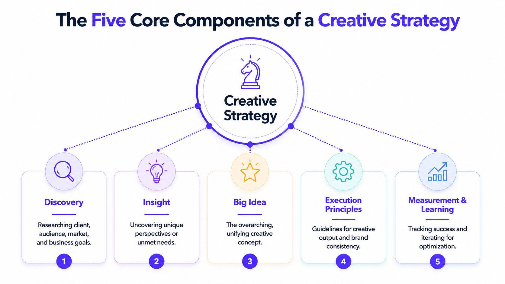
If you're trying to build one from scratch, these are the five components that matter most.
Audience insight
Teams often remain too superficial. “Fintech operators” or “startup founders” isn't an insight. It's a label.
What matters is what that audience is trying to avoid, what they're skeptical of, and how they prefer to learn. Developer audiences often reject glossy language and respond better to product-led proof, tight UI, and documentation-style clarity. That's why some of the strongest SaaS sites feel more like product interfaces than ad campaigns.
Example: if your AI product targets ops teams, the insight might be that they don't want “AI magic.” They want auditability, control, and fast setup.
Brand positioning
Positioning is your place in the market, in plain English. Not “platform for the future of finance.” More like, “the fastest way for finance teams to reconcile fragmented payment data without manual cleanup.” Clear beats impressive.
For a good example of how design choices reinforce positioning, this breakdown of design for branding is useful because it shows how visual and product decisions support a business narrative instead of sitting beside it.
Core messaging
Messaging turns positioning into language people can understand in seconds. Founders often over-explain here. Strong messaging is selective. It chooses one main belief you want the audience to leave with.
A simple way to pressure test it:
Question | Weak answer | Stronger answer |
|---|---|---|
What do you do? | AI for workflows | Automate repetitive support triage with reviewable AI actions |
Why should users care? | Save time | Cut manual queue handling and give teams control over edge cases |
Why trust you? | Advanced models | Clear review steps, visible logic, and stable product behavior |
The creative brief
The brief is where strategy becomes operational. It should tell the team what they're making, for whom, why now, what success looks like, and what constraints matter. Without this, founders end up reviewing design files and reacting to taste.
A good brief makes fewer opinions matter.
For a SaaS launch, that might mean: target compliance leads at fintech startups, explain the product in under a minute, prioritize trust over novelty, and make the demo request flow feel low risk.
Channel strategy
The same idea shouldn't look identical everywhere. It should stay consistent while adapting to context. Figma can be crisp and product-centric on its website, more educational in community content, and more workflow-focused inside the product itself.
A simple example:
Homepage: Lead with the category problem and product proof.
Onboarding: Reduce cognitive load, use plain labels, and confirm value early.
Paid social: Focus on a sharp pain point, not full product education.
Sales deck: Show business logic, objections, and implementation confidence.
The mistake isn't inconsistency. The mistake is saying the same vague thing everywhere.
A Simple Framework for Your First Creative Strategy
You don't need a giant deck to start. Most early-stage teams need a one-page document that creates alignment fast.
The simplest version of what is creative strategy comes down to four decisions: who you're talking to, what you need them to understand, why it matters to the business, and how that message should show up in execution. That structure comes from Motion's explanation of a creative strategy statement.
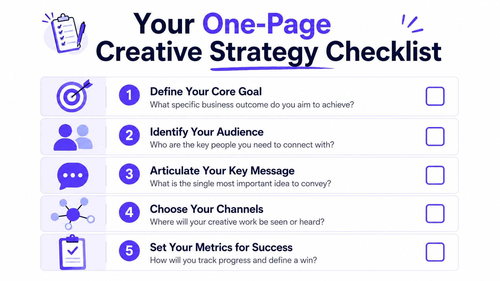
Your one page document
Keep it brutally short. If the document is bloated, the team won't use it.
Include these five lines:
Core goal
What business outcome matters right now? More qualified demos, better onboarding completion, stronger trust on the homepage, cleaner launch positioning.Audience
Who is the one person this work needs to move? Not everyone. One decision-maker or user type.Main message
What's the one thing they should believe after seeing this?Proof
What will make that believable? Product UI, workflow examples, customer language, clear process, transparent pricing, or implementation detail.Execution rules
How should this feel in practice? Direct, technical, calm, premium, transparent, low-friction.
What a founder should write down
Here's a practical set of prompts that works well for startups:
Who are we really speaking to?
“Head of Operations at a fintech startup” is better than “B2B buyers.” Better still is naming what they're anxious about.What problem do they need solved first?
Not your full roadmap. The first painful thing.What do we want them to believe?
One belief, not five. For example, “This product makes a complex workflow feel manageable.”How will we prove it quickly?
A clean dashboard screenshot. A short product walkthrough. A pricing model that feels legible. A setup flow that doesn't ask for too much upfront.What should we not do?
This part saves time. Don't use inflated AI language. Don't hide important trust details. Don't make the UI feel denser than the problem already is.
A founder can build this in an afternoon. Then the team can use it to review landing pages, ad concepts, onboarding copy, sales materials, and product decisions against the same standard. If a choice doesn't support the one-page strategy, cut it.
Aligning Creative Strategy with Product and Growth
A founder ships a polished homepage, launches paid traffic, and sees visitors bounce when they hit the product. The problem usually is not design quality. It is that the promise in marketing, the logic in the UI, and the path to first value were built by different people with different assumptions.

Creative strategy matters here because it sets one clear story across acquisition, product, and retention. For a startup, that story should shape what users see in an ad, what they read on the landing page, what the onboarding asks them to do, and what the product proves in the first five minutes. If those pieces disagree, conversion drops and trust gets expensive to rebuild.
This is why early teams should treat creative strategy as a product and growth discipline. Stripe, Linear, and Figma all benefit from the same principle. Their message and product experience reinforce each other. The marketing sets an expectation. The UI confirms it quickly. That consistency improves signup quality, activation, and brand recall.
How strategy changes shipped product
If your strategy is to make complexity feel manageable for AI teams, that should show up in the product itself. Use plain labels. Show examples before asking for configuration. Explain what the model is doing and where a human stays in control. A cleaner message without those product choices will not fix drop-off.
If your strategy is trust for a fintech or crypto product, the interface has to carry that burden. Put permissions, approval steps, audit trails, and transaction status where users need them. Founders often want to lead with vision. Buyers in regulated or high-risk categories usually want proof first.
Teams that already have a roadmap should line this work up with product planning. A useful reference is this guide to product strategy for startups, especially if brand decisions and feature decisions are being made in separate tracks.
Here's a short example worth watching before going further:
Three startup examples
AI SaaS
Before alignment, the site promises intelligence and speed, but onboarding asks users to set up ten things before they see one useful result. People hesitate because they cannot tell what the product will do for them.
After alignment, the product leads with one concrete job. Triage support tickets. Draft summaries. Flag anomalies. The first screen shows a sample workflow, the model output is explained in plain language, and users get to a small win fast. That usually improves activation because the product delivers the same story the homepage sold.
Web3
Before alignment, the brand looks advanced but the product asks for trust too early. Wallet connection appears before context. Risk, verification, and control are hard to find.
After alignment, the experience is organized around confidence. Users can see what the protocol does, how actions are verified, what they control, and what happens next. The design can still feel ambitious. The structure just respects skepticism, which is what helps more users continue.
Fintech
Before alignment, the visual design is polished, but the language still creates tension. Finance teams do not abandon a flow because it lacks gradients. They abandon it when approval logic, transaction states, or compliance details feel vague.
After alignment, the interface becomes more specific. Labels read like something an operator would trust. Review steps are visible. Error states explain what to fix. The growth result is practical: better conversion from qualified traffic, fewer support tickets during onboarding, and stronger handoff from marketing to product.
Creative strategy shows up in shipped screens.
The same discipline applies to growth channels. If paid social is bringing in attention but weak-fit users, the issue may be the angle, not just the targeting. Teams trying to connect creative choices to revenue can borrow ideas from PostSyncer's ROI strategies, then use the same logic inside product flows: measure which message brings in better users, which onboarding path gets them to value, and which UI proof points reduce hesitation.
How to Measure the ROI of Creative Strategy
If you can't measure it, founders will treat it like overhead. That's the wrong frame. Creative strategy should be judged by business movement.
The most useful metrics are the ones tied directly to behavior and revenue. Verified guidance on creative strategy measurement points to conversion rates, cost per acquisition, and return on ad spend as core ways to evaluate whether the work is performing.
Track business outcomes, not pretty artifacts
A cleaner homepage matters if it improves understanding. A stronger onboarding flow matters if more users reach value. Better messaging matters if the right buyers convert at a healthier rate.
Use a simple mapping:
Homepage strategy maps to conversion rate on demo requests, signups, or activation starts.
Onboarding strategy maps to activation, completion of key setup steps, and support friction.
Brand clarity maps to sales-call quality, objection patterns, and branded recall in the market.
Paid creative strategy maps to CPA and ROAS, not just click-through curiosity.
For social and campaign teams, a practical reference is PostSyncer's ROI strategies, especially if you need a tighter way to connect content activity to business KPIs instead of vanity reporting.
A simple measurement stack
You don't need a complicated dashboard at first. You need consistency.
Area | What to measure | Why it matters |
|---|---|---|
Acquisition | Conversion rate, CPA | Shows whether messaging and creative are attracting the right users |
Product | Activation and early drop-off points | Reveals whether the product story survives first use |
Revenue | ROAS and sales quality | Connects creative choices to commercial outcomes |
Experience | Support themes and usability friction | Shows where messaging and interface still conflict |
If you're measuring design impact more broadly, this guide on how to measure UX design ROI for a startup is useful because it puts design decisions in the same business language leadership already uses.
The important part is feedback. Review results, identify which messages or screens moved the KPI, and update the strategy. Creative strategy isn't a one-time deck. It's a working system.
Next Steps How to Build Your Creative Strategy
Most founders have three realistic paths.
Three realistic paths
The DIY path works when the problem is still narrow. If you know your audience well, have direct customer conversations, and just need alignment, use the one-page framework and make decisions from there. This is enough for an early positioning reset, a landing page rewrite, or a cleaner onboarding pass.
The freelancer path works when the strategy is already clear and the execution need is specific. Maybe you need a motion designer, a copywriter, or a frontend developer to ship the work. That's useful when the brief is solid and the problem is already framed.
The partner path is the right call when the team is still defining the problem. That's where the best partnerships usually win. As noted in this perspective on stronger creative partnerships, the strongest outcomes happen when the creative partner helps define the problem before the brief is written and asks hard business questions early.
That matters a lot in AI SaaS, Web3, and fintech because the work rarely stays in one lane. The homepage affects conversion. The product narrative affects onboarding. The UI affects trust. The frontend implementation affects whether the experience ships as intended.
If your team is also scaling paid acquisition, tools that automate Meta ad campaigns can help with execution volume, but they won't replace the strategic thinking that decides what story is worth scaling in the first place.
For teams in that third category, one integrated partner is often simpler than stitching together separate hires. That's especially true when you need product design, brand design, and frontend development working from the same strategy instead of passing work across handoffs.
If your startup needs clearer positioning, sharper product UX, and shipped frontend that all tell the same story, 925 studios is built for that. We work with AI SaaS, Web3, and fintech teams as one creative partner across strategy, design, and build, so you can move from vague direction to a product and brand people understand.


Let’s keep in touch.
Discover more about high-performance web design. Follow us on Twitter and Instagram.

