
What Is Design System

Yusuf
Founder and lead designer at 925studios

Your product team ships fast, your brand deck keeps changing, and the same button seems to look different every time someone opens a new feature. One designer says the spacing is off, one developer asks which version to use, and your marketing lead just wants the dashboard to feel like the same company customers saw on the homepage. That's usually the moment founders start asking what a design system is, because the cost of “we'll fix it later” has started showing up in the product itself.
A design system is the thing that turns that chaos into a repeatable way of building. It gives your team one shared way to make screens, one shared way to name components, and one shared place to check what's approved. For a startup, that means less rework, fewer style arguments, and a cleaner path from idea to shipped product.
Table of Contents
Why a Design System Matters for Your Startup
A startup rarely gets inconsistent on purpose. It happens because each release is built under pressure, one screen at a time, by people solving local problems. A dashboard update lands with one button style, the onboarding flow uses another, and the marketing site still carries last quarter's colors. After a few cycles, the product feels stitched together instead of designed.
That's where a design system earns its keep. NN/g says design systems manage design at scale by reducing redundancy and creating a shared language and visual consistency across pages and channels, and that's exactly what founders need when product, brand, and engineering are all moving at once. The point isn't decoration, it's coordination.
A team can move quickly and still ship a fragmented product if each release invents its own rules.
For AI SaaS, Web3, and Fintech startups, that fragmentation hurts trust fast. Users notice when a primary action looks different on every page, when form feedback changes tone from screen to screen, or when a wallet flow feels unlike the rest of the app. In regulated categories especially, inconsistency reads like carelessness.
A design system gives your team a stable base. Designers stop redrawing the same controls. Developers stop guessing at spacing, states, and interaction details. Marketing gets a product experience that matches the promise on the website. And founders get fewer last-minute fixes that pull the team away from shipping.
If you're working with a partner that covers product design, brand, and frontend in one place, like 925 Studios, the design system becomes the glue between those three jobs. It keeps the product from drifting while the company is still finding its shape.
Understanding What a Design System Is
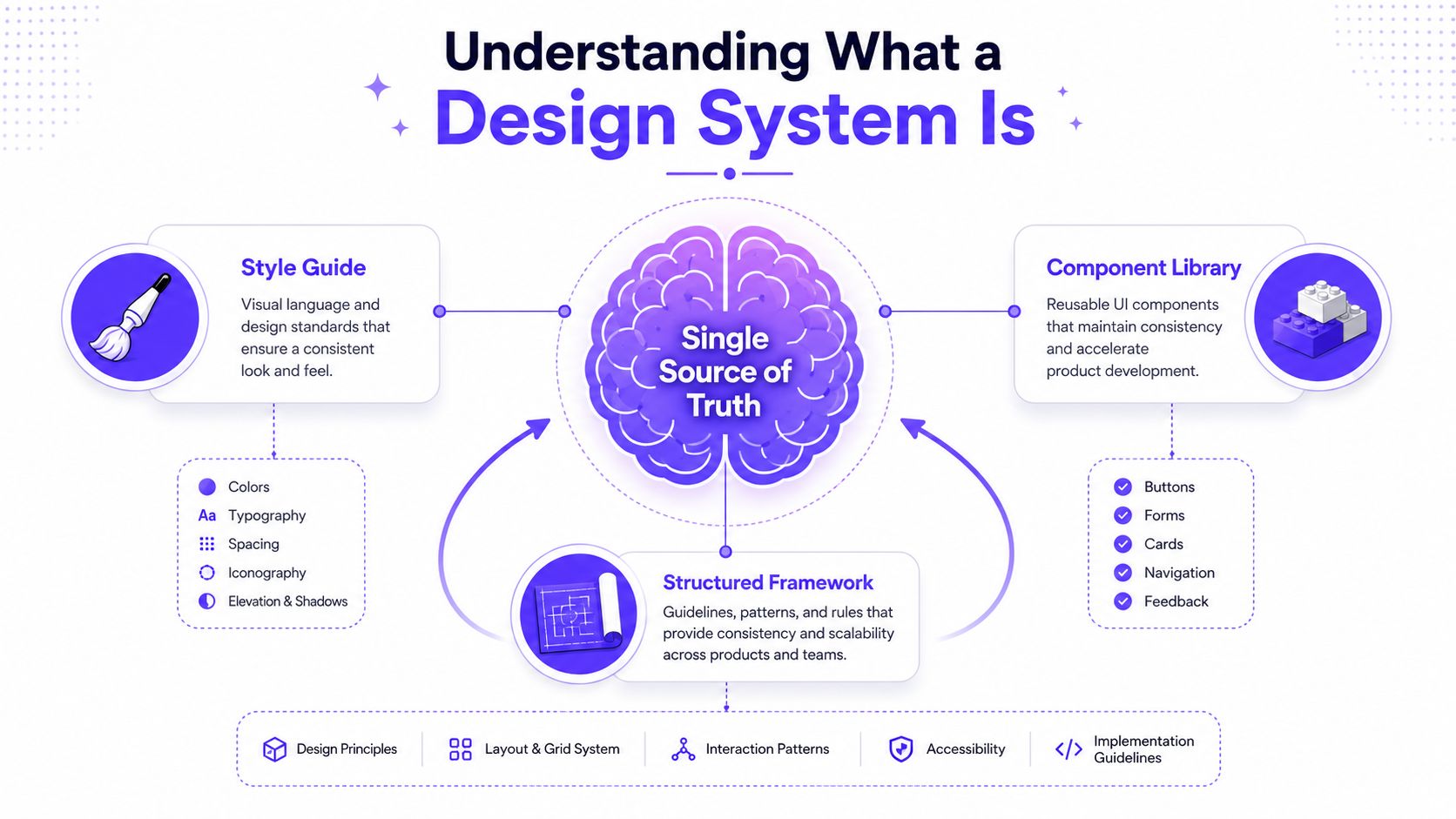
A design system is not the same thing as a style guide. Figma describes it as a set of building blocks and standards, NN/g calls it a complete set of standards for design at scale, and the Interaction Design Foundation frames it as reusable components plus principles and guidelines for efficiency and consistency. It's a single source of truth that helps design and development teams make the same choices without reinventing them every time.
It serves as a construction blueprint for your product. The blueprint doesn't just show what the final building should look like. It also defines the measurements, materials, and rules that keep every room aligned with the rest of the structure. In product work, that means your colors, typography, spacing, component behavior, and documentation all point to the same decisions.
What founders usually miss
Many teams start with a visual library and call it done. That works for a while, but it breaks once more people start shipping. A real design system includes the standards that govern how pieces fit together, not just the pieces themselves.
Practical rule: if your team can't tell when to use a component, how it behaves, or what to do when it breaks, you don't have a system yet, you have a folder.
For a Fintech product, that might mean one approved pattern for a balance card, one for risk warnings, and one for identity verification states. For an AI SaaS product, it might mean a consistent way to show loading states, empty states, and generated output. The value is not in having more UI parts, it's in having fewer decisions to argue about.
The benefit is simple. Everyone works from the same playbook, so the product feels coherent even when multiple teams touch it. That's what makes a design system worth building before the chaos gets expensive.
Breaking Down Core Components of a Design System
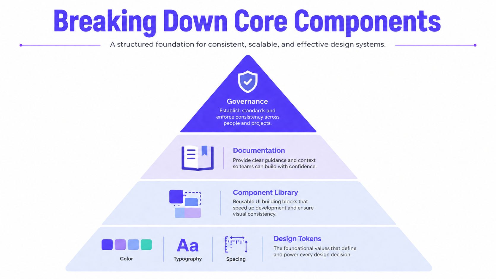
A design system usually has four connected layers. The base is design tokens, then the component library, then documentation, and finally governance. When one layer is weak, the others become harder to use and trust, much like a building that rests on an uneven foundation.
Start with tokens, not opinions
Design tokens are the shared values behind the UI, including color, typography, spacing, and sizing decisions. They turn personal preference into repeatable values, so teams are not debating every button, card, or alert from scratch. In a Fintech dashboard, that might mean the same alert color and spacing scale show up in account pages, admin views, and support tools.
Build components on top of those tokens
A component library is the reusable set of buttons, forms, cards, navigation patterns, and layouts your team relies on. NN/g notes that mature systems are usually paired with design specifications or component specs that spell out variants, edge cases, limits, and behavior so engineering can build with less ambiguity. That matters because a button is only clear when everyone agrees on hover, disabled, loading, and error states.
For a clear look at the building blocks themselves, this guide on design system components is a useful companion.
Document the rules, not just the visuals
Documentation is often the difference between a system that gets used and one that sits untouched. If your team is building a Web3 wallet, the docs need to explain how validation messages appear, what happens when an action fails, and how states change across devices. NN/g's guidance on creating design specs for development is worth reading if you want to see why detail matters here.
For teams exploring modular delivery patterns, WebinOne headless architecture is also a helpful resource because it shows how structured frontends and reusable parts can support consistency across surfaces.
Put governance around the system
Governance keeps the system from drifting. It decides who approves changes, how updates get made, and how the team avoids multiple versions of the same component. Without it, the library slowly turns into a junk drawer. With it, the system stays current enough to trust.
If you want a deeper implementation view, this internal resource on design system documentation is a practical next stop.
Benefits of a Design System for Startups
The first benefit is simple, less duplicated work. NN/g says the main practical value of a design system is reducing duplicated work while preserving consistency across pages, channels, and teams. That means your designer isn't remaking the same form states for every new feature, and your developer isn't rebuilding the same modal from scratch because the previous one was never documented well enough to reuse.
The second benefit is brand consistency. This matters more than founders often expect. In AI SaaS, the brand promise is usually clarity and confidence. In Fintech, it's trust. In Web3, it's credibility and control. If your product UI doesn't match those promises, users feel the mismatch even if they can't name it.
The third benefit is cleaner handoff. When components are documented and the rules are clear, design doesn't need to sit in every engineering decision. That lowers the amount of back-and-forth during build and QA, and it makes product work less dependent on one person remembering how a thing used to work.
The fourth benefit is easier collaboration across roles. Figma's guidance on metrics emphasizes tracking library and component usage, documentation effectiveness, and consistency measures like component detachment and style overrides to understand adoption and friction. That's a strong signal that the system is not just a design asset, it's an operating tool for the whole company.
For teams trying to tighten the engineering side of delivery, streamline your engineering with this guide is a good complement because it focuses on workflow discipline, which design systems depend on.
Founders usually feel the payoff first in fewer last-minute fixes, then in faster alignment, and only later in the deeper brand and process gains.
A startup doesn't need every possible feature to feel these benefits. It needs a stable core, a shared language, and a process that keeps the system usable as the product grows.
When to Invest in a Design System
The right time to invest is usually earlier than founders think, but not before there's a real pattern to solve. A design system becomes worth the effort when your team keeps rebuilding the same things, fixing the same mistakes, or debating the same interface rules. If every new feature forces a fresh set of visual choices, the company is already paying the tax.
Signals that the timing is right
Repeated inconsistencies: Buttons, inputs, alerts, and spacing rules keep changing between screens.
Growing team size: More designers, developers, and marketers are touching the product, so memory is no longer enough to keep things aligned.
Rising maintenance cost: Small UI fixes keep turning into repeated cleanup work.
Slower releases: Product sprints stall because people are waiting on clarification instead of building.
A quick audit can make this obvious. Count how many versions of the same component appear in your product. Look at style overrides in your design tool. Review how often engineers ask for confirmation on the same UI choices. Those are all signs that the product is running on habit, not shared structure.
For teams using embedded product teams or layered product architecture, this internal guide on embedded design systems can help you think through where the system needs to live inside the company, not just inside the file structure.
The mistake founders make is waiting until the product feels “big enough.” Size helps, but friction is the better trigger. Once the team spends more time correcting inconsistency than creating new value, the design system has already moved from nice-to-have to necessary.
Roadmap for Implementing a Design System
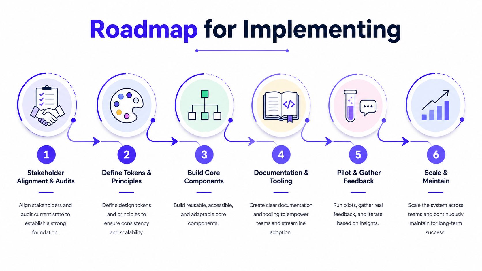
Start with a small, real problem. A design system fails when it tries to solve everything at once, and it succeeds when it solves the parts of the product people touch every day. Figma's 2024 guidance notes that some teams use full audits over 2–3 weeks and can see maturity improvements within 8 months, which is a useful reminder that system work is a program, not a weekend project. Figma's metrics guidance also makes clear that you should measure early and often, not wait until the launch is over.
1. Align stakeholders and audit what already exists
Get product, design, engineering, and marketing in the same room. Look for duplicated components, inconsistent patterns, and the screens that matter most to users. This is also where you decide which surfaces deserve the first pass, usually the ones with the most traffic or the most user risk.
2. Define tokens and principles
Pick a minimal set of shared values for color, type, spacing, and radius. Write down the rules behind them in plain English. This is the point where the system starts to feel like a product asset instead of a design file.
3. Build the core components
Create the components people use most often, not the fanciest ones. That usually means buttons, inputs, dropdowns, alerts, cards, and navigation patterns. Keep the API simple so people can use the components without reading a manual for every action.
4. Add documentation and versioning
Document use cases, edge cases, and what not to do. If the team cannot tell when to choose one variant over another, adoption will stall. Living docs matter more than static screenshots, because people need to see how the system behaves in practice.
5. Pilot in production
Ship the system into one actual flow, not a mock environment. That could be onboarding, billing, portfolio views, or any other user path where consistency matters. The goal is to prove the system works in the live product, not just in a design review.
6. Govern, train, and maintain
Set a review cadence, assign ownership, and train new contributors. Medium's EightShapes framing is useful here because it treats a successful design system as three interrelated systems, a kit of reusable parts, cohesive products, and a community of collaborative people. That cross-functional shape matters because design systems only survive when more than one team can keep them healthy. Medium's EightShapes article captures that idea well.
For the educational side of the process, the embedded video below is a useful complement if your team wants a visual walkthrough of implementation thinking.
A lean startup doesn't need a giant rollout plan. It needs one clear path, one small pilot, and one team that owns the rules well enough to keep them useful.
Tracking ROI and Avoiding Common Pitfalls
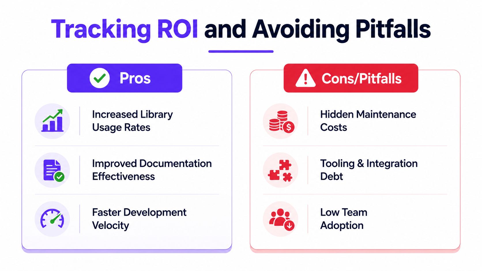
ROI for a design system is easy to misread if you wait for one large payoff. Startup teams get a clearer view by watching adoption, friction, and consistency over time. Figma's metrics guidance points to library and component usage, documentation effectiveness, and consistency measures like detachment and overrides, which gives founders a practical way to judge whether the system is being used.
What to measure
Library usage: Are designers and developers choosing the shared components, or are they rebuilding pieces on their own?
Documentation effectiveness: Can people find the answer in the docs, or do the same questions keep coming back?
Component detachment: Are designers breaking away from the system often?
Style overrides: Are teams repeatedly changing approved values to make things work?
These signals matter because they show behavior, not just intent. An AI SaaS team may say the system is adopted, but if product designers keep detaching components for each dashboard variant, the system is not carrying its weight. A fintech team may have clean token files, yet still lose consistency if every release introduces new overrides for buttons, spacing, or card layouts.
What usually goes wrong
Outdated tokens are a common problem. So is siloed ownership, where one team maintains the system but everyone else treats it like someone else's job. Another common failure is letting governance disappear after launch. Once that happens, the system starts drifting, and the product slowly loses the consistency the system was supposed to protect.
Medium's EightShapes framing treats a successful design system as three interrelated systems, a kit of reusable parts, cohesive products, and a community of collaborative people. That structure helps founders see why a system breaks when one part is ignored. A shared component library without product adoption becomes shelfware, and adoption without community support leaves teams guessing about how to use it. Medium's EightShapes article captures that idea well.
A 2024 industry summary reported that audits over 2–3 weeks can yield maturity improvements within 8 months, and it cited Delivery Hero's gamified adoption approach as improving delivery speed by 57% with zero technical debt. Those figures matter because they show design systems can behave like business infrastructure when adoption is managed intentionally, not left to chance. Figma's metrics article covers that shift in practice.
The lesson for founders is straightforward. Don't ask whether the system is beautiful. Ask whether it is being used, whether people trust it, and whether it reduces the work it was meant to remove.
Conclusion and Next Steps
A design system is not a luxury layer on top of your product. It's the structure that keeps product, brand, and engineering aligned while the company is still moving fast. For founders, the smartest first move is usually small, a design audit, a minimal token set, and one core component that proves the system can work inside the product.
If your team is already fighting inconsistency, that's the signal to act. If your product spans multiple surfaces, brands, or user flows, the need is even clearer. And if you're trying to keep AI SaaS, Web3, or Fintech experiences polished without hiring a full in-house squad, the right partner can help you build the system and ship it.
925 Studios helps startups turn messy product UI into a reusable system that supports design, brand, and frontend work in one place. If you want one creative partner that can help you audit what exists, define the right foundation, and ship the pieces into your product, visit 925 studios and start the conversation.


Let’s keep in touch.
Discover more about high-performance web design. Follow us on Twitter and Instagram.

