
Conversion Optimization Techniques for Startups: 2026 Guide

Yusuf
Founder and lead designer at 925studios

You're not just fighting for clicks anymore, you're fighting against decision compression. In AI, Web3, and fintech, buyers often arrive already briefed by summaries, chat tools, and quick comparisons, so the page has less time to earn trust and more pressure to answer the core question fast. That's why conversion optimization techniques are a product discipline, not a marketing trick. The best teams treat conversion like a loop, measure what's happening, form a clear hypothesis, test it, and keep iterating, because the primary lift comes from better decisions, not random page tweaks, as outlined in practical CRO guidance from Marketingscoop and Mouseflow's CRO loop.
For founders, this matters because the highest-value conversion work usually sits between brand clarity, product design, and frontend execution. A good headline won't save a slow page. A sleek UI won't fix a confusing offer. The techniques below are ordered for startup reality, not theory, so you can see what moves the number and what just creates busywork.
Table of Contents
1. Value Proposition Clarity
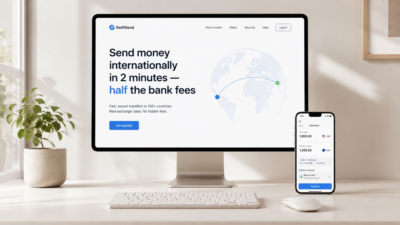
If visitors can't explain what you do in a few seconds, you've already lost most of the battle. Strong conversion starts with a message that is specific enough to feel obvious, and that usually means replacing broad claims with the actual job your product performs. For a fintech app, “financial technology” is weak, while “send money internationally in minutes for less than banks charge” tells the visitor what changes in their life.
The practical test is simple. Ask five people who don't know your product to look at the homepage for ten seconds, then say what it does and who it's for. If they drift into generic language, your headline is too vague, your subhead is too busy, or your page is trying to serve too many audiences at once.
Match the message to the traffic source
A paid ad visitor needs faster clarity than someone arriving from organic search. The promise in the ad and the promise on the landing page need to line up, or the user feels a gap and backs out. That's one reason clarity is not just copywriting, it's a brand and acquisition decision.
Practical rule: lead with the outcome, then explain the method. “Cut design handoff time” lands harder than “Design collaboration platform,” because it tells the buyer what gets better.
Specific examples make this easier to see. Stripe's “Payment processing designed for developers,” Notion's “One workspace for your whole team,” and Linear's “Issue tracking designed for high-velocity teams” work because each one names the audience and the use case. That kind of clarity gives a startup a sharper first impression and reduces the amount of work the visitor has to do before the page feels relevant.
2. Form Field Reduction
Every extra field asks the user to do more work, and more work means more drop-off. Startup teams often over-collect on signup because they want routing data for sales too early, but the key question is whether the field is needed before the user experiences value. If it isn't, move it later.
The cleanest product flows make a hard choice. Figma asks for email and password, Slack starts with a minimal account setup and gathers team context later, and Stripe's documentation lets developers start building without making the signup process feel like a gate. That sequence lowers psychological friction because it turns the first interaction into progress instead of a questionnaire.
Ask for intent later, not earlier
If sales needs qualification, use product behavior as a signal instead of stuffing the form with dropdowns. A user who activates a key feature, returns to the product, or reaches pricing is telling you more than a company-size field ever will. That gives marketing and sales better context without blocking the first step.
A useful audit is brutally simple. Count every field in your signup, trial, demo, and lead forms, then ask whether each one is required before the user can get value. In many startups, the answer is no for half the fields.
Practical rule: if a form field doesn't change the next screen, it probably doesn't belong on the first screen.
Watch what happens when you shorten the flow. Even a single field can feel like a tax when the user is undecided, rushed, or on mobile. That's especially true in AI SaaS and fintech, where the visitor is already evaluating complexity, trust, and switching cost at the same time.
3. Landing Page Specificity
Generic pages usually underperform because they try to be useful to everyone and end up being compelling to no one. A specific page, built for one traffic source or one use case, gives the visitor a straighter path from promise to action. If an ad talks about NFT minting, the page should talk about NFT minting, not the history of blockchain.
The best version of this is not about creating a giant library of pages. It's about aligning the page with the intent already in the visitor's head. That could mean one page for enterprise buyers, another for startups, or separate pages for a product's most common use cases.
Build around the segment that clicked
Use your analytics to find which audiences convert, then design pages around those groups first. HubSpot, Typeform, and Airtable all do this in different ways by shaping landing pages around audience or use case instead of burying visitors in generic product language. That approach reduces the gap between ad promise and page content, which is where many conversions die.
For founders, specificity is also a design decision. The hero image, supporting copy, testimonials, and CTA should all reinforce the same message. If the page headline says “AI finance forecasting,” but the visuals and subcopy drift into broad platform talk, the page feels like a pitch deck instead of a landing page.
See how a tighter product narrative can support this in 925 Studios' SaaS website design perspective. The point isn't just to make the page prettier, it's to make the buying path feel obvious.
A focused landing page does less, but it converts more because every element pulls in the same direction.
4. Social Proof and Trust Signals
People rarely convert on first contact when the product is unfamiliar, especially in fintech and Web3 where the stakes feel high. Social proof reduces that hesitation by showing that other buyers, builders, or teams already trusted the product and got value from it. The best proof is specific enough to feel believable and familiar enough to feel relevant.
Customer logos help when the logos are recognizable. Testimonials help when they sound like real outcomes, not generic praise. Certifications help when the product touches security, compliance, or money movement, because users want evidence that the company has done the hard work behind the scenes.
Put proof where the decision happens
The strongest placement is close to the CTA, pricing, or checkout, not buried in a carousel that nobody reaches. A visitor needs reassurance at the exact moment they hesitate. If you wait until after the decision point, the proof doesn't do its job.
This is also where teams make a common mistake. They collect too many weak signals and none of them land. Five recognizable logos usually matter more than a wall of unfamiliar names, because the user can process them instantly.
Use proof that matches the risk level of the product:
Recognizable customers: strongest for trust in B2B SaaS and fintech.
Outcome-specific testimonials: useful when they mention concrete product results.
Certifications and security signals: essential when the buyer is worried about compliance or data safety.
Video testimonials: stronger when you need to reduce suspicion, because they're harder to fake.
If you can capture a quote right after a customer gets a win, do it then. That's when the language is freshest and the outcome is easiest to describe. For AI SaaS and technical tools, that timing usually produces better proof than asking weeks later when the excitement has faded.
6. Page Speed Optimization
Speed is a conversion decision, not just a technical metric. If a page hesitates before it shows the offer, the form, or the checkout path, visitors start questioning whether the product will feel equally slow after signup. That hesitation hurts AI SaaS especially hard, because buyers already expect the product itself to feel responsive and reliable. For a practical web performance optimization playbook, the starting point is simple, remove anything that delays the first meaningful interaction.
For founders, page speed usually points to product architecture as much as design. Large media files, heavy front-end bundles, and third-party scripts all add weight, and every extra dependency creates another place for the page to stall. If mobile pages feel sluggish, the conversion problem may sit in the implementation stack rather than the offer or the copy.
Fix the parts users actually wait for
Start with what the visitor sees first. A hero image that does not help them decide, a background animation that eats bandwidth, or an oversized video can all slow the page without improving conversion. After that, review chat widgets, analytics tags, heatmaps, and other scripts that accumulate across teams until they become part of the page's burden.
Use real-user performance data, not just lab scores. Google PageSpeed Insights and Web Vitals matter because they show what the experience looks like on actual devices and connections, especially on mobile where delays are more visible and more damaging. Desktop screenshots from a conference room do not tell you whether a buyer on a weak signal can reach the CTA without waiting.
That also means product and engineering need to make trade-offs on purpose. If a visual effect or vendor script does not help the visitor decide, it should be removed, deferred, or rebuilt in a lighter way. Teams that treat speed as a shared conversion goal usually ship cleaner pages and fewer features that look impressive but slow the path to action.
A practical rollout often starts here:
Compress images aggressively: keep only the visuals that help the buyer decide.
Lazy-load below-the-fold assets: protect the first screen from unnecessary weight.
Trim third-party scripts: remove tools that do not directly support conversion.
Reduce front-end bloat: simplify components that slow rendering on key pages.
Test on real devices: confirm the page works under mobile conditions, not just in lab tests.
These changes are not cosmetic. Each one shortens the wait between intent and action, which gives more visitors a fair chance to reach the form, pricing, or checkout step. On a product-led site, that usually means speed work belongs in the same backlog as CTA copy, form design, and the rest of the conversion path.
6. Page Speed Optimization
Slow pages do more than annoy visitors, they interrupt the buying decision before it starts. Multiple CRO guides recommend aiming for page-load times under 2 to 3 seconds, and that target matters because every extra moment gives users more time to doubt the experience. The risk is highest on signup and checkout pages, where delay can feel like instability. See the benchmark guidance from Cometly's CRO best practices.
For AI SaaS, speed is often a product architecture decision as much as a design decision. Heavy components, large images, and third-party scripts all add weight. If a page feels sluggish on mobile, the conversion issue may be the front end, not the offer.
Fix the parts users actually experience
Start with the assets and scripts that affect the first screen. A large visual that does not help the visitor decide is carrying cost, not value. After that, review analytics tags, chat widgets, and tag managers, because these are easy to add and hard to notice when they slow the page.
Use real-user performance data, not only lab tests. Google PageSpeed Insights and Web Vitals are useful because they show how the page behaves in the wild, including mobile conditions. Desktop demos in a conference room can hide the experience a buyer gets on a weaker connection.
The team can usually make progress in this order:
Compress images aggressively: keep only the visuals that help the buyer decide.
Lazy-load lower-page components: do not make the browser load everything up front.
Trim third-party scripts: remove anything that is not directly supporting conversion or measurement.
Test on mobile networks: Wi-Fi hides the problem that mobile buyers feel.
For technical products, speed also shapes perception. A fast docs page or pricing page suggests the team is organized and ready to handle demand, while a slow one suggests the opposite. That is a brand signal, not only a performance metric.
A helpful companion read is this web performance optimization playbook, especially if your team wants a clearer way to connect front-end load with conversion outcomes.
8. Checkout and Payment Optimization
Checkout is the last place to lose a buyer who already decided to spend. At that point, the product should calm uncertainty, make the cost legible, and let payment happen without forcing extra thinking. That applies to e-commerce, and it applies just as much to SaaS billing flows where the final step separates intent from revenue.
The quickest way to improve checkout is to remove avoidable decisions. Guest checkout matters because account creation adds work right before the purchase, which is exactly when attention is thinnest. Showing the final price upfront matters for the same reason. If the buyer discovers extra fees at the end, the issue is no longer pricing. It is trust.
Make the last step feel honest
Payment method design also changes conversion. On mobile, Apple Pay and Google Pay reduce typing and make the purchase feel familiar, which lowers the chance that a buyer abandons the flow mid-step. In SaaS, delayed billing can work well when the user gets value first and pays after the product has earned confidence. The trade-off is simple. More flexibility can raise completion, but it also adds complexity to billing logic and support.
The hard part is that checkout optimization touches product, design, and engineering at once. Payment flow, trust badges, error handling, and form design all need to work together. A polished interface with weak payment logic still loses the sale, and a technically correct flow that feels risky can do the same.
The highest-value decisions are usually the least glamorous ones:
Offer guest checkout: do not force account creation before purchase.
Show total cost early: remove surprise at the final step.
Support familiar payment methods: especially on mobile.
Keep the form short: every extra field adds hesitation.
Add trust signals near payment: place them where the buyer decides.
Founders should treat this as a product surface, not a design polish exercise. The same principle shows up in broader checkout UX guidance, like this guide to enhancing checkout UX, and it is worth using that lens when product, billing, and frontend teams are deciding what to ship next.
8. Checkout and Payment Optimization
Checkout is where good intent often disappears. If the buyer has made it this far, the job is to reduce anxiety, remove surprises, and make payment feel safe and simple. This matters in e-commerce, but it also matters in SaaS billing flows where the final step is the difference between intent and revenue.
Guest checkout is one of the clearest examples. Forcing account creation adds friction right before the purchase, which is the worst possible moment to introduce it. Showing the final price upfront also matters because surprise fees feel like a trust break, not a pricing issue.
Make the last step feel honest
For mobile buyers, payment method choice is part of the experience. Apple Pay and Google Pay cut friction because they reduce typing and make the action feel more familiar. For SaaS, delayed billing can work well when users are allowed to try the product first and pay after they experience value.
The hard part is that checkout optimization touches product, design, and engineering at once. Payment flow, trust badges, error handling, and form design all need to work together. A polished UI with broken payment logic still loses the sale.
Useful tactics include:
Offer guest checkout: don't force an account before purchase.
Show total cost early: remove surprise at the final step.
Support familiar payment methods: especially on mobile.
Keep the form short: every extra field adds hesitation.
Add trust signals near payment: security indicators and privacy promises help at the right moment.
For SaaS founders, the analogue is simple. Let users reach value first, then bill them. That reduces resistance because the buyer has already seen the product work before they're asked to commit money.
The same principle shows up in broader checkout UX guidance, and it's worth treating checkout as a product surface, not just a billing screen. If the last step feels clunky, the entire funnel pays for it.
10. Testing and Iteration Framework
Conversion optimization is not a project with a finish line. It is a decision system. Founders who improve conversion over time do not rely on opinions about button colors or page layouts, they build a habit of testing clear hypotheses, using real traffic, and turning results into product changes.
The starting point is the question itself. “Users will click more when the CTA matches the promise in the headline” is a testable hypothesis. “Make the button blue” is a preference, not a strategy. The first version gives you something to learn from, and the second one gives you noise.
Put your highest-traffic surfaces under test first
Pages with meaningful traffic deserve priority because they create signal faster. Test duration matters as well, because you need enough time to account for weekday and weekend behavior. Benchmark guidance from 925 Studios' conversion rate improvement guide points to running tests for at least one full business cycle and aiming for enough conversions per variant to make the result believable.
That does not mean every startup can hit every benchmark right away. It means sample size and timing need to be part of the decision, or you will read too much into a short-lived spike. Fast tests keep teams busy. Proper tests keep teams honest.
Prioritization should follow business impact, not internal preference. Start where a change can affect revenue, retention, or activation, then work outward. On a founder's team, that usually means a landing page, onboarding step, pricing page, or checkout flow before a lower-traffic experiment with limited upside.
A simple operating sequence keeps the team focused:
Measure the baseline: identify where the funnel leaks.
Write one clear hypothesis: state what should change and why.
Ship the smallest testable version: keep the change narrow enough to isolate the effect.
Review the result against a decision rule: decide whether to keep, iterate, or discard the change.
Document the learning: feed the result into the next product or design decision.
The point is not to run more tests. The point is to run better ones, with enough traffic, a clear question, and a direct line to revenue.
10. Testing and Iteration Framework
Conversion optimization isn't a one-off project. It's a system for making better decisions over time. The teams that win don't guess which button color is best, they build a habit of testing clear hypotheses, using real traffic, and learning from what happens.
That starts with the right kind of question. “Users will click more when the CTA matches the promise in the headline” is a hypothesis. “Make the button blue” isn't. The first one can be tested and learned from, the second one is just a preference dressed up as strategy.
Prioritize tests that can actually move revenue
High-traffic pages deserve attention first because they give you faster signal. Test duration matters too, because tests need enough time to smooth out weekday and weekend behavior. Benchmark-oriented guidance recommends running tests for at least one full business cycle of one to two weeks and aiming for roughly 350 to 400 conversions per variant as a practical minimum sample size, according to Cometly's CRO best practices.
That doesn't mean every startup can hit every benchmark immediately. It does mean you should respect sample size and not declare victory because a test looked good after a few days. Short tests make people feel busy. Proper tests make people correct.
The process should look like this:
Measure baseline performance: know where the funnel is leaking.
Segment by traffic, source, or device: different users behave differently.
Form one clear hypothesis: test a real cause, not a hunch.
Run the experiment with discipline: don't stack too many changes.
Implement the winner: ship the learning.
Repeat with the next best idea: compounding matters.
For teams building AI SaaS, fintech, or Web3 products, design and engineering discipline is paramount. If 925 Studios is involved, the value isn't just making a prettier page, it's turning test insights into a redesigned flow, a sharper brand message, and frontend changes that ship.
Read 925 Studios' guide on improving conversion rates if you want a practical lens on how to move from ideas to experiments without losing momentum.
10-Point Conversion Optimization Comparison
Item | Implementation complexity | Resource requirements | Expected outcomes | Ideal use cases | Key advantages |
|---|---|---|---|---|---|
Value Proposition Clarity | Low–Medium (strategy + copy/design) | Copywriter, UX research, design time | Faster understanding; lower bounce from qualified traffic | Homepages, paid ads, landing hero sections | Clear messaging; consistent cross-channel positioning |
Form Field Reduction | Low–Medium (UX + frontend changes) | Frontend dev, UX, analytics | Higher signup rates; faster time-to-first-value | Signup flows, lead capture, onboarding | Reduced abandonment; faster conversions |
Landing Page Specificity | Medium (content + production overhead) | Content, design, targeted landing pages, analytics | Higher conversion; better ad ROI and quality scores | Segmented campaigns, paid traffic, specific use cases | Strong message-match; improved CPA |
Social Proof and Trust Signals | Low (content collection + placement) | Customer success, legal signoff, design assets | Increased trust; higher enterprise/paid conversions | B2B sales, fintech, new brands seeking validation | Credibility boost; justification for pricing |
Call-to-Action Optimization | Low (copy + design + tests) | Copywriter, frontend tweaks, A/B testing tool | Noticeable conversion lift (5–25% typical) | Buttons, forms, demo scheduling, CTAs across site | Clear next step; reduces user hesitation |
Page Speed Optimization | High (technical and infra work) | DevOps, frontend engineers, CDN/hosting, monitoring | Improved conversions; better SEO and mobile UX | High-traffic sites, e-commerce, global audiences | Measurable conversion & performance gains |
Friction Audit and Removal | Medium–High (analysis + iterative fixes) | Analytics, session recording, user testing, dev resources | Fewer drop-offs; quick UX wins; broader experience gains | Complex funnels, multi-step checkouts, onboarding | Identifies root causes; scalable improvements |
Checkout and Payment Optimization | High (security + integrations) | Payment processors, compliance, dev, UX | Reduced cart abandonment; increased revenue | E‑commerce, paid SaaS, high-value transactions | Higher completion rates; improved trust at payment |
Personalization and Segmentation | High (data & experience variants) | Data infrastructure, engineering, content variants | Higher relevance, engagement, conversion and retention | Products with diverse user types or use cases | Tailored experiences; better LTV and CAC |
Testing and Iteration Framework | Medium–High (process + tools) | A/B/multivariate tools, analytics, cross‑functional team | Continuous lift over time; data-driven decisions | Growth teams, high-traffic pages, product experiments | Systematic learning; reduces guesswork |
Strategy to Shipped Product
Conversion optimization works when brand, product, and frontend all point in the same direction. A clear message gets the visitor's attention. A clean interface reduces hesitation. Good code keeps the path fast and reliable enough for the user to finish what they started. When those pieces are split across different teams, the funnel gets noisy and the learning gets slow.
That's why the best conversion work for startups usually isn't isolated to one page element. It shows up in the full system, the headline that matches the offer, the signup flow that removes unnecessary fields, the landing page that speaks to one audience, the checkout that feels trustworthy, and the tests that keep refining the experience. The pages that convert well aren't just attractive, they're coherent.
For AI SaaS, Web3, and fintech founders, that coherence is often the difference between a product that sounds promising and a product that converts. A visitor doesn't care which internal team owned the problem. They care whether the page answers their question, reduces their doubt, and makes the next step feel safe.
925 Studios is built for that gap. One creative partner can cover product design, brand design, and frontend development, which means less handoff, less drift, and more shipped work that supports conversion instead of fighting it. That matters when your team needs more than advice, it needs the strategy translated into a live product.
If you're trying to improve conversions without adding more hiring overhead, 925 Studios can help turn your site and product into one clear path to action. We design, brand, and build for startups that need their conversion work shipped, not stuck in slides. Reach out if you want a creative partner that connects strategy to pixels and helps your funnel do its job.


Let’s keep in touch.
Discover more about high-performance web design. Follow us on Twitter and Instagram.

