
How to Improve Conversion Rates for SaaS & Fintech

Yusuf
Founder and lead designer at 925studios

Most advice on how to improve conversion rates is built for simple purchases. Add urgency. Add pop-ups. Shorten the page. Change the button color. That playbook falls apart when you're selling a technical product that asks for trust before money, or asks for belief before understanding.
AI SaaS, Web3, and Fintech products convert when users understand what the product does, why it matters, and whether it feels safe to adopt. If any one of those breaks, the funnel leaks. A pricing page won't save you. A prettier button won't save you either.
The practical path is less glamorous. Measure the actual journey. Find the exact point where users hesitate. Fix the friction with focused changes. Then test what isn't obvious. That's how serious teams improve conversion rates without wasting months on redesign theater.
If you want the brand side of this problem, trust starts before the signup flow. It starts with what people think your company is the moment they land, which is why brand perception shapes conversion more than most founders think.
Table of Contents
Why Most Conversion Advice Fails for Technical Products
A lot of CRO advice assumes the user already understands the offer. That isn't true for an AI workflow tool, a custody product, a compliance dashboard, or a Web3 platform that needs wallet connection before the value is visible. In these categories, the main problem usually isn't a weak CTA. It's unresolved doubt.
Technical products carry three extra burdens.
Clarity burden: Users need to grasp the product fast, without reading a glossary.
Trust burden: Users need to believe their data, money, or workflow won't be put at risk.
Effort burden: Users need a reason to push through setup, onboarding, and learning curve.
That changes what good conversion work looks like. A countdown timer might help a commodity purchase. It often hurts a fintech application flow because it introduces pressure where users want reassurance. A modal might capture an email on a blog. It can derail an AI product page if the visitor still doesn't understand the core outcome.
Practical rule: For complex products, conversion is usually the result of reduced uncertainty, not increased pressure.
The strongest teams I've seen treat conversion like product design, not campaign decoration. They look at the full path from first click to first meaningful action. Then they ask harder questions. Where do users get confused? Where do they ask for proof? Where do they stall because the interface assumes too much prior knowledge?
The useful framework is simple:
Diagnose the funnel: Find the exact step where users drop.
Fix high-friction moments: Rewrite, simplify, reorder, or prove value sooner.
Build a testing roadmap: Validate uncertain changes instead of debating them.
That approach works because it matches reality. Founders of technical products don't need hacks. They need a repeatable way to turn complexity into comprehension.
First Stop Guessing and Set Up Your Analytics Correctly
If your analytics are sloppy, your conversion work becomes opinion management. The product team blames onboarding. Marketing blames traffic quality. Design blames copy. Nobody knows where users fall out.
According to marketing analytics research published by PubsOnLine (INFORMS), the most effective method for conversion rate optimization is leveraging analytics to understand consumer interests and preferences, enabling the delivery of the right message to specific segments. That's the part most startups skip. They install a tool, glance at pageviews, and call it instrumentation.
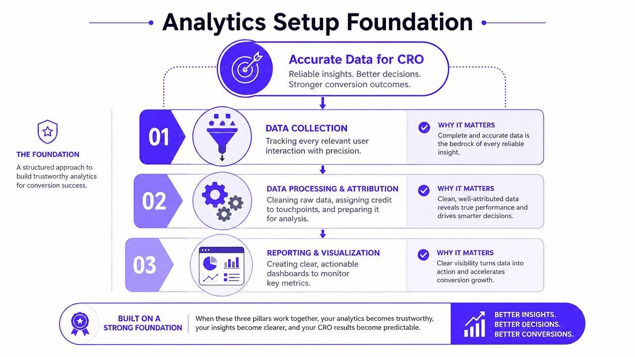
Track behavior that maps to value
For SaaS and Fintech, pageview tracking isn't enough. You need events tied to business progress. A clean baseline usually includes:
Account Created: The user crossed from visitor to known user.
Onboarding Step Completed: You can see where setup gets abandoned.
Core Action Taken: The product delivered its first real value moment.
Upgrade Intent Shown: The user clicked pricing, viewed plan comparison, or triggered a paywall state.
Subscription Started: The conversion is complete.
For some products, you'll add product-specific milestones. An AI app might track prompt submitted, workflow generated, or model output exported. A fintech product might track bank connection started, identity check completed, or card ordered. A Web3 product might track wallet connected, transaction initiated, or vault created.
Use a clean event model
The stack matters less than the discipline. Segment, Mixpanel, and PostHog can all do the job if you define events clearly and keep naming consistent. What breaks teams is not the tool. It's duplicate events, messy naming, and no agreement on what a conversion step means.
Use a tracking plan with these columns:
Event name
What triggers it
Why it matters
Properties attached
Owner responsible
Keep the property set lean. Source, plan, device, user type, and account state are usually enough to start. If you attach every possible field, your data gets noisy fast.
Clean analytics should answer one question without debate: where does a qualified user stop moving forward?
Once the basics are in place, build dashboards around journey steps instead of vanity metrics. I want to see signup completion, onboarding progression, activation, pricing intent, and paid conversion. I don't care about a dashboard full of chart clutter that nobody acts on.
A good tracking plan also supports review. If you're not sure what to audit, this guide on how to run a UX audit for your SaaS product step by step is a solid companion to the analytics setup work because it forces teams to inspect the product with the same rigor they claim to use in meetings.
Find the Leaks in Your Conversion Funnel
Once the data is trustworthy, the next job is diagnosis. Not improvement yet. Diagnosis.
A founder will often say, "We need a better homepage." The funnel usually says something else. Maybe homepage traffic is fine and the leak sits in onboarding step two. Maybe the pricing page is doing its job and the plan comparison inside the app is what causes doubt. Good conversion work starts by locating the leak before anyone proposes a fix.
A simple visual helps teams think in stages instead of pages.
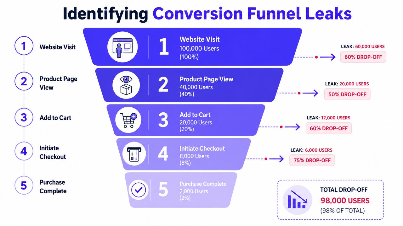
Read the funnel before you redesign
Build a funnel that reflects your actual journey, not a generic template. For a SaaS product, that might look like landing page, signup started, account created, onboarding completed, core action taken, upgrade started, subscription started. For fintech, it may include identity verification and funding steps. For Web3, wallet connection often deserves its own stage because it's a trust wall, not a tiny action.
One useful pattern from top-of-funnel work is page specificity. HubSpot research, cited by Matomo, found that companies saw a 55% increase in leads when they increased the number of landing pages from 10 to 15. For technical products, that matters because a single page rarely speaks well to every audience. A founder searching for API reliability, a product lead comparing workflows, and a compliance buyer checking risk controls shouldn't all land on the same generic promise.
The reason this works isn't volume for its own sake. It's alignment. Customized pages reduce top-of-funnel friction because the message matches the user's intent earlier.
A practical reference point is a strong sign-up flow with conversion-focused patterns. It helps teams distinguish between a healthy step-by-step journey and a flow that asks for confidence before earning it.
Use recordings to learn why people leave
Funnel reports tell you what happened. Session replay tools like FullStory or Hotjar tell you why it happened.
Watch the users who dropped at the same step. Not random sessions. The same step. You'll start seeing patterns fast:
Hover and pause: They don't trust the next action.
Back-and-forth between pricing and features: Your plan distinction isn't clear.
Repeated clicks on labels or screenshots: The interface suggests detail that isn't available.
Form stalls: A field asks for information users aren't ready to give.
This walkthrough is worth watching if your team needs a concrete example of how people inspect drop-off behavior in practice.
A good hypothesis combines both views. The funnel says pricing-to-signup drop-off is severe. Recordings show users hovering over plan features, scrolling up, then leaving. That points to a clearer problem: the offer is not legible enough to support commitment.
The number tells you where to look. The recording tells you what to fix.
Without both, teams usually redesign the wrong screen.
High-Impact Fixes Without a Full Redesign
Most startups don't need a full redesign to improve conversion rates. They need targeted fixes at moments where trust drops, value feels vague, or effort spikes. This is good news because focused changes are cheaper, easier to ship, and easier to measure.
Tighten the message before touching the layout
The fastest win is often copy, not visuals. Founders love rewriting the hero into something broad and ambitious. Users need the opposite. They need direct language that tells them what the product does, who it's for, and what happens next.
Here's a common before and after.
Before: "The unified operating layer for modern financial intelligence"
After: "Track cash flow, approvals, and audit history in one dashboard"
The second line won't win design awards. It will usually help more people understand the product on first read.
This also applies to onboarding. AI and Web3 products often force users to learn your model before they see your outcome. Reverse that. Show a sample result, a realistic demo state, or a guided preview before asking for setup effort. According to Aimers, interactive demos convert 2x better than static screenshots, and leads close 20-25% faster when value is shown before commitment.
If your product has a complicated checkout or payment step, it's worth reviewing examples of how other teams improve checkout page design with cleaner hierarchy, fewer distractions, and stronger trust cues. The same principles carry into SaaS billing and fintech application flows.
Reduce trust friction where decisions happen
Social proof works best when it's specific and placed near commitment. Not buried on an "About" page. Not dumped into a carousel.
Northwestern University research cited by Unbounce found that highlighting verified customer reviews and case studies can increase conversion rates by as much as 270%. For technical products, that usually means:
Near the CTA: Put a relevant customer quote or logo row beside the action.
Near forms: Add reassurance about privacy, security, or implementation support.
Near pricing: Show proof tied to the exact buyer concern, such as compliance, speed to launch, or operational clarity.
A fintech example is simple. If users hesitate near a payment or application form, put security badges and trust language close to the form. A Web3 example is different. You may need wallet permission explanation before the connect action, not after. For AI SaaS, a brief output sample near the CTA can reduce doubt faster than another paragraph of promise language.
The pricing page deserves separate discipline. The strongest SaaS pricing pages keep choice narrow. According to Grafit Agency, the most successful pricing pages limit options to 3-4 tiers to reduce choice paralysis. You don't need eight plans. You need a clear path.
Common Conversion Blockers and Quick Fixes
Conversion Blocker | Example | Quick Fix |
|---|---|---|
Vague value proposition | "AI-powered productivity for the future of work" | Replace with outcome-driven headline that names user, task, and result |
Weak trust at point of action | User reaches pricing or payment step and stalls | Add verified testimonials near CTAs and security cues near sensitive forms |
Too much form friction | Signup asks for job title, team size, company URL, phone, and use case before trial access | Remove nonessential fields, defer collection, enable autofill where possible |
Choice overload | Pricing page lists too many plans or feature matrices | Narrow to a small set of clearly distinct tiers |
Static explanation of a dynamic product | Users see screenshots but still can't imagine value | Add an interactive demo or guided preview |
Jargon-heavy onboarding | Web3 or AI terms appear before user context | Rewrite steps in plain language and explain why each action matters |
One thing that consistently doesn't work is polishing the visual layer while leaving the decision logic intact. If the user still doesn't know why this plan exists, why this field is required, or what happens after they click, the conversion problem stays put.
Build a Prioritization and A/B Testing Roadmap
A backlog of ideas isn't a strategy. It becomes one only when you rank what matters, ship what is obvious, and test what is uncertain.
The easiest way to bring order to CRO work is a simple ICE score. Impact, Confidence, Ease. It isn't perfect, but it stops teams from treating every idea like an emergency.

Score ideas before the loudest opinion wins
Take each proposed fix and score it across three questions.
Impact: If this works, does it affect a high-friction step or a low-stakes detail?
Confidence: Do you have evidence from analytics, recordings, support tickets, or direct observation?
Ease: Can your team ship it without derailing the roadmap?
A hero copy rewrite on a high-traffic page might be medium impact, high ease, medium confidence. A pricing restructure based on repeated user confusion may score high on impact and confidence but lower on ease. A total dashboard redesign often looks exciting and scores badly on ease, and usually worse on confidence than people admit.
Decision filter: Fix broken or confusing moments before testing cosmetic opinions.
That rule saves a lot of time. If a form label is misleading, rewrite it. If a button appears disabled when it isn't, fix the state styling. If onboarding asks for too much information too early, simplify the sequence. Don't A/B test obvious friction. Remove it.
Know when to test and when to ship
A/B testing is valuable when the right answer isn't clear and the page gets enough traffic to produce a meaningful read. Quantum Metric notes that a rigorous A/B testing framework can produce 10–30% lifts when executed correctly. The same source also stresses the discipline behind that result: one variable per test, clear hypotheses, and enough time to avoid false winners.
Use formal tests for things like:
Headline variants on a high-traffic landing page
CTA wording where intent is established but clickthrough is weak
Pricing presentation when users reach the page but fail to choose
Demo request flow changes on a page with steady volume
Just ship and monitor when the issue is plain:
Broken hierarchy: The secondary CTA visually overpowers the primary action
Form clutter: You are asking for data the sales team doesn't even use
Trust gap: Sensitive steps lack reassurance, proof, or explanation
Mobile friction: Buttons are hard to tap, text wraps badly, fields feel painful
For founders who want more tactical examples, this round-up of actionable CRO strategies for 2025 is useful because it stays focused on practical interventions instead of abstract theory.
A strong testing roadmap usually has three lanes:
Immediate fixes for obvious usability and trust issues
Structured experiments for high-traffic uncertainty
Deferred ideas that sound plausible but lack evidence
That split matters because startups lose momentum when everything becomes a test, and they lose rigor when nothing does.
Your Flywheel for Continuous Improvement
The companies that get better at conversion don't treat it like a quarterly cleanup. They build a loop. Measure. Diagnose. Fix. Test. Repeat.
Turn conversion work into operating rhythm
This loop compounds because every cycle sharpens the next one. Cleaner analytics show where users stall. Better diagnosis produces stronger fixes. Better fixes generate clearer test ideas. Over time, the product gets easier to understand, easier to trust, and easier to adopt.
In technical categories, this matters even more because the product itself keeps moving. New features change onboarding. New pricing changes evaluation. New audience segments arrive with different objections. If the conversion process doesn't evolve with the product, the experience gets harder to follow even while the company thinks it's improving.
A good operating rhythm looks like this:
Review journey metrics regularly: Focus on progression, not just traffic.
Watch real user behavior: Especially around pricing, signup, onboarding, and payment moments.
Ship focused fixes: Prioritize clarity and trust before visual flourish.
Document what you learn: Winning and losing tests both improve future judgment.
One adjacent area worth watching is how AI can support analysis and experimentation. This overview of how teams boost revenue with AI CRO is useful if you're evaluating where automation can help surface patterns faster.
Why embedded execution matters
Founders usually know when the funnel feels off. What they often lack is the bandwidth to diagnose, redesign, write, and ship improvements across product, brand, and front-end. That's why conversion work tends to stall in the handoff gaps. Marketing rewrites the page. Product owns the flow. Engineering controls implementation. Nobody is accountable for the complete experience.
The better model is integrated execution. The person improving the message should understand the product. The person changing the interface should understand trust cues. The person shipping the front end should care how the state changes feel at the decision point.
That's how conversion work becomes a flywheel instead of a pile of half-finished ideas.
If you need that kind of integrated execution, 925 Studios gives AI SaaS, Web3, and Fintech teams one creative partner that replaces three hires, a product designer, a brand designer, and a frontend developer. We help founders turn complex products into clear, polished, conversion-focused experiences without building a full in-house team first.


Let’s keep in touch.
Discover more about high-performance web design. Follow us on Twitter and Instagram.

