
SaaS Website Design: A Founder's Guide for 2026

Yusuf
Founder and lead designer at 925studios

Most SaaS website advice starts in the wrong place. It starts with layout trends, motion ideas, and homepage inspiration. Founders then end up with a polished site that still doesn't explain the product, doesn't reduce risk, and doesn't move buyers to action.
That approach breaks fastest in AI SaaS, Web3, and Fintech. In those categories, buyers aren't judging visual taste alone. They're asking harder questions right away. Is this product real. Is it secure. Does this team understand my workflow. Can I trust what happens after I click the button.
Treat your site like a brochure and you'll get brochure results. Treat it like the first usable layer of the product and the decisions get sharper. Messaging becomes simpler. Screenshots replace abstract art. Navigation helps different stakeholders find their path. Performance gets handled like a conversion issue, not a backend chore. That shift matters because the median SaaS landing page conversion rate is 3.8%, and top performers are far higher, according to Humbldesign's SaaS landing page benchmarks.
For founders building with lean teams, that product mindset also affects how you ship. If you're validating an idea before a full build, resources on no-code SaaS development can help frame what should be proven in the market before your website turns those assumptions into a public promise. The mechanics of the site still matter, but the structure only works when the underlying story is clear. That's also why it helps to understand the core parts of a website as a system, not a collection of pages.
Table of Contents
Your Website Is Part of Your Product
The mistake is treating the website like packaging.
In SaaS, the site is part of the product experience. For a buyer comparing tools in AI, Web3, or Fintech, the website often becomes the first real product interaction. Before they book a demo or create an account, they are already scoring your clarity, your security posture, and whether your team looks capable of handling a serious workflow.
That judgment happens fast. A vague headline, an empty product mockup, or a signup flow that asks for too much too early creates the same reaction as a weak onboarding experience inside the app. Buyers assume the friction will continue.
High-trust categories raise the bar. If an AI company makes bold claims without showing how the product works, buyers question the model and the team behind it. If a Fintech site hides pricing logic or skips compliance cues, finance leaders hesitate. If a Web3 product looks clever but fails to explain custody, permissions, or risk, conversion drops because the visitor cannot tell whether the product is credible or dangerous.
The practical standard is simple. Every page should help a skeptical buyer answer three questions. What does this product do for me? Why should I trust it? What is the safest next step?
That changes the design brief. Hero copy needs to make a concrete promise. Product visuals need to show a real workflow, not decoration. Navigation needs to reflect how different evaluators inspect software, especially in deals where an operator, founder, and security reviewer all influence the decision. A useful reference is this breakdown of the core parts of a website, but SaaS teams in high-trust markets need each part to carry more proof than a standard marketing site.
I have seen this play out with products like Stripe, Ramp, and Vanta. Their sites do not win because they feel trendy. They win because the product story, proof, and next step feel tightly connected. Even teams building through no-code SaaS development face the same requirement. The stack can change. Buyer scrutiny does not.
If the site feels vague, disconnected, or risky, buyers assume the product will feel the same.
First Principles Strategy Before Pixels
Strong SaaS sites rarely start with moodboards. They start with hard choices. Which buyer matters first. Which risk must be reduced before a visitor will click. Which proof belongs on the path to trial, demo, or security review.
That matters even more in AI, Web3, and Fintech. In those categories, vague strategy creates expensive design work. Teams polish screens before they decide how to explain model behavior, data access, compliance posture, or transaction risk. The result looks finished and still fails the credibility test.

Start with one buyer, not a blended audience
A homepage built for everyone usually reads like internal compromise. It lists capabilities, names several use cases, and leaves each visitor to guess where they fit.
Pick the primary buyer first, then build outward. For a Fintech product, that may be the CFO or controller. For an AI operations tool, it may be the ops leader who owns the workflow, even if security and IT review the purchase later. For a Web3 platform, it might be the protocol team or treasury lead, depending on who carries the operational risk.
This decision shapes the whole page. It changes the headline, the product story, the navigation labels, and the proof you prioritize. Stripe does this well. Its pages usually make the economic buyer and the implementation path clear at the same time. Vanta does the same for trust and compliance buyers.
If demand is still unclear, sort that out before you commit your website structure to the wrong segment. A structured AI market opportunity analysis is more useful at this stage than another round of visual references.
Write the message so a skeptical buyer can place you fast
Visitors make a snap judgment about whether a product is relevant. If the message is abstract, the design has to carry work it cannot do.
The fix is plain language with enough specificity to be credible. "Unified intelligence for modern operations" sounds polished and says very little. "Automate vendor risk reviews for enterprise procurement teams" gives the buyer a job, a workflow, and a reason to keep reading.
Use a simple check:
Check | Weak version | Strong version |
|---|---|---|
Audience clarity | "Built for modern teams" | "For RevOps teams" |
Problem clarity | "Streamline complexity" | "Reduce manual forecasting work" |
Outcome clarity | "Drive transformation" | "Close the month faster with fewer errors" |
For high-trust categories, I add one more filter. Can the buyer also infer the risk boundary? Good messaging for an AI product should hint at control, oversight, or data handling. Good messaging for a Fintech product should signal accuracy, auditability, or compliance logic. Good messaging for a Web3 product should clarify custody, permissions, or transaction flow.
Set architecture based on sales motion and review friction
Site structure should match how the deal moves. A self-serve product needs a fast path to understanding and action. A sales-led product needs routes for multiple evaluators, each with different concerns and different proof requirements.
That distinction gets sharper in regulated or technical markets. The user may love the product, but legal, security, procurement, or finance can still stall the deal. Good architecture accounts for that upfront. Product pages explain workflow. Trust pages answer security and compliance questions. Integration pages reduce technical uncertainty. Pricing and demo paths match the level of buyer commitment you need.
Ramp is a useful example. The product story is tied closely to financial control and operating efficiency, but the site also supports deeper evaluation for larger accounts. That is strategy expressed through page hierarchy.
A clear framework for this work helps teams make those calls before layout starts. This explanation of what design strategy covers before visual design begins is a practical reference if the team is still treating strategy like a copy doc instead of a conversion system.
Decide what proof must appear early
Proof is not decoration you layer in after the hero is approved. It is part of the core strategy.
In high-trust SaaS, the primary question is not "Should we add logos?" It is "What evidence does this buyer need before the next step feels safe?" For some products, that is customer results. For others, it is SOC 2 status, model oversight, partner ecosystem credibility, or a concrete product walkthrough. An AI startup selling into healthcare needs different proof than a PLG developer tool. A Web3 infrastructure product needs to explain security assumptions far earlier than a generic B2B SaaS app.
Teams that settle these decisions before design reviews move faster and argue less. The page has a job. The visuals support the job. Conversion usually improves because the buyer is no longer asked to infer trust from style alone.
The Anatomy of a High-Trust Homepage
The homepage doesn't need to do everything. It needs to do enough for the right visitor to keep moving. In high-trust categories, that means reducing three specific fears. I don't understand this. I don't believe this. I don't trust what happens next.
That's why homepage structure matters more than visual novelty.
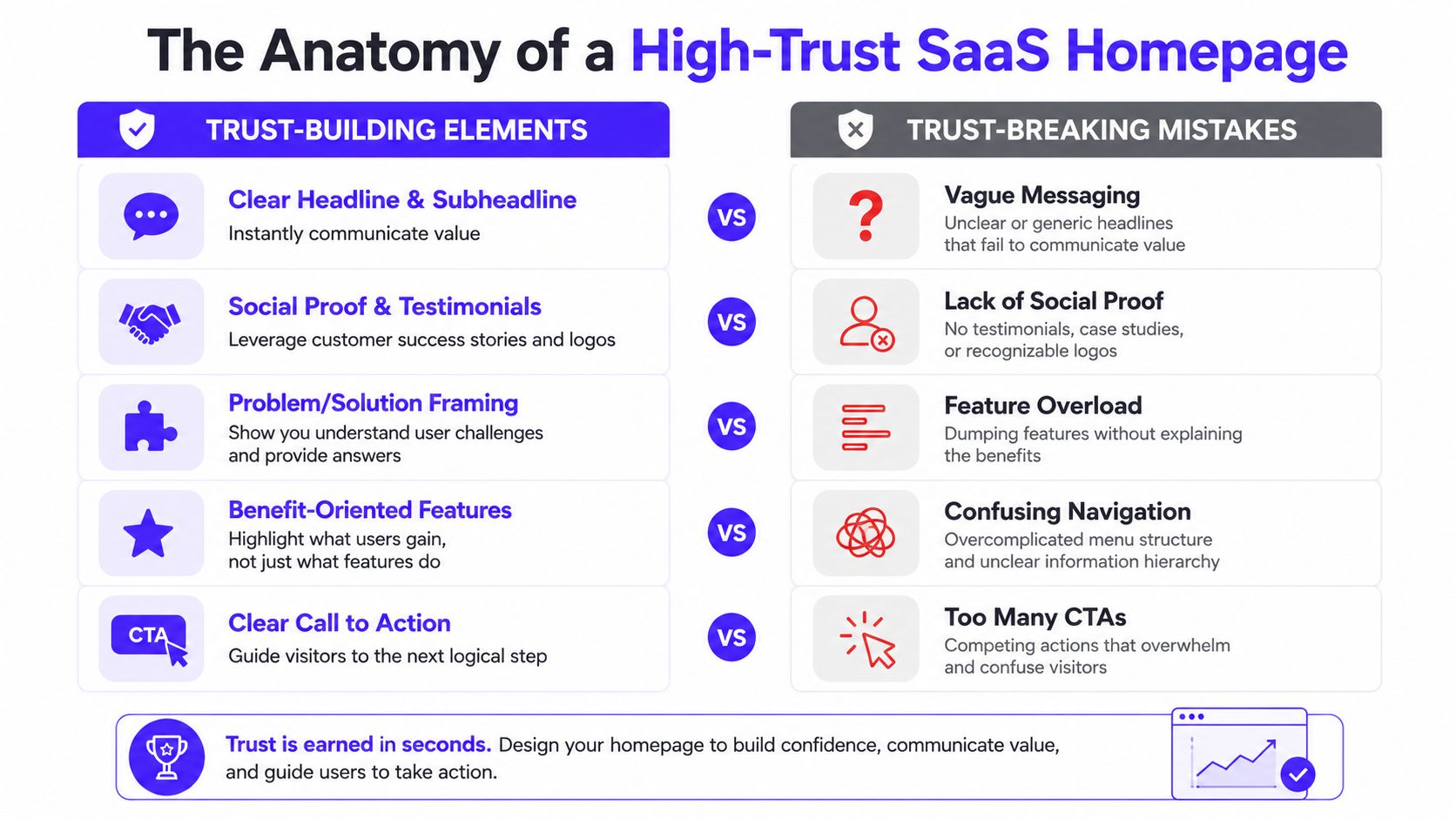
What the first screen must do
The hero section has one job. It should make the visitor feel oriented. If they need to decode your message, you've already lost momentum.
Pixels Within's B2B SaaS conversion benchmarks report that hero sections with clear, above-the-fold value propositions convert 35–40% better than heroes with clever or ambiguous messaging. The same source says interactive demos convert 2x better than static screenshots in the projected 2026 market.
That tracks with what works in practice. Strong heroes usually contain four things:
A plain headline: It says what the product helps someone do.
A supporting line: It adds context, scope, or the key constraint you remove.
One primary CTA: "Start free trial" and "Book demo" are clearer than "Learn more."
Immediate product proof: A real UI frame, product tour preview, or interactive slice of the workflow.
A vague promise plus abstract motion might win a design review. It rarely wins a buyer.
Trust signals belong before the ask
Founders often push logos, reviews, or proof lower on the page because they want a cleaner hero. That's usually the wrong trade-off. Trust doesn't belong after the conversion moment. It belongs before it.
For AI and Fintech especially, buyers need evidence that the company is real and used by credible teams. That can be customer logos, a short testimonial with a role and company, a compliance cue, or a product-specific proof point. What's important is placement and relevance.
A simple homepage flow often works better than a clever one:
State the outcome clearly
Show the product immediately
Add proof near the first CTA
Explain the workflow in plain language
Handle objections before pricing or demo intent
This is also where visual restraint helps. If your brand palette is muted or understated, that can support trust rather than weaken it, especially in categories where aggressive visuals feel promotional. There are useful principles behind muted colors in brand meaning, but color still has to support legibility and hierarchy.
Show the product, don't decorate around it
A homepage gets stronger when it helps the buyer picture real usage. The fastest way to do that is with actual interface visuals.
Think about the difference between a generic AI illustration and a dashboard screenshot that shows source data, output, approval states, and user actions. One suggests a category. The other suggests a product that exists.
Here are the homepage assets that usually pull their weight:
Element | Why it works | Common failure |
|---|---|---|
Real dashboard screenshot | Makes the product concrete | UI is too tiny or overdesigned to read |
Short guided demo | Helps buyers grasp flow fast | Video starts with branding instead of product action |
Annotated workflow strip | Connects features to outcomes | Turns into feature overload |
Proof near CTA | Reduces hesitation at action point | Social proof is generic or buried |
If the product is the reason to trust you, let people see it before you ask them to commit.
Pricing Pages and Onboarding That Convert
A lot of teams lose the sale after doing the hard part. The visitor understands the product, reaches the pricing page, and then hits friction. Plan names are vague. Feature labels are internal. The product shown on the site doesn't match the experience after signup. Confidence drops.
Good SaaS website design carries the same promise from homepage to pricing to first session in the product.
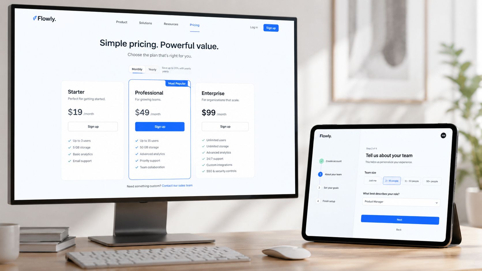
A pricing page should answer buying questions
A buyer opening your pricing page is usually asking one of four things. Is this for a team like mine. Which option fits my stage. What do I get. What risk am I taking if I start.
That means the page should do less selling and more clarifying. Good pricing pages use plain labels, obvious plan differences, and short supporting copy that translates features into operational value. "API access" may matter, but "connect your internal workflows" is easier to process at scanning speed.
The worst version is a comparison table written for people inside the company. The better version is written for the buyer who has to explain the purchase to someone else later.
A clean pricing page usually includes:
Clear plan intent: Starter, growth, and enterprise labels should map to real company situations.
Readable feature language: Use terms the buyer already uses internally.
Visible next step: Trial, contact sales, or request demo should match the plan and sales motion.
Risk reduction cues: Security notes, support expectations, and implementation context help buyers move forward.
The handoff into the product has to feel natural
Many startup sites undermine trust. The website shows one thing. The app delivers another. The site is polished and modern, but the first logged-in screen feels disconnected, unfinished, or confusing.
Stan Vision's guide to SaaS website design points out a critical pitfall. Teams use illustrations instead of real UI, when the best sites show screenshots, demo previews, or animated walkthroughs immediately so people can experience the product before signing up. That continuity builds momentum and reduces friction.
If your pricing page shows a workflow with approval states, analytics panels, and team actions, the product should deliver a recognizable version of that flow fast. The first-run experience shouldn't feel like a bait and switch.
A simple handoff looks like this:
Pricing page confirms fit
Signup asks for the minimum needed
First session mirrors the promised workflow
The user reaches a useful output quickly
Follow-up prompts deepen setup after value is visible
This product walkthrough is a helpful example of how teams teach a complex flow without overloading the page:
The main point is continuity. If your website is the first chapter of the product, onboarding is chapter two. They should feel written by the same team.
Building a Cohesive Brand and UI System
Brand consistency gets treated like polish. In trust-sensitive SaaS, it functions more like due diligence. Buyers in AI, Web3, and Fintech use your site and product UI to judge whether the team is careful, credible, and ready for real adoption.
A mismatch creates doubt fast. A refined homepage paired with a messy dashboard suggests the company invested in acquisition before product maturity. A strong product with generic sales pages creates a different problem. The team may be capable, but the company still looks harder to trust.
Consistency changes how buyers judge risk
In high-trust categories, people often decide before they have months of product experience. They look for signals they can verify in minutes. Clear hierarchy, repeated interaction patterns, stable component behavior, and predictable visual rules all reduce perceived risk.
That is why design systems matter earlier than many founders expect.
Dribbble's product design case study points to a practical pattern. When teams apply the same system across marketing flows and product UI, buyers get a more coherent experience. In categories that ask users to trust automation, financial workflows, or sensitive data handling, that coherence supports conversion because the company appears more disciplined.
A useful system at this stage is usually small and strict:
Type rules: one heading scale, one body scale, one treatment for labels, captions, and support text
Spacing logic: consistent vertical rhythm across sections, forms, cards, and tables
Color roles: one primary action color, stable neutral surfaces, and feedback states used the same way everywhere
Reusable components: buttons, inputs, navigation, tables, modals, and cards that behave predictably across site and app
Users will not call this a strong design system. They will say the product feels reliable.
A system helps small teams ship without drift
Early-stage teams usually resist this work for one reason. Speed. The assumption is that systems slow shipping down.
In practice, the opposite happens. Without a shared kit, each new page becomes a fresh set of design decisions. Headings change. Form styles drift. CTA treatments multiply. Frontend work takes longer because nothing is standardized, and QA gets messier because every flow behaves a little differently.
Small teams feel that cost first.
A practical setup can be lightweight. One embedded partner, such as 925 Studios, can cover product design, brand design, and frontend implementation so the marketing site and app follow the same visual logic without building a full internal team.
That discipline prevents common startup drift:
Without a system | With a system |
|---|---|
Buttons change by page | Primary actions stay obvious |
Forms feel different across flows | Signup and in-app setup feel related |
Marketing claims look detached from product reality | Screens and site support the same promise |
New pages take too long to design | Teams build from tested components |
The goal is not to look bigger than you are. The goal is to look coherent, especially in markets where clarity, proof, and security are required for conversion.
Shipping Measuring and Winning
Launch day creates a false sense of completion. For high-trust SaaS categories such as AI, Web3, and Fintech, it is the point where the essential work begins. Once the site is live, opinion should lose influence fast. The next decisions should come from behavior, performance, and conversion quality.
That matters because B2B teams often redesign the homepage, pricing, forms, and onboarding cues at the same time. Then results move, but nobody can explain why. A cleaner operating model is to ship with a measurement plan, isolate changes, and learn in public from actual user sessions instead of internal debate.
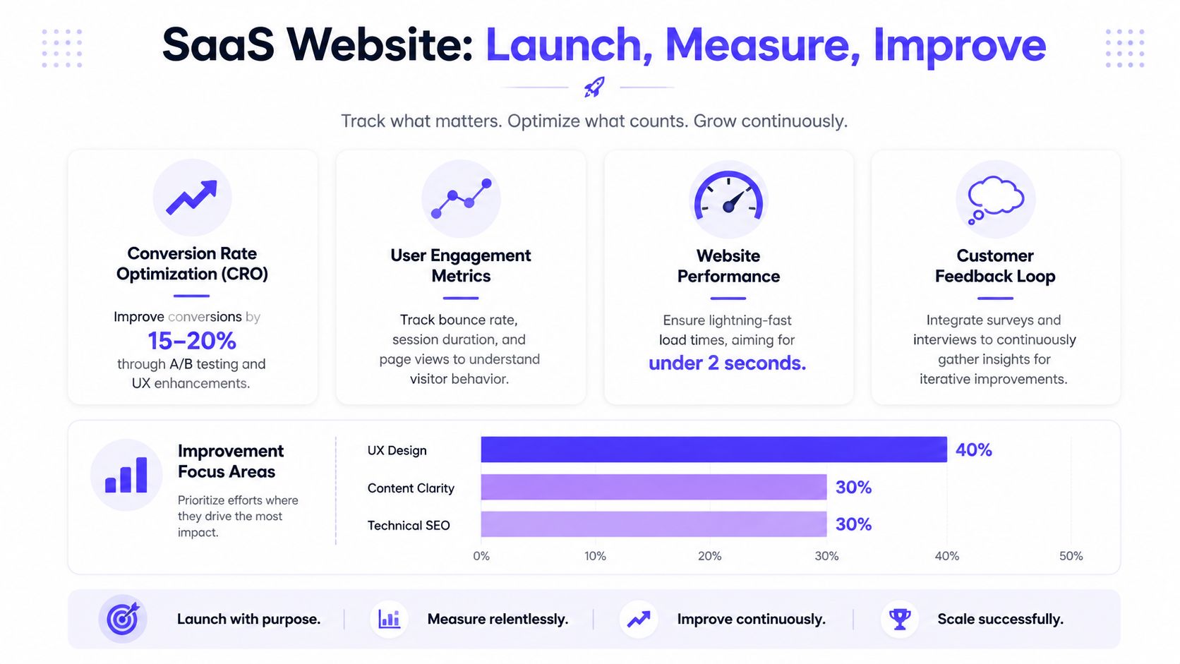
Launch with a measurement plan
Each key page needs a job.
A homepage should move the right visitor toward a trial, demo, or deeper product evaluation. A solutions page should qualify a buyer by industry or use case. A pricing page should answer the last serious objections. In regulated or technical markets, those objections are rarely cosmetic. Buyers want proof, implementation clarity, security signals, and confidence that the product will survive procurement.
That is why generic analytics setups fall short. Pageviews and average time on page rarely tell a SaaS team where trust breaks.
Track moments tied to intent and sales quality:
Primary CTA clicks: Which messages create movement toward trial or demo.
Form completion quality: Whether qualified visitors convert, not just total leads.
Page-to-page drop-off: Where serious buyers stop progressing.
Onboarding continuation: Whether new users keep going after the first session starts.
Then pair that with direct observation. Review session recordings. Check heatmaps for hesitation around pricing, security language, and forms. Read support tickets from new signups. For a fintech product, a spike in exits near compliance copy means something different than a generic bounce on a blog post. The diagnosis has to match the buying risk.
Performance is part of design
Fast pages convert better because they reduce friction before the buyer reads a headline or sees a proof block. That is not a developer-only concern. It is a design decision.
I see the same trade-off repeatedly. Teams want autoplay product videos, heavy motion, chatbot layers, scheduling widgets, and oversized UI renders above the fold. Each choice can be defensible on its own. Stacked together, they slow the page, delay the first useful interaction, and hurt the exact conversion path they were meant to support.
The fix is simple, but it requires discipline:
Audit media weight: Compress screenshots, trim videos, and remove decorative assets that do not help a buyer decide.
Review third-party tools: Every script adds cost in load time, tracking complexity, and QA risk.
Set a performance budget: New marketing tools should earn their place.
Test on real mobile conditions: Weak connections and older devices expose problems quickly.
For AI SaaS, this often means resisting the urge to explain the whole model on the homepage with motion-heavy demos. For Web3, it means not burying trust signals under flashy interaction patterns. For Fintech, it means the page must load fast enough that buyers reach security, compliance, and integration details without waiting.
Continuous optimization beats redesign theater
The strongest SaaS sites behave like shipping products. Teams review evidence, form a hypothesis, make a contained change, and measure the result.
The weak pattern is familiar. A site sits untouched for months. Pipeline pressure rises. The company commissions a full redesign. Messaging, layout, proof, CTA labels, and forms all change at once. If conversions improve, nobody knows what caused it. If they drop, recovery gets slower because the team has to untangle five variables instead of one.
Small wins usually come from specific fixes. A stronger headline on the homepage. Customer proof moved closer to the first CTA. Pricing copy that answers procurement questions before the buyer asks. Fewer fields in a demo form. Clearer onboarding expectations after signup.
Those changes look modest. They compound.
If your team needs a SaaS website that feels consistent with the product, explains a complex offer clearly, and ships without hiring three separate roles, 925 Studios is one option to evaluate. We work with AI SaaS, Web3, and Fintech teams across brand, product design, website design, and frontend implementation so the marketing site and the shipped interface tell the same story.


Let’s keep in touch.
Discover more about high-performance web design. Follow us on Twitter and Instagram.

