
Parts of a Website: A Founder's Guide to Web Dev 2026

Yusuf
Founder and lead designer at 925studios

Most founders think the parts of a website are the visible pieces, the header, the hero, the footer. That's outdated. For modern startups, some of the highest-impact parts are invisible to users but decisive for the business, like architecture, instrumentation, and how the site adapts to intent.
That gap matters. Most content on parts of a website still treats layouts as static, even though 68% of users expect adaptive navigation based on intent, not just page type, according to Clutch's discussion of website page structure. If you run an AI SaaS, Web3, or fintech company, that's not a design detail. It changes how you think about navigation, trust, onboarding, and how design hands off to engineering.
A website isn't a brochure with nicer fonts. It's a system that has to attract the right traffic, orient the visitor fast, move them into action, support the product story, and give your team a structure that can evolve without constant rewrites.
Table of Contents
Your Website Is More Than a Homepage
When founders talk about the parts of a website, they usually mean the pieces they can point at in Figma or on a staging link. That list is too shallow to be useful. A startup website has visible layers, interactive layers, technical layers, and sensing layers, and each one affects a different business outcome.
Stripe is a good reference because its site doesn't just look clean. Its navigation frames product categories clearly, its docs support technical evaluation, and its infrastructure choices let product marketing and engineering move without breaking each other's work. Notion does something similar from a different angle. Its site blends education, templates, product entry points, and conversion paths into one system instead of treating pages as isolated assets.
That's the model. The parts of a website aren't a checklist. They're a coordinated stack.
Practical rule: If a founder can only describe the homepage, they probably don't have a website strategy yet.
A useful way to think about website parts is in four groups:
Visual layout: Header, navigation, hero, content blocks, footer. These create first impression, trust, and clarity.
Functional modules: Forms, signup flows, search, pricing toggles, account entry points. These turn intent into action.
Technical infrastructure: Hosting, CMS, frontend, backend, APIs, database, CDN, SSL. These determine reliability, scale, and how fast the team can ship.
Analytics layer: Tracking, event naming, consent, privacy surfaces, reporting. These tell you what people are doing and where they drop.
Founders who miss the hidden layers usually pay for it later. Marketing launches pages engineering can't support cleanly. Product teams ship flows with no measurement. Brand decisions create UI debt. Then every change gets slower and more expensive.
The practical question isn't “what pages do we need?” It's “which parts help a customer trust us, understand us, and move forward without friction?”
The Visual Foundation Layout and UI Components
The visible parts of a website still matter. They just matter because of the jobs they do, not because they're standard template regions. The header or hero isn't there because every site has one. It's there because users need orientation and proof fast.
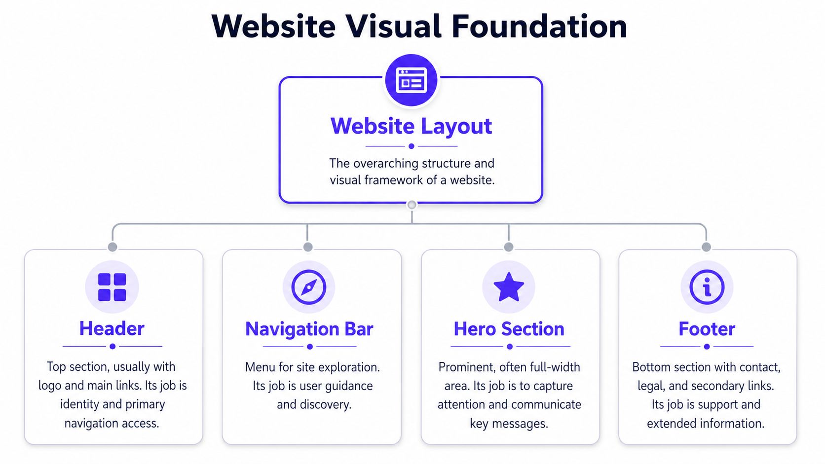
About 50% of web traffic originates from mobile devices, and 70% of users never scroll past the initial screen view if the above-the-fold content isn't immediately engaging, based on website behavior data summarized by UserGuiding. That makes your mobile header, navigation, and first screen some of the most valuable real estate you own.
The header is your orientation layer
The header has one job. Tell people where they are and how to move. That sounds obvious, but many startup sites overload the header with too many choices, clever labels, or a CTA that's disconnected from the product's actual buying path.
A better header usually does three things well:
Identifies the company fast: Logo placement, product category language, and a clean top-level structure matter more than decoration.
Supports the main decision paths: “Product,” “Pricing,” “Docs,” and “Book demo” are clearer than novelty labels.
Holds up on mobile: If the mobile nav hides key product paths or turns into a maze, users leave before they understand the offer.
For fintech, trust content often belongs closer to the top than founders expect. Security, compliance, and proof points shouldn't be buried in a footer if they're part of the buying decision.
The hero answers the first hard question
The hero section is where a site earns the next click. For an AI product, that usually means answering “what does this do?” For Web3, it often means “is this credible?” For fintech, it means “can I trust this with money or data?”
Stripe's heroes are strong because they frame a clear problem and a concrete product category. Notion's are effective because they make a broad product feel approachable. In both cases, the copy and the UI preview do the work together.
A practical review for this area:
Part | What it should do | What usually fails |
|---|---|---|
Header | Orient and direct | Too many links, vague labels |
Navigation | Map your offer | Mirrors org chart instead of user intent |
Hero | Clarify value fast | Generic slogan with no product context |
Footer | Support trust and recovery | Treated like a legal dumping ground |
If your team needs a sharper baseline for evaluating these choices, this breakdown of foundational UI design principles is useful because it ties interface decisions back to comprehension and action. For a more current startup lens, modern user interface design patterns are worth reviewing before a redesign starts.
Good homepage structure doesn't impress designers first. It helps the right buyer say, “I get this.”
The footer matters for the same reason. It's the recovery zone. When users scroll all the way down, they're still looking for reassurance, alternate paths, legal context, support, or contact. A strong footer catches people who weren't ready at the top and gives them somewhere sensible to go next.
The Engine Room Functional Modules That Drive Action
A lot of websites look polished and still underperform because the functional parts are weak. The issue usually isn't visual quality. It's that the modules that convert interest into action were treated like secondary details.

A CTA button, signup flow, or contact form is not decoration. It's where the business model becomes real. If you sell a SaaS product, those modules are often the first product experience a buyer gets.
What good friction looks like
There's a difference between friction and necessary qualification. A bad signup flow asks for too much too early and gives too little context. A good one earns each input.
Take a common SaaS mistake. The homepage promises “get started free,” then the signup form asks for company size, role, phone number, use case, budget, and a password before showing anything. That's not qualification. That's abandonment.
Now compare that with a cleaner sequence:
Start with one obvious action: “Create workspace” or “Book demo” works better than a vague “Submit.”
Ask only for what is needed for the next step: Email first, then workspace setup, then optional enrichment later.
Show progress and outcome: Users should know what happens after the click.
Match copy to intent: Demo CTAs should lead to sales context. Product trial CTAs should lead to product access.
That's why onboarding design deserves as much scrutiny as homepage design. Teams refining trial-to-value paths can learn a lot from these SaaS onboarding best practices, especially when product marketing and product design share ownership.
Forms and search are product surfaces
Founders often underestimate forms because forms feel administrative. They're not. A contact form can signal whether your company is easy to work with. A waitlist form can signal momentum or confusion. A support form can reduce sales friction if it routes users well.
A few patterns tend to work:
Short forms for high-intent pages: Demo requests, sales contact, and investor interest should be direct.
Context around sensitive asks: If you request data, explain why.
Search that reflects product language: Docs, help centers, and marketplaces need search tuned to how users think, not internal naming.
Search matters more for complex products than brochure sites. On a docs-heavy platform or knowledge-rich SaaS, search is a navigation product of its own. Notion understands this well. Users don't browse every path manually. They search, skim, and jump.
This walkthrough is useful because it shows how interaction decisions shape action, not just appearance.
If a user wants to act and your module makes them stop to think, the website is losing money in plain sight.
The practical test is simple. Open your site and try to complete the core action like a new buyer would. If the path feels longer than the value exchange justifies, the module needs redesign.
The Unseen Architecture Technical and SEO Structure
Weak technical structure shows up later, usually when the team tries to ship faster and finds every website change touching three systems, two owners, and a growing list of workarounds. Founders feel this as slow launch cycles, inconsistent pages, and rising engineering cost for what should be simple updates.
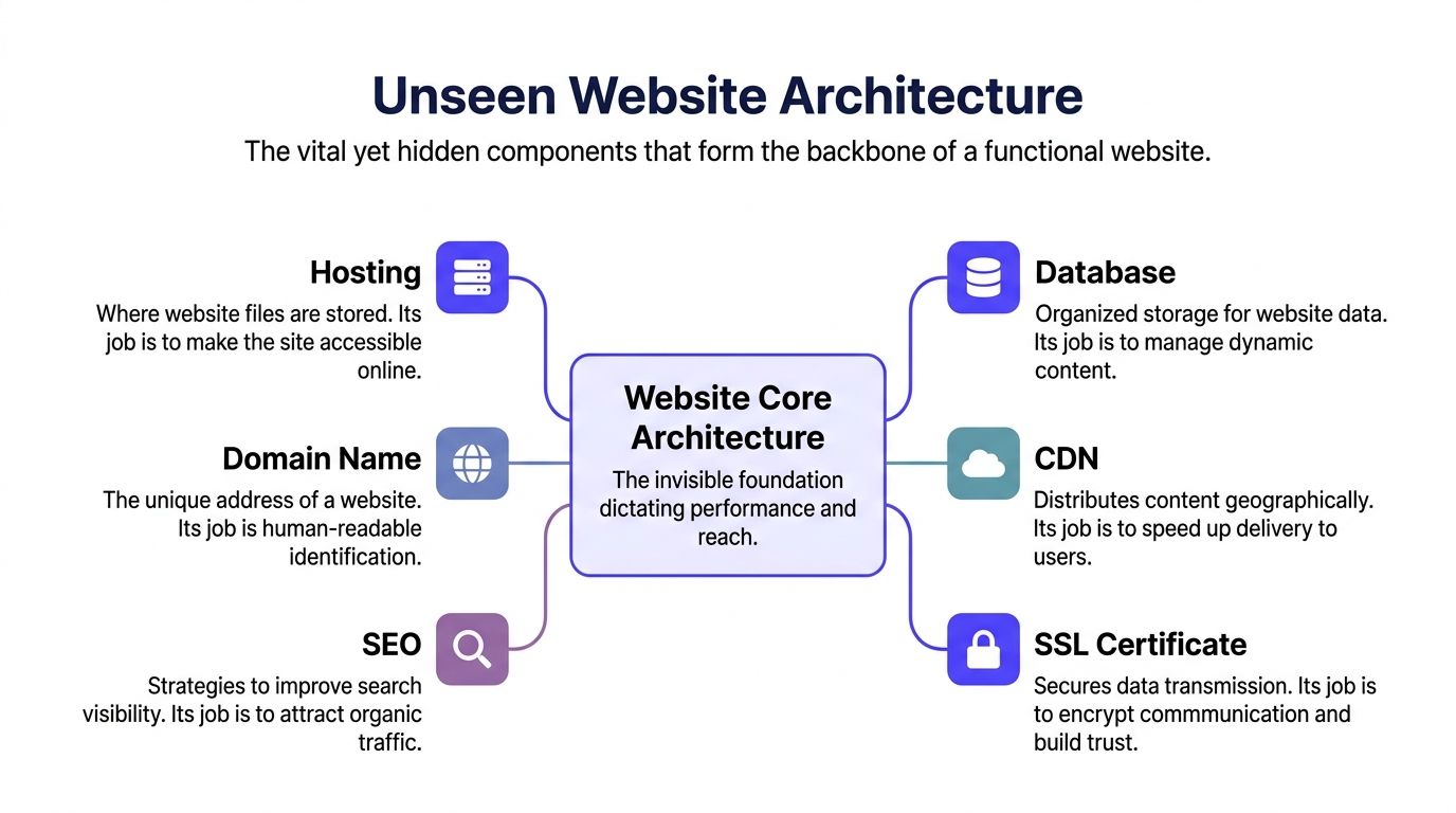
The frontend handles what users see and click. The backend handles logic, integrations, and data flow. The CMS gives marketing a controlled way to publish without waiting on developers for every headline change or landing page update.
That separation matters once the site does more than present information. Stripe's site, for example, blends marketing pages, product education, docs, pricing logic, and authenticated product experiences without feeling stitched together. Notion does something similar across templates, help content, and conversion pages. The business result is straightforward. Teams can ship content quickly, engineers can change product logic without rewriting the presentation layer, and users get a more consistent experience.
A founder does not need to diagram the system. A founder does need to understand what each choice costs later.
Hosting affects speed, uptime, and room to grow: Cheap hosting can look efficient until traffic spikes, deployments stall, or page speed drops on high-intent pages. If you need a practical framework for evaluating providers, ARPHost's web hosting guide is a useful starting point.
CMS choice affects marketing velocity: A content team publishing comparison pages, case studies, and solution pages every week needs workflows, permissions, and reusable components. A static setup can be fine for a small brochure site, but it slows down a growth team.
API boundaries affect engineering velocity: Clean connections between CRM, product data, billing, and the website reduce one-off fixes. Messy integrations turn the site into a fragile layer no one wants to touch before a launch.
SEO lives inside this structure. Search performance depends on whether pages are easy to crawl, internally connected, and organized around how buyers evaluate the product.
A common failure mode is depth. Important pages get buried under resource hubs, dropdowns, or campaign layers that made sense during one launch and never got cleaned up. Then high-value pages for integrations, use cases, or industries become harder for both users and search engines to reach.
The better model is simple page hierarchy tied to business intent:
Layer | Business effect |
|---|---|
Homepage and top nav | Clarifies the offer and routes visitors by intent |
Category and solution pages | Capture demand and match buyer context |
Product and feature pages | Support evaluation and conversion |
Docs, help, or resources | Add depth, answer objections, and reduce support load |
Teams usually need one shared map before they can improve any of this. A clear explanation of website information architecture helps design and engineering make page structure decisions from the same model instead of treating SEO, navigation, and CMS setup as separate problems.
A polished interface gets attention. Good architecture gets trust, search visibility, and a site the team can keep improving without breaking it.
The Senses Analytics Security and Compliance
A website that cannot observe behavior or protect user data will lose trust faster than any visual polish can recover it. Founders often split analytics, security, and compliance across marketing, product, and legal. Users experience them as one system. They either feel confident enough to continue, or they leave.
Tracking shows where intent turns into friction
Pageviews rarely answer the question a startup needs answered: what moved a visitor closer to revenue, and what blocked them? Useful website analytics capture decision points such as CTA clicks, pricing interactions, form starts, demo requests, docs visits before signup, and drop-off inside onboarding.
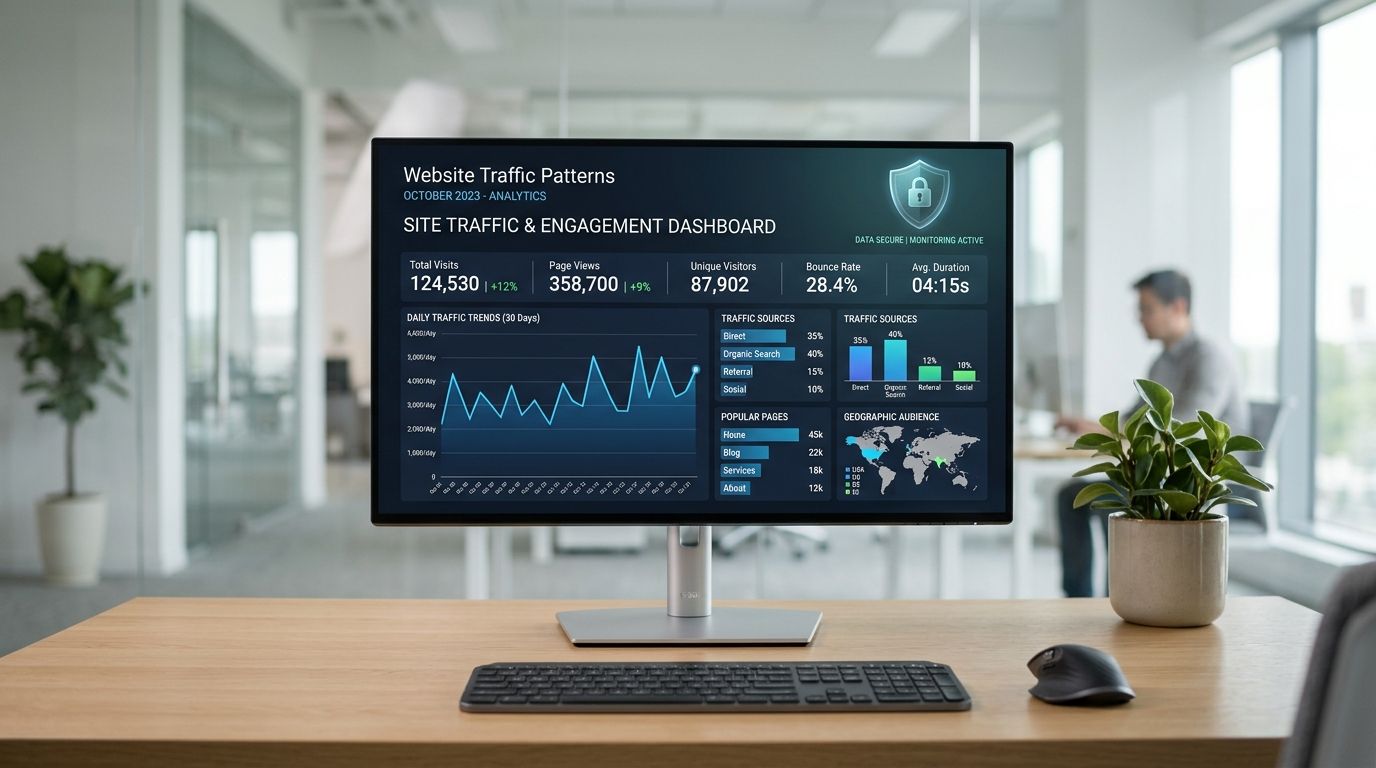
Here, product and marketing alignment stops being political and starts being operational. If visitors click into pricing but never engage with the annual toggle, that says something about packaging. If they start a demo form and quit at the company-size field, that points to form design or qualification logic. Teams like Stripe and Notion win in part because their websites are instrumented around user intent, not just traffic totals.
The common failure mode is boring and expensive. A team installs GA4, Mixpanel, or Heap, then never agrees on event names, ownership, or what counts as a meaningful conversion. Six months later, every dashboard exists and no one trusts any of them.
A better setup is disciplined and cross-functional:
Track decision moments: pricing toggles, form starts, demo completions, docs visits before signup
Separate acquisition from activation: a visit is awareness, an action is progress
Review behavior with design and engineering together: one team sees the symptom, the other can fix the cause
Tie events to business questions: which page assists pipeline, which step suppresses conversion, which content reduces sales friction
Security and compliance shape credibility before sales ever gets involved
Security is not hidden infrastructure from the user's perspective. It shows up in browser trust signals, how forms handle sensitive input, whether cookie consent is clear, how account entry points behave, and whether privacy language reads like legal filler or a real explanation.
That matters more in AI, fintech, and B2B SaaS, where the website often asks for work email, company information, and in some cases access to live systems. If those moments feel careless, prospects assume the product is careless too. Teams auditing these basics can use these data security best practices as a practical checklist.
Compliance also affects how teams work together. Designers define how consent, disclosures, and trust signals appear. Engineers decide how scripts load, how forms store data, and how access is controlled. If those decisions happen in isolation, the result is usually a site that satisfies a policy requirement while hurting conversion. Good teams make trust visible without adding unnecessary friction.
Users rarely describe this in governance language. They say the site feels sketchy, confusing, or not ready for serious work.
The business outcome is straightforward. Strong analytics help teams improve conversion with evidence. Strong security and compliance reduce hesitation, support enterprise trust, and prevent expensive cleanup later. Together, they turn the website from a marketing surface into a product the company can measure, defend, and improve.
Integrated Parts Create a Cohesive Product
The parts of a website only work when they're built as one product. If the brand layer says one thing, the interface says another, and the frontend implementation can't support either cleanly, the result feels cheap even when each contributor is talented.
Many startup teams often get stuck at this stage. The product designer optimizes flows. The brand designer refines expression. The frontend developer tries to reconcile both under deadline. Without a shared system, the site accumulates inconsistencies, rework, and handoff friction.
There's also a direct cost angle. UX Planet's salary comparison notes that replacing three separate hires, a product designer, a brand designer, and a frontend developer, can save funded startups $180,000 to $240,000 annually in direct salary costs alone. For Seed to Series B teams, that's not a small operating detail. It changes hiring plans and shipping capacity.
The point isn't that specialists don't matter. They do. The point is that website work is interconnected enough that founders need one coherent system, not three separate interpretations of what the site is supposed to do.
If your team needs one creative partner across product design, brand, and frontend, 925 studios works with AI SaaS, Web3, and fintech companies to turn complex products into polished, conversion-focused websites and interfaces without building a full in-house team.


Let’s keep in touch.
Discover more about high-performance web design. Follow us on Twitter and Instagram.

