
What Is Information Architecture: A 2026 Guide for AI & Web3

Yusuf
Founder and lead designer at 925studios

Information architecture is the practice of organizing a digital product's content so people can find what they need and complete tasks, and at least 50% of users enter through a page that isn't the homepage. That means your product can't rely on one clean landing page to make sense, it needs a clear structure everywhere, like a blueprint for a digital space.
If you're running an AI SaaS, Web3, or Fintech product, you've probably felt this already. The product is powerful. The feature set keeps growing. The team knows how it works. But users still ask basic questions, skip important steps, or leave before they reach the value.
That usually isn't an engineering problem. It's an information problem.
A product can be technically strong and still feel broken if the structure underneath it is messy. Users don't experience your roadmap, your internal naming, or your org chart. They experience menus, labels, flows, search, settings, dashboards, and help content. If those pieces don't line up, the product feels harder than it should.
Good information architecture fixes that. It gives your product a structure people can trust, understand, and move through without second-guessing every click.
Table of Contents
Your Product Is Confusing and It Is Costing You Users
Founders usually notice IA problems indirectly. Trial users stall out. Existing customers ignore valuable features. Sales calls go well, but activation is weak. Support gets the same questions again and again, even though the answers are already in the product.
That's what poor information architecture looks like in practice. Not ugly screens. Not missing features. Just a product that makes people work too hard to understand where things live and what they're supposed to do next.
The hidden reason smart products feel hard
This happens a lot in technical categories because complexity arrives gradually. A team launches with one core workflow. Then it adds permissions, analytics, integrations, billing logic, AI outputs, audit logs, and settings. Each addition makes sense on its own. Together, they create a maze.
A founder often sees this as a messaging problem. A PM may treat it like onboarding friction. Engineering may assume users just need more documentation. Sometimes those are part of the fix, but the root issue is often simpler. The product's structure stopped matching the way customers think.
Practical rule: If users keep asking where something is, what a label means, or how two features differ, the issue usually sits in structure before it sits in visuals.
Poor IA causes expensive mistakes because teams build on top of confusion. They add another tab instead of regrouping the dashboard. They rename a feature in marketing, but not in the app. They ship a help center to explain a workflow that should've been clear in the product itself.
What good IA changes
Good IA is the invisible structure that makes a complicated product feel calm. It decides what belongs together, what deserves top-level navigation, what can stay secondary, and what language users will understand.
Here's what tends to improve when the structure is right:
Feature discovery gets easier, because important capabilities aren't buried under vague categories.
Onboarding gets cleaner, because new users can follow a logical path instead of decoding your internal model.
Support load drops, because fewer people need help with basic wayfinding.
Product decisions get sharper, because the team has a shared map of the system.
For startup teams, this matters early. Every confusing branch in the product creates more design debt, more frontend cleanup, and more friction for growth.
A clear structure won't make a weak product strong. But it will stop a strong product from feeling weak.
What Information Architecture Actually Is
Information architecture is the structural design of shared information environments. In practical product terms, it's how you organize content, labels, navigation, and search so people can find things and use the product without getting lost. The modern discipline was formally introduced in 1976 through Richard Saul Wurman's address at the American Institute of Architecture conference, a key milestone in defining IA as a professional practice tied to information design, as outlined in the Journal of Information Architecture.
The blueprint behind the interface
The easiest way to understand what information architecture is, is to think like a builder.
A blueprint doesn't decide the paint color. It decides where the walls, doors, rooms, and hallways go so the building works. IA does the same for digital products. It determines where information belongs, how sections connect, and how someone moves from one task to the next.
That's why IA sits underneath UI. A polished interface can still fail if the structure is wrong. If your navigation groups billing with developer tools, or your AI results are separated from the actions users need next, the surface design can't save the experience.
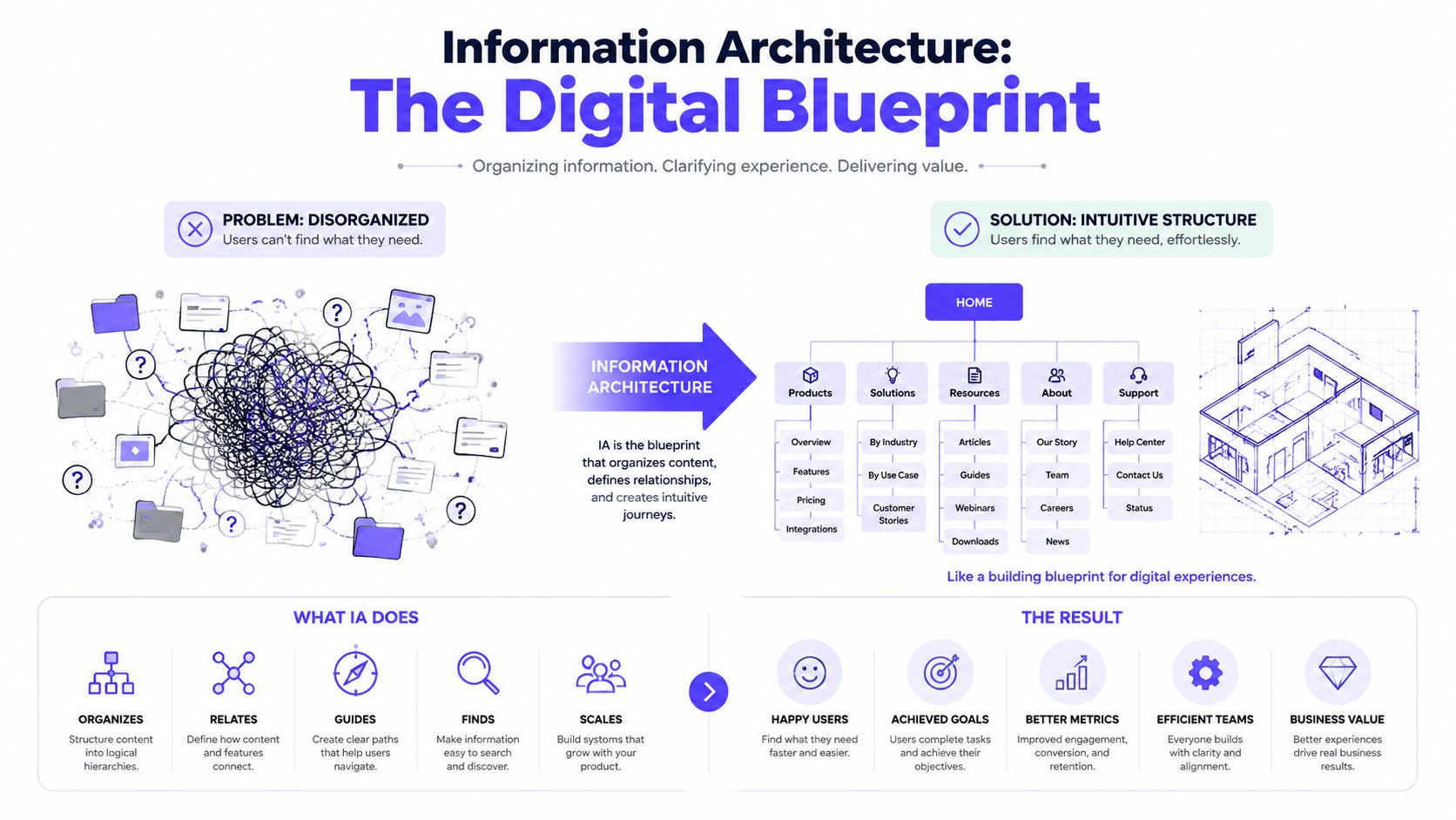
A useful analogy is a library. Readers don't need to know how the librarians think internally. They need shelves, labels, categories, and a catalog that help them find the right book quickly. Your users want the same thing from your product.
If your team manages a lot of product content, docs, or catalog-like data, it also helps to understand how structured information supports operations over time. Approaches that boost ecommerce growth with data gain importance, as strong structure improves both user findability and internal content management.
The four parts founders should know
The four main components of information architecture are organization systems, labeling systems, navigation systems, and searching systems, as defined by Baymard's overview of information architecture in UX.
Component | What it does | Product example |
|---|---|---|
Organization systems | Group information into meaningful categories | A Fintech app separates accounts, transactions, cards, and compliance instead of dumping them into one dashboard |
Labeling systems | Decide what things are called | An AI SaaS product uses “Workflows” instead of an internal term like “Execution Graphs” |
Navigation systems | Help users move through the product | A Web3 platform keeps wallet, assets, activity, and security visible across the app |
Searching systems | Help users find specific items directly | A docs portal lets users search policies, API references, and setup guides from one place |
Good IA isn't arranging boxes on a screen. It's choosing a structure users can predict before they click.
When founders ask for a cleaner UI, they're often really asking for better IA. They want fewer confused users, clearer feature paths, and a product that feels easier to adopt. That starts long before visual polish. It starts with the blueprint.
Why IA Is a Must-Have for AI SaaS Web3 and Fintech
In a simple brochure site, weak IA is annoying. In a complex technical product, it becomes expensive.
AI SaaS, Web3, and Fintech products carry more cognitive load than a typical marketing site. Users aren't just browsing. They're making decisions, completing workflows, interpreting system output, and trusting the product with money, data, or both.
Complex products break when structure is weak
AI products are the clearest example right now. Interfaces change based on user input, generated output, model state, or automation logic. That's harder to organize than a static app. According to the Interaction Design Foundation's IA topic page, data from a 2025 NNConf UX report shows that 67% of AI SaaS founders struggle with labeling and navigation when content evolves in real time.
That tracks with what product teams run into. Static navigation doesn't hold up when dashboards change state, AI-generated objects multiply, and users need to understand both what happened and what to do next.

If you build AI software, weak IA usually shows up in a few places:
Outputs without context, where users see results but can't tell what generated them.
Labels that reflect the model, not the customer, such as internal system terms in user-facing menus.
Navigation that breaks under growth, especially when new workflows keep getting added beside old ones.
Object confusion, where users don't understand the difference between projects, runs, agents, prompts, reports, or templates.
Web3 has a different failure mode. The product may be technically elegant, but the structure assumes too much prior knowledge. Wallet actions, governance, staking, bridging, asset management, and network selection get blended together. New users don't know what belongs where, so every step feels risky.
Trust depends on clarity
Fintech products live or die on trust. People need to know where their money is, what action they're taking, what status a transaction is in, and how to reverse or confirm it. That trust comes partly from visual design, but mostly from predictable structure.
When financial information is grouped logically, labeled clearly, and placed in the right sequence, users feel in control. When it isn't, they hesitate.
In complex products, clarity isn't decoration. It's part of the product's credibility.
This is why IA becomes a competitive advantage. Teams often focus on features, interface polish, or launch velocity. Fewer teams slow down long enough to ask whether the whole product is organized in a way customers can understand.
Founders who get IA right usually make better product decisions across the board. They define cleaner objects. They name things more clearly. They build navigation that can scale. They ship products that feel smaller than they are, in a good way.
That's hard to copy once your competitors have already built confusion into the foundation.
The Core Principles of Good Information Architecture
Strong IA doesn't start with menus. It starts with alignment.
Louis Rosenfeld and Peter Morville defined effective IA as the intersection of content, context, and users, as explained in Figma's guide to what information architecture is. That sounds simple, but it's the reason many products drift into confusion. Teams over-index on one circle and ignore the other two.
Content, context, and users
Content is the information and functionality your product contains. In a SaaS dashboard, that includes records, reports, settings, alerts, tasks, templates, and support content. In a Fintech product, it might also include balances, transaction history, statements, permissions, and compliance notices.
Context is the business reality around the product. Your revenue model, technical constraints, regulatory requirements, sales motion, and support burden all shape the right structure. A self-serve AI tool and an enterprise admin console shouldn't be organized the same way, even if they share features.
Users are the people trying to get work done. Their goals, vocabulary, mental models, and expectations matter more than your internal team's naming. If customers think in terms of “campaigns” and your product calls them “deployments,” you've introduced friction before they even click.
Here's the practical test:
If you optimize only for... | What happens |
|---|---|
Content | The product becomes complete but hard to navigate |
Context | The product serves internal business logic more than customer understanding |
Users | The product may feel intuitive at first, but break under technical or business constraints |
Rules that hold up in real products
Some IA principles are consistently useful because they match how people make sense of complexity.
The Principle of Choices matters because too many options weaken decision-making. In product terms, that means a top nav shouldn't expose every possible destination. It should expose the destinations that help users act.
The Principle of Disclosure matters because users don't need every detail at once. An AI analytics dashboard can show the headline result first, then let users drill into prompts, model runs, and supporting evidence when they need it.
The Principle of Exemplars matters because categories are clearer when people can see what belongs inside them. “Resources” is vague. “Resources, reports, templates, and policy docs” gives users a better mental boundary.
A useful check: if a label needs a long tooltip to make sense, the label probably isn't doing its job.
This is also where IA overlaps with content structure and discoverability. Teams trying to improve visibility in AI answer engines often run into the same issue inside their products and websites. Clear structure helps machines parse information, but above all, it helps people trust what they're seeing.
Visual presentation still matters. Once the structure is right, hierarchy on the screen makes that structure easier to scan. The clearest explanation of that relationship is in this guide on visual hierarchy in product design.
A lot of founders want one rule that solves everything. There isn't one. Good IA comes from repeated decisions that balance business logic with user logic, then keep the product understandable as it grows.
Common IA Deliverables and Workflows
IA work is easy to underestimate because the output doesn't always look flashy. But these deliverables are what keep a product team from building the wrong thing cleanly.
The workflow usually starts before any polished UI exists. It begins with an inventory of what's already there, what users need, and what the business is trying to make easier.
What the workflow looks like in practice
A strong IA process starts with a content audit. According to Instaclustr's comparison of data architecture and information architecture, effective IA requires initial content audits, often through card sorting or spreadsheet analysis, to identify master structures before defining navigation paths.
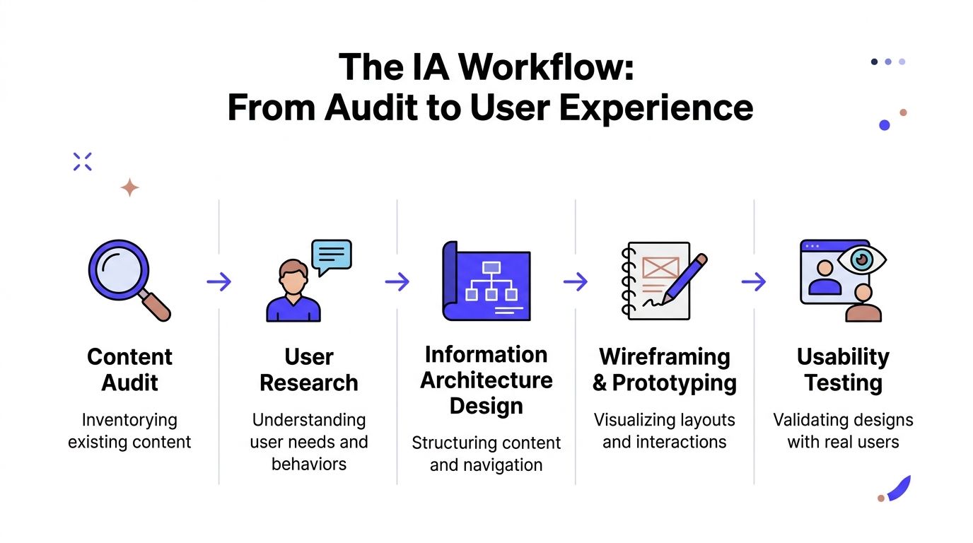
In plain terms, that means gathering the current pages, screens, modules, docs, and labels into one place. The inventory frequently uncovers surprising issues. Duplicate pages. Overlapping features. Settings hidden in multiple locations. Labels that mean different things in sales, product, and support.
After that, teams usually move through a sequence like this:
Audit what exists
Pull together screens, flows, docs, settings, and edge cases. A spreadsheet often exposes the mess faster than a design file does.Map user goals Identify what different users are trying to accomplish. Admins, analysts, traders, operators, and end customers usually need different paths.
Create the structure
At this stage, sitemaps, object models, and navigation groups take shape. The question isn't “what can we fit in the menu.” It's “what belongs together.”Pressure-test the flow
Low-fidelity wireframes help teams check whether the structure works before they commit to polished UI and frontend build.
To make that process more concrete, this walkthrough is useful:
The deliverables that keep teams aligned
A sitemap is the map of the product. It shows what lives at the top, what nests below, and where related areas connect. For founders, it's one of the fastest ways to spot bloat. If the structure looks confusing in a tree, it usually feels confusing in the app.
A user flow is a script for task completion. It shows how someone gets from starting point to finished outcome. This matters most in products with setup, transactions, approvals, or multi-step configuration.
A wireframe proves whether the structure survives contact with the interface. If a wireframe feels crowded or unclear, the issue often sits in the IA, not just the layout.
Teams often treat wireframes like rough visuals. Their bigger job is to expose structural mistakes while they're still cheap to fix.
A design system, once the structure is stable, helps keep that logic consistent across the product. This guide on design system documentation is helpful if your team is trying to scale naming, patterns, and component rules after the IA is defined.
If a startup doesn't have in-house coverage for product design, brand, and frontend implementation, one option is 925 Studios, which works as one creative partner across those areas. In IA-heavy projects, that matters because structure decisions need to survive strategy, interface design, and shipped code.
Is Your Product's IA Working? An Evaluation Checklist
You don't need a full redesign to spot IA problems. You can review your product with a short set of plain-language questions and get a pretty honest read.
One rule matters immediately. At least 50% of users will access a website through an entry point other than the home page, which means every important page needs enough context and navigation to stand on its own, as noted in CareerFoundry's guide to information architecture.
A fast founder-level review

Run through this checklist inside your product, not just on the marketing site:
Can a new user understand the main navigation quickly? If the top-level choices feel abstract, overlapping, or internal, people will hesitate immediately.
Do labels match customer language? Terms should reflect how users describe their work, not how your team describes your system.
Can users complete common tasks without hunting? Signing up, funding an account, running a workflow, exporting a report, or finding settings should all have obvious paths.
Does every page explain itself? A user landing deep in docs, a dashboard, or a settings page should still know where they are and what to do next.
Are important features buried under “more,” “other,” or vague menu groups? That usually signals that the structure needs another pass.
A content review often helps here too, especially for teams carrying years of docs, blog posts, release notes, and product pages. If that's your situation, this checklist for unlocking your content library value is a practical place to start.
When to step in and fix it
Some IA issues are cosmetic. Others are expensive.
If users complete tasks but complain about wording, you may only need labeling fixes. If users repeatedly miss key features, get lost in settings, or rely on support for basic navigation, the structure itself likely needs work.
Use this rule of thumb:
Signal | Likely issue |
|---|---|
Users ask “where is this?” | Navigation or grouping problem |
Users ask “what does this mean?” | Labeling problem |
Users start tasks but don't finish | Flow or hierarchy problem |
Users avoid useful features | Findability problem |
If you want a deeper review process, this step-by-step guide on how to run a UX audit for your SaaS product gives a useful structure for diagnosing friction beyond the surface.
Good IA isn't invisible to your business. It shows up in whether users adopt the product, trust it, and come back without needing someone to explain every step.
If your product has grown fast and the structure hasn't kept up, 925 Studios helps AI SaaS, Web3, and Fintech teams turn complex products into clear, usable experiences. We work as one creative partner across product design, brand design, and frontend development, so the strategy behind your IA makes it into the shipped product.


Let’s keep in touch.
Discover more about high-performance web design. Follow us on Twitter and Instagram.

