
User Interface Animation: A Founder's Guide to Better Apps

Yusuf
Founder and lead designer at 925studios

Most advice about user interface animation gets the priority backward. Teams debate whether motion is tasteful, trendy, or “worth the polish pass,” when the core question is simpler. Does the product feel understandable and trustworthy when people use it?
For AI SaaS, Web3, and Fintech products, that answer often depends on motion more than founders expect. When a dashboard updates, a trade confirms, a wallet connects, or an AI workflow takes a moment to respond, people need signals. They need to see what changed, what's loading, what succeeded, and what the system is doing on their behalf. If that feedback is missing, the product can still function, but it feels shaky. Users hesitate. Conversion suffers. Support tickets rise. Trust slips.
That's why user interface animation isn't a cosmetic layer. It's part of product communication, just like naming, layout, and copy.
Table of Contents
Animation Is Not Decoration
Founders hear the same bad take all the time. Animation is “nice to have.” It's what you add after the core product work is done.
That's wrong.
The use of animation in interfaces isn't a new trend. It dates back to the Apple Lisa in the early 1980s, which used motion in its graphical user interface to show how different elements related to each other, establishing animation as a core part of human-computer interaction from the beginning, as described in this history of UI animation. The point wasn't flair. The point was clarity.
That same rule matters even more now. AI SaaS tools juggle prompts, outputs, streaming states, approvals, and confidence gaps. Web3 products ask people to sign transactions and trust wallet states they often don't fully understand. Fintech products handle balances, transfers, verification, and money movement, where uncertainty is expensive.
When motion is absent, users fill the gap with doubt.
If a button does something important and the interface barely reacts, people assume the product missed their action.
That's the business issue. Poor motion design doesn't just make a product feel plain. It makes it feel unreliable. A static jump from one state to another can feel like a glitch. A modal that appears with no relationship to the screen behind it can feel abrupt. A loading state with no visible progression can make users wonder whether they should click again, refresh, or abandon the task.
A useful way to think about it is this:
Copy explains meaning
Layout explains structure
Animation explains change
If your product handles simple content, you can get away with rough transitions for a while. If your product handles money, identity, analytics, or AI-generated output, you usually can't. Those products ask users to trust invisible systems. Motion helps make those systems legible.
Good user interface animation tells people, “your action registered,” “this object moved here,” “this panel belongs to that control,” and “the system is working.” None of that is decorative. It's operational.
The Business Case for Thoughtful Motion
Animation earns its keep when it improves perception, not when it shows off. The strongest product teams use motion to make an app feel faster, more stable, and easier to trust.
Start with the business reality. Most founders aren't selling pixels. They're selling confidence. They need a user to believe, quickly, that the product is responsive, clear, and worth continuing with.
This summary captures the payoff well:
Research from the Nielsen Norman Group confirms that animation significantly helps users understand how a UI works. Their studies show that motion isn't subjective, it's a functional tool that conveys spatial relationships and can even alter the perception of time, making loading feel shorter, as summarized in this discussion referencing the NNGroup studies.
Faster feeling products win more patience
Perceived speed matters because users don't experience your system as backend architecture. They experience it as waiting or not waiting.
An AI product is a good example. If a prompt takes time to process, the interface can either leave the user in dead silence or show clear, restrained movement that says the request is underway. The second approach usually feels more competent. The same is true in Fintech when a transfer is processing, or in Web3 when the app is waiting on wallet approval and chain confirmation.
A founder doesn't need more “delight.” They need fewer moments where users think the product is broken.
For teams improving product quality broadly, the same thinking applies to modern user interface design. Motion is one of the tools that turns a functional flow into one people trust enough to finish.
Feedback reduces hesitation
People commit more easily when the system answers them immediately. A pressed button state, a subtle color shift, a panel that enters from the control that opened it, these cues are tiny, but they remove friction at the exact point where a user decides whether to continue.
Compare a few familiar patterns:
Product moment | Weak motion choice | Strong motion choice | Business effect |
|---|---|---|---|
Stripe checkout confirmation | Sudden screen swap | Clear success feedback tied to the action | Less uncertainty at payment moment |
Mercury dashboard action | No visible acknowledgment | Immediate state change with light transition | More confidence in money-related tasks |
Linear issue update | Jarring redraw | Tight feedback on save and status change | Faster-feeling workflow |
The pattern is simple. When the interface reacts with precision, people trust it more.
Later in the flow, motion can also support brand perception. A product that behaves consistently feels premium. Not expensive-looking. Competent. That matters when buyers compare similar features and one product feels cleaner to use.
A short product example makes the difference obvious:
Practical rule: If motion helps a user understand what happened, where something went, or whether the system is working, it has business value.
A Simple Taxonomy of UI Animation
This is often overcomplicated. You don't need a giant motion framework to make good decisions. For product work, user interface animation usually falls into three buckets.
Feedback that confirms intent
This is the smallest kind of motion, and often the most important. A button depresses. A toggle snaps. A saved state appears. A field shows that input was accepted.
Linear does this well. The interface reacts quickly and stays out of the way, which is exactly what a work tool should do. You click, and the system answers. Stripe's forms also rely on this kind of tight feedback. When payment or setup flows ask for precision, visual confirmation lowers doubt.
This is the layer many teams ignore because each motion is tiny. But tiny moments stack. If every click feels uncertain, the whole product feels fragile.
A useful primer on this category is what interaction design means in products. The core idea is simple. Interfaces should acknowledge intent right away.
Transitions that preserve orientation
This category handles movement between states. A drawer slides in. A page panel expands. A card opens into a detail view. The point is to preserve spatial logic so users don't feel teleported.
Mercury's product style is a good reference here. Financial tools have a lot of dense information, and abrupt changes can feel risky. A controlled transition helps users understand that they're still in the same system, just looking at a deeper level of information. Not a new world, not a random jump, just a clear next state.
Here's where weak teams usually make the wrong trade. They remove all transitions in the name of speed, then end up with an interface that feels harsher and harder to parse. Users may not name the problem, but they feel it.
Narrative motion that teaches
This is the broadest bucket. It includes onboarding sequences, product tours, animated explanations, and guided reveals of advanced features.
Stripe has long been strong at showing complex ideas with restrained motion on both product surfaces and marketing pages. Good narrative animation can explain a flow without paragraphs of copy. In AI products, it can show how data moves from prompt to output to action. In Web3, it can explain a wallet flow or transaction sequence in plain visual terms.
A quick way to separate useful narrative motion from fluff:
Useful narrative motion helps users understand a process
Weak narrative motion fills space and delays action
Best use case is when the product involves invisible system behavior
Motion should either confirm, orient, or explain. If it doesn't do one of those, it probably shouldn't ship.
Guiding Principles of Good Animation
Bad motion usually fails in plain, expensive ways. It adds doubt, adds delay, or makes the product feel less reliable.
That matters more in AI, Web3, and Fintech than in a simple marketing site. If a wallet confirmation flickers, a balance update arrives with no visual cue, or an AI workflow jumps between states without explanation, users do not read that as a design flaw. They read it as product risk.
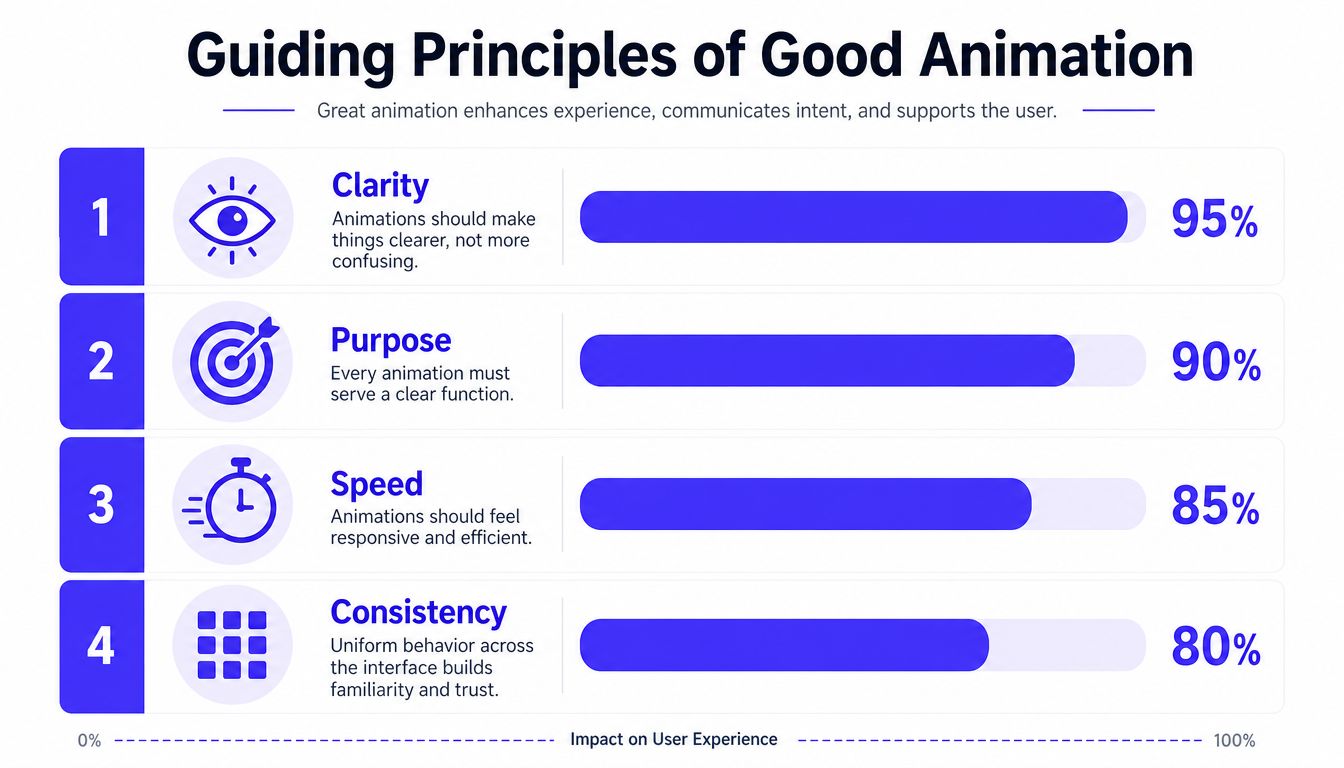
Give every movement a job
Every animation needs a business reason before it gets a design reason.
A loading shimmer in ChatGPT works because it signals that the system is processing. The card expansion in Apple Wallet works because it preserves context while revealing more detail. The subtle balance and transfer feedback in products like Revolut and Stripe helps users trust that money moved, or did not move, with intent. In each case, motion reduces uncertainty. Lower uncertainty improves task completion and reduces abandonment.
A simple review standard works well in product critiques:
Purpose: Does the motion confirm, guide, or explain?
Clarity: Does it reduce user doubt during a state change?
Consistency: Does the same action behave the same way every time?
If a transition cannot pass that test, it is probably decoration.
Timing shapes perceived quality
Teams often ship one of two bad outcomes. Interactions snap so fast that users lose the thread, or they linger long enough to feel like the product is stalling.
Arizona State University's animation guidance recommends keeping many interface transitions in the 200 to 500 ms range, with quicker feedback for simple interactions such as toggles and taps, in its UX animation guidelines. That is a useful starting point, not a law. A trading action should feel tighter than an onboarding explainer. A complex AI result reveal can take a bit longer if the motion explains what is happening and reassures the user that progress is real.
I usually push teams to judge timing by trust, not taste. In a Fintech product, a deposit confirmation that vanishes too quickly can feel unsafe. In an AI tool, an overly theatrical result reveal can make the model look slower than it is. Both choices hurt confidence, and confidence affects conversion.
Natural motion depends on easing too. Material Design recommends deceleration for elements entering a resting state because it lets motion start promptly and settle in a way users can follow, as described in Google's motion easing guidance. That is why ease-out curves show up so often in well-tuned product interfaces. They make the response feel immediate without ending abruptly.
Here is a practical cheat sheet:
Interaction type | What usually works |
|---|---|
Click, hover, toggle | Immediate response with very short motion |
Panel open, drawer reveal, layout shift | Brief transition with obvious direction and clean stop |
Onboarding or explanatory motion | Longer only when it reduces confusion or teaches a process |
One more rule matters for founders in regulated or high-stakes products. Motion has to respect digital accessibility requirements. If an animation looks polished but distracts, disorients, or hides key state changes, it is not doing its job.
Good animation makes the product feel responsive, credible, and easier to trust.
Performance and Accessibility Trade-Offs
Animation has to earn its place in the product.
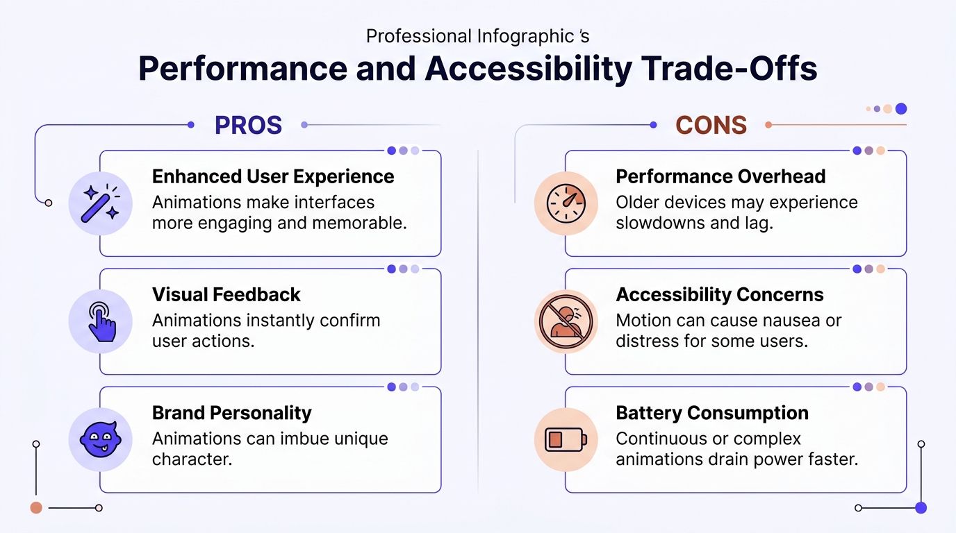
For AI, Web3, and Fintech teams, that means motion cannot steal resources from the actions users care about most. If a portfolio screen lags while balances refresh, or an AI workspace stutters while a response streams in, users do not read that as a small front-end issue. They read it as product instability. In products that handle money, predictions, or sensitive decisions, that instability cuts into trust fast.
Some motion is cheap, some is expensive
The browser handles some animations well and struggles with others. Animating opacity and transforms usually performs better because those changes avoid heavier layout work, as explained in this guide to smooth animation performance.
That matters more in real products than in polished prototypes.
A simple fade on a confirmation toast is usually fine. A card stack that constantly resizes, reflows, and animates live data updates at the same time is where teams get into trouble. I see this often in dashboards with streaming AI output, trading views, and admin tables. Every extra moving layer competes with rendering, input response, and data fetches. The result is a product that feels slower than it is.
Stripe gets this right in many parts of its product. Motion tends to clarify state changes without making the interface feel busy. Coinbase has a similar constraint. Price movement already creates enough visual activity, so extra animation has to stay restrained or the product starts to feel noisy and less dependable.
A useful operating rule:
Animate changes in state, not constant activity
Prefer opacity and transform over layout-heavy properties
Cut overlapping motion while live data is updating
Test on average laptops and phones, not only high-end machines
Document approved patterns in your design system documentation so teams stop inventing new motion on every screen
Performance problems here are not cosmetic. They affect task completion, session length, and conversion. If a checkout flow, wallet connection, or model-generation step feels unstable, users hesitate. Hesitation costs revenue.
Accessibility is part of product quality
Motion also has a user cost.
Some people experience dizziness, nausea, or disorientation from interface movement that others barely notice. Products should respect system reduce-motion preferences and remove nonessential animation, as covered in Concrete CMS's overview of animation and UX accessibility. For teams that need a broader reference point, these digital accessibility requirements are a useful starting resource because they connect design choices back to real implementation standards.
The business case is straightforward. If motion makes the product uncomfortable to use, some users leave, some avoid key workflows, and some stop trusting the team behind the product. That is a product failure, not a preference mismatch.
Reduced motion should not mean reduced clarity. If an animation signals that a payment succeeded, a trade executed, or an AI answer is still generating, keep that meaning through copy, color, progress states, or labels. Save movement for the cases where it improves understanding. Cut it where it only adds flair.
From Concept to Code Without Headaches
Animation usually fails in the handoff.
A founder approves a polished concept for an onboarding flow, wallet connection, or AI response state. Design shows the intent. Engineering ships something close, but the timing drags, the exit state snaps, or the loading transition behaves differently across screens. Users read that inconsistency as product sloppiness. In Fintech and Web3, that hurts trust fast. In AI products, it makes system latency feel worse than it is.
The fix is boring and effective. Show motion clearly before anyone builds it.
Show the motion before building it
For complex interactions, use a motion comp. A short exported video or prototype, paired with a simple timeline, removes guesswork that static screens always leave behind. Engineers should not have to infer movement from a Figma file with arrows and comments.
A usable spec covers five things:
What triggers the animation
Which elements move
How long it lasts
What the end state should be
What changes in reduced-motion mode
That level of clarity saves more than design time. It cuts rework, shortens QA, and reduces the small inconsistencies that make a product feel unreliable. Stripe does this well in its product surfaces. States change with purpose, not drama, and that restraint supports the impression that the system is controlled and dependable. Cash App and Coinbase benefit from the same principle. In products tied to money, motion that feels precise makes the whole product feel safer.
For teams building in React, practical implementation details matter too. This guide on strategies for better React UI motion is useful because it focuses on shipping motion without creating chaos in the codebase.
Documentation matters just as much. If your team already has approved patterns for drawers, hover feedback, success states, and loading behavior, each sprint starts from decisions that were already made well. Good design system documentation helps teams keep motion consistent across product design and frontend work.
One partner removes handoff failure
Founders run into this problem when product design, brand design, and frontend development operate as separate functions with separate priorities. Motion sits across all three. It shapes clarity, perceived quality, and implementation detail at the same time.
925 Studios is built around that overlap. It acts as one creative partner replacing three separate hires, a product designer, a brand designer, and a frontend developer, so motion decisions stay intact from concept through shipped interface.
That model has a practical benefit. User interface animation is often where fragmented teams expose seams first. The concept is strong, but the shipped product feels slightly off. Users notice that immediately. They may not describe it as a timing issue or a transition bug, but they do feel less confidence in the product, and that affects conversion, retention, and expansion.
A Simple Animation Checklist for Your Team
Teams often don't need more inspiration. They need a sharper review standard.
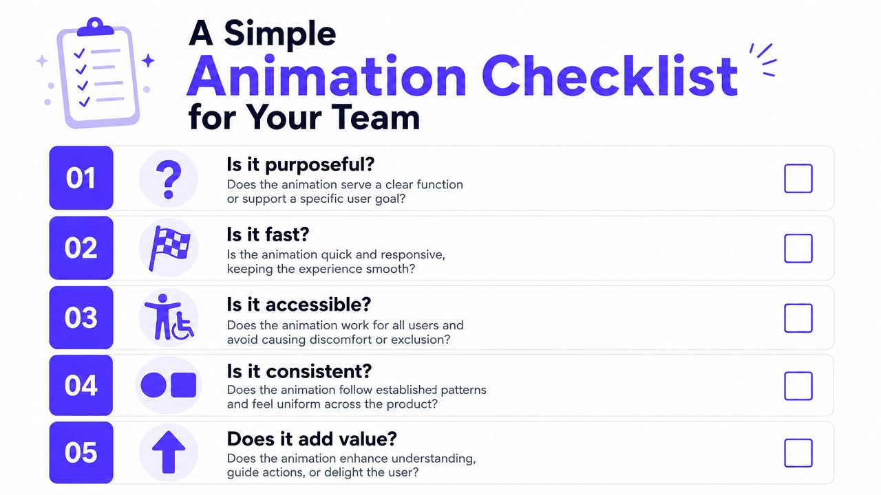
This checklist works well in product reviews, sprint planning, and QA. It keeps the conversation focused on product outcomes instead of personal taste.
Use these questions in design review
Ask these before anything ships:
What job is this animation doing? If the team can't answer in one sentence, remove it or rethink it.
Does it make the product feel faster or slower? Motion should reduce uncertainty, not extend it.
Is the response immediate where it matters most? Confirmation around clicks, taps, and form actions should feel tight.
Does the movement match the importance of the action? A tiny save event doesn't need a dramatic sequence.
Will a first-time user understand the transition? The interface should feel connected, not random.
That last point matters more in AI and Fintech than in simpler products. Users already have enough ambiguity to manage.
What strong teams decide early
The hardest challenge in complex AI dashboards is balancing rich interaction with system latency. Smashing Magazine points out that there's little guidance on balancing high-FPS micro-interactions with AI response times, which creates a real product gap for teams trying to add polish without sacrificing speed in their article on accessible UI animation.
That's why the checklist should also include operational questions:
Review question | Why it matters |
|---|---|
Is this animation tied to a real state change? | Prevents decorative noise |
Have we tested it on a low-powered device? | Catches lag before users do |
What happens when reduced motion is enabled? | Protects accessibility |
Is this pattern used consistently elsewhere? | Builds trust through repetition |
Does this help conversion, comprehension, or confidence? | Keeps motion tied to business goals |
Ship less motion, but make each piece of motion earn its place.
The best animation strategy usually isn't “add more.” It's “use it where uncertainty is highest.” That means onboarding, payments, AI generation states, wallet actions, confirmation flows, navigation changes, and key success moments. In other words, the places where trust affects completion.
If your product feels functional but not fully convincing, motion is often part of the gap. 925 studios works with AI SaaS, Web3, and Fintech teams that need one creative partner across product design, brand, and frontend development, so interaction ideas don't die between mockup and code.


Let’s keep in touch.
Discover more about high-performance web design. Follow us on Twitter and Instagram.

