What Is Interaction Design? a Founder's Complete Guide

Yusuf
Founder and lead designer at 925studios

Interaction design is the practice of designing the conversation between a person and a product, focusing on its behavior. It was formally coined in the mid-1980s, and it took approximately 10 years before the field gained widespread adoption and became a recognized discipline.
You probably know the feeling. Your team built something technically strong, an AI workflow tool with real capability, a fintech product with serious infrastructure behind it, or a Web3 app that solves a real protocol problem. Then real users hit it, and suddenly the cracks show.
They hesitate at the first empty state. They don't know whether a transaction went through. They don't trust the AI output because the product doesn't explain what happened or what to do next. They abandon the onboarding flow, not because the technology is weak, but because the product's behavior is unclear.
That gap is where interaction design lives.
Founders often spend months on model quality, security, compliance, integrations, and shipping roadmap items. All of that matters. But users don't experience your architecture diagram. They experience button states, form logic, loading feedback, error recovery, motion, copy, and timing. They experience the conversation your product has with them.
In complex categories like AI SaaS, Web3, and Fintech, this matters even more. When the product handles money, automation, identity, permissions, or opaque system logic, people need more than a clean interface. They need a product that behaves in a way that feels legible, trustworthy, and controlled.
A polished UI can make a dashboard look expensive. Good interaction design makes it usable under pressure.
Table of Contents
Introduction Why Good Tech Is Not Enough
A founder usually sees the failure first in the metrics, but the root problem is often behavioral.
An AI app gets signups, but users stall after the first prompt because the system doesn't guide them toward a good input. A fintech dashboard has every feature an operations team asked for, but support gets flooded because users can't tell the difference between pending, failed, and completed actions. A Web3 product works exactly as designed, but new users bounce because wallet connection, signing, and confirmation states feel risky and obscure.
None of those are "just UX issues." They're interaction problems.
Where products break in the real world
Most product teams can spot visual problems fast. Misaligned spacing, weak typography, inconsistent colors, those are visible. Behavioral problems are easier to miss because they only show up when a user does something and expects the system to respond clearly.
Common failures look like this:
Unclear next steps: The interface shows information, but doesn't direct action.
Weak feedback: A user clicks, taps, submits, or signs, and the system response is delayed, vague, or invisible.
Bad recovery paths: Errors appear, but the product doesn't help the user fix them.
Inconsistent rules: Similar actions behave differently in different parts of the product.
Poor timing: Animations, loading states, or message timing create uncertainty instead of confidence.
In AI, this often shows up as trust friction. Users don't know whether the model is thinking, generating, or stuck.
In Fintech, it shows up as risk friction. If someone moves money or changes account settings, ambiguity isn't a minor annoyance. It feels dangerous.
Good technology earns interest. Good interaction design earns trust.
Behavior is the product layer users remember
Founders sometimes treat interaction design as polish added late in the cycle. That usually produces a product that looks complete in screenshots and feels unfinished in use.
The better way to think about it is simple. Features define what your product can do. Interaction design defines how safely, clearly, and confidently people can do it.
That's why the difference between a product people tolerate and one they adopt often comes down to small moments. What happens after a click. How a system confirms progress. Whether the user can undo a step. Whether the language explains the consequence before the action, not after.
If you're asking what is interaction design, the practical answer is this. It's the layer that turns raw capability into a product people can operate without second-guessing themselves.
What Interaction Design Actually Is
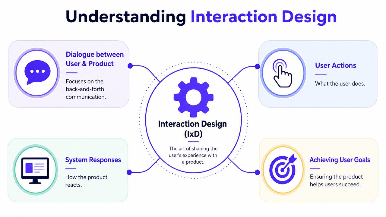
Interaction design is the design of product behavior.
That sounds abstract until you make it concrete. If UI is how a product looks, interaction design is how it responds. It covers the back-and-forth between a person and the system, what the user does, what the product does next, how fast it responds, what signals it gives, and whether the whole exchange feels clear.
A simple way to think about it
Think about a trading app.
The UI is the visual layer, charts, buttons, forms, colors, layout. The interaction design is what happens when a user taps "Buy." Does the app preview the order clearly? Does it show fees and consequences before confirmation? Does it confirm success immediately? Can the user distinguish a submitted order from an executed one? If the action fails, does the product explain why and what to do next?
That's interaction design.
The same logic applies in AI software. A model output isn't enough. The product needs to explain state, confidence, editability, and next-step options in a way that helps users move forward instead of freezing.
A useful parallel for founders is software architecture versus runtime behavior. Architecture tells you how the system is built. Runtime behavior tells you what happens under load and in edge cases. Interaction design is the user-facing version of runtime behavior.
Why the field exists at all
This isn't a trendy label designers made up to sound specialized. According to the history of interaction design, Bill Moggridge and Bill Verplank formally coined interaction design in the mid-1980s, and it took approximately 10 years before the concept gained widespread adoption, with the discipline cementing its authority by the mid-1990s. That matters because it marks the moment design moved beyond form and into behavior.
The field emerged because digital products created a different challenge from traditional objects. A chair doesn't change state when you touch it. A financial platform, AI assistant, or wallet app does. Someone had to define the logic of that exchange.
If you're building AI products, it's also worth reading about UCD for AI-driven software development. AI products add another layer of ambiguity, and user-centered thinking becomes critical when outputs are probabilistic rather than fixed.
A founder doesn't need more design vocabulary. A founder needs a product that tells users what happened, what will happen next, and what to do if something goes wrong.
IxD vs UI vs UX vs Product Design
Founders often lump these terms together, then hire for the wrong problem.
If users say the app feels confusing, the fix might not be a better visual designer. If onboarding looks polished but drop-off is high, the issue might not be brand or layout. It may be that the product's behavior isn't carrying the user through the task.
The cleanest way to separate the roles
Use the house analogy.
UX is the blueprint. It decides whether the structure makes sense for the people living in it. UI is the paint, fixtures, and visible finish. Interaction design is how the doors open, how the lights switch on, and whether the elevator responds the way people expect. Product design usually sits across all of it, tying user needs to business goals and shipped functionality.
Here is the practical breakdown.
Discipline | Primary Focus | Core Question It Answers |
|---|---|---|
UX Design | Logic, flow, usability | Is this experience useful and understandable? |
UI Design | Visual interface and presentation | Does this look clear, credible, and usable on screen? |
Interaction Design | Behavior, feedback, and response | What happens when the user acts? |
Product Design | End-to-end product outcomes | Does this solve a user problem and support the business? |
Where founders get tripped up
The most common mistake is assuming a strong UI designer can cover interaction design by default.
Sometimes they can. Often they can't, especially in technical products with permissions, asynchronous states, risk, edge cases, and multi-step workflows. A dashboard can look sharp in Figma and still fail in production because nobody specified hover states, empty states, loading logic, undo paths, motion timing, or error handling.
That confusion gets worse because "UX" often becomes a catch-all label. If you want a broader explainer on the distinction, this guide on UI vs UX design for founders is useful for framing what each discipline owns.
A good outside reference is Helbling Digital Media's overview of HDM design services, because it shows how teams often package UI and UX together while still leaving room to ask whether behavior itself is being designed thoroughly.
Hire for the question you need answered
A few shortcuts help:
If the product looks dated or visually inconsistent, you likely need stronger UI and brand execution.
If users don't understand the flow, you likely need UX work around structure and information hierarchy.
If users hesitate, mistrust actions, or get lost in state changes, you need interaction design.
If roadmap, user need, and business model are out of sync, you need product design leadership.
Founders waste time when they hire for titles. They get leverage when they hire for the unanswered question inside the product.
The Five Dimensions of Interaction Design
One reason interaction design feels fuzzy is that people talk about it as taste. It isn't. It has a practical framework.
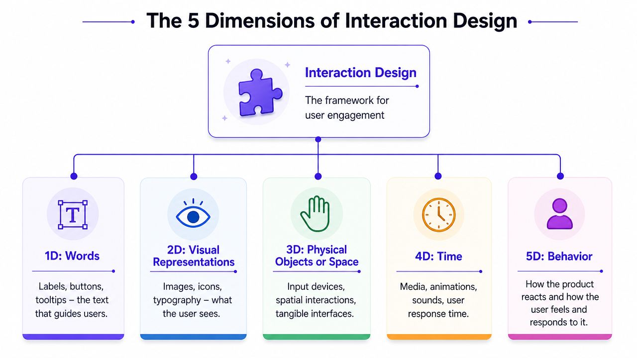
According to LogRocket's explanation of interaction design, interaction design is formally defined by five core dimensions: words, visual representation, physical objects or space, time, and behavior. That's useful because it gives founders a way to review product interactions without hiding behind general comments like "this feels clunky."
The five dimensions in product terms
1D Words
This is the language inside the interface.
Button labels, helper text, field instructions, confirmations, warnings, tooltips, all of it. In a fintech flow, "Continue" is often weaker than "Review transfer." In an AI workflow, "Generate" may be too vague if what really happens is "Draft summary."
Words shape confidence. If labels are generic, users guess.
2D Visual representations
This is what users see.
Icons, typography, color, charts, layout signals, and visual hierarchy all help users understand available actions. A secondary action shouldn't visually compete with a destructive one. A pending state shouldn't look identical to a completed state.
For founders working on complex dashboards, visual clarity intersects with risk management.
3D Physical objects or space
This covers the context in which the interaction happens, screens, devices, touch targets, keyboard use, desktop versus mobile, and how layouts adapt across breakpoints.
If you're building a data-heavy product, space isn't just a layout issue. It's operational. Dense tables that work on desktop can become unusable on mobile. If you need a deeper foundation here, this explanation of information architecture helps connect structure to interaction.
4D Time
Time is where a lot of products gradually lose trust.
Animation speed, spinner duration, delayed tooltips, transition timing, loading sequences, and message persistence all sit here. In AI tools, time carries meaning. A delay can signal processing, uncertainty, or failure depending on how it's handled.
5D Behavior
This is the payoff. What does the product do after the user acts, and how does the user feel in response?
Does a wallet app explain why a transaction needs another signature? Does a compliance flow save progress automatically? Does the dashboard remember filters when a user returns?
A founder's review checklist
When a flow feels off, don't say "make it smoother." Review it through the five dimensions.
Check the words: Are labels specific enough to reduce guesswork?
Check the visuals: Do status and priority read instantly?
Check the space: Does the interaction still work on the devices your customers use?
Check the timing: Are delays and transitions helping users understand state?
Check the behavior: After each action, does the product answer the user's silent question, "Did that work?"
That turns subjective feedback into a product decision.
What Great Interaction Design Delivers
Strong interaction design doesn't end as a mood board. It produces assets your team can ship from.
The practical outputs are specific. Interactive prototypes in Figma. User flows that show every decision point. State diagrams for loading, success, empty, and error cases. Annotations for hover, click, tap, drag, scroll, and motion timing. Specs that tell engineering how the interface should behave, not just how it should look.
The business impact is operational
According to UXPin's overview of interaction design principles, the core principles derived from Don Norman's work include visibility, feedback, constraints, and consistency. Those aren't academic ideas. They're the mechanics behind products that convert and retain.
Visibility means users can find what matters. In onboarding, that helps people move without hunting.
Feedback means the system responds to every action. That reduces uncertainty after form submissions, AI runs, payment actions, and settings changes.
Constraints prevent bad actions before they happen. Good products don't wait for users to fail if they can guide them earlier.
Consistency lets people transfer learning from one part of the product to another. That lowers training burden and reduces support friction.
If your team keeps answering "what happens when I click this?" in Slack, the product is missing interaction design, not documentation.
What good teams hand off
A useful interaction design handoff usually includes:
Interactive prototypes: Clickable flows that let product, engineering, and stakeholders test behavior before code.
Behavioral specs: Clear notes for transitions, modals, disabled states, confirmations, and edge cases.
System-state design: Defined loading, success, empty, and error states so the product never drops into ambiguity.
Content cues: Microcopy that explains action, consequence, and recovery. If you want a sharper view of that layer, this breakdown of UX writing is worth reading.
What doesn't work
Static screens alone don't work for products with complexity. Neither does handing engineers a nice layout and expecting them to "figure out the interactions."
That approach usually creates drift. One component confirms inline, another uses a toast, another updates without explicit notification. One modal closes on save, another doesn't. The product feels inconsistent because behavior was never designed as a system.
Great interaction design fixes that. It makes the product feel intentional under real use, not just review-call conditions.
How Founders Should Apply Interaction Design
Interaction design matters in every product. In AI SaaS, Web3, and Fintech, it's closer to infrastructure.
These categories ask users to trust systems they often can't fully inspect. AI outputs can feel opaque. Blockchain actions can feel irreversible. Financial workflows can carry operational or legal consequences. If the product's behavior is vague, the user doesn't just feel confused. They feel exposed.

What to look for in each vertical
In AI SaaS, look at how the product handles uncertainty. Does it explain what the model is doing, what the output means, and what the user can safely do next? If you're adding conversational support into product flows, tools that manage AI support for WhatsApp are a useful reminder that the interaction layer matters as much as the model layer.
In Web3, focus on state clarity and risk communication. Wallet connection, signing, approval, confirmation, and failure paths need plain language and visible status. If users are making irreversible moves, every action needs consequence-aware design.
In Fintech, prioritize trust cues and recovery. Users need to know whether an action is pending, complete, editable, or final. They need clear paths to reverse mistakes where possible, or at minimum understand what cannot be undone.
Why design systems aren't enough
A lot of startups invest in a design system and assume they've solved product experience.
They haven't.
According to UX Planet's piece on the shortage of interaction design, there is a critical shortage of dedicated interaction design specialists because companies mistake design system implementation for behavioral design. The result is predictable. Products become functional, but not intuitive or enjoyable.
A design system gives you consistency in components. It doesn't decide how a risky flow should reassure a user, how an AI result should invite revision, or how a wallet signature sequence should reduce hesitation.
Here's a useful talk that reinforces how interaction decisions shape product outcomes in practice.
How to hire without bloating the org chart
Founders usually have three options.
Hire a generalist designer: This can work early, but only if the product's complexity is still low.
Build a specialist team: Strongest option when product surface area and risk are growing.
Use one embedded partner: Useful when you need product design, brand design, and frontend execution without building three separate roles internally.
That last model is where 925 Studios fits for startups in AI SaaS, Web3, and Fintech. It gives teams one creative partner that replaces a product designer, brand designer, and frontend developer, which is useful when the problem isn't just visual polish but getting complex product behavior shipped coherently.
If your product handles money, automation, permissions, or irreversible actions, interaction design is not an enhancement layer. It's part of product risk management.
Conclusion The Conversation Is Your Product
A lot of founders still think of design as the layer that makes the product look finished. That's too small a definition.
Your users don't experience your roadmap, your architecture, or your internal org chart. They experience a conversation. They click, type, submit, connect, approve, retry, and wait. The product responds. That response is the relationship.
When people ask what is interaction design, the useful answer isn't theoretical. It's the practice of making that relationship clear.
According to the Interaction Design Foundation's principles on design feedback and system status, effective interaction design requires keeping users constantly informed of system status through immediate feedback. That builds trust and gives users a sense of control, especially when they need to recover from mistakes or explore without fear.
The takeaway founders should keep
If the product doesn't explain itself through behavior, users will make up their own story.
Usually that story sounds like this. "I don't know if this worked." "I don't want to click that." "I'm not sure what happens next." "This feels risky." Once that feeling sets in, better branding won't save the flow.
A strong product does the opposite. It makes actions obvious, system status visible, and outcomes legible. It respects the user's attention. It reduces hesitation at the exact moments where doubt would otherwise creep in.
That's why interaction design matters so much in AI, Web3, and Fintech. In these products, feedback loops are not decorative details. They're the engine of trust, retention, and adoption.
If you're building a complex product and need one team that can shape the behavior, sharpen the brand, and ship the interface, 925 studios works as a single creative partner across product design, brand design, and frontend development. That setup is useful for founders who need senior execution without splitting the work across three separate hires.


Let’s keep in touch.
Discover more about high-performance web design. Follow us on Twitter and Instagram.

