UI vs UX Design: What Founders Actually Need to Know (2026)

925studios
Creative agency for AI & Web3

Reviewed by Yusuf, Lead Designer at 925Studios
Most founders hire a UX designer when they mean UI designer, brief a UI designer on what is really a UX problem, and end up with beautiful screens that users do not complete. The UI vs UX distinction is not a semantic argument. It is the difference between spending $20,000 on the right thing and spending it on the wrong layer of a problem that lives somewhere else entirely.
TL;DR:
UI design covers the visual and interactive layer: colors, typography, components, and states
UX design covers flow, architecture, and whether users actually reach their goal
In good products, the two are inseparable. In bad products, one was prioritized without the other
Most startups need UX first, UI second. Optimizing the wrong layer first is the most common design hiring mistake
At Series A and beyond, a unified team handling both is the standard that drives retention and conversion
Quick Answer: UI design covers the visual and interactive layer of a product: colors, typography, buttons, layouts, and component states. UX design covers the overall structure and flow: how users move through a product, where they drop off, and whether they reach their goal. In practice, the best products treat UI and UX as inseparable. A beautiful interface on a broken flow fails. A well-structured flow with inconsistent visuals undermines trust. Most startups need both, but UX should always come first.
What is the actual difference between UI design and UX design?
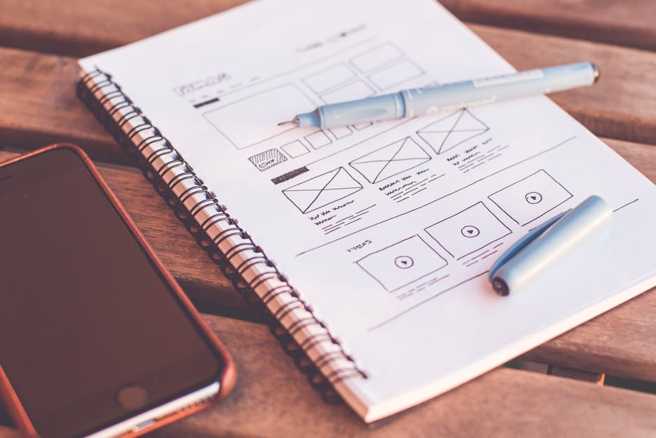
UI design and UX design are distinct disciplines that operate at different levels of a product. Understanding what each covers is the foundation for making the right hiring and investment decisions at each stage of your company's growth.
UI design (user interface design) is the practice of designing the visual and interactive layer of a product. It covers the color system, typography hierarchy, button states, icon library, component library, layout grids, and the visual treatment of every screen a user touches. UI design answers the question: does this look right, does it feel consistent, and does it communicate the right level of trust and quality for our brand? Products like Stripe and Linear are frequently cited for exceptional UI work because every element is considered, consistent, and visually coherent at a level that signals precision and reliability.
UX design (user experience design) is the practice of designing how users move through a product and whether they reach their intended goal. It covers information architecture, user flows, onboarding sequences, error states, empty states, and the overall logic of how screens connect. UX design answers the question: can users find what they need, complete what they came to do, and understand where they are in the product at any given moment? Products like Duolingo and Notion are cited for exceptional UX work because the structure underneath the interface is built around how users think and behave, not just how the product is organized internally.
The practical distinction: if users say "I can't figure out how to do X," that is a UX problem. If they say "this feels cheap" or "the interface is inconsistent," that is a UI problem. If they say "I gave up and cancelled," that is almost always a UX problem that looks like a churn metric.
Dimension | UI Design | UX Design |
|---|---|---|
Focus | Visual and interaction layer | Flow, structure, and outcomes |
Primary question | Does this look right and feel consistent? | Can users complete their goal? |
Deliverables | Design system, component library, style guide | User flows, wireframes, usability tests |
Tools | Figma, design tokens, Framer | Figma, Maze, UserTesting, Hotjar |
Measured by | Brand consistency, accessibility scores | Activation rate, task completion, churn |
Best examples | Stripe, Linear, Vercel | Duolingo, Notion, Intercom |
Why does the UI vs UX distinction matter for your product decisions?
The UI vs UX distinction matters because the two disciplines address different failure modes, and treating them as interchangeable leads to misdiagnosed problems and misdirected investment. When a SaaS product has a churn problem, the instinct is often to redesign the interface: new colors, new components, a more modern visual style. But if the churn is happening because users cannot find a key feature, cannot understand the product's logic, or hit a confusing error state with no clear path forward, a UI refresh will not move the retention number. The flow is broken. The information architecture is wrong. Those are UX problems, not UI problems.
According to McKinsey research tracking 300 companies over 5 years, companies in the top design quartile achieved 32 percentage points higher revenue growth than their industry peers. That advantage came from design being treated as a strategic function, not from aesthetic investment alone. The companies that outperformed invested in understanding how users think and behave (UX), and then built visual systems that reinforced those behaviors (UI). The two worked together, not as substitutes for each other.
Maze research from 2025 found that 88% of users are less likely to return after a single bad UX experience. One confusing onboarding step, one error state that offers no path forward, one navigation structure that buries the feature they came for, and the user is statistically likely to leave and not come back. The UI on those screens may have been perfect. The UX was not.
For founders making design hiring decisions, the practical implication is: identify whether your problem is in the flow or in the surface before deciding what kind of designer you need. A senior UX designer who cannot do UI can still fix your churn problem. A UI designer who cannot do UX will make your churn problem look nicer.
Not sure whether you have a UI or UX problem? Get a free 30-minute product audit from 925Studios.
What are the core patterns where UI and UX intersect in real products?
Information architecture vs visual hierarchy
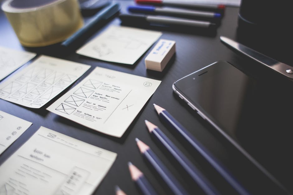
Information architecture is a UX discipline: it is the decision about what content and features live where, how they are grouped, and what labels make sense to the user rather than to the internal team. Visual hierarchy is a UI discipline: it is the decision about what appears large, what appears small, what is primary and what is secondary within a given screen. Both solve the same user problem (helping users find and understand things quickly), but at different levels of the stack.
The most common failure mode is applying strong visual hierarchy to a broken information architecture. Linear's success is partly attributable to getting the information architecture right first (issues, projects, cycles, views all map to how development teams actually think), and then applying an extremely clean visual hierarchy to that structure. The UI reads clearly because the UX underneath it is coherent. When you flip that order and design the visual hierarchy before the architecture is resolved, you produce beautiful screens that confuse users at the decision level.
User flow vs interaction design
User flow is a UX deliverable: it maps the steps a user takes from entry point to goal completion, including every branching path, error state, and empty state along the way. Interaction design is a UI discipline: it determines how each step feels, including transitions, micro-animations, loading states, and feedback signals. Both contribute to whether users complete the flow, but they work at different abstraction levels.
Notion's onboarding is an example of exceptional flow design: the sequence from signup to first document is structured around progressive disclosure, with each step logically required before the next. The interaction design reinforces that structure with smooth transitions and clear visual feedback. Remove either element and the experience degrades. A user flow with jarring interactions creates friction that stops completion. Perfect interactions on a confusing flow structure achieve the same result differently.
Usability research vs visual refinement
Usability research is a UX practice: running structured sessions with real users to identify where they get confused, where they give up, and what assumptions the team made that do not match user behavior. Visual refinement is a UI practice: iterating on color, spacing, typography, and component states to improve the aesthetic quality and clarity of a given screen. Both are necessary in a mature product development process. The mistake is substituting one for the other.
When a SaaS team does not have the budget or time for usability research, they tend to substitute visual refinement: making the interface look better on the assumption that if it looks more polished, users will feel more confident. Sometimes this works. More often, it produces a more attractive version of the same confusing flow. At 925Studios, when we work on SaaS activation problems, we always start with user research before touching the visual layer. Knowing where users stop and why is what tells us which screens to redesign, not which ones look worst.
Want to know which layer of your product needs work first? We run rapid UX audits to answer exactly this question.
Onboarding: where UX does the heavy lifting
Onboarding is the moment in a SaaS product where UX work has the highest leverage. The first-run experience, the empty state design, the progressive disclosure of features, the copy that frames what users should do next: all of these are UX decisions that determine whether users reach their first value moment before giving up. UI quality matters in onboarding (an inconsistent or cheap-looking signup screen undermines trust immediately), but the structural decisions drive outcomes more than the visual ones.
Duolingo's onboarding is studied specifically because it is a masterclass in UX-led design: before you set up an account, you complete a lesson. The value moment (learning something in a foreign language) precedes the commitment ask (create an account, set a goal, choose a plan). That sequencing is a UX decision. The colorful, gamified UI reinforces it, but the structural insight (show value before asking for commitment) is what drives the activation rate. Copying Duolingo's UI without replicating the UX logic produces a gamified-looking product that does not convert.
Design systems: where UI and UX become inseparable
A design system is the artifact that makes UI and UX work together at scale. It includes: the visual component library (UI), the interaction patterns for each component (the boundary of UI and UX), and the documentation for how and when to use each pattern (pure UX thinking applied to the system level). Companies like Stripe, Vercel, and Atlassian invest heavily in design systems because they enforce consistency (UI) while making product decisions faster and more predictable (UX).
For startups, a lightweight design system created early pays dividends in two ways: it prevents visual inconsistency as the product grows (a UI benefit), and it forces the team to make explicit decisions about interaction patterns before a feature ships rather than improvising them on the fly (a UX benefit). The investment is typically $10,000 to $30,000 to build a first version properly. Without it, you rebuild the same components differently every sprint and accumulate both design debt and engineering debt simultaneously.
What mistakes do founders make with UI and UX design?
Treating UI and UX as sequential rather than parallel
A common approach in early-stage product development is to do UX first (wireframes, user flows) and then hand off to UI (visual design, component styling). This sequential process misses the reality that UI decisions affect UX outcomes: the size and placement of a button is both a UI and a UX decision. The most effective teams run both disciplines in parallel with constant feedback between them, testing visual design in the context of complete flows rather than screen by screen.
Hiring for the wrong layer at the wrong stage
A pre-product-market fit startup rarely needs a senior UI designer. It needs UX research, flow design, and rapid prototyping to discover what users actually want. A post-launch startup with a churn problem rarely needs more features. It needs UX research to understand why users are leaving and targeted redesign of the specific flows driving drop-off. The mistake is hiring based on the most visible symptom (the product looks rough) rather than the diagnostic question (where in the product experience are users failing?).
Measuring UI outcomes instead of UX outcomes
Teams frequently use visual quality scores, design awards, and subjective feedback from team members as their design success metrics. These are UI proxies, not UX measures. The relevant metrics are: activation rate (do users reach their first value moment?), task completion rate (can users do the specific thing they came to do?), and 30-day retention (do they come back after the first session?). A product that scores 9/10 on visual quality and 23% on activation rate has a UX problem that the visual quality score is hiding.
Skipping research and assuming the team knows the answer
Founders and engineers spend so much time in their own product that they have normalized everything about it. Flows that take 8 clicks and require three context switches feel obvious to the team. New users experience them as confusing. Running even five structured usability sessions with people who have never seen the product before will reveal assumptions that no amount of internal debate will surface. This is UX work, and it is the most underfunded category in early-stage product development.
We have run usability research for SaaS teams where the findings from five user sessions changed the product roadmap for the next quarter. Browse case studies from 925Studios to see what that looks like in practice.
Frequently Asked Questions

What is the difference between UI and UX design?
UI design (user interface design) covers the visual and interactive layer of a product: colors, typography, button states, component styles, and layout systems. UX design (user experience design) covers the structure, flow, and overall logic of how users move through a product and whether they reach their goal. The distinction matters for hiring and investment: a UI problem (looks inconsistent, feels cheap) needs a different fix than a UX problem (users cannot find the feature, drop-off is high in a specific flow).
Which comes first, UI or UX?
UX should always come first. Understanding what users need to do, in what order, and where they currently struggle is the foundation for making good UI decisions. Designing a beautiful interface before the flow and architecture are validated produces visually polished products that users still cannot use effectively. The standard process is: user research, information architecture, wireframes, usability testing, then visual design (UI) applied to a validated structure. In practice, the two run in parallel in mature teams, but UX drives the decisions that UI then expresses.
Can one designer do both UI and UX?
Yes, and for most startups, one strong product designer who can work across both disciplines is the right hire. The title "product designer" usually implies proficiency in both UI (visual systems, component design, Figma execution) and UX (user research, flow design, usability testing). Pure UI designers who cannot conduct research or structure flows are specialists suited for larger teams. Pure UX designers who cannot execute visual design are better fits for research-heavy organizations. For seed to Series A, a generalist product designer who leans toward outcomes is the strongest hire.
What is a UI/UX designer and what do they do?
A UI/UX designer is a product designer who works across both disciplines. Their work includes: conducting user research, mapping user flows, building wireframes and prototypes, running usability tests, designing the visual component system, and maintaining the design system as the product grows. In smaller teams, this person also defines information architecture, writes UX copy for error states and empty states, and collaborates closely with engineering on interaction specifications. The title is used loosely in the market; always ask a candidate to walk you through a project from research to final visual handoff to understand their actual depth.
Do startups need a UX designer or a UI designer first?
For pre-product-market fit startups, UX research and flow design matters more than visual quality. Users will forgive a rough interface if the product does what they need. They will not forgive a beautiful interface that does not let them accomplish their goal. After product-market fit, when you are growing and need the product to feel trustworthy to a larger audience, UI quality becomes more important. The practical hiring answer: find a product designer who does both, and brief them on UX problems first before UI problems.
How much does UI/UX design cost for a startup?
For a startup, UI/UX design costs range from $5,000 for a focused UX audit and recommendations report to $150,000 for a full product redesign with research, architecture, visual design, and design system work. A realistic budget for a first meaningful engagement (onboarding flow redesign plus a new visual component library) runs $20,000 to $50,000 with a focused agency over 8-12 weeks. Ongoing product design support via a retainer typically costs $8,000 to $20,000 per month depending on scope and team size.
What tools do UI and UX designers use?
The standard tool stack in 2026: Figma for both wireframing and visual design (it covers UX flows and UI components in one tool), Maze or UserTesting for usability research, Hotjar or FullStory for session recording and behavioral analytics, Amplitude or Mixpanel for product analytics, and Framer for interactive prototypes and final website builds. Most designers work primarily in Figma, supplementing with research and analytics tools depending on the phase of the project.
How do you know if your product has a UI problem or a UX problem?
The diagnostic is in user feedback and analytics. If users say the product looks dated, feels cheap, or is visually inconsistent, that is a UI problem. If your analytics show high drop-off in specific flows, low task completion rates, or support tickets clustered around the same 2-3 confusing interactions, those are UX problems. The clearest diagnostic tool is a 5-user usability test: watch five people who have never used your product try to complete a core task. If they get confused or lost, that is UX. If they complete the task but express hesitation about the visual quality, that is UI.
If you are not sure which layer your product needs work on first, talk to 925Studios. A 30-minute call usually produces a clear answer.
If you're building a product and want a second opinion on your UX, talk to 925Studios. 925Studios works with SaaS, fintech, healthtech, web3, and AI startups.
See the 925Studios work or book a free 30-minute call.
Follow 925Studios on Instagram and YouTube for design breakdowns and case studies.
Let’s keep in touch.
Discover more about high-performance web design. Follow us on Twitter and Instagram.

