
Muted Colors Meaning: Design for Trust & UX

Yusuf
Founder and lead designer at 925studios

Muted colors aren't always the safe choice founders think they are. Clinical guidance notes that dark, muted palettes such as grays, deep blues, and blacks are statistically correlated with higher anxiety and depression scores, even though low-saturation colors can also signal environmental stability to the brain and feel calming in the right context, as described here. That's the trap. A palette meant to build trust can just as easily make a product feel heavy, tired, or emotionally flat.
For AI SaaS, Web3, and Fintech teams, that's not a minor design detail. It affects whether a dashboard feels readable, whether a landing page feels credible, and whether users want to stay with the product long enough to convert.
Table of Contents
What Is the Real Meaning of Muted Colors
The meaning of muted colors isn't just calm, soft, or tasteful. In product design, muted colors mean controlled visual intensity. They tell users, “this interface is stable, readable, and under control.”
That matters because users judge product quality fast. A bright, over-saturated interface can make a fintech app feel speculative. A flat, gray-heavy interface can make the same app feel lifeless. The best muted palettes sit in the middle. They feel polished without feeling sleepy.
Calm isn't the whole story
Muted colors are technically defined by reduced saturation and low chroma. In practical terms, they're colors that have been quieted down. Think dusty blue instead of electric blue, clay instead of orange, slate instead of pure navy.
The problem is that many teams stop at “quiet” and assume the job is done.
Practical rule: A muted palette should reduce visual strain, not remove energy from the product.
Dark muted tones often cause the biggest mistakes. Founders pick charcoal, steel blue, and cool gray because those colors look expensive in a moodboard. Then the live product ships and users spend time inside an interface that feels dim, distant, and harder to parse than expected.
Why this matters for trust
In AI SaaS and Fintech, color isn't decoration. It's product behavior. Your palette tells users whether they should feel alert, reassured, or cautious.
A good muted system usually signals these things:
Stability: The interface feels deliberate, not noisy.
Maturity: The brand doesn't look like it copied every other startup using bright gradient blue.
Focus: Users know where to look because not every element is shouting.
A bad muted system signals something else:
Fatigue: Too many dark, gray-dominant surfaces make long sessions feel draining.
Uncertainty: Weak contrast makes content feel less reliable.
Emotional flatness: The product feels passive when it should feel capable.
That's the useful way to think about muted colors meaning. It's not a mood-board adjective. It's a decision about how your brand will regulate attention, trust, and usability across every screen.
How Muted Colors Affect User Psychology
Color saturation works a lot like audio volume. Bright colors are loud. Muted colors are quiet. Neither is automatically better, but the wrong volume in the wrong setting makes it harder to think.
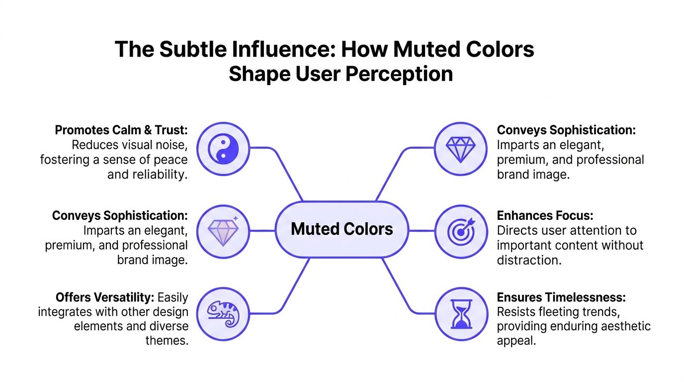
That's why muted palettes work so well in complex products. Low chroma and low saturation reduce visual stimulation, lowering the workload on the brain's processing centers and allowing the eye to rest, which is why they're used in SaaS dashboards to minimize cognitive load and improve readability, according to Adobe's explanation of muted colours.
Quiet colors lower the noise
Open a typical startup dashboard and you'll see cards, charts, tables, labels, tabs, alerts, and filters competing for space. If those parts also compete in color intensity, users burn energy sorting signal from noise.
Muted colors solve that by creating a visual baseline. Backgrounds stay quiet. Containers recede. Secondary text supports instead of distracts. Then the important action, like “Approve transfer,” “Deploy model,” or “Upgrade plan,” gets the brighter accent.
That structure improves usability because color starts doing a clear job. It separates what matters now from what can wait.
For motion, the same rule applies. If your UI already uses restrained color, interaction can carry more meaning without becoming chaotic. Here, thoughtful movement and palette work together. A good example is this guide to user interface animation, where motion is treated as support for clarity, not visual clutter.
What users actually feel
Users usually won't say, “this palette has the right saturation balance.” They'll say the product feels easier, cleaner, or more trustworthy.
That reaction comes from a few practical effects:
Effect | What the user experiences | Business outcome |
|---|---|---|
Muted backgrounds | Less glare and fewer competing signals | Longer comfortable sessions |
Softer secondary UI | Easier scanning of dense information | Better task completion |
Controlled accent use | Clearer calls to action | Stronger conversion paths |
Quiet color gives users more room to think.
That's why muted colors do well in categories where attention matters more than entertainment. AI products need clarity. Fintech products need credibility. Web3 products often need both, especially when the underlying product already asks users to trust something technical.
Muted color doesn't win because it's trendy. It wins because it helps users stay oriented.
Using Muted Colors in Your Product and Brand
The most effective muted palettes don't show up everywhere with equal force. They work because they're assigned clear jobs.
That's become common in startup branding. Brand guidelines for AI SaaS companies increasingly specify muted primary colors such as #6B7280 or #475569, and 64% of seed-to-Series B startups are adopting these tones to convey maturity and reduce visual noise on marketing sites. That shift makes sense. Many founders want distance from the overused bright tech-blue look that makes different products feel interchangeable.

Where muted colors work best
Muted tones usually perform best in the structural parts of the product and brand:
Large surfaces: backgrounds, panels, cards, sidebars
Supportive UI: borders, dividers, inactive tabs, input states
Secondary messaging: subhead text, metadata, captions
Brand framing: presentation decks, illustrations, website sections that need restraint
What usually doesn't work is using muted color for everything. If your primary button, chart highlight, status message, and headline all live in the same low-energy range, nothing stands out. Users have to work harder to decide what deserves attention.
What good startup execution looks like
The strongest interfaces often use a simple formula. Muted neutrals handle the surface area. One brighter accent handles intention.
A fintech homepage might use slate and warm off-white across the whole layout, then reserve a single vivid accent for “Get started.” An AI dashboard might keep charts and cards restrained, then use one active color to show the selected model, a live run state, or a revenue-critical alert.
That's also why teams spend time using colour to build brand trust before they commit to a visual system. Color choices shape how safe, capable, or speculative a company feels long before a prospect reads the copy.
A muted palette works best when it creates a stage, not when it tries to be the performance.
One useful test is to open your product and blur your eyes a little. Can you still spot the primary action, the active navigation state, and the most important data point? If not, the palette may be elegant but operationally weak.
For brand systems, the same thinking applies. A muted identity shouldn't only look good in Figma. It has to survive product screens, sales decks, landing pages, and front-end implementation. That's where a system-led approach to design for branding usually pays off, because the palette has to function across shipped work, not just a logo presentation.
Building a Muted Color Palette From Scratch
Most founders make color harder than it needs to be. You don't need a giant library of swatches. You need a small system with clear roles.
A muted palette starts with one base hue, then expands into a few dependable variants. This infographic is a useful way to picture the workflow.

Start with one brand color
Pick one color that fits the company's character. If the product handles money, risk, or security, that might be blue, teal, slate, or green. If the brand wants more warmth, clay, sand, olive, or dusty rose can work better than default gray.
Then mute it on purpose. There are four standard ways to create muted colors: adding white softens the shade, adding black deepens it, adding gray neutralizes vibrancy without changing brightness much, and mixing complementary colors creates earthy, organic muted tones, as outlined here.
A quick example using blue:
Start with a clear base blue.
Add gray if you want a stable dashboard tone.
Add white if you want a lighter, friendlier marketing feel.
Add black if you need depth for dark UI.
Mix with a touch of orange if you want a more natural, less synthetic result.
Here's a simple sample palette structure:
Role | Example hex |
|---|---|
Primary muted |
|
Light surface |
|
Mid neutral |
|
Dark text |
|
Accent color |
|
These example hex codes are practical starting points, not universal rules. The job is balance, not perfection.
Build the rest of the system around it
After the base color, add neutrals and one accent. That's enough for most startup brands.
Use this sequence:
Choose a quiet surface color: off-white, warm gray, or pale stone usually works better than pure white because it softens the interface.
Add a reliable text color: this should be dark enough to carry long reading sessions.
Pick one accent: use it for primary buttons, active states, or standout chart data. Don't let it spread everywhere.
Test on real screens: a landing page, a dashboard, and a mobile view will reveal problems faster than a color board alone.
If you want a quick way to experiment before handing the system to design or engineering, a tool for marker color planning can also help you compare muted combinations without guessing.
This walkthrough gives a useful visual reference for the same process:
The best test is always context. A muted palette that looks refined in a branding mockup can fall apart once text, charts, and forms are added. Build from usage, not from aesthetics alone.
Keeping Your Design Accessible with Muted Colors
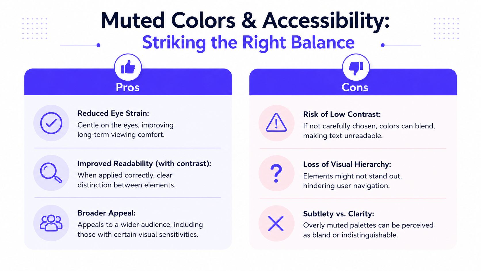
Muted colors can make a product easier on the eyes. They can also make it unreadable if you confuse “soft” with “low contrast.”
That mistake is common in startup UI. A team picks tasteful dusty backgrounds, soft gray text, and subtle borders. The result looks premium in a static mockup, then fails the moment real users try to scan dense data, read labels quickly, or use the interface in poor lighting.
A 2024 Nielsen Norman Group study found that dashboards using muted background colors with saturation below 35% reduced cognitive load by 22% compared to high-saturation backgrounds, as cited here. That's useful, but it doesn't mean every muted combination is accessible. Lower visual noise helps. Weak contrast hurts.
Muted is not the same as low contrast
These are different decisions:
Muted describes saturation
Contrast describes the difference between foreground and background
A color can be muted and still be highly legible. A muted navy on a pale stone background can work very well. A light gray on a dusty blue card usually won't.
Good muted design gives the eye rest without forcing the eye to strain.
That distinction matters for trust. If users can't read balances, labels, legal text, or chart legends easily, the interface stops feeling premium and starts feeling careless.
Simple rules that prevent expensive mistakes
Keep the muted palette in the background layer of the system, then protect usability with hard rules.
Use muted tones for surfaces: cards, app shells, section backgrounds, and passive containers are good candidates.
Keep text strong: body text and key labels need clear separation from the background.
Reserve subtlety for non-critical UI: helper text can be softer, but not to the point of disappearing.
Stress-test states: disabled, hover, selected, success, warning, and error colors all need to remain distinct.
A simple do and don't view helps:
Do | Don't |
|---|---|
Pair muted backgrounds with dark readable text | Put pale gray text on dusty gray cards |
Use one accent for actions and status | Use six similar muted tones and expect hierarchy to appear |
Test on real dashboards and forms | Judge the palette only from a hero section mockup |
Accessibility isn't a compliance add-on. It's part of product quality. If your muted color system can't hold up under real content, it isn't a strong system yet.
Your Next Steps from Muted Tones to Market Trust
Muted colors work because they remove friction. They give your product a steadier visual voice, help users focus, and make complex tools feel more manageable. That's the upside.
The downside is just as real. A dark, gray-dominant muted scheme can make a brand feel drained instead of elegant. A low-contrast palette can make the interface harder to use. A system without a clear accent can bury the very actions that drive activation and conversion.
For startups in credibility-sensitive categories, this has direct commercial weight. In fintech and Web3 branding, 78% of financial app users rated muted-tone interfaces as more credible than bright-color alternatives, according to this source. Credibility changes behavior. It affects whether people trust the onboarding flow, the pricing page, the dashboard, and the company behind all of it.
What to carry forward
Use muted tones as the foundation, not the headline. Keep them warm or balanced enough to avoid the fatigue problem. Give primary actions one brighter accent so users know what matters. And make sure readability survives every screen, every state, and every device.
There's also a brand layer here. Color teaches people how to feel about your company before they can judge your product depth. If the visual system feels stable and clear, the product often feels more capable too. That connection matters in AI and fintech, where buyers often decide whether a company seems credible before they understand the technical details. This broader idea of trust shaping perception is worth exploring in perception of brands.
Muted colors meaning, in the end, comes down to this. The right palette helps people trust what they're seeing. The wrong palette makes them hesitate.
If your startup needs that level of clarity across product, brand, and front-end execution, 925 studios gives you one creative partner that replaces three hires, a product designer, a brand designer, and a frontend developer. That means fewer handoffs, tighter systems, and shipped work that looks credible where it counts, in the product, on the site, and in the market.


Let’s keep in touch.
Discover more about high-performance web design. Follow us on Twitter and Instagram.

