
Product Design Strategy: Drive Growth in AI & Web3

Yusuf
Founder and lead designer at 925studios

Most advice about product design strategy is backwards. Founders get told to ship fast, clean up the UX later, and worry about brand once revenue shows up. That advice burns money. In AI SaaS, Web3, and Fintech, bad design doesn't just look sloppy. It makes users hesitate, kills trust, creates rework, and weakens the story you tell investors.
A real product design strategy isn't a mood board and it isn't a Figma file. It's the operating logic behind what you build, why you build it, how you test it, and how you make the product feel trustworthy enough for someone to use it with their data, money, or workflow. If your team treats design like paint on drywall, you're already behind.
Founders who get this right don't separate design from business. They use design to reduce product risk, sharpen positioning, and make complex products feel obvious.
Table of Contents
Why Your Product Design Strategy Defines Your Valuation
Most founders still frame design as polish. That's wrong. Design is one of the clearest signals of whether your company understands its users, its market, and its own product risk.
McKinsey found that companies that rank in the top quartile for design performance generate 32% more revenue and 56% higher shareholder returns over a five-year period compared to industry laggards. If you're raising capital or trying to justify premium pricing, that's not a side note. That's a business case.

Design changes the business, not just the interface
A weak product design strategy usually shows up in predictable ways.
The roadmap gets bloated, because nobody has defined the core user problem tightly enough.
Engineering absorbs product confusion, because the team is building around assumptions instead of tested flows.
Sales cycles get harder, because prospects don't immediately understand why your product is better.
Retention suffers, because the first-run experience feels uncertain or heavy.
That is why design belongs near the front of company strategy, right next to market selection, pricing, and product scope.
Practical rule: If a founder can't explain the core user problem, the primary user action, and the product's trust signal in one minute, the design strategy is not done.
What investors and buyers actually see
Investors don't just evaluate code and market size. They look at whether the company can turn technical capability into adoption. Buyers do the same. They don't reward complexity because it's technically impressive. They reward clarity because it lowers perceived risk.
For AI products, that means confidence and explainability. For Web3, it means reducing fear during wallet and transaction flows. For Fintech, it means turning sensitive financial actions into calm, understandable steps.
If you haven't defined the user-facing value clearly, your interface will expose that weakness. The homepage will drift. The onboarding will over-explain. The dashboard will try to do too much. Your sales demos will rely on narration because the product can't carry the story itself.
A strong value proposition design approach fixes that upstream. It forces the team to align product promise, user need, and visible proof before design turns into screens and code.
The short version is simple. Your valuation isn't shaped only by what you've built. It's shaped by how convincingly your product communicates utility, trust, and repeatable demand.
The Four Pillars of a Bulletproof Design Strategy
Founders don't need abstract design theory. They need a framework they can use in product reviews, planning sessions, and launch decisions. A solid product design strategy rests on four pillars.
Start with the model below, then pressure-test each pillar against your own product.
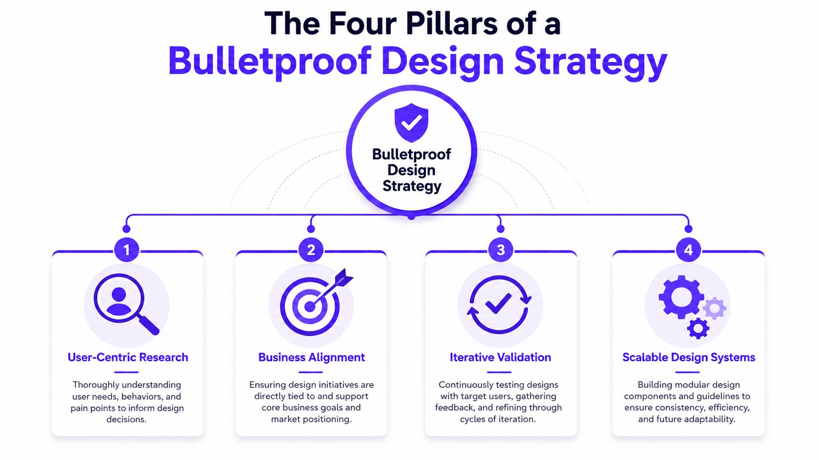
Pillar one, verified user pain
This pillar answers one question. Are you solving a real problem your users face often enough, and painfully enough, to change behavior?
The most common failure pattern is designing around assumed pain. This analysis notes that designing for assumed pain rather than verified user problems contributes to 80–95% of new product failures, and it points to a pain frequency analysis approach to align decisions with real user needs.
Stripe is a useful example here. Its early product didn't try to educate the market with ornate flows. It removed repeated pain around online payments and made implementation feel straightforward.
Use a simple filter:
Frequency: How often does this problem happen?
Cost: What does it cost the user in time, money, or frustration?
Current workaround: What ugly workaround are they already using?
If you want a practical companion read on how product teams can enhance app UX for mobile teams, this piece is useful because it focuses on reducing friction in real usage, not just making screens look cleaner.
Pillar two, business alignment
A design decision is only strategic if it supports a business outcome. That can mean activation, retention, deal velocity, conversion quality, or trust in a regulated workflow.
Airbnb is the obvious example. Its product design isn't just friendly. Every major interaction reinforces listing confidence, booking confidence, and host participation. The experience supports supply growth and transaction completion.
A founder should be able to map every meaningful design priority to one of these:
Design priority | Business effect |
|---|---|
Clearer onboarding | Better activation |
Better information hierarchy | Faster user understanding |
Stronger trust cues | More conversion confidence |
Reusable components | Less design and build waste |
Pillar three, iterative validation
Good teams don't debate design into existence. They test it. The fastest path is usually a loop of low-fidelity concept, quick prototype, user reaction, and revision.
That is why this video is worth watching before your next redesign discussion.
Dropbox is a good mental model. It won by making a technical product feel understandable before users had to commit to complexity. Validation let the team refine the story and flow before scaling the product further.
The best validation question isn't "Do you like this?" It's "What would you do next?"
Pillar four, scalable systems
If every new screen is a custom job, your product will get slower, messier, and harder to trust. Scalable systems solve that.
Notion is a good example. The product feels flexible because the underlying interaction patterns stay consistent. The system gives users freedom without making the interface feel random.
A scalable system includes:
Shared components, so product and engineering aren't rebuilding buttons, tables, forms, and states each sprint.
Interaction rules, so the same action behaves the same way across the product.
Brand logic, so the interface feels like one company, not a pile of shipped tickets.
These four pillars are enough to audit almost any startup product. If one is weak, the rest start to wobble.
A Practical Workflow for Design and Validation
Most startup teams either over-process design or skip it entirely. Both approaches create waste. The better model is lean, testable, and boring in the best way. Treat design like the scientific method.
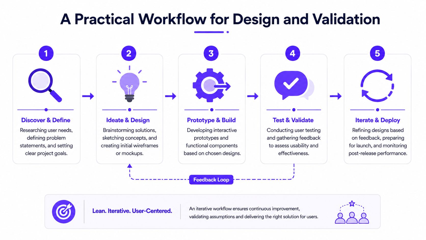
Run design like a set of hypotheses
Every major product decision should be written like this: "We believe this change will help this user complete this task with less confusion." That forces precision.
A rigorous workflow matters because industry data summarized here says 88% of online consumers abandon a site after a single bad UX experience, and it argues that discovery and prototype validation should be built into scope to avoid late-stage rework. Founders feel that cost when engineering has to rebuild flows that should have been resolved before implementation.
A clean sequence looks like this:
Define the problem clearly, including the user, the context, and the blocked action.
Write the hypothesis, so the team knows what success should look like.
Sketch the simplest flow, not the prettiest one.
Prototype only what needs proof, usually the risky parts.
Test with target users, then decide whether to keep, revise, or kill it.
Structure before polish
A lot of teams jump into high-fidelity screens too early. That hides bad thinking under nice visuals. Start with structure.
Information architecture isn't just navigation. It's the logic of what appears first, what gets grouped together, and what the user needs to understand before taking action. In a fintech dashboard, for example, the order of account balance, recent activity, and risk signals matters more than the color palette on day one.
This gets even more important in AI interfaces. If you're deciding how much context to expose in a workflow, the debate overlaps with model behavior and system design. That's why technical teams often benefit from thinking through Prompt engineering vs context engineering while shaping the UX, because what the system knows and what the user sees can't be treated as separate conversations.
Use this quick test for structure quality:
Can a first-time user explain what this page does in five seconds?
Can they identify the primary action without hunting?
Can they recover from a mistake without fear?
If the answer is no, don't move to polish.
Validation before commitment
A prototype exists to answer a question. Keep the question narrow. Test onboarding comprehension, not the entire platform. Test the transfer flow, not the whole banking app. Test the confidence state for AI outputs, not every setting page.
For teams that need a grounded primer, this guide on what user testing is is useful because it keeps the process practical instead of academic.
Here is the workflow I recommend founders use in product reviews:
Stage | What to review | What to reject |
|---|---|---|
Discovery | Problem clarity, user pain, business goal | Feature ideas without evidence |
Wireframes | Flow logic, hierarchy, task path | Visual debate |
Prototype | Friction points, hesitation, errors | Internal opinions as proof |
UI pass | Brand consistency, readability, trust cues | Decorative extras |
Build QA | State handling, empty states, edge cases | "Good enough" handoff gaps |
Operator note: If users hesitate during a prototype, the team should treat that as product feedback, not as user error.
Design systems come in at the end of this loop, not the start. Once a pattern proves itself, systematize it. Reuse the good decisions. Don't standardize confusion.
Special Considerations for High-Stakes Products
Generic product design advice falls apart in high-stakes categories. If your product touches money, automation, identity, or transactions, users aren't asking whether the UI looks modern. They're asking whether they should trust it.

AI products need visible trust signals
A lot of AI founders still design like the model output is enough. It isn't. Users need to know what the system did, how certain it is, and what they should do when it gets something wrong.
One source worth noting states that 92% of AI SaaS founders report that user trust is their top conversion barrier, and that design strategy rarely addresses how to visually encode model uncertainty or explainability into the UI, as discussed here.
That should change your interface decisions immediately.
Use patterns like:
Confidence indicators, when certainty varies and the user needs context.
Fallback workflows, when the model can't complete the task reliably.
Reason summaries, so users understand why a suggestion appeared.
Editable outputs, so people stay in control.
If you're building in this category, research on AI UX patterns and user trust is worth studying before you commit to interface conventions that hide too much.
Web3 products need simpler onboarding
Web3 teams often normalize complexity because they're close to the infrastructure. Users don't care about your architecture. They care whether they can connect a wallet, understand a transaction, and recover from a mistake.
The design priorities are plain:
Translate protocol terms into user language
Explain irreversible actions before signature
Show fees and consequences before commitment
Reduce the number of trust leaps in onboarding
The fastest way to lose a non-technical user is to present wallet connection as if everyone already understands custody, permissions, and network switching.
If a user has to learn your ecosystem before they can use your product, the design has failed.
Fintech products need restraint
Fintech founders often try to prove seriousness by showing more data. That backfires. Trust comes from clarity, sequence, and controlled disclosure.
The best fintech experiences usually lead with one decisive number or one next action. They don't flood the screen with every metric available. They establish orientation first, then expose depth where it helps a decision.
For a lending flow, that might mean showing eligibility status before secondary account details. For a portfolio product, that might mean making performance summary obvious before opening advanced analytics. For payments, that means confirmation states that leave no doubt about what just happened.
In all three categories, your job is the same. Reduce ambiguity without hiding reality.
Measuring What Matters with Design Metrics and OKRs
A lot of teams still measure design with output metrics. Number of screens shipped. Number of tickets closed. Number of components added. That's production reporting, not business reporting.
One source focused on startup design measurement says only 14% of Seed-to-Series B startups track design-specific KPIs alongside business metrics, and that startups using trust metrics achieve 27% higher retention than those relying solely on traditional UX benchmarks in this write-up. That gap is the difference between treating design as decoration and treating it as a growth lever.
Stop reporting activity, start reporting outcomes
Use a simple structure like HEART to keep the team honest:
Happiness, are users more confident and less frustrated?
Engagement, are they completing meaningful actions?
Adoption, are new users reaching first value?
Retention, do they come back and keep using the core flow?
Task success, can they finish the job cleanly?
For AI products, add trust metrics. Track whether users understand error states, whether they can recover when the model fails, and whether explanations help them continue.
Board-level takeaway: Design metrics matter when they explain movement in revenue, retention, conversion quality, or support burden.
A simple OKR model founders can use
Don't write vague objectives like "improve UX." Write one objective tied to one business effect.
Example:
Objective | Key results |
|---|---|
Improve onboarding trust for new users | Increase successful first-run completion, reduce user hesitation in the riskiest step, improve clarity of error recovery, raise retention among users who hit the onboarding flow |
That format works because it ties design work to behavior. The design team isn't judged on polish alone. It's judged on whether the product became easier to trust and easier to use.
The standard should be simple. If a design initiative can't connect to a measurable business outcome, it probably shouldn't be a priority.
Executing Your Strategy In-House vs With a Partner
Execution is where a lot of good strategy dies. Founders decide they need a product designer, then realize they also need brand help, frontend implementation support, design systems, and someone senior enough to make judgment calls without constant supervision. That's how one hire turns into three.
The in-house route can work, but only when you have the budget, leadership time, and enough design volume to keep specialists effective. If you don't, you get fragmented output. One person is shaping flows, another is improvising brand, and engineering is filling visual gaps in the build.
When in-house makes sense
Build internally when the design workload is constant and deep enough to support a real team. That usually means you already have clear product leadership, a mature roadmap, and internal review discipline.
Even then, founders need one rule. The team must have a single decision-maker. This client guidance makes the point clearly. Someone has to be the final yes, not just the person collecting everyone's opinions.
Here are the main trade-offs:
Model | Best for | Main risk |
|---|---|---|
In-house team | Long-term design depth, steady roadmap volume | Hiring drag and management overhead |
Strategic partner | Senior execution across brand, product, and frontend | Poor fit if the partner lacks process clarity |
If you're weighing the trade-offs, it can help to review a comparison that contrast Cyndra with in-house teams. The useful part isn't the brand comparison itself. It's the framing around management load, internal coordination, and execution coverage.
When a partner is the better call
For most Seed to Series B startups, a partner model is the cleaner decision. One reason is operational simplicity. A strategic outsourcing model lets founders keep core strengths in-house and outsource the rest, which can help teams ship polished product work without the slow ramp of building a full internal design function, as argued here.
The partner only works if you vet them properly. This checklist gets the basics right. Look for a dedicated account team, transparent pricing, platform-specific expertise, proof of consistency over time, and communication that fits your workflow.
And don't get distracted by pretty case studies. The standard is impact. As this guide puts it, the work should show movement in hard business results, not just visual taste.
The model I recommend for startups is straightforward. Use one creative partner that replaces three hires, a product designer, a brand designer, and a frontend developer. That gives founders senior coverage across strategy and shipped product without building an in-house team too early.
If you need that kind of coverage, 925 studios works with AI SaaS, Web3, and Fintech teams as one creative partner replacing three hires, product designer, brand designer, and frontend developer, so you can ship polished product and brand without the overhead of building the whole team yourself.


Let’s keep in touch.
Discover more about high-performance web design. Follow us on Twitter and Instagram.

