
What Is User Testing: Guide for Startups & Founders 2026

Yusuf
Founder and lead designer at 925studios

Most advice about user testing starts too late.
It tells founders to put a prototype in front of five people, watch where they click, and clean up the rough edges. That advice sounds practical, but it misses the bigger risk for AI SaaS, Web3, and Fintech startups. If you're testing whether a workflow is smooth before you've proved the workflow matters, you're polishing a product nobody needs.
That's the trap. User testing is valuable when it reduces product risk. It's expensive theater when it only confirms that a bad idea is easy to use.
Table of Contents
When User Testing Is a Waste of Time
User testing is a waste of time when you're testing the wrong thing.
The common mistake is using usability tests to answer a demand question. Founders build an AI feature, a trading flow, or a compliance dashboard, then ask users to click through it. Participants can complete the tasks, give polite feedback, and still never use the product in real life. That happens because usability and usefulness are different problems.
Data from Dovetail notes that 42% of startups fail because they build products users don't need, and that's exactly where shallow testing breaks down. If your sessions only ask, "Can people use this?" you can miss the harder question, "Would anyone care enough to adopt this at all?"
Test demand before polish
For early-stage teams, the right order matters.
Start with low-fidelity concepts. A paper sketch of an onboarding flow, a storyboard for an AI assistant, or a rough wireframe of a wallet action can expose whether the core idea solves a painful problem. That's faster and safer than testing a polished Figma file that already pushed the team into implementation mode.
A few practical examples:
AI SaaS: Don't start by testing button labels on your dashboard. Start by testing whether buyers trust the output enough to act on it.
Web3: Don't obsess over wallet microcopy first. Test whether the transaction flow matches how people think about risk and confirmation.
Fintech: Don't refine a reporting interface before confirming the report helps someone do a job they already struggle with.
User testing helps when it reduces uncertainty around a real business decision. It hurts when it gives false confidence.
What bad testing usually looks like
Bad testing usually has one or more of these traits:
Wrong artifact: The team tests polished UI when the actual question is feature relevance.
Wrong participant: Friends, junior generalists, or internal staff stand in for actual buyers or operators.
Wrong success metric: The team counts compliments instead of behavior.
Wrong timing: Testing happens after engineering already built most of the flow.
To understand what is user testing in practical terms, start with this filter. It isn't a ritual. It's a way to avoid shipping the wrong thing, then spending months making it prettier.
What User Testing Really Means
User testing means watching a real target user try to complete a realistic task with your product, without coaching, so you can see where the product helps and where it breaks down.
The simplest analogy is flat-pack furniture. You designed the parts, the labels, and the instructions. User testing is watching someone assemble it for the first time. You're not asking if they like the wood finish. You're watching where they stop, reread, backtrack, and force the wrong piece into the wrong slot.

Stop asking for opinions
A lot of founders think user testing is a feedback session. It isn't.
According to Virtuoso's usability testing guide, usability testing works when you recruit real users from the target audience who have no prior exposure to the product, give them realistic scenarios, and measure how they figure out tasks out on their own. The point is to observe behavior, time, confusion, and success, not to collect abstract opinions.
That distinction matters because people are generous in conversation and unreliable in prediction. They'll tell you an AI workflow seems useful, a dashboard looks clean, or a payment step feels fine. Then they'll hesitate, miss the main action, or abandon the flow when they're alone and under pressure.
If you're building a fuller research habit around that behavior, these B2B voice of customer strategies are useful because they connect test sessions to broader buyer language and recurring objections.
What a real test looks like
A solid session is plain and specific.
You hand a participant a task like, "You need to review this flagged transaction and decide what to do next," or, "You want to compare two AI-generated summaries before sending one to your team." Then you stay quiet and watch.
A good session usually includes:
A realistic scenario: It sounds like something the user needs to do.
A first-time experience: The participant hasn't already learned your interface.
Observable behavior: You can see hesitation, wrong turns, and recovery attempts.
A clear outcome: Either the task gets completed or it doesn't.
A quick explainer helps if your team is new to this process:
What is user testing, then, in plain English? It's not asking users what they think. It's watching what they do when the product has to carry its own weight.
Why User Testing Drives Growth and Revenue
Founders don't need another design ritual. They need a process that protects revenue, reduces waste, and improves the odds that shipped work performs.
That's where user testing earns its place.
It protects revenue
The strongest business case is simple. Products lose money when users get confused, stall, or leave. Teams that test systematically catch those issues before they become churn, support burden, and reputation drag.
According to Forrester's analysis of user testing impact, organizations that systematically implement user testing can achieve a 10% reduction in customer churn, and the ROI for UX design driven by those insights ranges from $2 to $100 for every $1 invested. The same analysis notes that only 55% of companies conduct any form of user experience testing.
That gap matters. If half the market still isn't doing this consistently, a startup that learns faster from real users has a practical advantage. It finds friction earlier, fixes the path to value sooner, and avoids making roadmap decisions off internal opinion alone.
If your team is also trying to formalize customer insight beyond usability sessions, the Voice of Customer guide is a useful companion because it helps separate one-off anecdotes from repeatable customer signals.
It cuts waste across the team
User testing isn't just a design activity. It changes how product, engineering, and marketing spend time.
When founders skip it, they usually pay twice. First they pay to build the wrong thing. Then they pay again to rewrite onboarding, redo screens, patch confused states, and explain avoidable friction to customers. In practice, that shows up as delayed launches, messy handoffs, and product pages that promise clarity the interface doesn't deliver.
A few patterns show up again and again:
Product teams stop arguing in circles because they can point to observed behavior.
Design teams make sharper decisions because they see where assumptions failed.
Engineering teams spend less time cleaning up preventable UX mistakes.
Marketing teams can message the product more clearly because they understand what users value.
Practical rule: If a user can't get to value quickly, the problem isn't cosmetic. It's commercial.
For startups building technical products, this is especially important. AI, Web3, and Fintech tools often ask users to trust unfamiliar systems, handle sensitive workflows, or make high-stakes decisions. Confusion in those moments isn't a small UX flaw. It directly affects adoption and retention.
This is also why research shouldn't live in a silo. We see the same pattern in product work every week. Teams that treat UX research as a pre-ship checkpoint tend to move slower in the long run than teams that use it to shape the product from the start. That's a big part of why AI products fail without UX research.
Choosing the Right Testing Method for Your Startup
There isn't one correct testing method. There is only the method that matches the decision in front of you.
A pre-seed founder validating an idea does not need the same setup as a Series A product leader refining a dense fintech workflow. The right choice depends on what you're trying to learn, how much context the task needs, and how expensive a wrong conclusion would be.

Pick the method by the decision you need to make
Start with moderated versus unmoderated.
Moderated testing is better when the workflow is complex, the user group is specialized, or the impact of errors is significant. That's often the case for fintech approvals, compliance tooling, or admin-heavy AI products. You can ask follow-up questions, hear how the user interprets the screen, and spot subtle hesitation.
Unmoderated testing works when the task is straightforward and you need breadth more than depth. It's useful for quick checks on landing pages, onboarding steps, or simpler feature flows.
Remote versus in-person is mostly a trade-off between convenience and depth of observation.
Remote testing is usually the default for startups. It helps you reach busy buyers, distributed teams, and niche users without logistical overhead.
In-person testing is still useful when body language, environment, or trust-heavy interactions matter. That can help with financial workflows, hardware-linked products, or sensitive enterprise demos.
Guerrilla versus lab-based is a question of precision.
Guerrilla testing is quick and cheap, but risky if the product targets a specialized audience.
Lab-based testing gives tighter control, but it only makes sense when the decision is important enough to justify the setup.
User Testing Methods At a Glance
Method | Best For | Cost | Speed |
|---|---|---|---|
Moderated | Complex workflows, niche users, high-context tasks | Higher | Medium |
Unmoderated | Simple flows, broad directional feedback | Lower | Faster |
Remote | Distributed users, fast scheduling, recurring checks | Lower to medium | Faster |
In-Person | High-trust tasks, rich observation, sensitive interactions | Higher | Slower |
Guerrilla | Early concept checks with broad consumer relevance | Lower | Fastest |
Lab-Based | Controlled sessions with high observation needs | Higher | Slower |
Sample size also gets misunderstood. Maze explains that qualitative user testing can identify up to 85% of usability problems with just five users, because each tester is likely to uncover about a third of all issues. But that's for qualitative insight. If you want quantitative confidence around things like conversion probabilities, you usually need 40 users or more.
That means a founder can learn a lot from a small round of well-run qualitative sessions, but shouldn't pretend five sessions prove a metric will move after launch.
When the question is "Where are users getting stuck?", small qualitative testing can be enough. When the question is "Will this improve conversion?", you need a different level of evidence.
One practical shortcut is prototyping first. If you need a cleaner way to test flows before code exists, this guide on what prototyping is is worth reading because prototypes make it easier to test decision paths before engineering invests in them.
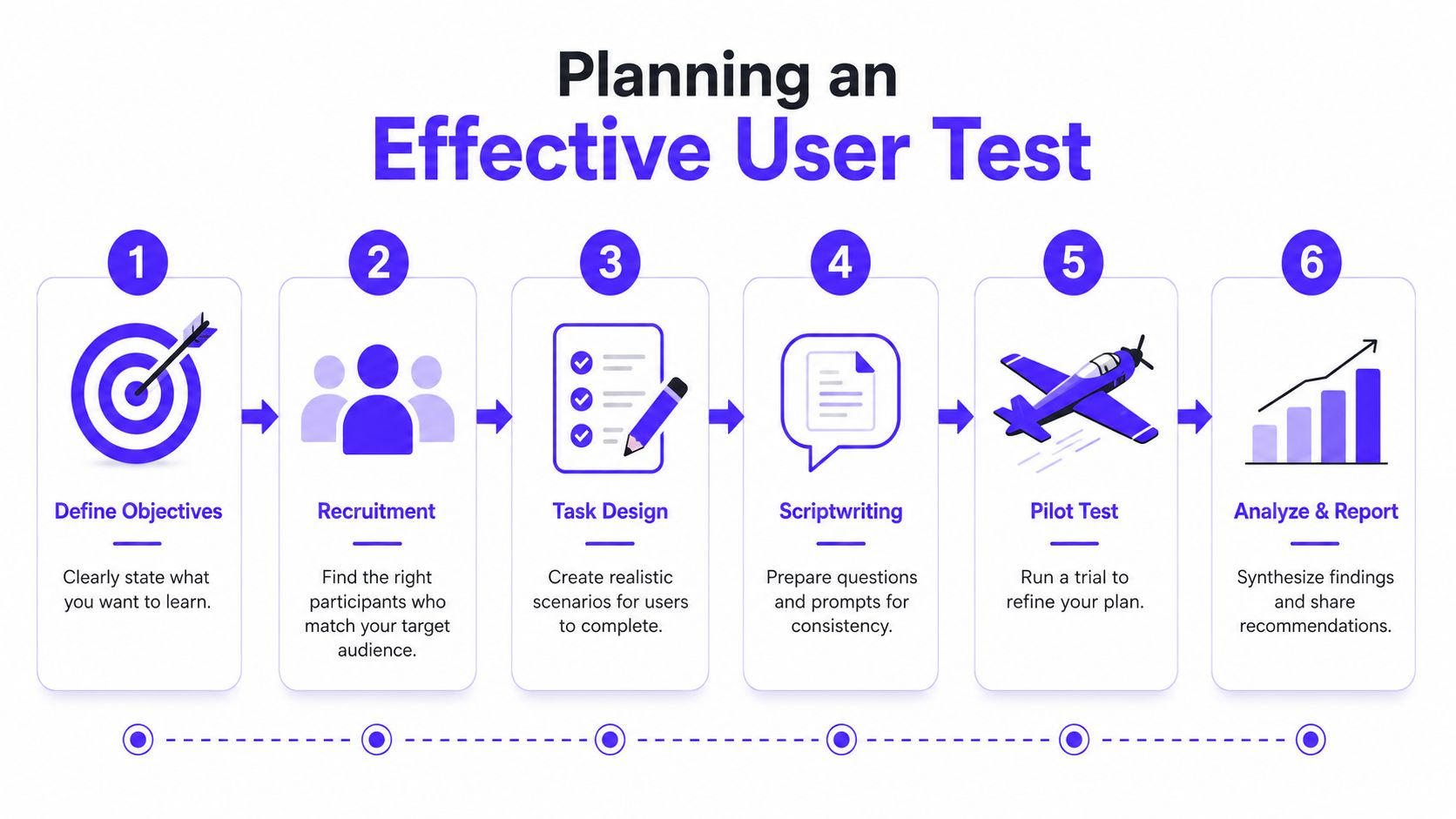
How to Plan a User Test That Delivers Insights
A useful test is planned backward from a decision.
Not from a template, not from a tool, and not from a vague goal like "get feedback." If you don't know what decision the session should inform, the output turns into a pile of observations with no consequence.
Recruit the right people, not convenient people
At this stage, most startup research goes sideways.
For AI SaaS, Web3, and Fintech products, the target user is often hard to reach and hard to screen. A generic testing panel might be fine for a meal delivery app. It usually falls apart when you need an enterprise AI buyer, a compliance lead, or an institutional DeFi operator. As covered in a specialized recruiting discussion, these audiences can require 3–6 months of recruitment and failure rates up to 60% on standard screener questions.
That changes how you should plan.
Use your network carefully: Customers, prospects, community members, and partner contacts are often better than broad panels.
Screen for behavior: Ask what tools people use, what workflows they own, and what decisions they make. Job titles alone are weak filters.
Protect first-time exposure: Don't recruit people who've already seen the design unless repeat-use behavior is the thing you're testing.
If you need outside help, use a recruiter, a research ops partner, or a product team that already runs moderated studies. 925 Studios is one option for startups that want research tied directly to design and shipped frontend work, especially when the issue isn't just finding friction but fixing it in product.
Write tasks that mirror real work
Tasks should sound like something a user would naturally try to do on a busy day.
User Interviews recommends limiting a usability study to no more than 3 to 4 specific tasks per study. Each task should have clear success criteria, use simple language, and avoid too many steps.
That advice is practical because overloaded sessions create muddy findings. If you ask participants to do too much, they get fatigued, the signal blurs, and you can't tell which part of the journey failed.
Try framing tasks like this:
For fintech: "You need to review a flagged payment and decide whether to approve it."
For AI SaaS: "You want to generate a summary, compare outputs, and send one to your manager."
For Web3: "You need to swap an asset and confirm the result before leaving the app."
Each task needs a clear definition of success. Not "user explores dashboard." More like "user finds the report, interprets the status, and completes the next action without leaving the flow."
Use a script that keeps you honest
A script isn't there to make the session stiff. It's there to stop you from leading the witness.
Keep it tight:
Opening context: Explain the scenario, not the solution.
Task prompt: Give one realistic objective at a time.
Neutral follow-ups: Ask what they expected, what confused them, or why they chose a path.
Wrap-up questions: Save reflection for the end.
The cleaner the task prompt, the cleaner the signal you get back.
Run a pilot before real sessions. One dry run usually exposes awkward wording, broken links, and hidden assumptions that would contaminate the test.
Turning Observations Into Product Changes
The test itself is only half the job. Its primary value comes from what the team changes next.
A founder doesn't need a highlight reel of confusing moments. They need a short list of product decisions, design fixes, and messaging changes that improve the path to value.

Treat struggle as evidence
One of the most useful ideas in usability work is the struggle metric.
Yale's guidance on user testing notes that when a moderator helps a stuck user, it can artificially inflate success rates by up to 40%. That's why rescuing participants is so damaging. The moment of confusion is the data.
If a trader can't find the confirmation step in a wallet flow, or a compliance analyst misreads a risk state in a dashboard, that friction is not user error to smooth over in the session. It's a product signal. The interface failed to communicate what mattered, when it mattered.
Useful evidence usually shows up in a few forms:
Repeated hesitation: Users pause in the same place and reread the same UI.
Wrong turns: They choose a path that seems logical to them but not to the product.
Workarounds: They invent their own method to complete the task.
Drop-off points: They stop because they no longer trust what will happen next.
Don't fix the session. Fix the product.
Turn notes into a product backlog
After the sessions, don't dump every observation into one long document and call it synthesis.
Sort findings into buckets that teams can act on:
Observation type | What it usually means | Product response |
|---|---|---|
Users can't find the next step | Weak hierarchy or unclear CTA | Redesign layout, labels, or action priority |
Users misunderstand status or data | Copy or visual signaling is unclear | Rewrite content, adjust states, improve information design |
Users hesitate before confirming | Low trust or unclear consequences | Add reassurance, context, and pre-action clarity |
Users complete tasks but complain after | Flow works, but it feels heavy | Simplify steps, reduce effort, tighten sequence |
Documenting these findings clearly matters. If your team struggles to convert raw notes into usable decisions, practices around improving documentation accuracy can help keep research from turning into vague summaries no one uses.
A good rule is to prioritize changes by user impact and closeness to the core path. If the issue blocks onboarding, purchase, activation, or trust, it moves to the top. If it only affects an edge case, it can wait.
This is the same lens we use when improving product conversion. Small UI fixes matter, but the biggest wins usually come from reducing uncertainty at the exact moment a user needs confidence. That's why conversion work and usability work are tightly connected in practice, especially when you're trying to improve conversion rates.
From Insights to a Shipped Product
User testing isn't about collecting feedback. It's about reducing risk before that risk turns into churn, rework, and missed growth.
The best startup teams use it in the right order. First, they test whether the problem matters. Then they test whether the product makes that problem easier to solve. After that, they choose the method that fits the decision, recruit users who match the market, and turn observed struggle into product changes the team can ship.
For AI SaaS, Web3, and Fintech companies, that discipline matters more because the products are often dense, trust-sensitive, and aimed at specialized users. A clean interface helps, but clarity is the core job. Users need to understand what the product does, why they should trust it, and how to get value without guessing.
That is what user testing is when it's done well. Not a design ceremony. A practical system for making better product bets.
If you're building a complex product and need a team that can connect research, interface design, brand clarity, and shipped frontend work, 925 studios works as one creative partner that replaces three hires, a product designer, a brand designer, and a frontend developer. That setup is useful when the goal isn't just to gather insights, but to turn them into a product people can understand and use.


Let’s keep in touch.
Discover more about high-performance web design. Follow us on Twitter and Instagram.

