
AI Product Design: A Founder's Guide for 2026

Yusuf
Founder and lead designer at 925studios

Most advice about AI product design is stuck at the tool layer. It tells founders how to generate screens faster, write prompts, or automate a prototype pass. That advice misses the hard part. The actual challenge isn't getting an interface on the screen. It's building a product that can make useful guesses, recover when it's wrong, and still feel trustworthy enough that users keep coming back.
That shift matters because AI features don't fail in Figma. They fail in production, when a sales rep gets a weak summary, when a trader sees a suggestion with no explanation, or when a fintech user can't tell whether the system is confident or just fluent. Good AI product design isn't about novelty. It's about designing behavior, trust, and feedback into the product from day one.
Table of Contents
Beyond the Hype What AI Product Design Is Not
AI product design is not “using AI in the design process.” That's workflow optimization. Useful, yes. Strategic, not always.
What founders need is a product that behaves well under uncertainty. If your app generates recommendations, drafts copy, flags fraud, ranks transactions, or explains blockchain activity, then the design problem isn't how quickly your team can mock a screen. The design problem is how the interface handles variable output quality while keeping the user in control.
The market confirms this isn't a side experiment. The generative AI product design market is projected to grow from $15.84 billion in 2025 to $24.99 billion by 2029. That matters because startups aren't competing in a niche anymore. They're building in a category where buyers increasingly expect AI-assisted workflows to be part of the product itself.
What founders often get wrong
A lot of teams still treat AI like a faster paintbrush. They add a prompt box, call it an assistant, and hope usage climbs. That usually creates one of two bad outcomes:
A gimmick feature that gets tried once and ignored.
A risky feature that automates too much and creates support problems.
In SaaS, that might look like a dashboard insight tool that produces generic summaries nobody trusts. In Web3, it might be a wallet analysis flow that sounds smart but doesn't show enough evidence. In fintech, it might be a risk explanation that reads clearly but leaves out what the user should do next.
Practical rule: If the value of your AI feature depends on the user assuming it's always right, the design is weak.
What AI product design actually solves
Strong AI product design solves for repeat usefulness. It creates systems where the AI can suggest, draft, rank, summarize, classify, or predict, and the user still understands what's happening well enough to act.
That means the work sits at three levels at once:
Product logic, what the model should help with and where it shouldn't.
Interface behavior, how suggestions appear, update, and fail.
Brand expression, whether the product feels distinct or just like another wrapper around the same model.
For founders, that's the shift. You're not buying speed. You're defining how intelligence shows up inside your product.
Thinking in Probabilities A New Design Mindset
Traditional product design is mostly deterministic. Tap a button, open a modal. Submit a form, see a confirmation state. The same action usually produces the same result.
AI changes that. The same prompt can produce a strong answer, an acceptable answer, or something that needs correction. That's why AI product design starts with a different mindset. You're not designing a fixed path. You're designing a range of likely outcomes and the user experience around them.
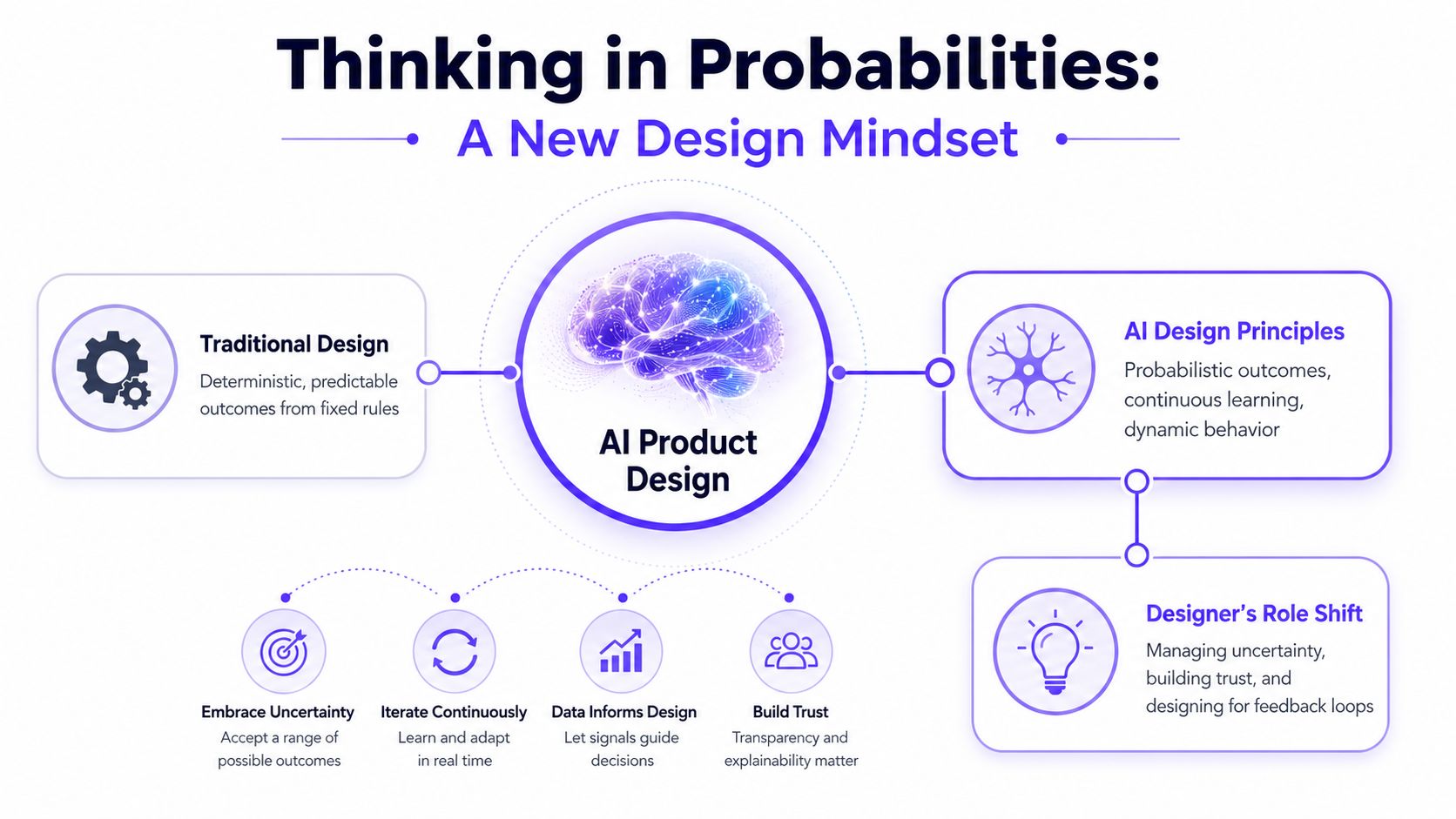
The cleanest analogy is this. A calculator gives one right answer if the inputs are valid. A writing assistant, fraud explainer, or portfolio summarizer gives a plausible answer that still needs context. That doesn't make AI worse. It means the product has to support judgment.
The industry has already moved in that direction. In 2026, 91% of designers use AI for design tasks weekly, up from 54% in 2025, and 57.3% use it for core production tasks like prototyping, according to the State of AI Design tools survey. That jump matters because it shows teams aren't using AI only for brainstorming anymore. They're building around it.
What changes in the way you design
The first change is where you place certainty. In a normal app, certainty sits in the system. In an AI product, certainty often sits in the workflow around the system.
A few examples make this concrete:
A CRM assistant shouldn't just generate a follow-up email. It should show the source notes, let the rep edit the tone, and make it obvious the output is a draft.
A fintech insights panel shouldn't only surface a spending anomaly. It should explain why the system flagged it and what the user can review next.
A Web3 analytics tool shouldn't translate wallet activity into plain English without showing the transactions behind the summary.
The designer's job shifts
You're no longer designing only for action. You're designing for interpretation.
That changes the job in a few important ways:
Design for ranges, not single states
Every AI output has best case, acceptable case, weak case, and fail case versions. The UI has to hold up across all of them.Build feedback into the main flow
Thumbs up and thumbs down aren't enough if they live in a forgotten corner. The product needs structured correction paths that improve the next interaction.Treat trust as an interface problem
Users don't trust AI because you call it advanced. They trust it when they can verify, edit, reject, or recover.
A strong AI interface doesn't pretend uncertainty is gone. It helps users work through uncertainty without friction.
What this means for founders
If you're planning an AI feature, stop asking only, “What can the model do?” Ask, “What does the user need to decide after seeing the output?”
That question leads to better product decisions. It pushes your team toward interfaces that support review, comparison, and revision. It also prevents the common mistake of shipping a flashy assistant that creates more cognitive load than value.
A Practical Workflow for Building AI Features
Teams waste months on AI when they start with model choice, prompt tricks, or a vague brief like "add a copilot." Start with the decision the user needs to make and the business risk around getting it wrong.
A stronger brief sounds like this: "Help account managers prepare renewal risk summaries before customer calls, using CRM notes, product usage signals, and open support issues." Now the team can define what inputs matter, what a useful output looks like, and where a bad suggestion could hurt revenue or trust. That level of specificity matters even more in SaaS, Web3, and Fintech, where an AI feature often touches retention, compliance, or money movement.

Write the AI requirement differently
A standard PRD usually fails here because it describes intent, not performance. "Generate helpful recommendations" gives engineering and design no shared bar for quality.
A better AI requirement names the job, the failure modes, and the review method. For a support draft feature, define what counts as relevant, safe, complete, on-brand, and correctly formatted. Then decide how the team will test each one before launch. If relevance drops, does the draft miss the ticket history? If safety fails, does it promise a refund the company cannot issue? Those are product questions, not model questions.
In practice, I push teams to write acceptance criteria around output quality and workflow impact:
Relevance. The response uses the right customer context, not generic filler.
Tone. The draft sounds like the company, not a chatbot.
Completeness. It covers the user's request and the next step.
Safety. It avoids claims, promises, or actions the business cannot support.
Format compliance. It fits the structure the team already works with.
That changes the conversation fast. Design can shape the review UI, engineering can instrument failures, and leadership can decide where a human still needs final approval.
Build the workflow around correction
The first draft is only half the feature. True product work sits in correction, because that is where users decide whether the AI saves time or creates cleanup.
For a fintech assistant that drafts transaction explanations, users need to edit numbers, remove weak inferences, and trace the source records before sharing anything with a client. For a Web3 analytics product, a wallet summary needs an easy way to tighten the scope, exclude suspicious transactions, or rerun the output with a different time range. If those controls are missing, adoption stalls. People return to manual work because reviewing the AI takes longer than doing the task themselves.
The interface should support that correction path directly:
Editable outputs instead of frozen generated text.
Targeted regeneration with instructions like "shorter," "use only CRM data," or "exclude unresolved tickets."
Reason capture when users reject an output, so the team learns whether the issue was tone, logic, missing context, or risk.
Visible source context for summaries, classifications, and recommendations.
Teams also need to teach users how these features behave inside the product. The Nuxie AI-native growth platform is a useful reference for teams thinking through in-app guidance, onboarding, and contextual education around AI behavior.
Ship with monitoring built into the feature
AI features degrade subtly. A prompt change, a model update, new customer data, or a shift in usage patterns can lower quality long after launch. If the product team is only watching top-line adoption, they will miss the damage until support tickets and churn make it obvious.
A practical rollout keeps the scope narrow and the feedback loop tight:
Start with one high-value job
Ship one contained workflow first, such as summarizing a call note or drafting a renewal brief. Do not roll out a broad assistant that tries to help everywhere and performs inconsistently.Match review to business risk
In SaaS, a weak summary might waste a few minutes. In Fintech, a weak recommendation can create compliance exposure. In Web3, a wrong interpretation of wallet activity can destroy trust with power users. Set human review rules based on that risk.Instrument the failure points
Track edit rate, reject rate, retry rate, and whether the output led to completion of the task. Those signals tell the team far more than raw generation volume.Review content and interface together
Bad UX can make a decent model look broken. Weak output labeling can make a decent interface feel deceptive. Product, design, and engineering need to review both as one system.
Founders who want a more concrete example can look at this guide on how to integrate AI into a website experience. The product issues show up fast once users try to act on an AI suggestion in a live interface.
One operating model that helps is keeping product design, brand design, and frontend execution close together. That is one reason some startups work with teams like 925 Studios, rather than splitting strategy, interface design, and implementation across separate vendors.
Essential UX Patterns for AI Interfaces
The difference between a helpful AI feature and an annoying one usually isn't the model. It's the interface around it.
A lot of weak products make the same mistake. They treat AI output like a final answer, but users need a starting point. That creates friction fast. People hesitate, double-check manually, or stop using the feature because the cost of verifying the output is higher than doing the task themselves.

Suggest, don't seize control
One strong pattern is suggestion over automation. In a sales SaaS product, an AI can propose the next best follow-up email, but the rep should still choose whether to send, edit, or discard it. In a fintech dashboard, the system can flag unusual behavior, but the user should decide what action to take after reviewing the evidence.
This changes the feel of the product. The AI becomes a capable assistant, not an unpredictable operator.
Redesigned well, the UI usually includes:
A proposed action with clear labeling, so the user knows this is generated.
A quick-edit layer, so the output can be tuned without starting over.
An easy dismissal path, so users don't feel trapped by the system.
Show where the answer came from
Source visibility matters most when users need to trust a summary or recommendation. If an AI assistant rewrites a customer insight, categorizes a transaction, or explains a smart contract event, users need a way to inspect the underlying evidence.
That doesn't require a giant technical audit panel. Often a simple expandable evidence drawer works. The point is to connect the answer to the material behind it.
When users can inspect the reasoning path, they forgive uncertainty more easily.
This is especially important in products where wrong output has a real cost. A founder reviewing an investor update draft may tolerate some cleanup. A compliance user reviewing a flagged transaction won't.
Build the escape hatch into the primary flow
A lot of teams talk about “human in the loop,” then bury the human controls. The better pattern is obvious recovery.
For example:
In an AI writing tool, let users revert to their original draft in one click.
In a financial recommendation flow, let users request a more conservative version.
In a Web3 explanation panel, let users switch from AI summary to raw transaction view.
Later in the product journey, education matters too. This walkthrough is a good example of how product teams think about AI interaction patterns in practice:
Ask for feedback in context
The worst feedback pattern is a generic “Was this helpful?” after a complex interaction. It produces weak signals.
Better patterns are tied to the output itself. If a generated meeting summary missed a key decision, the user should be able to mark that issue directly. If an AI classification grouped a transaction incorrectly, the user should be able to correct the label where they see it.
Good AI interfaces create a compact loop:
Pattern | Before | Better after |
|---|---|---|
Output labeling | Users assume the answer is final | Users see it's a draft or suggestion |
Evidence view | Summary appears with no support | Source items are one click away |
Recovery path | User must manually undo damage | Clear reject, edit, or revert controls |
Feedback | Generic rating only | Specific correction attached to the output |
These patterns sound simple. In shipped products, they're often the difference between a feature that becomes part of the workflow and one that gets ignored after the demo.
Common Pitfalls That Erode User Trust
The biggest AI design failures aren't always dramatic. Often the product looks polished, the responses sound smart, and the demo lands. Trust still erodes because the interface asks users to accept too much ambiguity.
That problem shows up fast in fintech and Web3, where people are already cautious. If the system suggests an action without enough context, or hides uncertainty behind smooth language, users don't just hesitate. They stop relying on the feature.
Over-automation strips out confidence
Founders often push for more automation because it sounds like a stronger AI story. In practice, over-automation can make the product feel reckless.
A common red flag is when the interface collapses too many decisions into one AI action. For instance, a portfolio tool that summarizes risk and recommends a move in the same panel may skip the user's need to review assumptions first. A better design separates explanation from action and lets the user decide how much help they want.
Black-box behavior creates support problems
If users can't tell why the AI produced a result, support has to absorb that confusion, making trust expensive.
One of the clearest gaps in AI product design is showing users what happens if the AI is wrong. Practical patterns for confidence, error probability, and recovery paths are critical, especially in high-stakes products, as explained in this piece on designing AI interfaces for trust and fallback behavior.
A useful test is simple. If the output is wrong, can the user answer these questions without contacting support?
What did the system likely base this on
How risky is it to act on this
What can I do instead
How do I fix or override it
If the answer is no, the UI still needs work.
Generic AI behavior weakens the product brand
Another quiet failure is brand flattening. Teams adopt a model, add generated text, and end up with an experience that feels like every other AI wrapper in the market.
That hurts more than aesthetics. In crowded SaaS categories, product feel is part of why users stay. If every recommendation sounds the same, every empty state feels generic, and every assistant panel follows the same pattern, you're training users to see your product as replaceable.
A weak AI interface doesn't just create usability issues. It removes the personality and judgment that make a product memorable.
Founders dealing with this problem usually need sharper research before they need more screens. This guide on AI UX research is useful because it focuses on how users interpret AI behavior, not just whether they can click through it.
How to Measure AI Product Design Success
Teams measure AI features like novelty products. They count generations, prompt volume, or how many users clicked the assistant once. Those metrics can tell you whether people were curious. They don't tell you whether the feature earned a place in the workflow.
The more useful question is whether the design helps users complete meaningful tasks with enough confidence that they return to it. That's the gap many AI products never close. Launch attention is easy to get. Repeat use is harder.
Use a benchmark framework that matches real product behavior
Production-ready generative systems need a custom benchmark framework across computational performance, solution quality, solution diversity, business impact, and user experience, because off-the-shelf benchmarks miss how real products behave in context, as outlined in this generative design benchmark framework.
That matters for product design because a feature can perform well in one category and still fail overall.
A few examples:
A summary tool may be fast, but low on solution quality if users constantly rewrite it.
A recommendation engine may look smart, but weak on user experience if people can't understand why it chose that option.
A drafting tool may produce diverse outputs, but weak business impact if teams don't reuse it in actual workflows.
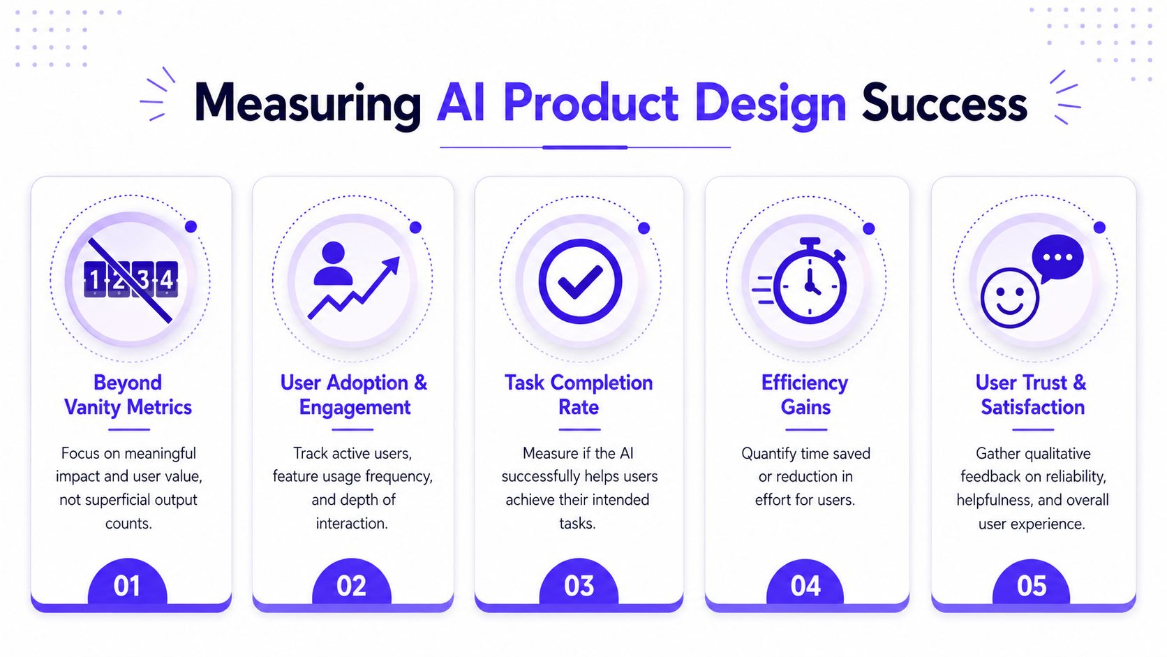
Measure task value, not output volume
Founders usually need a mixed scorecard. Some metrics are behavioral, some operational, and some qualitative. The point isn't to find one magic KPI. It's to connect design choices to user outcomes and business outcomes.
Key Metrics for AI Feature Performance
Metric Category | Example KPI | What It Measures |
|---|---|---|
Business impact | Repeat task completion with AI assistance | Whether users come back to the feature for real work |
Solution quality | Acceptance rate of AI output after review | Whether outputs are usable without heavy correction |
User experience | User confidence in acting on the result | Whether the interface supports trust and clarity |
Computational performance | Response speed in live product conditions | Whether the experience feels workable in production |
Solution diversity | Breadth of useful output variations | Whether the system gives users meaningful options |
This is also where product strategy matters more than dashboards. If you're deciding which of these metrics should shape roadmap choices, this article on product design strategy is a strong companion because it ties feature measurement back to product direction.
A better review cadence
The best teams don't only review AI performance at launch. They review it as product behavior.
A practical operating rhythm looks more like this:
Weekly product review, focused on obvious failure cases and user corrections.
Monthly pattern review, focused on where users accept, edit, or abandon outputs.
Quarterly strategy review, focused on whether the AI feature is improving the core product or just adding surface complexity.
The goal is simple. Keep measuring whether the feature reduces work, improves decisions, or increases user confidence. If it doesn't, the answer usually isn't “add more AI.” It's redesign the interaction.
Your AI Product Implementation Checklist
A lot of AI features fail for boring reasons. The team never defined quality well. The interface hid uncertainty. The success metric rewarded clicks instead of outcomes. None of that is a model problem. It's an execution problem.
Use this checklist before you ship, and again after the first release.
Strategy questions
What exact user decision are we improving If the feature doesn't support a clear decision or task, it will feel optional.
Where should the AI assist, and where should the user stay in control Founders often regret automating the final step before they validate trust.
Does this feature strengthen the product's position If it could be copied as a generic assistant panel with no impact on workflow, it's probably too shallow.
Design questions
Have we defined clear quality signals for each AI output If the team can't name what “good” looks like, engineering can't target it.
Can users inspect, edit, reject, or recover from the output These controls shouldn't live in a hidden overflow menu.
Does the product show what happens when the AI is wrong This matters most in high-stakes categories, but it improves trust everywhere.
The safest launch is rarely the smallest feature. It's the feature with the clearest boundaries.
Operations and measurement questions
What feedback will users give us in context Generic ratings won't tell you enough to improve the system.
What is our core ROI signal after launch You need a metric tied to repeat use, task success, or decision quality.
Who reviews failures and how often If nobody owns the correction loop, quality drifts unnoticed.
For teams working in regulated or sensitive categories, implementation support often needs domain-specific thinking beyond UI. If you're dealing with care delivery, compliance, or clinical workflows, this guidance for scaling healthcare solutions is a useful example of how operational support changes when the product stakes are higher.
The point of the checklist isn't to slow the team down. It's to stop you from shipping an AI feature that looks modern and behaves badly.
If you're building for AI SaaS, Web3, or Fintech and need one partner that can shape the product, define the brand, and ship the frontend, 925 studios helps teams turn complex AI behavior into polished interfaces people trust and use.


Let’s keep in touch.
Discover more about high-performance web design. Follow us on Twitter and Instagram.

