
How to Make Digital Product

Yusuf
Founder and lead designer at 925studios
You're probably in the ugly middle right now. You've got a sharp idea, maybe a rough Figma frame, maybe a landing page nobody's buying from yet, and a dozen decisions all pretending they're equally urgent. That's the start of how to make digital product, not the polished launch post, and the founders who win treat the first version like a learning tool, not a trophy.
For AI SaaS, Web3, and fintech teams, the mistake is usually the same. People split product, brand, UX, and frontend into separate conversations, then wonder why the thing feels half-built when it finally ships. A digital product only works when the promise, the interface, and the build all line up.
Table of Contents
The First Week of a Digital Product
A founder's first week usually looks messy in the same specific way. There's a user problem that feels real, a few screenshots in a folder, and a Slack thread full of opinions about onboarding, pricing, copy, and whether the dashboard should feel “premium” or “minimal.” None of that is the product yet. It's just the noise around the product.
The fastest way out is to stop treating the build like a blank canvas and start treating it like a test. Prophet's six-stage lifecycle, opportunity definition, rapid experience design, alpha, beta, core, and retirement, exists for a reason, it forces you to reduce concept risk before full build-out instead of discovering the truth after you've already burned time and money on code (Prophet). That's the right mindset for the first week. You're not trying to finish. You're trying to learn what deserves to exist.
Practical rule: if you can't describe the user pain in one sentence, you're still upstream of product work.
A good founder in week one narrows, not expands. Pick one user, one problem, and one action you want them to take. That's the only way the rest of the work, design, copy, frontend, and positioning, can point in the same direction. A scattered start creates a scattered product.
The other thing founders get wrong is trying to skip straight to polish. A digital product isn't “shipped software,” it's a measurable system where user behavior tells you whether it's useful and sticky, and the standard language for that system is acquisition, engagement, retention, and revenue metrics such as DAU/MAU, retention rate, churn rate, conversion rate, ARPU, MRR, and NPS (AltexSoft). If you don't know what behavior you want to see, you're decorating uncertainty.
Think of week one as the bridge between instinct and evidence. The product that ships well almost always starts with a narrower question than the founder wanted to ask.
Validate the Problem Before You Validate the Solution
Most bad products don't fail because the UI is ugly. They fail because the team built the wrong thing with confidence. Validation is where you stop being in love with your idea and start checking whether a real audience has the problem you think they have.
Start With One Outcome
Write one measurable outcome that matters to both sides of the table. The business side cares about whether the product earns attention, trials, or revenue. The user side cares about whether the product saves time, reduces friction, or makes a task feel possible. That single outcome becomes the spine of the brief.
A strong brief is short. It names the audience, the pain, the current workaround, and the desired result. It also tells the team what success looks like so design doesn't drift into decoration and engineering doesn't drift into feature sprawl. If you need a model for that kind of clarity, use the structure in this value proposition design guide.
Validate the Pain, Not Your Favorite Fix
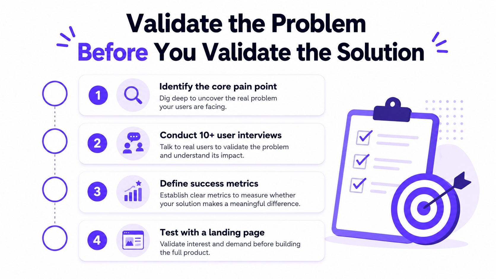
Interview people without pitching the solution first. Ask how they handle the problem today, what they've already tried, where they got stuck, and what they'd pay to stop doing. If the answer sounds like curiosity, not intent, keep listening. If they describe a current workaround with frustration, that's signal.
A quick sanity check helps too. You can validate your startup idea for free before you commit to the build path. Use it as a pressure test, not as permission to overthink. The point is to find out whether the problem has urgency and whether the audience is narrow enough to serve well.
Use a Simple Validation Gate
Keep going only if three things are true. First, the user names the pain without you leading them there. Second, they already spend time or money solving it another way. Third, the solution would clearly change a workflow, not just sound nice in a demo.
Buy intent shows up in behavior, not compliments. If someone says “cool idea” and never asks when they can get it, you don't have validation.
That's the line between vanity feedback and real demand. A founder who learns that distinction early saves months of false progress. A founder who ignores it usually ends up launching a product that looks finished and behaves like a guess.
In-House Team, Studio Partner, or Freelancers
Every founder hits the same hiring fork. You need product thinking, brand judgment, and frontend execution, but you don't need the same setup at every stage. The wrong answer is usually the one that feels cheapest on a spreadsheet and most expensive in revision cycles.
Option | Ramp Time | Best Fit Stage | Main Risk |
|---|---|---|---|
In-house team | Slowest, because you're hiring and aligning multiple roles | Later stage products with repeat design and build demand | You pay for payroll before the work pattern is stable |
Studio partner | Fast to engage, with senior people already working together | Seed to Series B teams that need strategy, design, and frontend in one motion | Picking a partner that only looks good in pitch mode |
Freelance bench | Variable, depending on who's available and how much you manage them | Narrow tasks and highly defined execution work | You become the project manager, QA lead, and integrator |
An in-house trio, a product designer, a brand designer, and a frontend developer, is the benchmark many founders use because it maps to the actual work. It also makes sense when the product is evolving fast and you need one team living inside the roadmap. The downside is obvious. You don't just hire talent, you absorb coordination.
A studio partner fits when the product still needs senior thinking across several layers and you don't want to assemble that bench yourself. For founders who need to Hire LATAM talent through a broader staffing route, LatHire can be useful for building an internal team with a different cost structure. That path still leaves you managing integration, which is where many startups lose momentum.
Freelancers make sense for isolated jobs, not for a product that has to feel coherent. If your interface, brand, and marketing site all need to speak the same language, a loose freelancer stack can turn into a patchwork fast. That's not a talent problem. It's a systems problem.
The clearest signal is control. If you want one accountable partner who can carry strategy through shipped pixels, a studio is usually the cleanest move. If you already have product leadership and only need execution capacity, in-house can work. If the work is narrow and the scope is frozen, freelancers are fine.
UX, Brand, and Frontend Prototyping That Convinces
The first prototype should answer one question fast, does this product feel worth using? That matters for SaaS dashboards, fintech onboarding, and Web3 interfaces alike, because people do not buy complexity, they buy clarity and trust.
Design the First Screens That Carry the Story
Start with the screen that proves the promise. For a SaaS dashboard, that is often the main workspace, the place where users see the value of data, actions, or alerts without hunting around. For fintech, it is the onboarding or verification flow, because trust drops fast when that path feels vague. For Web3, it is usually the wallet or transaction surface, where confidence matters more than visual drama.
Brand belongs in the prototype from the start, not as a separate polish pass. Color, type, spacing, motion, and tone all tell the user what kind of product this is. If you leave brand until after UX is “done,” you end up redesigning twice. If you shape them together, the first usable version already feels intentional.
The point of prototyping is to make decisions visible before they get expensive, and this prototyping guide gives a practical baseline for that work. If your product uses reusable UI patterns and needs to stay consistent as it grows, the AI component systems best practices piece is worth reading because it ties interface structure to speed and coherence.
Use Clickable Prototypes as the Core Test
A clickable Figma flow can do three jobs at once. It can show your team how the product should feel. It can surface confusion in user interviews. It can also help investors or internal stakeholders understand the logic without waiting for engineering to finish.
Show the smallest path that proves the core value. If the prototype needs a tour guide, the product is still too complicated.
Keep the prototype honest. Leave out hypothetical features that are not part of the first user job. Do not over-animate it into a demo reel. A convincing prototype is clear, not theatrical. The more specific the flow, the better the feedback.
Strong frontend thinking matters early because the jump from Figma to live UI should not erase the original intent. The product should still feel like the same system when it is running in the browser.
Picking the Tech Stack and Building the MVP
Founders waste time arguing about stack choices because it feels productive. It isn't. The job is getting a usable version into the market without dragging unnecessary infrastructure behind it. An MVP is a build sequence, not a philosophy, and the product, design, brand, and frontend decisions all sit in the same conversation from the start.
Choose the Default Stack for the Job
For SaaS, fintech, and Web3 products, the safest default is a modern frontend framework like Next.js or Remix, plus a backend or database layer that does not create a heavy ops burden too early. Supabase or Firebase make sense when speed matters and you need straightforward authentication, storage, or database plumbing. If the first version is mostly marketing, lead capture, or a lightweight client surface, Webflow or Framer can be the right answer.
No-code and low-code work when the workflow is simple and the goal is proof, not platform architecture. They break down when teams pretend a prototype is already a product company. Custom builds make sense when security, data structure, and product depth matter from day one, which is common in fintech and more complex SaaS. If you want a sharper framework for that decision, the MVP in startups guide is a useful reference.
Ship in a Realistic Window
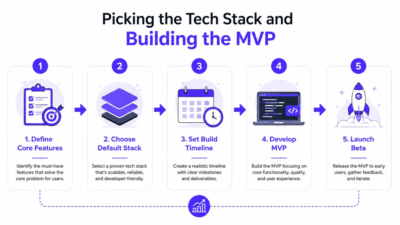
The first shippable version should sit on a tight, fixed timeline, not an open-ended build calendar. Keep the scope small enough that the team can make tradeoffs without rewriting the entire plan every week. A short sequence like core feature selection, stack choice, build schedule, MVP development, and beta release keeps the work honest.
Keep the Right Work In-House
Outsource the parts that are easy to specify and expensive to keep learning from scratch. Keep in-house the decisions that shape the product direction, data model, and launch priorities. That usually means the founder owns scope, the product lead owns tradeoffs, and the technical partner owns implementation quality.
The sources that talk about product creation also remind you to export carefully, preserve links, test on multiple devices, and control file size when interactive assets are involved (the-pinkink.com). That same discipline applies to software MVPs. Test the boring stuff before you call the product ready.
If the stack choice is slowing the schedule more than the product learning, you've made the decision too early.
A good MVP does not prove you can build anything. It proves you can build the right first thing, and that the market understands it fast enough to keep going.
Launching and Reading the First 30 Days of Traction
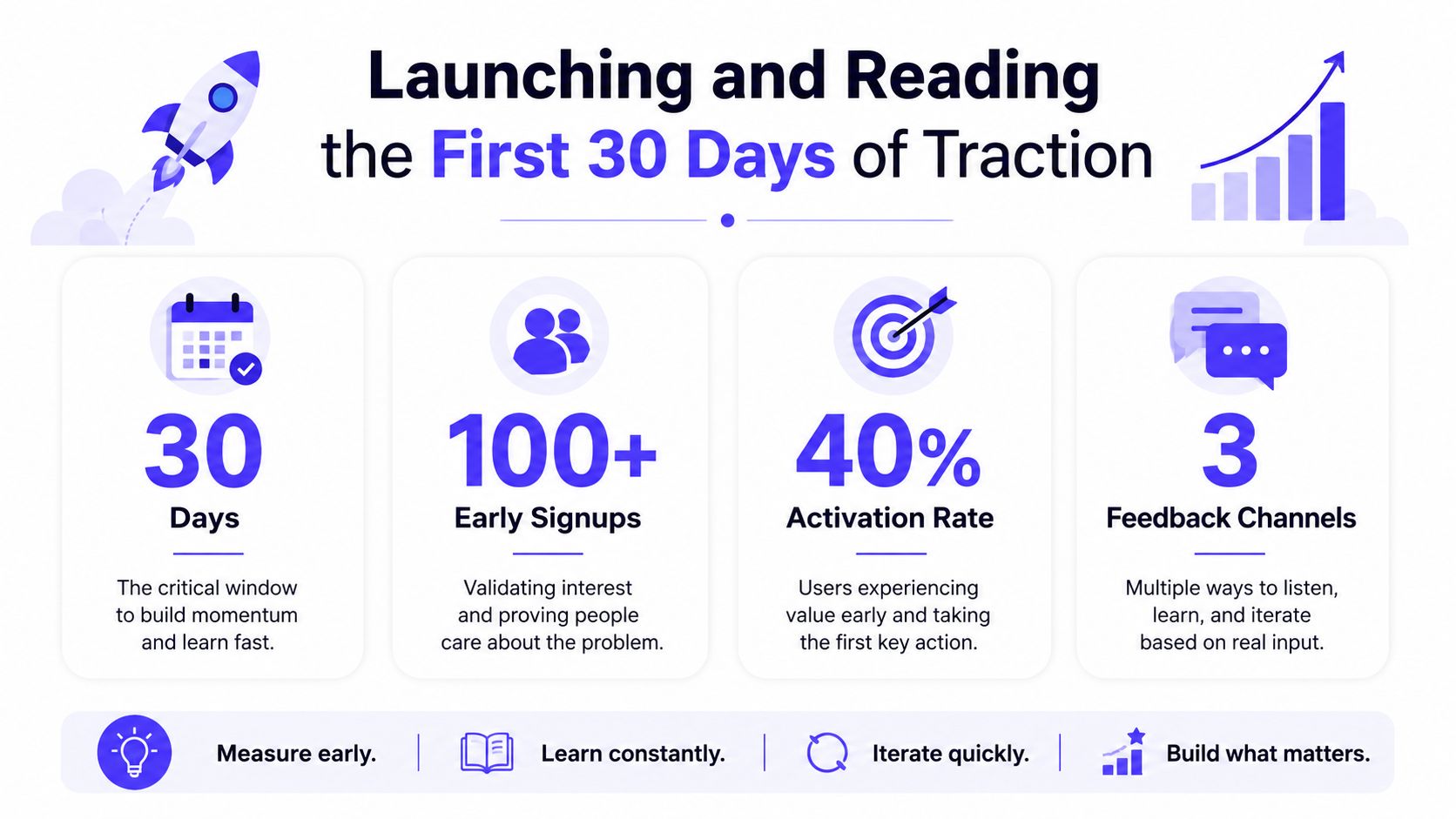
Launch day is not the finish line. It is the first stretch of proof. The landing page, onboarding, analytics, and feedback channels need to work as one system, because the product will reveal its real shape long before the pitch deck does. Founders who treat product, brand, and frontend as separate conversations usually miss the point, because users experience them as one judgment.
Read Behavior Before Opinions
The first question is simple. Are people activating? If they sign up and never reach the core action, the problem is usually onboarding, not demand. If they reach the core action but do not come back, retention or value delivery is weak. If they keep using it and still complain, the product may be useful but awkward.
Watch the signals that show whether the product is sticky. Product teams often track session duration, bounce rate, and customer effort alongside revenue and retention signals, because sessions and clicks alone do not show usefulness. That matters for SaaS dashboards and fintech products, where repeat usage matters more than a single polished activation.
A launch report should answer one question fast. Did the product create a habit, or just a moment?
Separate Product Problems From Distribution Problems
Not enough signups can mean two very different things. The message can be weak, or the product can be positioned well while nobody sees it. Do not rewrite the product just because traffic is thin. Fix distribution when the landing page resonates but the channel is dry.
Several creators get this backwards and spend their time posting random updates instead of building channels that compound. The stronger pattern is a waiting list, email, search-first content, launch partners, or niche communities, because organic social alone is unstable and usually too shallow for a serious launch. That is the hard part most beginner advice skips.
Treat Feedback as a Map, Not a Verdict
The first wave of criticism is useful if you read it correctly. One person's complaint about copy does not outweigh repeated friction in onboarding. One excited comment does not prove market pull. Look for patterns across what users say, where they stop, and what they try to do next.
The product proof point framework from Customer Proof is useful here, because the strongest evidence is the smallest specific fact that backs one claim at the point of maximum doubt (Customer Proof). Use that idea in your launch page and in your follow-up conversations. Buyers trust exact proof more than broad hype.
If you want a clean benchmark for what to watch after launch, use a short list of product metrics and keep it tied to user behavior, not vanity reporting (AltexSoft).
Iterating Well and Knowing When to Hire In-House
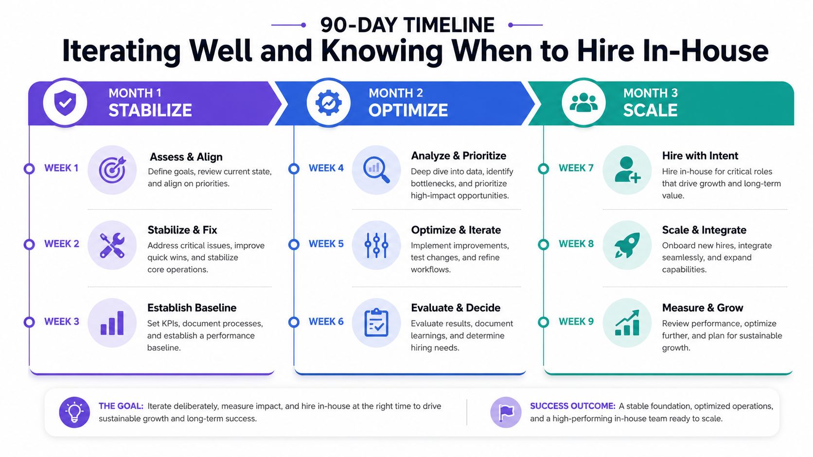
The next 90 days usually decide whether the product becomes a real business or an expensive experiment. Month one is for stabilizing the core flow. Month two is for tightening the weak spots. Month three is where you decide whether the work pattern justifies internal hires.
Use a Short Decision Loop
Every week, ask three questions. What confused users? What made them move forward? What work keeps repeating? If confusion stays high, iterate on the flow. If the same design or frontend problem keeps showing up, you've found a systems issue, not a one-off bug.
A redesign is justified when the product structure is wrong. Iteration is enough when the product is directionally right but rough around the edges. Hiring in-house is the right move when the product needs steady, recurring work that can't be handed off cleanly anymore.
Don't Hire to Relieve Anxiety
Founders often hire too early because they want relief, not because the workflow supports it. That creates a team before the product has a stable shape. It also drifts the brand and design standard if nobody has a strong creative owner.
Keep the creative bar anchored to shipped work, not internal taste.
If you extend a studio partnership past launch, hand off the repeatable parts and keep the strategic parts close. If you move in-house, protect the product language, the visual system, and the frontend standards from day one. The common mistake is confusing motion with progress.
If you need a creative partner that can hold product design, brand, and frontend together without turning the work into three separate projects, 925 studios is built for that exact gap. We help AI SaaS, Web3, and fintech teams ship polished interfaces, clear brands, and frontend that matches the product story. If you're at the point where the idea is real but the build needs a senior hand, visit 925 studios.


Let’s keep in touch.
Discover more about high-performance web design. Follow us on Twitter and Instagram.

