
Design System Components Guide for Startup Teams

Yusuf
Founder and lead designer at 925studios

If you're a founder staring at a product that started clean and now feels like five different apps stitched together, you already know the problem. One feature has rounded buttons, another has sharp ones, your payment form looks like it came from a different company, and every new screen makes the design system messier, not better. That's usually the moment teams realize they don't need more one-off screens, they need design system components that can keep product, brand, and frontend work aligned.
For startups, this isn't about building a giant library for the sake of it. It's about choosing the smallest useful set of reusable parts, documenting them well, and making sure they can stretch when the product hits edge cases. That's especially relevant if you're trying to ship AI SaaS, Web3, or fintech products without adding another full-time designer or frontend hire. If you're new to the bigger picture, this primer on why startups need a design system is a useful companion.
Table of Contents
Introduction to Design System Components
A founder ships an MVP, then a few weeks later the dashboard, onboarding flow, and billing page all look slightly different. The product still works, but users notice the inconsistency, and the team feels it too, because every new screen takes longer than it should. That is the cost of skipping design system components, small decisions keep piling up until every new page becomes custom work.
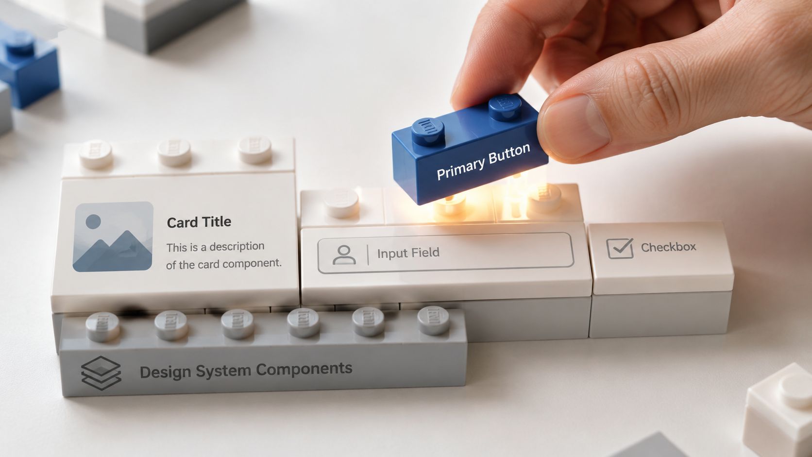
Design system components work like reusable building blocks. Each one combines visual style, code, and behavior into a piece the team can use again without starting over. NN/g describes design systems as a complete set of standards for managing design at scale, and that idea helps here, because the point is coordination, not decoration. For a startup, a key benefit is shared language across design, product, and engineering, so everyone works from the same reference instead of a trail of one-off choices.
Practical rule: if a screen keeps getting rebuilt from scratch, it usually needs a reusable component, not a prettier mockup.
Early-stage teams do not need a huge library on day one. A small set of core components can cover the screens that repeat most often, such as signup, onboarding, settings, and billing, while the rare edge cases stay flexible for later. If you want a simple way to decide what belongs in that first set, this guide on why startups need a design system gives a useful starting point. The goal is to cover the common 80 percent with a minimal set, then leave room to extend the system when product needs get more specific.
That balance matters because a system that is too thin creates inconsistency, while one that grows too fast becomes hard to use. Start with the pieces that show up again and again, document them clearly, and treat exceptions as exceptions until they prove they deserve a place in the system.
Understanding Design System Components
A design system component bundles visual style, code, and behavior into one reusable piece. That means the team is not recreating the same button, card, or input field from scratch each time a screen changes. The point is consistency that is easy to repeat.
That bundle is what makes components more than screenshots. A component is not only how something looks, it is also how it acts and how the team uses it across products. UXPin notes that many teams can cover 80% of their interface needs with just 15–30 core components, usually starting with buttons, inputs, cards, navigation, alerts, and form controls UXPin.
A small core does most of the work
That 80 percent idea is the part founders should pay attention to. Early-stage teams do not need every possible component on day one, they need the ones that show up again and again in product flows, onboarding, and settings pages. A button that behaves the same way across signup, billing, and dashboard actions saves more time than a large library of rare widgets nobody uses.
A simple way to decide what belongs first is to ask, “What gets rebuilt the most?” If your team keeps remaking form fields, call-to-action buttons, navigation items, or alert banners, those are strong candidates for the core set. If a one-off screen needs something unusual, handle it as a local exception first, rather than promoting it into the system right away.
Reuse only works when the common case is easy to find and easy to trust.
That is why startup teams should treat the first component set like a working kit, not a complete catalog. The goal is speed with consistency, so design and engineering can move together instead of negotiating every button label and every card layout from scratch. Build that foundation well, and handoff gets easier. The product also starts to feel like one product, not a collection of temporary solutions.
Anatomy and Hierarchy of Components
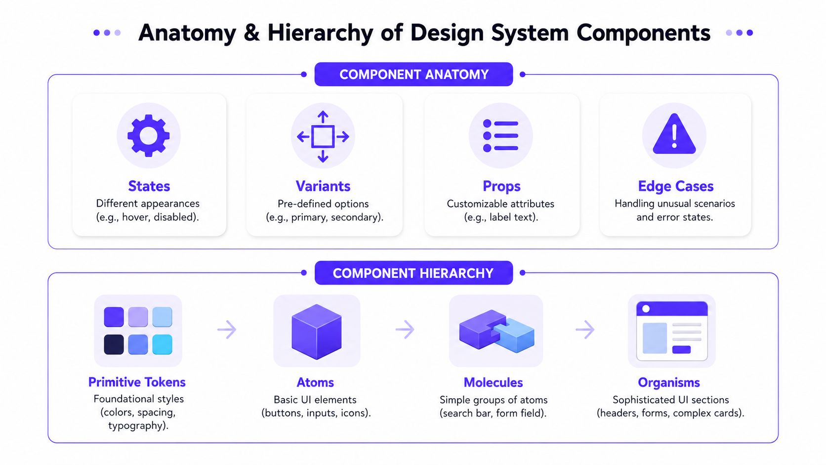
A useful component has more going on than color and shape. It needs to define how it looks, how it changes, and what happens when things go wrong. That's why strong component specs include variants, states, anatomy, props, and edge cases, so engineering doesn't have to guess what “primary button” or “error state” is supposed to mean component-spec practice.
What a component needs to define
The easiest way to think about component anatomy is to split it into a few concrete pieces. States are the different conditions a component can be in, like hover or disabled. Variants are the predefined choices, like primary or secondary. Props are the inputs that change content or behavior, like label text. Edge cases cover the odd situations that break messy systems, like long labels, missing data, or error handling.
That level of specificity matters because it keeps the design file, code, and product behavior aligned before build starts. When the spec says what the component accepts and how it should respond, the frontend team doesn't need to interpret intent from a screenshot. It also gives non-designers a map they can read without translating design language into implementation guesses.
Why hierarchy keeps teams sane
Hierarchy is the second half of the picture. Most systems are easier to use when they're organized from primitive tokens to atoms, molecules, and organisms. Primitive tokens are the foundational styles, things like color, spacing, and typography. Atoms are the basic UI elements, like buttons, inputs, and icons. Molecules combine those atoms into a simple functional unit, like a search bar or a labeled form field. Organisms are more complete sections, like headers, forms, or complex cards.
That structure gives everyone a shared filing system. A founder can ask for a “payment form,” and the team can see whether it belongs as a molecule, an organism, or a product-specific feature pattern. A designer can find the right layer faster, and an engineer can understand which pieces are supposed to be reusable versus assembled for one workflow.
Win is predictability. Once the layers are clear, the team stops mixing system-wide rules with screen-specific hacks. The result is cleaner documentation, fewer naming disputes, and less time spent hunting through files to figure out where a component belongs.
Common Components and Patterns in UI Libraries
A startup UI library usually starts with the same cast of characters. Buttons handle action, inputs collect data, cards package content, and navigation keeps people oriented. More specialized pieces, like tooltips, alerts, tables, and dropdowns, fill in the gaps once the product begins to spread across more screens and workflows.
The hard part is deciding what stays in the core and what stays local. Josh Cusick argues for an 80/20 split, where the core system handles about 80% of needs and the remaining 20% is handled by localized components abstracted from primitives Josh Cusick. That's a smart model for startups, because it leaves room for product-specific behaviors without bloating the shared library too early.
The core set startups usually need first
Here's the practical shortlist that is immediately understandable:
Common Component Patterns Comparison | Description | Example Use Case |
|---|---|---|
Primary button | The main action on a screen, usually the clearest call to action | Saving a profile, submitting a payment, starting an onboarding step |
Secondary button | A lower-priority action that supports the main one | Cancel, go back, dismiss |
Form input | A field for entering data, with labels, helper text, and validation | Email entry, wallet address, API key input |
Dropdown | A compact way to choose from a list of options | Currency, plan tier, network selection |
Card | A contained block for summarizing content or data | Account summaries, project tiles, NFT listings |
Table | A structured view for comparing many records | Transactions, invoices, access logs |
Navigation | The set of links or tabs that orients users | Sidebar menu, top nav, settings sections |
Alert | A message that signals status, success, warning, or error | Payment failure, permission issue, account update |
Tooltip | A small contextual helper for short explanations | Explaining a fee, icon label, or data field |
In a fintech app, the payment form usually leans on inputs, dropdowns, alerts, and a primary button, because the whole point is reducing friction while keeping people confident about what happens next. In an AI SaaS dashboard, cards and tables often carry more weight, because users need to scan models, usage logs, or task results quickly. In a Web3 product, permission dialogs and confirmation states matter a lot, because users need to understand exactly what action they're approving.
When patterns matter more than single elements
Patterns are what happen when components work together repeatedly. A modal, for example, isn't just a box, it's a behavior pattern that freezes attention, asks for a decision, and returns the user to the underlying screen. An accordion does something similar for dense content, except it saves space instead of interrupting flow.
For startups, the point is to stop treating every screen as a unique composition. If the same login warning, onboarding step, or delete confirmation keeps showing up, document that as a pattern and reuse it deliberately. That keeps product behavior familiar, which matters just as much as visual consistency.
Best Practices for Naming Accessibility and Documentation
A component library becomes hard to use when names drift. One team calls a button “primary-large-button,” another calls it “cta-main,” and a third buries it in a folder nobody opens. A clear naming convention, such as category–element–modifier, keeps the list readable, so a founder, designer, or engineer can find the right piece without decoding inside jokes.
Naming that stays readable as the library grows
Use names that tell you what the thing is before you open it. button–primary–large is easier to scan than a clever internal label, because the structure communicates category, style, and size in one glance. That matters when a library starts holding dozens of pieces, since the list itself becomes part of the workflow.
Consistency matters more than the exact pattern, as long as the team uses one pattern everywhere. If the component names mirror the folder structure and the visual hierarchy, people spend less time guessing where to look. A clear system also makes duplicate components easier to spot before they spread.
Practical rule: if a component name needs a Slack explanation, it probably needs a better name.
Accessibility and documentation that prevent drift
Accessibility belongs in the component definition, not as an extra layer added later. Technical documentation should include keyboard interactions, screen-reader behavior, ARIA attributes, and focus management so implementations do not drift across teams and platforms Designx. That keeps a button working for a keyboard user, not just looking right in a mockup.
Good documentation also needs to be more than screenshots. MagicPattern recommends including a name and description, a visual example, an anatomy breakdown, a code example, design tokens, accessibility requirements, and related components, and it advises referencing token names instead of raw hex codes or pixel values MagicPattern. That bridge between design and engineering turns styling into a shared system instead of a collection of magic numbers. For a deeper look at building guides people can maintain, see design system documentation. For teams building their docs process, software documentation best practices are worth borrowing, especially the part about keeping docs maintainable instead of ornamental.
A design system only stays useful if the team can update it as the product changes. If the docs lag behind the code, people stop trusting both.
If you want a practical starting point, each component entry should answer three questions. What is this for? How do I use it? What can go wrong? That simple frame clears up a lot of back-and-forth between design, product, and frontend.
Scaling and Implementation Tips for Startup Teams
A design system rollout fails when teams try to cover everything at once. A better path is to start with the pieces that cover the most common work, then add room for edge cases later. For startup teams, that usually means building a small set of shared components first, so the product can move quickly without turning every screen into a one-off decision. For a complete walkthrough of that sequence, see how to build a design system from scratch.
The first step is an audit. Before creating anything new, inventory the current UI and look for repeated patterns, inconsistent states, and components that are already acting like system pieces even if nobody has named them that way. Brightside Studio points out that inherited systems often hide undocumented palettes, old structure, and scattered migrations, so the audit is where you surface the mess instead of layering over it Brightside Studio.
A rollout process that doesn't stall shipping
A simple checklist helps keep the work grounded:
Audit existing UI: review active product screens, marketing surfaces, and common flows for repeated patterns and mismatches.
Define the MVP: choose the core components and tokens that cover the most common user actions first.
Pilot with feature teams: ship the new pieces with one or two teams, then collect feedback from real builds.
Set up maintenance: assign ownership, track changes, and keep a roadmap for additions and deprecations.
The goal is to cover the everyday paths first. A button, input, card, and navigation pattern often handle a large share of startup use cases, while rarer interactions can stay flexible until they prove worth standardizing. That keeps the system small enough to adopt without slowing product work.
Measuring adoption matters too. The Figma metrics guidance recommends watching how much of the interface is built with shared components instead of custom ones, along with how much of the UI appears consistently in design and code Figma metrics guidance. If those signals do not move, the library is probably too hard to use or too far from the way the team builds.
Lightweight tooling and upkeep that keep the system useful
For most startups, the tooling stack can stay lean. Figma is enough for shared design work, and Storybook is often enough for a component playground if the team wants a structured preview layer for UI behavior. The point is not to add more tools. The point is to make the shared parts easy to find, reuse, and test.
The maintenance rhythm should be boring on purpose. Brightside Studio recommends checking design-system performance data on a regular basis so teams can see whether the library is still saving time and reducing drift Brightside Studio. For a startup, that does not mean heavy governance. It means reviewing what is still in use, what has started to drift, and what should be retired so the system stays small enough to manage.
If the system connects to a React codebase, a practical integration guide like the React app integration guide can help teams think through how shared components are consumed in product code without turning the library into a side project. That matters because a design system works best when it stays close to the product team's daily work, not locked away in a design file no one opens.
Conclusion and Actionable Checklists
The best design systems don't try to be encyclopedias. They define the common bricks, map the hierarchy, document behavior clearly, and leave room for product-specific exceptions when the app needs them. That's how small teams keep shipping without turning every screen into a custom project.
Use these checklists as your working folder structure:
Core components: button, input, card, navigation, alert
Component spec: variants, states, anatomy, props, edge cases
Docs entry: name, description, example, code, tokens, accessibility notes, related parts
Rollout plan: audit, MVP, pilot, maintenance
A simple folder setup can look like this, even if your tools change later:
tokens/
components/
patterns/
docs/
examples/
Treat the system like a product you maintain, not a file you publish once. Review it, prune it, and add to it only when the new piece earns its place. If you want help turning that into a design system your team can ship with, 925 Studios can help you build the product, brand, and frontend pieces together.
A CTA for 925 studios.


Let’s keep in touch.
Discover more about high-performance web design. Follow us on Twitter and Instagram.

