
The Art of Landscape for Digital Product Design

Yusuf
Founder and lead designer at 925studios

The art of depicting outdoor scenery looks old because it is old, but the surprising part is how directly it maps to modern product design. The same visual choices that helped 16th-century artists make a scene readable are the choices that help a SaaS dashboard feel clear, a fintech onboarding flow feel trustworthy, and a Web3 landing page feel less chaotic. When a screen has too many competing elements, the problem usually isn't lack of information. It's lack of hierarchy.
The art of outdoor design is not just about nature scenes. It's about organizing space so people know where to look, what matters first, and what can fade into the background. That's the same job a product designer does on a homepage, a dashboard, or a pricing page. If founders treat it as a visual language instead of a decoration style, it becomes a practical tool for reducing confusion and improving confidence.
Table of Contents
Your Next Great Feature Is a 500-Year-Old Painting
The fastest way to clean up a cluttered product is often to borrow from how scenery painters work, not from how software teams usually build screens. That sounds unlikely until you look at the history. In the Western tradition, natural views did not become an independent genre until the Renaissance in the 16th century. Before that, they mostly served as backdrops for religious and figural scenes.
Why that matters in product work
That shift matters because it points to a familiar design problem, turning a busy scene into something people can read quickly. Artists in the Netherlands began treating outdoor views as a subject in their own right in the 1500s, which means they were already solving the same core issue founders face now, how to hold a lot of information inside one frame without tiring the viewer. A dashboard has that pressure. So does a Web3 portfolio page or a fintech account screen.
Practical rule: if a screen feels confusing, do not add more explanation first. Remove visual competition until the eye has one clear place to land.
That is why the principles of composition belong in product conversations. They teach restraint, spacing, and visual sequence. Those are not art-school luxuries. They are trust signals. Users tend to trust interfaces that feel composed, because composed interfaces feel deliberate.
A painter of natural scenery makes a series of decisions about what to foreground, what to soften, and what to leave implied. Founders should do the same. If your product page looks like every element is shouting at once, users assume the product is poorly organized too. If the layout feels calm, they read that as competence.
The business result is straightforward. Better visual order lowers friction, and lower friction helps people keep moving toward sign-up, trial, or purchase.
What the Art of Landscape Really Means
Art of scenery is not “pictures of nature.” It is the deliberate construction of space, mood, and hierarchy inside a frame. That distinction matters because founders often confuse decoration with direction. A scenic hero image can look polished and still fail the product if it does not guide attention.
A useful way to read this field is as visual decision-making with business consequences. Each element either earns its place or distracts from the message. If the frame does not tell people where to look first, the interface has already lost some of its authority. Users do not call that out explicitly, but they feel it as hesitation.

What founders should take from that
When a founder asks for a “more premium feel,” they are usually asking for stronger control over space without naming it. In practice, that means fewer competing focal points, cleaner transitions, and a clearer sense that each screen has one job. A scenic mindset helps because it starts with the whole view, then trims away whatever does not support the main message.
The frame should feel like it has a climate, not just content.
That is why broad contextual thinking helps both brand and product. Brand needs atmosphere. Product needs clarity. Scenic art can support both when it is used well. It lets you signal ambition without noise, which is especially useful in AI SaaS, Web3, and Fintech, where users are already dealing with complexity.
Three Landscape Principles Every Founder Should Know
Composition
Composition decides where the eye starts and what it treats as background. In product terms, it separates a homepage that feels intentional from one that reads like a stack of unrelated claims. A strong layout gives the page one main subject, supporting detail, and enough space around both to keep the message legible.
That matters because people do not process every element with equal attention. In fine art, the viewer's eye follows the structure. In a SaaS dashboard, the same pattern shows up in cards, charts, and calls to action. If each element competes for attention, the screen loses authority and users hesitate.
A useful rule from garden design is to treat negative space as functional space, not wasted space. Colorado State Extension recommends placing finer-textured plants in distant corners and coarser textures toward the foreground or outer arms of a bed, because texture appears finer with distance and stronger textures dominate visually. It also recommends changing leaf size between adjacent groupings by at least one-half to avoid visual collision and keep the structure readable (Colorado State Extension).
Light
Light does more than decorate a scene. It creates emphasis. In product design, brightness, contrast, and visual weight do the same job painters assign to sunlight. The aim is not realism for its own sake. The aim is to make one element matter more than the rest.
For founders, that usually means giving the primary action a stronger visual signal and letting everything else recede. Color, spacing, and a softer background treatment can all do that. The result is the digital version of a lit foreground and a quieter horizon, which helps users decide faster and with more confidence.
Depth
Depth keeps an interface from feeling flat and disposable. In terrain art, depth comes from layering and from making distant elements feel lighter or less detailed. In a product, the same effect comes from a clear front layer, a supporting layer, and a background layer that does not compete for attention.
Analysts at the MIT Leonard study found that ancient Chinese paintings of natural scenes used far more empty space than modern ones, with a higher share of works dominated by open area. That supports a practical point for founders. Open space is not empty branding fluff. It creates calm, makes hierarchy easier to read, and gives users room to process a decision without feeling crowded.
Practical rule: if every layer in your UI has the same level of detail, none of them feels important.
For a product-specific companion to this idea, 925 Studios' guide to visual hierarchy shows how structure directs attention in a way users can feel immediately.
Translating Landscape Principles to Digital Design
A strong interface does not need more visual events. It needs a clear hierarchy that tells the eye where to start, what matters next, and what can wait.
Use composition to control conversion
On a landing page, composition begins with the main promise. Every other element should support that promise, not compete with it. A founder does not need twelve visual entry points. They need one primary story, one main action, and a few controlled details that build confidence.
Natural-scene composition maps cleanly to UI. Leading lines in a scene work like directional cues in a product. They can point toward a CTA, a pricing block, or a key metric. Negative space works the same way. It gives users room to process a decision instead of feeling cornered.
For founders who want a plain-English guide to how structure shapes attention, 925 Studios' visual hierarchy guide shows how the eye moves through a page and why that flow affects clicks and trust.
For teams that want a simple explanation of how layered motion changes perceived depth, Exclusive Addons' parallax insights are a useful reference because they show how motion can add depth without making a page feel heavier.
Edit harder than your instincts want
The hard part is usually not accuracy. It is subtraction. A useful outdoor scene often depends on removing details that do not help the read. The same discipline applies when product teams polish a homepage, onboarding flow, or account dashboard. The question is not what else can be shown. It is what can be cut without weakening trust.
That edit-first mindset matters in cluttered products. Fintech users want certainty. AI SaaS users want speed to understanding. Web3 users want clarity without the fog of jargon. In each case, visual excess slows confidence and makes the page feel harder to use.
Apply the principle where the eye already lands
A useful way to work is to map the screen into three zones, primary, secondary, and background. The primary zone gets the strongest contrast and the sharpest detail. The secondary zone supports the story. The background zone should feel present but quiet.
That same logic is why atmospheric perspective works so well as a digital analogy. Distant objects in a natural vista often feel lighter and less detailed. In UI, secondary information should do the same. It should stay accessible, but it should not compete with the main action.
If you want a useful mental model for motion and depth, keep the rule simple. One screen, one story, one clear path.
A Practical Workflow for AI Landscape Imagery
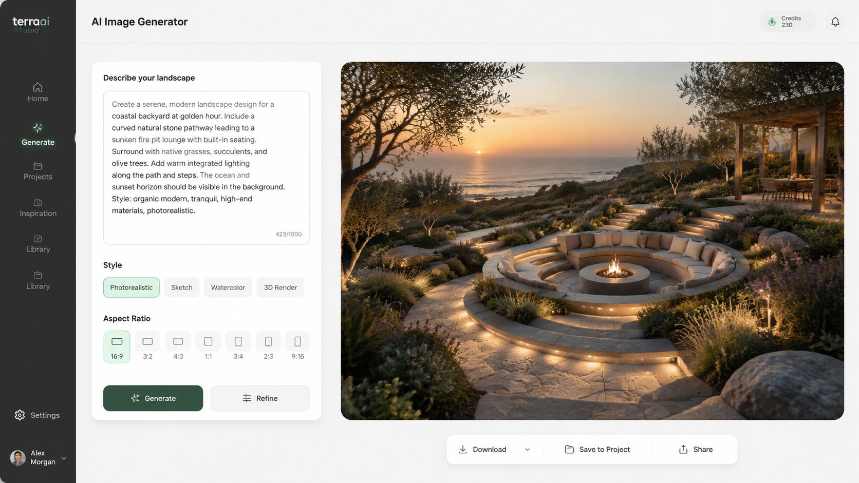
AI can help teams generate scenic imagery fast, but “beautiful scenery” is a weak prompt. It leaves too much to chance, and chance is expensive when the image has to support a brand, not just decorate a page. The better move is to prompt for function first, then style.
A useful prompt structure is simple:
Subject and mood. Start with the scene and the emotional goal, like stable, calm, expansive, or premium.
Composition cues. Add horizon placement, focal point, and whether the foreground or background should dominate.
Brand language. Include adjectives that match the company, such as precise, futuristic, institutional, or warm.
Palette direction. Specify color families that match the brand system.
Detail level. State whether the image should be restrained or highly textured.
That approach keeps the output aligned with the product instead of letting the model invent a random atmosphere. For a fintech brand, a prompt might ask for an expansive, clear vista with a low horizon line and a restrained palette that reads stable and forward-looking. For an AI startup, the same framework might lean more luminous, with stronger contrast and a more experimental skyline.
Adobe's recent move also matters here. It now plans to integrate third-party generative AI models, including Google Imagen 3 and models from OpenAI, directly into Creative Cloud applications like Photoshop, so users can choose from a diverse range of models beyond Adobe's own Firefly (PetaPixel on Adobe's third-party model plan). That gives teams more room to test look and feel without rebuilding the whole workflow.
For teams comparing options, top AI image models is a practical place to see how model choice affects output style and control.
For product teams that need both the interface and the visual asset system to stay aligned, one option is to use a partner like 925 Studios, which covers product design, brand design, and frontend development in one workflow.
The key here is consistency. If the vista image feels like your product, users read the whole experience as intentional. That's worth more than a pretty background.
You can also compare prompt output against your broader design system with 925 Studios' AI tools guide for UI and UX designers, especially when the image needs to sit beside real product screens without clashing.
Building a Brand That Feels Like a Destination
A strong product brand doesn't feel like a logo pasted onto a screen. It feels like an environment with rules, rhythm, and mood. That's why the art of environmental design is so useful for founders. It pushes the team to think about the whole experience, not just isolated assets.
The core business payoff is trust. When a page feels composed, users assume the product is composed too. When the interface has a clear horizon line, a clean foreground, and enough breathing room, people relax into it. That matters in AI SaaS, Web3, and Fintech because the user is already taking a risk by signing up, connecting data, or moving money.
Landscape thinking also keeps brand and product from drifting apart. If the visual system says “premium” but the interface feels crowded, the brand breaks. If the interface is clean but the visual language is generic, the product forgets to stand out. The point is to make both parts feel like they belong to the same place, which is the kind of integrated work outlined in 925 Studios' branding approach.
The best digital products feel less like software and more like destinations people want to return to. That doesn't happen by accident. It happens when composition, light, and depth are treated as business tools, not artistic extras. If your next product release needs to feel clearer, calmer, and more credible, use the same discipline painters of natural scenes learned centuries ago, then apply it ruthlessly to the screen.
A CTA for 925 studios.


Let’s keep in touch.
Discover more about high-performance web design. Follow us on Twitter and Instagram.

