
How to Create Brand Guidelines: AI & Web3 Startups 2026

Yusuf
Founder and lead designer at 925studios

Your team is shipping fast. Product pushes a new onboarding flow, marketing needs a launch page by Friday, and sales asks for a one-pager for investor intros. Then the cracks show. The homepage uses one logo lockup, the pitch deck uses another, the app uses a slightly different blue, and the AI copy in your lifecycle emails sounds like a different company entirely.
That's what brand drift looks like in an AI SaaS, Web3, or fintech startup. It usually doesn't start with a dramatic rebrand gone wrong. It starts with small decisions made in different tools by different people under deadline. A designer grabs an old Figma file. A marketer copies messaging from a stale Notion page. A developer hardcodes a button color from memory. Nobody means to break the brand, but the result still lands in front of customers.
If you're figuring out how to create brand guidelines, the primary objective isn't making a polished PDF. The job is creating a system people can effectively use while the company keeps moving. Good guidelines help teams make decisions without stopping for approval every time. Better ones do that for both humans and the AI tools now writing copy, generating visuals, and filling product surfaces.
Founders usually feel this problem before they name it. The product looks solid, but launches feel uneven. Messaging gets rewritten too often. New pages don't quite match the app. If that sounds familiar, it helps to study how strong companies build consistency across channels, which is why a roundup of branding strategy examples can sharpen your eye before you document your own system.
Table of Contents
Introduction to Creating Brand Guidelines
Most startups create brand guidelines too late. They wait until the company feels messy, then try to fix inconsistency with a deck full of logos and color chips. That helps a little, but it doesn't solve the operating problem underneath.
A useful brand guide starts earlier and goes deeper. It gives product, marketing, sales, and external partners one shared definition of what the company stands for, how it should look, and how it should sound. More importantly, it turns those decisions into assets, templates, and rules that people can apply without guessing.
For fast-moving teams, that matters because brand inconsistency doesn't stay in the design file. It leaks into shipped product. A fintech onboarding screen that uses a colder tone than the marketing site can make trust feel thinner at the exact moment a user is deciding whether to connect an account. A Web3 dashboard with mismatched UI patterns can make the product feel less stable than it is. An AI SaaS launch page with generic copy can flatten a powerful product advantage.
Practical rule: If a founder, marketer, and frontend developer would each describe the brand differently, the guidelines aren't ready.
Strong guidelines do a few things at once. They document the basics, logo use, color values, typography, voice, and examples. They also reduce decision fatigue. A growth marketer shouldn't need to ask a designer which button style belongs in a webinar page. A developer shouldn't have to inspect production to find the correct border radius.
The best teams also stop treating guidelines as a file that sits somewhere "for reference." They treat them like operational infrastructure. That means the guide lives in the same workflow as Figma libraries, code tokens, campaign templates, and AI writing rules.
If you're learning how to create brand guidelines in 2026, that's the standard to aim for. Not a static document. A living, machine-readable resource that keeps your brand intact while the company scales.
Align Brand Strategy and Positioning
Before anyone picks a typeface or debates a gradient, get the core strategy signed off. That's the part many startups skip, and it's why visual work gets redone later. According to Frontify's guide to brand guidelines, creating brand guidelines requires a foundational stakeholder alignment session to secure sign-off on the brand's mission, vision, positioning, and values before any visual design begins, a process that prevents the costly repetition of work caused by inconsistent internal perceptions.
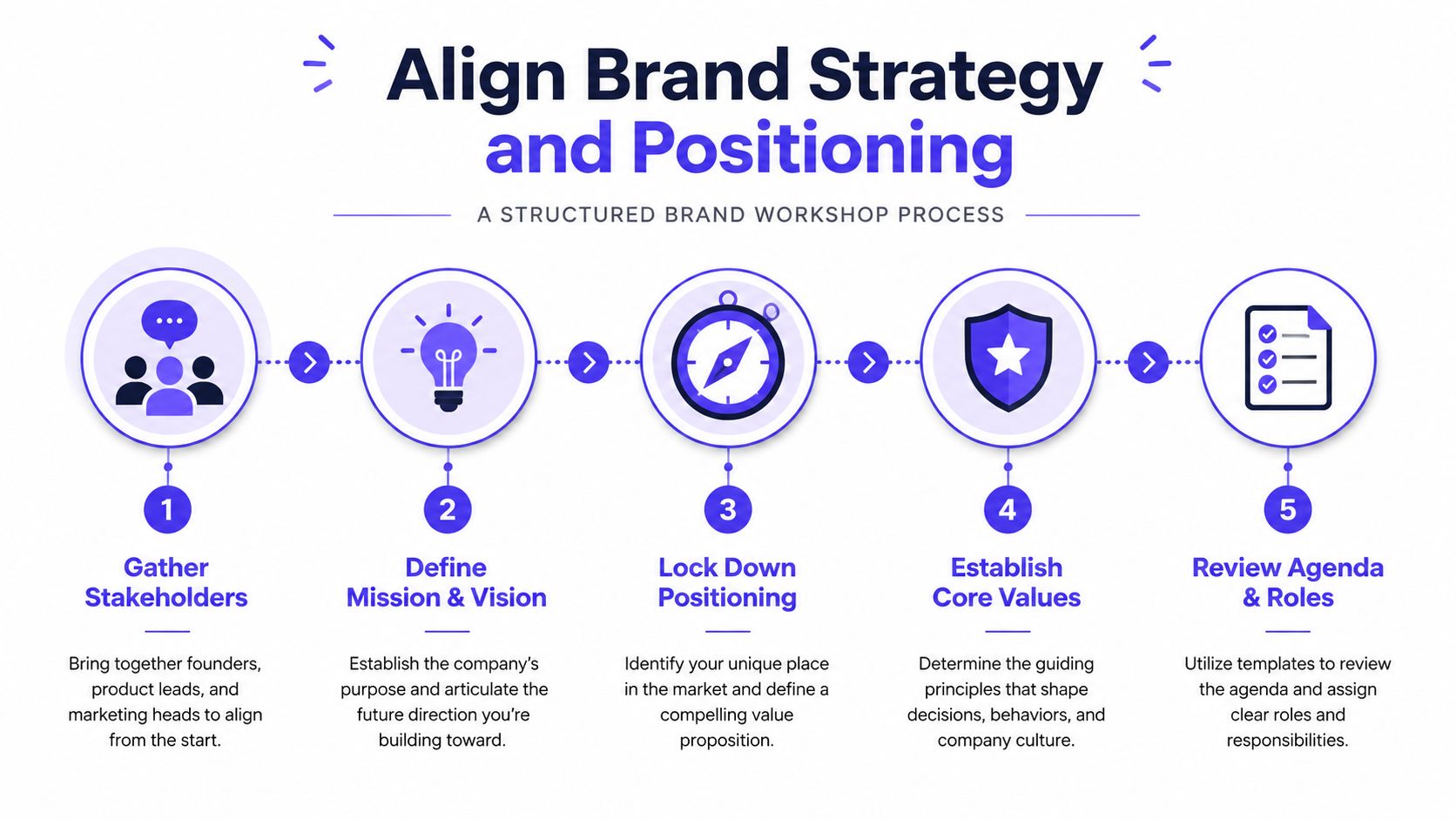
A practical workshop usually needs founders, the product lead, and the person responsible for go-to-market. If those people don't agree on the company's promise, the rest of the team will fill the gap with assumptions. That's how one team starts saying “enterprise-grade,” another says “developer-first,” and the product experience lands somewhere in between.
Run a short workshop with hard outputs
Keep the session tight. Half a day is often enough if the right people show up prepared.
Use an agenda like this:
Mission check. What problem does the company exist to solve?
Vision check. What future is the company trying to create?
Positioning statement. Who is the product for, what category does it play in, and why is it different?
Core values. Which principles should shape the product experience and public voice?
Approval pass. What gets signed off today, and who owns the document after the workshop?
The deliverable should be simple. One page is enough if it's clear. Many teams make the mistake of writing a strategy memo nobody reopens. Instead, create a short strategic brief that later sections of the guide can point back to.
A good positioning brief also gives design a decision filter. If your fintech product is built around clarity and control, dense visuals and hype-heavy copy should fail the test immediately. If your AI product wins on calm expertise, a loud, chaotic visual system fights the promise.
For teams refining this part of the process, design for branding systems is a useful way to think about how strategic decisions turn into repeatable design choices.
Audit what already exists
Most startups already have more brand material than they think. It's just scattered.
Gather:
Logo files across Figma, Google Drive, pitch decks, and website repos
Color uses from product UI, marketing pages, sales collateral, and social templates
Voice samples from homepage copy, lifecycle email, ad copy, and investor materials
Reusable patterns such as presentation decks, one-pagers, and landing page sections
This inventory matters because asset fragmentation usually hides in plain sight. One team may use the square logo mark in app navigation while another crops the full lockup for LinkedIn graphics. A growth lead might pull colors from a Canva file that no longer matches the product.
The audit isn't busywork. It's where you catch the off-brand decisions your team has already normalized.
When the workshop ends, don't move forward on “rough alignment.” Get explicit sign-off. If the founder wants to revisit the positioning next week, pause the visual system until that decision is settled. Brand guidelines work when they anchor execution. They fail when they're built on unresolved strategy.
Document Your Visual Identity
Once strategy is locked, document the parts people misuse first. In most startups, that means logos, color values, and typography. These are the assets that drift fastest because they get touched by marketers, designers, freelancers, and developers in different tools.
A weak visual identity section says, “Use these colors and this logo.” A strong one removes ambiguity. It tells people which files are approved, where each variation belongs, what not to do, and how those choices translate across web, product UI, and print.
Start with an asset audit
Don't assume the latest logo file is obvious. Create a master asset library and name files in a way non-designers can understand. “Primary logo horizontal dark,” “icon mark light background,” and “favicon” beat mysterious export names every time.
Include at minimum:
Approved logo variations for horizontal, stacked, icon-only, and monochrome use
Context rules for dark backgrounds, light backgrounds, and small surfaces
Minimum size guidance so a logo doesn't collapse in a mobile header or slide footer
Incorrect use examples such as stretched marks, changed colors, shadows, or crowded placement
This is also where startups should clean up old files. If sales still has access to last year's deck with an outdated wordmark, that deck will keep resurfacing.
Write specs developers can use
This is the point where visual identity becomes operational. According to VistaPrint's brand style guide article, technical specifications for color documentation must include HEX for web, RGB for digital screens, and CMYK/Pantone for print production to ensure cross-medium fidelity, while typography rules require precise line-height calculations, typically dividing font size by 1.15 for headers, 1.25 for sub-headers, and 1.1 for body copy to maintain readability hierarchy.
That means your color section shouldn't just show swatches. It should function like a spec sheet.
Element | Web (HEX) | Digital (RGB) | Print (CMYK/Pantone) |
|---|---|---|---|
Primary brand color | Document exact value | Document exact value | Document exact value |
Secondary brand color | Document exact value | Document exact value | Document exact value |
Neutral dark | Document exact value | Document exact value | Document exact value |
Neutral light | Document exact value | Document exact value | Document exact value |
Accent color | Document exact value | Document exact value | Document exact value |
For typography, document more than font names. Specify usage by role. For example, define which typeface appears in product UI versus marketing headlines, when sentence case is preferred over all caps, and what fallback font the frontend team should use if the licensed font doesn't load.
A simple typography block might include:
Header scale tied to your actual landing page and app patterns
Sub-header rules for feature sections, cards, and modals
Body text guidance for dashboard tables, help text, and long-form marketing copy
Line-height formulas based on the ratios above, so implementation stays consistent
If you're managing assets across teams and vendors, implementing brand asset platforms can help you think through storage, access, and approval structure before your library turns into another pile of folders.
A founder shouldn't need to translate the brand guide for a developer. If the specs are clear, the handoff is already half done.
One more trade-off matters here. Some teams want a broad visual system with many accents and exceptions because it feels more expressive. Early-stage startups usually benefit from fewer choices. A tighter palette and a smaller type system are easier to apply across a product, a launch page, and a sales deck without drift. Restraint is often what makes the brand feel sharper.
Craft Your Brand Voice and Messaging
Most brand voice documents fail because they describe personality in abstract words nobody can apply. “Bold.” “Human.” “Creative.” Those labels sound fine in a workshop, but they don't help a product marketer write a launch email or an AI tool generate in-app empty states.
Your voice section needs plain language and examples. According to Petapixel's referenced article, brand voice guidelines that prioritize plain language over jargon increase comprehension by 40% among non-specialist audiences, and removing design-insider terms like “kerning” or “leading” from client documents reduces revision cycles by an average of 2.3 rounds per project.
Replace vague tone words with usable rules
Start by banning language that only insiders understand. Founders don't need writing guidance filled with creative jargon. They need rules a marketer, support lead, or AI prompt can follow without interpretation.
Instead of this:
visionary
disruptive
premium but playful
design-forward
Write this:
Use short sentences when explaining product value
Lead with the customer problem before the feature
Sound confident, not inflated
Avoid filler words like “best-in-class” and “cutting-edge” unless you can prove them
Then add before-and-after examples.
Before: “Our intelligent orchestration layer employs advanced automation to streamline complex financial workflows.”
After:
“Automate manual finance workflows without adding more ops overhead.”
The second version is easier to use across a homepage, ad, sales deck, or onboarding tooltip. It also gives AI tools less room to drift into generic SaaS language.
For teams publishing frequently, a practical reference like the Image Studio social content guide can help translate voice rules into repeatable content formats.
Build a messaging matrix your team will actually use
A messaging matrix turns voice into decisions. It doesn't need to be large. It needs to be specific.
Include rows like these:
Audience. Founders, product teams, compliance stakeholders, developers
Primary pain point. What each group is trying to fix
Brand promise. The clearest value statement for that group
Tone adjustment. More direct, more reassuring, more technical, less promotional
Words to avoid. Overclaiming, slang, empty superlatives
Sample headline. One line that shows the voice in action
Write for the least experienced person who will use the guide. If they can stay on-brand, the rest of the team will too.
For AI-native companies, this section should also include structured tone definitions. If your team uses AI for drafts, define voice in a way a system can parse. “Confident but calm” is a decent starting point for humans. For machines, pair it with explicit writing constraints, approved vocabulary, banned phrases, sentence-length preferences, and sample outputs. That's where voice stops being a mood board and starts becoming a repeatable input.
Build UI Component Rules and Design Tokens
A brand guide becomes durable when it reaches the product layer. If the website looks polished but the app UI keeps drifting, you don't have a brand system yet. You have marketing documentation.
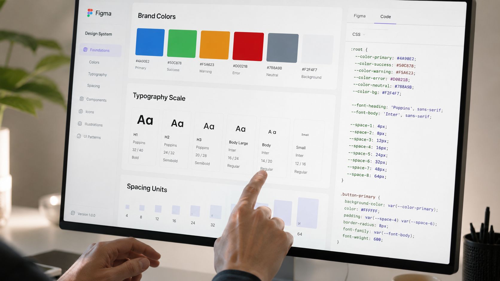
This is where design tokens and component rules matter. They turn brand choices into reusable variables and patterns that Figma, code, and AI-supported workflows can all reference. That's especially important for AI SaaS founders shipping new surfaces constantly, from onboarding flows to settings panels to generated reports.
According to Geneo's brand guidelines guide, existing content overwhelmingly assumes brand guidelines are written for human readers, neglecting the emerging 2026 requirement to structure them for machine consumption by AI agents and auto-generative tools. The same source says a 2025 industry survey found only 9% of published brand guidelines include structured, machine-readable data, yet this is critical for AI SaaS founders relying on generative tools.
Turn visual choices into tokens
Start by extracting the decisions you already made in the visual identity section and naming them as tokens. Don't call a token “blue-500” unless your system requires a scale-based structure. In many startup teams, semantic naming is more useful.
Examples:
color-brand-primary
color-surface-default
color-text-muted
space-card-padding
radius-button
font-heading
font-body
shadow-modal
The point is consistency across tools. When a designer updates a token in Figma and a developer sees the same token name in code, handoff gets cleaner. When product marketing builds a microsite in the same system, they aren't picking values from memory.
A simple token object might look like this:
Machine-readable structure doesn't need to be fancy to be useful. It needs to be consistent and accessible.
Make the system machine-readable
This is the shift many teams still miss when they think about how to create brand guidelines. Human-readable guidance explains intent. Machine-readable guidance enforces it across tools.
That means pairing narrative rules with structured data such as:
JSON token files for color, typography, spacing, and radius
Prompt-ready tone definitions for approved voice behavior
Component property rules that define allowed states and variants
API-accessible references if your team is syncing brand logic into internal tools
For example, “our tone is clear and expert” helps a writer. A machine needs stronger boundaries, such as approved phrases, banned words, preferred reading level, and examples of compliant outputs for onboarding copy, release notes, or support macros.
Here's a useful walkthrough before you formalize your own system:
Add component rules, not just color swatches
A startup with a landing page and one dashboard can still benefit from a small design system. You don't need a huge enterprise library. You do need component rules for the UI patterns users see repeatedly.
Document things like:
Component | What to define | Why it matters |
|---|---|---|
Buttons | variants, states, size rules, icon placement | Prevents one-off CTA styles across marketing and product |
Form fields | label style, help text, error state, spacing | Keeps onboarding and settings screens consistent |
Cards | padding, border, shadow, hover behavior | Makes dashboards feel coherent |
Navigation | active state, icon usage, hierarchy | Reduces confusion in dense products |
Empty states | tone, illustration use, CTA style | Keeps product voice aligned with brand voice |
Accessibility belongs here too. If your guide doesn't say how color, typography, and interaction states should behave in real interfaces, teams will make local decisions under pressure. Those local decisions compound. A button style changed for one release often becomes three variants six sprints later.
Good component rules don't slow product teams down. They remove the small choices that eat time in every sprint.
A practical trade-off comes up often. Founders want room for special launches and experiments. That's fair. Build for controlled flexibility. Keep a stable core system for common components, then create a documented “campaign layer” for exceptions such as event pages, partnerships, or product announcements. That gives marketing space without forcing the core UI to absorb every temporary style.
Implement Governance Versioning and Developer Handoff
A guideline that never changes becomes wrong. Startups change their product, pricing, audience, and messaging too often for a locked brand document to stay useful. The operating model has to assume updates.
Most guides break at this stage. The rules exist, but nobody owns them. New pages get shipped outside the system. Product updates don't flow back into the design library. Templates sit in a folder nobody can find. According to Fabrik Brands' article on creating brand guidelines, most content on this topic ignores the gap between documenting rules and engineering compliance, and guidelines with embedded, accessible templates achieve 3.2x higher adoption rates than those requiring manual lookup.
Assign ownership before the guide spreads
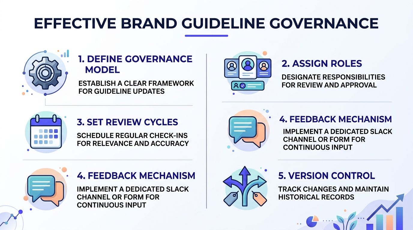
Set governance early. It doesn't need to be bureaucratic, but it does need named owners.
A simple model works well:
Brand owner handles visual and verbal updates
Product design owner maintains UI patterns and Figma libraries
Engineering owner syncs design tokens and component implementation
Marketing owner manages campaign templates and content usage
Approver group reviews significant changes on a regular cycle
Use a dedicated feedback channel in Slack or a simple intake form. That keeps requests visible. “Can we create a social card variant for partner announcements?” is better handled in one shared place than in scattered DMs.
Versioning matters too. If your tokens live in code, use version control. If your brand guide lives in Notion, Zeroheight, or a shared documentation tool, add a visible version history and update log. Teams should know what changed, when, and why.
For a closer look at structuring documentation so designers and developers stay aligned, design system documentation practices are directly relevant.
Package templates where people already work
Don't make people open a PDF to follow the brand. Put the brand inside the workflow.
That means shipping templates such as:
Figma files for landing pages, blog headers, social cards, and pitch slides
Canva templates for non-design marketing tasks
Reusable code snippets for UI sections and common layouts
Prompt templates for AI-assisted copy, with voice constraints built in
Here, self-service becomes operational. If a growth marketer can open a pre-approved webinar graphic template in Canva and swap content without touching the layout rules, compliance goes up. If a developer can pull the latest token package instead of copying values from screenshots, consistency goes up too.
There's another overlooked part of governance. Audit the legal status of your assets, especially fonts. As your system expands, Font Checker Pro's guide to copyright audits is a practical reference for checking whether your font usage matches the licenses tied to product, web, and marketing use.
The easier it is to do the right thing, the more often your team will do it.
One more operational note. Review cycles should be scheduled, not assumed. A quarterly review works well for many startups because it lines up with product planning and campaign resets. Use those reviews to retire stale assets, approve new templates, and check whether the product UI still matches the written guide. A living system stays trusted because people see it evolve with the company.
Conclusion and Next Steps
Good brand guidelines don't exist to impress investors or decorate a Notion workspace. They exist to help teams ship work that feels like one company. That takes more than a logo page and a color palette.
The durable version starts with strategic alignment, then moves into concrete visual specs, clear voice rules, reusable UI patterns, machine-readable tokens, and governance that keeps everything current. When those pieces connect, product, marketing, and engineering stop reinterpreting the brand from scratch. They build from the same source.
That matters even more for AI SaaS, Web3, and fintech teams because the brand now shows up in more surfaces than a homepage and a deck. It lives in dashboards, onboarding flows, AI-generated copy, support content, launch campaigns, and partner materials. If your guide can't support all of that, it isn't finished.
There's also a staffing reality behind this. According to DPReview's referenced article, startups that consolidate product design, brand design, and frontend development into a single creative partner reduce hiring overhead by 35% compared to teams with three separate hires, while maintaining faster time-to-market for polished interfaces and brand systems. For many funded startups, that trade-off is more practical than building three separate functions too early.
If you're starting from scratch, begin with one alignment workshop this week. Audit the current assets. Define the first token set. Package two or three templates your team needs right now. Then schedule the review cycle before the guide goes stale.
If you need one creative partner across product design, brand design, and frontend development, 925 studios works with AI SaaS, Web3, and fintech teams to turn early brand decisions into shipped interfaces, design systems, and polished launch assets without building an in-house team first.


Let’s keep in touch.
Discover more about high-performance web design. Follow us on Twitter and Instagram.

