
What Is Conversion Optimization: A 2026 Guide

Yusuf
Founder and lead designer at 925studios

Conversion optimization is the systematic process of increasing the percentage of website visitors who take a desired action, and the baseline starts with a simple formula: (Conversions / Total Visitors) × 100. For startups, it's one of the most efficient growth levers available because conversion optimization programs deliver an average of $223 for every $1 invested, while many teams still overspend on acquisition instead of improving the traffic they already have.
A lot of advice about what is conversion optimization gets stuck on shallow tactics. Change the button color. Move the CTA up the page. Run a headline test. That thinking comes from e-commerce playbooks where the conversion is often a direct purchase on a short path.
That's not how most AI SaaS, Web3, and Fintech products work.
In these companies, complete conversion usually happens across a chain of decisions. Someone lands on the homepage, checks the product page, scans security or compliance details, opens pricing, books a demo, invites teammates, then completes onboarding. If you treat that as a single-page problem, you miss the actual friction that blocks growth.
For a founder, conversion optimization is not a design exercise. It's a business discipline. It helps you turn more visits into qualified demos, more signups into activated users, and more onboarding starts into retained customers.
Table of Contents
What Conversion Optimization Really Means
Conversion optimization is the work of increasing the share of users who take a meaningful business action.
For a startup, that action is rarely a purchase on the first visit. It is more often a demo request, a qualified signup, a wallet connection, a KYC completion, or an onboarding milestone that signals the user is likely to activate and stay. The math behind conversion rate is simple. The strategic question is harder. Which user action predicts revenue, retention, or pipeline quality?
That distinction matters more in SaaS, Web3, and Fintech than it does in a typical e-commerce funnel. A click on a CTA has limited value if the user never books the meeting, never funds the account, or never reaches first value inside the product.
Complex products convert across journeys, not pages
A lot of CRO advice is built around short checkout flows. That model misses how technical products sell and onboard. In B2B software and regulated categories, users often move through multiple steps before they become valuable accounts.
Lucky Orange explains this clearly in its guide to conversion rate optimization for complex funnels. The practical implication is straightforward. Founders should stop treating CRO as a landing page project and start treating it as journey design. Ultimately, the question is where qualified users lose confidence, context, or momentum between first visit and activation.
I usually frame it this way for founders. Acquisition gets attention. Conversion optimization reduces the friction between attention and value.
Many startups do not have a traffic problem first. They have a clarity problem, a trust problem, or a process problem.
That is why strong CRO work sits across messaging, UX, product flow, and sales operations. A homepage has to explain the product fast. A signup flow has to ask for the right information at the right time. An onboarding sequence has to get users to the first useful outcome before interest drops. Response speed matters too, especially in lead-driven funnels, which is why these industry benchmarks for response time are useful context.
What founders should actually optimize
For complex tech products, conversion optimization usually spans three layers:
Macro conversions: Demo requests, qualified signups, completed onboarding, funded accounts
Micro conversions: Pricing page visits, onboarding starts, wallet connection starts, first dashboard interaction
Retention-linked actions: Inviting teammates, connecting data, completing the first workflow, reaching the first successful transaction
This is the part many teams miss. If revenue happens weeks after acquisition, the most impactful CRO work often happens before the final form submit and after it. Improving the steps that predict activation usually produces better business outcomes than chasing small lifts on a button click alone.
Why CRO Is Your Startup's Hidden Growth Engine
Founders often try to grow by adding channels before fixing the path those channels feed. That is usually backwards.
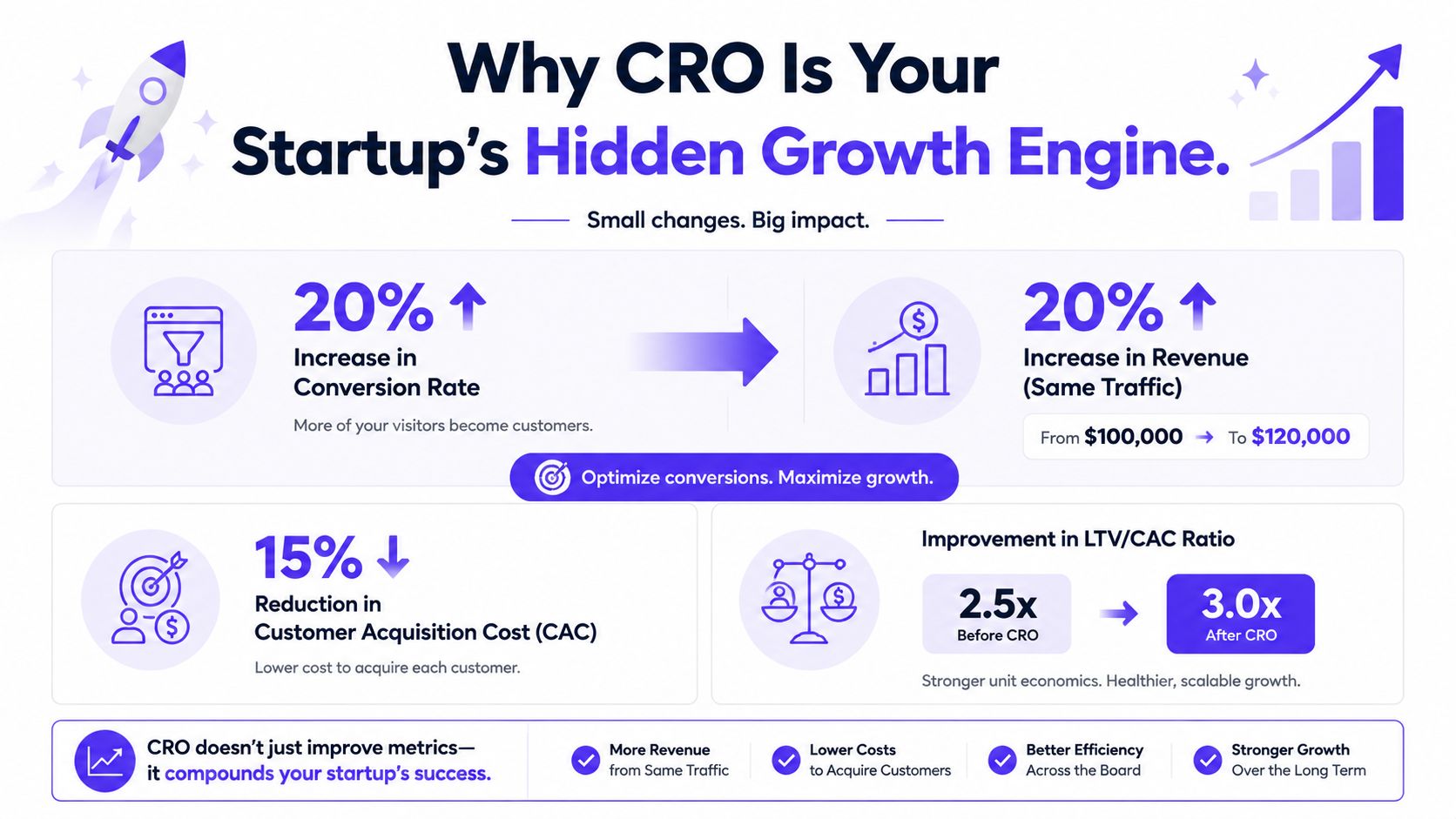
CRO improves the unit economics of demand you already created. For SaaS, Web3, and Fintech teams, that usually means improving a chain of decisions across the site, signup flow, onboarding, and sales handoff. More traffic does not help if prospects stall at pricing, abandon a wallet connection, or request a demo and never hear back.
The financial case is straightforward
Analysts cited in AMW Group's CRO statistics roundup report three points worth paying attention to together: conversion programs can produce strong returns relative to spend, companies often put far more budget into acquisition than optimization, and top-performing sites convert at meaningfully higher rates than average ones. For a founder, the takeaway is simple. There is usually more room in the funnel than the budget model assumes.
That creates a real operating choice:
Approach | What happens |
|---|---|
Buy more traffic | CAC rises before you know whether visitors understand the product, trust the offer, or complete the flow. |
Improve conversion first | More of your existing traffic turns into demos, qualified signups, and activated users before you increase spend. |
I see this mistake a lot in complex products. Teams spend months testing paid acquisition while the primary blocker sits inside the journey. The pricing page does not answer procurement questions. The demo form asks for too much too early. The onboarding flow delays the first useful outcome. Each issue looks small in isolation. Together, they cap growth.
CRO improves growth quality, not just volume
Founders should care about more than headline conversion rate. The better question is whether the funnel produces users who reach value and stay.
For a B2B SaaS product, a signup only matters if the account reaches activation. For a Fintech product, funded accounts and first transactions matter more than raw registrations. For a Web3 product, wallet connection is only one step. If users never complete the next action, the funnel still underperforms.
That is why user research belongs inside CRO work, not beside it. Reviewing user testing methods for product and website flows often reveals where intent collapses in multi-step journeys. Analytics might show a drop at step three. User testing shows why it happens.
A healthy funnel gives every team better inputs. Marketing sends better-fit traffic into a clearer journey. Sales speaks with prospects who understand the product and arrive with stronger intent. Product teams see more users reach activation, which improves the odds of retention and expansion later.
Startups feel the gains faster
Early-stage companies do not get many wasted cycles. One weak handoff between ad, landing page, form, and onboarding can erase the value of a campaign.
CRO helps across four areas at once:
Marketing efficiency: More demos, trials, or account creations from the same traffic
Product efficiency: More users completing setup and reaching first value
Sales efficiency: Better qualification before an AE spends time on a call
Retention efficiency: Fewer early drop-offs caused by confusing onboarding or delayed activation
The practical upside is capital efficiency. A founder who improves conversion before scaling spend gets cleaner signals about channel quality, payback period, and onboarding health. That matters more than cosmetic wins on button color tests.
For startups selling complex products, CRO works best as a growth system. It reduces friction across the full journey from first visit to activated account. That is why it often becomes the fastest way to grow signups, demo requests, and retention without adding the same amount of acquisition cost.
The Three Principles of Smart Conversion Optimization
The teams that get CRO right don't start with tactics. They start with a way of thinking about the funnel.
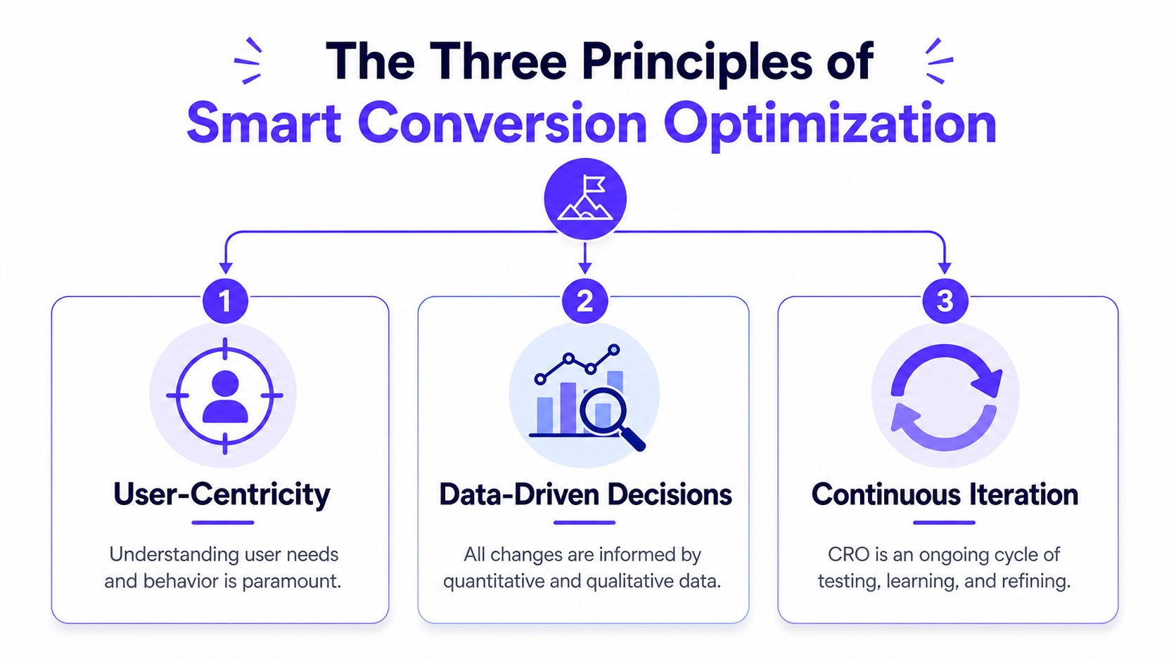
Clarity beats persuasion
Most low-performing pages don't fail because they aren't persuasive enough. They fail because users don't understand the offer, the product category, or what happens next.
For an AI product, “Autonomous intelligence for operational transformation” sounds expensive and vague. “Automate finance QA without changing your current workflow” gives a buyer something concrete to evaluate.
This applies to navigation too. If users can't tell where to go next, they hesitate. A good rule from Conversion Design's CRO basics is to keep the main menu to seven or fewer items to reduce cognitive load.
A homepage should answer three questions fast:
What is this
Who is it for
What should I do next
If one of those answers is missing, conversion drops because uncertainty rises.
Behavior matters more than opinions
Founders, marketers, and designers all have instincts. Useful instincts still need evidence.
A strong CRO process uses analytics, session recordings, user interviews, form analytics, and usability testing to understand where people get stuck. If you need a grounded starting point, this guide to what user testing is is a practical reminder that direct observation often reveals friction that dashboards can't explain on their own.
What works in practice is simple: watch users try to complete a real task, then compare that behavior with your funnel data. What doesn't work is debating headline preferences in Slack.
If users keep missing the next step, the interface is speaking clearly to the team that built it, not to the customer using it.
Iteration wins where redesigns fail
A lot of startups swing between two extremes. They either make random small edits with no measurement, or they announce a full redesign and hope conversion improves afterward.
The better path is steady iteration. Keep the baseline. Identify a point of friction. Change one meaningful thing. Measure the result. Repeat.
Here's the mindset difference:
Weak CRO habit | Strong CRO habit |
|---|---|
Redesign because the site feels stale | Change specific parts of the journey tied to user drop-off |
Debate subjective preferences | Use behavior and test results to decide |
Treat launch as the finish line | Treat launch as the start of learning |
That's especially important for technical startups. Product messaging changes, features expand, compliance pages grow, and onboarding gets more complex over time. The conversion path needs regular adjustment or it slowly becomes harder to use.
A Practical Five-Step CRO Process for Founders
Founders usually do not have a CRO problem. They have a prioritization problem.
The leak is rarely a button color. For SaaS, Web3, and Fintech products, conversion usually breaks across a longer path: first visit to pricing, pricing to demo request, signup to activation, activation to retained use. A practical CRO process helps teams improve those moments without turning every growth discussion into a redesign debate.
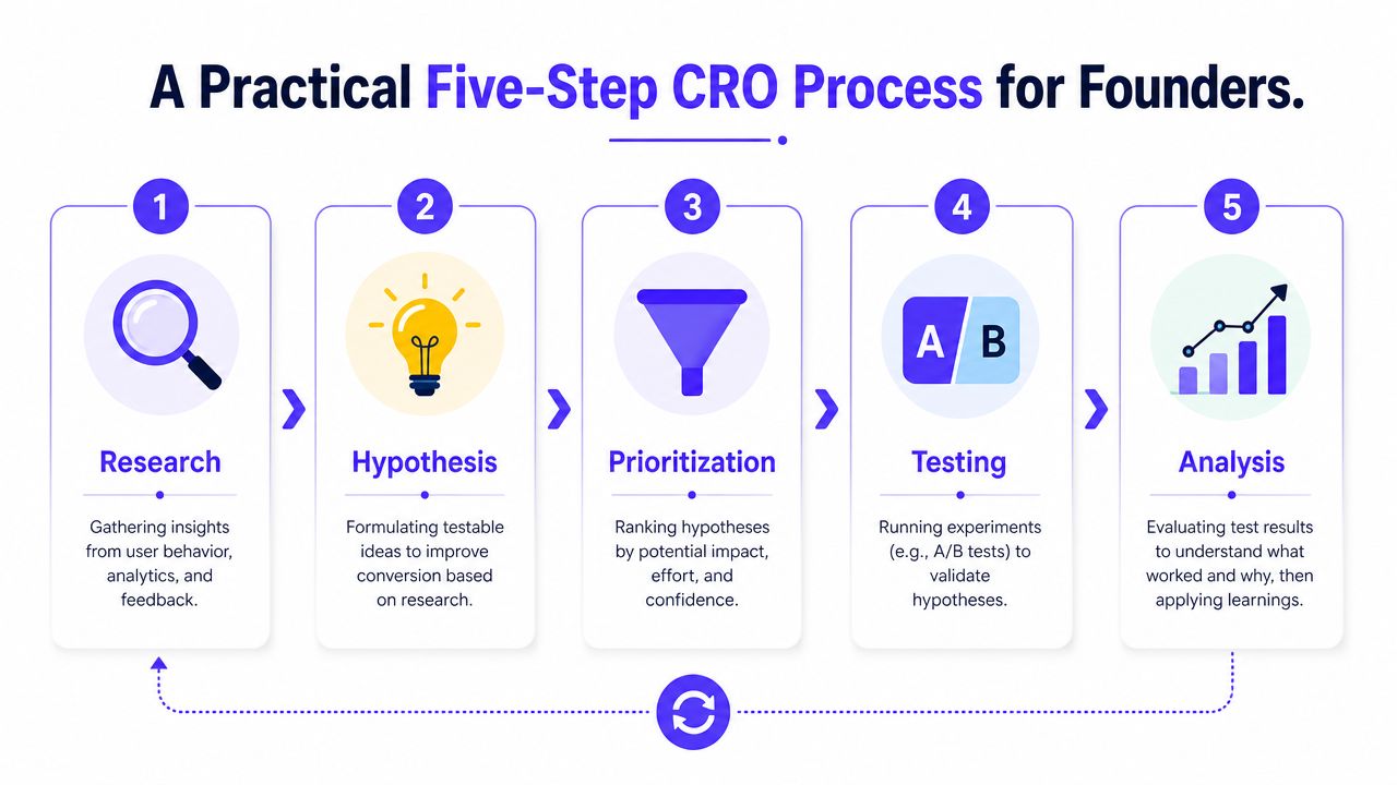
Step 1, map the revenue path before you change anything
Start with the conversion path that matters to the business. For an early-stage B2B SaaS company, that may be homepage to pricing to demo request. For a fintech app, it may be landing page to signup to identity verification to first deposit. For a web3 product, it may be wallet connect to onboarding completion to first transaction.
Then inspect each step with evidence. Review funnel drop-off, session recordings, form analytics, support tickets, sales call notes, and onboarding complaints. The goal is to find the exact point where intent is high but momentum breaks.
That keeps the team focused on business outcomes, not surface-level edits.
Step 2, turn friction into a testable hypothesis
A usable hypothesis connects one observed problem to one change and one expected outcome.
For example: visitors reach the pricing page but do not book a demo because the plan differences are vague and procurement questions are unanswered. If the page clarifies who each plan is for, adds implementation detail, and makes the demo CTA more specific, more qualified buyers should request a call.
That standard matters because vague ideas waste product and design time. This guide on how to improve conversion rates lays out a stronger way to score and refine ideas before they become work for engineering.
Step 3, prioritize by impact on the funnel, not ease of opinion
Founders often approve the changes that are easiest to ship, not the changes most likely to improve signups or activation.
A better filter is simple:
Revenue proximity: Will this affect demo requests, qualified signups, onboarding completion, or activation?
Evidence strength: Do recordings, funnel data, or user feedback point to the same issue?
Implementation cost: Can the team ship the change without delaying product work for weeks?
Learning value: Will the result help you make a better decision even if conversion does not improve?
Trade-offs become tangible. Rewriting a homepage headline is cheaper than restructuring a six-step onboarding flow. But if onboarding is where qualified users abandon, the headline is not the priority.
Step 4, choose the right validation method for your traffic level
A/B testing is useful, but many startups do not have enough traffic to run clean experiments quickly. Convertibles' guidance on statistically significant A/B testing notes that a site converting at 2% may need around 50,000 visitors per variant to reach statistical significance.
For many founders, that means classic A/B testing is the wrong first tool for pages with limited volume. Use the method that fits the stage of the company:
A/B tests for high-traffic landing pages or signup steps
Usability tests for onboarding, KYC, wallet connection, and complex forms
Pre and post analysis for meaningful page changes when traffic is limited
Cohort analysis for activation and retention changes inside the product
Segment reviews to spot differences by traffic source, device, or user type
It also helps to hear the process explained visually and verbally before you start testing:
The mistake is not running fewer A/B tests. The mistake is claiming certainty from weak samples and then building product strategy on top of it.
Prematurely stopping a test creates confidence faster than it creates truth.
Step 5, document the result and ship the next decision
Every experiment should end with a short decision log. Record what changed, which segment it affected, what happened to the target metric, and what the team believes now.
Some tests raise conversion. Some expose the main blocker. A pricing page experiment may show that messaging was not the issue at all, while sales objections and drop-off patterns point to missing trust signals, a long form, or delayed time-to-value after signup. That is still a useful outcome because it sharpens the next move.
Over time, this process builds an operating system for growth. The team stops guessing. It gets better at improving the points in the journey that affect demos, activation, and retention.
For teams that need outside execution across strategy, interface, and frontend delivery, options range from freelancers to in-house designers to partners like 925 Studios, which works as one creative partner covering product design, brand design, and frontend development for startups shipping conversion-focused experiences.
CRO Tactics and Pitfalls for Complex Tech Products
CRO for complex products is rarely won by changing a button color. It is won by reducing uncertainty at the exact moments where a prospect has to commit. For SaaS, Web3, and Fintech teams, that usually means the path to a demo request, account setup, wallet connection, identity check, or first successful action inside the product.
A polished interface can still underperform if the user cannot answer three basic questions fast: What does this product do for me, why should I trust it, and what happens after I click?
Homepage and landing page decisions
Founders often treat the homepage like a company summary. That hurts conversion. A homepage that tries to explain every feature, every audience, and every offer usually weakens the primary action.
The better approach is narrower. Give the page one main job and one main next step.
Here's what that looks like in practice:
Pitfall | Better tactic |
|---|---|
“Learn More” as the main CTA | A specific CTA like “Book a Demo” or “Start Free Trial” |
Three different offers on one page | One primary action, one secondary path |
Headline full of category jargon | Headline tied to a concrete outcome |
This matters more in technical categories than in straightforward e-commerce. A visitor evaluating payments infrastructure, crypto compliance tooling, or B2B SaaS automation is not asking, “Is this page attractive?” They are asking, “Does this solve my problem, and is it safe to engage?”
That changes how teams should design landing pages. Product screenshots usually outperform abstract brand visuals. Proof tied to a use case usually beats generic positioning copy. A CTA like “See how teams cut manual reconciliation” gives a higher-intent prospect more to work with than “Get Started.”
Onboarding and product flow decisions
A lot of conversion loss happens after signup, not before it.
Teams spend weeks improving acquisition pages, then send new users into an onboarding flow with too many fields, unclear setup steps, and no visible payoff in the first few minutes. That is where demo requests fail to turn into qualified pipeline, and where free trials fail to turn into activated accounts.
The core question is simple. How fast can a new user reach first value?
Good onboarding for complex products does not mean removing every step. Fintech and Web3 products often need KYC, permissions, security checks, or wallet actions that cannot be skipped. The job is to make each step feel justified, ordered, and worth completing.
Practical fixes that consistently help:
Ask for less up front: Collect only the information required to begin the next action.
Sequence setup by user intent: Show the shortest path for the use case that brought the user in.
Explain why a step exists: If you need compliance details or wallet permissions, say what the user gets in return.
Create an obvious first win: Guide users to the first report, transaction, integration, or team invite that proves value.
Carry acquisition context into product: If someone converted on a page about a specific workflow, reflect that workflow in onboarding.
If you are tightening an activation flow, these SaaS onboarding best practices for reducing early churn are a useful reference.
Users will tolerate complexity. They will not tolerate unnecessary complexity.
Trust and proof in high-consideration products
For high-consideration products, trust is part of the funnel. It is not decoration.
A startup can have strong demand and still lose conversions if the page leaves obvious risk questions unanswered. Fintech buyers want to know how funds move, how data is handled, and what safeguards exist. Web3 users want clarity on custody, permissions, and transaction risk. SaaS buyers want proof that the product works for teams like theirs and will not create operational headaches after purchase.
Weak proof shows up in familiar ways:
Generic testimonials: Praise with no role, company context, or result
Hidden trust signals: Security, compliance, or implementation details buried deep in the site
Mismatched proof: Enterprise case studies on a self-serve trial page, or startup-friendly messaging on an enterprise demo page
Claims without evidence: “Trusted by leaders” with no customer names, no product screens, and no specifics
The stronger pattern is specific proof near the point of action. Put customer outcomes near the demo form. Put implementation expectations near the signup CTA. Put security and compliance explanations where a risk-aware buyer is deciding whether to proceed.
This is one of the biggest differences between CRO for complex products and CRO for a simple checkout flow. The obstacle is often not attention. It is justified hesitation.
Teams that ignore that hesitation usually see the same pattern. Traffic looks fine. Form completion stays weak. Trial starts happen, but activation lags. Sales blames lead quality. Product blames marketing. Ultimately, the issue is that the journey did not do enough to earn the next commitment.
Your Checklist for Starting CRO with a Creative Partner
Founders slow CRO projects in a predictable way. They hire a strong partner, then spend the first weeks answering basic questions about goals, funnel steps, user objections, and who can approve changes. That delay is expensive because early momentum usually determines how quickly the team gets to the first meaningful test.
Start with a baseline. Use a simple formula. Conversion rate = (Conversions / Total Visitors) × 100. Measure it for the steps that matter in your actual growth model, not just the homepage. For SaaS, that might be demo requests, qualified trial starts, and onboarding completion. For Fintech or Web3, it could be account creation, identity verification, wallet connection, or first successful transaction.
A creative partner does better work when the company arrives with a clear operating brief instead of a vague goal like “improve the funnel.”
What to prepare before the work starts
Define the primary conversion goal: Choose one priority tied to revenue or activation, such as demo requests, qualified signups, completed applications, or onboarding completion.
Map the supporting micro-conversions: Include steps like pricing page visits, form starts, email verification, wallet connection, or first key product action.
Collect user evidence in one place: Pull sales call notes, support tickets, onboarding drop-off feedback, and session recordings together so the team can spot patterns fast.
Grant access to the full tool stack: Analytics, CRM, product analytics, heatmaps, experiment tools, and feature flagging access should be ready on day one.
Set decision ownership early: Name the person who approves messaging, the person who can ship frontend changes, and the person who signs off on experiment results.
The trade-off is simple. Teams can either spend time diagnosing real conversion friction, or spend it chasing missing context. In complex products, that missing context usually sits in three places: buyer intent, compliance or trust concerns, and internal approval bottlenecks.
What a strong partner setup looks like
Creative partners add the most value when they can work across message, interface, and implementation in the same engagement. That matters more in SaaS, Web3, and Fintech than it does in a basic e-commerce flow. A weak demo page is rarely just a copy problem. It often includes unclear positioning, the wrong proof for the buyer stage, and frontend friction inside the form or onboarding flow.
Founders usually get better output when they also provide:
Needed input | Why it matters |
|---|---|
Brand guidelines and product story | Keeps new pages, forms, and experiments aligned with the company's positioning |
Audience definition | Helps tailor the journey to the actual buyer or user segment, not a generic visitor |
Decision cadence | Keeps approvals from delaying launches, especially when tests require product, legal, or compliance review |
When one team can handle product design, brand design, and frontend execution together, fewer ideas die between strategy and launch.
If your startup needs help turning a complex product journey into a clearer path to demos, signups, and activation, 925 Studios works with AI SaaS, Web3, and Fintech teams as one creative partner across product design, brand, and frontend development.


Let’s keep in touch.
Discover more about high-performance web design. Follow us on Twitter and Instagram.

