
Web Design for Startups That Converts

Outrank AI

Your homepage is live. The logo is polished, the animations are smooth, and the team likes the new color palette. A few weeks later, signups remain flat, demo requests are inconsistent, and visitors still ask what the product does.
That pattern is common in web design for startups. The problem usually isn't that the page looks bad. It's that the website hasn't been designed as a product with a clear audience, a defined conversion path, reliable performance, and a message that both buyers and AI systems can understand.
For AI SaaS, Web3, and fintech companies, the website often carries several jobs at once. It has to explain a complex product, build trust, route different buyers to relevant proof, support search discovery, and create a measurable next step. Visual polish matters, but it only works when the strategy underneath is sound.
Table of Contents
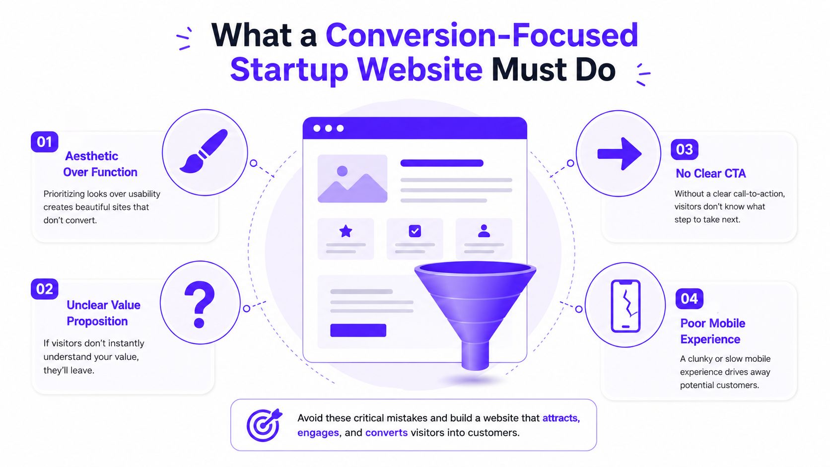
What a Conversion-Focused Startup Website Must Do
A clean homepage won't compensate for an unclear offer. If a visitor can't tell who the product serves, what problem it solves, or what to do next, a better layout makes confusion more attractive.
A conversion-focused website has three practical responsibilities:
Qualify the visitor. Show an AI engineering lead, fintech compliance buyer, and Web3 community manager the information that matches their concerns.
Route the visitor. Give every page one primary action, such as starting a trial, booking a demo, joining a waitlist, or connecting a wallet.
Remove friction. Make the site readable, responsive, accessible, and fast enough that visitors don't abandon it before the value appears.
The performance gap between an average and exceptional site can be substantial. A 2026 benchmark analysis covering more than 46 billion sessions reports a 2.35% median conversion rate, 5.31% for top-quartile sites, and 11.45% or higher for the top 10%. For B2B SaaS landing pages, the same source reports a 3.8% median and 11.6% rate for the top 25%.
Those figures aren't a promise that every startup can reach the same result. They are a warning against treating the site as a decorative brochure. Clarity, hierarchy, relevant proof, and a low-friction CTA can move a page from average performance toward a stronger position.
Design for the first decision
Visitors judge a website quickly. One widely cited usability study reports that users can form a first impression in about 50 milliseconds, or 0.05 seconds, and another source reports that 94% of first impressions are design-related. The same conversion benchmark source reports that 75% of users judge a company's credibility by its website design, while 57% of internet users won't recommend a business with a poorly designed mobile site.
That first decision isn't “Do I like this color?” It's “Am I in the right place, and should I spend more time here?”
Write the hero section around that decision. State the audience, the product category, the meaningful outcome, and the next action. Keep supporting links available, but don't give the visitor five competing routes.
Practical rule: If a visitor needs a call to understand the product category, the homepage is carrying too much ambiguity.
Define the Audience and Conversion Path
Positioning should be founder-led before it's handed to a designer. The founder has the strongest access to sales conversations, objections, onboarding friction, and the language customers already use.
Start with five to eight short interviews. Speak with people who resemble the buyers you need, such as a developer evaluating an AI SaaS API, a treasury lead reviewing a fintech platform, or a protocol community manager assessing a Web3 product. Ask:
Trigger: What were you searching for when you found solutions like this?
Evaluation: Which pages, integrations, or proof did you review?
Friction: What almost stopped you from continuing?
Decision: What information would have made the choice easier?
Language: How would you explain the problem to a colleague?
Use those conversations to identify repeated terms, concerns, and decision criteria. For a more structured approach, use these user research methods for product and website decisions to organize interviews and turn observations into usable evidence.
Then scan three to five direct competitors. Don't copy their visual style. Record how each competitor frames the headline, separates audiences, presents customer proof, explains pricing, and asks for action. You may find that several companies use the same category language while none clearly owns the buyer's actual problem.
Turn research into a usable message
Write one sentence that names:
Audience: Who is this for?
Problem: What costly or frustrating situation do they face?
Approach: How does your product solve it?
Outcome: What changes after they use it?
For example, an AI infrastructure startup might move from “The intelligent data layer for modern teams” to a clearer statement about helping product teams deploy reliable model features without rebuilding their data pipeline. The second version gives the homepage something specific to prove.
Translate the positioning statement into a homepage headline and subheadline. A buyer should recognize the situation immediately, not decode a category metaphor.
Finally, choose one primary conversion action for the site. Use book a demo, start a free trial, join the waitlist, or connect a wallet when that action matches the buyer's readiness. Add two supporting actions, such as reading a case study or subscribing to product updates, but keep them visually and strategically secondary.
Track homepage-to-signup, landing-page-to-demo, and pricing-page-to-lead separately. A single sitewide average hides the difference between high-intent product traffic and low-intent educational traffic. Industry benchmarking guidance recommends comparing equivalent page types, recording a baseline before redesign, and segmenting by page intent, traffic source, and device.
Build the Structure and Brand Experience
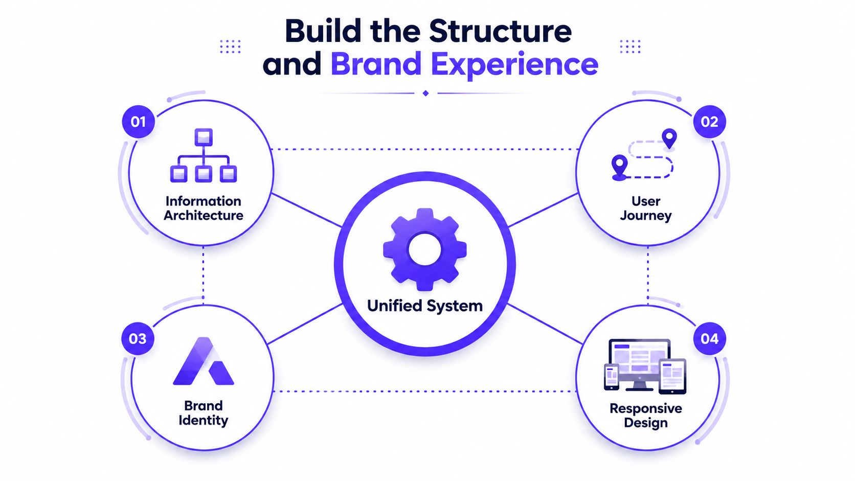
Your information architecture, user journey, brand, and frontend behavior should be designed as one system. Separating them creates a familiar startup problem: the brand team produces one promise, the website says another, and the frontend makes the CTA difficult to reach on mobile.
Keep top-level navigation flat and buyer-oriented. Most startup sites need a focused set of pages around the product, solutions or use cases, pricing, proof, resources, and company information. The exact labels depend on the business, but the structure should reflect how a buyer evaluates the company rather than how the internal team is organized.
Map the path for each priority buyer
An AI SaaS evaluator may enter through an API documentation page, review security and integration details, inspect the product workflow, and then start a trial. A fintech compliance lead may enter through a risk or compliance page, look for governance evidence, review implementation requirements, and request a conversation. A Web3 community member may start with a protocol overview, explore token utility, inspect ecosystem activity, and then join the community or connect a wallet.
Each path needs:
An entry point that matches the visitor's question.
A confidence sequence that answers the next likely objection.
A hand-off to the primary action.
Don't force every visitor through the same homepage journey. Give the technical evaluator technical proof, the financial buyer operational reassurance, and the community member a clear explanation of participation.
Your brand system should reinforce that message. Use a focused visual language, restrained color choices, typography that remains readable at small sizes, and one clear accent for conversion elements. A fintech product may need calm authority and visible security language. A Web3 product can feel distinctive without making basic product mechanics difficult to find.
Use content hierarchy principles to decide what deserves attention first. A prominent headline, meaningful subheadline, primary CTA, and relevant proof should beat decorative motion or oversized abstract graphics.
Design mobile behavior before desktop polish
Start with the narrowest practical screen. Check whether the hero still explains the product, whether buttons are easy to tap, whether tables remain usable, and whether the CTA stays reachable as the page grows. Then expand the system for tablet and desktop instead of shrinking a desktop composition until it breaks.
This matters for trust as much as usability. Pages that load in two seconds average a 9% bounce rate, while pages taking five seconds average 38%, according to Unbounce's page speed benchmarks. Another mobile performance benchmark reports that 53% of mobile visits are abandoned when a page takes longer than three seconds.
AI-mediated discovery adds another requirement. Put important answers in short, factual blocks with descriptive headings. Explain what the product is, who it's for, what it integrates with, how it works, and what action a qualified visitor should take. A 2026 startup web design trends analysis advises founders to define the story they want AI systems to tell about the company in two to three sentences. Treat that as a messaging exercise, not a trick for manipulating summaries.
Choose the Right Website Technology
The right stack depends on the site's job, the people who will maintain it, and how often the team needs to change it. Don't choose Next.js because it sounds more serious, and don't choose no-code because the first page is easy to publish.
Path | Control | Speed to Launch | Maintenance Burden | Best Fit |
|---|---|---|---|---|
Hosted CMS, such as Webflow or WordPress | Strong visual and content control | Fast | Moderate | Most seed SaaS startups |
No-code, such as Framer or a Notion-to-site tool | Limited to moderate | Very fast | Low at first | Pre-seed teams validating a story |
Custom frontend, such as Next.js or Astro with a headless CMS | Highest control | Slower | High | Products where the website experience is part of the product |
Choose Framer or another no-code option when a pre-seed Web3 team is still testing its narrative, audience, and community path. The trade-off is less control over complex interactions, content governance, and integrations.
Choose Webflow or WordPress for most seed SaaS founders who need polished pages, reliable editing, landing-page experiments, and a manageable hand-off. A hosted CMS often gives the marketing team enough autonomy without creating a frontend project every time the headline changes.
Choose Next.js or Astro with a headless CMS only when the site needs custom application behavior, deep product integration, unusual content requirements, or an experience that directly supports the product's differentiation. A custom stack can create excellent control, but it also creates more decisions around hosting, deployment, testing, and maintenance. For a useful view of the stages and decisions involved, review this agency guide to website development.
Before committing, answer four questions:
Control: Does the site need custom interaction or mainly clear content?
Experimentation: Who will publish and test landing pages?
Ownership: Who fixes a broken form or updates a component after launch?
Integration: Which analytics, CRM, billing, documentation, and search requirements must work from day one?
Also verify headless CMS options, hosting responsibility, form delivery, analytics events, metadata, redirects, sitemap generation, and structured content. A comparison of AI website builders and design agencies can help clarify where generated pages stop being sufficient and where senior design and frontend judgment becomes necessary.
Prepare a Thorough Website Launch
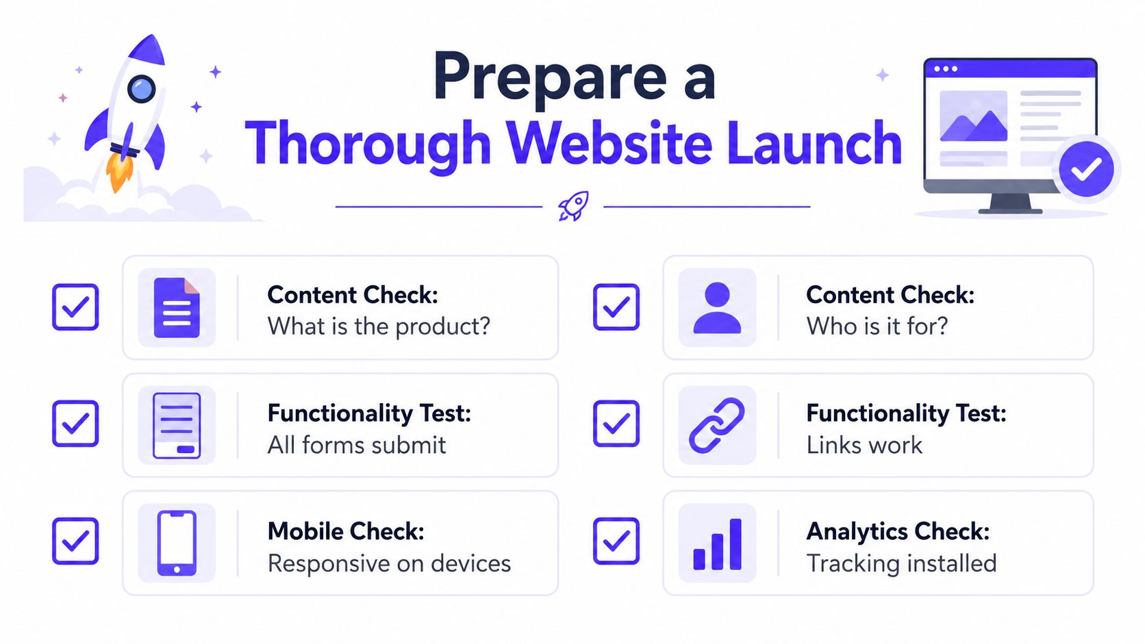
A launch isn't a button click. It's a controlled release with a checklist, a staging URL, real-device testing, and a rollback plan.
Start with the message. Every page should answer three questions quickly: What is the product? Who is it for? What should I do next? Remove placeholder copy, stale screenshots, empty states, broken links, and old product claims. If the product has changed since the first wireframe, update the website before launch rather than explaining the mismatch on sales calls.
Verify the experience
Check accessibility as part of the build, not as a final cosmetic pass:
Contrast: Text and controls should remain legible against their backgrounds.
Keyboard use: Visitors should be able to use menus, forms, dialogs, and buttons without a mouse.
Alt text: Meaningful images need descriptions, while decorative images shouldn't create noise.
Typography: Body copy and labels must remain readable on smaller screens.
Motion: Animation shouldn't block interaction or create discomfort.
Performance needs a real target. Aim for Largest Contentful Paint under 2.5 seconds on mobile, compress large images, load only necessary fonts, and remove third-party scripts that don't support a clear business requirement. Pages loading under 2.5 seconds on mobile and under two seconds on desktop are treated as practical targets in website speed optimization guidance.
Test the business plumbing
Submit every form yourself. Confirm the correct inbox, CRM record, autoresponder, calendar flow, and error state. Click every primary CTA and verify analytics events fire for page views, CTA clicks, form starts, completions, trial starts, demo requests, and other actions tied to the conversion path.
Check Open Graph previews, structured data, canonical tags, page titles, descriptions, robots rules, redirects, SSL, and domain behavior. Then test on a mid-range Android phone and an iPhone browser, including slow connections and interrupted submissions. Desktop Chrome alone won't expose the problems your mobile visitors experience.
Release in a monitored window. Keep the prior version available, define who can roll back, and watch forms, error logs, analytics, and real-user performance after publishing. A staged launch protects the funnel while the team catches the issues that a design review can't see.
Measure Performance and Run Better Tests
Analytics should support a decision, not decorate a dashboard. Start with the conversion path defined during positioning, then measure how each page moves the right visitor toward the intended action. This creates one operating system for the website, connecting human behavior, AI-mediated discovery, and business outcomes.
For a landing page, track unique visitors, scroll depth, time on important sections, CTA click-through, form starts, form completions, and traffic source quality. A product-led SaaS site should separate homepage-to-signup behavior from documentation-to-signup behavior. A fintech site should distinguish content engagement from qualified demo requests. A Web3 site should separate community participation from wallet connections.
Use page-level benchmarks
A practical baseline for many websites is 2% to 3% conversion. SaaS and B2B software sites commonly sit around 1.5% to 3% median conversion, with 5% or more at the top quartile, according to conversion rate benchmarking guidance. Use these figures as context, not as a universal target. The meaningful number is the business action that matters, measured on the page where that action occurs.
Segment results by:
Traffic source: Search, paid campaigns, partner links, community posts, and sales outreach bring different levels of intent.
Device: Mobile visitors may encounter layout or performance problems that desktop users never reveal.
Audience: Technical evaluators and economic buyers need different proof.
Landing template: A pricing page and a thought-leadership article require different performance interpretations.
Speed belongs in the same analysis. Littledata's performance analysis reports 3.05% average conversion for e-commerce sites loading under two seconds, compared with 1.94% for sites loading between three and four seconds. It also reports that a one-second improvement can raise conversions by roughly 2% to 7%, depending on sector and starting point.
Instrument real-user metrics such as LCP and TTFB, then compare conversion by speed band. Lab scores help locate technical problems, but they do not prove that a faster landing page creates more signups. A site speed benchmark associates a one-second delay with a 7% conversion drop and reports 39% conversion at one second compared with 22% at five seconds. Treat these figures as directional evidence, then test the relationship with your own visitors.
Change the page that leaks the most qualified intent, not the page that looks least fashionable.
Run focused experiments
Use a disciplined testing process:
Choose one page with a clear business role.
Write a hypothesis tied to the primary CTA.
Change one variable, such as the headline, CTA wording, proof placement, pricing visibility, or form length.
Run the test long enough to collect a meaningful sample for that page and audience.
Record the result with the audience, traffic mix, dates, implementation details, and decision.
Do not test five unrelated changes and call the result a redesign insight. If an AI SaaS homepage says “Build the future of intelligence,” test a specific product explanation against it. If a fintech demo form asks for unnecessary details, reduce friction and measure completion. If a Web3 page hides token utility below abstract visuals, move the explanation forward and observe qualified actions. Tie every experiment back to positioning, UX, implementation limits, and the discovery signals that help both people and AI systems understand the product.
Staff the Work and Turn the Plan Into Action
Early-stage teams often make one of two expensive mistakes. They ask a generalist to handle strategy, identity, UX, copy, frontend, analytics, and QA without enough time, or they hire several specialists before the message and scope are stable.
For most funded startups, use one accountable creative partner until the website system is clear. That partner should cover positioning translation, brand expression, UX, frontend implementation, and launch QA. 925 Studios is positioned for this model, replacing separate product designer, brand designer, and frontend developer responsibilities with one studio across strategy through shipped pixels.
Model | Team | Indicative Cost | Time Commitment | Main Risk |
|---|---|---|---|---|
Founder-built | Founder, Webflow or Framer builder, fractional designer | Variable | Heavy founder involvement | Copy, QA, and technical decisions get neglected |
In-house | Product designer, frontend developer, content lead | Salaried team | Ongoing weekly ownership | Hiring takes time and responsibilities can fragment |
Studio sprint | One embedded agency or studio partner | Project-based | High collaboration during the sprint | Weak internal ownership after hand-off |
A founder-built model works when the product story is still changing and the team can accept a functional, focused first release. A small in-house team makes sense when the site is part of a larger product and marketing operation. A studio sprint is usually the cleanest option when a funded team needs brand, UX, build, and launch support without building the full department immediately.
The hidden gaps matter more than the org chart. Someone must write the page, source proof, prepare screenshots, configure forms, set up events, test responsive states, check accessibility, and own updates after launch.
Use a simple operating cadence
Keep one shared Notion brief with audience notes, positioning, page goals, proof, open questions, and decisions. Keep the Figma file as the design source of truth and a staging URL as the implementation source of truth. Run a weekly review with the founder, product owner, marketing lead, and delivery partner, focused on decisions rather than taste.
A practical 14-day kickoff sequence looks like this:
Days 1 to 3: Lock the audience, positioning, proof, and primary conversion action.
Days 4 to 7: Finalize the information architecture, user journeys, content hierarchy, and wireframes.
Days 8 to 12: Build the homepage, priority landing pages, responsive system, forms, and analytics events.
Days 13 to 14: Run content, accessibility, performance, integration, and real-device QA.
Assign these three tasks tomorrow morning:
Book the customer interviews and invite the people closest to your ideal buyer.
Write the one-sentence positioning statement and choose the site's primary CTA.
Name the accountable owner for content, approvals, analytics, and post-launch maintenance.
A startup website becomes an operating system when one team can connect the message to the brand, the journey to the interface, the interface to the build, and the build to measurable business outcomes. 925 Studios offers that integrated design and development support for AI SaaS, Web3, and fintech teams that need to ship a clear, conversion-focused website without assembling three separate hires. Visit 925 studios to discuss your positioning, brand, UX, and frontend build in one working plan.

Let’s keep in touch.
Discover more about high-performance web design. Follow us on Twitter and Instagram.

