
How to Create Web Forms That Users Actually Finish

Outrank AI

A form can be visible, usable, and still lose most of the people who encounter it. One widely cited benchmark puts view-to-completion at 45%, while people who start a form complete it at 66%, and people who start an application finish it at 75%. The gap matters. Your team may be optimizing the submit button while most users are deciding whether the form deserves their time at all. Aggregated form benchmark reporting makes the point clearly: form performance depends on the entire experience, from first impression to confirmation and whatever happens after submission.
To create web forms that users finish, treat the form as a product surface, not a widget dropped onto a landing page. The field strategy, brand signals, mobile layout, validation, accessibility, security, API wiring, and revenue reporting all shape the outcome. That matters even more for AI SaaS, Web3, and Fintech teams, where a failed form can mean a lost qualified lead, an incomplete wallet connection, or a compliance problem.
Table of Contents
Why Most Web Forms Fail Before the First Click
A form abandonment benchmark frequently cited in conversion discussions puts abandonment at roughly 81% for landing-page forms that are started but never completed. A separate 2026 benchmark places average form abandonment at about 67.9%, or roughly two out of every three people who begin a form. These figures come from different measurement approaches, so they shouldn't be treated as one universal rate. Together, they show why form design remains a serious product problem rather than a solved implementation detail. Form abandonment coverage provides the relevant benchmark context.
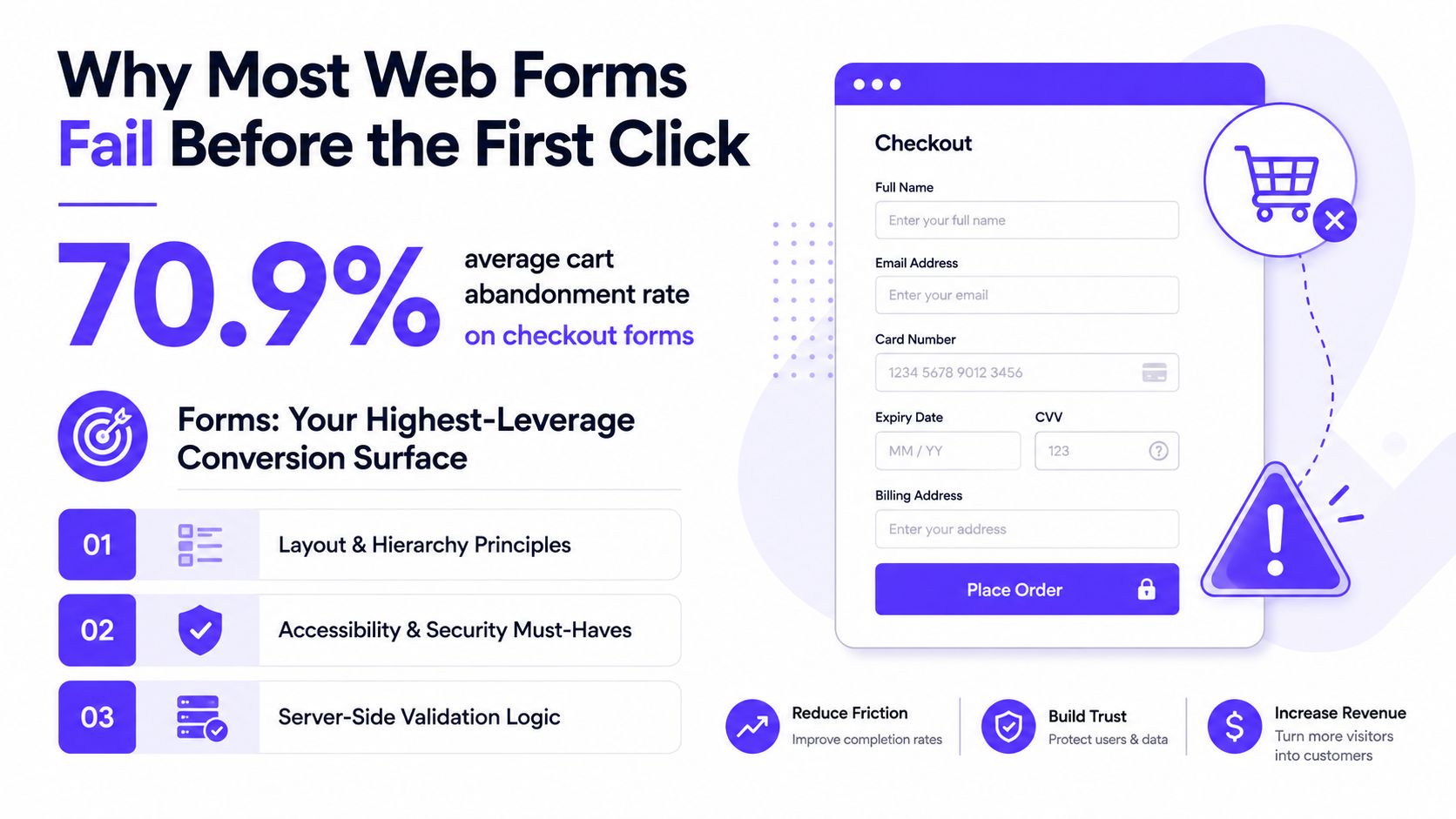
The usual failure isn't user carelessness. It's a mismatch between what the business wants to collect and what the user came to do. Long forms create cognitive load, vague labels create hesitation, weak trust signals make sensitive questions feel risky, and mobile layouts turn routine inputs into tedious work.
Start with the form's job
Every form needs one primary job, stated as a single user outcome:
Book a demo: capture enough context for a useful sales conversation.
Connect a wallet: verify the wallet relationship without asking for secrets.
Open a verified account: collect only what the identity and compliance process requires at that stage.
Write the intent sentence before choosing fields. Then list the data your downstream systems require. Finally, subtract anything that isn't strictly necessary for that user outcome.
A KYC flow may need legal identity information, date of birth, and address for verification, but a marketing form rarely needs all of those fields before a conversation begins. A Web3 wallet-connect flow should request a wallet connection and a signed message, not a private key or a long profile questionnaire. The form should earn the right to ask for more information later.
Trim before you style
Large-scale benchmark data shows a sharp relationship between field count and completion: three-field forms reached 10.1% completion, five-field forms 7.8%, seven-field forms 5.3%, and nine-field forms 3.6% in one 2026 benchmark set. The figures are benchmark-specific, not a promise for every product, but the direction is useful. Field-count and device benchmark data supports testing the shortest viable form rather than assuming every extra question is harmless.
Mobile deserves its own review. Mobile completion trails desktop by around 9 to 11 percentage points in U.S. small and midsize business contexts, and the benchmark source above reports mobile lead-generation forms converting about 32% below desktop on a normalized five-field B2B form. Don't shrink the desktop design and call it mobile. Rebuild the interaction for thumbs, narrow screens, interruptions, and autofill.
A useful exercise is to score every field on revenue value, fraud risk, and time cost. Delete or defer the bottom third before touching visual design. If you need a reference for structuring capture flows, data capture forms can help you compare practical patterns without confusing a component library with a finished product strategy.
Layout, Hierarchy, and Mobile Friction
Good form layout answers three questions immediately: What is this for? What do I enter? What happens after I submit? Put the primary instruction before the form, use top-aligned labels, and keep the first screen focused on the next useful action. W3C guidance recommends placing overall instructions before the form element so assistive technology can announce format requirements before users enter forms mode. W3C form instructions guidance explains why placement matters.
Group related fields into meaningful chunks such as account, billing, and verification. On mobile, use a single-column stack, comfortable spacing, tap targets around 44 by 44 pixels, and a font size of at least 16 pixels to avoid unwanted iOS zoom. Those interface dimensions are practical implementation guidance, not a conversion guarantee.
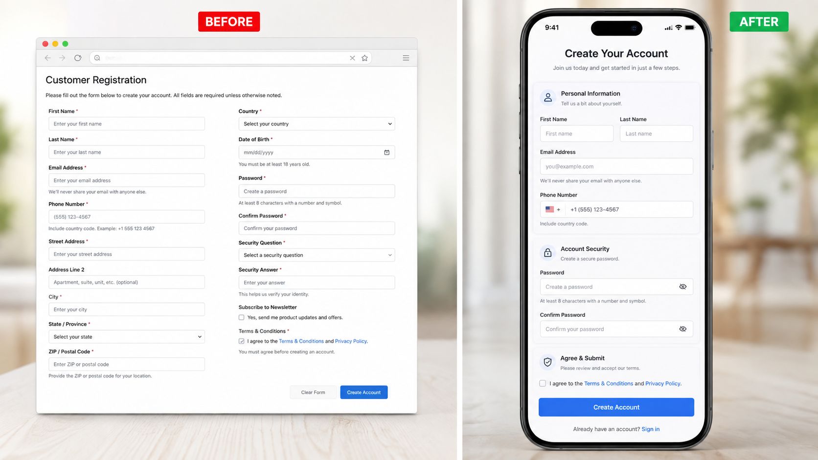
A fintech onboarding screen often starts with a dense two-column layout, tiny helper text, and optional company details mixed into identity verification. A stronger version uses one column, clear sections, short explanations above inputs, and a visible progress cue. Optional billing or company details can sit inside a details drawer, while the primary action stays visible and unambiguous.
Progressive disclosure is useful when the form needs depth. It isn't useful when it hides simple questions behind unnecessary clicks. Use a multi-step flow or accordion when the current screen becomes difficult to scan on the target device, and keep each step logically complete.
For reusable style references, a MarTech Do form generator can help teams explore form treatments before engineering a custom implementation. Keep the design review grounded in content hierarchy, not decoration.
Run this checklist on every layout review:
Purpose: The form's job is obvious before the first field.
Labels: Every input has a persistent, readable label.
Grouping: Account, payment, and verification questions are separated.
Mobile: No sideways scrolling, cramped controls, or tiny text.
Feedback: Helper text sits near the question, and errors sit near the field.
Actions: One primary submit action leads the screen, with a quieter secondary option.
Validation Patterns That Don't Annoy Users
Start with native HTML. Use type="email" for email, type="tel" for phone numbers, required where necessary, minlength and maxlength for bounded text, pattern for constrained formats, autocomplete tokens for known user data, and inputmode to request a useful mobile keyboard. Native constraints improve the baseline experience without forcing a JavaScript dependency.
Then add the Constraint Validation API. checkValidity() lets the interface test the browser's rules, while setCustomValidity() supports a specific message when the default browser response isn't enough. Tie the message to the field and focus the first invalid control after submission. A red banner at the top that makes users hunt for the actual problem is a poor substitute for local feedback.
Validation timing should match the risk and effort of the field:
Field type | Trigger moment | Reason | Example |
|---|---|---|---|
Identity detail | On blur | Gives the user time to finish entering it | Date of birth |
Structured technical value | While typing, with restraint | Early feedback prevents an invalid final value | Web3 wallet address |
Contextual business detail | On submit | Avoids interrupting thought during a low-risk answer | Business name |
Framework choice is a trade-off, not a moral decision. React Hook Form suits large React forms where minimizing unnecessary re-renders matters. Formik is often easier for teams that value a straightforward mental model. Vee-Validate fits Vue applications, while Zod or Yup can provide shared schemas across client and server boundaries when your stack supports that pattern.
Error copy should state what went wrong and how to fix it. “Enter a valid work email, such as name@company.com” is useful. “Invalid input” isn't. The principles behind clear UX writing apply directly here, especially when the user is already frustrated.
Accessibility Patterns That Hold Up Under Audit
Accessibility is engineering work, not a final polish pass. Every control needs an explicit programmatic label using a native <label for> relationship or an equivalent accessible name. Placeholder text doesn't count as a label, because it disappears during entry and often fails to explain the field once the user needs to review it. W3C forms guidance covers labels, grouping, and semantic structure.
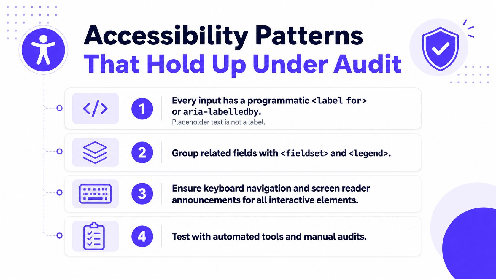
Use <fieldset> and <legend> for related controls, especially address, payment, and identity blocks. If a field has an error, set aria-invalid, connect the input to the error with aria-describedby, and ensure the message exists in the DOM when submission fails. Don't render an error only after focus moves to a field, because screen reader users and keyboard users may never receive the same context.
Give keyboard users a reliable path
On submit, move focus to the first invalid field and keep the focus indicator visible with a strong :focus-visible treatment. Never trap keyboard users inside a modal, and never let an auto-advancing interaction move focus without a clear reason.
Text contrast should meet 4.5:1 for normal text, while large text can meet 3:1, according to WCAG-based guidance on accessible form design. Contrast guidance for accessible forms is especially relevant to labels, helper text, and error messages that users need to read quickly.
Founders can hand engineers this audit checklist:
Names: Every input has a programmatic label.
Structure: Related controls use fieldsets and legends.
Order: Keyboard focus follows the visual reading order.
Errors: Invalid fields and messages are associated programmatically.
Visibility: Focus remains visible against the surrounding interface.
Timing: Users can extend or disable a required time limit where security permits, following W3C validation guidance.
Testing: Automated checks are followed by keyboard and screen reader review.
Security, Privacy, and Server-Side Trust
Client-side validation is a courtesy. The server is the source of truth.
Re-validate every submitted field on the server, normalize values into the format your system expects, and reject unexpected data. A browser can be modified, bypassed, or replaced by a direct request. The backend must enforce authorization, not just input shape.
Protect the submission endpoint against common threats:
CSRF: Use appropriate tokens or SameSite cookie protections for state-changing requests.
XSS: Escape user-controlled output and never evaluate user input as code.
Bots: Start with rate limiting and honeypot fields. Escalate to CAPTCHA only when abuse justifies the added friction.
Replay and duplication: Use request identifiers where repeated submissions could trigger account creation, billing, or asset movement.
Minimize personally identifiable information. Mask sensitive values in logs, encrypt stored data, and restrict access by role. For Fintech products, send card data to a PCI-compliant processor and keep raw primary account numbers out of your servers. For Web3 products, never ask users to type private keys. Verify signed messages server-side and bind the signature to the intended domain, action, and account context.
Privacy requirements depend on jurisdiction and product design, but the basics are consistent. Establish a lawful basis, capture consent separately for optional marketing fields, and provide practical data export and deletion paths where applicable.

A small server-side checklist catches many expensive mistakes:
Validate: Check type, format, length, and business rules.
Authorize: Confirm the user can perform the requested action.
Log safely: Exclude or mask PII.
Rate limit: Protect the endpoint from repeated abuse.
Audit: Emit a submission event with the outcome, actor, and relevant system identifiers.
Wiring Forms to APIs, CRMs, and Analytics
The frontend shouldn't know how every downstream system works. Define a canonical submission event with stable field names, send it to one server endpoint, and let a thin translation layer fan the data out to your CRM, product database, billing system, and webhook subscribers.
That separation matters when a team swaps HubSpot for Salesforce, adds a Slack alert, or changes its product provisioning logic. The form stays focused on collecting a valid user action. The integration layer handles mapping, authorization, retries, and system-specific failures. For email hygiene before CRM creation, an Email Validation API can fit into the server-side pipeline without adding another frontend decision.
Use idempotency keys for submissions that can create accounts, start trials, or trigger payments. Retry temporary failures with exponential backoff, and place persistent failures in a dead-letter queue that someone can inspect. A SaaS signup form may create a contact, provision a workspace, and begin a billing trial. A wallet-link form may depend on an unreliable RPC provider. Those paths need durable processing, not a single fragile browser request.
Analytics should capture the journey, not only the final success:
Start: The user begins interacting with the form.
Focus and blur: The user enters and leaves a field.
Error: Validation fails, with the field name and error category.
Abandon: The session ends before submission.
Submit: The request succeeds or fails, with the outcome.
Segment the funnel by device, traffic source, and user role. That turns “the form underperforms” into a concrete question about a specific field and audience. Teams building or deploying this infrastructure can also review cloud-based app development patterns for the wider system around the form.
Wire these five events early:
CRM contact creation
Email double opt-in
Product account provisioning
Billing trial start
Analytics funnel completion
Close the loop with operational alerts. When a high-intent Fintech onboarding form completes, sales should see the right context, and revenue attribution should connect the submission to the resulting opportunity instead of disappearing into an unmonitored integration.
Your First Week of Form Improvements
Give each role a contained task that can ship within a focused work session. The objective isn't to redesign every form. It's to expose the highest-cost friction, make one meaningful change, and create a repeatable review habit.
Founders and product leaders
Audit the three forms closest to revenue. Count fields in each step, write the single job-to-be-done for each form, and mark every question as required, deferrable, or unnecessary. Review the results with someone who understands compliance so a “shorter form” doesn't remove a required control.
Designers
Redline label placement and grouping. Add visible focus states, check mobile spacing, and rewrite helper text so it answers a question the user is likely asking, such as why an address is required or what happens after a wallet signature. Use the existing brand system to make trust visible through consistent typography, color, and confirmation states, not through decorative effects.
Frontend engineers
Replace silent submit handlers with native constraint validation, then add inline messages connected through aria-describedby. Confirm that every input has an associated label, that the first invalid field receives focus, and that the mobile keyboard matches the expected input.
Backend engineers
Move all business validation server-side. Add rate limiting and CSRF protection to state-changing endpoints, verify authorization, and confirm that PII fields stay out of application logs. Add an idempotency strategy wherever one submission can create more than one downstream effect.
Data and growth teams
Stand up a field-level funnel that records start, abandonment point, error rate, and completion. Segment it by device, acquisition source, and role, then schedule a weekly review that produces one testable change rather than a long backlog.
Finish the week with a cross-team review. Watch the same three session recordings, identify where users hesitate or recover, and write down the next product bet. Empirical research supports this disciplined approach: guideline-compliant forms achieved 78% one-try submissions versus 42% for forms that violated the guidelines in one usability study, with improvements to completion time, submission attempts, and visual search effort. The published form optimization research shows why basic usability rules deserve engineering attention.
The best form isn't the one with the most elegant component library. It's the one that asks only what the user needs to provide, works on the device in their hand, explains mistakes without blame, protects sensitive data, and delivers the submission to the systems that make the business work.
925 studios gives AI SaaS, Web3, and Fintech teams one creative partner across product design, brand design, and frontend development, so forms move from rough requirements to polished, shipped experiences without three separate hires. Visit 925 studios to discuss a conversion-focused form, product flow, or design system your team needs to ship.


Let’s keep in touch.
Discover more about high-performance web design. Follow us on Twitter and Instagram.

