
Content Hierarchy That Converts a Practical Guide

Yusuf
Founder and lead designer at 925studios

A founder pulls up two analytics dashboards after a customer interview. Both contain the same data, the same filters, and the same product metrics. One feels calm and obvious within seconds. The other feels noisy and slow, even before anyone clicks.
That difference usually isn't a data problem. It's a content hierarchy problem. The order, weight, and relationship between elements determine whether a user sees the primary message, understands what matters, and knows what to do next.
For AI SaaS, Web3, and fintech teams, this affects far more than visual polish. It shapes whether a customer trusts a model output, understands a transaction, or completes an onboarding flow. The examples below show how to engineer that clarity across real product surfaces.
Table of Contents
The Dashboard That Felt Right and the One That Did Not
The founder leans toward the first screen. A large usage number sits at the top, its label is specific, and a short status message explains whether the account is on track. The supporting charts sit beneath it in a predictable order. A single primary action is visible without competing with every other control.
Then the founder rereads the second dashboard. The same usage number is buried beside several equally large cards. A warning appears in the same visual style as a routine activity update. Filters, export controls, and account settings occupy the same area as the decision the customer came to make.
Nothing is technically missing. The second dashboard has all the information, but it hasn't told the user how to read it.

The difference is structural
The first interface establishes a clear reading order. The second asks the user to create one from scratch. That creates hesitation, rereading, and unnecessary exploration, especially when the interface supports a high-stakes decision.
This is why dashboard work needs more than attractive cards and a polished color palette. A useful guide to SaaS dashboard design examples can help teams study patterns, but the important question is always contextual. What must this user understand first, and what can wait?
Content hierarchy is the system behind that answer. It controls which element gets attention, which pieces belong together, and how the interface explains relationships to people and machines. The rest of this guide breaks down how to make that feeling deliberate in SaaS dashboards, product pages, and conversion flows.
What Content Hierarchy Means
Content hierarchy is a three-layer system that determines how a product communicates with people and software.
The visual layer controls attention through size, contrast, position, spacing, and styling. The information layer groups related material so users can understand what belongs together and what follows next. The semantic layer defines meaning for browsers, assistive technologies, search systems, and AI tools that interpret the interface.
A screen can look orderly while failing in another layer. A large headline may attract attention, but without a heading element, a screen reader may not identify its role. A tidy card layout may group information visually, yet if each card represents a different task, users still lack a clear decision order.

A SaaS example
Consider a usage analytics screen for an AI SaaS product. The visual layer can make current usage the focal point, with a clear status showing that the account is approaching its plan limit. The information layer can separate usage trends, billing context, and recommended actions into distinct groups. The semantic layer can provide correct heading levels, descriptive labels, accessible table relationships, and ARIA labels where native HTML does not express the interface behavior.
Each layer answers a different product question:
Visual: What should the user notice first?
Information: Which elements should the user understand as related?
Semantic: What does each element mean, and how can software interpret it?
The same structure changes across products. A Web3 wallet needs a clear relationship between asset, network, transaction status, and confirmation action. A fintech dashboard must distinguish balances, pending activity, and risk warnings without making routine updates look urgent. In each case, hierarchy shapes the build, not only the final appearance.
The Nielsen Norman Group recommends defining the content hierarchy and the key points users should take away before design begins, in its guidance on visual hierarchy in user experience. That decision affects layout, copy, component structure, and interaction behavior from the start.
For the relationship between grouping content and defining its structure, this information architecture guide offers useful product context.
The Core Principles That Drive Scannability
A scannable interface doesn't make every element equally easy to notice. It makes the important path easier to follow than the alternatives.
Start with the scan path
People often scan dense web pages in an F-shaped pattern, with many fixations concentrated toward the top and left side. Nielsen Norman Group's eye-tracking discussion explains why the first words in headings and the first lines of paragraphs carry disproportionate attention in this pattern, as described in its research on F-shaped reading behavior.
Product teams can apply this without turning every screen into a rigid template. Put the primary message where users naturally begin. Place the next action near the point where the user finishes understanding the message. On a settings page, that might mean showing the account state and the required action before optional preferences.
Group related information
Users should be able to tell which label belongs to which value and which controls affect which content. Proximity, shared containers, alignment, and consistent spacing help the eye treat related items as one unit.
A billing card that places plan name, usage status, renewal information, and upgrade action together creates a meaningful cluster. Separating those elements across the page forces the user to reconstruct the relationship. Research on visual hierarchy and viewing behavior connects spatial position and distinctiveness with earlier attention engagement, which supports testing placement instead of relying on personal preference.
Practical rule: If users need to compare two values, place them in the same visual and information group.
Use progressive disclosure
Advanced controls shouldn't compete with the primary task. Put them behind an expandable panel, details link, or secondary route when beginners don't need them to complete the main job.
A model configuration screen might show the selected model, output goal, and run action first. Temperature settings, token controls, and developer options can remain available without dominating the initial experience. The trade-off is discoverability. Hidden controls need clear labels and sensible defaults, or experienced users will spend time hunting for them.
Keep heading depth shallow
Headings provide both a visual outline and a semantic outline. The Australian Style Manual recommends no more than 4 heading levels, with consistent relationships between headings and subheadings, and connects this structure to WCAG requirements for page titles, headings, and programmatic relationships in its guidance on hierarchical content structure.
For product teams, this usually means one clear page title followed by a small number of meaningful section levels. Don't use a heading because its font size looks right. Use it because it represents the correct relationship in the content model.
A useful visual hierarchy reference can help teams separate visual emphasis from structural meaning. Teams planning content for AI discovery can also use the MyMentions AI content strategy guide to think about how clear structure supports interpretation beyond the screen.
How It Plays Out Across SaaS Web3 and Fintech
The same hierarchy rule can produce different interface decisions depending on the user's risk, expertise, and next action. A model output, a blockchain transaction, and a bank transfer don't deserve the same visual treatment.
Product category | Visual layer priority | Information layer priority | Semantic layer priority |
|---|---|---|---|
AI SaaS | Model output, confidence or status, and the primary action | Separate result, explanation, source context, and configuration | Label output state, feedback controls, provenance, and interactive controls clearly |
Web3 | Asset, transaction state, and risk signal | Group wallet, network, gas, contract, and confirmation details into tiers | Identify addresses, amounts, networks, warnings, and status changes precisely |
Fintech | Amount, recipient, fees, and finality state | Separate review, verification, and commitment steps | Expose labels, errors, required fields, and confirmation states to assistive technology |
AI SaaS
An AI product often has one piece of information users care about most, the output. That doesn't mean the output should stand alone. Confidence indicators, source context, processing state, and the next action should sit close enough to support judgment without overwhelming it.
The trade-off is between immediate usefulness and explainability. If the explanation appears before the answer, the interface feels slow. If it disappears entirely, users may distrust the result.
Web3
Web3 surfaces commonly contain unfamiliar technical details, including wallet addresses, transaction hashes, network names, gas information, and contract states. Hiding all of that makes the product feel opaque. Showing everything at once makes it difficult for non-native users to act safely.
A tiered structure works better. Put the asset and current transaction state first, show the risk or warning next, and let users expand technical details when they need to verify them.
Fintech
Fintech flows carry a different burden. Users need to know what they're committing, what it costs, and whether the action is complete. Amounts, fees, recipient details, verification cues, and finality states shouldn't compete with promotional copy or secondary links.
The design decision is compression without concealment. Fewer steps can reduce effort, but removing context at the wrong moment creates mistrust and support requests.
Three Product Examples Worth Studying
The strongest hierarchy decisions are often small changes to order and emphasis, not dramatic visual redesigns. Consider three common product situations.
A B2B analytics dashboard
The team starts with a dashboard containing a primary KPI, several secondary metrics, trend charts, and a set of operational widgets. Customers can find the data, but sales conversations reveal that prospects don't understand what the dashboard is asking them to do.
The redesign moves the primary KPI above the fold, gives it a direct explanatory label, and demotes secondary widgets into a collapsible rail. The heading structure mirrors the user's questions, starting with current performance before moving into causes and supporting detail. The primary action follows the KPI instead of sitting beside unrelated export and filter controls.
The outcome is a lift in qualified demo requests by double digits. The important lesson isn't the exact result. It's that the team changed the decision path, not merely the card styling.
An AI note-taking marketing site
The original hero presents a feature list. Recording, transcription, summaries, integrations, and search all compete for attention before the visitor understands the product's main outcome.
The revised hero leads with one outcome line, followed by three supporting proofs and one primary CTA. The page then uses sections with clear heading relationships, while deeper integration details appear later for visitors who need validation.
Trial signups rise after the team gives the page a single entry point. The hierarchy makes the product easier to understand before asking the visitor to act.
A fintech onboarding flow
The onboarding flow originally asks users to begin funding before they have a clear view of fees or the approval timeline. Users reach the commitment point with unresolved questions, then leave to look for answers.
The team reorders the flow so fee transparency, identity verification expectations, and approval timing appear earlier. The review screen isolates amount, fee, recipient, and final status instead of blending them into one dense confirmation panel. Drop-off at the funding step falls after the change.
These examples share a pattern. Each team identified the user's decision, placed the information needed for that decision earlier, and moved secondary material out of the primary path.
Mistakes Founders Make When They Skip Hierarchy
Founders often treat hierarchy as decoration because the problems appear in the interface rather than in the roadmap. The team adjusts type sizes, adds a brighter button, and assumes the screen is finished. That approach leaves the underlying decision structure untouched.
The wall of data
A dashboard gives every metric the same card size, color weight, and heading treatment. The user can't tell which number represents the business decision and which numbers provide background.
This creates a comprehension problem. Users revisit areas of the screen, compare unrelated cards, and ask support which metric they should trust. Eye-tracking research on visual hierarchy found that a useful hierarchy leads users to focus on one level at a time and search more systematically, while higher layout complexity is associated with more revisits, fixations, and saccades in the cited CHI eye-tracking study.
The buried action
A product page explains features for several scrolls before showing the action that matches the visitor's intent. A settings screen places Save below optional configuration and explanatory content.
The result is avoidable drop-off. Users may understand the product but fail to reach the commitment point because the interface doesn't expose the next step when motivation is highest.
The broken heading tree
A screen jumps from a page title to a deep subheading because the designer selected the size that looked right. That breaks the relationship between sections for screen readers and makes the visual outline harder to follow.
The same issue appears when teams repeat calls to action so often that assistive technology users hear several identical controls without meaningful context. A CTA needs a clear name and a clear purpose, not just high contrast.
Trust arrives too late
Fintech and Web3 teams sometimes place verification details, fees, contract information, or transaction warnings after the commitment ask. Users then encounter important information only after they've invested effort.
That sequence creates hesitation at the worst moment. Put trust signals near the decision they support, and distinguish routine information from a warning that should interrupt the flow.
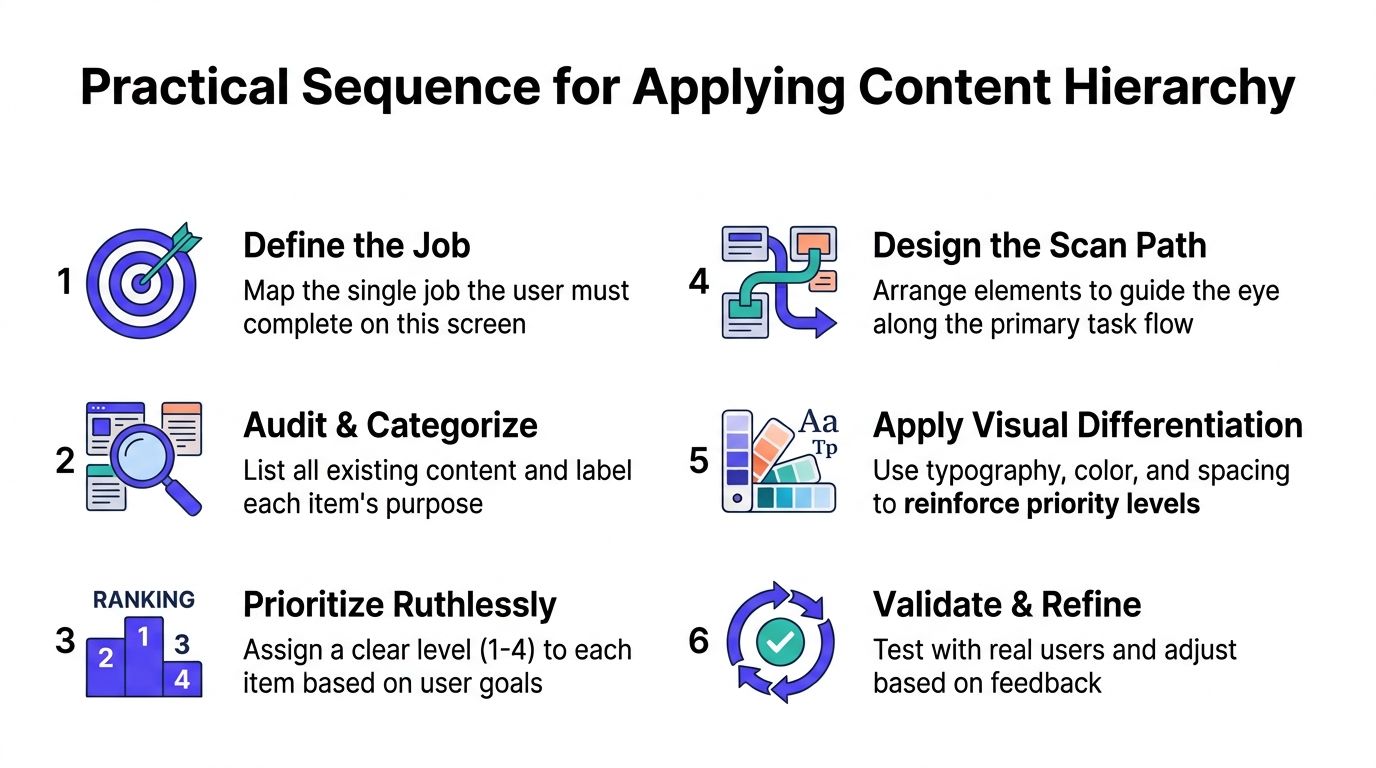
A Practical Sequence to Apply It in Your Product
Use this sequence during a new build, not only during a redesign audit.
Define the job
Write one sentence describing what the user must complete on the screen. “Review this transaction and confirm it” is useful. “Manage account settings” is too broad.
This sentence gives the screen a primary test. Any element that doesn't support the job must earn its place.
Audit and categorize
List the content, controls, statuses, warnings, and supporting details already present. Mark each item against the three layers:
Visual: Does its emphasis match its importance?
Information: Is it grouped with the content needed to understand it?
Semantic: Does its markup and label communicate its role?
This audit often reveals that a supposedly secondary message has become visually dominant because of an inherited component style.
Prioritize ruthlessly
Assign each item a practical priority level based on the user's goal. The Australian Style Manual's guidance supports keeping content structures shallow, so avoid creating a deep chain of competing priorities.
The primary item gets the strongest position and clearest label. Supporting items explain or validate it. Optional details become candidates for progressive disclosure.
Design the scan path
Arrange the screen so the eye reaches the primary message, supporting context, and next action in a predictable sequence. The University of Nottingham explains that eye tracking can show which elements attract attention, how much copy users read, and how long they take to find specific information through its eye-tracking research overview.
You don't need a lab for every iteration. Start with a teammate who doesn't know the screen and ask what they noticed first and what they think happens next.
Apply visual differentiation
Use type, color, spacing, position, and container treatment to reinforce the priorities you already defined. Don't use color as the only signal, especially for status and error states.
For teams building AI workflows or developer-facing products, it can help to study practical approaches to AI tool-building on Vision, particularly when the interface needs to expose complex system behavior without turning every control into a primary action.
Validate and refine
Run a short scan test. Give a teammate a brief look at the screen, then ask what the page is for, what they noticed first, and what they believe the next step is.
For a more formal test, tree testing can expose whether users understand the information structure even when visual styling is removed. Yale's information architecture guidance also encourages teams to identify gaps, redundancies, and consolidation opportunities before refining the hierarchy.
Why Hierarchy Is a Shipping Decision Not a Polish Step
Content hierarchy belongs in the product brief, not at the end of visual QA. It decides which screen gets built first, which information earns space, and which interaction remains visible when the product becomes more complex.
When the hierarchy is sound, engineers can build cleaner components around meaningful roles. Copywriters know which message is primary. QA can test whether users reach a defined action instead of checking whether every element merely appears on the page.
When hierarchy is wrong, teams often patch confusion with tooltips, modal dialogs, extra helper text, and support macros. Those fixes add surface area without solving the original ordering problem. A three-layer review also exposes issues earlier, including a visually prominent element with weak semantics or a well-marked heading structure that still groups the wrong information.
For AI SaaS, Web3, and fintech products, this is a trust decision as much as a usability decision. Users need to understand outputs, transactions, fees, warnings, and commitments in the right sequence.
925 Studios works with funded startups and scaling teams as one creative partner across product design, brand design, and frontend development. If your product has a dashboard, onboarding flow, or technical marketing site that makes users work too hard, visit 925 studios to discuss the hierarchy and build decisions behind a clearer shipped experience.


Let’s keep in touch.
Discover more about high-performance web design. Follow us on Twitter and Instagram.

