Small Business Branding: A Practical 2026 Guide

Outrank AI

Most small businesses start branding with the wrong question: “What should our logo look like?” That decision comes after the harder ones, who you serve, what you promise, why buyers should believe you, and how the experience should feel from first click to paid invoice.
For AI SaaS, Web3, and fintech startups, branding is no longer decoration around the product. It's the operating system for trust and differentiation. A clear system shapes your positioning, interface, sales deck, onboarding emails, and the memory you leave after a prospect visits once. Consistent brand presentation is widely associated with revenue gains ranging from 10% to 20%, with some research summaries reporting increases as high as 33%, as reported by Marq's brand consistency research summary.
Table of Contents
Why Branding Is the Last Decision Most Startups Get Right
Founders often treat branding as a weekend logo task. They hire a freelancer shortly before launch, choose a color they like, export a few files, and move on. By then, the company has already made dozens of brand decisions through its name, pricing page, product language, sales emails, demo flow, and customer support.
That timing creates a predictable problem. Your business already feels like something, even if nobody has defined what that something is. A prospect may experience a polished homepage, a confusing dashboard, a formal invoice, and a casual sales email in the same week. Each touchpoint either reinforces trust or makes the company feel improvised.
Branding should be the first cross-functional decision, alongside your target market and product wedge. It determines what you say, what you show, how you explain complexity, and which details you repeat until customers remember you.
Practical rule: If your team makes the same customer-facing decision more than once, turn it into a brand rule.
Branding compounds through repetition
A brand system gives your team standards for the work it ships. It tells a product designer how an empty state should sound, a marketer how to structure a landing page, and a developer which interface patterns belong in the product. That repetition reduces confusion for buyers because the same company feels recognizable across every channel.
Research into brand consistency also found that 68% of companies said consistency contributed at least 10% to revenue growth, while only about 25% of companies with guidelines enforce them consistently, according to industry data on branding consistency. The useful lesson isn't that a brand guide automatically creates growth. The lesson is that written rules only matter when they shape shipped work.
A founder should be able to answer these questions before approving a logo:
Who should trust us first?
What do we want them to remember?
What proof can we show immediately?
What should feel consistent across the site, product, and sales process?
Your brand isn't separate from your product. It is the pattern customers experience when they encounter the product repeatedly. The practical brand visibility insights from revid.ai are useful for thinking about that repetition as a business process rather than a collection of promotional assets.
Read how customers form perceptions of brands before starting visual work. The important shift is simple: branding isn't a logo deliverable, it's a repeatable trust system.
Positioning Before You Pick a Color
Positioning is the decision that makes every later brand choice easier. Write it on one page before you open Figma, Canva, or a mood-board folder.
Your positioning needs four answers:
Audience: Who has the problem, and who has authority to buy?
Problem: What costly, urgent, or frustrating situation do they face?
Alternatives: What do they use today, including spreadsheets, agencies, internal work, or doing nothing?
Distinct proof: What can you demonstrate that competitors can't easily copy?
The four decisions
“Everyone who needs this” isn't an audience. An AI SaaS company might serve operations leaders at companies with 50 to 200 employees who still rely on spreadsheets for recurring workflows. That description gives the team a buyer, a context, and a visible alternative.
The problem must describe the buyer's reality, not your feature list. “AI-powered workflow automation” is a capability. “Operations teams spend every month reconciling data across spreadsheets” is a problem.
Alternatives reveal your real competition. If buyers use spreadsheets, your homepage must explain why switching is worth the effort. If they use a compliance consultant, your message needs to address confidence and accountability, not just convenience.
Distinct proof keeps positioning honest. It could be a visible product workflow, a transparent audit trail, a founder's domain expertise, or a specific integration that makes the promise credible. Don't claim “more efficient” unless you can show how the product creates that outcome.
One product, three possible positions
The same AI SaaS product can take very different routes:
Positioning Choice | Alternative Framing | Downstream Effect on Homepage |
|---|---|---|
Automation tool | Replace repetitive spreadsheet work | Lead with workflow reduction and show the product completing a task |
Compliance tool | Reduce audit preparation risk | Lead with controls, permissions, logs, and reviewability |
Time-back tool | Give operations leaders hours back | Lead with the human cost of manual work and show a simpler daily routine |
Each framing changes the demo. An automation position should show setup and execution. A compliance position should show evidence and oversight. A time-back position should show the before-and-after workday.
Use this template before visual design:
We serve [specific buyer] who struggle with [specific problem]. Today, they use [current alternative]. We are different because we can prove [distinct proof].
That sentence isn't a tagline. It's a filter. If a new feature, campaign, or homepage section doesn't strengthen the position, cut it or explain why it belongs.
Voice and Messaging Without the Jargon
Most messaging frameworks produce wall art instead of usable copy. Founders fill a slide with words like bold, human, and trustworthy, then write the same vague sentences they wrote before.
Use three working layers instead.
Start with a voice filter
Choose two or three rules that kill weak sentences. For a fintech product, those rules might be:
Say the financial outcome first.
Use ordinary words for technical actions.
Never promise certainty where the product provides visibility or control.
For a developer tool, the filter might be:
Show the implementation detail.
Use the user's vocabulary.
Don't describe a feature as magic.
These rules help a team reject copy quickly. “Grow your business potential” fails because it doesn't identify a buyer, problem, or result. “Close books in three days, not three weeks” gives the reader a concrete contrast and a reason to continue.
Build a message hierarchy
Your homepage needs a simple order:
One-sentence promise: What changes for the buyer?
One-paragraph explanation: How does the product create that change?
One proof point: What can the buyer verify?
Example:
Promise: “Review every payment risk before money moves.”
Explanation: “Our fintech platform brings transaction signals, approval rules, and audit history into one workspace for finance teams.”
Proof: “See the rule, the decision, and the person who approved it in the same record.”
Don't hide the proof in a case-study library. Put enough of it near the initial claim to make the promise believable.
Test the tagline aloud
Ask a stranger to read the tagline once, then repeat it. If they can't explain what you do, the line failed. “The future of intelligent commerce” sounds polished but gives the buyer nothing to retain. “Automated invoice checks for finance teams” is less dramatic and far more useful.
Run a 60-second audit on any landing page:
Can I identify the buyer immediately?
Can I name the problem after reading the first screen?
Does the page explain the product without internal language?
Is there proof before the main call to action?
Could a sales representative say the same words naturally?
Use contractions, concrete verbs, and short sentences. Clarity isn't a tone choice, it is a trust signal.
Visual Identity Built for Recognition, Not Decoration
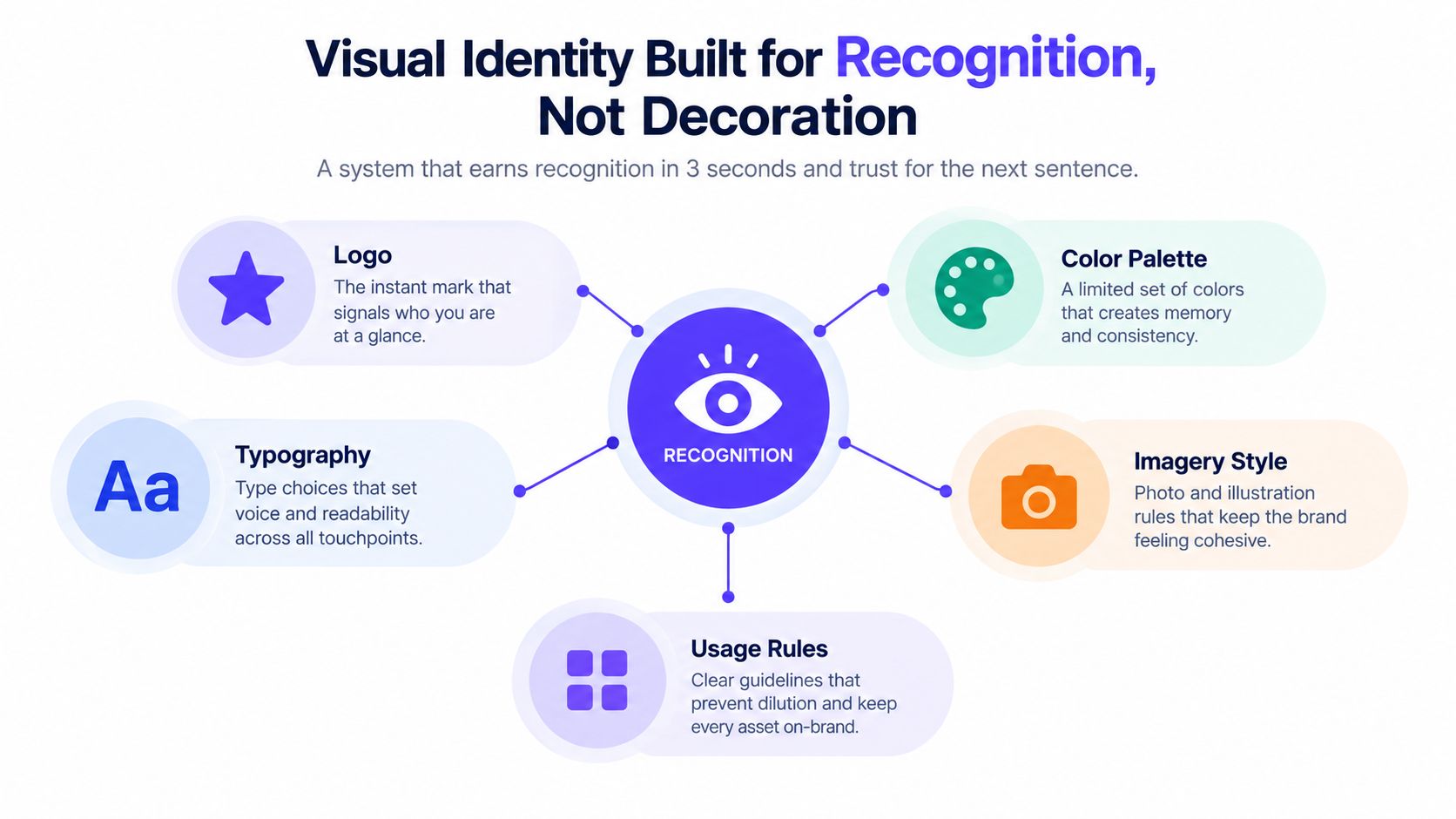
A visual identity should help someone recognize your company quickly, then trust it long enough to read the next sentence. Every choice needs to answer a recognition question, not a taste question.
Research on logo recognition found that greyscale and concrete logos were recognized more accurately than other variants, while more blue and green were positively related to recognition and liking, as reported in this peer-reviewed logo color study. That doesn't mean every startup should use blue. It means legibility and a clear shape matter more than visual novelty.
Build five working parts
Logo: Define the mark, wordmark, lockup, background variations, and minimum clear space. Test it at the size used in a browser tab, a product header, and a social avatar.
Color: Choose one primary color, one secondary color, one neutral set, and one alert color. Document accessible pairings so designers and developers don't improvise contrast on every screen.
Type: Use one display face, one text face, and a scale of four or five sizes. Your type system should make a headline, label, paragraph, and button look related without making every surface identical.
Spacing: Pick a base unit, such as 8px, then use a consistent rhythm for cards, forms, headers, and sections. Spacing is how the interface signals order.
Imagery: Decide what your photos, illustrations, screenshots, and diagrams depict. A real product screen with real data usually creates more credibility for a technical startup than a generic illustration of people smiling at laptops.
A muted palette with one strong accent will usually travel better across a checkout page, invoice, and social story than an uncontrolled rainbow gradient. The point isn't restraint for its own sake. The point is making the same company recognizable in different contexts.
Create a one-page guide
Your weekend brand guide should include:
Logo files and incorrect-use examples
Color values and approved pairings
Type choices and size hierarchy
Spacing rules and component examples
Image direction
A short list of approved interface and marketing phrases
The guide matters more than any single asset because it controls what comes next. A beautiful logo can't prevent an inconsistent website, product, or sales deck. A usable guide can.
The Brand System That Runs Across Site, Product, and Sales
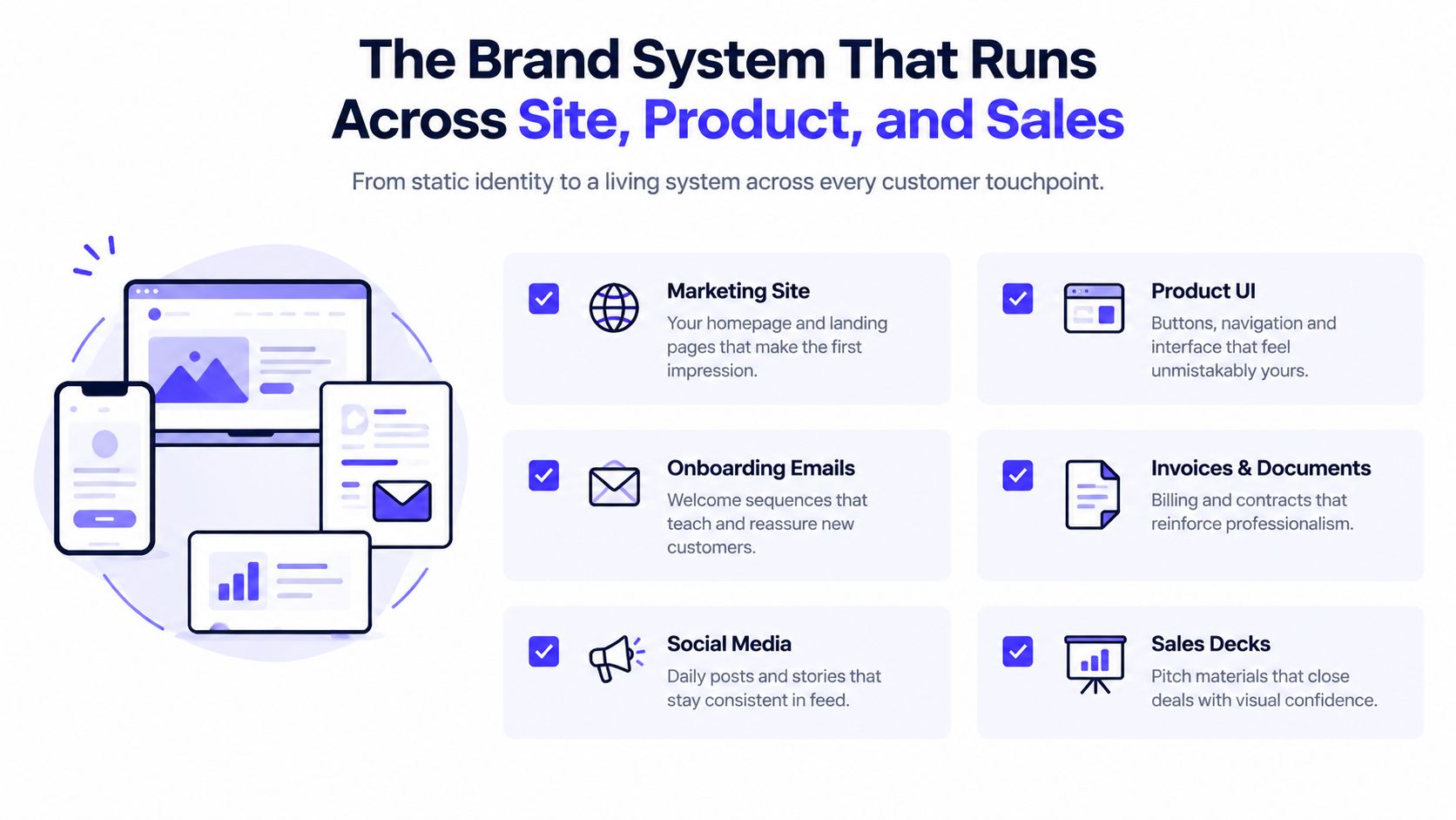
A visual identity is static. A brand system is the version your team runs every week.
List the surfaces customers encounter:
Marketing site and campaign pages
Product interface and onboarding
Welcome, billing, and lifecycle emails
Invoices, contracts, and receipts
Social profiles and posts
Pitch decks and sales proposals
Help docs and support replies
At least one live sales conversation
Each surface should share recurring cues. Logo placement should feel intentional. Buttons should use the same visual logic. Headers should follow the same hierarchy. The voice should sound like one company, whether the customer is reading an empty-state message or a contract footer.
Put a lightweight operating layer in place
Don't build a bureaucracy. Build shared sources of truth.
A small product team can maintain a shared Figma library for core components, a type and color token file that developers import into the codebase, and a Notion page containing approved phrases and banned phrases. Assign one owner to review external-facing assets before they ship. That person doesn't need to approve every internal draft, but they should catch a different button style, a new unapproved color, or copy that makes an unsupported claim.
A practical guide to creating brand guidelines can help turn these decisions into a document the team uses.
Run a monthly drift audit:
Site: Do current pages use the approved type, color, and button patterns?
Product: Do new screens sound and behave like the rest of the interface?
Sales: Does the deck make the same promise as the homepage?
Email: Do signatures, footers, and unsubscribe pages feel intentional?
Support: Are agents using approved language for sensitive issues?
Standardizing an overlooked surface, such as the unsubscribe page, can make the company feel more considered and invite a better final interaction. Treat every customer-facing screen as part of the product, including the screen where someone chooses to leave.
Standing Out When Every Brand Looks the Same
AI has made production easier, but it has also made sameness cheaper. The common startup pattern is familiar: a soft pastel background, a sans-serif headline, three friendly illustrations, and copy about helping teams achieve their potential.
That pattern isn't neutral. It makes your acquisition spend work harder because buyers have to distinguish you from a page that looks like every other AI company. In 2026, 54% of small business owners use AI marketing tools and 27% plan to start, while consumers are showing stronger resistance to low-effort AI content, according to 2026 small business marketing trend data. Use automation for volume, but keep human judgment in the product story, examples, and voice.
Replace defaults with evidence
Pick one opinionated design decision and commit to it. Use a loud color, an unexpected layout, a hand-drawn annotation, or a distinctive diagram style. One signature element is more memorable than five decorative effects.
Then replace generic assets with proof:
Show a real product screen with real, anonymized data.
Publish a photo of the team responsible for the product.
Use a chart from your own dashboard.
Explain a difficult product decision in the founder's voice.
Name the customer situation instead of describing an abstract persona.
Element | AI Default (Generic) | Deliberate Choice (Distinct) |
|---|---|---|
Hero copy | “Transform your workflow with intelligent automation” | “Stop reconciling the same report every Friday” |
Visual | Pastel gradient and smiling illustration | Product screen with a marked-up workflow |
Proof | Broad claims about innovation | A clear explanation of what the system checks |
Voice | Polished, cautious, interchangeable | Direct language for one identifiable buyer |
Signature | Decorative shapes repeated everywhere | One recognizable accent used with restraint |
Your social channel should extend the same point of view, not become a separate brand. For practical guidance on using social media to support growth, review proven social media for small business growth.
Use the logo-removal test. Hide the logo from your homepage, deck, and product screenshots. If a customer couldn't tell they came from you, your brand is still relying on a label instead of a recognizable system. The fix isn't more decoration. It's more specificity, restraint, and repeated evidence.
Read examples of branding strategies to compare how different choices can shape the full customer experience rather than a single campaign asset.
A 90-Day Brand Plan and a Scorecard That Actually Works
A brand rollout should fit the founder's calendar, not an abstract agency timeline. Work in three phases, keep one decision-maker accountable, and ship the system on real customer surfaces as soon as possible.
Days 1 to 30 build the foundation
Lock the audience, problem, alternatives, and proof. Write the one-sentence promise, paragraph explanation, and proof point. Then make the logo, type, and color decisions in one focused working session with one external designer.
Don't spend this phase polishing assets you haven't assigned a job. A clear position with a simple visual system will outperform a beautiful identity attached to vague claims.
Days 31 to 60 produce the working assets
Create the website, pitch deck, social templates, email signature, and one representative product screen from the same source files. You discover whether the system works. If the color palette fails in the product or the voice feels unnatural in sales copy, revise the rule instead of forcing the asset.
A focused plan for how to boost your impact in 90 days can add useful discipline to this production phase, especially when the founder is also the primary spokesperson.
Days 61 to 90 establish rhythm
Start a monthly brand check-in. Review a one-page scorecard with four categories:
Recall: Ask new prospects what they remember after a first interaction. Progress means they repeat the intended problem or promise. If they can't, sharpen the homepage and sales opening.
Consistency: Compare the site, product, emails, and deck side by side. Progress means the same visual and verbal rules appear without manual correction. If they drift, update the shared source files.
Conversion: Track whether key pages lead to the intended next action, such as booking a demo or starting onboarding. If the action weakens, inspect the message, proof, and friction before changing the logo.
Sales signals: Record repeated objections and the phrases prospects use. Progress means sales conversations increasingly use your own positioning language. If buyers describe you differently, rewrite the message hierarchy.
Phase | Days | Focus | Deliverables | Owner |
|---|---|---|---|---|
Foundation sprint | 1 to 30 | Position and define the system | Positioning statement, messaging hierarchy, logo, type, color | Founder and external designer |
Asset production | 31 to 60 | Apply the system to real surfaces | Website, deck, templates, email signature, product screen | Brand or product lead |
Operating rhythm | 61 to 90 | Review and improve | Monthly audit, scorecard, quarterly refresh trigger | One named brand owner |
Refresh the system when the audience changes, the product expands, the sales objection shifts, or the interface begins to require exceptions. Don't refresh it because a new trend appeared online.
925 Studios gives AI SaaS, Web3, and fintech teams one creative partner across product design, brand identity, and frontend development, replacing the need to coordinate three separate hires. Visit 925 studios to turn your positioning and visual system into a clear website, polished product experience, and shipped design system.


Let’s keep in touch.
Discover more about high-performance web design. Follow us on Twitter and Instagram.

