
Fintech Website Design: Trust, Conversions & Compliance

Outrank AI

Most fintech website design advice starts in the wrong place. It talks about gradients, typefaces, animation, and screenshots before asking whether the page answers the visitor's first and most important question: Can I trust you with my money, data, or compliance risk?
A fintech site isn't a prettier bank website, and it isn't a generic SaaS landing page with financial vocabulary added later. It's a public layer of a regulated product. Every headline, form, interaction, and technical decision either lowers perceived risk or adds to it. For founders and product leaders, that changes the job from making a site look polished to making the company legible, credible, and safe to act with.
Table of Contents
Why Fintech Website Design Is Not About Visuals
A polished interface can attract attention, but visual polish alone can't establish financial trust. A visitor evaluating a payments platform, business account, lending product, or compliance tool is also checking whether the company appears accountable, transparent, and capable of handling consequences when something goes wrong.
That's why a generic SaaS hero often fails in fintech. “Automate your finances with intelligent workflows” may sound modern, but it leaves basic buyer-risk questions unanswered. Who regulates the company? How is customer data handled? What does the product cost? Can a customer reach a human? What happens if a payment fails?
A useful reference for these decisions is this practical guide to UX design for fintech, particularly because fintech UX sits between product usability and compliance responsibility. The website needs to help people understand the product while also making the company's operating posture visible.
A fintech homepage should make trust easier to verify, not merely easier to feel.
The first screen should therefore do more than present a benefit-driven headline. It should connect the benefit to evidence. A business banking product might lead with a clear account outcome, then immediately show its regulatory status, security approach, support model, or customer proof. A fraud platform might explain the risk it detects and show how its workflow supports compliance teams. A Web3 infrastructure company might separate technical capability from custody, permission, and transaction responsibilities.
This approach treats the website as regulated infrastructure, not just a marketing layer. Recent fintech design coverage makes the same point, noting that the first screen must surface regulatory status and security signals because generic SaaS-style heroes don't answer whether a buyer can trust the company with money and compliance. The analysis from WSA Design is useful because it frames trust as a structural design problem rather than a decorative one.
The visual system still matters. Typography, spacing, color, motion, and imagery shape credibility quickly. But they should support a clear risk story. Restrained motion can suggest control. Strong contrast can improve comprehension. A real product view can show operational substance. A memorable brand can make a complex product easier to recall.
The mistake is treating those elements as the product of fintech website design. They're the delivery system. The product is the confidence to continue.
Designing for Trust Before Features
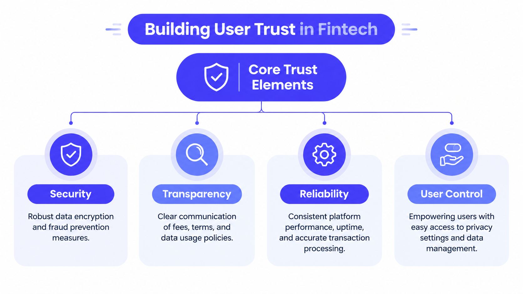
Trust becomes actionable when you stop treating it as a feeling and start designing its evidence. A serious fintech homepage should help a visitor verify four things: the company is legitimate, the product is reliable, the terms are understandable, and the user retains control.
Put accountability in the first screen
Regulatory status shouldn't live exclusively in a footer. If your company operates under a license, registration, partnership, or defined compliance framework, state that in language a buyer can understand. Link to the relevant details, but don't force the visitor to hunt through legal pages before they can establish whether the business is real.
The same applies to security. “Bank-grade security” is a slogan unless the page explains what it means for the user. Describe the protections that affect the journey, such as encryption, authentication, fraud monitoring, access controls, or data retention. The right level of detail depends on the audience, but vague reassurance should never be the only signal.
Security theater looks like a row of badges with no explanation. A genuine security signal tells the user what is protected, who is responsible, and where they can learn more.
Make the money and data understandable
Pricing should answer the questions a buyer would ask before committing. Show the structure of fees, identify conditions that change the price, and explain whether a plan includes usage limits or additional charges. If the product handles personal or financial data, explain what you collect, why you collect it, how long you retain it, and what choices the customer has.
Transparency doesn't require putting a full privacy policy in the hero. It does require making the important parts visible at the point of concern. A short explanation near account creation can reduce anxiety more effectively than a compliance badge placed far away from the decision.
This is also where brand perception becomes practical. The discussion in 925 Studios' perspective on brand perception is relevant because users interpret consistency, clarity, and restraint as evidence about how a company operates. A trustworthy brand isn't only a logo system. It's the repeated experience of finding direct answers in the places where uncertainty appears.
Use proof that matches the risk
Financial testimonials need context. A quote saying a product is “easy to use” has limited value when a buyer is deciding whether to trust it with payroll, payments, or customer funds. Stronger proof connects the product to a relevant situation, buyer role, or measurable operational outcome, provided the claim is real and supportable.
Use customer names only with permission. Show relevant partner or integration logos when they're accurate. Explain certifications and audits rather than displaying them as decoration. A compliance buyer may care about audit readiness, a founder may care about onboarding clarity, and a finance leader may care about reconciliation. Proof should meet the specific concern of the person reading the page.
Give users visible control
Control is a trust signal in its own right. Let users understand permissions before they grant them. Make account settings, privacy choices, data exports, and support routes easy to find. If the product uses automation or AI, explain where the system acts automatically and where a human can review or intervene.
Practical rule: Every important trust claim should answer three questions, what does it protect, who is responsible, and what can the user do next?
A feature list belongs below this foundation. Features matter, but they work harder after the visitor understands the company's responsibilities and the user's rights.
Building High Conversion Financial Layouts
Trust earns attention, but conversion depends on what the page asks the visitor to do with that attention. Financial pages perform best when they reduce decision complexity without hiding important information.
Financial services landing pages have a median conversion rate of 8.4%, compared with a 6.6% cross-industry benchmark, which is 27% higher, according to Upqode's fintech website design benchmark. That doesn't mean every fintech page should chase a benchmark. It means the category contains meaningful intent, and a focused page can capture it when the path is clear.
Give each page one primary job
A business account page should help a qualified visitor start an account conversation or application. A payments infrastructure page might drive a technical evaluation or demo request. A compliance platform page may need to move an enterprise buyer toward a security review.
Choose one primary action and make the page support it. Secondary actions can exist, but they shouldn't compete with the main decision. A hero with six buttons, multiple product categories, and an animated feature carousel makes the visitor build the information architecture in their own head. Most won't.
A stronger structure often looks like this:
State the outcome: Explain what the product helps the user accomplish.
Show the product: Use an interface view, workflow, or concrete example.
Reduce perceived risk: Surface regulatory, security, pricing, support, or customer proof.
Answer objections: Address implementation, eligibility, integrations, and data handling.
Repeat the action: Ask for the next step after the page has earned it.
This isn't a rigid template. The order can change by product, but the page should always make the next decision obvious.
Design mobile as the shortest serious path
Financial services visitors spend 11 minutes 36 seconds on desktop before converting, compared with 6 minutes 12 seconds on mobile, while the reported average category completion rate is 0.2%, according to the Contentsquare financial services benchmark. The useful design implication isn't that mobile users lack intent. It's that mobile gives them less time and space to resolve uncertainty.
Design the mobile path around the essential questions. Keep the opening copy compact, make key fees and conditions scannable, and remove form fields that don't serve qualification, security, or compliance. Use progressive disclosure for detail, not as a way to hide it. If a question is important enough to affect the decision, it should remain easy to access.
Forms deserve special attention. Group related fields, explain why sensitive information is required, preserve entered data when validation fails, and show progress in multi-step applications. A user who has already invested effort shouldn't have to restart because of one mistake.
Let the interface carry the explanation
The Mercury screenshot below illustrates a useful direction for fintech pages, show enough of the product environment that the visitor can understand the experience rather than relying only on claims.
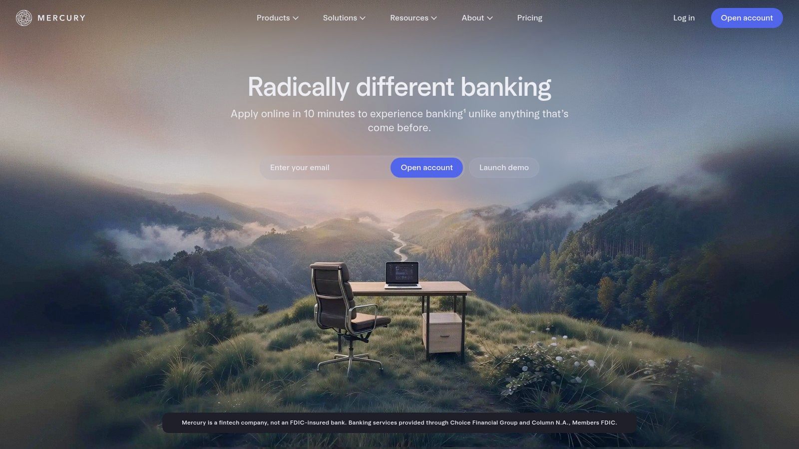
Product screenshots work when they answer a real question. Show how a user creates an account, reviews a transaction, manages permissions, or finds support. Avoid cropped screens that display attractive cards without enough context to explain what the product does.
The same principle applies to calls to action. “Get started” is acceptable when the destination is clear. “Open a business account,” “See the compliance workflow,” or “Review API documentation” gives the user a more accurate expectation. Specific language lowers the cognitive cost of clicking.
For a deeper treatment of reducing friction across acquisition journeys, these conversion optimization techniques from 925 Studios provide useful adjacent guidance. The central point remains simple: don't make a high-intent visitor work to discover what happens next.
Marketing Pages vs Product Dashboards
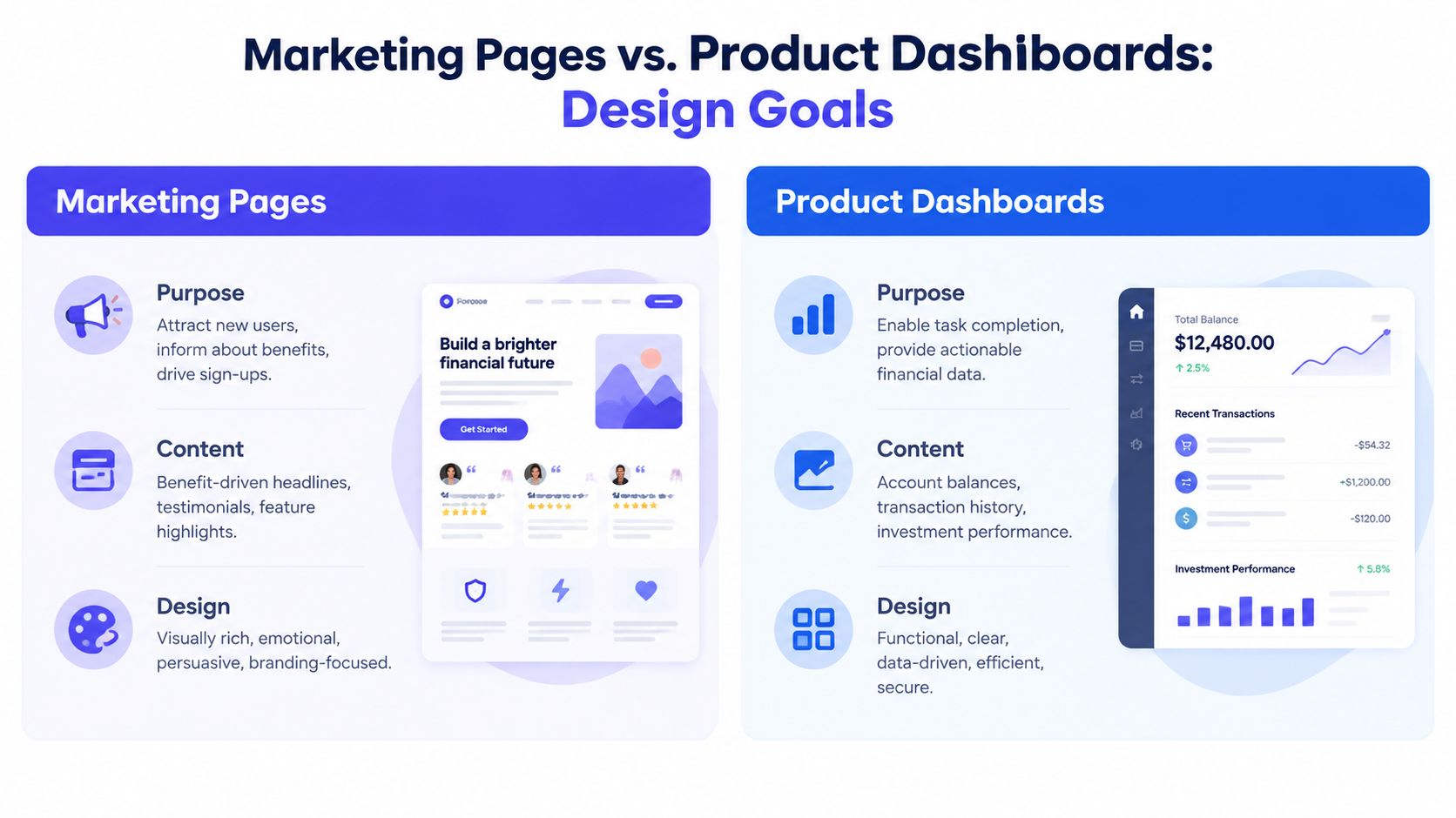
A public fintech website and a logged-in financial dashboard belong to the same product ecosystem, but they don't have the same job. Confusing them produces a site that feels either too decorative for daily work or too dense for first-time visitors.
The public site persuades through clarity
The marketing site must explain the problem, establish legitimacy, and help different audiences find the right path. It can use brand color expressively, create visual rhythm with whitespace, and introduce the product through narrative. Its content should answer questions before the visitor signs in.
A payments platform might use a bold visual identity to stand apart from banks and processors, then shift into practical sections for developers, operations teams, and finance leaders. A wealth product might use approachable language and visual explanations to make investment concepts less intimidating. A regtech company might lead with the business risk before showing the workflow.
The site should still avoid visual noise. Motion, gradients, and illustrations work when they reinforce the message. They fail when they delay the page, compete with the CTA, or make a serious product look like a campaign rather than an operating company.
The dashboard optimizes for repeated work
Once a user signs in, persuasion gives way to utility. The dashboard needs to support scanning, comparison, review, and action. Users may be checking balances, reconciling transactions, approving payments, managing team access, or investigating an alert. They don't need to be convinced that the product has a personality every time they open it.
A personal finance dashboard, such as the design discussion in Fintrack's personal finance dashboard guide, makes this distinction clear. Data organization, prioritization, and user control matter more than a promotional visual sequence.
Public marketing page | Logged-in product dashboard |
|---|---|
Leads with outcomes and use cases | Leads with current tasks and account state |
Uses brand color to create recognition | Uses color primarily to communicate status |
Supports exploration and comparison | Supports fast scanning and completion |
Shows selected product moments | Shows live, relevant operational data |
Encourages a sign-up, demo, or evaluation | Protects user actions and confirms consequences |
Color illustrates the difference well. A marketing page may use a bright accent across buttons, illustrations, and section transitions. In a dashboard, green should communicate a successful state, red should indicate an error or risk, and warning colors should retain their meaning everywhere. If every element uses the same high-intensity accent, status becomes harder to interpret.
Connect the systems without merging them
The two experiences should share foundations, not identical layouts. Use the same core type decisions, spacing logic, icon principles, and interaction language where consistency helps. Then create separate rules for marketing storytelling and operational density.
Security requirements sharpen this boundary. Open Banking security guidance says users must be able to verify a site's authenticity, including seeing the URL bar and lock icon. A secure flow shouldn't obscure browser security signals with embedded patterns that make the user unsure where authentication is happening.
The public site can encourage a visitor to begin. The dashboard must make every sensitive action understandable before it occurs.
Technical Foundations and Accessibility
A fintech brand can lose credibility before a visitor reads a headline. A slow page, shifting layout, broken keyboard path, or inaccessible form suggests that the company hasn't handled the basics of reliability. In finance, users reasonably extend that judgment to the product itself.
Treat performance as a trust signal
Only 39% of large national bank websites pass Core Web Vitals on mobile, according to Webtonic's fintech technical SEO benchmark. The same source reports that fintech pages using schema markup can achieve 20–40% higher search visibility for financial product pages, while 36% of fintech sites deliver less than 80% of homepage content in raw HTML, creating crawlability gaps for search engines and AI agents. It also cites a benchmark in which 62% of consumers are less likely to convert after a negative mobile site experience.
These figures point to practical work, not an abstract SEO checklist. Render core product and trust content in crawlable HTML. Reserve heavy client-side behavior for interactions that need it. Compress images, limit third-party scripts, define layout dimensions before assets load, and test the actual mobile experience rather than trusting a desktop preview.
Schema should describe the page accurately. Use structured data for the relevant organization, product, FAQ, or service context, and keep it aligned with visible content. Markup can't repair unclear messaging, but it can help search systems interpret a well-structured page.
Build accessibility into the system
Accessibility is part of market access and operational quality. A finance user may interact with a keyboard, rely on a screen reader, enlarge text, reduce motion, or need stronger contrast to distinguish account states. If the interface works only for a mouse user on a large display, the company has designed an avoidable barrier into a high-stakes task.
Use semantic headings and landmarks. Make focus states visible. Label fields clearly, associate errors with the right inputs, and don't communicate status through color alone. Test account creation, payment review, document upload, and support flows with assistive technology, not just the homepage.
The broader anatomy of a reliable site is covered in this guide to the parts of a website, but fintech teams need to connect each part to a user consequence. A missing label can block an application. A poor focus order can make a payment review confusing. Low contrast can hide a warning. These aren't cosmetic defects.
Keep authentication and consent explicit
Open Banking flows require clear security and permission decisions. Strong customer authentication generally involves multiple factors, often including an OTP, so the interface should explain what the user is confirming and why. Avoid presenting a sensitive account-access or payment step as an unexplained one-click action.
Consent needs equal care. Users should see the requested data scope, the organization receiving access, the duration or conditions of access, and the action that will revoke or change permission. Open Banking consent guidance emphasizes explicit consent screens, consent models, and granular acquisition flows.
A trustworthy technical foundation makes the interface faster, more inclusive, easier to crawl, and easier to verify. Those outcomes reinforce one another.
From Principles to a Shipped Product
A credible fintech website starts with risk questions, then turns those answers into a clear public experience. Surface regulatory status and security evidence before feature detail. Make pricing and data handling understandable. Give each page one primary action, then remove unnecessary friction from mobile forms and authentication flows.
The technical layer carries the same responsibility. Core Web Vitals, crawlable HTML, schema, accessibility, visible browser security signals, and explicit consent aren't separate from the brand. They are how the brand behaves when a customer needs clarity.
A unified design and build process offers significant advantages. 925 Studios works with AI SaaS, Web3, and fintech teams across product design, brand identity, website design, frontend development, and design systems. The model replaces separate product designer, brand designer, and frontend developer hires with one creative partner responsible for turning a complex product into a polished, conversion-focused experience that can ship.
Good fintech website design isn't a cost center added after the product is complete. It's part of the product's trust surface, acquisition system, and operating posture.
925 Studios helps fintech, Web3, and AI SaaS teams design and build trustworthy marketing sites, dashboards, design systems, and product experiences without assembling a large in-house team. Visit 925 studios to discuss the regulatory, conversion, and product-design challenges your next release needs to solve.

Let’s keep in touch.
Discover more about high-performance web design. Follow us on Twitter and Instagram.

