
8 Pagination Best Practices UX Teams Can Use

Outrank AI

Infinite scroll isn't automatically the modern answer to long lists. It's useful when people are casually exploring a feed, but it can frustrate users who need to search, compare, revisit, or audit specific records. Pagination is a product decision tied to user intent, data scale, accessibility, and performance, not a footer detail added after the interface is finished.
A social feed, an AI SaaS workspace, a fintech transaction history, and a Web3 block explorer all present lists, but they don't create the same job for the user. The right pattern might be numbered pages, a load-more control, or continuous scrolling. The decision should reflect how people move through the data and how confidently they need to return to a known position.
These pagination best practices UX teams can use cover the practical choices that affect shipped products: how to show position, when previous and next controls matter, when infinite scroll belongs, how page size changes across devices, and when direct page input becomes worthwhile. They also address loading and empty states, focus management, keyboard access, and the trust problems that appear when navigation feels ambiguous.
Table of Contents
6. Maintain Scroll Position or Jump to Content on Navigation
8. Optimize Pagination for Keyboard Navigation and Accessibility
1. Show Total Count and Current Position
A pagination control tells users how to move. A count tells them where they are.
Show the current range and the total set near the results, such as “40 to 60 of 1,200 results” or “Page 3 of 47.” This gives people a working model of the dataset. Without it, an AI SaaS user reviewing customer records can't tell whether the list is complete, whether more results exist, or whether a filter removed most of the data.
For a fintech product, that context supports confidence during reconciliation. A finance lead reviewing transaction history needs to know whether they're looking at the latest slice, a filtered subset, or the end of an archive. In a Web3 explorer, a count can be less useful when the underlying chain is constantly changing, so the interface may need to show a stable range, timestamp, block range, or a qualified message such as “500+ results found.”
The same principle applies to information architecture and labeling. A clear taxonomy helps users understand what a list contains before they explore it, as the guidance on building a useful website taxonomy explains.
Make the count readable and stable
Use human-readable separators in large numbers. Avoid refreshing the total on every small data change if that causes the layout to jump or makes the user's position feel unstable. AI SaaS products often receive new records while a user is working, so update counts at deliberate moments, such as after a refresh or filter change.
On mobile, the count doesn't need to dominate the screen. Put it beside the filter or sort controls, or expose it within a compact results summary. Preserve the information, but give the primary space to the records themselves.
Practical rule: If users can't tell how much data exists and where they are inside it, the pagination control is doing only half its job.
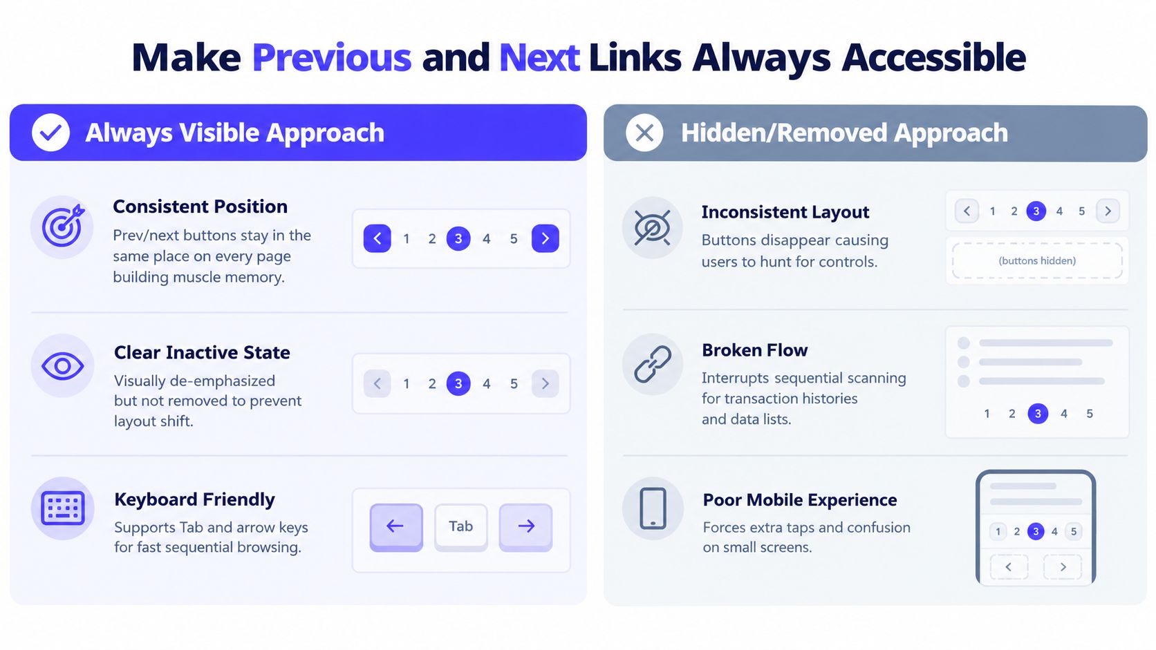
2. Make Previous and Next Links Always Accessible
Previous and next controls support the most common sequential action, especially in structured lists. Keep them in a predictable location and keep their footprint stable at the beginning and end of the sequence. On the first page, Previous can remain visible in an inactive state. On the last page, Next can remain visible but unavailable.
That consistency matters in a fintech transaction history. Compliance teams may move through records page by page while comparing dates, accounts, and references. A Web3 explorer creates a similar need when someone is examining adjacent blocks or transaction batches. Removing a control at the edge changes the layout and forces users to search for what happened.
Use text with arrow icons on desktop so the action is unambiguous. On mobile, an icon-only treatment can work when space is tight, but the accessible name still needs to describe the action. Don't rely on a left or right arrow alone, particularly when the product serves international users or uses a visual style with weak directional cues.
Preserve layout and explain inactive states
An unavailable button should look different from an active button, but it shouldn't vanish from the document structure. This prevents layout shift and makes the interaction predictable for keyboard and assistive technology users. Use an appropriate disabled or aria-disabled state, and confirm that the inactive control doesn't look like a broken feature.
Keyboard shortcuts can help power users move through records quickly. If you add arrow-key navigation, explain it through a tooltip, help panel, or keyboard-shortcut reference. A shortcut that exists but isn't discoverable creates hidden complexity rather than useful speed.
The historical pagination research summarized by the Interaction Design Foundation's pagination guidance found that pagination materially shaped how users inspected ranked results. The lesson for product teams isn't to copy an old search layout. It's to treat sequential navigation as a real behavior, not a backup for people who couldn't find the right number.
3. Implement Infinite Scroll Strategically, Not by Default
Infinite scroll works when the list itself is the experience. Social feeds, visual discovery products, and content recommendations can benefit because users aren't trying to reach a precise location. They're scanning for something interesting, and the next set of content should arrive without interrupting that flow.
Twitter/X, Pinterest, and Instagram are familiar examples. Their users generally browse through a stream rather than audit a stable record set. The interface can prioritize momentum because the user's intent is open-ended exploration.
That logic breaks down in most B2B dashboards. An AI SaaS customer looking for a particular model run, support ticket, or workspace event usually needs filters, search, a stable URL, and a repeatable position. Continuous loading can hide the scope of the dataset and make it difficult to return to a result after opening a detail view.
A foundational browsing study found no statistically significant difference in browsing satisfaction or content recall between pagination and infinite scrolling, although the small participant pool limited the study's statistical power. Its enduring product lesson is more useful than a universal winner: pagination supports orientation and stable return points, while continuous scrolling suits casual exploration. Read the original pagination and scrolling study for the research context.
Use load more when you need a compromise
A “Load more” button can preserve a continuous browsing rhythm while giving users an explicit stopping point. It's often easier to understand than automatic loading, especially on mobile. It also gives analytics a clearer event to track and lets users decide whether they want more content.
If you use infinite scroll, provide a fallback route to traditional pagination or another accessible way to reach later content. Show a clear loading state, lazy-load heavy images, and make sure the interface doesn't trap users at the bottom of a long feed. For B2B tables, start with pagination or a fixed-size result set unless user research clearly supports another pattern.
4. Use Clear Page Size Controls and Defaults
Page size changes the basic cost of browsing. A small page creates more clicks but keeps each view manageable. A large page reduces navigation but can make scanning slow, especially on a phone or in a dense table.
Give users a sensible default and let them adjust it when their workflow calls for more control. A desktop operations dashboard might offer 10, 25, 50, or 100 records per page. A mobile transaction list should usually start with fewer rows because vertical space and network conditions are more constrained. The exact default should come from the content, task, and device, not from a universal convention.
Stripe, Linear, and GitHub demonstrate the kind of flexibility users expect from mature work tools. The important part isn't copying their controls. It's showing the active page-size setting clearly and preserving it when that helps repeat users.
Match the setting to the job
A support lead reviewing customer records may prefer a larger page so they can scan names and statuses together. An auditor comparing transaction details may prefer fewer rows with more breathing room. A Web3 analyst may want a dense list on desktop but a compact range on mobile.
Persist the preference for signed-in users so the product doesn't make them configure the same view every session. If the account is used across devices, consider syncing the preference, but don't let a desktop setting create an awkward mobile experience. Device-specific defaults can be more useful than forcing one setting everywhere.
Be careful with “Show all.” It can be appropriate for a short list, but it defeats the purpose of pagination when the dataset is very large. Progressive loading can offer a middle path, with an initial batch followed by more records when the user asks for them.
The Nielsen Norman Group's list usability guidance recommends a single default page size such as 10 or 20, alongside a View All option for users who want the complete list. Treat that as a starting point, then validate it against your product's data density and task patterns.
5. Provide Direct Page Number Input for Large Datasets
Numbered links work well when the sequence is short. They become a poor tool when users need to move through a deep archive one click at a time.
Add a direct page input when the dataset has enough depth that sequential clicking becomes a real burden. A labeled field such as “Go to page” lets a fintech reviewer jump toward a known period in a transaction archive. A Web3 investigator may not want a page number at all. They may need a block number, timestamp, wallet address, or transaction hash as the direct navigation target.
This control should sit near the main pagination, not inside a settings menu. Users reach for it when they already understand the list and have a destination in mind. Hiding it removes the advantage.
Design the field for fast correction
Show the valid range in the label or supporting text. A placeholder such as “Page 1 to 487” communicates the expected input without requiring a separate help article. Pressing Enter should submit the value, and the field should return a clear error when the number is outside the available range.
Don't add direct page input to every list. A shallow AI SaaS record table may be easier to search with filters and a query field. Direct jumping is most valuable for archives, historical logs, and datasets where users understand sequence and location.
The mobile search study linked in the research on pagination versus scrolling in mobile web search found that pagination improved task performance compared with scrolling. Participants were more likely to find relevant documents, attended to relevant results for longer, clicked faster, and spent less time on the result page overall. That supports a practical distinction: when people have a target, give them controls that move them toward it.
6. Maintain Scroll Position or Jump to Content on Navigation
Page changes should make the next result set easy to find. Most list views should move the user to the top of the new results, because the new page represents a new context. If the interface leaves the user at the previous vertical position, they may land halfway through the list and miss the first records entirely.
This is especially important in mobile interfaces, where a long page can make the new content appear unrelated to the action that caused it. Google Search and GitHub issue lists generally orient users at the top of the next result set. That behavior matches the expectation that a page change starts a fresh slice of content.
Single-page applications need to manage this deliberately. Update the URL when the page changes so users can bookmark or share the current state, then move focus to the result heading or first result after the data renders. The visual movement and the accessibility focus should agree.
Preserve position only when the task needs it
There are cases where preserving position is better. A detailed form, comparison workspace, or table with an expanded row can lose context if a page change sends the user away from the active control. In those views, preserve the relevant location or return the user to the row that initiated the action.
The choice should be visible in the interface. If new content appears below the current position, distinguish it clearly and announce the change to assistive technology. If the product jumps upward, use a restrained smooth transition rather than an effect that delays access to the data.
Test on slow networks. A page shouldn't scroll before the new content has rendered, leaving the user staring at a blank area or an old skeleton. In product work, scroll position is part of state management, not just a visual flourish. The guidance on improving pagination for modern interfaces connects this issue to focus management, loading announcements, and the broader behavior of SPA-like products.
7. Show Contextual Loading States and Handle Empty Results
A loading state should explain what the interface is doing without making the user doubt the product. Use a skeleton that matches the actual table, card grid, or result rows when a new page is loading. A generic spinner can indicate activity, but it doesn't preserve the shape of the content or help users understand what will arrive.
An empty page needs even more explanation. “No results” can mean that the filter is too narrow, the account has no activity, the selected chain is wrong, or the data hasn't arrived yet. An AI SaaS dashboard should identify the active filters and offer a way to clear or change them. A fintech product should explain whether the account has no transactions in the selected range. A Web3 explorer should make the selected network or wallet state obvious.
The Baymard research summarized by Smashing Magazine's pagination and infinite scrolling analysis found that users complained pagination felt slow and that too many page links discouraged browsing. That makes loading feedback and compact controls part of the same problem. Every click should feel purposeful, and every wait should have a clear explanation.
Give users a useful next step
An empty state should help users recover instead of ending the journey.
Clear the current filter: Provide a direct action that returns the user to a broader result set.
Change the search: Suggest a different query, date range, account, or chain where that makes sense.
Create the first record: In a new workspace, let users add an issue, customer, project, or transaction-related entry when appropriate.

Keep the empty state visually consistent with the product's brand, but don't bury the explanation under illustration. Teams can also use motion carefully to communicate transitions and status, as discussed in user interface animation guidance. The result should feel intentional, not decorative.
8. Optimize Pagination for Keyboard Navigation and Accessibility
Pagination fails when users can see the controls but can't operate them without a mouse. Every page link, Previous and Next control, page-size selector, and direct-jump field should work in a sensible Tab order. Focus should remain visible, and users should know which page is active.
Use semantic HTML. Wrap the controls in a navigation landmark such as <nav aria-label="Pagination">, place page links in an ordered or unordered list, and mark the active page with aria-current="page". The current page should communicate state rather than behave like a link that reloads the same view.
The WCAG pagination examples at the WCAG pagination pattern reference specifically recommend a named navigation landmark, a real list structure, and aria-current="page". These details are small in the code, but they change how screen-reader users understand the control.
Test the complete interaction
A visible focus treatment needs enough contrast against the surrounding interface. Don't hide inactive controls with visibility: hidden, because that can remove useful structure and create inconsistent navigation. Use the appropriate disabled or aria-disabled state, and verify that users aren't able to trigger an unavailable action.
Test the flow with a keyboard and screen readers such as NVDA, JAWS, and VoiceOver. Check that focus moves to the new results after navigation, loading updates are announced, and the page-size control explains what changed. A Web3 dashboard with filters, chain selectors, dense tables, and expandable rows needs extra care because the keyboard path can become long and confusing.
The accessibility and compliance guidance for healthtech UX is relevant beyond healthcare. Funded startups should treat accessibility as part of product quality, especially when their tools serve operations, compliance, finance, or internal teams. For broader implementation checks, use this web accessibility checklist from Nerdify.
8-Point Pagination UX Comparison
Pagination Pattern | Implementation complexity | Resource requirements | Expected outcomes | Ideal use cases | Key advantages |
|---|---|---|---|---|---|
Show Total Count and Current Position | Low–Medium (backend counts, caching for scale) | Moderate (accurate counts, occasional refresh, UI space) | Better orientation and trust; helps estimate progress | SaaS dashboards, search results, customer lists | Informs users of scope; reduces anxiety; supports decisions |
Make Previous and Next Links Always Accessible | Low (UI states, keyboard support) | Low (simple UI + keyboard handlers) | Consistent, fast sequential navigation | Transaction histories, explorers, mobile lists | Builds muscle memory; simple, reliable navigation |
Implement Infinite Scroll Strategically, Not by Default | Medium–High (lazy loading, history handling) | High (performance tuning, analytics, back-button workarounds) | Smooth browsing and higher engagement but reduced positional awareness | Exploratory feeds, image-heavy discovery (social, visual) | Seamless flow; higher engagement on discovery experiences |
Use Clear Page Size Controls and Defaults | Medium (controls + persistence, responsive defaults) | Moderate (preference storage, backend adjustments) | Customizable trade-off between clicks and scroll; improved workflow fit | Dashboards, power-user interfaces, mixed device audiences | User control over density; fewer clicks; adaptable UX |
Provide Direct Page Number Input for Large Datasets | Low–Medium (input UI, validation, optional shortcuts) | Low (validation, small UX affordances) | Very fast navigation for power users across large sets | Archives, audits, Web3 explorers, large result sets | Quick jumps; compact UI; efficient for known targets |
Maintain Scroll Position or Jump to Content on Navigation | Medium (focus management, smooth scrolling) | Moderate (UX decisions, animation, accessibility work) | Clear orientation when navigating; reduced re‑orientation friction if preserved correctly | Comparison workflows, forms, long result lists | Prevents disorientation; improves perceived continuity |
Show Contextual Loading States and Handle Empty Results | Medium (design assets, state logic) | Moderate (skeletons, illustrations, guidance content) | Less confusion during load; actionable empty states; fewer support requests | Search interfaces, filtered dashboards, SaaS lists | Communicates status; guides next steps; reduces frustration |
Optimize Pagination for Keyboard Navigation and Accessibility | Medium–High (ARIA, keyboard patterns, testing) | Moderate–High (accessibility testing, semantics) | Inclusive, faster navigation for keyboard/screen-reader users; compliance | Enterprise SaaS, compliance-focused apps, accessibility-first products | Ensures accessibility/compliance; improves efficiency and semantics |
Choose the Pattern Your Users Can Control
Use numbered pagination when users inspect records, compare results, or audit a stable sequence. It gives them a position, a return point, and a way to move with intent. That makes it a strong default for AI SaaS records, fintech histories, admin tables, and many Web3 data explorers.
Use infinite scroll for exploratory feeds where the next item matters more than the user's exact location. Social content and visual discovery can benefit from the continuity. If your product combines exploration with serious search, consider load more or a hybrid approach that preserves accessible URLs and a clear way to return to a known result.
Add page-size controls when different users have different scanning habits. Add direct-jump navigation when the dataset is deep enough that clicking through pages becomes inefficient. For constantly changing data, think carefully about whether numbered pages remain stable or whether a cursor, timestamp, block number, or another domain-specific position makes more sense.
Before shipping, review the interaction as a complete product flow:
Position clarity: Show the current range, page, and total when the count is reliable.
Navigation consistency: Keep Previous and Next in stable locations and make edge states understandable.
Loading behavior: Match skeletons to the content and prevent scroll jumps before rendering finishes.
Empty results: Explain whether filters, account state, network selection, or search terms caused the empty view.
Mobile behavior: Use compact controls, adequate tap targets, and a page size that fits the device.
Focus management: Move focus to the new result context after navigation and announce meaningful updates.
Keyboard testing: Operate every control without a mouse and verify behavior with assistive technology.
State and URLs: Preserve filters, sort order, page size, and page position in a way users can share and revisit.
Pagination also belongs in the broader design-system review. A control that looks correct in a static mockup can fail when the API returns changing totals, a user applies several filters, or a screen reader encounters a loading transition. 925 Studios can help founders and product leaders connect pagination with product UX, frontend implementation, visual identity, and reusable design-system decisions, so the pattern works in the shipped interface rather than only in the design file.
925 Studios gives AI SaaS, Web3, and fintech teams one creative partner across product design, brand design, and frontend development. If your pagination, dashboards, or broader interface need a practical review from state design through shipped pixels, visit 925 studios to discuss the product and design work.


Let’s keep in touch.
Discover more about high-performance web design. Follow us on Twitter and Instagram.

