
How to Redesign a Website

Outrank AI

Your Series A team has inherited a three-year-old marketing site. On mobile, the Largest Contentful Paint sits above four seconds, free trial signups have stalled, and the CEO thinks a new typeface and a sharper hero image will solve the problem.
They won't. A slow site, unclear positioning, weak page hierarchy, and missing trust signals usually point to a business problem, not a photography problem. If you're researching how to redesign website experiences, start by treating the work as a measurable conversion program that protects revenue, search visibility, performance, and accessibility during the change.
Table of Contents
Why a Redesign Is a Business Move, Not a Paint Job
A serious redesign changes what the site says, how visitors move through it, how quickly pages respond, and how confidently buyers act. A new visual style matters, especially for AI SaaS, Web3, and fintech companies selling products that are difficult to explain. But visual polish can't compensate for a pricing page that confuses buyers, a demo form that fails on mobile, or a product story that no longer matches what the company sells.
Four signals usually justify the investment:
Demo or trial conversion is declining: Traffic may remain stable while fewer qualified visitors take the next step.
Pricing pages attract exits: Visitors reach the page with buying intent, then leave because packaging, proof, or comparison logic is unclear.
The product has been repackaged: The site still describes an older product, audience, or category.
Technical debt blocks testing: The team can't change templates, instrument events, or run controlled experiments without engineering risk.
A well-executed redesign can lift conversion rates by 15% to 25% within about six months, while larger UX-driven redesign efforts have reported average gains of around 31% across SaaS, fintech, and Web3 projects, according to redesign conversion benchmarks. Another benchmark places typical improvement at 20% to 50% within about six months, with B2B SaaS companies often seeing 25% to 50% growth in MQL volume over three to six months, when teams baseline performance, reduce journey friction, and track cohorts after launch (website redesign ROI guidance).
That doesn't make every redesign a profitable one. Poor execution can reduce conversion rates by 10% to 50%, which is why measurement, phased rollout, and structured testing belong in the plan from the beginning (redesign ROI and performance statistics).
Signal | Paint Job Response | Business-Move Response |
|---|---|---|
Conversion declines | Change colors and imagery | Find the broken journey, then test the highest-value page |
Pricing bounce rises | Add visual polish | Clarify packaging, proof, objections, and the buying action |
Product changes | Update a few headlines | Rebuild positioning, page hierarchy, and supporting content |
Testing is difficult | Ask engineering for one-off changes | Fix the template and tracking foundation during the redesign |
The two common failure modes are predictable. One is the cosmetic refresh that ships in eight weeks and changes almost nothing. The other is the year-long replatform that keeps expanding until nobody can define launch. The middle path is a focused program with a baseline, a defined information architecture, a controlled migration, and a post-launch testing cadence.
Discovery and Audit Before Any Pixels Change
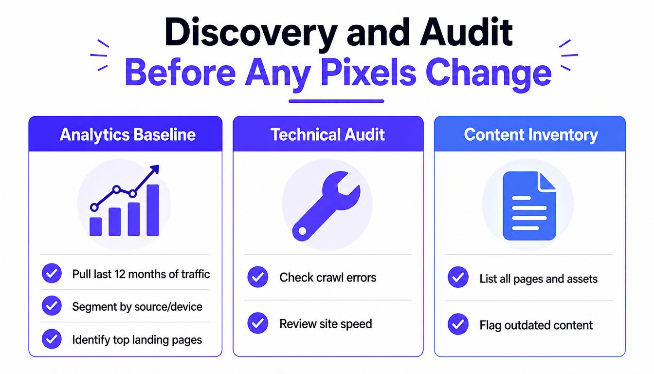
Don't open Figma first. Spend the first two weeks establishing what the current site does for the business, where users struggle, and which constraints the new build must respect.
Build the evidence base
Start with the last 12 months of traffic, segmented by landing page, source, device, and conversion path. Rank pages by contribution to qualified pipeline, not raw sessions. A high-traffic blog post that produces no qualified action may deserve less redesign attention than a lower-traffic feature page that consistently supports sales conversations.
Layer in session recordings and heatmaps from Hotjar, FullStory, or Microsoft Clarity. Look for rage clicks, dead CTA buttons, form abandonment, and scroll-depth drop-offs on pricing and feature pages. These tools won't explain every cause, but they show where the current interface creates friction.
Interview five to seven people across sales, support, and product. Ask sales which objections prospects repeat, support which questions customers ask before activation, and product which capabilities the marketing site consistently misrepresents. Repeated language from customer-facing teams often reveals the copy problem faster than internal brand workshops.
For a more detailed process, use this step-by-step UX audit for SaaS products as a working reference.
Compare competitors without copying them
Run a competitive teardown of six to eight direct competitors. Score each site on positioning, page hierarchy, proof elements, mobile usability, and Core Web Vitals. You're looking for table stakes, such as clear pricing access or obvious product explanations, and opportunities to differentiate, such as a sharper point of view or stronger evidence.
The output should be a one-page audit brief with three decisions:
Top three conversion leaks: The points where qualified visitors lose momentum.
Top three content gaps: The questions buyers can't answer from the site.
Technical debt to fix now: The issues that would make migration, testing, accessibility, or analytics unreliable.
Keep the audit brief short enough that the founder, marketer, designer, and engineer can use it during every tradeoff. If a proposed feature doesn't address a named leak, gap, or constraint, it probably doesn't belong in the first release.
Setting Goals and Defining Done
A redesign fails when everyone agrees that the new site looks better but nobody agrees on what success means. Write the goals document before visual design starts, then make the team sign it.
Pick one outcome that matters
Choose one north-star metric, usually marketing-qualified demo requests or free trial activations. Protect it from feature creep. Organic sessions, scroll depth, and visual consistency can help explain performance, but they shouldn't replace the business outcome.
Set a baseline and a measurement window for every important page. The targets below are examples of a usable scorecard, not universal promises.
Page | Primary Action | Baseline | Target | Window |
|---|---|---|---|---|
Homepage | Start a free trial | Record current rate | Lift start rate by 20% | 60 days after launch |
Pricing | Compare plans or request a demo | Record current bounce | Reduce bounce by 15% | 60 days after launch |
Feature page | Request a demo | Record current completion | Improve qualified submissions | First post-launch cohort |
Homepage | Load on mobile | Record current Lighthouse result | Score above 90 | Before launch |
The example targets above reflect the type of measurable definition teams can use. If you need a practical way to document remediation owners, priorities, and verification steps, the WP Triage remediation example is a useful model to adapt.
Give every page one job
For each key page, assign one primary conversion action and no more than two secondary actions. A homepage might prioritize starting a trial, with product documentation and pricing as secondary paths. A pricing page might prioritize requesting a demo, with plan comparison and security information supporting that action.
This rule prevents a common failure: designing a page around a collection of components rather than a clear decision. If every button has equal visual weight, visitors have to decide what the company wants them to do.
Capture constraints in the same document:
Brand boundaries: Colors, symbols, or language that carry recognition and can't move.
Required integrations: CRM forms, analytics, authentication, billing, and support tools.
Legal approvals: Claims, disclosures, risk language, and regulated financial copy.
Technical boundaries: CMS, frontend framework, hosting, and existing product dependencies.
Rebuild the information architecture before screens
Map every existing URL to a new destination before sketching a screen. Start with the top 20 pages by traffic and the top 10 pages by conversion contribution, then group the content into no more than six primary navigation buckets based on how buyers search. Your org chart isn't a navigation system.
Run tree tests on the proposed structure with five outsiders. Ask them to find pricing, documentation, and case studies, and confirm they can locate each in under 30 seconds. If they can't, change the labels or grouping before the team builds navigation around them.
On mobile, put secondary navigation behind one predictable menu and keep the primary conversion action visible without scrolling. For long pricing and product pages, use progressive disclosure. Show the headline comparison and the three key differentiators first, then place FAQs, legal detail, and fine print in expandable sections.
Finally, audit the three highest-friction journeys:
Pricing to demo request.
Blog to trial signup.
Feature page to contact sales.
Remove unnecessary steps, fields, and decisions. The finished goals document becomes the scorecard for the post-launch review and the tie-breaker when stakeholders disagree.
UI Refresh and Brand Without Reinventing the Wheel
Treat the interface as a system, not a mood board. Before designing new pages, define a small set of decisions that engineers can implement consistently.
Use two typefaces, a four-step type scale, an eight-point spacing grid, three neutral grays, one primary color, and one accent. Define hover, focus, disabled, and error states at the same time. Put the decisions in Figma variables or a Tailwind configuration so a change to a token propagates across the product and marketing site.
Brand refresh should improve recognition, not erase it. Keep a wordmark that already has equity, adjust colors for contrast and dark mode, and replace inconsistent photography or illustration with a clear visual direction. For a deeper guide to documenting those choices, use brand guidelines for a consistent identity.
Design rule: If a component needs a custom exception on every page, the system isn't finished.
Production order matters more than expected. Lock the component library before designing marketing pages. Buttons, inputs, cards, navigation, modals, alerts, and empty states should exist as reusable components with defined behavior. That keeps the engineering handoff close to one-to-one and stops the build from filling with visually similar one-offs.
Review each screen against the token set before approval. Check type, spacing, color, interaction states, and responsive behavior. A polished page that breaks the system is expensive decoration. A smaller system applied consistently gives the brand a stronger presence across landing pages, dashboards, documentation, and onboarding.
Stack, Performance, and Accessibility Foundations
Choose the stack before the first design review. A late platform decision forces teams to redesign components, rewrite content models, and revisit performance assumptions after the work already looks finished.
For marketing sites under 500 pages, a headless CMS such as Sanity, Contentful, or Payload, paired with Next.js or Astro, offers a practical balance between editor autonomy and developer control. Smaller sites can use a modern Webflow or Framer build when the team lacks engineering capacity. The right choice is the one the team can maintain, measure, and migrate safely.
Write the performance budget into the project brief:
Metric | Target | How to hit it |
|---|---|---|
Largest Contentful Paint | Under 2.5 seconds on 4G | Prioritize the main content, compress assets, and avoid oversized hero media |
Interaction to Next Paint | Under 200 milliseconds | Reduce client-side work and defer noncritical scripts |
Cumulative Layout Shift | Under 0.1 | Reserve space for images, embeds, and dynamic modules |
Homepage weight | Under 1.5 megabytes | Remove unnecessary assets, compress imagery, and limit third-party code |
Speed directly affects conversion. Research summaries cite about a 7% conversion decrease for every one-second increase in page load time (website redesign performance statistics). Google found that 53% of mobile visitors leave when a page takes more than three seconds to load, while mobile pages in its study averaged 22 seconds to fully load. Pages loading one second faster saw up to a 27% conversion lift (Google Mobile Site Speed Playbook).
Use static rendering where possible, lazy-load below-the-fold imagery, choose AVIF or WebP, defer noncritical scripts, and prefer system fonts or self-hosted variable fonts. Google also found that bounce probability rose 123% as load time increased from one second to ten seconds, while conversion probability dropped 95% as page elements increased from 400 to 6,000 (Google mobile page speed benchmarks).
Accessibility belongs in the first component, not the final QA ticket. Target WCAG 2.2 AA, use 4.5 to 1 text contrast, support keyboard navigation, show focus rings, use semantic landmarks and skip links, and label every form field. The W3C Web Accessibility Initiative recommends consistent navigation naming, styling, and positioning, plus more than one navigation method such as site search or a sitemap (W3C designer accessibility guidance). Early accessibility work typically adds 10% to 15% to design and development time, while retrofitting can cost roughly 10 times more (accessibility planning guidance).
Rollout, Migration, and SEO Preservation
A redesign launch is a controlled cutover, not a switch you flip and hope survives. Build the new site in a sandboxed environment behind a robots noindex wall, then test it against a written regression checklist.
Freeze content edits on the live site for two weeks before switchover. A stable source makes the migration script easier to verify and prevents new pages or edits from disappearing during the move.
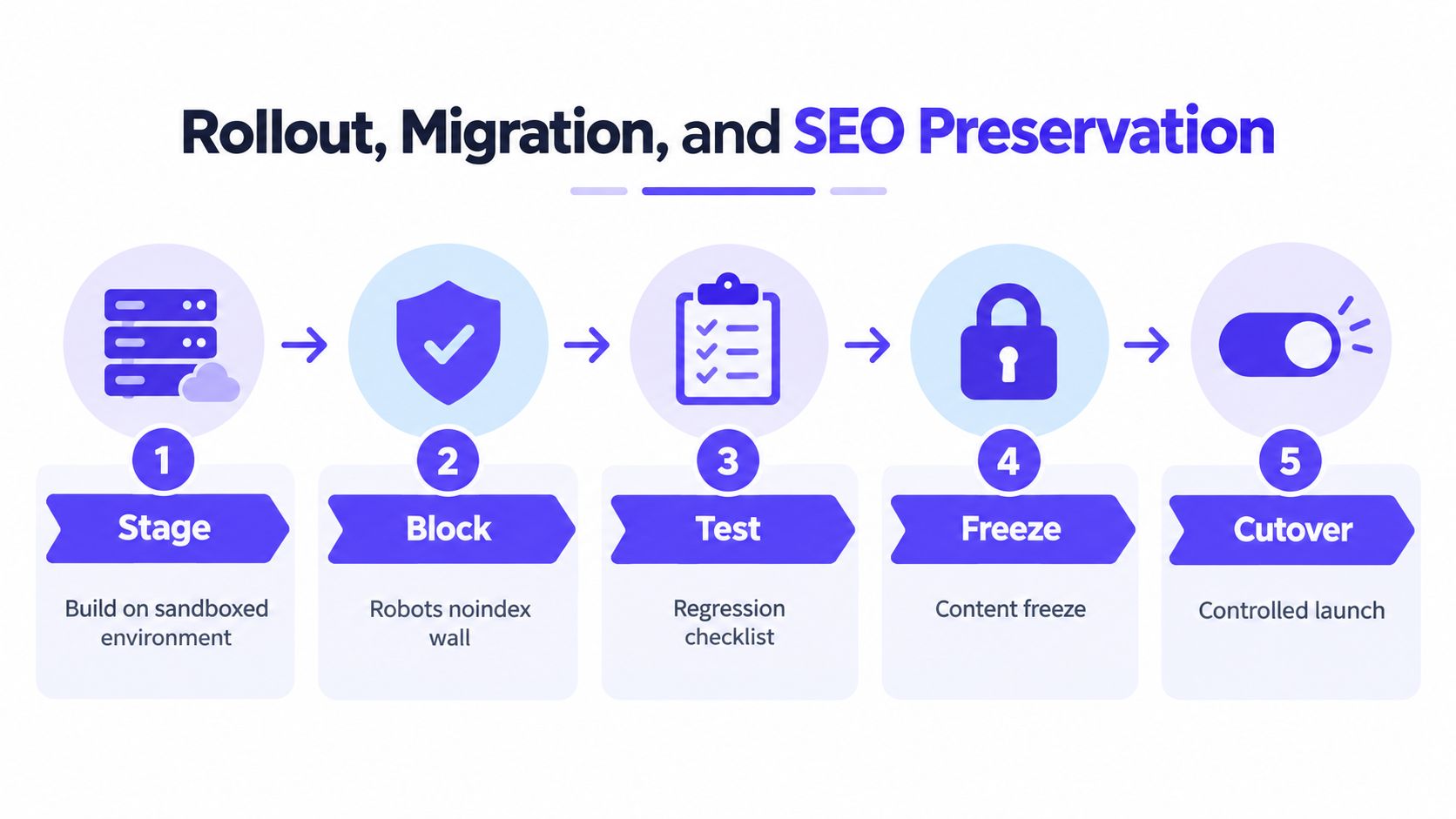
Create one spreadsheet that maps every old URL to its new equivalent. Generate 301 redirects in bulk, then verify in Search Console that no page in the top 200 returns a 404 or passes through more than one redirect hop. Preserve metadata, structured data, canonical tags, and sitemap URLs across templates.
Run parallel crawls with two tools and compare the results against the pre-launch baseline. Review status codes, title tags, indexable pages, internal links, and canonical behavior. A safe website update workflow with SEO tips can help your team structure this review without treating SEO as a last-minute checklist.
Before announcing the launch, smoke-test production forms, checkout, authentication, analytics events, and key mobile journeys. Keep redirects monitored for 90 days and document a rollback path. If organic traffic drops, the team should be able to identify the cause and reverse the cutover in hours, not weeks.
For teams moving from design files into a production site, this Figma-to-live website workflow offers a useful reference for connecting design decisions to implementation and QA.
Testing, Analytics, and Post-Launch Iteration
Launch day is when real users begin testing the redesign for you. Your team needs a dashboard ready before cutover, with pre-launch and post-launch comparisons for organic sessions, conversion rate, bounce on top landing pages, signups, and qualified pipeline.
Hold the visual design constant for at least four weeks while you test structure and messaging. If you change the layout, copy, CTA, and pricing presentation at once, you won't know what caused the result. Start with the highest-traffic pages and test the most consequential decision first.
Track cohorts, not launch-day excitement
Compare new visitors with the pre-launch baseline at 7, 14, and 30 days. Watch for silent regressions that surface below the headline metric, such as incomplete forms, broken checkout steps, missing analytics events, or mobile interactions that fail only on certain devices.
Metric | Target vs Baseline | Review Cadence | Owner |
|---|---|---|---|
Organic sessions | Compare with pre-launch baseline | Weekly | SEO specialist |
Conversion rate | Track against the goals document | Weekly | Product manager |
Landing-page bounce | Compare priority pages | Weekly | Marketing lead |
Trial signups or demos | Compare qualified actions | Weekly | Growth owner |
Form completion | Check for silent regressions | Each release | QA reviewer |
Qualified pipeline | Compare downstream business impact | Monthly | Founder or revenue lead |
Set a weekly review cadence for the first quarter. Review the data, choose one fix or test, ship it, and record the result. A testing platform can support this workflow, and teams evaluating experimentation tools can explore Optimizely with Captiwate as part of that decision.
Keep scope and ownership visible
Plan for an eight to twelve week build with a two-week buffer, and allow more time when the CMS is also being replatformed. A typical team includes a product manager who owns scope, a lead designer, one or two product designers, two frontend engineers, a backend engineer for CMS and integrations, a QA reviewer, and a part-time SEO specialist.
Budget depends on the work. A focused marketing-site refresh on an existing stack can range from $15K, while a full replatform with custom design and migration work can reach $150K or more. Those figures are provided in the redesign planning brief, and they should be tied to deliverables rather than vague creative hours.
Require a written deliverable at every phase:
Audit deck: Findings, conversion leaks, content gaps, and technical debt.
Goals document: Baselines, targets, owners, constraints, and measurement windows.
IA diagram: Current-to-target structure and URL decisions.
Design system: Tokens, components, states, and responsive rules.
Prototype: Key journeys validated before development.
Staging build: Working pages, integrations, and tracking.
Redirect map: Every old URL matched to a destination or deliberate retirement.
Go-live checklist: Owners and due dates for redirects, analytics QA, accessibility scans, backups, rollback, and stakeholder approval.
925 Studios works across product design, brand identity, website design and development, and design systems, giving funded AI SaaS, Web3, and fintech teams one creative partner across product designer, brand designer, and frontend developer responsibilities. If your redesign needs strategy, interface work, brand application, and shipped frontend in one operating model, visit 925 studios and bring the audit, goals sheet, and current site data to the first conversation.


Let’s keep in touch.
Discover more about high-performance web design. Follow us on Twitter and Instagram.

