
Figma to Live Website AI Workflow: The Founder's Build Guide

Yusuf
Founder and lead designer at 925studios

You already know the feeling. The Figma file looks polished, the launch date is real, and somebody on the team says the homepage can be “converted this week.” Then the first export lands in Slack, and suddenly it's breakpoints, tokens, spacing drift, and a dozen little arguments about whether the button is wrong or the component map is wrong.
That's the figma to live website ai workflow problem. The hard part isn't making a page appear. It's keeping that page tied to your design system, your brand, and your actual shipping code after the first AI pass. For startups selling AI SaaS, Web3, or fintech products, that difference shows up in conversion, trust, and how often your team has to rebuild the same surface under pressure.
Table of Contents
Why Most Figma to Live Website Pipelines Break
A live site breaks the moment a team treats the first AI output as finished work. It is a draft of markup, not a production surface that has been checked against breakpoints, accessibility, analytics, and the messy reality of a shipping codebase.
Figma's own workflow language still points to the gaps that remain after design. Traditional handoff leaves manual work for breakpoints, developer translation, testing, and publishing, which is why a fast conversion can look clean in a demo and still fail in production Figma's introduction to Sites. The demo wins because it is controlled. The live site wins only when structure survives real content, real browsers, and real product updates.
Practical rule: if the AI output cannot survive a second round of edits without getting brittle, it is not a site yet. It is a starting point.
The breakdown is usually organizational too. Design gets asked to fix visual drift, engineering gets asked to fix code structure, and marketing gets asked to fix copy, then nobody owns the full loop. That is how the rebrand tax shows up, the one where every small refresh turns into a partial redesign.
The industry is already operating this way. Figma's 2025 AI reporting says 78% of design and development professionals say AI tools significantly speed up their workflows, 22% use AI to create first drafts of interfaces or websites, and 21% use it to explore layouts or themes Figma web design statistics. The same reporting says 34% of designers and developers shipped an AI product in 2025, up from 22% the year before, while 56% of users say their companies are actively integrating AI into existing products and 43% are building entirely new AI products. That is not a side experiment anymore, it is a production habit.
If you want this workflow to hold up over time, treat it like a maintenance loop. Use AI to reduce handoff drag, then keep the design system, accessibility, and shipped conversion work tied together on every pass.
For teams still sorting out how much of this should be automated, the practical breakdown in vibe coding for designers is worth a look. And if the file itself is not ready for that loop, start with the basics in Supercenter readiness tips.
Preparing Your Figma File So AI Can Read It
Clean the structure before you ask for code
AI reads structure badly when your file is a pile of visual guesses. Start with auto-layout on every component that needs to survive into code, because spacing rules are easier for a generator to interpret than freeform layers. Use named layers that match your design system, not “Rectangle 14” and “Group 9,” because vague labels invite vague output.
Treat responsive behavior as part of the design, not a later task. If your desktop frame doesn't show the intended breakpoints, AI has to infer them, and inference is where layout drift begins. Figma-oriented automation guidance keeps pointing back to the same basics, auto-layout, clear layer naming, and explicit responsive breakpoints before generation, because those signals reduce ambiguity when code-generation tools convert frames into React, HTML, and CSS structures Figmentor on AI Figma to website automation.
Wire your tokens and lock the noisy parts
Use variables for color, spacing, and type tokens instead of hard-coded hex values. If you leave raw values scattered through the file, AI may reproduce the look once and then break the system the moment you regenerate a section. That's how a button ships in the wrong shade, or a dark-mode state appears with a close but not quite correct color.
Lock the parts that shouldn't be “helpfully” reinterpreted. That includes core navigation, repeated CTA patterns, and anything already mapped to a component library. The more you let AI improvise on stable elements, the more cleanup you inherit later.
Good file hygiene beats clever prompts. The prompt can't fix a design that isn't structured enough to read.
If you want a practical readiness pass before export, Supercenter readiness tips are a useful sanity check because they force you to look at the file the way a generator will. I also recommend pairing that with the workflow notes in our own vibe coding for designers guide, because the handoff rules are similar even when the tool changes.
What to remove and what to keep
Remove decorative clutter that doesn't affect layout. Keep the content hierarchy, the button variants, the repeated sections, and the states you want on the live site. If a component can't explain itself in the layer tree, it probably won't translate well into code.
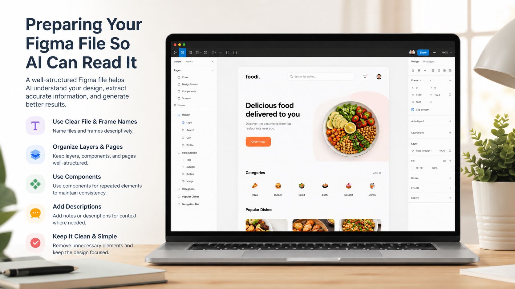
If you're still naming layers by feel, stop. The file should read like a spec, not a mood board.
Choosing How AI Generates the Code
Pick the path that matches your stage
A Figma to live website AI workflow only works if you choose the generation path that fits the job. Teams waste time when they force one tool to cover prompt-first marketing pages, design-aware product builds, and guided import flows at the same time. Each path has a different maintenance cost, and the wrong one erodes design-system integrity.
Path | Best Use Case | Speed | Design System Fidelity | Stage Fit |
|---|---|---|---|---|
Figma Make or Sites | Prompt-first landing pages and fast internal prototypes | High | Medium | Seed-stage marketing pages |
MCP and Dev Mode based tools | Existing product codebases that need design-aware generation | Medium | High | Series A and beyond, especially product surfaces |
Third-party builders | Marketing pages, CMS-driven content, and one-off landing pages | High | Medium to High, depending on setup | Teams that want a guided import flow |
Figma's own AI website-builder flow starts with a prompt. You describe the page, for example a “marketing site for a productivity app,” and AI generates a full-page layout on the canvas. From there, you shape the copy, assets, and structure to fit the brand Figma how to use AI to create a website. Use this path when the page needs to ship fast and the brand system is still simple. It works well for a homepage, a waitlist page, or a campaign landing page. It also works like a disposable first draft, which is fine for early marketing pages and not fine for a product surface that needs long-term consistency.
For teams with a real codebase, I want Dev Mode, design variables, and MCP in the loop. Figma's design-context flow moves from user research in FigJam, to prototyping in Figma Make with the design system as the starting point, then into handoff through Dev Mode, MCP, and design variables so specs, component names, and variables stay attached to the build Figma design context AI. That matters when the product already has implementation rules and every stray override creates future cleanup. It keeps the live site closer to the source of truth, which protects accessibility decisions, spacing rules, and conversion-critical layouts.
Third-party builders fit content-heavy pages, marketing-led sites, and teams that want less engineering overhead. I use them when the goal is a working landing page with fewer rebuilds, not when the page has to stay aligned with an existing component library. They can speed up the first launch, but they also need discipline around tokens, responsive behavior, and copy handling if you want the site to age well instead of drifting.
The AI agent website builder category sits between design import and code generation, so it is worth evaluating if your team wants some guidance without handing over the whole system. For teams deciding how much control to keep, our Claude Code vs Cursor for designers comparison is useful because it frames the tradeoff between design intent, implementation speed, and how much cleanup lands back on design.
Don't overestimate the first pass
Treat the workflow as a loop, not a conversion moment. A published walkthrough of Figma to live site shows the pattern clearly, extract the design, export a component, let AI generate code, make manual tweaks, build the page, push to GitHub, and publish. The demo makes it look tidy. The value comes from how well that loop preserves the system after the first ship.
Here's the rule I use. If the page is mostly marketing and the code can be disposable, start inside Figma or a builder. If the page has to live inside a product system, start with spec-driven generation and keep engineering in the loop from day one. That is how you protect the design system, avoid unnecessary rework, and keep conversion changes tied to a maintainable code path.

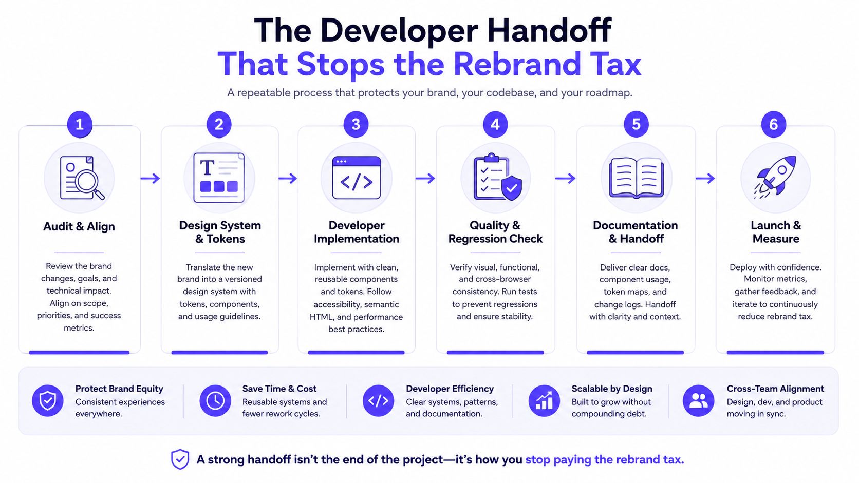
The Developer Handoff That Stops the Rebrand Tax
Make the handoff two-way, not one-way
The old workflow was design hands off to engineering, then engineering ships something slightly different, and design sees it later. That model creates rebrand tax because every revision starts from a disagreement about what the site is supposed to be.
The better workflow is bidirectional. Figma's newer direction around code-to-canvas and canvas-to-code makes that obvious, because teams need to pull running code back into Figma and push changes back without hand-editing CSS when the design has already moved Figma on Claude Code to Figma. That's the only way to keep the live site and the design file from drifting apart after the first launch.
Use Dev Mode, MCP, and variables as your guardrails
Dev Mode should carry specs, component names, and intended behavior into the build. MCP should pull live code context back into the design conversation. Design variables should keep the visual system intact so colors, spacing, and type don't get rewritten during implementation.
The deployment step should be boring. Branch, review, merge, publish. Whether you use Vercel or Cloudflare Pages, the point is the same, design changes should move through Git, not through one-off manual edits in production. That process keeps every change reviewable and every rollback possible.
If a design update can't be traced to a branch, it's too easy to lose.
One practical way to think about this is simple, design stays authoritative on system intent, code stays authoritative on runtime behavior. That split keeps the team honest. It also makes product updates safer because your live page changes in a controlled way instead of by stealth.
925 Studios works in this overlap when teams need one partner to cover product design, brand, and frontend implementation. That matters here because the handoff only stays clean when the same group understands the visual system and the code it becomes.
Testing, Performance, and Accessibility After Generation
AI code ships fast and ships bugs fast. If you skip QA because the page looks “close enough,” you'll pay for it in support issues, slow pages, and a brand that feels less polished than the pitch deck promised.
Use a real QA pass, not a visual glance
Check the page at mobile, tablet, and desktop widths first. Don't just resize once and move on. Look for wrapping issues, button overflow, sticky elements that cover content, and cards that collapse in a way the design never intended.
Then run performance and accessibility checks. I'd treat a 90+ Lighthouse performance score as the target for a startup marketing page, and I'd want zero critical accessibility violations before launch. If the page misses those marks, fix the structure before you polish the animation.
Don't trust Chrome alone
Open the site in Safari and Firefox, not just Chrome. AI-generated CSS can look fine in the browser you used to build it and fall apart elsewhere. That's especially true for custom typography, form states, and layout edge cases that weren't tested against real rendering differences.
Run a broken-link crawl and a quick content check while you're there. Navigation mistakes and dead links are easy to miss when the page looks nice. They're also the kind of mistakes that make a funded startup feel rushed.
If you want a practical note on image payloads and why media weight matters, RankEngine on picture file sizes is a good reminder that large assets drag the rest of the page down. That's one of the easiest places for a nice-looking AI build to get sluggish.
Audit brand fidelity by hand
AI can't reliably judge whether the typography feels slightly off, whether the color usage drifted from the system, or whether a component is visually consistent with the rest of your product. You have to inspect that yourself.
I use three manual questions on every AI-generated page:
Does the type hierarchy still match the brand system?
Are any colors off-token or slightly “almost right”?
Did the spacing change in a way that weakens the conversion path?
Our how to integrate AI in website guide goes deeper on where teams usually overtrust AI. The short version is that the machine can assemble a page, but it can't decide whether the page still feels like your company.
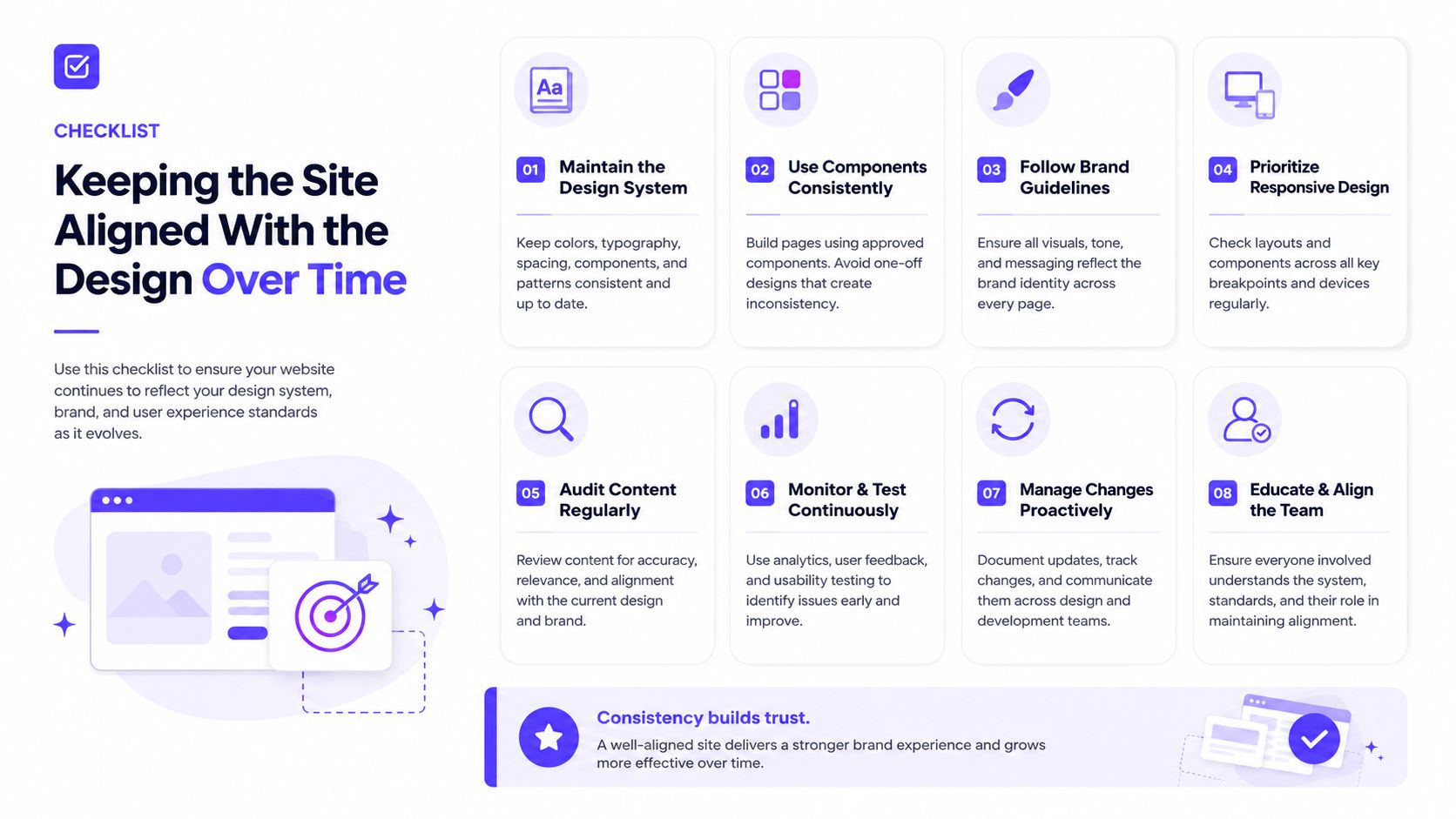
Keeping the Site Aligned With the Design Over Time
The hard part starts after launch. Month one looks great. Month six is where the Figma file has changed, the code has drifted, and someone wants a quick edit that introduces a second visual language.
Treat updates as a maintenance loop
Pin versions between the Figma source and the codebase. If the live site is on one branch of the design system and Figma is on another, the team will start making guesses. Those guesses add up fast.
Keep your design tokens named and enforced so AI can't override them without a review. That includes typography, spacing, color, and reusable states. If the token changes, it should be a deliberate system change, not a side effect of regeneration.
Require a small review on every AI-generated change
Every AI-generated PR should pass the same checklist. The copy must still fit the brand. The motion must not feel noisy. The components must still map cleanly to the library. If the change touches a customer-facing page, a human should confirm that the page still matches the intended conversion path.
Figma's recent movement toward integrated creation inside the design tool makes this even more important, because teams are no longer just converting a frame once. They're generating, revising, and publishing in a loop Builder.io on turning a Figma landing page into a live website. That means quality control has to scale with the workflow, not sit outside it.
AI should accelerate the edit, not replace the review.
That's the maintenance rule I'd give any founder. Keep the design system authoritative, keep the code reviewable, and keep a human in the loop for anything that affects trust.
Your 30-Day Rollout Plan and Common Founder Questions
Week one, audit the Figma file and clean the structure. Week two, generate the first page with the tool that matches your stage. Week three, run QA across devices, accessibility, and browser support. Week four, publish, document the workflow, and assign one owner for future changes.
The goal isn't to “finish” the system in 30 days. The goal is to get the first live loop working so your team can ship without re-litigating the handoff every time.
Common founder questions
How do we keep the site on-brand after multiple regenerations? Lock tokens, pin versions, and require a human review for copy, motion, and component drift.
When should we skip Figma Make and use an external builder instead? When the page is mostly marketing content and doesn't need to stay tightly tied to a larger product codebase.
How do we maintain design-system integrity as the team grows? Keep the file structured, make the code reviewable, and treat every AI output as a draft until QA says otherwise.
If you want this workflow built into a real launch plan, 925 Studios can handle the design, brand, and frontend side as one embedded partner, so the live site, the Figma system, and the shipped code stay aligned. If that's the kind of setup you need, visit 925 studios and start the conversation.


Let’s keep in touch.
Discover more about high-performance web design. Follow us on Twitter and Instagram.

