
Vibe Coding for Designers: Ship Polished UI

Yusuf
Founder and lead designer at 925studios

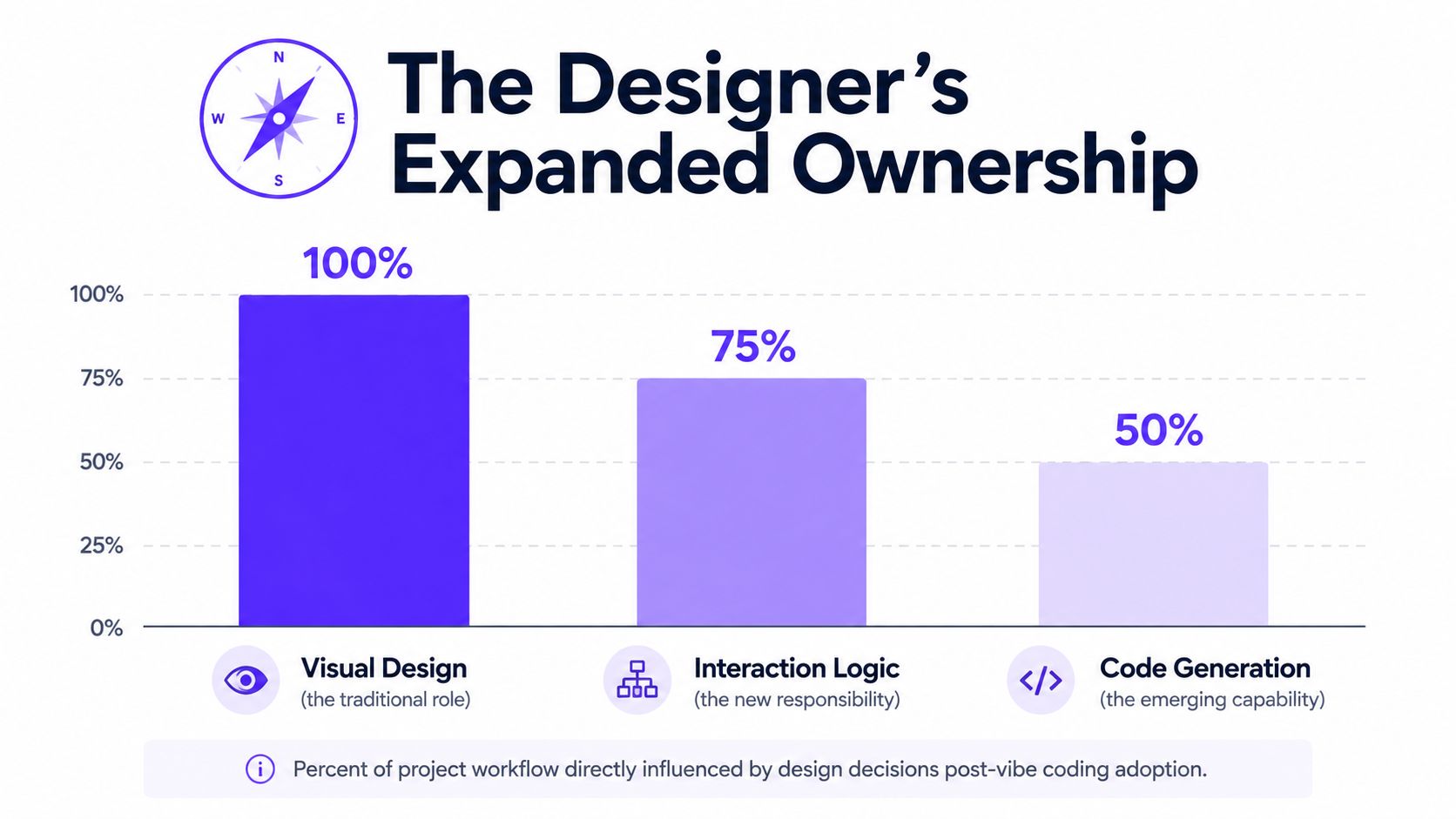
Many teams still treat vibe coding like a faster way to mock up screens. That misses the bigger change. With 41% to 46% of new production code AI-generated globally by 2026 and non-developers making up a large share of users, vibe coding has moved from a side experiment into the part of product creation where designers shape what gets built, not just how it looks. Keyholesoftware's 2026 vibe coding trends report makes the shift hard to ignore, and so does the broader adoption pattern around AI-assisted building.
For designers, that means the job expands into interaction logic, UI behavior, and the rules that keep a product consistent once it's live. In AI SaaS, Web3, and fintech, that matters because teams don't just need ideas faster, they need a testable surface they can trust. The old handoff model slows that down.
Table of Contents
Why Vibe Coding Changes the Designer Role
The common assumption is that vibe coding is mainly a speed tool. That's too small. It changes who owns the first working version of a product, and that changes the designer's scope.
Figma's definition is useful here because it starts with intention, not implementation, and says to begin with a prompt, not a wireframe. That is a different creative posture from the old mockup-to-handoff process. If the first draft can be generated, revised, and tested quickly, the designer's work moves closer to the actual product surface. Figma's vibe coding overview also recommends collaborative vibe checks, which is a good reminder that early feedback should happen before polish, not after it.
Practical rule: if the first version of the UI can be generated in minutes, the designer has to own the rules that keep it coherent.
That shift is already visible in adoption. One 2026 roundup reports that vibe coding tool downloads surged 150% in 2023, GitHub repositories tied to the practice grew 45%, and teams using vibe coding complete prototypes 35% faster. The same source says 28% of developers adopted vibe coding practices since 2022 and users report 65% higher productivity. WorldMetrics' vibe coding statistics roundup points to a workflow that's replacing slow handoff cycles with rapid iteration. That matters for startups shipping dashboards, admin tools, and customer-facing flows where every extra day between decision and test slows learning.
What founders should hear in that shift
A founder deciding between a frontend hire and a design-led build workflow shouldn't frame it as design versus engineering. The question is whether the team needs a separate implementer for the first pass, or whether the design function can shape the product surface directly with AI assistance. For many early teams, especially when the product is still moving, that can mean the designer owns more of the build loop while engineering focuses on deeper logic, integrations, and scale.
The boundary isn't disappearing, it's moving.
That's why vibe coding for designers is becoming a discipline of product definition, not a shortcut around craftsmanship. The teams that win with it are the ones that treat the first generated screen as a working draft with rules, not as disposable output.
The Designer Toolchain for Vibe Coding
A good vibe coding setup starts before the first prompt. The fastest way to get messy output is to throw AI at an undefined visual direction. The safer path is to turn the design into a small system first, then ask the model to build inside that system.
Start with tokens, not screens
A practical workflow is to convert a moodboard into 4 to 8 design tokens first, usually covering color, radius, spacing, and animation duration. That gives the AI a compact rule set to follow. If the token set is clear, the first draft is much less likely to invent random card radii, button spacing, or motion that doesn't belong in the product.
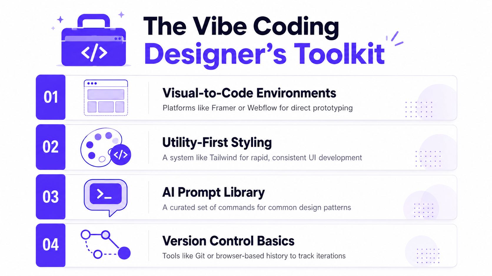
That token-first setup works best when Figma remains the source of design truth and the code layer reads from it. If you're building in a visual-to-code environment like Framer or Webflow, the job is to keep the system small enough that the builder can stay faithful to it. If you're using Tailwind, the utility layer gives you a clean bridge from tokens to implementation. For a deeper comparison of code environments from a designer's point of view, Claude Code vs Cursor for designers is a useful reference.
Build the environment around the workflow
A designer's setup doesn't need to be bloated, but it does need a few basics:
Design tokens: define the visual rules first, then reference them everywhere.
Utility-first styling: use a system like Tailwind to keep spacing and color decisions consistent.
Prompt library: keep reusable prompts for cards, tables, filters, sidebars, and empty states.
Version history: track changes so you can revert the one version that went wrong.
If you want a quick way to verify the claim that visual builders can produce legitimate code-backed sites, the evidence behind V0-built sites is a practical place to look. It's useful not because it sells a tool, but because it shows how often AI-assisted builders are now crossing into real production workflows.
A no-code builder works well when the product is mainly about layout, content, and simple interactions. A code-assisted environment makes more sense when the experience needs richer state handling, API connections, or a design system that has to stay tight across multiple screens. For AI SaaS, fintech, and Web3 products, that line gets crossed quickly.
From Moodboard to Golden Screen
A dashboard prototype usually goes wrong when the team tries to build the whole thing at once. The better move is to make one golden screen, a single surface that defines the product's visual language, component behavior, and state logic before anything else branches out. For a SaaS dashboard, that might be the main overview page with metrics, a primary card type, and one critical CTA.
Figma's guidance to start with a prompt rather than a wireframe fits this well. The prompt should describe the intent of the screen, the kind of user it serves, and the interactions that matter most. Once the first version appears, the designer should name real components explicitly, not generic “blocks” or “sections,” because that forces the AI to think in terms of actual product parts.
A simple dashboard flow that holds up
A strong golden screen usually includes the states a real product needs, not just the happy path. For a billing dashboard, that means loading, error, empty, and success states show up early, even if they're rough. It also means the AI doesn't get to invent new UI patterns every time you add a chart or card.
Start with one screen, one system, one set of states. Anything larger usually becomes cleanup work.
A quick mapping helps keep the visual rules and code aligned. A Tailwind-style card can be kept honest by mapping the design tokens directly into the component:
Design token | UI use |
|---|---|
Color token | Card background, border, text |
Radius token | Card shape, button corners |
Spacing token | Padding, gap, section rhythm |
Motion token | Hover transition, loader timing |
That same discipline is why collaborative vibe checks matter. Designers, developers, writers, and stakeholders should react to the early prototype before visual polish. If the flow is wrong, prettier screens only make the mistake harder to see.
For a creative-team angle on using AI in visual workflows, photo editing for creative teams is a useful adjacent reference, especially if you're thinking about how generated visuals and product UI need to stay consistent.
Prompting Patterns That Prevent Rework
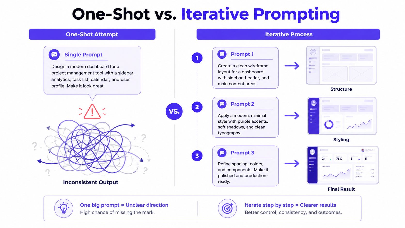
The most common failure mode in vibe coding is simple, asking for too much at once. One giant prompt often produces a screen that looks close enough at first glance, then falls apart when the team tries to maintain it. That's because the model is optimizing for completion, not for a build that can survive revisions.
The fix is to treat prompting as an iterative loop, generate, review, test, refine. The designer stays in control by making one change at a time, saving versions after each successful change, and feeding the model explicit context. That context should include things like PRDs, screenshots, and error details so the AI can work against the actual product, not a vague description.
Good prompts keep the task small
A bad prompt for a table sounds like this, “Build an analytics table for my dashboard with filters, sorting, row actions, responsive behavior, and loading states.” It's broad, and it invites the model to guess.
A better version says, “Build the revenue table only. Use the existing design tokens, keep the header sticky, and add a loading state plus one empty state.” That prompt has boundaries, which makes the output easier to review and less likely to break the rest of the screen.
The same applies to a sidebar. If you ask for the full navigation, account switcher, notification area, collapsed state, and mobile behavior in one shot, you'll usually spend more time untangling inconsistencies than you saved. A vertical slice is safer, because it keeps each iteration shippable rather than half-finished.
Rule of thumb: if you can't review the output in one pass, the prompt is too large.
A structured workflow also benefits from shared planning artifacts and rules. The AI does better when it knows the component naming convention, the layout limits, and the states it must support. For a more tactical view on prompt structure from a design perspective, prompt design as a UX skill is a good companion read.
Keeping AI Output Aligned with Your Design System
Most vibe coding advice stops once the prototype looks good. That's where the governance problem begins. If the output is going to live inside a product team, every screen has to stay aligned with the design system, the component library, and the production rules that stop the UI from drifting.
The safest model is to treat the design system as the source of truth, not the cleanup layer. If the AI creates a button, a table, or a card, that output should map back to a named component with known tokens and known states. That keeps the generated UI from becoming a one-off visual island.
Make the system legible to the AI
Naming matters more than many teams expect. If your Figma component names match the repo names, the model can connect the dots more reliably. If your design tokens are explicit and your components already have consistent props, the AI is less likely to improvise a new shadow, a new spacing scale, or a new empty state style.
Repo-aware AI assistants outperform prompt-only tools. A repo-aware assistant can read the existing patterns, spot the library that already exists, and fit the change into the right place. If you want a practical discussion of why visual consistency breaks when teams let AI freestyle too much, keeping your AI visuals consistent is a helpful reference.
Most importantly, keep the design system visible during review. The designer shouldn't ask, “Does this look okay?” The better question is, “Does this match our named component, our token set, and our production state rules?”
For a deeper process view, design system documentation is the missing habit that keeps a small team from drowning in variations later.
Review rituals catch drift early
A good review ritual is short and specific. Check the generated component against the library, confirm the token values, and test the edge states before anything lands in production. That's especially important when one designer is carrying the system at a seed to Series B startup, because tiny inconsistencies compound fast.
Checkpoint | What to verify |
|---|---|
Component mapping | The generated UI matches an existing component |
Token usage | Colors, spacing, and radius come from the system |
State coverage | Loading, empty, error, and success are present |
Naming | Figma and repo names line up |
Handoff Practices for Teams That Ship Together
The hardest part of vibe coding isn't making a screen appear. It's making AI-assisted changes safe enough for a team to merge repeatedly. Solo prototypes can be loose. Team workflows can't.
That's why handoff needs to be more than a Slack message and a screenshot. The pull request should explain what the AI generated, what the designer changed, and what still needs engineering review. If the reviewer can't tell those three things in a minute, the handoff isn't ready.
Make the pull request do real work
Repo legibility for non-engineers matters here. Designers don't need to become full-time engineers, but they do need enough visibility to understand how the code is organized and where the risk sits. A good PR template should capture intent, edge cases, and the behavior that was tested.
Intent: what the screen or component is supposed to do.
AI output: what the model generated before design cleanup.
Designer edits: what was corrected, tightened, or removed.
Engineering review: what still needs a deeper look.
If the review notes don't describe edge cases, the team is likely shipping a demo, not a product surface.
This is also where a frontend developer still earns their place on complex logic. If the work involves tricky state, nontrivial data flow, or security-sensitive behavior, the designer should not fake confidence. The best use of vibe coding is to let the designer own the surface and the interaction language, then bring engineering in where the logic actually matters.
For teams using a model where one creative partner replaces three separate hires, that boundary is the point. The designer can drive the product shape, the brand feel, and the first implementation pass. The developer can focus on the hard parts that deserve engineering depth. That split keeps the team lean without pretending every problem is the same.
If you want a partner who can turn this workflow into a shipping product, 925 Studios builds the design, brand, and front end together so your team doesn't have to stitch three hires into one outcome. Visit 925 Studios if you're ready to ship a polished dashboard, tighten your design system, or turn an AI product idea into something customers can use.


Let’s keep in touch.
Discover more about high-performance web design. Follow us on Twitter and Instagram.

