
How to Build Design System with AI: SaaS Guide 2026

Yusuf
Founder and lead designer at 925studios

If you're a founder or product leader staring at a growing SaaS or fintech app, the problem probably isn't that your team lacks taste. It's that the product now has too many screens, too many hands touching them, and too many small inconsistencies that keep slipping through. AI can help build a design system, but only if you treat it like infrastructure, not a pile of pretty components.
A lot of teams try to build design system with AI by jumping straight into generation. That usually looks good in a demo, then turns into drift, duplicate patterns, and token chaos once real product work starts. The better move is to make the system machine-readable, token-first, versioned, and governed, so AI can help instead of multiplying inconsistency.
Table of Contents
Prompts, Review Loops, and the Engineering Side of the System
Governance, Drift Detection, and Proving the System Is Working
Why Most AI Design Systems Fall Apart After Launch
A funded startup can ship a polished component library in a few weeks, then watch it drift apart by the next quarter. One team uses the new button set, another keeps building custom screens in a hurry, and a third hardcodes colors because the prompt was faster than the token lookup. The result isn't a failed design system, it's generation speed outrunning governance.
That failure mode shows up everywhere in AI SaaS and fintech products. The first output looks clean, so the team assumes the system is working. Then support docs use one visual language, onboarding uses another, and the dashboard starts to feel like three apps stitched together.
Practical rule: if AI can generate faster than your team can validate, it's not accelerating the system, it's fragmenting it.
An AI-ready design system isn't just a component library with automation sprinkled on top. It's machine-readable, token-first, versioned, and documented, so the rules live somewhere AI tools can use them. That matters because recent guidance is already shifting from static libraries toward infrastructure with metadata, APIs or MCP access, versioning, and validation workflows, which is a much better fit for AI-assisted product work than a folder of screenshots and isolated components, as outlined in emerging guidance on AI-ready design systems.
The old model still dominates a lot of tutorials. It treats a design system like a polished asset library, something you finish, hand off, and hope people use. That's fine for a small team with one designer. It falls apart when product, marketing, and engineering all keep shipping.
925 Studios' documentation guidance is useful here because it treats documentation as part of the system contract, not a separate afterthought. That's the right mental model for founders. If the rules aren't explicit, AI will infer them from whatever is already in the codebase, including the messy parts.
The Four Layers Every System Needs Before AI Touches It
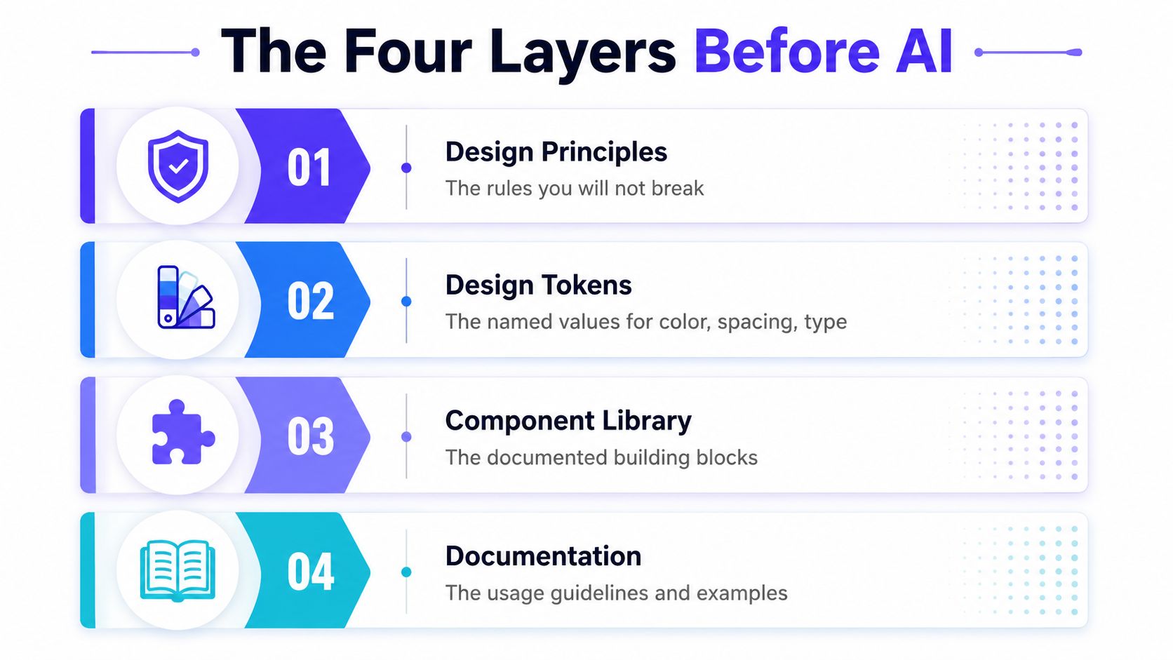
A system that works with AI starts with four layers, and they need to exist before you ask a model to generate anything. Magic Patterns describes those layers as design principles, design tokens, component library, and documentation. That framing is simple, and it's right, because each layer answers a different question about how the product should behave, not just how it should look, as laid out in Magic Patterns' design system guide.
Design principles set the guardrails
Design principles are the rules you won't break. In practice, that means things like staying readable in dense fintech dashboards, keeping destructive actions visually distinct, and not inventing one-off patterns for every team. If principles are vague, AI will happily produce polished nonsense that doesn't match the product's actual tone.
Tokens make the system machine-readable
Tokens are the named values behind the UI, and they should use semantic names, not raw hex codes. In one fintech dashboard, a token like surface.primary made much more sense than a literal color value because AI tools could reason about intent instead of guessing. The same applies to action.danger, text.muted, and spacing names that map to use, not appearance.
Components and documentation turn intent into reuse
The component library is the set of reusable building blocks, buttons, inputs, tables, cards, and nav patterns. Documentation is the contract that tells product and engineering how to use them without remixing them every time. A useful design-system guide from 925 Studios' component thinking helps here, because the win isn't having more UI parts, it's having parts people can trust.
AI amplifies whatever foundation you give it. Clean input produces consistent output. Messy input produces confident, on-brand chaos.
The practical move is to start with an audit, not a blank canvas. Screenshot what exists, name what's repeated, and decide which values are canonical before a model starts generating new parts. That saves rework later, because AI won't have to guess what the system means.
Running the Audit That Makes AI Output Trustworthy
The audit is where teams get disciplined enough to make AI useful. Start by screenshotting every live screen in production, then inventory every color, font size, spacing value, icon size, and button variant already in use. That catalog becomes the source of truth, which is a lot more valuable than a prompt full of opinions.
Capture what the code already does
For each component, don't stop at appearance. Record hover states, focus states, disabled states, and any behavior the codebase already enforces. If the product has a dark mode roadmap, include dark-mode equivalents early so you don't have to revisit the tokens later. That's one of those small decisions that prevents a painful round of rework six months down the line.
A simple naming pattern helps a lot in SaaS interfaces. For a dark dashboard, tokens like surface.primary.dark, surface.elevated.dark, and text.subtle.dark are far easier to maintain than one-off values pasted into components. The point is consistency, not clever naming.
Turn the audit into a reusable inventory
One practical way to run the sequence is audit → tokens → components → generation → documentation. That order matters because AI works best when it's reading a structured catalog, not improvising against a messy codebase. A Figma-based workflow can also start from inspiration boards, then move into generated pages, then system extraction and token refactoring, which is exactly the direction you want when the goal is production consistency.
The same audit mindset works well in product-led fintech and AI SaaS because the live product already contains the design system you have. You're not inventing a new visual language from scratch. You're formalizing the language the team is already using, including the mistakes.
Practical rule: if a value appears more than once in production, it should probably become a token before AI generates anything new.
If you want a deeper process for this part, the step-by-step SaaS UX audit guide is a good companion. The audit isn't glamorous, but it's the thing that keeps the rest of the workflow honest.

Where AI Belongs in the Loop and Where It Does Not
AI is very good at some parts of design-system work and clumsy at others. Use it for generation, review support, and documentation drafts when the system already has clear tokens and patterns. Keep humans in charge of naming, semantics, and edge cases that change the meaning of the system, because those are the places where a model can look right while being wrong.
The strongest evidence for using AI carefully comes from a design-system-specific study that reported organizations can cut design implementation time by 82% while maintaining 94.3% consistency across platforms. The same source estimated a 48% reduction in overall design and development costs and average annual savings of $385,000 for enterprise-scale implementations, with a 156% increase in component reuse, which matters because reuse is one of the main reasons teams build design systems in the first place, as reported in the AI-driven design systems study.
Those numbers are useful, but only when the foundation is already solid. Without a clean token map and a documented review process, AI just creates more inconsistent output faster.
Use AI for generation when the primitives are already defined
If a component maps cleanly to existing tokens and variants, generation is a good use case. That's true for familiar UI like buttons, fields, labels, breadcrumbs, and simple lists. It's also where AI can help a small team move without adding another full-time designer immediately. In that sense, a service like 925 Studios, which covers product design, brand design, and frontend build work in one place, fits naturally into the same conversation as AI because the job is still to ship coherent product surfaces, not just produce assets.
Use AI for linting and review support
AI also works well as a checker. It can scan for token violations, accessibility misses, and mismatched patterns faster than a person scrolling through every screen. That's especially useful on pull requests, where the goal is to catch drift before it lands in production. The review job gets easier when AI is verifying against a catalog instead of inventing a new answer.
Keep humans on the vocabulary layer
Anything that changes the system's language needs a person. That includes token naming, component semantics, and the decisions that define what a new pattern means. Small teams often skip that part because it feels slower than generation, but it's the part that keeps the system coherent when multiple products start sharing the same visual language.
Prompts, Review Loops, and the Engineering Side of the System
The most reliable prompts are boring in a good way. Give the model the Figma file, tell it which tokens to use by name, list the states it has to handle, and require TypeScript output with variants. That lines up with a workflow that starts with a style guide file, extracts values from the source, analyzes component data, implements the interactive component, and then generates documentation for each component.
A good prompt for a new component usually looks like this in practice. Reference the canonical source, name the tokens explicitly, describe all states, and demand proper TypeScript plus a preview that applies the system values. If the component needs interactive behavior, make that part of the ask instead of hoping the model guesses it.
The review loop should be mechanical. Compare the output against the audit catalog, run accessibility checks, and either approve, edit, or regenerate. A useful external resource here is the guide to AI technical writing, because the same discipline that keeps generated docs accurate also keeps generated UI instructions from drifting into vague prose.
Treat the codebase like the real source of truth
The engineering side is where the design system becomes real. Static libraries are easy to admire, but 2026-era systems need metadata, MCP access for AI tools, versioning, and validation workflows so models can consume the system instead of approximating it. That shift matters because AI doesn't follow intent, it follows what the repository makes easy to find and hard to break.
A practical way to think about this is simple. If the code enforces the standard, the model learns the standard. If the code tolerates shortcuts, the model will copy the shortcuts. That's why prompts alone aren't enough.
Use the prompt to ask for the right thing. Use the codebase to make the wrong thing fail.
Governance, Drift Detection, and Proving the System Is Working
Once the system is live, governance becomes the primary product work. Decide who owns tokens, who can add a component, how changes get reviewed, and how AI tools are allowed to touch the system. If those rules are vague, drift sneaks in through small exceptions that look harmless at the time.
Drift detection should be part of the workflow, not an annual cleanup project. A live product flow can be audited for token violations, missing accessibility attributes, and stale screenshots in documentation. That keeps the system tied to reality instead of whatever the docs looked like when the sprint ended.
Measure what founders actually need to know
The metrics that matter most are adoption rate, rework rate, time to merge, and accessibility scores. Adoption rate tells you how much shipped UI comes from system components. Rework rate shows how often teams override the system. Time to merge reveals whether the process helps product velocity or slows it down, and accessibility scores show whether consistency is also usable.
For governance structure, it helps to study adjacent frameworks outside design. Enterprise governance with digna is a useful reference because it treats ownership and review discipline as operating rules, not decoration. That's the right mentality for design systems too.
Read the system like a product
A design system has users. Product designers, engineers, marketers, and sometimes founders all depend on it. If they don't trust the tokens or can't find the right component, they'll go around the system, and the system will start losing relevance.

If the system can't show who owns what and what changed last, it's not governed. It's just documented chaos.
The 30 Day Plan to Ship Your First AI Ready System
Start narrow. One product flow or one component family is enough for the first month, because incremental implementation makes drift easier to control and makes AI output easier to align with existing standards. Trying to build the whole library in one sprint is how funded startups end up with a half-finished system nobody fully trusts.
Week | Focus | Output |
|---|---|---|
Week 1 | Audit the live product | Screenshot inventory, token list, component map |
Week 2 | Define tokens | Named values for color, spacing, type, radius, shadows, motion |
Week 3 | Generate one component | AI-assisted component reviewed against the catalog |
Week 4 | Add governance and metrics | Ownership rules, review flow, basic dashboard |
Week by week, keep the scope tight
Week one is about the audit. Collect screenshots, values, variants, and behavioral states from the live product, then decide what's canonical. Week two is for tokens, and the goal is to make the first set complete enough that AI doesn't have to invent names to keep moving.
Week three is the first AI-generated component, but only one. Review it against the catalog, test it, and make sure it matches the system before expanding. Week four adds governance and a first metric dashboard so you can see whether the system is being used.
The cleanest rollout is usually foundation first, then shell, then each feature section in order, with every milestone implemented, reviewed, and tested before the next one starts. That approach reduces drift, keeps the model inside the boundaries you've defined, and gives the team proof before you scale the work. The goal isn't a finished system on day 30. It's a system that survives real product work without falling apart.
If you're trying to build design system with AI and want it to hold up in a real SaaS or fintech product, 925 Studios can help with the design system, the brand layer, and the frontend implementation in one workflow. Visit 925 Studios if you want one partner to shape the tokens, components, and shipped interface instead of stitching that work together across three separate hires.


Let’s keep in touch.
Discover more about high-performance web design. Follow us on Twitter and Instagram.

