
Vibe Coding for Designers: A Practical Workflow Guide

Yusuf
Founder and lead designer at 925studios

You paste a polished Figma frame into an AI coding tool, describe the interaction you want, and a working React component appears minutes later. It looks close enough to show a founder, close enough to test with users, and sometimes close enough to ship. Then the edge cases arrive: the empty state is missing, keyboard navigation breaks, the type scale drifts, and the component doesn't match the rest of the product.
That gap defines vibe coding for designers. It isn't magic, and it isn't just no-code with a new name. It's a controlled way to move from design intent to interface code through conversation with AI, while the designer remains responsible for decisions, constraints, and review.
For AI SaaS, Web3, and fintech teams, the value is practical. A designer can explore a product flow, build a credible frontend draft, and test interaction ideas without waiting for a complete engineering cycle. The risk is equally practical. A polished screen can conceal weak product logic, inaccessible controls, security problems, and code that becomes expensive to maintain.
Table of Contents
What Vibe Coding Actually Means for Designers
A designer starts with a frame for a fintech dashboard. The screen has a left navigation rail, a balance summary, a transaction table, and a primary action for connecting an account. Instead of stopping at a static handoff, the designer gives an AI coding tool the layout, the component rules, and the intended behavior. The tool returns a working React screen with routes, buttons, loading states, and sample structure.
That workflow is vibe coding for designers. The designer describes what the interface should communicate and how it should behave, then uses AI to generate and revise the implementation. The designer still decides whether the hierarchy works, whether the brand feels credible, and whether the flow makes sense for a real customer.
A generic no-code builder usually asks you to assemble predefined blocks inside a constrained editor. Vibe coding gives you more control over the structure and the code, but that freedom creates responsibility. You aren't just selecting a card component. You're deciding how the card behaves, which data it accepts, what happens when data fails, and whether another person can safely extend it.
The workflow has changed, not disappeared
Traditional handoff creates a boundary. Design happens in Figma, requirements are documented, and engineering translates the work into a product. That process still matters for complex systems, but AI can reduce the distance between those activities. A designer can now test a layout with realistic interactions before asking engineering to harden the implementation.
The shift became especially visible as designers expanded their AI toolkits. A 2026 design report found that designers had increased their average AI toolkit from three tools to seven tools, while 91% used AI weekly and 75% used it daily. The same report found that half had pushed frontend or backend code, as documented in research on how AI is reshaping design in tech.
That doesn't mean every designer should become a full-stack engineer. It means the design role can include more direct contact with the working interface. A useful starting point is this guide on whether designers should learn Claude Code, especially if you want to understand where design judgment ends and engineering ownership begins.
Practical rule: Use AI to shorten the distance between an idea and a testable interface. Don't use it to avoid making the decisions that give the interface value.
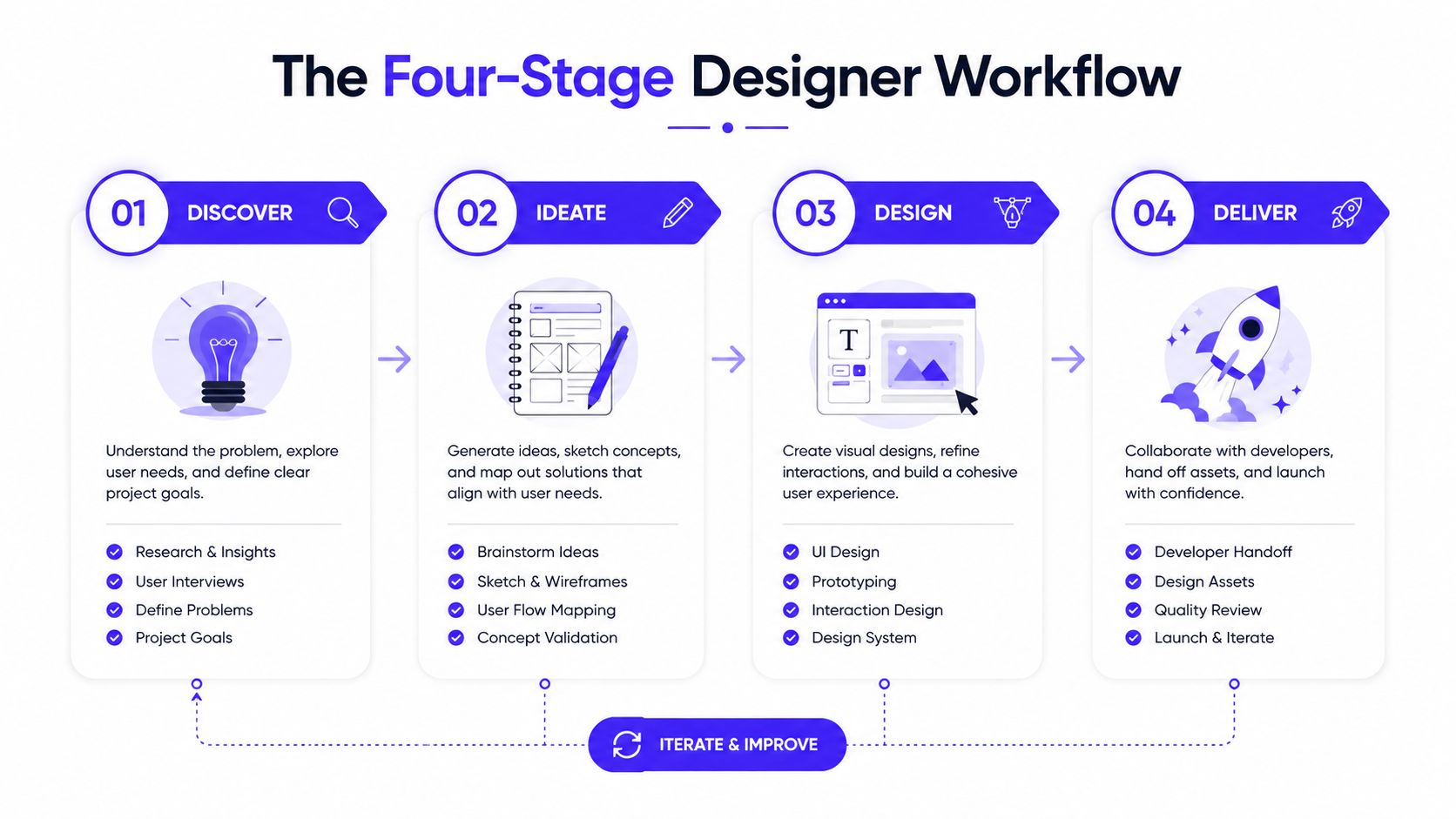
The Four-Stage Designer Workflow
A reliable workflow starts before the first prompt. In a 2026 UX study of 20 professionals across enterprises, startups, and academia, researchers described vibe coding for UX work as a loop of ideation, AI generation, debugging, and review. The process isn't fully automatic. Manual verification and refinement remain part of professional practice, as detailed in the UX study of vibe coding.
Start with intent
Before generating anything, write down what the user needs to accomplish. Include the user, the context, the primary action, the information hierarchy, and the constraints. “Build a dashboard” is too vague. “Build a first-session dashboard for a finance manager who needs to connect a data source, understand current cash position, and find recent anomalies” gives the tool something useful to work with.
Add the design direction in plain language. Name the visual tone, layout rhythm, responsive behavior, content density, and states the screen must support. If the flow has permissions, mention them before the tool invents a single-user experience.
Generate a narrow draft
Ask for one screen or one meaningful flow at a time. A narrow prompt makes it easier to judge the output and prevents the tool from creating a large, inconsistent application before you've validated the foundation.
Give the tool existing components when you have them. If the project already uses a button, modal, table, or form pattern, ask AI to use those rather than creating replacements. For ecommerce teams, the same principle applies to an end to end theme development process. A clear system gives generated work a stable base.
Debug against constraints
Don't only ask whether the screen looks good. Check whether the layout responds correctly, whether the form validates, whether the controls work with a keyboard, and whether the content remains understandable when values are long or unavailable.
Ask the tool to list the states it implemented and the states it hasn't implemented. That question often exposes missing loading, error, permission, empty, and confirmation states faster than a visual review.
Review before handoff
Review the result as a product designer, not just as a person checking pixels. Compare the generated interface with the intended hierarchy, brand rules, interaction model, and accessibility requirements. Then decide what belongs in the prototype, what needs manual correction, and what must move to engineering.
The strongest loop is short and repeatable: define intent, generate a small slice, test it against constraints, and refine it. The tool writes code, but the designer owns the quality bar.
Picking the Right Tool for the Job
The right tool depends on where the work already lives. If you have a repository and need to adjust a component, a code editor with an AI agent is more useful than a screen generator. If you need to explore a dashboard from a rough description, a visual generation tool can get you to a reviewable direction sooner.
Tool | Best workflow stage | Typical output for designers |
|---|---|---|
Cursor | Component editing and repository-based iteration | Changes to existing React components, styles, and flows |
v0 | Early screen and layout exploration | Marketing pages, dashboard scaffolds, and UI concepts |
Lovable | Full-screen generation from rough product intent | Shareable product prototypes with multiple connected views |
Bolt | Rapid interface experimentation | Browser-based app drafts and interactive screens |
Replit | Lightweight prototypes that need a backend | Shareable prototypes with simple data and server behavior |
Use Cursor when the system already exists
Cursor makes sense when you're working inside a real codebase. You can point it toward a specific component, explain the visual issue, and ask for a contained change. That makes it useful for spacing fixes, responsive behavior, form states, and component variations.
It also demands more judgment. A designer needs to understand the project structure well enough to know whether a change belongs in a component, a token, a layout wrapper, or a route. The tool can suggest the change, but it can't decide whether the existing architecture should remain intact.
Use v0 for fast structure
v0 works well when you want to turn a written description into a first-pass marketing section, dashboard, or form. It can help answer structural questions early, such as whether a dense table should be replaced by a summary plus drill-down flow.
The output is a starting point, not a finished brand system. Expect to replace generic copy, refine spacing, connect real components, and remove patterns that don't fit the product.
Use Lovable, Bolt, or Replit for broader experiments
Lovable and Bolt are useful when the question involves more than one screen. They can help a designer test navigation, onboarding progression, and connected states from rough intent. Replit is a better fit when the prototype needs lightweight data behavior or a shareable environment rather than a static frontend.
A repository workflow may be more appropriate once the concept has survived review. This comparison of Claude Code and Cursor for designers can help clarify whether you need an agent working in an existing project or a tool focused on generating a new surface.
925 Studios can also cover the product design, brand identity, design system, and frontend implementation when a startup needs one creative partner instead of separate design and development hires.
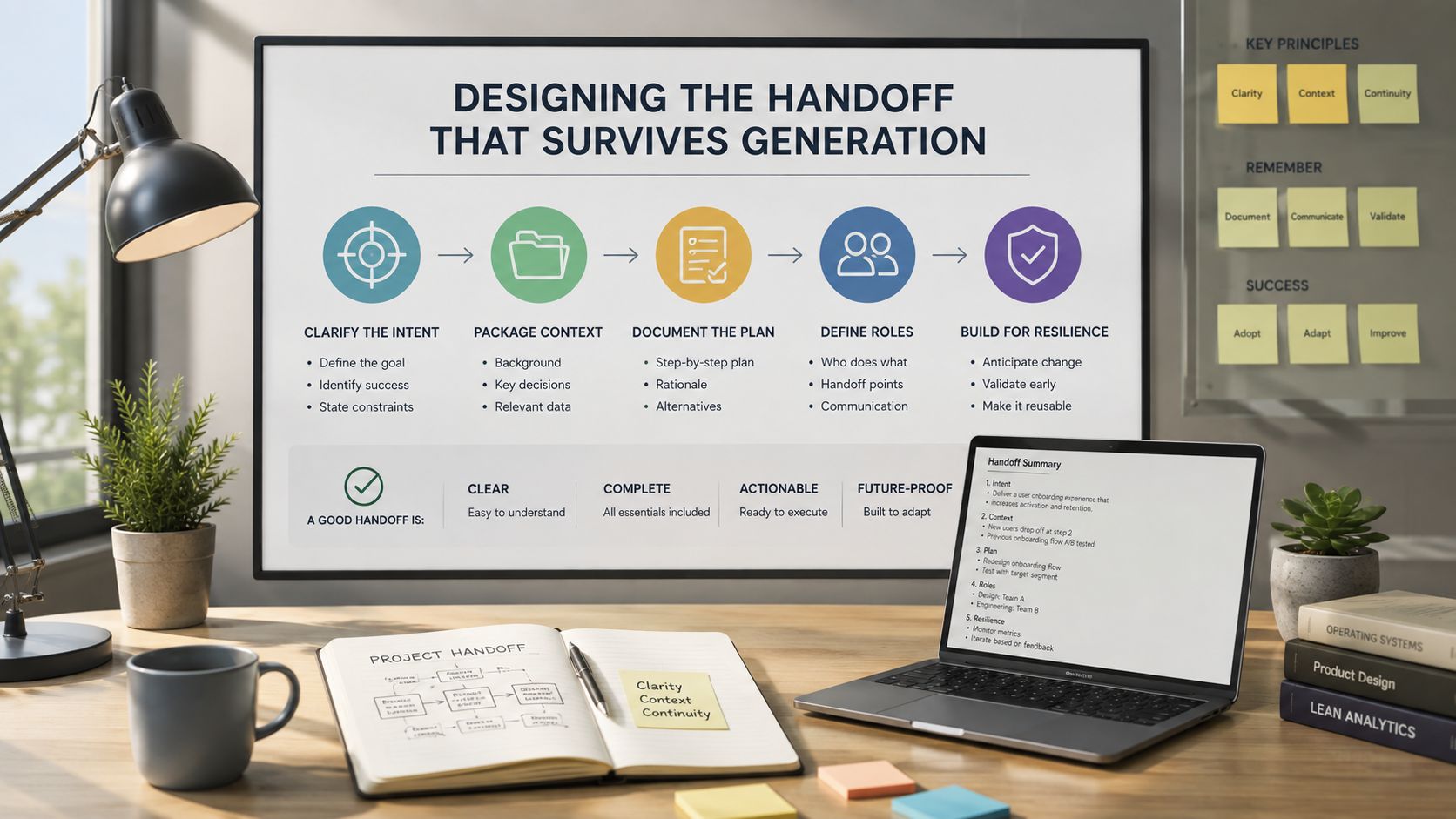
Designing the Handoff That Survives Generation
Most AI-generated interfaces look inconsistent because the design system is inconsistent, not because the tool lacks imagination. A prompt can't reliably preserve a visual language that exists only as scattered Figma frames, personal preferences, and comments.
Give the tool a usable surface to work within. That usually means design tokens, a small component library, and a few layout primitives that describe how the product is assembled.
Turn visual decisions into tokens
A token file gives names to decisions that would otherwise be repeated in prompts. Use tokens for color, typography, spacing, radius, shadows, and surfaces. Tailwind can then reference those values instead of letting every generated component invent its own version of blue, gray, or padding.
A small example might look like this:
The names matter more than the syntax. rounded-card, bg-surface, and p-space-lg tell the generator that these values belong to a shared system. Without that shared vocabulary, AI tends to produce locally reasonable choices that become globally inconsistent.
Keep the component set small
A designer doesn't need a huge library before starting. A compact set of tested primitives is more useful: button, input, card, modal, table, badge, navigation, and responsive container. Radix or shadcn can provide accessible foundations, while your own tokens and composition rules make the result feel specific to the product.
Write down when each component should be used. Tell the AI which button is primary, which states exist, and which components must not be duplicated. A deeper guide to building a design system with AI can help teams formalize those rules.
A good prompt surface works like a Figma library. It limits random choices so the designer can spend time on product decisions.
Describe layout primitives explicitly
Name the patterns you want the tool to reuse. “Use a centered content container with a two-column responsive grid” is more useful than “make it clean.” “Keep the action row aligned to the card footer on desktop and stack it on narrow screens” gives the implementation a testable rule.
The goal isn't to remove creativity. It's to prevent accidental variation from becoming the product's visual language.
Building a Real Screen With Vibe Coding
A useful test is an onboarding screen for an AI SaaS product that helps fintech teams analyze financial data. The user has just created an account and needs to connect a data source before seeing the main dashboard.
The first prompt should describe the job, not just the visual composition:
Build a responsive onboarding screen for a fintech analytics product. The user needs to connect a data source before entering the dashboard. Show a progress indicator, a short explanation of why the connection is needed, one primary connection action, a secondary option to continue with sample data, and clear loading, success, error, and empty states. Use the existing design tokens and components. Don't invent financial results or imply that sample data is real.
That prompt gives the tool a product context, a hierarchy, and boundaries. It also blocks a common failure, fabricated metrics that make a prototype look more complete than it is.
The first pass is structural
The generated screen might produce a top bar, a centered card, a connection button, and supporting text. That is enough to evaluate the core arrangement. At this stage, don't spend time tuning a shadow while the user's next action remains unclear.
Check four questions:
Can the user explain the next step? The primary action should be visually and verbally obvious.
Does the screen establish trust? A fintech product should explain what connection means without making unsupported security claims.
Does the layout adapt? The card, progress indicator, and actions need a sensible narrow-screen arrangement.
Does every state have a place? Loading, failure, cancellation, permission denial, and successful connection shouldn't be afterthoughts.
The designer makes the expensive corrections
The first refinement usually involves spacing rhythm and type scale. Generated screens often use too many sizes and inconsistent gaps, which makes the interface feel assembled rather than designed. Replace one-off values with the token system and make the hierarchy visible through deliberate contrast.
Then rewrite the microcopy. “Connect your financial data” may be accurate but incomplete. “Connect a data source to review cash flow and anomalies in one place” explains the outcome without promising a result the product can't guarantee.
The primary CTA needs a small interaction. On activation, show a clear progress state, preserve the button width, and prevent duplicate submissions. On success, provide a confirmation that explains what happens next. On failure, show what went wrong and offer a recovery path instead of just rendering a red message.
Review the boundary conditions
Ask AI to enumerate the states, then test each one manually. Try a long institution name, a failed connection, a slow response, a user without permission, and a user who chooses sample data. Check that the screen doesn't expose fake chart values or imply that the data source connected when it didn't.
The final pass isn't a cosmetic cleanup. It's where the designer verifies that the generated interface reflects the product's actual promise. Engineering can then receive a smaller, clearer implementation target rather than a beautiful screen with hidden ambiguity.
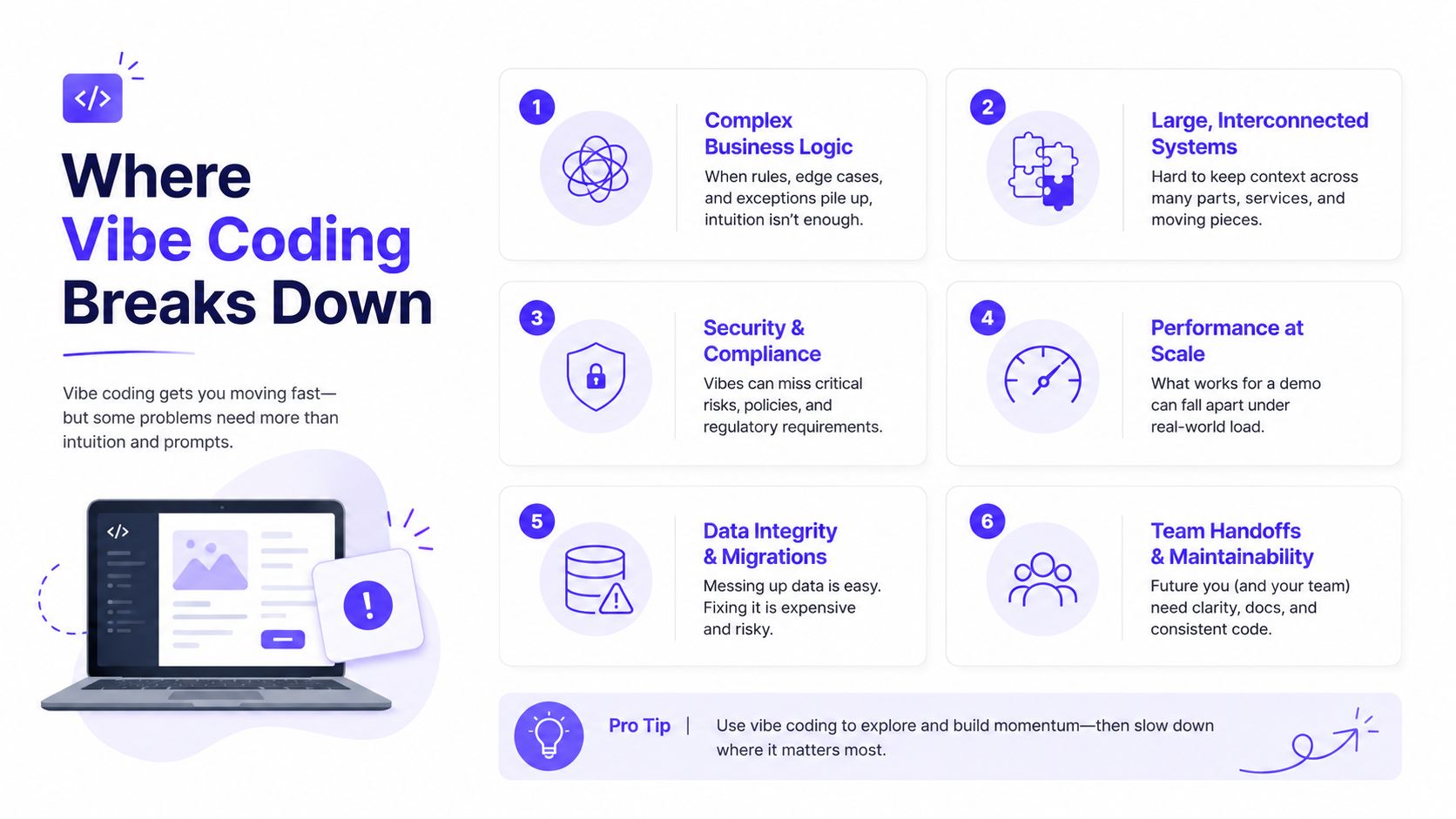
Where Vibe Coding Breaks Down
Vibe coding fails most dangerously when the output looks finished. A polished card can contain incorrect logic, a familiar form can omit an important state, and a clean interface can ship a security weakness that isn't visible in the browser.
The evidence supports caution. A 2025 systematic review of AI-generated code bugs found that functional bugs appeared in 78% of the studied papers and covered 270 specific bug instances, according to the systematic review of AI-generated code bugs. For designers, that means visual review can't be the only review.
The interface can hide functional failure
Generated code may show the right button while failing to handle duplicate clicks, invalid input, stale data, or permission changes. Ask AI to describe the underlying state machine in plain language. Then test each state with realistic values rather than relying on the happy path.
The maintenance problem also grows over time. An empirical study of AI coding assistants reported 484,366 distinct issues across real repositories. Code smells represented 89.3% of those issues, more than 15% of commits from every AI coding assistant introduced at least one issue, and 22.7% of AI-introduced issues remained in the latest repository version, as reported in the empirical study of AI coding assistant issues.
That isn't a reason to avoid generated code. It is a reason to require ownership, review, and cleanup before a prototype becomes a product dependency.
Accessibility needs deliberate testing
AI often adds a visible label and assumes the job is done. It may still produce weak focus states, incorrect heading structure, poor contrast, inaccessible menus, or interactions that depend on hover. Run keyboard checks, inspect focus order, test zoom, and use a screen reader for important flows.
Designers are well positioned to catch these issues because they understand the intended interaction. They still need to verify the implementation in the browser, not only in Figma.
Security and product logic stay with engineering
A 2026 security analysis reported that Veracode tested over 100 large language models on security-sensitive coding tasks and found 45% of AI-generated code samples introduced OWASP Top 10 vulnerabilities. The same analysis reported a 72% failure rate for Java, as summarized by the Cloud Security Alliance security analysis.
Don't let a designer-owned prototype handle authentication, payments, sensitive financial data, authorization, or compliance logic without technical review. AI coding tools can accelerate the interface around those systems, but they shouldn't become the only authority on whether the systems are safe.
When a Designer Should Own the Build
A designer can usually own the first version of a marketing site, an onboarding flow, a static dashboard concept, or a low-risk internal tool. The designer should define the experience, generate the frontend draft, test the important states, and hand over a clear implementation when production concerns exceed the prototype's scope.
Engineering should own authentication, payments, permissions, data correctness, security-sensitive integrations, and compliance requirements. That division protects both speed of exploration and product reliability.
For AI SaaS, Web3, and fintech startups, the practical model is shared ownership. The designer controls the user experience and brand expression. Engineering controls the systems where an incorrect result creates financial, legal, or operational risk.
925 Studios works in that space as one creative partner covering product design, brand design, design systems, and frontend development, so founders can coordinate one team instead of hiring three separate roles. The decision checklist is simple:
Vibe code it: Marketing pages, early flows, visual experiments, and low-risk frontend surfaces.
Review it together: Shared product screens, integrations, complex states, and anything entering a real repository.
Hand it to engineering: Auth, payments, permissions, sensitive data, compliance, and production-critical logic.
If your AI SaaS, Web3, or fintech product needs a coherent brand, usable product interface, and frontend that can move from generated prototype to shipped experience, 925 studios can cover product design, brand identity, design systems, and implementation as one creative partner. Visit 925 Studios to discuss the screen or workflow you need to build next.


Let’s keep in touch.
Discover more about high-performance web design. Follow us on Twitter and Instagram.

