
How to Build Design System with AI in 2026

Yusuf
Founder and lead designer at 925studios

A Series A fintech can have talented designers and still ship a fragmented product. One squad builds a button with a familiar blue, another copies an older variant, and a third pulls a nearly identical component from a Figma library that forked months ago. The team isn't failing because nobody cares about consistency. They're failing because every screen creates another manual decision.
That's where AI changes the practical case for a design system. The useful role isn't autonomous component generation. AI can help draft tokens, inspect interface drift, write usage guidance, compare releases, and surface accessibility risks, while people decide what belongs in the product. This guide shows how to build design system with AI around that operational layer, from scope and tokens to components, documentation, governance, rollout, and maintenance.
Table of Contents
Why AI Changes the Math on Building a Design System
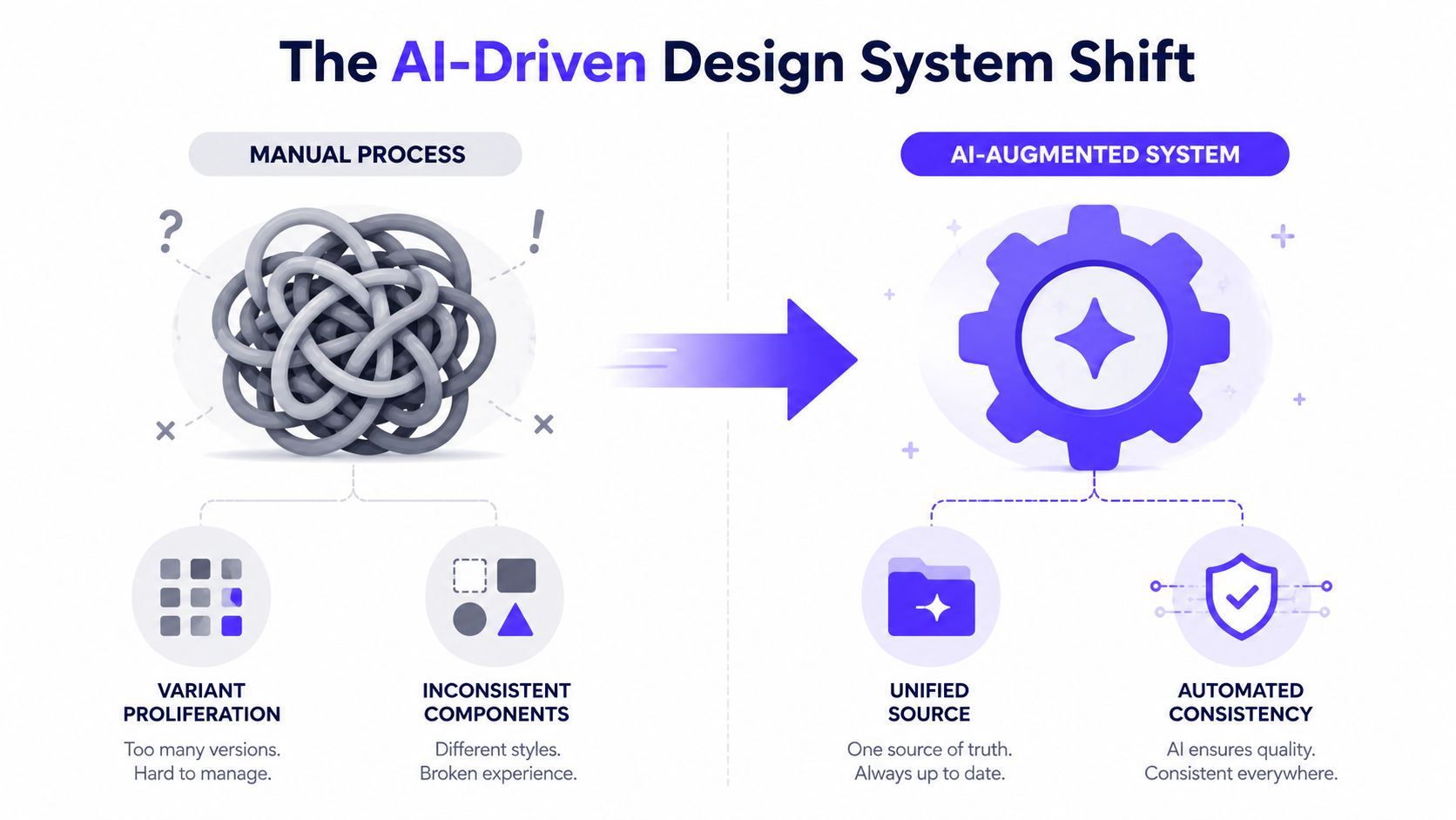
A growing fintech can have a two-person design team supporting five product squads, with each squad shipping screens every week. One button appears in four variants. The dashboard uses one gray scale and the marketing site another. Engineers ask which modal is current, while designers spend mornings answering questions that should have been settled once.
AI changes the economics by reducing the operational work around the system. It can draft documentation, check token usage, find duplicate values, prepare change summaries, and flag likely drift. Component generation is only one input. Used without constraints, it can add more inconsistent variants instead of removing them.
That distinction matters. In zeroheight's 2026 State of AI in Design Systems survey, 82% of design system teams said they use AI in some form, 61% said usage increased significantly, and 50% reported real problems from shadow AI. The same report found that 63% were most satisfied with AI for writing documentation. Documentation is not glamorous, but it is often the first place where AI produces useful, reviewable work.
The operational layer comes first
A broader 2026 design tools survey reported 88.7% AI adoption among agency design leaders, with 75.2% of AI usage focused on text-based work such as copy, documentation, and content generation. The finding does not show that AI can replace product judgment. It shows where teams are already finding practical value.
For a startup, this changes the cost of maintaining consistency. A model can inspect a large token file faster than a person can review every entry. It can draft component guidance from typed props, compare a new screen with canonical patterns, and identify likely drift before release.
The strongest workflow has clear ownership:
People define intent: Product, brand, accessibility, and interaction decisions remain with the team.
AI handles repetition: Drafting, classification, comparison, and documentation become assisted tasks.
The toolchain enforces rules: Types, linters, tests, and Storybook keep invalid output from becoming the default.
That operating model shapes the rest of the build. Scope the system before prompting. Encode brand decisions in tokens. Build components against those tokens. Publish documentation where people and AI tools can find it. Add governance before the library becomes a collection of unreviewed outputs.
Scope the System and Write the One-Page AI Brief
Don't open ChatGPT or Claude before deciding what the system is responsible for. A model can produce a polished answer to an undefined question, and that answer can send the team in the wrong direction with impressive confidence.
Start by naming the surfaces the system covers. Separate the web application from the marketing site, mobile product, and internal admin tools. Then identify the product line that ships first. A fintech may begin with the authenticated dashboard, while an AI SaaS company may start with the workspace and billing flows. The first release should solve a real delivery bottleneck, not attempt to standardize every surface at once.
Define the minimum useful scope
For a practical v1, make these components essential:
Button: Actions, hierarchy, loading, disabled, and destructive states.
Input: Labels, help text, errors, validation, and focus behavior.
Select: Native or custom interaction rules, keyboard behavior, and empty states.
Modal: Focus management, dismissal, responsive behavior, and confirmation patterns.
Table: Dense data, sorting, filtering, pagination, and responsive treatment.
Toast: Success, warning, error, duration, and dismissal behavior.
Card: Informational, interactive, and grouped-content patterns.
Your one-page brief should give AI enough context to make useful drafts without pretending the model owns the decisions. Include brand voice adjectives, approved and forbidden color behavior, typography references, microcopy tone, the accessibility floor of WCAG 2.2 AA, and patterns the product won't use.
Paste this prompt into ChatGPT or Claude:
Act as a senior product designer and design-system editor. Using the attached product and brand context, draft a one-page AI design-system brief with these headings: product surfaces, first-release scope, brand voice, color rules, typography rules, microcopy tone, WCAG 2.2 AA requirements, forbidden patterns, open decisions, and human approval gates. Separate confirmed decisions from recommendations. Do not invent brand values, component behavior, or accessibility results. Mark missing information as an open question.
Turn the brief into a working checklist
A second prompt can convert prose into something the team can execute:
Convert this design-system brief into a scope checklist. Group items under surfaces, foundations, components, documentation, engineering integration, accessibility, governance, and rollout. For each item, include owner, input required, acceptance test, and status. Remove anything that isn't necessary for the first release. Return unresolved assumptions separately.
Keep the stack straightforward. Figma with Tokens Studio can manage design variables and token relationships. Style Dictionary can transform structured tokens for code consumption. Storybook 8 can provide the component reference, interaction examples, and documentation surface. The exact stack can vary, but the principle shouldn't: store decisions in structured files that tools can validate, not only in a long page of prose.
Generate Tokens, Color, Type, and Spacing With AI
Tokens are where AI-assisted systems either gain structure or create decorative noise. Ask a model to generate a new color for every component and you'll get a collection of locally reasonable decisions that don't belong to one product. Ask it to create a controlled foundation and semantic aliases, and you have something the team can audit.
Use a prompt that makes the constraints explicit:
Using the attached design-system brief, generate a Style Dictionary JSON foundation. Create a 10-step neutral color ramp, a primary brand ramp with accessible contrast pairs, a modular type scale using a 1.250 ratio with a 16px base, and an 8px spacing scale. Also create radius and shadow tokens. Separate primitive tokens from semantic aliases. Use semantic keys such as color.text.primary, color.surface.default, color.border.subtle, and color.action.primary. Do not create component-specific ramps. Flag any contrast pair that requires human verification.
A response might produce a structure like this:
Category | Example Key | Value | Purpose |
|---|---|---|---|
Color |
|
| Main content text |
Typography |
|
| Default reading size |
Spacing |
|
| Common layout gap |
Radius |
|
| Inputs and buttons |
Shadow |
|
| Raised content surface |
The values in that table are examples of token structure, not a substitute for the brand brief. Your team still needs to choose the actual color values, typefaces, and shadow treatment. AI is useful for creating the initial schema, naming candidates, and spotting inconsistencies across a file.
Audit tokens instead of trusting them
Run a separate audit prompt after generation:
Audit this token file against WCAG AA requirements. Check every declared foreground and background pairing using calculated contrast, not visual approximation. Flag near-duplicate hex values, primitive values used directly in components, semantic aliases with unclear intent, missing dark-mode mappings, and names that describe appearance rather than meaning. For every issue, show the token path, explain the risk, and propose a replacement. Do not claim a contrast result unless you calculate it from the supplied values.
That last sentence matters. A language model can describe a contrast ratio without checking the math. Connect the audit to a contrast checker or automated test, then ask the model to explain the output in plain language.
Practical rule: Semantic tokens are the unit of consistency. Literal values belong in the foundation, not scattered through component files.
Store tokens in version control, connect them to Figma variables, and generate platform outputs from the same source. When the brand changes, the team should update the semantic mapping once instead of hunting through screens for isolated hex values.
Build Components in Figma and Export to Storybook
A component becomes useful when designers and developers can use the same decision without translating it by hand. Start in Figma with token-bound variables, auto-layout, named properties, and states that reflect real product behavior. Don't create a visual master component and leave the interaction model for engineering to guess.
For a button, use a prompt like this:
Define a Button component for a fintech web application. Create six variants: primary, secondary, tertiary, destructive, loading, and disabled. Specify hover, focus-visible, pressed, and default states. Use semantic color and spacing tokens only. Include label behavior, an optional icon slot, minimum target size, keyboard interaction, loading behavior, and WCAG 2.2 AA considerations. Return a Figma variant matrix, prop contract, accessibility notes, and Storybook story list. Mark any decision that requires product approval.
Bind the resulting properties to Figma variables so spacing, color, type, radius, and state behavior stay connected. Then compare export paths rather than assuming a one-click result will be production-ready:
Figma Dev Mode with Tokens Studio: Good for inspecting token use and supporting a controlled React handoff. It still needs engineering judgment around APIs and behavior.
Anima: Useful for generating an initial implementation from visual layouts. Complex variants and application state usually need cleanup.
Locofy: Helpful for scaffolding screens and Storybook-oriented output. It can struggle when a design uses conditional props, advanced responsive behavior, or custom interaction logic.
The handoff checklist should include the details screenshots can't communicate:
Prop contract: Define valid combinations and defaults.
Icon slot: Specify placement, sizing, and accessible labeling.
Dark mode parity: Map every semantic token to an intentional dark treatment.
Accessibility attributes: Include roles, labels, focus behavior, and state announcements.
Storybook documentation: Generate MDX from component descriptions, then have a person verify every example.
For experiment-driven product teams, component consistency also supports cleaner testing. Before changing a shared pattern, use a resource such as A/B testing best practices for teams to separate a component change from a weak test design.
Teams using Figma and coding agents can also review how to use Figma MCP with Claude Code when they need a more direct design-to-code workflow.
Use this prompt to refactor an existing screen:
Inspect this screen and map each element to the canonical design-system components. Replace one-off buttons, inputs, cards, modals, and tables with approved components. Preserve content and behavior. Report every element that has no suitable component, every hardcoded value, every accessibility concern, and every proposed new component. Do not create a new component without explaining why an existing one cannot support the use case.
Automate Documentation, Audits, and Changelogs
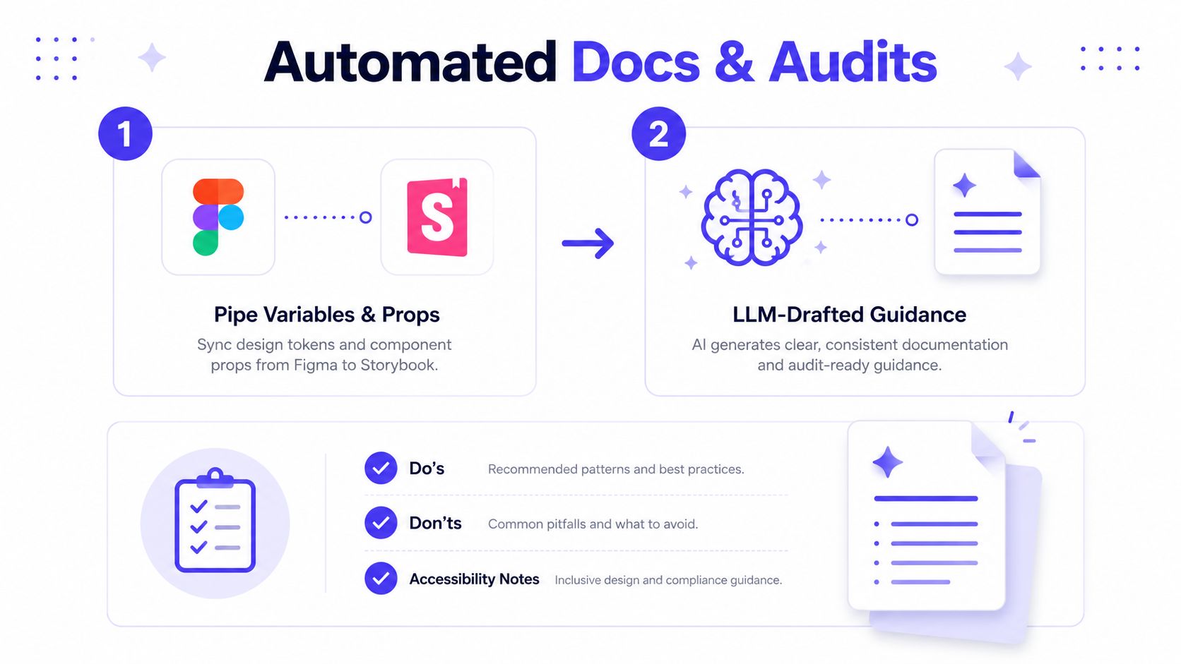
Documentation shouldn't be a wiki page that somebody updates after a release if they remember. Pipe Figma variables and component props into Storybook MDX, then let an LLM draft the explanation around structured inputs. The model can turn a TypeScript interface into usage guidance, do and don't examples, code snippets, and notes about states without requiring a writer to start from a blank page.
Use a prompt like this:
Using the supplied component description, TypeScript props, token references, Storybook stories, and interaction tests, draft developer documentation. Include purpose, when to use, when not to use, anatomy, prop examples, states, accessibility requirements, responsive behavior, and do and don't guidance. Never invent a prop, behavior, browser result, or test outcome. Mark missing evidence as “needs verification.”
The same approach works for audits, provided the model receives actual tool output:
Review this Storybook build report and accessibility test output. Summarize issues under color contrast, focus order, keyboard operation, ARIA roles, accessible names, missing alt text, and state announcements. Include the affected story, evidence, severity, and recommended fix. Do not infer that a test passed if no result is supplied.
AI is strong at bulk comparison and consistent language. It can scan many component pages, find repeated gaps, and turn technical output into notes that founders and engineers can understand. It isn't reliable as an invisible authority. If it says a text pair passes contrast without receiving calculated results, treat that as an unverified claim.
Make release communication routine
For changelogs, give the model the current token file and the previous release:
Diff these two token files. Group changes by color, typography, spacing, radius, shadow, and semantic meaning. Draft a changelog for designers and developers. Identify breaking changes, migration steps, affected components, and items that need human confirmation. Don't describe an unchanged value as a release change.
That kind of workflow supports scaling knowledge with automation, especially when the system serves multiple squads. Keep a human review gate for any documentation that ships to external developers. AI can prepare the page, but a product designer or engineer must confirm that the guidance matches the shipped component.
For a deeper documentation workflow, see the design system documentation guide.
Governance, Accessibility, and Anti-Slop Guardrails
An AI-built design system doesn't fail because the model lacks imagination. It fails when the team allows unreviewed output to become precedent. Once a weak pattern appears in production, future prompts and generated screens treat it as evidence that the pattern is acceptable.
Governance can stay small at first. You need a contribution RFC, a token naming specification, a component promotion checklist, and named owners who review the system on a regular cadence. The process should make a decision traceable without turning every change into a committee meeting.
Minimum viable governance
A contribution RFC should answer:
Problem: What user or delivery problem does this change solve?
Scope: Which products, surfaces, and platforms need it?
Reuse check: Which existing component or token was rejected, and why?
Accessibility: What keyboard, focus, semantic, and contrast behavior is required?
Ownership: Who reviews the change, and who maintains it?
Sunset condition: What evidence would cause the team to revise or remove it?
The naming specification should prevent tokens such as blue-new, gray-final, or button-dark. Prefer names that describe meaning, such as color.text.primary or color.action.destructive. A component promotion checklist should require a working example, documented intent, typed props, responsive behavior, accessibility tests, and a clear owner.

Accessibility is the boundary
Ask an AI tool to audit a component against WCAG 2.2 AA, but require evidence:
Audit this generated component against WCAG 2.2 AA. Check keyboard access, visible focus states, focus order, semantic roles, accessible names, error messaging, reduced-motion behavior, and text contrast. Flag text pairs below 4.5:1 where the text is normal-sized, but only report a ratio when calculated from the supplied color values. Return a remediation checklist and identify which findings require manual testing.
Anti-slop rules protect the product's character as well as its usability. Ban six shades of nearly identical gray when the token model doesn't justify them. Reject AI-generated illustrations in production flows unless the brand team approves them. Remove microcopy that reads like a LinkedIn post. Reject components that have no documented intent, because a visually attractive pattern without a job becomes maintenance debt.
Decision record: Record the suggestion, context, evidence, reviewer, decision, implementation owner, and sunset date.
The team can adopt that record on day one. AI may suggest a new token or pattern, but it shouldn't automatically establish policy. A reviewer needs to approve the change, and the system needs enough mechanical structure to stop the same mistake from returning in the next generated screen.
Rollout, Metrics, and Keeping the System Alive
Roll out the system through a real product surface, where inconsistency already creates visible cost. Choose one workflow, such as onboarding, payments, account settings, or a core AI workspace. Pilot it for two weeks, then extend the same approach to two more surfaces before enforcing adoption through CI checks and Storybook as the source of truth.
A phased plan separates artifact production from actual adoption:
Pilot: Connect tokens, build the first components, document their intended use, and migrate one surface.
Expand: Apply the structure to two additional surfaces, recording exceptions instead of hiding them.
Enforce: Check token usage, approved imports, component stories, and accessibility tests before merge.
Rollout also needs a clear operating model. Define who approves exceptions, who responds to requests, and which team owns the source files, code, and documentation. For a practical view of how embedded design systems operate in practice, align system ownership with the product teams that use it rather than treating the library as a detached design exercise.
Measure system health, not activity
Track a small set of signals:
Component reuse rate: Are squads choosing canonical components instead of rebuilding them?
Design-to-code cycle time: How long does a reviewed pattern take to reach the product?
Accessibility defect count: Do repeated issues decline as tests and guidance improve?
Internal consumer NPS: Can designers and developers find, understand, and trust the system?
A large catalogue does not prove that the system works. Reuse shows whether the library supports real product work. Defect counts show whether the rules hold under pressure, while internal feedback exposes gaps that static documentation will miss.
Use this leadership-update prompt:
Summarize the attached design-system metrics into a one-page leadership update. Include adoption, delivery friction, accessibility defects, consumer feedback, decisions made, risks, and the next investment required. Separate measured results from interpretation. Do not create a trend or percentage that isn't present in the data.
For incoming requests, use a triage prompt:
Classify these component requests as existing component, token change, component extension, new component, or product-specific exception. For each request, identify duplicate patterns, affected surfaces, accessibility implications, owner, urgency, and evidence required before approval. Recommend the smallest change that solves the stated problem.
Assign ownership before launch
A design system without maintenance can decay within six months. Assign a directly responsible individual, fund quarterly token audits, and schedule a monthly health review. AI can prepare weekly changelogs, but a person must confirm that each change is accurate and worth publishing.
Keep the system as a living set of docs, tokens, examples, tests, and governance records. AI helps by drafting updates, checking usage, and finding drift across design and code. The team keeps those artifacts trustworthy by reviewing decisions, rejecting weak patterns, and ensuring the codebase teaches the same rules the documentation describes.
A practical benchmark from a 2026 experimental study of design-system-aware development found AI-assisted work reduced delivery time by 46% to 69% versus manual implementation, and by 15% to 24% versus a design-system-only workflow across Angular, iOS, and Android. The useful lesson is the operating setup behind those results. AI performed alongside explicit constraints, platform rules, and repeatable evaluation, rather than inventing interfaces without limits.
Plan the system so AI can find approved examples, use the right tokens, fail on invalid choices, and explain its changes. For AI SaaS, Web3, and fintech teams, 925 Studios provides product design, brand identity, frontend implementation, and design-system work through one creative partner rather than three separate hires. Visit 925 studios to discuss a system connecting brand, product UI, tokens, documentation, and shipped code.


Let’s keep in touch.
Discover more about high-performance web design. Follow us on Twitter and Instagram.

