Search Bars on Websites: A Founder's Guide

Yusuf
Founder and lead designer at 925studios

A search user is often closer to buying than a visitor who browses. On major retail websites, roughly 43% of visitors go directly to the search bar, and search users convert at 4.63% versus a 2.77% site average, about 1.7 times higher, according to e-commerce site search benchmarks. That makes the search bar more than a navigation control. It's a direct signal of intent.
Table of Contents
Why Search Bars Deserve Founder Attention
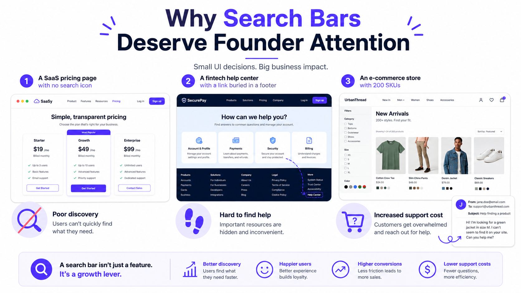
A SaaS founder launches a pricing page with no search because the site only has a few pages. A fintech company publishes a useful help center, then hides the link in the footer. An online store carries 200 products, but customers still email support to ask whether a particular item exists.
These problems look different, but they share one failure. The business knows where information lives, while the visitor doesn't. A search bar gives visitors another route when navigation, labels, or product structure fail them.
The commercial case is strong. Search users can contribute about 44% of total revenue while representing about 24% of visitors, according to the same e-commerce search data. Treat that benchmark as directional, not as a promise for your company. The practical conclusion is clear: search is revenue infrastructure when users arrive with a specific need.
Start with the user's question
Before choosing a search tool, write down what visitors are trying to find:
AI SaaS: “Where do I create an evaluation set?”
Web3: “Does this wallet support this network?”
Fintech: “How do I download a monthly statement?”
E-commerce: “Do you sell a black waterproof backpack?”
If those questions recur in support tickets, sales calls, or product analytics, search deserves attention. If visitors only need to choose between a few clearly labeled pages, search may add clutter instead of value.
Your information structure still matters. A clear information architecture guide will reduce the work search has to do, but it won't replace search when the content is broad, technical, or frequently changing.
You should leave this decision with four answers: whether search is necessary, which interface choices increase use, whether to build or buy the underlying system, and which two-week rollout will connect search behavior to product and revenue data.
When Your Website Actually Needs a Search Bar
Use a simple rule. If a visitor can reach the answer in three or fewer clicks from the homepage, you probably don't need a global search bar. If the path takes four or more clicks, or the site contains roughly more than fifty distinct items, add search.
This isn't a law. It's a fast decision tool for a busy team.
A five-page SaaS marketing site usually doesn't benefit from search. A visible search field can compete with the primary action, make a small site feel larger than it is, and encourage visitors to search for pages that should already be obvious. Put the effort into navigation labels, page hierarchy, and a strong pricing path.
A knowledge base with 200 articles is different. Visitors often arrive with a specific problem, and search can become the primary way they move through the site. The same applies to product catalogs, API documentation, transaction help, compliance libraries, and internal tools with many record types.
The small-site exception
A small number of pages doesn't automatically mean search is unnecessary. A regulatory database, pricing archive, or technical reference site may have limited visible pages while containing dense, searchable material. In those cases, search supports exact lookup rather than broad browsing.
Your website taxonomy guide can help you decide what belongs in categories, filters, and search results. Don't add search to compensate for unclear labels. Add it when visitors have a legitimate reason to enter a term instead of selecting a route.
Run this five-minute check:
Count the destinations: Include articles, products, tools, records, and help documents.
Trace the deepest path: Start at the homepage and count clicks to the hardest-to-find item.
Review support questions: Look for repeated “where can I find” or “do you have” requests.
Choose the smallest useful solution: Skip global search for a small marketing site, but add scoped search to a large documentation or catalog experience.
Placement, Width, and Affordance Decisions
Founders don't need a custom design exercise for the first version. They need a search control that looks available, sits where people expect it, and works without a mouse.
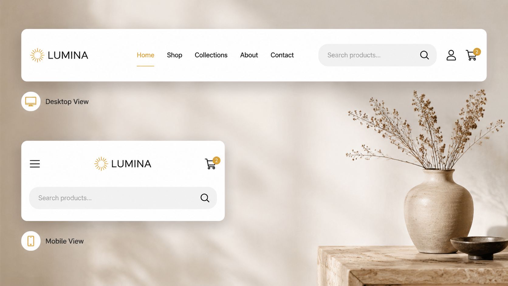
On desktop, place search in the header, usually toward the right, close to account actions or primary navigation. On mobile, stack it below the logo or primary header controls. Don't hide it inside a hamburger menu unless the layout leaves no practical alternative. A search bar that requires an extra menu action loses the advantage of direct access.
Use a field that fits a realistic query. A desktop width of roughly 24 characters, or about 200 to 280 pixels, gives room for terms such as “invoice template.” On mobile, make the field full-width. Search logs indicate that the average query is 1.6 words or 11.34 characters, 86% of queries contain one or two words, and a field that fits at least 26 characters covers 95% of queries, according to search UX metrics guidance.
Make the control self-explanatory
Use a visible magnifying-glass icon, but don't rely on the icon alone. Add a visible “Search” label or an accessible label with the same meaning. Your placeholder should show a useful example tied to the site, such as “Search invoices” in a finance dashboard or “Search API docs” in a developer portal.
Good choices are simple:
Show a submit button: Especially on long forms or dense desktop layouts.
Use the visitor's language: Match the selected interface language in the label, placeholder, suggestions, and results.
Allow immediate typing: The field should accept input as soon as it receives focus.
Keep focus visible: A user should know exactly where typing will happen.
Avoid delayed animations that open the field after a pause. Avoid a design that forces the visitor to click a second time before entering text. These details create small interruptions, and search already asks the visitor to state a need.
For broader navigation patterns, review these best navigation menu examples before changing the header. The search bar should support the menu, not fight it.
Keyboard rule: A visitor should be able to focus, type, move through results, and submit using only the keyboard.
Autocomplete, Suggestions, and Recovery From Empty Results
Autocomplete isn't a decorative dropdown. It should help a visitor recover from an uncertain query before they reach a dead-end results page.
Start suggestions after the visitor has entered two or three characters. Show a short ranked list of five to eight suggestions, combining product names, categories, and useful popular queries. Let users move through the list with the arrow keys and choose an item with Enter. Keep the result types visually distinct, but don't overload the field with filters, thumbnails, or every possible category.
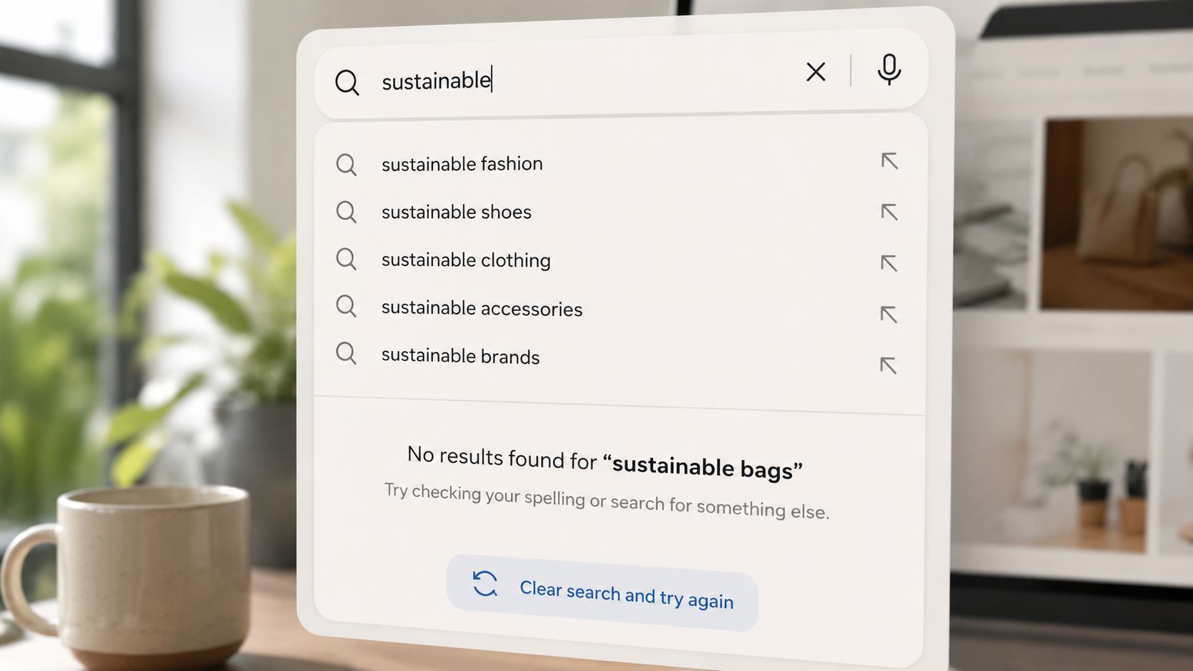
Treat autocomplete, scoping, filters, and empty states as one recovery system. If your product has multiple content types, offer an inline scope such as “in docs” or “in jobs.” Use chips or a small switch rather than making visitors learn a complicated query syntax. For result refinement, place facets such as price, date, or type on the results page. Putting every filter inside the input makes the first interaction harder.
The brief's suggested reduction of zero-result rates by 20% to 40% isn't supported by the verified data provided, so don't use it as a target. Measure your own zero-result rate instead.
Design the empty state as a second chance
A failed search shouldn't end the journey. Show the closest three matches, offer a route to browse categories, and give the visitor a clear way to refine the query or contact support.
Good and poor implementations look like this:
Poor: “No results found.” The visitor must invent a new path.
Better: “No results for ‘invoice export.’ Try ‘export invoices' or browse Billing.”
Best for support-heavy products: Show related documentation, explain the likely terminology, and offer a support contact without forcing the visitor to restart.
Write the messages with the same care as the interface. Guidance on UX writing principles is useful here because a short sentence can clarify what the system understands and what the visitor should do next.
One accessibility detail matters during autocomplete. The input should expose an accessible label, aria-expanded should reflect whether the popup is open, aria-controls should point to a stable listbox ID, every suggestion should use role="option", and a polite live region should announce messages such as “8 suggestions available” or “No results found.” Announce updates after roughly 200 to 500 milliseconds of typing inactivity to avoid noisy intermediate messages, as described in accessible search and autocomplete guidance.
Accessibility and Performance Trade-offs
Search is a revenue and intent signal only when every visitor can use it quickly. Treat accessibility and speed as product requirements, then measure failed searches, search exits, and response time after launch.
Keep the ARIA combobox implementation in the earlier placement and interaction guidance. This section should focus on the performance cost and the quality bar for release. Add a visible focus ring, sufficient contrast for placeholder text, and a mobile tap target large enough to use without precision. Test keyboard-only navigation and a screen reader before calling the component finished.

Keep the first load lean
Autocomplete adds JavaScript, network requests, and rendering work. Defer the search script until the browser is idle if visitors do not need search for the first meaningful interaction. Keep the initial JavaScript payload under 30 KB when that constraint fits your stack, and aim for query responses under 150 milliseconds at the 75th percentile, based on the performance requirements in the implementation brief.
Use server-side rendering for initial results. A query should remain useful when JavaScript fails, is blocked, or has not loaded. Avoid images in the suggestion dropdown unless they carry real decision value. A text-first list loads faster and is easier to scan.
Trade-off: Rich autocomplete costs bytes. Cap the suggestion list, skip dropdown images, and spend the performance budget on relevance rather than decoration.
Run the search on slow mobile hardware and with JavaScript disabled. Check the first-load payload, response timing, keyboard operation, and screen-reader behavior. If the interface passes visual review but fails any of these checks, delay launch and remove decoration or interaction until the core search works. Recheck these measures after release because a heavier index or new suggestion feature can turn a useful intent signal into a slow exit.
Build, Buy, or Hosted Search Compared
Choose the simplest search system that can support your content and measurement needs. Don't build a ranking engine because the interface looks custom, and don't adopt an expensive hosted platform before you understand your queries.
Client-side search is the cheapest first step. Libraries such as FlexSearch, MiniSearch, and Lunr.js can index a small content set in the browser and ship quickly. The trade-off is shallow relevance, limited analytics, and ranking that becomes harder to control as content grows. This path fits a small documentation set or an early prototype.
Server-side search gives you more control. Postgres full-text search, Meilisearch, and Typesense can support stronger relevance, facets, typo tolerance, and owned data. You'll take on deployment, index maintenance, monitoring, and relevance tuning. For a seed-stage team, this is often the practical middle path when search is central to the product.
Hosted tools such as Algolia, Elastic App Search, and Coveo usually provide strong relevance, dashboards, analytics, and globally distributed response performance. You pay for convenience and accept vendor dependency. Lock-in can become material when ranking behavior depends on proprietary configuration.
Approach | Time to Ship | Monthly Cost, estimated | Relevance Quality | Analytics | Lock-in Risk | Best For |
|---|---|---|---|---|---|---|
Client-side, FlexSearch, MiniSearch, or Lunr.js | About a day | Free library, hosting varies | Basic | Limited, must instrument | Low | Small content sets and prototypes |
Server-side, Postgres, Meilisearch, or Typesense | Several days of engineering and operations work | Infrastructure cost varies | Stronger control, typo tolerance, and facets | Good with custom events | Low to medium | Products that own their data |
Hosted, Algolia, Elastic App Search, or Coveo | Short integration once content is prepared | Free tiers or usage-based plans | Strong out of the box | Built in plus custom events | Medium to high | Teams prioritizing managed relevance |
The brief's suggested $20 monthly VPS and under 10,000 pages are not supported by the verified data, so treat them as planning variables rather than promises. If your product uses natural-language analytics, these articles on search-based BI tools offer useful context for separating keyword lookup from conversational discovery.
For founders with a small engineering team, start server-side when search affects core product use. Choose hosted search when relevance tuning and operational simplicity matter more than control. Keep the interface and event schema portable so you can change providers later.
Metrics to Track So Search Becomes a Measurable Lever
Google Analytics treats internal search as a formal reporting category, with metrics for sessions with search, unique searches, search exits, and search refinements. It can also calculate goal conversions for sessions that include at least one on-site search, as documented in Google Analytics site search reporting.
Instrument search before you polish it. At minimum, send events for search opened, query submitted, suggestion selected, results viewed, result clicked, zero results, refinement, and conversion after search. GA4 or a product analytics tool can receive these events without building a separate reporting system.
Track five operating KPIs:
KPI | What it measures | Target range |
|---|---|---|
Searches per session | How often visitors use search | Establish a baseline, then segment by page and visitor type |
Results click-through rate | Whether results appear useful | Track improvement over your baseline |
Zero-result rate | How often the system fails to find a match | Investigate every recurring query |
Refinement rate | Whether visitors change, filter, or sort after searching | Separate helpful refinement from confusion |
Search-assisted conversion | Whether search sessions contribute to desired actions | Compare with sessions that don't use search |
You can measure autocomplete adoption, abandonment, and task success too. Independent UX research guidance recommends these measures because each exposes a different failure mode.
Don't import unsupported target percentages into your dashboard. The verified research confirms that search users convert above the site average, but it doesn't establish universal targets for zero-result rate, click-through, refinement, or search-assisted conversion. Set a baseline in the first week, segment by device and query type, and review the worst queries weekly.
A Two-Week Rollout Plan and What Comes Next
Run the first release with one engineer and one designer. Keep the scope narrow, but don't ship a decorative field with no measurement.
Week one builds the useful path
Day one: Decide whether search is global, scoped, or both. List the content types that can appear in results, such as docs, products, invoices, jobs, or help articles.
Day two: Choose client-side, server-side, or hosted search based on content volume, relevance needs, operational capacity, and data ownership. Define the event names before implementation.
Days three and four: Add the header search field, keyboard submission, autocomplete, result grouping, and a clear results page. Keep suggestions text-first and short.
Day five: Build the empty state. Include related matches, a browse route, query refinement, and support contact where appropriate. Wire the five core KPIs into GA4 or your product analytics tool.
Week two tunes what users actually do
Start by reviewing queries, not opinions. Find the top recurring searches, the queries that return nothing, and the results visitors select most often. Fix the top three failing queries with better synonyms, content labels, ranking rules, or redirects.
Add scoped search only if the data shows that visitors are confusing content types or getting too many irrelevant results. Run the accessibility audit against the combobox pattern, test arrow-key navigation and Enter submission, and check the field on mobile.
Don't overcommit to the next wave of search capabilities. AI-assisted semantic search, voice input in mobile browsers, and visual search for product catalogs are changing what users may expect from search bars on websites, as covered in recent search trend analysis. Budget for those capabilities in a later product cycle after your keyword search has clean content, reliable events, and known failure queries.
925 Studios combines product design, brand design, and frontend development for AI SaaS, Web3, and fintech teams that need a search experience connected to a polished, shipped product. Visit 925 studios to discuss your website, product interface, or design system and decide what should be built now versus later.


Let’s keep in touch.
Discover more about high-performance web design. Follow us on Twitter and Instagram.

