
Minimalist User Interface Guide: Principles That Convert

Outrank AI

A minimalist user interface is not about putting less on screen. It's about giving users fewer decisions to make, and minimalist mobile variants scored 4.35 for aesthetics, 4.21 for usability, and 4.40 for satisfaction, compared with 3.69, 3.78, and 3.85 for non-minimalist variants. Minimalism helps conversion when it removes decision cost without removing trust, task cues, or accessibility.
The popular advice is to “remove stuff.” That's incomplete, and sometimes dangerous. A founder can strip a product down until it looks elegant in a design review, then discover that new users can't find the next step, older users can't read the labels, and serious buyers can't find enough evidence to trust the purchase.
The useful question isn't, “What can we delete?” It's, “What decision can we make easier?” That distinction matters for AI SaaS, Web3, and fintech products, where the interface often has to explain complex systems without making the user feel lost or exposed.
Table of Contents
Why Minimalist UI Is a Decision Problem, Not a Design Problem
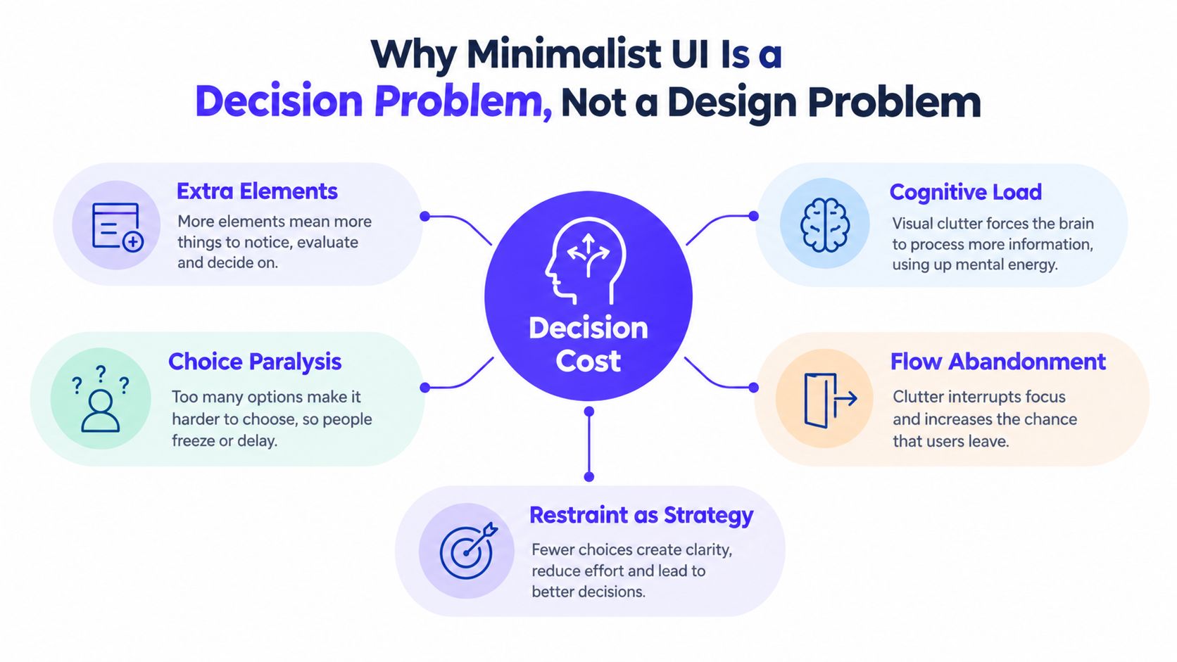
Minimalism is a decision-cost problem, not a decoration problem. Every button, badge, tooltip, statistic, menu item, and competing message asks the user to pause and evaluate it. A sparse screen can still be exhausting if the remaining controls are ambiguous. A dense screen can work if its hierarchy makes the next action obvious.
Take two billing screens with the same features. The first shows the current plan, usage, invoice history, and one clear upgrade action. The second adds an upsell banner, three usage charts, a tooltip about overages, a referral prompt, several plan badges, and a “compare plans” link. The second screen hasn't necessarily added useful capability. It has added decisions. Users must work out what matters before they can act.
That's why a modern user interface design should be judged by the user's path through it, not by how empty the canvas looks. The practical aim is to lower the number of judgments a person has to make while preserving the information needed to proceed confidently.
What restraint buys, and what it can cost
Research traces minimalist interface thinking into mainstream web usability in 1995, when Jakob Nielsen included minimalist design in his usability heuristics. The Nielsen Norman Group later connected modern web minimalism with the early 2000s, Google's sparse visual language, and responsive web design in 2010, which helped normalize negative space, restricted palettes, and simpler layouts (historical overview of minimalist web design).
That history explains the appeal, but not the operating rule. Restraint can improve trust by making a product feel deliberate. It can damage trust when a fintech dashboard hides fees or when an AI product conceals how an answer was produced. It can improve task completion by clarifying flow. It can hurt completion when a critical control becomes an unlabeled icon.
The standard is simple: remove competition, not meaning. Keep what helps users understand the state, choose the next action, recover from mistakes, and believe the product is safe.
The Five Rules That Make Restraint Actually Work
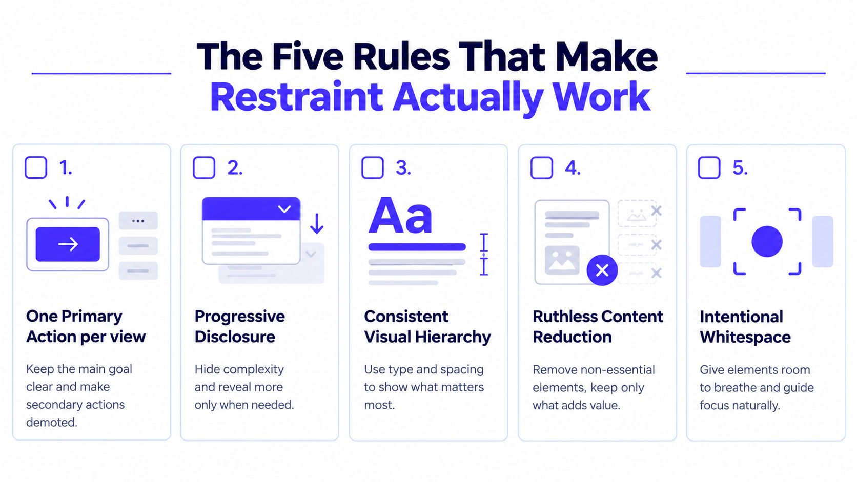
A founder should be able to hand these rules to a designer and audit a screen without opening Figma. Each rule has a pass-or-fail test. If the team can't answer the test quickly, the interface probably needs another round of reduction.
One primary action per view
A screen should have one action with the strongest visual weight. Secondary actions can remain, but they should be quieter through color, size, placement, or text treatment.
Pass test: Can a first-time user name the main action in a few seconds without reading every label?
An AI SaaS prompt screen might prioritize “Run analysis,” while export, save, and advanced model settings sit nearby but don't compete. If every action uses the same bright accent, the interface makes the user do the prioritization work.
Progressive disclosure
Don't make advanced settings disappear. Put them behind an explicit, understandable affordance such as “Advanced settings” or “Show delivery options.” Users who need control can reach it. Everyone else gets a clean default path.
This is especially important in Web3, where transaction details, network selection, slippage, and wallet permissions may all matter, but showing every option at once can overwhelm a new user.
Let typography carry meaning
Use a small, consistent type system to distinguish page titles, section labels, body content, and supporting detail. You don't need an icon, divider, badge, and color shift for every semantic difference.
A useful visual hierarchy guide can help teams decide which differences deserve emphasis. The pass test is whether users can scan the page structure with the text alone. If hierarchy collapses when the icons are removed, the type and spacing are underperforming.
Use spacing as structure
Generous padding and consistent grouping can replace decorative borders. An eight-pixel grid is a practical foundation, not a law, because it gives engineers and designers shared spacing decisions. Related content should sit together. Unrelated content should have enough separation to feel distinct.
Pass test: Can users tell which label belongs to which field without relying on a border?
Ship ruthless defaults
A product should arrive with an opinion. Presets, sensible filters, and preselected options let most users complete the common task without configuring the system first.
For a fintech reporting tool, the default dashboard might show cash position, recent transactions, and outstanding invoices. Custom widgets can stay available, but they shouldn't become an onboarding requirement.
A minimalist UI should also limit element types, font styles, colors, menu depth, and hierarchy. One cited guideline recommends keeping menu screens below 7 or 8 items and limiting menu hierarchy to 3 levels or fewer (interface menu guidance). Timelines usually break defaults and progressive disclosure first. Teams add options to avoid making a product decision, then call the resulting complexity “flexibility.”
What the Research Actually Shows About Restraint
The evidence supports restraint, but not the lazy version of it. A 2024 comparative study found that users rated minimalist mobile app variants higher than non-minimalist variants across aesthetics, usability, and satisfaction. The minimalist designs averaged 4.35 versus 3.69 for perceived aesthetics, 4.21 versus 3.78 for perceived usability, and 4.40 versus 3.85 for satisfaction, with the differences statistically significant (comparative minimalist mobile app study).
Those results support a clear product position: users often respond well when an interface feels coherent, legible, and deliberate. They don't prove that every stripped-down screen performs better. Ratings capture perception. A payment flow still has to expose the information needed to approve a transaction.
The ceiling is real
A recent review found that simplicity, visual coherence, and objectivity can improve navigation efficiency and clarity by reducing cognitive overload. The same review warns that oversimplification creates confusion when designers remove essential cues, which is why progressive disclosure works better than indiscriminate deletion (review of minimalist interface usability).
A mixed-method study with 60 participants found that minimalist web prototypes improved perceived elegance, ease of navigation, trust, and professionalism. It also found that missing visual cues made some complex tasks harder to complete (mixed-method minimalist web design study).
Metric | Minimalist UI | Dense UI |
|---|---|---|
Perceived aesthetics | 4.35 | 3.69 |
Perceived usability | 4.21 | 3.78 |
User satisfaction | 4.40 | 3.85 |
The honest model is a curve. Restraint usually helps while it removes irrelevant competition. It plateaus when the remaining interface already communicates the task. It hurts when users lose the cues, evidence, or recovery paths they need.
How Linear, Stripe, Mercury, and WHOOP Practice Restraint
The best examples aren't empty screens. They're products that decide what not to foreground.
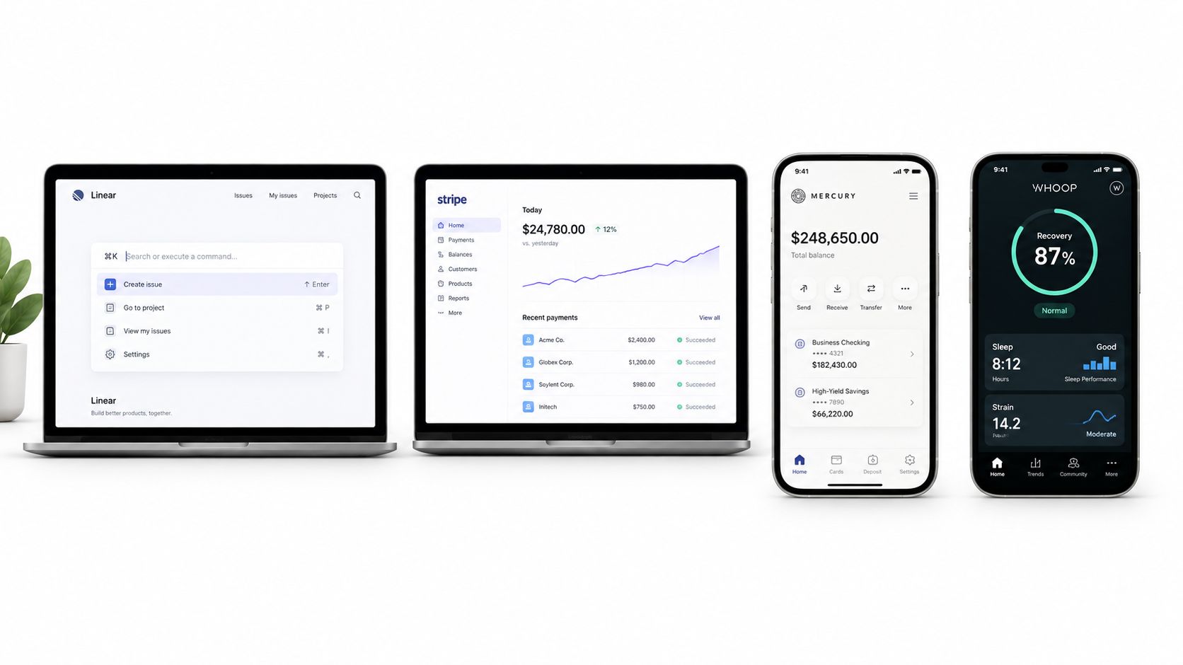
Linear puts serious capability behind a command palette and keyboard-first interaction. That creates a clean working surface for experienced users, because navigation, search, and actions can happen without permanent chrome. The cost is real: first-time users may not know that command-driven behavior exists. Copy the pattern only if you provide visible entry points, onboarding prompts, or labeled alternatives. The likely payoff is stronger repeat use among users who adopt the workflow, not effortless discovery for everyone.
Stripe's documentation demonstrates another kind of restraint. It avoids relying on decorative imagery to explain technical concepts, then uses writing, code examples, grouping, and spacing to carry comprehension. The design decision isn't “no images.” It's “don't ask decoration to do the job of explanation.” A technical SaaS team can borrow that approach by auditing every visual and asking whether it teaches, reassures, or only fills space.
Mercury's financial dashboard shows the value of a strong primary number. A balance can act as the first layer of account state, while transactions, transfers, and account details remain available through deliberate navigation. The trust tradeoff is obvious. A financial product can hide complexity only when it makes the underlying detail easy to inspect and gives users confidence that the summary is accurate.
WHOOP's recovery reporting forces a hierarchy decision that many fitness products avoid. A report has to decide which interpretation deserves attention first, then place supporting metrics behind it. That can make the product feel calm and useful, but it also means the headline must be understandable and responsibly framed. Copy the pattern when your product can explain the conclusion and expose the evidence behind it.
Founder's test: Remove the decorative layer from a key screen. If comprehension falls, the visual was carrying information. If comprehension improves, it was competing with the product.
Applying Minimalism to Product and Marketing Surfaces
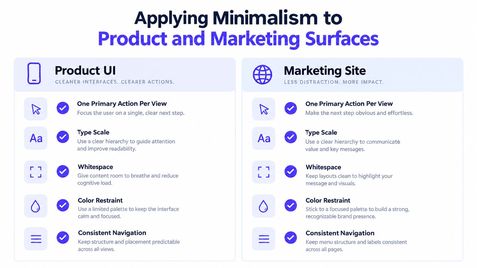
Minimalism should change with the job of the surface. Marketing earns attention. Product repays it. A landing page can create curiosity with a bold message. The product must then make the promised action obvious, safe, and recoverable. For AI SaaS, Web3, and fintech, restraint earns trust only when users can inspect inputs, permissions, fees, limits, and outcomes.
Give each view one primary action. Use a type scale with three to five sizes so title, section, body, and supporting content remain distinct without extra decoration. Keep the base palette neutral, reserving the accent for actions, selected states, and meaningful emphasis. If every card and badge uses it, nothing carries priority.
A practical surface checklist
Hierarchy: Put the answer or next step near the top of a product view. On a landing page, lead with the buyer's problem, then provide evidence that resolves doubt. Use a clear content hierarchy before choosing visual treatments.
Spacing: Use an eight-point rhythm and generous vertical separation. Negative space can signal control, but only when the page still contains enough proof.
Color: Assign color to states such as success, warning, error, and selection. Decorative color can be mistaken for status, especially in financial workflows.
Motion: Keep transitions under 250ms and tie movement to a user action. Decorative animation adds noise in dashboards and transaction flows.
Disclosure: Show the default answer first. Put advanced controls behind a clear label that tells users what they will find.
Marketing teams often need to reduce claims without weakening persuasion. This guide to optimize landing page copy helps align the words with the layout. A restrained page still needs enough context to support a buying decision.
Design and engineering should encode these decisions in one token system, not separate versions for product, website, and brand. Shared color, spacing, type, radius, and motion values make restraint repeatable. Without tokens, every new page becomes an argument, and exceptions gradually refill the interface.
Three Minimalist Patterns That Quietly Hurt Conversion
Minimalism fails when it hides the answer buyers need. The following patterns often look disciplined in a design file and perform poorly once real users bring uncertainty, limited context, or accessibility needs.
Icon-only navigation
An icon-only bar assumes users already understand the product's mental model. A wallet icon, spark icon, or stacked-square icon may feel obvious to the designer who created it. It may not be obvious to a new customer deciding whether to trust a financial workflow.
Track task completion rate and watch where users hover, backtrack, or abandon. Also review support tags for navigation questions. The fix is straightforward: use labels first, then let familiarity earn a more compact mode later.
The proof-free hero
A single headline and one CTA can create a beautiful landing page that answers none of the buyer's objections. Fintech users may need security and pricing context. AI SaaS buyers may need to understand inputs, outputs, limits, and workflow fit. Web3 users may need to know what happens to assets and permissions.
Measure scroll depth and CTA progression, then compare whether visitors encounter proof before the decision point. Add only the evidence that resolves a real concern, such as a product example, integration detail, customer context, or pricing explanation.
The auto-hiding header
A disappearing header saves space but makes navigation harder on mobile, particularly for one-handed users who need to move between sections. Review support volume for “where do I find” questions and compare navigation use before and after the change. A persistent compact header, or a clearly revealed header on upward scroll, usually preserves the space benefit without trapping users in the current page.
Pattern | Failure Mode | Metric to Catch It | Fix |
|---|---|---|---|
Icon-only navigation | Users can't identify destinations | Task completion rate and support tags | Add visible labels |
Proof-free hero | Buyers can't self-validate | Scroll depth and CTA progression | Add focused evidence |
Auto-hiding header | Users struggle to navigate back | Navigation use and support volume | Keep a compact header |
The rule is blunt: if removing an element forces users to guess, you didn't remove clutter. You removed guidance.
Accessibility, Older Users, and Global Audiences
Minimalism has to obey accessibility constraints. WCAG 2.1 requires normal text to meet a 4.5:1 contrast ratio, while large text needs 3:1. User interface components also need at least 3:1 contrast against adjacent colors (WCAG 2.1 contrast requirements). A pale gray label beside a white input may look refined in a brand review, but it can disappear for people with lower vision.
Older users often need stronger legibility, clearer grouping, and more forgiving interaction. The elderly-centric medication reminder study cited in the evidence found 96.55% task completion, a normalized task execution time of 15.96 seconds, and high usability scores of SEQ 5.86 and MAUQ 5.91, alongside qualitative reports of lower cognitive strain and better legibility (elderly-centric medication reminder study).
Make the quiet interface readable
Contrast first: Test body text, muted labels, borders, focus states, and disabled controls. Don't rely on a designer's monitor or a bright office.
Labels over symbols: Pair icons with visible text when the action is important, unfamiliar, destructive, or financial.
Spacing with purpose: Give fields, buttons, and navigation enough separation that users can identify relationships without precision tapping.
Recoverability: Keep undo, confirmation, and error explanations visible when the consequence matters.
Typography: Use a readable body size and allow users to enlarge text without breaking the layout.
Global audiences add another layer. English-first interfaces often assume left-to-right reading, compact labels, and universal icon literacy. Translated copy may expand, scripts may require different line heights, and familiar symbols can carry different meanings across markets. Build flexible containers, test longer labels, and avoid packing the interface so tightly that translation breaks hierarchy.
A sparse screen isn't automatically accessible. Accessibility is the constraint that tells you which elements must stay.
Deciding If Minimalism Is Right for Your Product
Minimalism is a strong default for expert-facing tools and a poor excuse for hiding reassurance. A developer dashboard can reduce visual competition because users arrive with a goal and a vocabulary. A fintech onboarding flow often needs more visible explanation because the user is making a consequential decision. Healthcare intake, compliance-heavy workflows, and first-use experiences should favor clarity over visual purity.
Product maturity matters too. Early products need to establish credibility, explain the category, and answer objections. Removing testimonials, comparison content, pricing context, or security information can make the brand look confident to the team and underdeveloped to the buyer. Later, once users understand the product, progressive disclosure can reduce repeated explanation and make routine work calmer.
Use this decision rule: hide complexity only after you've made the core decision obvious and the supporting evidence easy to reach.
Product Context | Use Minimalism? | Why | Watch-Out Metric |
|---|---|---|---|
Expert developer tool | Yes, strongly | Users know the task and value focus | Time-to-first-value |
Fintech onboarding | Carefully | Trust and explanation matter | Activation and abandonment |
Web3 transaction flow | Selectively | Reduce distraction, preserve permission detail | Task completion and error rate |
Early-stage SaaS landing page | Partially | Clear positioning needs supporting proof | CTA progression |
Complex admin workflow | In layers | Hide routine complexity, expose controls when needed | Support volume |
Run the audit on one funnel, not the whole company. Count the decisions required to reach the first meaningful outcome. Watch activation, time-to-first-value, support volume, and errors after each reduction. If the screen looks cleaner but users ask more questions or fail to complete the task, restore the missing cue.
Minimalism should also fit the brand. It can signal confidence, precision, and a premium position. It can also make a young company look cold or unproven when the interface removes the warmth and evidence buyers need. For AI SaaS, Web3, and fintech teams, the winning design is rarely the emptiest one. It's the one that makes complexity feel controlled without pretending complexity doesn't exist.
925 studios works with AI SaaS, Web3, and fintech teams on product UI/UX, brand identity, websites, frontend development, and design systems, giving founders one creative partner in place of a product designer, brand designer, and frontend developer. Visit 925 studios if you need to turn a complex product into a clear interface and ship the design, brand, and frontend as one system.


Let’s keep in touch.
Discover more about high-performance web design. Follow us on Twitter and Instagram.

