
Design Elements for Websites That Actually Convert

Outrank AI

The popular advice is to add more. More animation, more gradients, more 3D, more copy, more visual personality. That advice confuses attention with persuasion. Design elements for websites are conversion variables, and each one has to earn its place by improving trust, comprehension, direction, or action.
That standard matters most for AI SaaS, Web3, and fintech startups. Buyers already have to understand unfamiliar products, assess risk, and decide whether the team behind the interface deserves their information or money. A spectacular page that loads slowly, hides the value proposition, or makes a wallet flow feel uncertain won't help. It will create friction at the exact moment your business needs confidence.
Table of Contents
Why Design Elements Are Conversion Variables, Not Decorations
Visitors don't arrive on a website ready to admire your design system. They arrive with a question, a task, or a concern. In the opening moments, they decide whether the page looks credible enough to explore. Industry summaries report that 94% of first impressions about a website are design-related, and users can form an opinion in as little as 0.05 to 5 seconds. The same body of research reports that 75% of people judge a business's credibility by how its website looks, while 88% of online users are unlikely to return after a bad user experience. See the website design statistics behind these first-impression patterns.
That makes visual hierarchy, spacing, type, color, and navigation business decisions. A weak headline treatment can bury the value proposition. A low-contrast button can make the next step easy to miss. An overworked hero can force a visitor to decode your product before they understand why it matters.
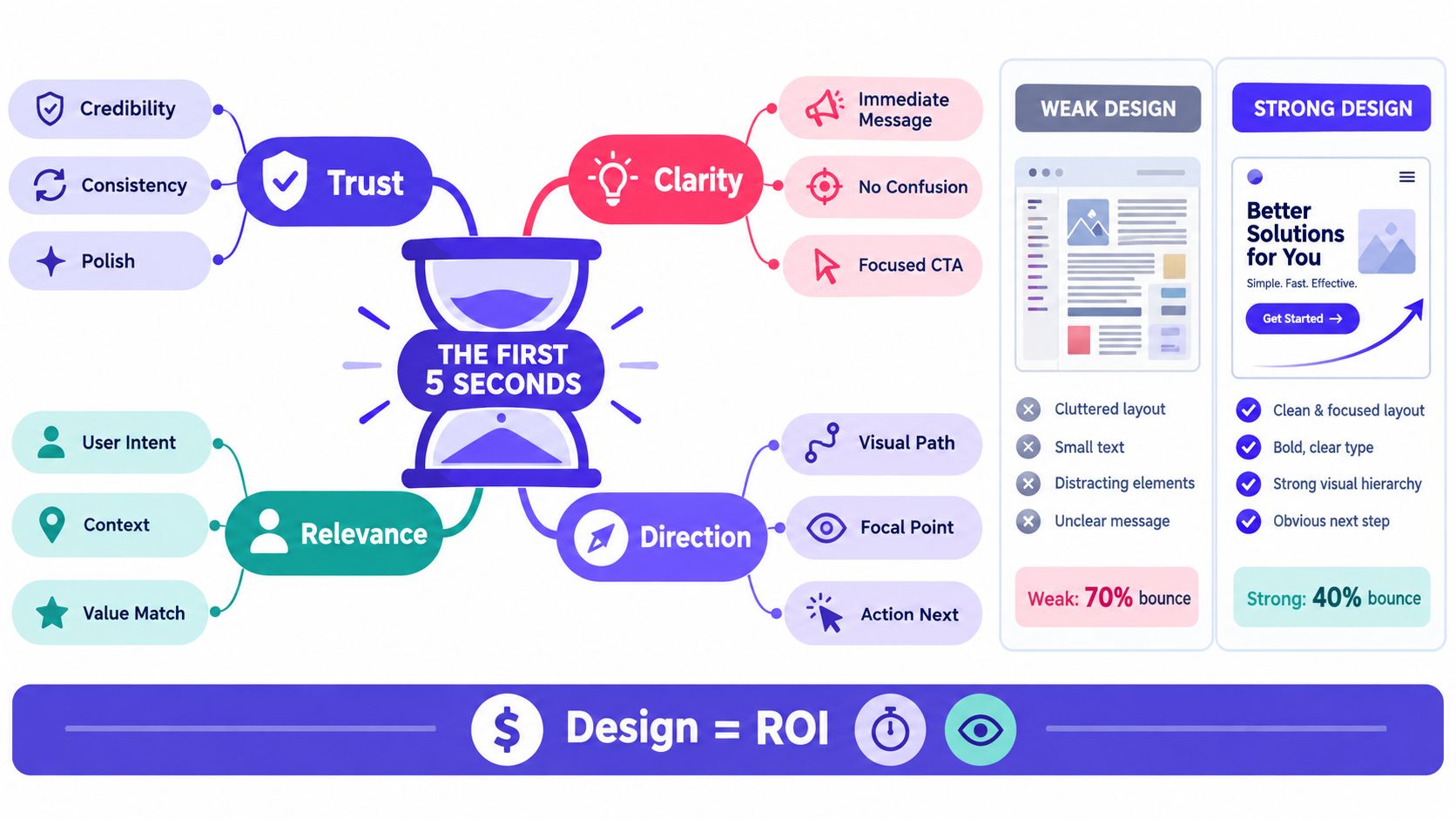
Judge every element through three filters
Use this order when deciding whether an element belongs on the page:
Trust: Does it make the company and product feel deliberate, consistent, and safe?
Clarity: Does it help a visitor understand the offer without extra interpretation?
Friction: Does it slow the page, complicate interaction, or exclude users?
Restraint becomes a competitive advantage. A single saturated accent can direct attention better than a page covered in gradients. A product screenshot can explain more than a staged photograph. A short, specific CTA can outperform a clever phrase because the visitor knows what will happen next.
Practical rule: If an element doesn't improve trust, clarity, or direction, remove it before you polish it.
Performance belongs in the same conversation as visual design. A one-second delay in page load can reduce conversions by 7%, according to the benchmark summarized by AbilityNet's history of web accessibility and performance. That source also records that the Web Accessibility Initiative began in 1996 and WCAG 1.0 was published in 1999, a reminder that usable web design has never been separate from standards.
Founders should treat conversion optimization as a design discipline, not a final analytics task. Your conversion optimization process starts before a visitor clicks. It starts with whether the page makes the right promise, supports it with evidence, and gives the user a clear next move.
Layout, Grid, and Visual Hierarchy
A page layout is the path your visitor follows through the offer. If that path isn't obvious, every section competes with every other section, and the visitor has to do the organizing themselves.
Start with a 12-column grid. It gives your team a flexible structure for aligning the header, hero, product imagery, proof points, and lower-page content without forcing every section into the same shape. Consistent gutters matter as much as the columns because they create a repeatable edge between content groups.
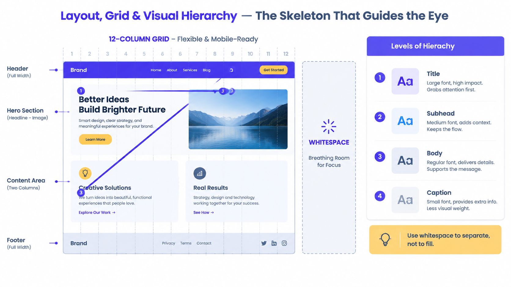
Build the page in a deliberate order
A strong SaaS hero often follows a simple pattern: a clear headline, a supporting explanation, a product visual, and one primary CTA. That structure doesn't make every SaaS site look the same. It gives the visitor a stable route from problem to product to action.
Control that route with three levers:
Size creates priority. The headline should carry more visual weight than the supporting copy. The CTA should be easy to find without overpowering the message.
Contrast creates separation. Use changes in color, weight, or surface to distinguish the action from the surrounding content.
Position creates sequence. Place the main promise and next action where the eye naturally begins, then support them with evidence below.
Your spacing system should follow a repeatable rhythm. Don't give one section arbitrary padding, another a different gap, and a third a decorative offset because it “feels balanced.” Consistent spacing lets users recognize related content and understand where one decision ends and another begins.
The visual hierarchy guide goes deeper on how size, contrast, grouping, and position shape the reading path. The practical test is simple. Hide everything except the headline, subhead, product visual, and primary CTA. If the page still communicates who the product serves and what the visitor can do next, the skeleton is working.
Whitespace is a choice
Whitespace isn't unused real estate. It tells the reader what to ignore. Around a hero headline, it creates focus. Between feature groups, it creates meaning. Inside a form, it makes the fields feel manageable rather than crowded.
Review the page at desktop and mobile widths. Confirm that the headline remains dominant, the CTA stays near the decision point, and supporting sections don't collapse into a dense wall. You can test this in a week by comparing the current page with a restrained version that removes competing buttons, reduces decorative blocks, and gives the primary message more room.
Typography and Color Systems That Build Trust
Typography is a conversion variable. Visitors judge whether a product feels understandable before they finish reading the page. Use a neutral sans-serif for body copy when calm, legible scanning matters. Add a distinctive headline face only when it strengthens the brand without making pricing, documentation, or security information harder to read.
Set one dependable body face and no more than one headline face. Build a consistent scale from 14 to 56 pixels, then adjust line height to match each size and the density of the content. Keep long-form pages, including pricing, documentation, and security information, within 50 to 75 characters per line so readers can track their place.
The same rule applies to advertising. This resource on font selection for ads explains how type choices shape a message. Choose a typeface for the job it must perform, not because it looks unusual in a design file.
Color should operate as a system. Define one primary action color, a neutral range for surfaces and text, and semantic colors for success, warning, and error states. Fintech products benefit from muted blues and grays that support a measured, dependable tone. AI SaaS products can use one saturated accent to make the CTA visible without turning every component into a visual alarm. Softer palettes can also support a considered brand impression. The guide to muted colors and their meaning connects palette choices with perception.
Element Choice | What It Signals | Best Fit |
|---|---|---|
Neutral sans-serif body type | Clarity and operational confidence | SaaS, fintech, documentation |
Distinctive headline face | Character and category separation | Brand-led AI SaaS and Web3 |
Muted blue and gray palette | Restraint and stability | Fintech trust flows |
One saturated action color | Direction and focus | AI SaaS landing pages |
Strong semantic color system | Clear product feedback | Dashboards and financial tools |
Contrast is part of the brand
Color decisions must survive real use, not just a polished mockup. The WCAG contrast guidance sets a minimum contrast ratio of 4.5:1 for normal text and 3:1 for large-scale text, with exceptions for logo text and inactive or decorative text. It also calls for 3:1 contrast against adjacent colors for user interface components and graphical objects that communicate meaning. Test buttons, icons, status indicators, and product controls, not only paragraphs.
A faint label can hide a payment state. A low-contrast button can bury the next step. Treat those failures as trust problems, because users cannot confidently act on information they cannot find or read. Apply the standard while choosing tokens, then verify the finished interface across light and dark surfaces.
Imagery, Iconography, and Motion
Every image spends something. It uses space, bandwidth, attention, and often engineering time. Keep it when it helps a visitor understand the product, imagine the outcome, or trust the company. Cut it when it exists only to make an empty section feel complete.
For an AI SaaS product, a real interface screenshot usually earns more pixels than a generic person smiling at a laptop. Show the workflow a buyer cares about, not a dashboard filled with unreadable data. A calm background with a Linear-style product screenshot can make the product feel tangible. A Stripe-style minimal gradient can support an intangible product without competing with the message.
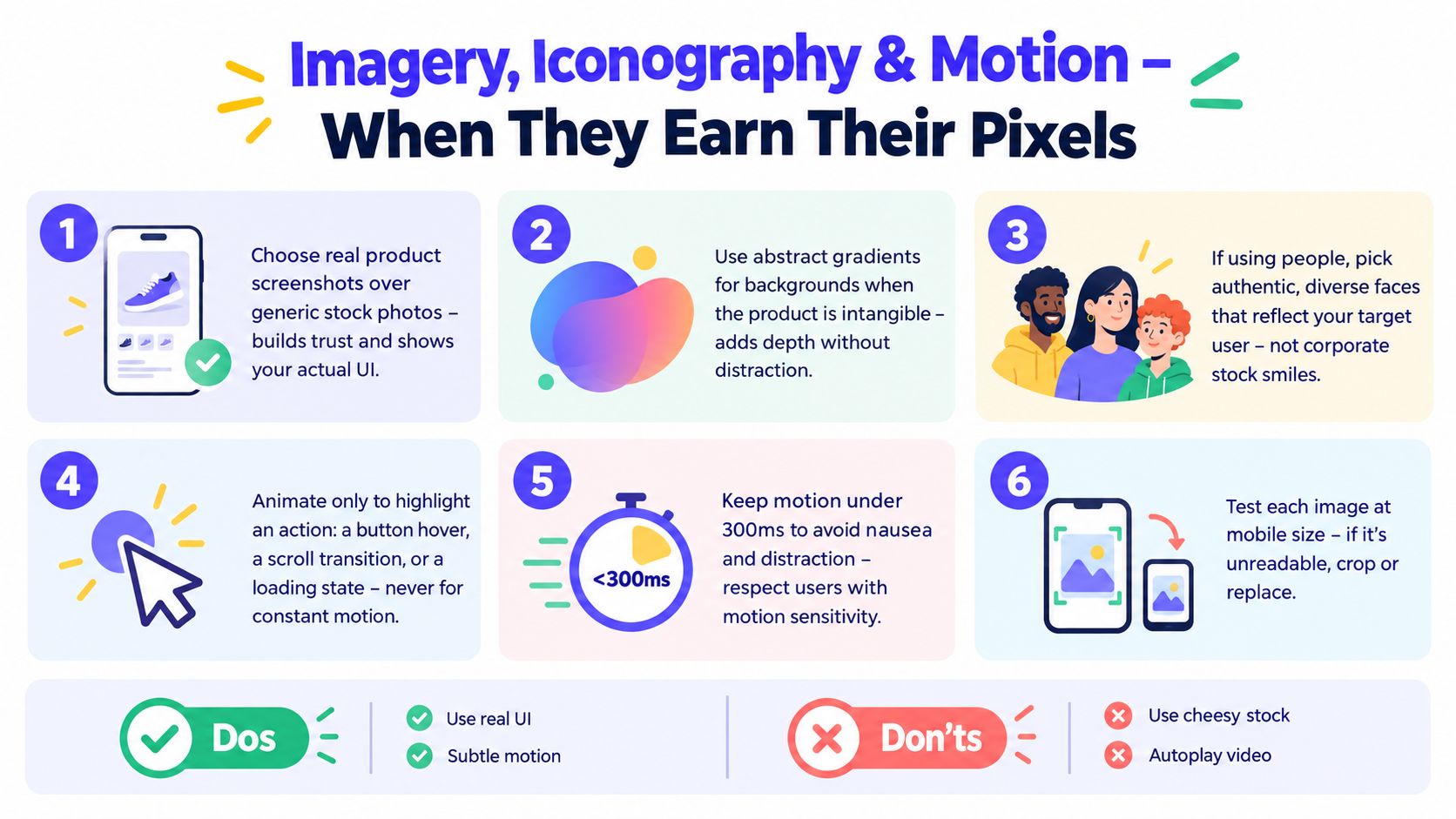
Choose evidence over atmosphere
Stock photography is especially risky in fintech trust flows. A staged office scene doesn't explain how money moves, what the user controls, or why the company is credible. If you use people, show real customers or authentic faces that fit the audience. If you use abstraction, make sure the surrounding copy does the explanatory work.
Web3 sites often use motion to signal energy and technical sophistication. That can work in the hero, but it shouldn't spill into wallet connection, transaction review, or signature confirmation. A Uniswap-style animated hero can establish a distinct brand while the swap interface remains direct and clinical.
Iconography needs the same discipline. Pick outline or filled icons, set a consistent stroke or weight, and use one coherent library unless a custom icon has a clear job. Mixed icon styles make a product feel assembled from unrelated parts.
Motion should explain a change
Animate a button hover, a loading state, or a transition that helps users understand where content went. Don't animate the background continuously just because the page feels quiet. Respect the user's reduced-motion preference, and keep meaningful transitions under 300ms, as shown in the assigned motion guidance for this visual system.
Use the alt text best-practices guide for marketing agencies when images carry meaning. Decorative imagery can stay out of the spoken experience, while product screenshots and explanatory visuals need useful descriptions. Test every visual at mobile size. If the interface becomes unreadable, crop it, simplify it, or replace it.
Calls to Action, Microcopy, and Interactive Components
The conversion layer begins where the visitor has to do something. A button, field, label, empty state, error message, dropdown, or modal can either make that action feel obvious or introduce doubt.
Use a clear button hierarchy. One primary action should own the screen or section. Secondary actions can support comparison or exploration. Tertiary actions should stay visually quiet. The label should describe the result, not the interface control. “Start free trial” tells the user what happens next. “Submit” describes the button, not the outcome.
A form also needs visible labels. Placeholder text isn't a substitute because it disappears as soon as the user types. Accessible form guidance recommends a visible label for every input, ideally linked programmatically with matching for and id attributes, as explained in this accessible forms and validation guidance.
User Intent | Primary CTA | Microcopy Pattern | Interactive Component |
|---|---|---|---|
Understand the product | See how it works | Explain what the visitor will see | Product tour or expandable demo |
Start using the product | Create your workspace | State what happens after the click | Signup form with inline validation |
Compare plans | View pricing | Clarify billing and access details | Pricing toggle only when it changes the decision |
Complete a financial action | Review transfer | Show fees, timing, and destination before confirmation | Confirmation step with clear status |
Recover from an error | Try again | Say what failed and how to fix it | Inline error beside the affected field |
Match interaction to uncertainty
Dropdowns work when users choose from a known set of options. They frustrate users when the list is short enough to show directly. Modals work for focused decisions that need attention. They interrupt when they appear before the visitor has enough context.
Tooltips should clarify an unfamiliar term at the point of use. They shouldn't carry essential instructions that disappear on mobile or vanish before a keyboard user can reach them. Onboarding hints should appear when the user encounters a feature, not as a tour that blocks the entire product before the first task.
Interactive controls also need room to work. Accessibility guidance recommends hit targets of at least 44px by 44px, equivalent hover and focus states, and enough spacing on collapsed mobile layouts to keep controls usable across breakpoints. The design and usability testing guidance from the University of Pennsylvania provides the practical standard to test against.
Ship the small fixes first
A product team can improve this layer in a sprint. Rename vague buttons. Add visible labels. Move errors beside the fields that caused them. Remove a modal that interrupts the first task. Give the keyboard focus state the same care as hover. These aren't quarterly redesign projects. They're interface decisions with immediate consequences for whether users complete the path.
Applying These Elements Across SaaS, Web3, and Fintech
The same principles produce different interfaces because the user risks and expectations change. An AI SaaS buyer wants to understand capability and workflow. A Web3 user needs expressive brand energy alongside precise transaction information. A fintech customer wants confidence, transparency, and control.
Design Element | AI SaaS | Web3 | Fintech |
|---|---|---|---|
Hierarchy | Lead with the problem, product view, and next action | Let the hero express the category, then simplify the task flow | Put trust signals, product benefit, and disclosures close together |
Imagery | Use real dashboard and workflow screens | Use motion or abstraction selectively, with product evidence nearby | Use authentic customer context and clear product visuals |
Color | One strong accent for actions and states | More expressive palette in marketing areas | Restrained neutrals with clear semantic feedback |
Motion | Demonstrate product behavior | Support identity in the hero, avoid distraction in wallet flows | Keep movement quiet and informative |
Microcopy | Explain capability in plain language | Clarify signing, network, and transaction consequences | Explain fees, timing, eligibility, and safeguards |
AI SaaS needs comprehension
For an AI dashboard, start with the task. The page should make the input, output, and next action easy to locate. Product-led imagery beats vague claims because it shows how the system behaves. Generous whitespace helps users separate configuration, results, and supporting information.
A Linear-style product page works because the product is the evidence. The brand can stay distinctive without forcing the visitor through a visual maze. Your marketing page should prepare users for the product's actual mental model, not promise an experience the interface can't support.
Web3 needs controlled spectacle
Web3 brands often benefit from a stronger visual point of view. Keep that expression in the hero, campaign surface, or community layer. Once a user connects a wallet or reviews a transaction, clarity takes priority.
A Uniswap-style swap interface can feel technically confident without making the user guess what asset they're sending, what they receive, or what they need to confirm. The brand earns attention at the edge of the experience. The transaction earns trust through precision.
Fintech needs restraint
A Mercury-style banking hero can feel modern without relying on visual noise. Conservative type, measured color, credible product imagery, and nearby trust information create the right tone. Don't hide important disclosures at the bottom of a long page or make security signals decorative. In financial products, comprehension is part of credibility.
The Founder Audit Checklist Before You Ship
Trendy visuals are not automatically valuable. Immersive 3D, kinetic type, maximalist layouts, and heavy effects earn their place only when they clarify the offer or strengthen action. The Figma overview of web design trends highlights the tension between expressive design, performance, and accessible experiences. For a conversion site, restraint beats trend when the trend creates friction.
Audit the live site, not only the design file. Mark each item pass or fail, then fix the failures closest to signup, demo request, purchase, or product activation.
Page-level checks
Message: Can a first-time visitor identify the audience, problem, and offer during the opening scan?
Hierarchy: Does the page move from headline to supporting detail to one clear CTA?
Whitespace: Does spacing separate sections and group related content instead of filling unused areas?
Responsive layout: Does the hierarchy hold across mobile, tablet, and desktop breakpoints?
Consistency: Do related pages share the same type scale, spacing logic, and button treatment?
Conversion checks
Primary action: Is there one dominant CTA for the current screen?
Button label: Does the action describe the result the user wants?
Form friction: Can you remove any field that is not needed at this step?
Trust proximity: Do proof, security, customer, or credibility signals appear beside the decision?
Recovery: Can a user understand and fix an error without starting over?
Accessibility checks
Contrast: Does normal text meet the 4.5:1 minimum, and does large text meet 3:1, according to the applicable accessibility standard?
Controls: Do buttons, icons, and meaningful graphical objects meet the required adjacent-color contrast?
Labels: Does every form field have a visible label rather than placeholder text alone?
Keyboard use: Can users reach, operate, and leave every interactive element with a keyboard?
Motion: Does the interface respect reduced-motion preferences and avoid movement that adds no meaning?
Industry checks
AI SaaS: Can a user distinguish input, generated output, status, and next action?
Web3: Do wallet connection, network, signature, and transaction messages explain consequences plainly?
Fintech: Are fees, timing, eligibility, disclosures, and trust signals close to the relevant decision?
Product evidence: Does the imagery show the product rather than a generic category metaphor?
Performance: Have you tested heavy imagery, animation, and third-party scripts on a realistic connection?
Set aside 30 minutes for a screenshot review. Capture key pages at desktop and mobile sizes, run the checklist, and rank fixes by likely signup or revenue impact. Do not spend that time debating whether a gradient feels premium while visitors still cannot find the next action.
925 Studios is a creative partner for AI SaaS, Web3, and fintech teams that need product design, brand design, and frontend development from one team. If your website needs clearer hierarchy, stronger trust signals, accessible interactions, and a design system that ships, visit 925 studios to discuss the work.


Let’s keep in touch.
Discover more about high-performance web design. Follow us on Twitter and Instagram.

