
Web Login Page Design That Converts and Builds Trust

Outrank AI

You've polished the dashboard, refined the pricing page, and invested in a serious security stack. Then a prospect returns the next morning, reaches your login screen, hesitates over an unclear error, and leaves. For an AI SaaS product, Web3 wallet, or fintech platform, that small screen can undo the confidence your brand built everywhere else.
Web login page design is a conversion surface, a trust signal, and a working part of your security model. Users need to understand what to do immediately, recover access without frustration, and feel that the product will handle their identity responsibly. The strongest login pages align visual hierarchy, plain-language copy, frontend behavior, accessibility, and authentication choices instead of treating the form as an isolated component.
Table of Contents
Why Web Login Page Design Decides Trust in Seconds
A founder often notices the problem through support tickets first. Users say they “can't log in,” but the underlying issue may be a missing password link, an error message that offers no next step, a social sign-in button that looks more important than the product's own method, or a layout that breaks on a phone. The product may work correctly, yet the interface makes the user feel locked out.
That reaction matters because login is usually the first repeat interaction after acquisition. A visitor may tolerate a dense marketing page while exploring, but they won't tolerate uncertainty when they're trying to access work, money, data, or a workspace. In fintech, ambiguous authentication can feel unsafe. In Web3, a vague wallet connection flow can feel suspicious. In AI SaaS, an overly technical login can make a polished product feel unfinished.
The page also carries your brand. Typography, spacing, color, button language, and the tone of recovery messages should feel related to the rest of the product. The point isn't to decorate a utility screen. It's to make the product's promise credible at the moment users need proof. This broader connection between visual signals and perceived quality is also relevant to how people perceive brands.
Practical rule: A login page should feel calmer and clearer than the product behind it, not more complicated.
The evidence supports treating recovery as part of the primary experience. In a 2019 comparative long-term study of fallback authentication, email-link password recovery averaged 34 seconds, and 75% of participants described the duration as “Very short time” (study PDF). That makes recovery a useful baseline for design: when users are blocked, a well-implemented path can restore momentum quickly.
After shipping, measure more than successful submissions. Track sign-in completion, validation failures, recovery starts and completions, time between page load and successful access, repeated attempts, and support requests related to authentication. Review those signals by device, browser, authentication method, and account type. A login page earns confidence when users can move through it without stopping to interpret the interface.
Planning the Layout and Information Architecture
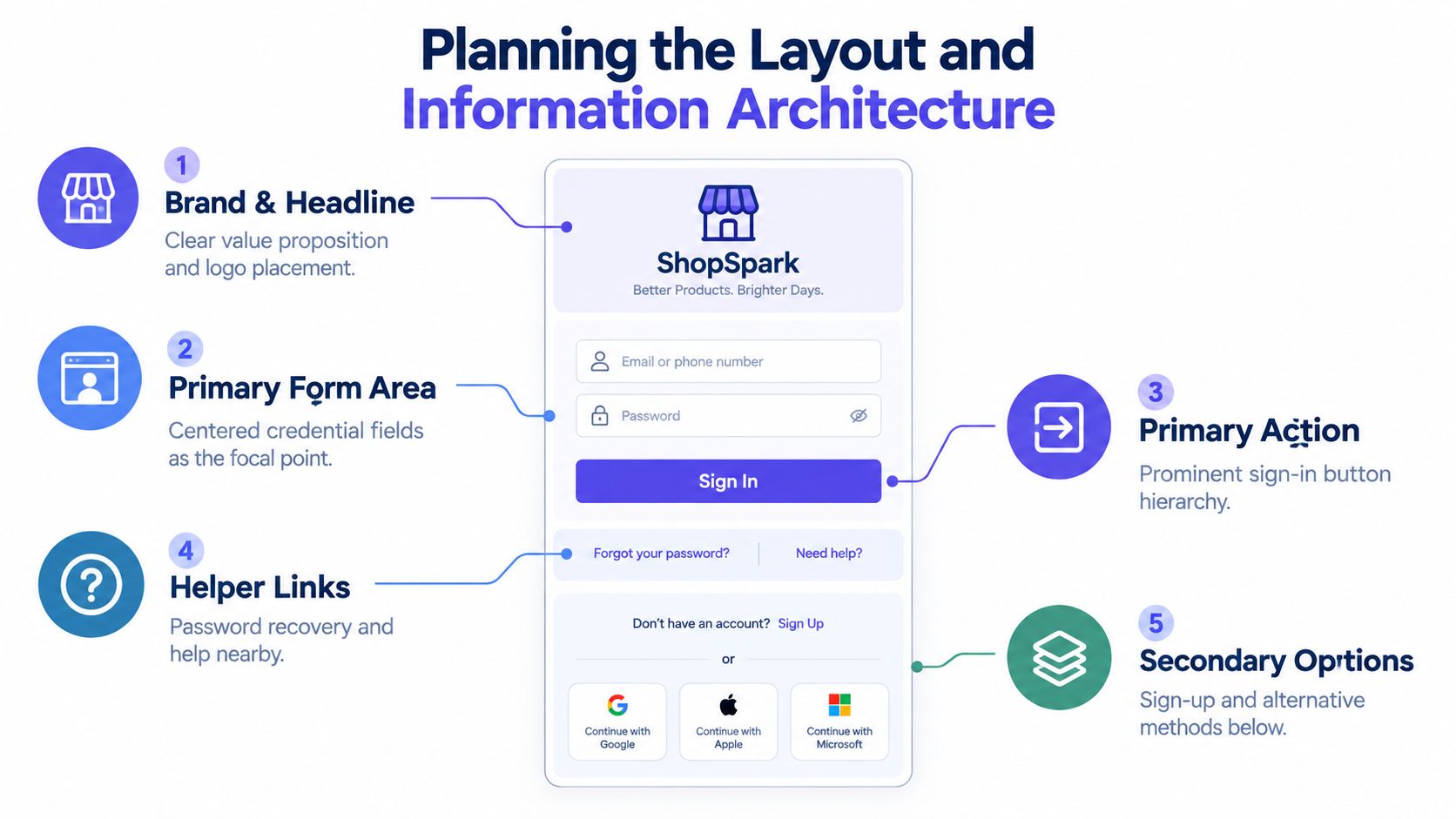
A good layout answers five questions in a predictable order: Where am I? What can I do here? What information do I enter? What happens when I submit? Where do I go if this doesn't work? If the page makes users answer those questions themselves, the interface is spending their attention before authentication begins.
Start with one primary task. For most products, that's signing in with an existing account. Put the logo and a short headline above the form, then place the credential fields, the main button, recovery help, and secondary options in a clear vertical sequence. A headline such as “Sign in to your workspace” is more useful than a brand slogan because it confirms the user's destination.
Choose a layout that matches the job
A centered card works well when authentication is the only task. It keeps attention on the form, adapts cleanly to mobile, and reduces decisions. Use a split screen when the brand or product context needs room, such as a fintech onboarding flow with a concise security message or an AI platform that needs to explain what a workspace contains. Keep the promotional side subordinate. If the visual panel competes with the form, it's not supporting trust, it's creating delay.
On smaller screens, avoid forcing desktop composition into a narrow viewport. The form should remain visible without excessive scrolling, and the primary button should be easy to reach with a thumb. Decorative artwork can disappear or move below the task. The user shouldn't lose access to the sign-in action because a marketing illustration received more layout priority.
Whitespace needs a job. Use it to separate identity, credentials, recovery, and account creation. Don't use large empty areas between a field and its error message, because that makes the relationship harder to understand. Keep the main action visually dominant through size, contrast, and placement, not through multiple competing buttons.
Keep secondary choices in their place
SSO, social sign-in, passkeys, and account creation can all be valuable, but showing every option at equal weight makes the page feel like a decision tree. Put the most common method first, then group alternatives under a clear divider or a secondary action. “Continue with Google” and “Continue with Microsoft” should look like distinct authentication methods, not like decorative brand tiles.
Make “Create account” visible for new users, but don't let it compete with “Sign in.” A user who already has an account shouldn't need to scan the entire page to find the path forward. This is an application of content hierarchy, where position and emphasis communicate priority before users read every word.
Designing Forms That Reduce Friction and Errors
The form should be minimal, forgiving, and easy to correct. A 2023 review of web authentication usability reports that people manage an average of 80 password-protected accounts, and that this number has doubled over time (review PDF). Users arrive with different password habits, password managers, devices, and levels of patience. Your form shouldn't make them prove they can get through an avoidable obstacle course.
Use persistent labels above fields. Floating labels can look tidy, but they often force users to remember what a field means after the placeholder moves or disappears. A visible “Work email” label remains available during typing, validation, and review. Supporting text should explain a real requirement, such as which identifier the account uses, rather than filling space with generic reassurance.

Validate at the right moment
Don't interrupt users while they're still entering a value. Validate format after the field loses focus or when they submit, then place the message next to the relevant field and preserve what they entered. If the email is malformed, say what to fix. If authentication fails, give a secure message that helps the user recover without exposing account details.
A large-scale authentication UX study found average success in finding and completing the authentication ceremony improved from 14% in the first phase to 79% in the second, while one app reached 96% completion after users learned the flow (ACM study). The practical lesson is to keep labels, actions, and feedback stable. Users can learn a flow when the interface behaves consistently between attempts.
Offer a show-password control, especially on mobile, and make it accessible to keyboards and screen readers. “Remember me” should explain what it does, particularly for shared or managed devices. Place “Forgot password?” close to the password field, where users look after a failed attempt. For products that support it, include username or email recovery rather than assuming the user remembers the exact identifier.
Browser behavior deserves implementation attention. Mozilla's documentation notes that autocomplete="off" can stop unwanted filling, while saveable login flows work more reliably when the username appears before the first password field so password managers can recognize the form correctly (Mozilla documentation). Use appropriate autocomplete tokens and test with the password managers your customers use.
A logic-driven form builder such as Kiwiform can help teams model conditional fields and validation rules, but keep authentication logic intentionally narrower than a lead-generation form. Sign-in is not the place to collect extra profile data.
Element | Keep Minimal | Defer or Remove |
|---|---|---|
Identifier | One clearly labeled email or username field | Duplicate identifiers or unnecessary profile inputs |
Password | One password field with show and hide control | Password confirmation during sign-in |
Primary action | One obvious sign-in button | Equal-weight competing buttons |
Recovery | A visible password or username recovery path | Hidden links or vague “Need help?” copy |
Extra context | Short, relevant security guidance | Long policy text beside the form |
Clear language carries the interaction. A practical guide to UX writing can help teams remove vague labels and write recovery messages that tell users what to do next.
Industry research summarized by Gotan's authentication UX guidance reports that roughly 52% of users abandon sign-in when the process feels too long or complex, and cites a benchmark where reducing fields from 4 to 3 increased conversions by 50%. Treat those figures as directional benchmarks, but take the design principle seriously: ask only for what authentication requires, and defer everything else until access is restored.
Choosing the Right Authentication Options
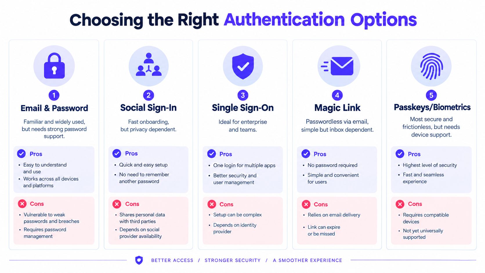
Authentication choice should follow your users' context, risk, and account structure. There's no universal winner. A consumer-facing AI tool may benefit from a familiar social method, while a fintech platform may need stronger device and recovery controls. An enterprise SaaS product may prioritize SSO even when it adds setup work for administrators.
Compare the common choices
Email and password remains familiar and broadly understood. It gives users a direct account path and works across devices, but it creates recovery and password-management obligations. Support it with password-manager compatibility, clear recovery, and security controls that don't turn every attempt into a challenge.
Social sign-in reduces typing and can make first access feel simple. It also introduces privacy concerns, provider dependency, and account-linking confusion. Tell users what will happen, use provider names accurately, and decide how an existing email account should behave if someone returns through a different provider.
Single sign-on earns its place in team products. Enterprise buyers often expect identity providers, domain controls, and centralized access management. The trade-off is that the first-time setup can be unclear for smaller customers, so show SSO as a relevant option rather than forcing every user through an enterprise path.
Magic links and one-time codes remove password memory from the experience. They're useful when email or phone access is dependable, but they make the inbox or device part of the critical path. Keep the waiting state specific, offer resend controls without creating a noisy loop, and explain where the code or link was sent without revealing unnecessary account information.
Passkeys and biometrics can provide a smooth sign-in experience when the device supports them. They're a strong fit for products with repeat use and security-sensitive data, but users still need a recovery path for a lost device, changed platform, or unfamiliar browser. Don't present a passkey prompt without explaining the next step when the user can't complete it.
Order options around user intent
Start with the method you expect most users to understand and complete. If your product is primarily enterprise, SSO may be the leading choice. If it serves independent creators, email or a familiar social provider may be more appropriate. Present alternatives after the primary route, and use plain labels such as “Use a passkey” or “Sign in with your work account.”
Account linking needs special care. If a person creates an account with Google and later enters the same email with a password, the product should provide a clear, secure path instead of creating duplicate workspaces. Web3 products need the same discipline when users connect multiple wallets. Explain whether a wallet creates a new profile, links to an existing identity, or requires an additional verification step.
For higher-risk actions, authentication can be layered without making every visit feel hostile. A product might allow a passkey for routine access and request a verification code before changing payout details. Teams that need a practical overview of how to protect accounts with verification codes can use that resource while designing the broader security journey.
Making Login Pages Accessible Fast and Reliable
Accessibility isn't a visual polish pass after the form is built. It affects whether people can identify fields, operate controls, understand errors, and recover from failure. Modern patterns such as passkeys, SSO buttons, floating labels, and one-time codes still need to work with keyboards, screen readers, password managers, zoom, and low-vision settings.
Make every state understandable
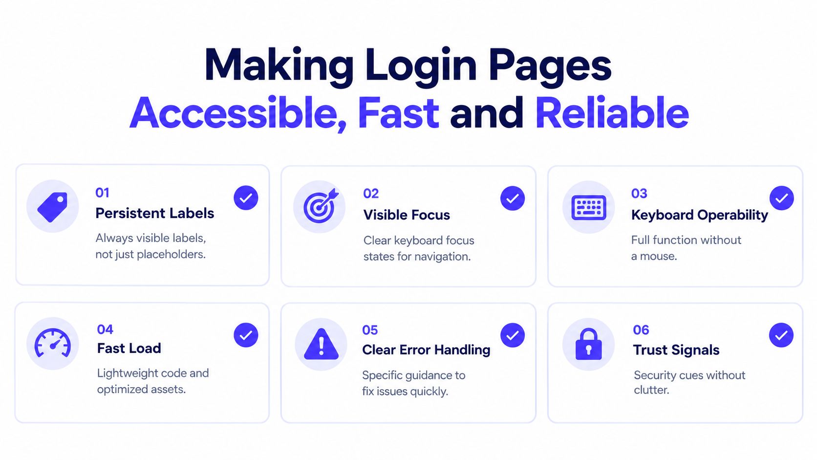
Persistent labels should remain visible, and each input should have a programmatic label that assistive technology can announce. Focus indicators need enough contrast and must not disappear against the brand color. Every control, including show-password toggles, resend actions, provider buttons, and modal close buttons, should work without a mouse.
Error messages should be tied to their fields and announced in a useful sequence. Avoid relying on color alone. A red border without text may signal a problem visually, but it doesn't explain what the user needs to change. Keep focus near the failed field after submission, while still allowing users to move through the page naturally.
The U.S. Web Design System sign-in template recommends a clearly marked password reset or username-recovery link. It also calls for secure error feedback that doesn't reveal whether the username or password was wrong. That balance helps legitimate users recover while reducing account-enumeration risk.
Protect performance and reliability
A login page rarely needs a heavy visual payload. Use lightweight assets, avoid unnecessary animation, and prevent layout shifts when errors appear or authentication options load. System fonts can reduce dependency on external resources, while stable field dimensions keep the page usable on slower connections.
Reliability includes the moments around the happy path. Show a clear loading state after submission, prevent accidental duplicate actions, and tell users when a network failure requires a retry. For code-based flows, preserve the entered identifier and provide a visible route back to editing it. For passkeys, make cancellation recoverable rather than treating it as a fatal error.
Run a focused accessibility check before release:
Keyboard path: Tab through the complete flow, submit it, trigger errors, and recover without a mouse.
Screen reader path: Confirm labels, headings, error associations, loading states, and button names.
Zoom and contrast: Check the form at enlarged text settings and in low-vision conditions.
Password managers: Test saved credentials, autofill, manual entry, and field order.
Responsive behavior: Review small phones, tablets, desktop browsers, and embedded webviews.
Failure states: Test expired links, incorrect codes, blocked accounts, network interruptions, and provider cancellation.
A login page can be secure and humane at the same time. The design challenge is to communicate enough for the user to act, without exposing sensitive account information or covering the screen in warnings.
Shipping a Login Page That Converts With Confidence
A shippable login page comes from a deliberate sequence. Establish the information hierarchy first, reduce the form to the credentials required, choose authentication methods that fit the audience, then test every state with real devices and assistive technology. Brand decisions should reinforce the product's credibility, while frontend implementation should preserve the behavior across browsers and account conditions.
Use this pre-launch checklist:
Copy: Confirm the headline, labels, button text, recovery links, and errors use plain language.
States: Design empty, focused, filled, invalid, loading, locked, expired, and success states.
Security: Prevent account enumeration, protect recovery, and make verification steps understandable.
Implementation: Verify autocomplete behavior, password-manager support, keyboard operation, and responsive layout.
Analytics: Track page views, submission attempts, completion, recovery starts, recovery completion, and support contact.
Quality assurance: Test supported browsers, mobile devices, slow connections, screen readers, zoom, and failed authentication paths.
Success isn't just a higher completion rate. Look for fewer repeated attempts, fewer avoidable recovery failures, and fewer support tickets that begin with “I can't log in.” A login experience should also preserve retention by helping returning users get back to value without re-learning the interface.
Teams that need a wider view can pair product design with practical guidance on accessibility in app login forms. For founders who don't want to coordinate separate product, brand, and frontend hires, 925 Studios covers those disciplines in one engagement, from interface structure and visual identity through the shipped website or product flow.
925 Studios helps AI SaaS, Web3, and fintech teams design and build login experiences that feel clear, credible, and ready for real users. Visit 925 studios to discuss your authentication flow, brand system, and frontend product needs with one creative partner.

Let’s keep in touch.
Discover more about high-performance web design. Follow us on Twitter and Instagram.

