
Chatbot UI Design: How to Build Interfaces That Convert

Outrank AI

A chatbot can be perfectly usable and still leave users less satisfied than a traditional interface. In a controlled mobile study, a graphical interface earned higher attractiveness and satisfaction ratings than a chatbot in several scenarios, while the chatbot performed better when users needed to change plans. The lesson for founders is uncomfortable but useful: chat isn't automatically the best interface just because the product uses AI. Good chatbot UI design starts by choosing where conversation helps, then gives users structure when conversation becomes vague.
That matters because chatbots have moved well beyond the small support bubble in the corner of a website. Banking and finance lead chatbot adoption at 83%, followed by SaaS and technology at 81%, e-commerce and retail at 79%, and telecommunications at 76%, according to GreetNow's chatbot adoption compilation. The same compilation reports that 74% of businesses are using or piloting generative AI chatbots, up from 23% in early 2023. Your chat window is increasingly where customers judge the product, the company behind it, and the reliability of the AI.
Table of Contents
Why Chatbot UI Is Now a Product Surface
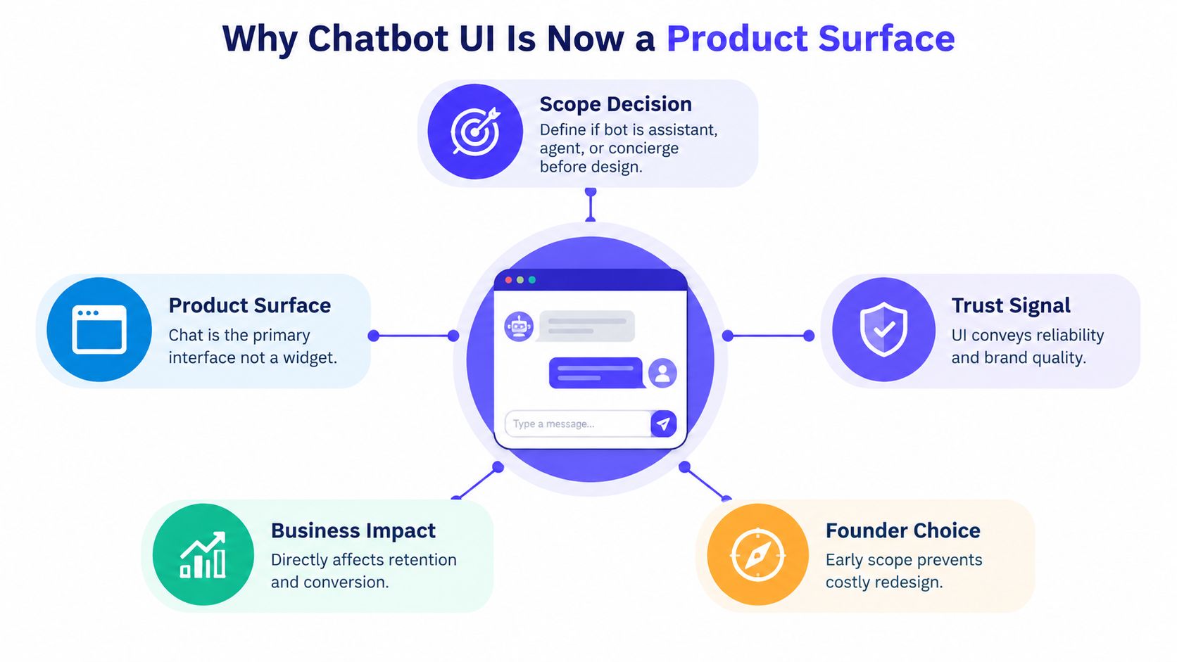
The chat window is the product, not a support widget bolted onto a SaaS dashboard.
That distinction changes the work before any visual design begins. A founder needs to decide what job the bot owns, which user actions it can complete end to end, and where it stops. A reporting assistant might explain a metric, build a report, and export it. It might not be allowed to change billing details or make a financial decision. Those boundaries should be visible in the interface, not hidden in a technical document.
The market already points in this direction. The U.S. chatbot market was valued at $407.54 million in 2025 and is projected to reach $2.36 billion by 2035, according to the Gitnux chatbot adoption research. That expansion creates pressure to design chat as a dependable product surface, with clear identity, useful states, and a credible path to completion.
Define the job before the look
Write the bot's purpose in one sentence that a customer can understand. “Help me compare transaction fees and prepare a recommendation” is more useful than “AI-powered fintech copilot.” Then list the actions it owns, the information it can access, and the moments where it hands the user to a person or a different screen.
This is also where you choose the bot's role:
Assistant: explains, summarizes, or guides the user.
Agent: takes actions such as creating a ticket or changing a setting.
Concierge: helps users find the right route across a broad product.
A vague role creates a vague interface. A bot that claims to do everything forces users to test its limits through trial and error, which is a poor way to build trust.
Practical rule: If the team can't describe the bot's first useful outcome and its handoff condition, it isn't ready for visual design.
The chat surface shapes first impressions because users see the bot's tone, response timing, controls, and uncertainty in one place. Treating it as decoration produces polished bubbles around shallow functionality. Treating it as a core surface forces decisions about capability, data use, recovery, and the business outcome you want, whether that's activation, retention, support resolution, or conversion.
For a useful comparison, review how AI assistants for in-product UX can guide users within a product instead of pulling them into a separate support journey. The rest of the work follows from this scope decision. You map the conversation, choose patterns that match the job, design the first turn, expose failure honestly, and test the experience on the devices your customers use.
Mapping the Conversation Before Drawing the Window
A pretty chat window can't rescue a bot that doesn't know what to do when a user changes direction.
Start with the jobs users bring to the product. For a fictional reporting assistant, those jobs might be:
“Show monthly recurring revenue by region.”
“Why did activation fall last month?”
“Email this report to my finance lead.”
“Change the date range to the previous quarter.”
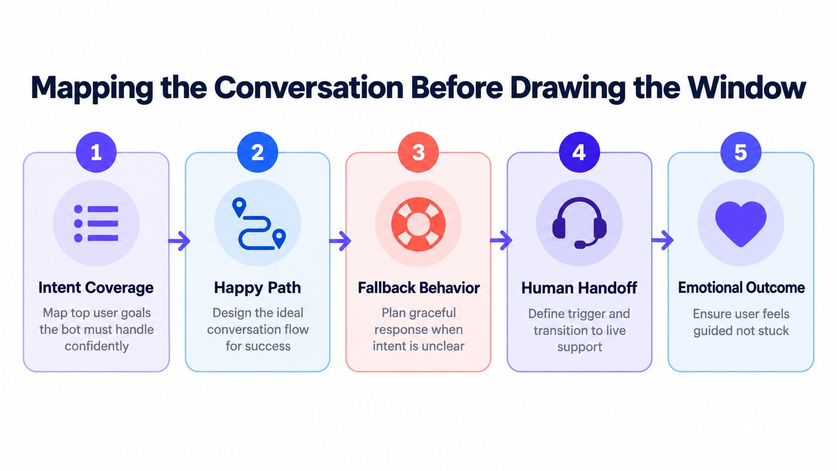
Group those requests into intents the system can recognize. “Explain a metric” differs from “create a report,” even if both mention revenue. The distinction matters because each intent needs its own permissions, response format, confirmation state, and fallback.
Nielsen Norman Group's research on chatbot usability found that users struggle when they move outside a bot's intended flow. Its practical recommendations are direct: tell users what the bot can do, support both free text and buttons, and provide an escape hatch to a human or another channel. The research used 8 participants across mobile and desktop task testing, which is a useful reminder that small qualitative studies can reveal serious flow problems before launch.
Write the branches, not just the happy path
Suppose a user types, “Show me the report.” The assistant should ask which report if several exist, or offer buttons such as Revenue, Activation, and Retention. If the user chooses Revenue, the bot can ask for a date range, display the result, and offer Compare, Export, or Ask another question.
The important design work appears when the user types, “Why is it weird?” The bot shouldn't reply with a generic failure message. It can ask, “Do you mean the revenue total, the regional split, or the change from last month?” If it still can't identify the intent, it should explain the limitation and offer a human review or a direct route to the analytics screen.
Use a flowchart or a simple document before opening Figma. Mark every point where the bot can:
Recognize the intent.
Ask for missing information.
Offer structured choices.
Recover from an unclear request.
Transfer context to a human.
A good handoff preserves the user's message history and states why the transfer happened. “A specialist needs to verify this account change” is more reassuring than “Something went wrong.” Teams that need a practical way to document these paths can use these user flow examples as a starting point.
The emotional outcome matters as much as the technical branch. A user can accept “I can't complete that here” if the next action is obvious. They resent a bot that keeps asking the same question, loses context, or sends them back to the beginning.
Picking the Right Message and UI Patterns
Every interface pattern makes a promise. A plain text reply promises speed and flexibility. A button promises that the system understands a limited choice. A card promises that the information has been organized for a decision.
Choose the pattern that matches the bot's actual capability, not the competitor screenshot your team saved for inspiration. If a user needs to select a plan, buttons or a comparison card reduce effort. If they need to describe an unusual compliance issue, open text is more appropriate. If the bot is showing a metric, a structured result with a source and a clear next action is stronger than a long paragraph.
Component | Best For | Watch Out For |
|---|---|---|
Text bubbles | Explanations, summaries, clarifying questions | Long blocks that hide the next action |
Rich cards | Products, reports, account options, recommendations | Visual weight that suggests certainty the data doesn't support |
Quick reply chips | Common intents, confirmations, recovery choices | Too many options that make the first turn feel like a menu |
Carousels | Comparing several items with similar attributes | Horizontal scrolling that hides important choices on mobile |
Form-style inputs | Dates, amounts, account details, and constrained values | Asking users to type data the interface could validate |
File uploads | PDFs, screenshots, contracts, and datasets | Unclear file limits, privacy handling, or processing state |
Confirmations | Payments, deletions, submissions, and external actions | Making low-risk actions feel slower than necessary |
Keep the shell predictable
The header should identify the assistant and show its status without pretending it's human. The composer needs a visible text field, send control, and attachment option only when attachments are supported. Conversation history controls should help users return to prior work without competing with the active task.
A rich card is useful when the user needs to inspect or choose something. It isn't useful when it just wraps a sentence in a decorative container. The same goes for animation. A subtle transition can show that a message was received, but motion shouldn't delay reading or make a financial workflow feel playful.
Messaging products offer a useful reference point because users already understand their basic structure. For teams considering support across messaging channels, a practical example of WhatsApp customer service AI shows how channel expectations can shape response structure and escalation. The interface still needs to fit the product's job rather than copy WhatsApp's visual language.
Good microcopy carries much of the usability burden. Labels such as Review report, Try another question, and Talk to support tell users what happens next. A focused guide to UX writing can help teams make those actions clear without filling the interface with explanation.
The strongest pattern is often hybrid. Let users type naturally, then use cards, chips, calendars, tables, and confirmation screens when the task becomes structured. Chat should reduce friction, not force every product action into a message bubble.
Designing the First Turn So Users Stay
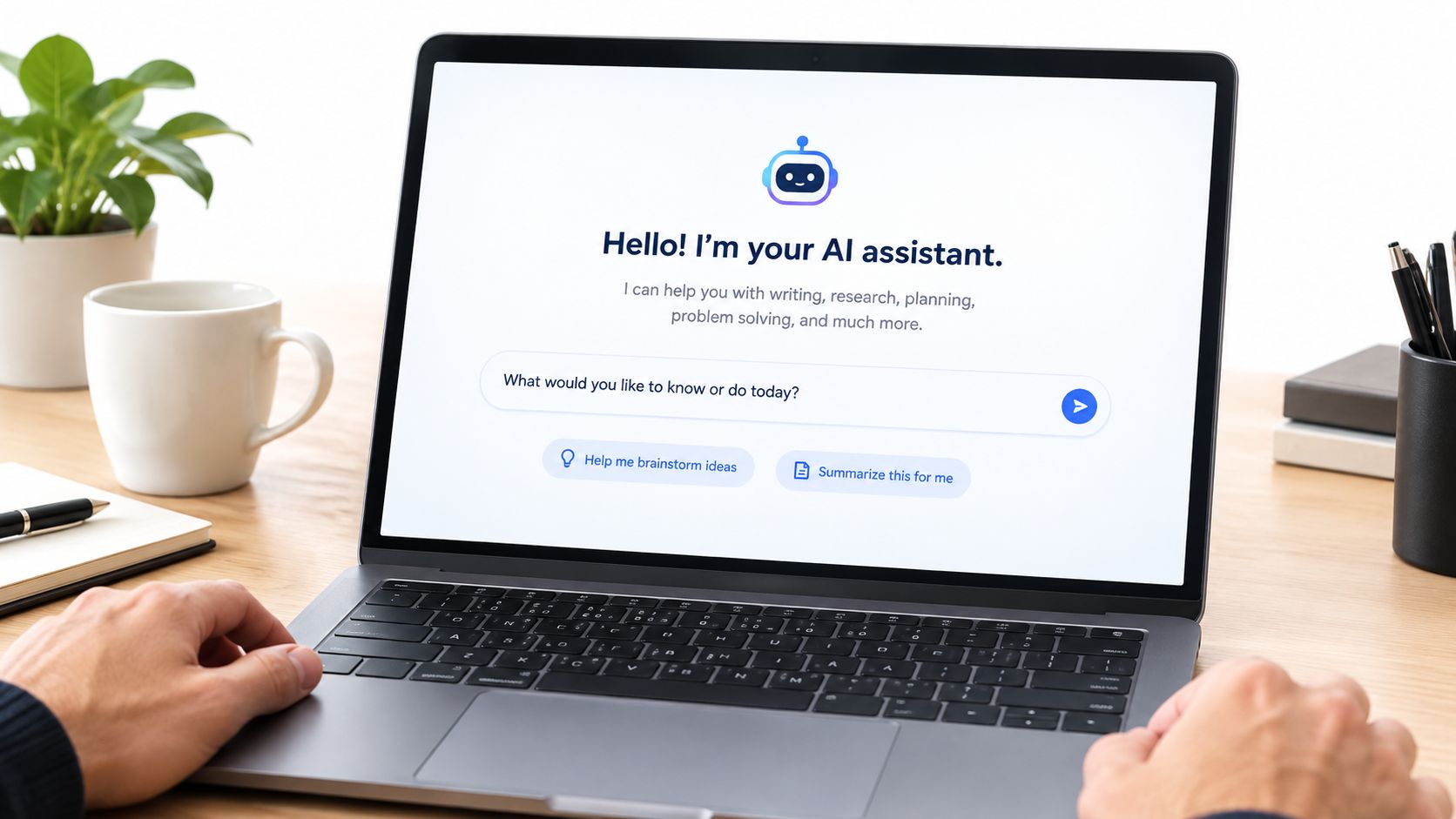
The empty state has one job: help a new user send a useful first message.
Start with a short capability line. “I can summarize uploaded documents, compare account activity, and explain dashboard metrics. I can't change billing settings.” That sentence gives the user a reason to continue and prevents the common mistake of implying unlimited intelligence.
Suggested replies make the range visible without making users invent a prompt. Show three to five options that represent real tasks, such as Summarize this PDF, Explain my revenue trend, or Find the latest invoice. Avoid novelty prompts that demonstrate personality but don't lead to a product outcome.
Make the first action obvious
Intercom Fin, ChatGPT, and Notion AI each show users a different version of the same principle. The interface needs to tell people what kind of work belongs there. A founder can borrow the clarity of those products without copying their tone, layout, or assumptions about user intent.
Use the empty state to answer three questions:
What can I ask? Give examples tied to the actual product.
What will I get? Name the result, such as a summary, comparison, draft, or action.
What should I do next? Put the cursor in the composer and make the input prompt specific.
A placeholder such as Try: summarize this PDF reduces hesitation because it shows the expected shape of a request. It shouldn't disappear the moment the user focuses the field if that removes the only useful instruction. Keep the example short enough to scan.
The typing indicator is part of the trust model. It should appear when the system is processing a response, remain visible during meaningful latency, and change into a clear status if the response takes longer than expected. Research on dynamic response delays found that response delays can increase perceived humanness and social presence, while also improving satisfaction with the interaction, as described in the ECIS research on dynamic response delays. That doesn't justify fake waiting. It means timing should feel intentional and honest.
Another chatbot interaction study found instant responses received a satisfaction score of 5.67, while long responses without a loading indicator received 4.40, with a statistically significant effect reported as F(2,206)=10.95, p<0.001 in the MobileHCI study. Keep early replies concise, show progress when needed, and give users control when generation runs long.
Handling Errors, Delays, and Uncertainty Honestly
Failure states decide whether users trust the successful states.
A chatbot that says “I don't know” with a useful next step can feel more reliable than one that answers every question with confidence. A 2025 analysis found that trust and transparency had the lowest satisfaction among conversational UI dimensions, with 60% satisfaction and 18% dissatisfaction, highlighting unresolved friction around privacy, decision clarity, and bias concerns in the published conversational UI analysis.
Give users a way back
Use four concrete patterns in the message thread:
Honest typing indicator: Place the status directly below the latest user message. Start with “Thinking” or “Checking your workspace,” then switch to a longer status if the model is still working. Add a stop control when generation can be interrupted.
Transparent error state: Keep the failed message in place and explain what failed. “I couldn't access the billing record” is better than “Oops.” Put Retry, Rephrase, or Open billing directly below it.
Uncertainty disclosure: When the answer depends on incomplete information, say so near the claim. Add a citation chip, a “Based on these sources” label, or a request for the missing detail. Don't bury uncertainty in a footer.
Recovery path: Put Regenerate, Edit prompt, and Talk to a person where the user can act without restarting the conversation.
Perplexity's citation chips, ChatGPT's stop and regenerate controls, and Intercom's escalation button illustrate patterns users can understand quickly. The exact styling should follow your product, but the control placement should stay close to the message that needs correction.
Inline evidence matters especially in fintech, Web3, and AI SaaS. A source chip can open the relevant document, transaction record, or knowledge-base article without forcing the user to leave the conversation. If the assistant used a tool, show that state plainly, such as Checked account activity or Searched approved documentation. Capability transparency helps users understand what the system did.

Make escalation a designed outcome
A handoff shouldn't be hidden under a settings menu. Surface it when the assistant detects repeated misunderstanding, a permission boundary, a sensitive request, or a task that requires judgment. Preserve the conversation context and tell the user what will happen next.
This is the same design discipline used in broader product alerts. A useful notification system design guide can help teams decide how status, urgency, and action should appear without turning every state into an alarm.
Honest uncertainty is a conversion feature. Users who see the system recover clearly are more likely to trust it during a successful task because the interface has demonstrated that it won't bluff when conditions change.
Making the Chatbot Accessible and Mobile-Ready
Accessibility is shipping quality, not a compliance task handed to someone at the end.
The core rules are straightforward. Chat messages should use 16px minimum body text, timestamps and metadata should use 14px minimum text, and message text should meet 4.5:1 contrast against its bubble background. Large text and icon buttons should meet 3:1 contrast. These specifications make the interface easier to read in bright light, at small sizes, and on lower-quality screens.
The accessibility guidance for conversational UI also calls for screen-reader support, keyboard navigation, focus management after sending, and WCAG AA contrast for message bubbles, as outlined in this conversational UI accessibility guide. A screen reader should announce a new assistant message without stealing focus from the composer. After sending, focus should return predictably to the input unless the user has moved elsewhere.
Element | Minimum Spec |
|---|---|
Chat message text | 16px |
Timestamp and metadata | 14px |
Message text contrast | 4.5:1 |
Large text and icon button contrast | 3:1 |
Focus treatment | Visible focus ring on every interactive element |
Keyboard access | Every action must be reachable without a pointer |
Mobile tap targets | 44px minimum |
Composer placement | Fixed near the bottom, with safe-area padding |
Treat mobile as the primary environment
Apple Messages and Google Messages work because the composer stays within easy thumb reach, recent messages remain visible, and the keyboard doesn't hide the active conversation. Your chatbot should follow the same basic logic. Keep the input bar at the bottom, support safe-area padding on notched devices, and preserve the user's position near the latest message without creating unexpected jumps.
Every action needs a reachable control. That includes quick replies, citation chips, attachments, regenerate controls, and human handoff. A visible focus ring should appear on the input and on every interactive message element. Keyboard users should be able to move through the thread in a sensible order, while screen-reader users should understand whether a response is loading, complete, failed, or awaiting input.
The W3C cognitive accessibility guidance recommends pauses between phrases, long timeouts, simple error recovery with human handoff, no advertisements or unnecessary information, jargon-free language, and a visual conversation log in its cognitive accessibility module. Those recommendations apply beyond voice interfaces. A readable history, calm pacing, and clear recovery help users who process information differently.
Keep the launcher button away from the composer and important content. Test long responses, larger text settings, rotated screens, the software keyboard, and attachments on real phones. A desktop layout that technically shrinks is not mobile-ready.
Prototyping, Testing, and a Pre-Launch Checklist
Don't start with a full build. Prototype the conversation in Figma first, then connect a real language model or a simple scripted flow once the structure is clear. The prototype should include more than the happy path because users form their opinion of the product when the bot hesitates, misunderstands, or transfers them.
Test these five moments:
Empty state: Can a new user tell what the bot does?
First reply: Does the response answer the request without unnecessary detail?
Fallback: Does an unclear request produce a useful clarification?
Slow reply: Does the interface show progress and preserve control?
Handoff: Does a person receive the context without making the user repeat it?
Watch behavior, not compliments
In moderated sessions, pay attention to hesitation, retyping, abandoned messages, and users who search the surrounding interface for help. Ask people to complete a real task, such as finding a report, checking a transaction, or preparing a customer reply. Don't ask whether they “like” the chatbot. Watch whether they understand its capabilities and recover when the first attempt fails.
After launch, instrument the conversation as a product funnel. Track first-response completion, suggestion click rate, handoff rate, and re-ask rate. These measures tell you where the design or system is failing. A high re-ask rate can point to unclear answers, missing context, weak citations, or a response format that makes users start over.
Launch principle: Measure the moments where users lose confidence, not only the moments where the bot produces an answer.
A Monday-ready checklist should fit on one page:
Capability line: The greeting states what the bot can and can't do.
Intent coverage: The main user jobs have mapped flows.
Fallback: Unclear requests produce clarification or a useful route.
Recovery: Retry, rephrase, edit, and regenerate controls work.
Citations: Answers that require evidence expose sources or records.
Escalation: The human handoff is live and preserves context.
Accessibility: Contrast, keyboard access, focus, labels, and screen-reader announcements have been tested.
Mobile input: The composer, safe-area padding, scroll behavior, and tap targets work on real devices.
Analytics: First response, suggestions, handoffs, and re-asks fire correctly.
Brand fit: Tone, colors, type, and motion support the product instead of distracting from the task.
A team may use Figma, a component library, a hosted model, or an integrated product studio to get this work shipped. 925 Studios works with AI SaaS, Web3, and Fintech teams across product design, brand identity, frontend development, and design systems, including chat and agent interfaces with prompt states, result states, citations, and human review. The model matters less than having one accountable team connect the conversation logic to the interface users touch.
If your chatbot needs more than polished bubbles, 925 studios can help define the flow, design the trust and recovery states, and build the frontend into a coherent product surface. Visit the studio to discuss a focused chatbot UI design engagement that connects product strategy, brand, and shipped interface work.


Let’s keep in touch.
Discover more about high-performance web design. Follow us on Twitter and Instagram.

