
8 User Flows Examples for SaaS, Web3, and Fintech

Yusuf
Founder and lead designer at 925studios

A user flow is the path between a user's intent and a meaningful result. It isn't a collection of screens. It's the sequence that decides whether someone trusts your product enough to finish setting up an AI workspace, connect a wallet, import financial data, approve a payment, or recover from a failed transaction.
That makes user flows examples valuable for more than interface inspiration. They show where complex products either earn confidence or create hesitation. The strongest diagrams expose entry points, decisions, system responses, success states, and failure paths before the team spends time polishing screens. A high-fidelity wireframe can then translate that logic into a realistic interface, as explained in this high-fidelity wireframing guide.
The examples below focus on the product decisions behind eight important flows. Each one connects an annotated path with interface details, copy, recovery logic, brand consistency, and a practical outcome founders can apply. The sequence moves from first setup through authentication, data, dashboards, payment, preferences, discovery, and failure recovery.
Table of Contents
1. Onboarding Flow for SaaS Product Setup
A strong SaaS onboarding flow gets a new user from signup to a first useful outcome without asking for every possible detail upfront. The path might begin with account creation, continue through workspace setup and an integration, and finish when the user creates an automation, imports a project, or completes another meaningful action.
For an AI SaaS product, that first outcome could be connecting a data source and generating a useful result. The interface should explain why each input matters. Asking for a company size, industry, or use case can be helpful when it changes the setup, but it becomes a tax when the product asks before showing value.
Stripe's onboarding approach begins by identifying the business type, then presents payment options that match the context. Notion's setup wizard helps users choose templates instead of dropping them onto an empty canvas. Slack uses workspace and channel creation to move teams toward their first message. These patterns differ, but each connects setup to a visible product benefit.
Design the first win, not the whole product
Use one clear primary action per screen. Show progress when the flow has multiple stages, but don't turn the progress indicator into a warning that the user has a long administrative task ahead.
A practical onboarding flow should include:
Smart defaults: Pre-fill details when the product already knows them, and let users correct rather than re-enter information.
Optional branches: Let users skip integrations or advanced configuration without blocking access to the core experience.
Visible recovery: Preserve entered data when validation fails, and explain what needs attention in plain language.
Behavior tracking: Measure activation rate, time to value, onboarding completion rate, feature adoption rate, and D1, D7, and D30 retention. These are established onboarding measures used to evaluate whether setup leads to sustained use, as outlined in SaaS onboarding metrics and KPIs.
Practical rule: If a setup question doesn't change the next product experience, move it later.
Test this flow with people who haven't seen the product before. Watch where they pause, skip, or ask what a term means. The first screen that repeatedly creates hesitation deserves redesign before visual polish elsewhere.
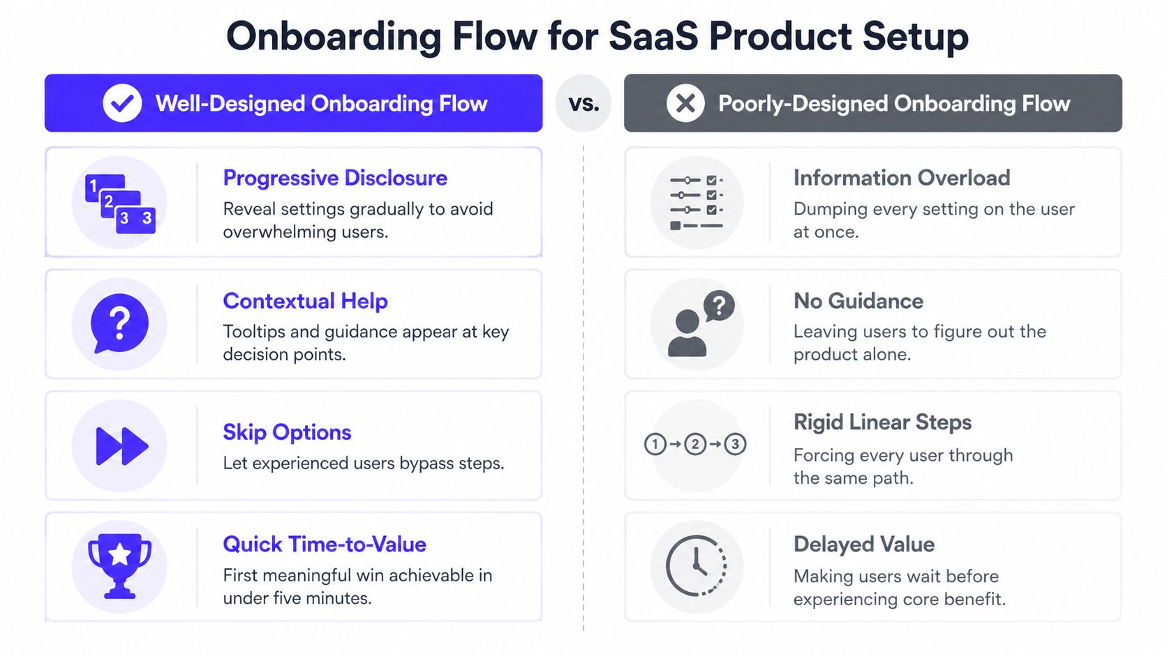
For a deeper implementation reference, see these SaaS onboarding best practices.
2. Authentication and Account Recovery Flow
Authentication is where a product makes a direct promise about access and security. The user wants to enter the product, not study your identity model. Your job is to make the secure path feel understandable, predictable, and recoverable.
A useful flow can include email signup, login, social login, password reset, two-factor authentication, and account recovery. The right path depends on the risk of the product. A fintech account or Web3 wallet needs more visible security context than a low-risk collaboration tool, but extra security should still come with clear explanations.
GitHub can introduce the value of an account before completing signup. Figma's single sign-on support removes repeated credential work for teams. 1Password's recovery-code model gives users a deliberate way to regain access without depending only on a memorized password. These examples point to a larger principle, recovery is part of authentication, not an afterthought.
Reduce uncertainty at every branch
Show password requirements before submission, not after a failed attempt. If a user enters an email that already has an account, provide a clear route to login rather than making them restart. If two-factor authentication is required, explain what the user needs and what happens if the device is unavailable.
Use a simple decision structure:
Known account: Continue to login or the next verification step.
Unknown account: Offer account creation without exposing unnecessary account information.
Forgotten credential: Send the recovery path and preserve the user's place.
Lost second factor: Present recovery options with plain-language security warnings.
The authentication endpoints reference is useful for teams connecting the interface to backend access logic. Product and engineering should review those states together, because a polished login screen can still fail if the API response creates an unclear dead end.
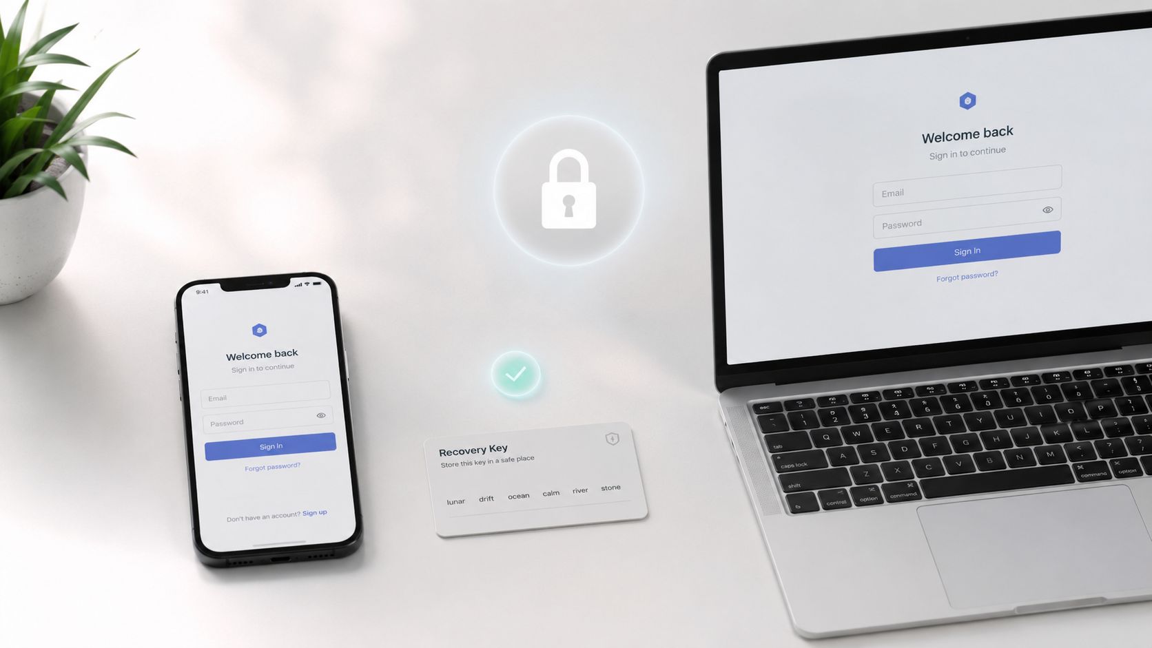
In Web3 and fintech, trust also depends on visual consistency. Verification screens, recovery messages, button labels, and security notices should feel like one product, not separate components assembled by different teams. Test password reset regularly. Broken recovery links and unclear expiry states create support work exactly when users are already frustrated.
3. Data Import and Integration Flow
Data import is the moment a product proves it can replace an existing workflow. The user already has files, records, documents, wallet history, or connected services somewhere else. If your product makes that transition risky, the user has little reason to continue.
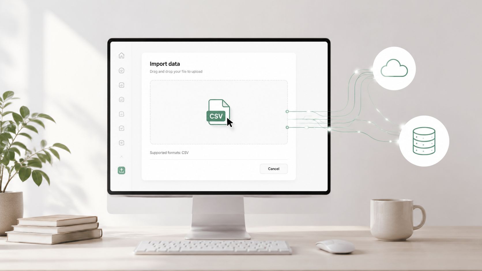
A good import flow begins by identifying the source. The user might upload a CSV, connect an API, authorize a platform, or import a wallet. The next steps should make the system's interpretation visible. File format detection, column matching, permission scope, and duplicate handling are product decisions, not merely technical details.
Notion's CSV import experience uses column matching to make spreadsheet migration easier to understand. Airtable's import wizard helps users connect several data sources. MetaMask's account import process supports wallet recovery and switching, where the consequences of a mistake are especially serious.
Show what will happen before it happens
A preview screen is one of the most important parts of this flow. Let users inspect mapped fields, identify missing values, and correct obvious errors before the import becomes permanent. For AI SaaS products, show which documents will be indexed, what permissions the connection requires, and whether the system will use the data for a specific workspace or account.
Helpful interaction details include:
Sample inputs: Offer an editable sample file so users can match the expected structure.
Automatic detection: Recognize common file types and suggest field mappings, while keeping manual correction available.
Duplicate protection: Tell users how repeated records will be handled before they confirm.
Permission clarity: Explain what an integration can read, write, or sync.
Progress feedback: Show whether the system is uploading, validating, importing, or waiting for user action.
Import is a trust decision. Users need to know what the system found, what it changed, and how to undo it.
Don't hide integration failures inside a generic notification. If a connection expires, identify the affected source and give the user a direct reconnect action. If an import partially succeeds, distinguish completed records from records that need attention. A branded empty state, clear status language, and a useful next action can turn a complicated migration into a controlled first experience.
4. Dashboard and Data Visualization Flow
A dashboard needs to serve two different user intentions. One person wants a quick answer, such as whether revenue, model usage, or portfolio performance is moving in the right direction. Another wants to investigate a change, filter a segment, export data, or share a report with colleagues.
Stripe's dashboard places revenue and transaction information in a prominent position, then supports deeper inspection by payment method. Mixpanel lets teams build funnels and retention cohorts. OpenSea's analytics experience gives Web3 users context around floor price, volume, and holder distribution. Each example starts with a high-value question and then provides paths for investigation.
Place the dashboard image near the start of the experience because the visual hierarchy determines whether users understand the product's value quickly.

Build a clear route from scan to explanation
The flow should move naturally from summary to detail:
Summary state: Lead with the metric that best represents the user's current objective.
Context state: Show comparison periods, segments, or status indicators without overwhelming the first view.
Detail state: Let users drill into the underlying records or events.
Action state: Make export, sharing, alerts, or follow-up actions easy to find.
Return state: Preserve filters and context when users move back from a detail view.
Consistent colors and chart types matter because users learn the visual language of a dashboard over time. Red shouldn't mean a warning in one chart and positive growth in another. Labels should explain the metric, its time range, and whether it reflects actual, estimated, or incomplete data.
A guided tour can help new users locate the most important dashboard areas, but it shouldn't cover the interface with tooltips. Use short copy, show the next action, and let users dismiss the tour. For more product-specific direction, review these SaaS dashboard design examples for 2026.
Teams connecting dashboards to external workflows can also review e-commerce and clinic integrations. The practical test is simple, load the dashboard with realistic data volume and ask a user to answer a real business question without assistance.
5. Checkout and Payment Processing Flow
Checkout is where a product's promise becomes a financial decision. The user has already chosen to buy, but they still need confidence that the amount, plan, payment method, and confirmation are correct.
A useful checkout flow keeps the order summary visible while the user enters payment details. Stripe's checkout experience supports saved payment information and a focused purchase path. Amazon's one-click approach removes repeated decision work for returning buyers. OpenSea combines wallet approval with transaction confirmation, which requires especially clear status communication because the user may be waiting for both a product interface and an external network.
Don't add fields because the backend can store more information. Every field creates another question, another validation state, and another opportunity for the user to hesitate. The exact form length should follow the transaction and compliance requirements, not a generic template.
Make status and recovery impossible to miss
The flow should distinguish between these states:
Ready to pay: The user can review the item, amount, billing terms, and selected method.
Verification required: The product explains why additional information is needed and what happens next.
Processing: The interface prevents duplicate submission while showing that the request is active.
Success: The user receives a clear confirmation with the purchased plan or item.
Failure: The product identifies whether the issue involves the card, wallet, authorization, network, or account.
Use a payment provider rather than handling sensitive payment data in a custom interface unless your team has a clear reason and the required controls. Put security information near the payment action, not in distant footer copy. Promo codes should be available without competing with the main purchase action.
In fintech and Web3, the confirmation state deserves as much design attention as the payment form. Tell users whether the transaction is submitted, approved, pending, rejected, or still awaiting external confirmation. Provide a receipt or invoice path that matches the product's promise, and test with real payment methods and realistic failure states rather than reviewing only the successful test path.
6. Settings and Preferences Configuration Flow
Settings become more important as users gain responsibility inside a product. A founder may want billing and workspace controls. An individual user may need notification preferences. An organization owner may need privacy, access, integration, and retention rules. Putting all of these into one undifferentiated menu forces every user to search through options that don't belong to them.
Slack separates personal preferences, team settings, and workspace administration. GitHub distinguishes account controls from organization and repository settings. Notion gives users control over privacy, notification frequency, and experimental features. These products show why settings architecture should reflect responsibility, not just the internal structure of the codebase.
Give each setting a clear owner
Organize settings around who can change them:
Individual user: Profile, password, appearance, language, and personal notifications.
Team administrator: Members, roles, shared integrations, and workspace defaults.
Organization owner: Billing, security policy, retention, legal controls, and account deletion.
Developer or technical operator: API keys, webhooks, environments, and system connections.
Each page should explain the effect of a change before the user saves it. A notification toggle can update immediately, but a change to permissions or data retention deserves a confirmation step and a record of what changed. Dangerous actions such as exporting sensitive data, removing a workspace, or deleting an account should be deliberate without becoming impossible.
Nielsen's third usability heuristic is user control and freedom, which means users need clear ways to undo mistakes, exit unwanted steps, and recover from misclicks, as described in this heuristic-based onboarding audit. Apply that principle to settings by making the current state visible and offering a safe return path.
Sensible defaults keep most users out of settings entirely. Power users should still find advanced controls without hunting through unrelated categories. After implementation, test that changing a preference changes the relevant workflow, including notification links, team permissions, and connected integrations.
7. Search and Discovery Flow
Search is a product's answer to growing complexity. It helps a user who knows the exact file, message, feature, person, or transaction they need. It also supports exploration when the user knows the problem but not the product's terminology.
Figma's command palette gives experienced users a route to actions without navigating menus. Slack brings messages, people, channels, and files into one search experience. GitHub supports repository and code discovery with advanced operators. These examples serve different products, but they all treat search as a primary path rather than a decorative field.
Support both known and unknown intent
A good search flow starts with a clear entry point. The field should tell users what they can search, and the system should respond as they type without making them guess the required format. Group results by type so the user can understand whether a match is a document, user, feature, message, or help article.
Useful details include:
Recent searches: Help repeat users return to unfinished investigation.
Helpful empty states: Explain what the system searched and suggest a narrower or broader query.
Filter persistence: Preserve selected filters when users open a result and return.
Keyboard access: Support command-driven users while making shortcuts discoverable.
Real query testing: Use the words customers type, including misspellings and internal jargon.
A command palette shouldn't replace ordinary navigation for everyone. It's a powerful second route for frequent users, but new users still need visible labels and understandable categories. Search results also need brand consistency. If the marketing site, help center, and product use different names for the same feature, users will struggle even when the search engine works correctly.
For guidance on placement, behavior, and search intent, see these search bar examples for websites. Then review failed queries with product and support teams. A result page that says nothing is often a content, naming, or indexing problem, not just a search-interface problem.
8. Error Handling and Recovery Flow
Users learn the character of a product when something fails. A successful checkout is expected. A failed payment that explains the cause, preserves the order, and offers a safe retry demonstrates competence.
Map error states beside the happy path, not after the interface is complete. The flow should account for invalid fields, expired sessions, unavailable integrations, network timeouts, rejected wallet transactions, permission problems, and partial imports. Each failure needs a next action that matches the actual cause.
Stripe's API errors are designed to identify the problem and guide correction. Gmail points users toward the field that needs attention. Ethereum wallet experiences need to explain issues such as gas requirements and the possible next step. In all three cases, the user needs a useful decision, not an internal system label.
Write the recovery path into the diagram
Inline validation works well when the system can identify the problem as the user types. Keep the user's valid input, highlight the exact field, and explain how to fix it. For a transient network failure, make retry prominent. For a permission failure, provide a route to request access or contact the administrator.
A recovery flow might include:
Specific message: State what went wrong in language the user understands.
Actionable correction: Tell the user exactly what to change, reconnect, verify, or retry.
Preserved work: Keep entered form data, selected filters, and draft content whenever possible.
Safe retry: Prevent duplicate payments, imports, or transactions when the user tries again.
Human support: Put a support option inside the error state when the user can't resolve the issue alone.
Avoid exposing technical codes to end users unless the code helps support and doesn't replace the explanation. “Something went wrong” gives the user no way forward. In fintech and Web3, distinguish a rejected transaction from a pending transaction, because telling someone to retry a pending action can create a duplicate or additional cost.
User-flow optimization should be measured with task success rate, time on task, and drop-off rate. These measures reveal whether people complete the process, how long completion takes, and where they abandon it, as defined in this user-flow case study.
Comparison of 8 Key User Flows
Flow | Implementation complexity | Resource requirements | Expected outcomes | Ideal use cases | Key advantages |
|---|---|---|---|---|---|
Onboarding Flow for SaaS Product Setup | Medium–High, conditional UX, state management, integrations | UX research, frontend, backend, integration work, content | Faster time-to-value; higher activation; reduce early churn (≈20–40%) | New users; complex/AI SaaS requiring data or integrations | Increases activation, reduces support, guides users to first win |
Authentication and Account Recovery Flow | High, security, token handling, MFA, compliance | Security engineering, backend, QA, compliance/legal review | Fewer failed logins/support tickets; increased trust and day-one access (support ↓ ~60%) | Fintech, Web3, enterprise apps, any sensitive-data product | Builds trust, lowers support, supports multiple auth methods |
Data Import and Integration Flow | High, format handling, mapping, retry, scalability | ETL/API engineers, QA, support docs, data privacy reviews | Faster migration and time-to-first-value; higher trial-to-paid conversion | Products replacing incumbents; AI apps needing user data; migrations | Removes migration barriers, accelerates value realization |
Dashboard and Data Visualization Flow | Medium–High, real-time updates, performance tuning, visualization | Data engineering, frontend viz, UX, monitoring | Better product understanding; increased engagement/DAU and retention (DAU ↑ ~25–35%) | Analytics, fintech, AI monitoring, product metrics | Surfaces key insights, encourages frequent use and deep dives |
Checkout and Payment Processing Flow | High, payments, PCI/compliance, international flows | Payment integrations (Stripe/etc.), security, legal, QA | Higher conversion and revenue; reduced checkout abandonment (conversion ↑ ~20–40%) | E‑commerce, subscription SaaS, marketplaces, fintech | Direct revenue impact; supports multiple payment methods; guest checkout |
Settings and Preferences Configuration Flow | Medium, hierarchy, RBAC, safeguards for dangerous actions | Backend for roles, UX, docs, QA, admin tooling | Reduced support; higher retention among power users (support ↓ ~30–40%) | Team products, enterprise apps, configurable workflows | Enables power-user customization, preserves privacy and control |
Search and Discovery Flow | Medium–High, indexing, relevancy tuning, performance | Search infra (Elasticsearch/Algolia), UX, analytics, QA | Faster task completion; increased power-user engagement (time-to-task ↓ ~40–60%) | Feature-rich or content-heavy apps, developer tools, large datasets | Speeds discovery, encourages feature exploration, supports both novices and experts |
Error Handling and Recovery Flow | Medium, validation, logging, retry strategies, UX writing | Backend logging/monitoring, UX writing, QA, support integration | Fewer frustrated support requests; improved reliability perception (support ↓ ~50–70%) | Fintech, Web3, any product with critical transactions or failure states | Builds trust through clear guidance, enables graceful recovery, reduces repeat errors |
Turn These User Flows Into Shipped Product Improvements
Start with the flow closest to the pain your team already sees. If activation is weak, review onboarding and data import. If revenue is leaking, inspect checkout and payment recovery. If support volume is rising, examine authentication, settings, search, and error states. If users don't trust the product, focus on permissions, transaction confirmation, recovery, and the consistency of the brand across every decision point.
Draw the happy path first. Keep it specific to one user, one task, and one meaningful outcome. A user flow works best when it represents a real product question, such as “Can a new operations lead connect a data source and create a first automation?” or “Can a treasury manager approve a payment and understand its final status?”
Then add the branches that change the outcome. What happens when the user has no data? What happens when an integration lacks permission? What happens when a payment is declined, a wallet is disconnected, or a password reset link expires? These aren't edge cases to leave for engineering. They define whether the product feels dependable.
Measure the path with task success rate, time on task, and drop-off rate. For onboarding, pair those measures with activation, time to value, completion, feature adoption, and retention. Don't redesign the entire product because one number moved. Find the decision or screen where users hesitate, then test the smallest change that could remove that friction.
The diagram should also carry the product's copy and brand decisions. Label the action as the user understands it, explain why sensitive information is needed, and keep button states, warnings, confirmations, and empty states visually related. A polished interface can't rescue unclear logic, and a technically correct flow can still weaken trust if its language feels inconsistent.
Cross-functional execution matters here. 925 Studios gives AI SaaS, Web3, and fintech teams one creative partner across product design, brand design, and frontend development. That model connects the flow diagram to the interface, design system, responsive behavior, and shipped pixels instead of handing the work across three disconnected hires.
Review one flow this week. Map its entry point, successful exit, failure paths, and highest-risk decision. Watch a real user attempt it, record where they pause, and ship the clearest improvement your team can validate.
925 Studios connects product design, brand identity, and frontend implementation for AI SaaS, Web3, and fintech teams improving complex user flows. If you need one partner to turn activation, payment, dashboard, or recovery logic into a polished shipped product, visit 925 studios and start a focused conversation.


Let’s keep in touch.
Discover more about high-performance web design. Follow us on Twitter and Instagram.

