
Brand Identity Development for AI Startups and Fintech

Yusuf
Founder and lead designer at 925studios

Most founders still treat brand identity development like a finishing touch, a logo pass, a color choice, a nice-looking homepage. That's backwards. If the identity doesn't hold up inside the product, on the dashboard, in onboarding, and in empty states, it isn't a real system, it's decoration.
For AI SaaS, Web3, and fintech teams, the brand is often experienced where the work happens, inside software. That means identity decisions shape how trust feels, how dense information reads, and how quickly a user understands what to do next. A strong system gives a small team a way to ship polished interfaces without hiring separate people for brand, product, and frontend execution.
The practical case is simple. Consistent brand presentation can increase revenue by up to 20% and about 85% of companies create brand guidelines to standardize how a brand looks and sounds across channels, according to DemandSage's 2025 branding statistics summary. When a team defines the visual system, voice, and usage rules early, it stops making one-off design decisions that don't scale.
Table of Contents
Discovery and Positioning Research That Actually Informs Design
Planning Timelines, KPIs, and Resourcing for Brand Identity Development
Why Brand Identity Development Is a Product Decision
A logo doesn't decide whether a dashboard feels trustworthy, clear, or usable. The system behind it does. In practice, brand identity development is the work of defining how visual hierarchy, language, and usage rules show up across the product, not just on the marketing site.
That matters because users don't experience a startup in a vacuum. They see the homepage, then the signup flow, then the empty state, then the first task inside the app. If those surfaces feel like different companies, trust drops fast, especially for technical buyers who are already evaluating security, reliability, and fit.
The product surface is part of the brand
The strongest founders I've worked with stop asking, “What should the brand look like?” and start asking, “What should the product feel like when a user lands inside it?” That shift changes the work. A brand that looks sharp on a deck but collapses in a dense dashboard isn't ready for market.
The source material backs up that broader view of identity. It notes that brand identity is built from the elements customers notice first, visual identity, messaging, and tone, and that in one 2026 summary 55% of first impression came from visuals alone, while 87% of consumers said design affects purchasing decisions, from the DemandSage branding statistics summary. Those numbers aren't a license to over-design. They're a reminder that appearance and clarity are part of product performance.
Practical rule: if a new user can't tell what to do in the first 30 seconds, your identity system is probably doing too much talking and not enough guiding.
A useful mental model is to treat the identity as a repeatable operating system. Once the visual language, voice, and usage rules are defined, the team can reuse them across pages, screens, and touchpoints without reinventing the wheel each time. That's where a small team starts to feel bigger than it is.
For founders comparing how brand content reaches the market, it can also help to look at practical distribution examples, including connect with verified TikTok affiliates, because the true test is whether the identity holds up when it leaves the slide deck and enters a live channel. The same standard applies to product surfaces. If the brand is meant to feel credible, it has to read that way inside software, not just in ads.
Why this saves painful rework later
Identity work done early is cheaper than redesign work done after the product has users. If the visual language, tone, and hierarchy aren't aligned at the start, every new screen becomes a judgment call. That's how founders end up with inconsistent buttons, muddy copy, and a support burden that shouldn't exist.
The better approach is to define the system before everyone has developed habits around the wrong version. Then the designer, frontend developer, and marketer are all working from the same logic. For a startup that wants one creative partner instead of three separate hires, that's the difference between a coherent brand and a pile of disconnected assets.
Discovery and Positioning Research That Actually Informs Design
Good identity work starts with research that is specific enough to change design decisions. If the inputs are vague, the output will be too. For AI SaaS, Web3, and fintech startups, the useful questions are usually not “What do we like?” but “Who is buying, what do they trust, and what do they need to understand quickly?”
The verified process names the core audience inputs clearly, demographics, psychographics, and behavior. It also defines those terms in practical ways, demographics as age, gender, income, and education, psychographics as values, interests, and purchase motives, and behavior as shopping habits, media usage, and brand loyalty, based on Clickworker's brand identity development guide. That's the right level of specificity. You can build from it this week.
Gather inputs founders can actually use
Start with three lightweight sources. First, run customer interviews with a narrow goal, not a broad brand brainstorm. Second, review competitor websites and product tours to see how they position themselves. Third, collect internal views from founders, sales, and support, because each group hears a different version of the same objection.
The source data also names the research methods directly, online surveys, market studies, and customer interviews from the same Clickworker guide. You don't need a giant research program to get value out of this. You need enough signal to answer three questions, who the user is, what problem they believe they have, and what language they already trust.
A good interview does more listening than pitching. Ask what triggered the search, what alternatives they considered, what made them hesitate, and what made the final choice feel safe. For fintech and AI products, that safety signal often matters more than a flashy visual concept.
Turn findings into a design brief
The best discovery work becomes a brief a designer or frontend developer can act on. That brief should name the target audience, the key objections, the product promise, and the tone of voice. It should also say what the brand is not, because negative definition prevents drift.
The fastest way to waste a brand sprint is to start designing before you've agreed on who the product is for and what it needs to prove.
If you want a tighter research workflow for AI products, the internal guide on AI UX research is useful because it connects user understanding to product decisions, not just messaging. That's the bridge founders need. Research should not sit in a deck. It should shape what the interface says and how it behaves.
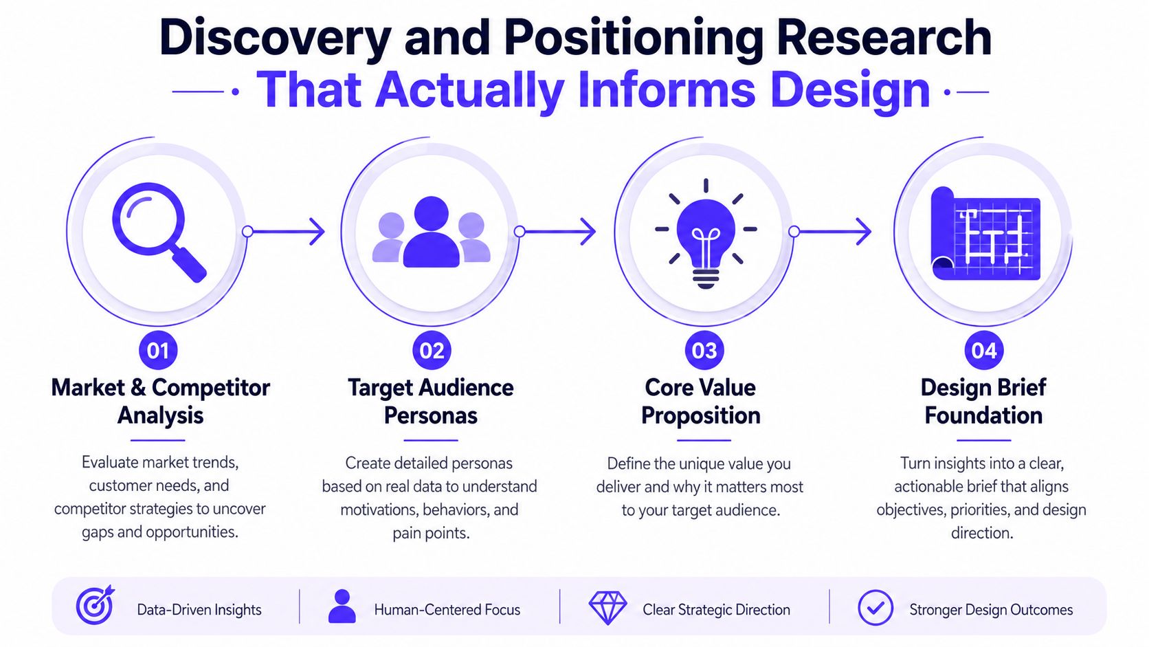
When discovery is done well, the visual work gets easier. Not because the design is simpler, but because the decisions are anchored. The team can stop debating taste and start making choices that match the market.
Building a Visual Identity System With Clear Constraints
A strong visual identity isn't a giant toolkit. It's a controlled one. The best systems for startups are small enough to maintain and strict enough to keep everyone from improvising their own version of the brand.
That's especially true when the same team has to support a website, an app, investor materials, and product UI. The source guidance points to a practical core set, one primary color, supporting colors, 1 to 3 fonts, a defined logo suite, and documented usage rules, with color codes locked for digital and print consistency through hex codes and Pantone numbers, from Adobe's brand identity design guide. That's the right kind of constraint for a startup.
Keep the system small on purpose
One of the most common mistakes is treating every surface like a special case. That's how color palettes sprawl, typography gets inconsistent, and the product starts feeling stitched together. A narrower system is easier to scale because more people can use it correctly.
For most early-stage teams, the minimum viable visual system includes a primary color, a restrained supporting palette, a type pairing that works in both marketing and product, a logo suite with clear formats, and iconography rules. If a color doesn't solve a functional need, it probably doesn't belong in the core system. The same goes for decorative type choices that break in small UI text.
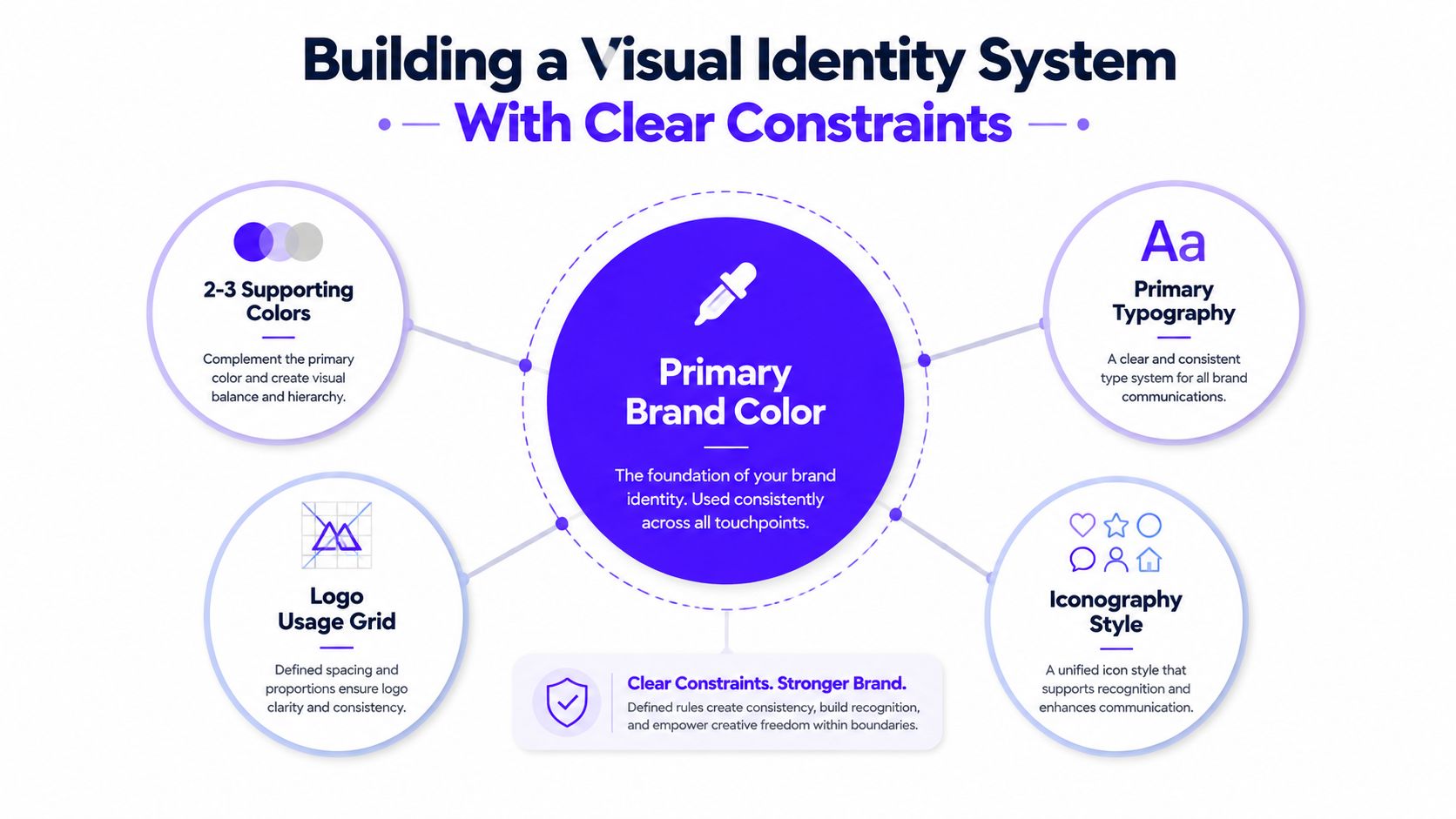
The visual language should also work across channels without extra translation. That means the same color values, spacing logic, and hierarchy principles need to survive from landing pages to dashboards. The narrower the palette, the easier that is to maintain.
Don't skip the sequence
The source guidance is clear that audience research, competitor analysis, and brand strategy should come before logo and palette work, not after. Skipping straight to visuals feels productive, but it usually produces a brand that looks good and explains little. In practice, the logo is the last easy choice, not the first strategic one.
The internal reference on design system components is useful here because the visual identity becomes much more durable when it maps cleanly into reusable UI parts. That's the bridge between brand and product. A color token means more when it's already tied to button states, charts, and panels.
A short video walkthrough can also help teams align on what “clear constraints” really means in practice.
If the visual system can't survive a handoff, it's too loose. If it can't flex across product and marketing, it's too rigid. The sweet spot is a system that feels opinionated without becoming fragile.
Extending Brand Identity Into the Product Experience
Traditional brand guides often stop at typography, color, and a landing page mockup. That's not enough for products people live inside. For AI SaaS, Web3, and fintech teams, the brand is felt in dashboards, onboarding flows, empty states, trust cues, and the words inside buttons and alerts.
That gap matters because product users don't separate “brand” from “software.” They read the copy, scan the hierarchy, react to the micro-interactions, and decide whether the product feels credible. A brand that says “simple” on the homepage but overwhelms people in the UI has a consistency problem, not a messaging problem.
Map voice to interface copy
Brand voice in product work has to be operational, not poetic. You can't just say the brand is “clear” or “human.” The team needs rules for what that means when the interface shows an error, asks for a payment, or explains a data request.
A useful pattern is to define voice by situation. Onboarding can be reassuring and concise. Error states can be direct without sounding punitive. Empty states can guide action instead of making a joke where a next step is needed. That's especially important in fintech and AI SaaS, where users want confidence more than cleverness.
Connect visual choices to component libraries
The source material makes the underlying point well, identity now has to extend across digital channels, product interfaces, and customer communications, not just static brand assets, from The CEO Magazine's brand identity explainer. In practice, that means the product team should know how the identity shows up in cards, tables, modals, alerts, and charts. Color is not just decoration, it signals status. Typography is not just style, it affects scanning speed and perceived reliability.
That's where a product-aware creative partner matters. A founder doesn't need three separate hires to make the brand live in software. They need someone who can handle the interface, the identity, and the front-end implementation as one system. This approach reduces translation loss between strategy and shipped screen.
A dashboard that looks branded but confuses users is not on-brand, it's under-designed.
Design for the moments users remember
The places that matter most are often the least glamorous. Empty states tell users what comes next. Trust cues explain why the product is safe. Status messages calm people when something fails. Microcopy either builds confidence or creates friction.
If those moments are designed well, the identity feels embedded rather than applied. That's the standard to use when evaluating the product. Not “Does the UI match the website?” but “Does the experience feel like one company wrote it?”
Documenting Brand Guidelines and Handoff Artifacts
A brand system only scales when other people can use it without asking for permission every ten minutes. That means the documentation has to be practical. If the guide reads like a mood board, it won't help product, frontend, or marketing teams make consistent decisions.
The strongest handoff artifacts are concrete. The source list includes logo file formats and minimum sizes, color codes, typography scale and pairings, photography and illustration styles, social media templates, and brand voice and messaging examples, according to Adobe's brand identity guide. That's the right checklist because it covers both design and communication.
Build the guide around what people actually need
A useful guideline document should answer three daily questions, what can I use, how should I use it, and what should I avoid. That means every key element needs a clear rule, plus at least one example of misuse. A note that says “don't stretch the logo” is weaker than a page showing correct and incorrect applications.
The guide should also track the values that make the system usable across teams. If marketing needs a template for campaign assets, include it. If product needs spacing guidance for card layouts or voice examples for empty states, include those too. Documentation that ignores real work gets ignored right back.
For teams that need branded output beyond the digital product, a practical resource like Find top custom logo swag can help keep physical items aligned with the same identity rules. The point isn't merch for its own sake. It's consistency across every place a customer sees the brand.
Keep room for change without losing the core
The best guidelines are stable at the center and flexible at the edges. Core marks, colors, and voice rules should stay fixed long enough to build recognition. Supporting examples, templates, and secondary applications can evolve as the product changes.
The internal guide on how to create brand guidelines is helpful if you want a more detailed structure for the document itself. The main thing is to make the guide usable by people who weren't in the original design meetings. If it only makes sense to the person who wrote it, it isn't a handoff artifact, it's a private file.
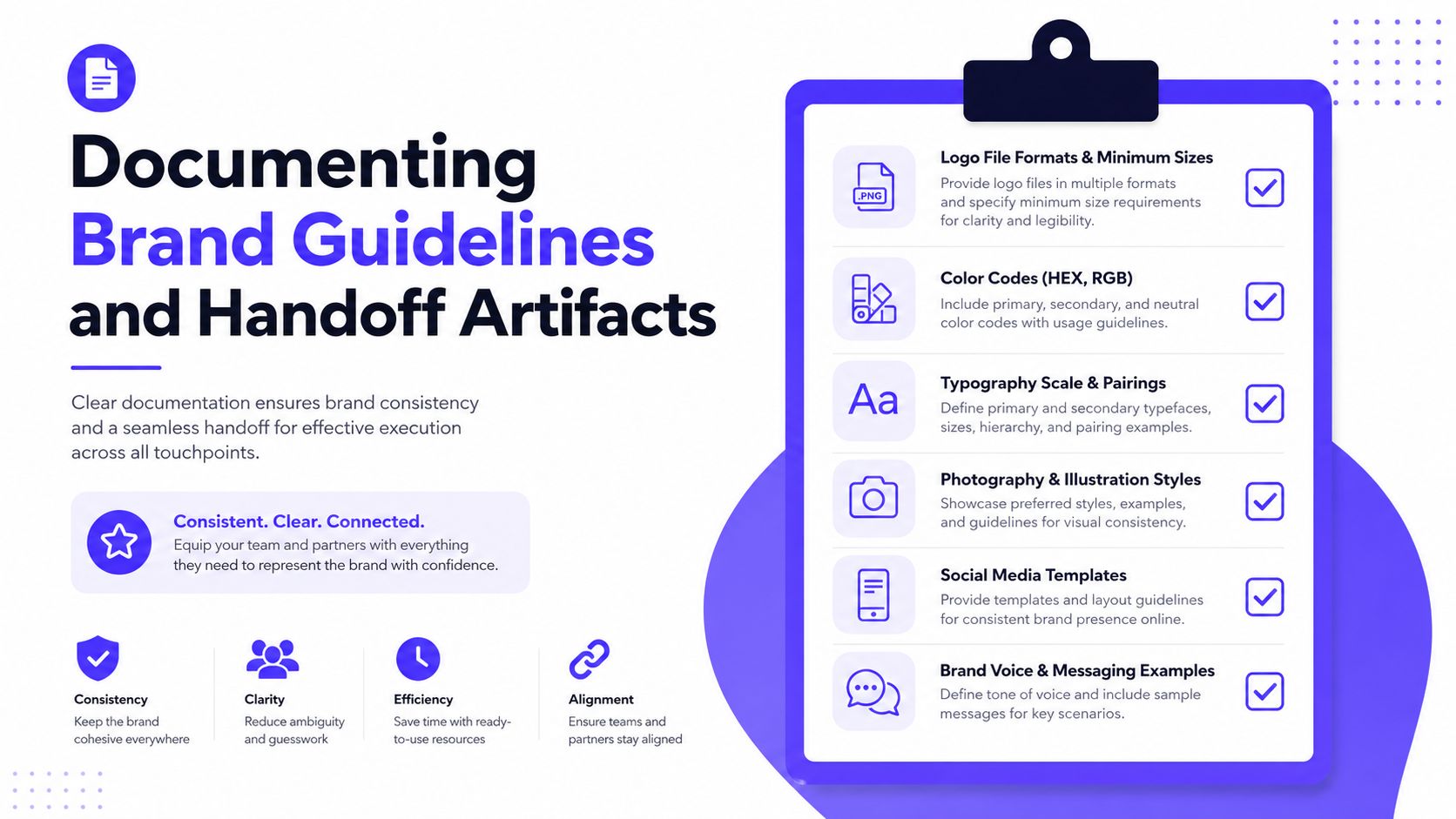
A good guideline doc doesn't freeze the brand. It protects the parts that users should recognize while leaving enough room for the product to grow without breaking its own language.
Planning Timelines, KPIs, and Resourcing for Brand Identity Development
Brand identity development needs a calendar, not just a mood board. The most usable benchmark in the source material breaks the work into Discovery, Strategy, Verbal identity, Visual identity, and Activation/governance, with a total of roughly 8 to 27 weeks depending on scope and complexity, from MetaBrand's startup branding process guide. That range is wide because startups vary widely. A focused refresh and a full identity system are not the same job.
Plan around the product, not against it
The practical move is to overlap phases where it makes sense, but not to blur the sequence. Research and positioning need to lock before design starts. Once those decisions are made, visual work can move faster because the system has a point of view.
This matters for founders balancing fundraising, product delivery, and launch timing. Identity work should support the next milestone, not compete with it. A brand system built in isolation often misses the product release train, and then everyone rushes to patch the gaps later.
Measure whether the identity is working
The cleanest KPIs are the ones teams can observe. Recognition across channels, consistency in how the brand is applied, and conversion on key flows are all useful signals. If users recognize the brand but still drop during onboarding, the identity may be clear but not helpful. If the UI converts but each channel looks different, the system isn't holding.
A simple review rhythm helps. Check whether product screens, marketing pages, and support materials still feel like one company. Look for repeated confusion, extra clarification, or visual drift. Those are usually the first signs that the system is getting diluted.
Match resourcing to stage
A small team has three basic options. It can build in-house, hire multiple specialists, or work with one creative partner who covers product design, brand design, and frontend development. The last option is often the cleanest for funded startups that want senior execution without adding headcount too early.
That doesn't mean every startup should pick the same model. In-house makes sense when brand and product need constant iteration and the volume is high. A partner model makes more sense when the team needs one group that can move from strategy to shipped screens without repeating the same brief three times.

The right setup is the one that lets the identity stay coherent while the product keeps moving. If the team can't maintain that balance, the brand becomes a bottleneck instead of an asset.
If your startup needs brand identity development that works in the actual product, not just on the homepage, talk to 925 Studios. We help AI SaaS, Web3, and fintech teams ship a cohesive brand, product design, and frontend experience without building a full in-house team first.


Let’s keep in touch.
Discover more about high-performance web design. Follow us on Twitter and Instagram.

